Categorized symbology is useful for visualizing distinct categories on nominal and ordinal scales. This method isn't type specific, thus we can use it with strings, numbers, and any other type of attributes. For example, we can show different countries, or hotels with different ratings with different colors. To try this out, let's open the Style tab of our administrative layer's Properties window as usual. Perform the following steps:
- Choose Categorized styling.
- Choose the NAME_1 column, as it contains the names of our administrative boundaries.
- Click on Classify to automatically assign random colors to distinct values.
- Remove the last, no data entry with the minus button, as we do not have null values:
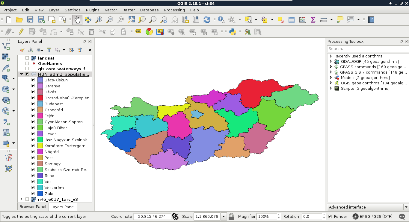
We cannot only see our boundaries colored with distinct colors, but also a legend associated with it in the Layers Panel. This is useful, as we can put these legends on our digital maps.
QGIS's random color generator is not a naive one. It generates appealing pastel colors to create nice representation models. However, if it is not good enough for you, you can pick great color palettes for thematic mapping from the ColorBrewer application. You can reach it at http://colorbrewer2.org/.