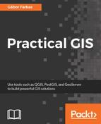
First, let's see our elevation model, opened in the second chapter. As we discussed before, this is the simplest rendering option that QGIS has to offer--a single-band grey representation. It simply clamps the raster values to a byte (0-255), and renders the result as an 8-bit texture. If we open the layer's properties and navigate to the Style tab, we can see the few options needed for such a visualization. QGIS needs a band, which is unambiguous as we have only one band, and the Contrast enhancement set to Stretch to MinMax.
Let's add some colors to this elevation model, and see how we can render it as a 24-bit image. For this, we have to change Rendering type to Singleband pseudocolor. This mode has a lot of options compared to the 8-bit mode, as it is more complex. QGIS needs to know how many colors it has to use, how to interpolate between colors, and what are the limits to the color intervals. QGIS offers a variety of predefined color ramps to choose from. As we are styling an elevation model, the BrBG color ramp is the best fit for our data. After choosing a color ramp, we can click on Classify, and QGIS automatically builds intervals for our data. As we can see, the classification results in painting the lowest points with brown, and the highest with green. We can easily invert this palette by checking in the Invert box. If we click on OK, we can see our colored elevation model:
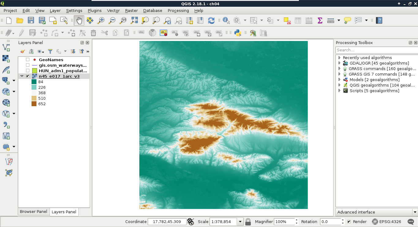
With the classification mode set to Continuous, we get equal intervals. The whole data range is partitioned into five equal parts, and the colors are assigned accordingly. This means, the distribution of the data are not uniform in the intervals. As my model contains values mostly between 84 and 150, I got a lot of green areas, and gradually, less brown areas.
Let's change that in such a way that every interval contains the same amount of values. We can do this by changing the classification mode to Quantile. If we apply the changes, we can see the coloring of our model changing in a more uniform way. As QGIS does not give an aesthetic color palette for terrain visualization by default, we can import other palettes installed, but not enabled. We can do this in the following way:
- Click on New color ramp in the color chooser.
- In the list, the cpt-city option contains numerous color ramps useful for geographic visualization. Select this option.
- From the dialog's left panel, choose the Topography category, and import the elevation color ramp.
- Give a name to the new palette.
- Classify the data with this palette and the Quantile mode, and get a much more appealing result, as shown in following screenshot:
Let's move on to multi-band visualizations. A multi-band rendering mode needs to access three bands in the same raster. It does not matter if we have more or less bands, it just needs one band in each of the RGB channels. A very good candidate for multi-band visualization is our Landsat data. Each of the bands are 16-bit rasters (digital numbers quantized from actual reflectance data); however, they are contained in different files.
The easiest way to create a single raster from the bands is by creating a virtual raster. A virtual raster is a file that contains only references to the source rasters, therefore, it is small, but only a few software can handle it. Perform the following steps:
- Click on Raster | Miscellaneous | Build Virtual Raster (Catalog).
- Select every band from the downloaded Landsat imagery as input files.
- Specify a file name at a location you can easily access later. Add the vrt extension to the end of the file name, manually.
- Check Separate, as otherwise, GDAL (as it is used by QGIS for this task) would try to merge the input rasters, and create a single-band output. This way, it keeps the input rasters in different bands.
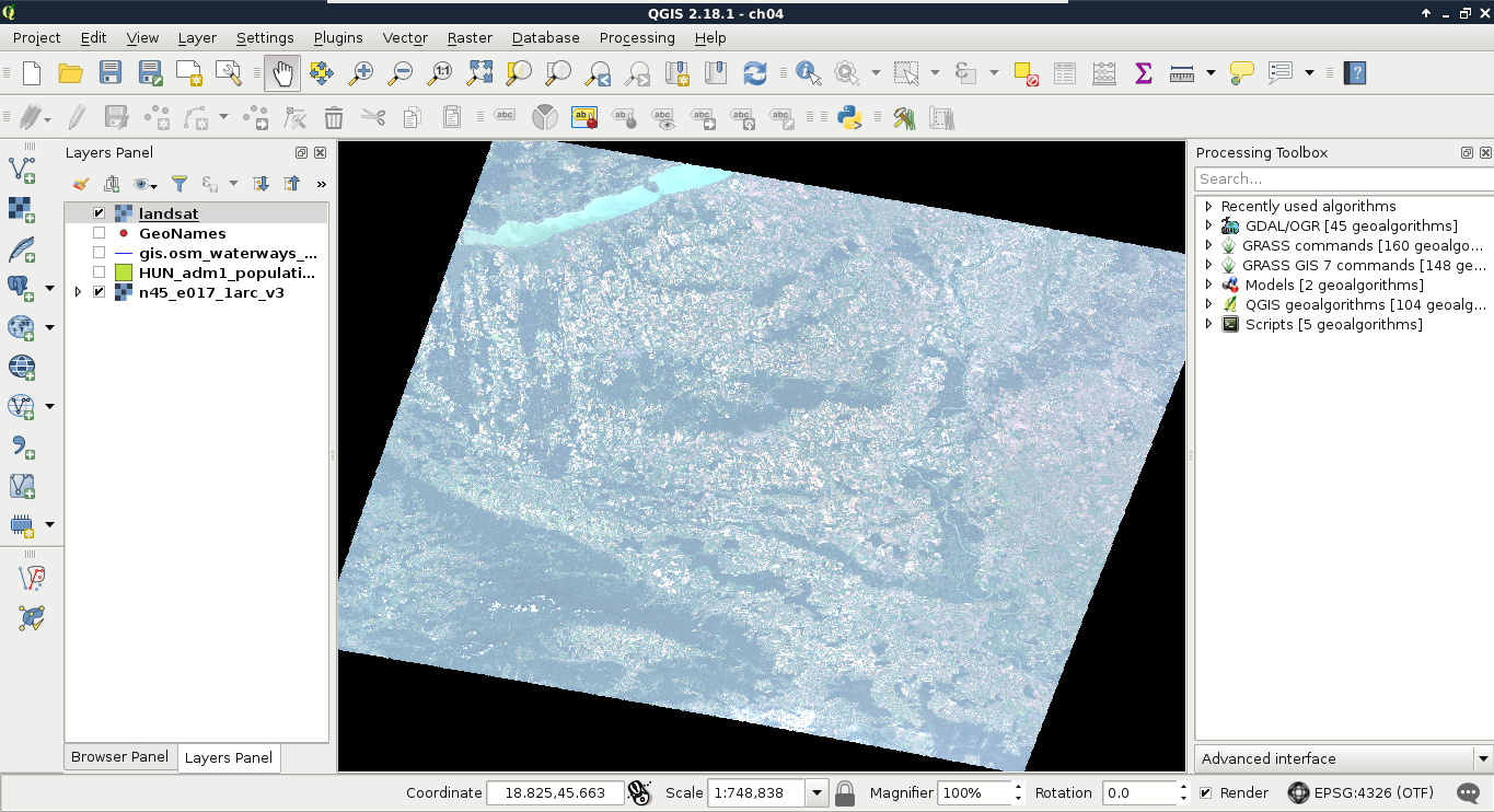
After running the tool, our Landsat layer appears on the map canvas. We can barely see any colors in it though, as the first six bands of the Landsat 8's Operation Land Imager (its multispectral instrument) have the following spectral properties:
| Band number | Name and use cases | Wavelength (µm) |
| 1 | Coastal blue (shallow waters, aerosol) | 0.433-0.453 |
| 2 | Blue (visible blue) | 0.450-0.515 |
| 3 | Green (visible green) | 0.525-0.600 |
| 4 | Red (visible red) | 0.630-0.680 |
| 5 | Near infrared (vegetation, plant health) | 0.845-0.885 |
| 6 | Shortwave infrared (humidity, soil type, rock type) | 1.560-1.660 |
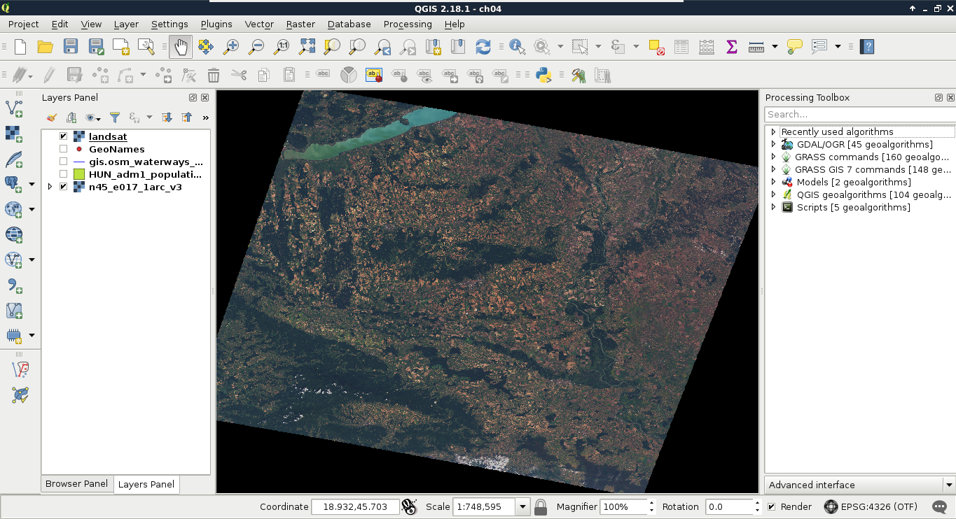
Therefore, in order to get a colored image, we have to create a 4-3-2 combination. To achieve this, we have to open the Properties of our Landsat layer, navigate to Style, and choose Band 4 for Red band, Band 3 for Green band, and Band 2 for Blue band. Now we have a colored image, although the image is quite pale and bright:
The bad news is that we have to calculate the original reflectance or radiance values, possibly with some atmospheric corrections, in order to get satellite imagery with the vivid colors that we are used to. However, we can get drastically better results even with some naive color enhancement techniques. To understand some of these techniques, let's learn why we got such a dull result. The type of the image is 16-bit unsigned integer. Therefore, it has a minimum value of 0, and a maximum value of 216 - 1 = 65,535. The visible bands (most likely due to the high reflectance of clouds) have maximum values near the absolute maximum, although the majority of their values range between 0 and 11,000.
When clamping values to a single byte, QGIS accepts user-defined values for minimum and maximum. If we provide values other than the minimum and maximum of our data, it truncates every value outside of this range to 0 and 255, and stretches only the in-between values. As a result, if we increase the maximum value, the values in between become less dominant, as they are stretched on a wider range. Hence, QGIS is smart--it saw that stretching to the whole data range of our Landsat imagery is hardly beneficial, as it would produce a very dark image. Therefore, it used a technique called cumulative cut, and cut the outer 2% of our data in order to remove distortions caused by outliers. However, this method also discarded some important values in the upper range. This is why we got a dull image:
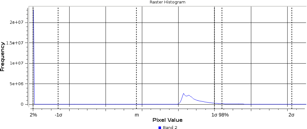
There is another popular stretching method called σ-stretching (sigma-stretching). It calculates the useful range from the mean (m) and the standard deviation (σ) of our data. The standard deviation is the density of our data in a quantified form. The more scattered our values are, the higher the standard deviation becomes, and vice versa. We can access this method by clicking on the Load min/max values menu in the Style tab. We have to check the Mean +/- standard deviation option, and simply click on Load, as 2σ is usually a good measure for excluding outliers, while keeping the important values.
If we apply our changes, we can finally see colors, although the image is still quite biased towards the upper range of the clamped values. To compensate, we can alter some values in the Color rendering menu of the Style tab. It might need a few tries to set the best values for your scene. I got a nice image with Brightness set to -90, Saturation set to 20, and Contrast set to 10:
The resulting image is much more vivid, although it might be biased in one of the bands. My result, for example, has an unnatural reddish glow, which can be compensated by increasing the maximum value of the Red band.