Although the syntax is the same, regular CSS differs from GeoServer's CSS. We already know that CSS rules consist of selectors and declaration blocks, which contain declarations in the form of key-value pairs. There are three kinds of basic selectors we should be able to use in CSS. We can style every tag in an HTML document by supplying the tag's name in a selector. For example, a div selector selects every <div> element in the document. We can constrict the selection to a specific class using .classname and to a specific ID using #idname. Selection based on multiple criteria (the AND logical operator) can be achieved by writing the corresponding selectors together. By writing div.map, we select every <div> element that has a map class. We can also define a union (the OR logical operator) by separating different selectors with commas. Writing div, .map selects every element that is either a <div> element or has a map class. Finally, by separating different selectors with only whitespaces, we can look for parent-children relations. By writing div .map, we select every element with a map class, which is directly nested into a <div> element. There are also special pseudo selectors that check for specific events. For example, if we use a :hover pseudo selector with a div selector and write div:hover, the declarations are only applied when we are hovering over a <div> element with our cursor.
Let's learn some basic styling tricks by styling our document:
- Add some multiline placeholder text to our <p> element ( <p>text</p>).
- Create a new file in our web server's root folder called map.css.
- Link this CSS file to our HTML document so that we can see our changes instantly. Use a <link> element in the <head> section to create this reference. The element must have two attributes: a href attribute pointing to the CSS file and a rel attribute containing the stylesheet value. The <head> section should look like the following:
        <head>
         <title>Map gallery</title>
         <meta charset="utf-8">
         <link href="map.css" rel="stylesheet">
        </head>
- Open map.css with a text or code editor.
- Create a declaration block for our <div> elements. For now, declare only a height value. We can supply physical sizes with absolute and relative values in CSS. An absolute value is usually supplied in pixels (for example, 20px), while a relative value is often supplied as a percentage value (for example, 80%). Relative values are calculated by the web client on rendering. They are always relative to the parent element's size:
        div {
         height: 80%;
        }
- Create two declaration blocks--one for the map element and one for the description element. Use the IDs of the elements in the selectors. Give the map element a width of 60% and the description element a width of 40%:
        #map {
         width: 60%;
        }

        #description {
         width: 40%;
        }
- Now we have our two <div> elements sized properly, but they aren't placed on the same line. The problem is that they are block elements. Block elements can be sized arbitrarily, but they are always placed under each other. To override this behavior, we have to float our map element to the left and declare both of the elements as inline blocks. Inline blocks can be sized arbitrarily, but they can also be floated next to each other until the sum of their sizes does not exceed the viewport's size:
        div {
         height: 80%;
         display: inline-block;
        }

        #map {
         width: 60%;
         float: left;
        }
- Add a thin border around the map element to have a nice placeholder, even if we do not have a loaded map. Adding a border is one of the few things for which CSS offers a convenience property. It is called border, and we can provide the three most important properties of a border as values: its width, its color, and its line style. The order is not important; however, the values must be separated with whitespaces. The rule should look like the following:
border: 1px solid black;
- Now if we refresh our site, we can notice that the design is broken and the elements are placed under each other again. The problem is that the borders, padding, and margins are not included in the overall size of an element by default. That is, we have exceeded the width of the viewport by two pixels. We can fix that by overriding this behavior for the map element. We can do that with an extra rule--box-sizing: border-box, although it only applies to borders. Padding and margins are still not included in the specified size. We can also round down the corners of the border nicely by supplying a border-radius property with an arbitrary value:
        #map {
         width: 60%;
         float: left;
         border: 1px solid black;
         border-radius: 5px;
         box-sizing: border-box;
        }
- The only thing left to do is increase the space between the map and the other elements (text and buttons). As defining a margin or a padding on either of the <div> elements would result in a broken design again, we can define a padding on the <p> element in order to achieve the desired effect. By adding additional rules to the <div> elements, we can safely create a padding:
        div {
         height: 80%;
         display: inline-block;
         padding-bottom: 1em;
        }

        p {
         padding-left: 1em;
        }
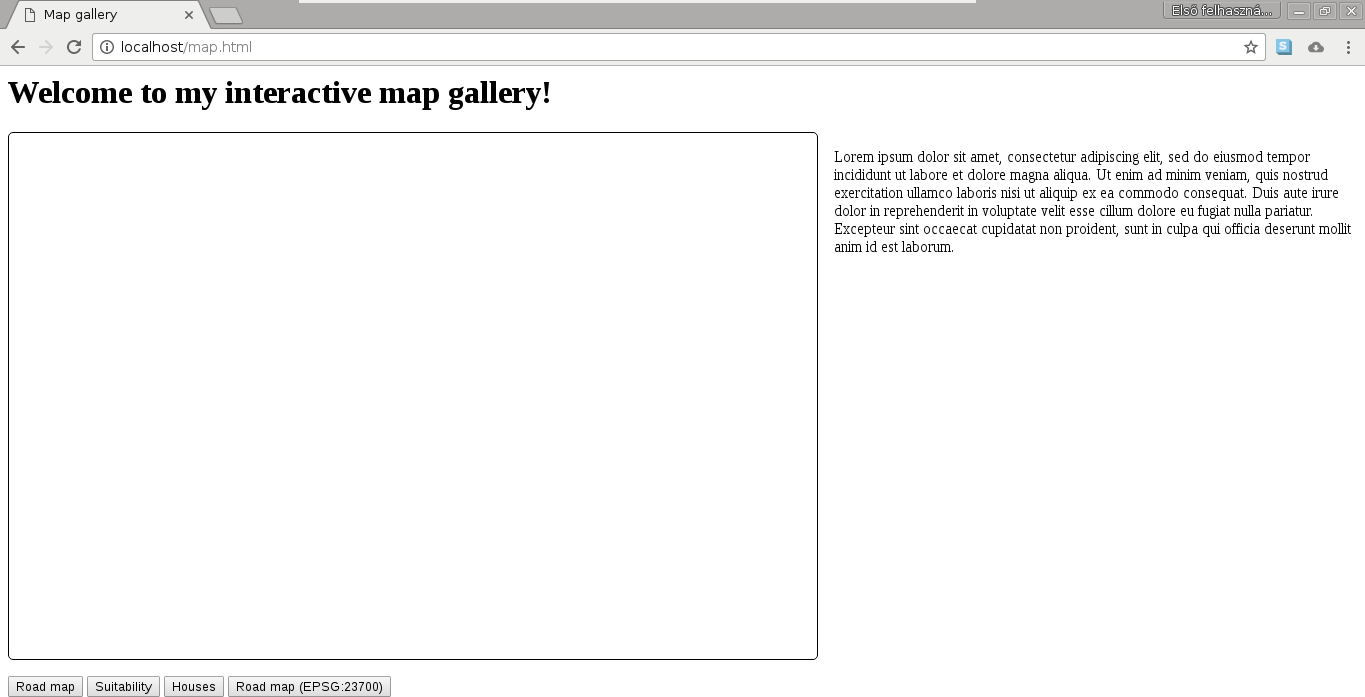
Our basic map gallery should look similar to the following:
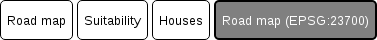
Finally, let's style our buttons. We can go wild here without worrying about breaking the page design:
- Create a declaration with a selector, selecting the class used for our buttons.
- Create a declaration block with some properties of your taste. A very simplistic solution can be the following one:
        .mapchooser {
         height: 40px;
         border: 1px solid black;
         border-radius: 5px;
         background-color: white;
        }
- If we inspect the result, we can see our new button design, although no visual changes occur when we click on them. As we overrode the default button styling, we also have to supply some rules for the click event. Define a style for the click event using the :active pseudo selector:
        .mapchooser:active {
         border: 2px solid black;
         background-color: grey;
         color: white;
        }
We can use as many CSS rules as we would like on our buttons, although using the simple rules provided here still brings a significant change in the design of our buttons: