The other common method, graduated styling, is useful to show comparable attributes, effectively on interval and ratio scales. This method is type-specific, as we can only compare numbers directly. By using this method, QGIS creates intervals (bins), groups the attributes, links a color to every interval, and draws the features accordingly. We can apply graduated symbology to every geometry type, although the most common use cases are using a color ramp for shading polygons (choropleth map), and applying different icon sizes on points (proportional symbol map). First, let's apply a filter on our GeoNames layer (or its extract) to only show some of the settlements. With the following query we can filter only the seats of the administrative divisions:
"featurecode" LIKE 'PPLA%'
Now we can apply a graduated symbology by doing the following steps:
- Open the Style tab of our administrative boundaries layer.
- Select the Graduated symbology.
- Select a numeric column. Population density is a nice column to work with.
- Select a color ramp (I used YlOrBr).
- Select one of the familiar modes from styling rasters. Quantile works really well with population density.
- Click on Classify, and apply the style.
- Open the Style tab of our GeoNames layer.
- Select the Graduated symbology and the population column.
- For the symbology method, select Size.
- Select a mode, and click on Classify. With population, Equal Interval is a good choice for creating initial intervals and modifying them to some more appealing ranges:
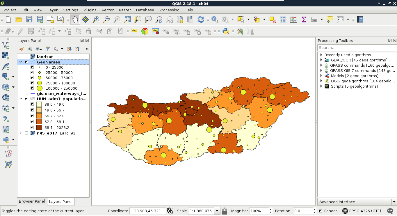
The custom ranges should always depend on the properties of the mapped data. For mapping settlements in Hungary excluding the capital city, I usually use intervals as per the preceding screenshot.