Table of Contents for
Practical GIS

Version ebook / Retour

Cover image for bash Cookbook, 2nd Edition Practical GIS by Gábor Farkas Published by Packt Publishing, 2017
  1. Practical GIS
  2. Title Page
  3. Copyright
  4. Credits
  5. About the Author
  6. About the Reviewer
  7. www.PacktPub.com
  8. Customer Feedback
  9. Dedication
  10. Table of Contents
  11. Preface
  12. What this book covers
  13. What you need for this book
  14. Who this book is for
  15. Conventions
  16. Reader feedback
  17. Customer support
  18. Downloading the example code
  19. Downloading the color images of this book
  20. Errata
  21. Piracy
  22. Questions
  23. Setting Up Your Environment
  24. Understanding GIS
  25. Setting up the tools
  26. Installing on Linux
  27. Installing on Windows
  28. Installing on macOS
  29. Getting familiar with the software
  30. About the software licenses
  31. Collecting some data
  32. Getting basic data
  33. Licenses
  34. Accessing satellite data
  35. Active remote sensing
  36. Passive remote sensing
  37. Licenses
  38. Using OpenStreetMap
  39. OpenStreetMap license
  40. Summary
  41. Accessing GIS Data With QGIS
  42. Accessing raster data
  43. Raster data model
  44. Rasters are boring
  45. Accessing vector data
  46. Vector data model
  47. Vector topology - the right way
  48. Opening tabular layers
  49. Understanding map scales
  50. Summary
  51. Using Vector Data Effectively
  52. Using the attribute table
  53. SQL in GIS
  54. Selecting features in QGIS
  55. Preparing our data
  56. Writing basic queries
  57. Filtering layers
  58. Spatial querying
  59. Writing advanced queries
  60. Modifying the attribute table
  61. Removing columns
  62. Joining tables
  63. Spatial joins
  64. Adding attribute data
  65. Understanding data providers
  66. Summary
  67. Creating Digital Maps
  68. Styling our data
  69. Styling raster data
  70. Styling vector data
  71. Mapping with categories
  72. Graduated mapping
  73. Understanding projections
  74. Plate Carrée - a simple example
  75. Going local with NAD83 / Conus Albers
  76. Choosing the right projection
  77. Preparing a map
  78. Rule-based styling
  79. Adding labels
  80. Creating additional thematics
  81. Creating a map
  82. Adding cartographic elements
  83. Summary
  84. Exporting Your Data
  85. Creating a printable map
  86. Clipping features
  87. Creating a background
  88. Removing dangling segments
  89. Exporting the map
  90. A good way for post-processing - SVG
  91. Sharing raw data
  92. Vector data exchange formats
  93. Shapefile
  94. WKT and WKB
  95. Markup languages
  96. GeoJSON
  97. Raster data exchange formats
  98. GeoTIFF
  99. Clipping rasters
  100. Other raster formats
  101. Summary
  102. Feeding a PostGIS Database
  103. A brief overview of databases
  104. Relational databases
  105. NoSQL databases
  106. Spatial databases
  107. Importing layers into PostGIS
  108. Importing vector data
  109. Spatial indexing
  110. Importing raster data
  111. Visualizing PostGIS layers in QGIS
  112. Basic PostGIS queries
  113. Summary
  114. A PostGIS Overview
  115. Customizing the database
  116. Securing our database
  117. Constraining tables
  118. Saving queries
  119. Optimizing queries
  120. Backing up our data
  121. Creating static backups
  122. Continuous archiving
  123. Summary
  124. Spatial Analysis in QGIS
  125. Preparing the workspace
  126. Laying down the rules
  127. Vector analysis
  128. Proximity analysis
  129. Understanding the overlay tools
  130. Towards some neighborhood analysis
  131. Building your models
  132. Using digital elevation models
  133. Filtering based on aspect
  134. Calculating walking times
  135. Summary
  136. Spatial Analysis on Steroids - Using PostGIS
  137. Delimiting quiet houses
  138. Proximity analysis in PostGIS
  139. Precision problems of buffering
  140. Querying distances effectively
  141. Saving the results
  142. Matching the rest of the criteria
  143. Counting nearby points
  144. Querying rasters
  145. Summary
  146. A Typical GIS Problem
  147. Outlining the problem
  148. Raster analysis
  149. Multi-criteria evaluation
  150. Creating the constraint mask
  151. Using fuzzy techniques in GIS
  152. Proximity analysis with rasters
  153. Fuzzifying crisp data
  154. Aggregating the results
  155. Calculating statistics
  156. Vectorizing suitable areas
  157. Using zonal statistics
  158. Accessing vector statistics
  159. Creating an atlas
  160. Summary
  161. Showcasing Your Data
  162. Spatial data on the web
  163. Understanding the basics of the web
  164. Spatial servers
  165. Using QGIS for publishing
  166. Using GeoServer
  167. General configuration
  168. GeoServer architecture
  169. Adding spatial data
  170. Tiling your maps
  171. Summary
  172. Styling Your Data in GeoServer
  173. Managing styles
  174. Writing SLD styles
  175. Styling vector layers
  176. Styling waters
  177. Styling polygons
  178. Creating labels
  179. Styling raster layers
  180. Using CSS in GeoServer
  181. Styling layers with CSS
  182. Creating complex styles
  183. Styling raster layers
  184. Summary
  185. Creating a Web Map
  186. Understanding the client side of the Web
  187. Creating a web page
  188. Writing HTML code
  189. Styling the elements
  190. Scripting your web page
  191. Creating web maps with Leaflet
  192. Creating a simple map
  193. Compositing layers
  194. Working with Leaflet plugins
  195. Loading raw vector data
  196. Styling vectors in Leaflet
  197. Annotating attributes with popups
  198. Using other projections
  199. Summary
  200. Appendix

Adding cartographic elements

In the composer window, we can access the layout properties of our map instantly. In the right panel, we can choose the paper size, and its orientation. On the left toolbar, we have access to the most important cartographic elements, which are added on demand as separate, configurable items. The first four tools are for item management. We can use the Select/Move item tool to move and resize items, and the Move item content tool to pan the map inside the data frame item. Under those tools, we can access the items which can be added.

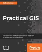
First, let's add the dataframe to the map. To do this, click on the Add new map tool, and draw a rectangle on the canvas. Let's resize the map to match the paper's dimensions. Once an item is added, we can snap its borders to the borders of our canvas. Now we have access to the item's properties in the right panel. Under Item properties, we can see the parameters of our map content. The first thing to change is its scale. It has a different scale from the browser's canvas, as it is now calculated to match our paper's size. Let's modify it to a nice, round number. When we change the scale, QGIS automatically updates the map on our canvas. However, it does not render the map at panning or zooming unless we change the Cache property to Render. Changing it degrades performance, but updates the map at every change. When you've found the right scale to use, align the map on the canvas with the Move item content tool:

You can find the Grids option under the map item's properties. Add a grid with the plus sign, set the intervals in the x and y axes, and see the results. You can draw coordinates at the axes by checking the Draw coordinates checkbox below. Finally, change the grid's CRS to WGS84 (EPSG:4326), and set the intervals to somewhere between 0.2 and 0.5.

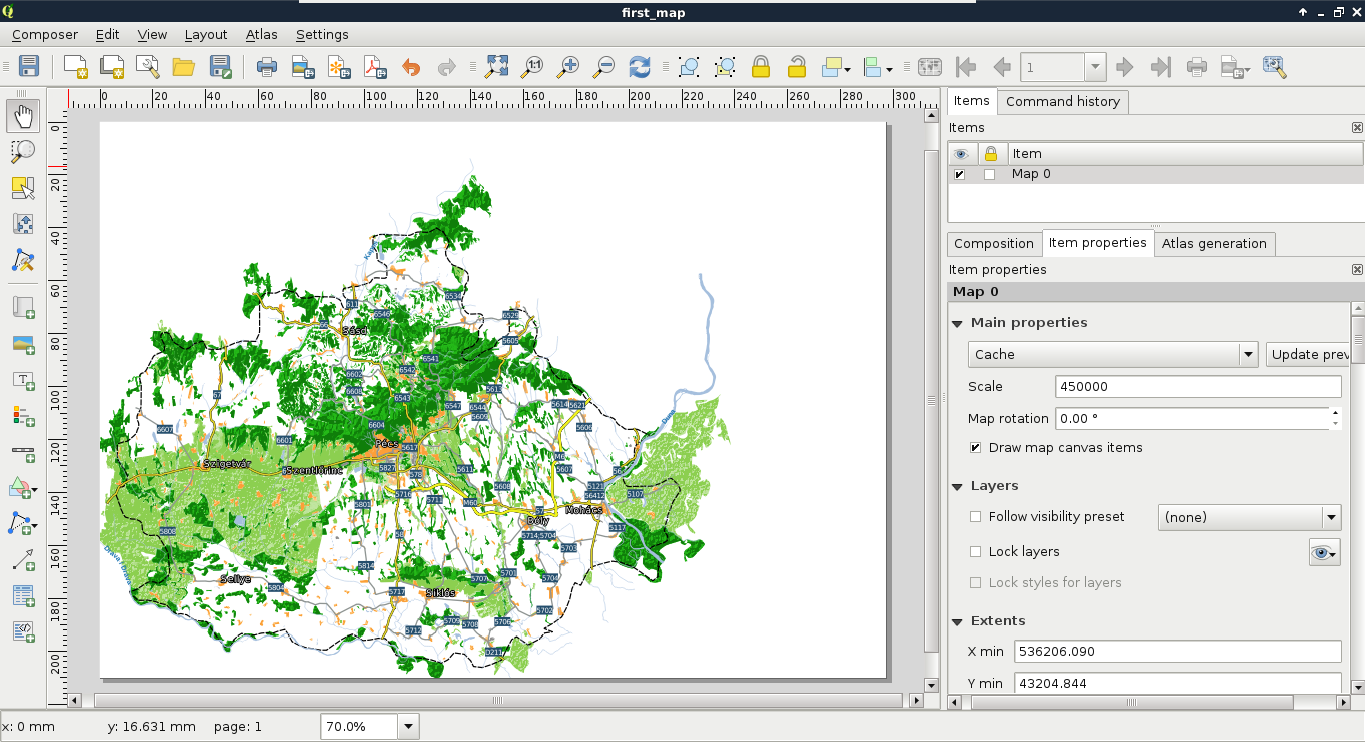
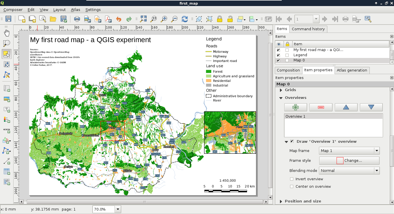
The next thing we add to the composition is a legend. We can create a legend by selecting the Add new legend tool, and drawing a rectangle on the canvas. As we can see, the legend is automatically created from the Layers Panel by default. As we have some layers which do not fit into the legend (for example, the srtm layer or the GeoNames layer), we can choose to manually customize the legend item. For this, we need to uncheck the Auto update box in the legend item's properties. Now we can delete superfluous entries by selecting them and clicking on the minus button. We can also rename the existing labels and groups, and change their order.

Let's get rid of the extra layers, and rename the rest of them to have more descriptive names. Also, there are two thematics (roads and land use) grouped, and two layers (waterways, administrative boundaries) ungrouped. To make the legend more consistent, let's create a custom group with the Add group button, name it as Other, and drag those entries into it. Finally, we should make the group fonts more consistent. The Other group has a different font, as it is a group, while the others are considered subgroups by QGIS.

To change this, you can right-click on the subgroups, and change their categorizations to group:

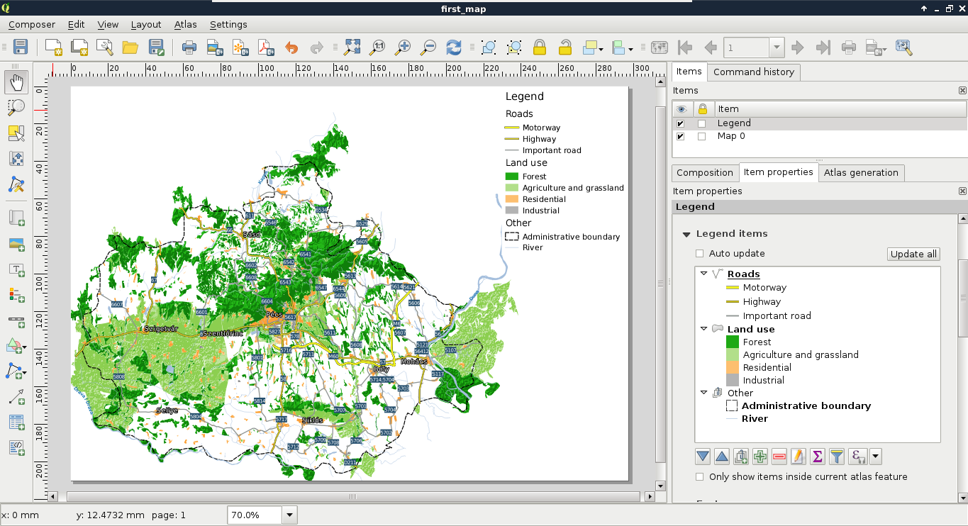
Next, we add some text content. Specifically, we add a title and proper attributions to the map. We can add custom text boxes with the Add new label button. Editing the label is not as interactive as in a vector editing software, but we can customize the label in its properties window in the right panel. The name of the layer should be concise, but descriptive. I used the name My first road map - a QGIS experiment. The attributions should go in a separate text box with a smaller font size. We should add the following four statements to the attributions:

  1. OpenStreetMap data © OpenStreetMap contributors.
  2. SRTM 1 Arc-second data downloaded from USGS's Earth Explorer.
  3. Administrative boundaries © GADM (or Natural Earth if you used their data instead).
  4. © Your Name, year of composition.

Now let's add the final piece to our map--the scale and the scale bar. We can add them both with the Add new scalebar tool. It comes with a fixed size, which needs some tinkering to modify. The easiest way to reduce its size is to modify the number of units it shows under Segments | Fixed width. We can also choose between some templates in its Style menu.

The second scale bar should only contain the scale in a numeric form. To achieve this, we can choose the Numeric style:

The scale can also be added with a text box, however, adding it with a scale bar item is more convenient, since if we change the scale of our map, we don't have to update it manually.

As a bonus task, let's add one final element to take up the empty space between the legend and the scale--an inset map. By adding additional data frames, we can focus on smaller areas in greater detail. Let's choose an area we would like to emphasize, and create a new data frame with the Add new map tool. If we resize it to fit the width of the legend and the scale bar, we end up with a large map and a small map showing exactly the same area. However, by using the Move item content tool, we can zoom and pan our new map to fit our needs.

If we have two or more maps, they will most likely have different scales. QGIS does not know which map we would like to use for the scale bar items, therefore, it allows us to specify it under the scale item's Map property.

QGIS offers a very handy tool for showing the extent of a data frame on another data frame. To access this property, let's select the large map's item, and navigate to Overviews. If we add an overview with the plus sign, and specify the reference to our second map in the Map frame property, we can see the extent of our inset map showing up on our main map. We can customize the look of this extent in the Frame style property:

Wondering how I got the projected lines in the map from the first chapter? Well, manually of course. You can use the Add Nodes item tool to add additional lines and polygons directly on the canvas.

The only thing we did not add to our map is the north arrow, as our map is oriented towards North. Unfortunately, adding a north arrow is far from trivial in QGIS 2. The first step is to add an image with the Add image tool. Under the image item's properties, we can find the Search directories menu, which contains some of the default SVG images shipped with QGIS. Among them there are some north arrows. The only problem remaining if we have to add a north arrow is that our map is rotated. An image item, on the other hand, is not. To solve this problem, we can check the Sync with map checkbox in the Image rotation menu. If our map is not rotated by hand, but by the CRS used, we can use the True north option in North alignment (Appendix 1.2).