Practical GIS
Use tools such as QGIS, PostGIS, and GeoServer to build powerful GIS solutions
BIRMINGHAM - MUMBAI
BIRMINGHAM - MUMBAI
Copyright © 2017 Packt Publishing
All rights reserved. No part of this book may be reproduced, stored in a retrieval system, or transmitted in any form or by any means, without the prior written permission of the publisher, except in the case of brief quotations embedded in critical articles or reviews.
Every effort has been made in the preparation of this book to ensure the accuracy of the information presented. However, the information contained in this book is sold without warranty, either express or implied. Neither the author, nor Packt Publishing, and its dealers and distributors will be held liable for any damages caused or alleged to be caused directly or indirectly by this book.
Packt Publishing has endeavored to provide trademark information about all of the companies and products mentioned in this book by the appropriate use of capitals. However, Packt Publishing cannot guarantee the accuracy of this information.
First published: June 2017
Production reference: 1080617
ISBN 978-1-78712-332-8
|
Author |
Copy Editor Sonia Mathur |
|
Reviewers Mark Lewin David Bianco |
Project Coordinator Prajakta Naik |
|
Commissioning Editor Aaron Lazar |
Proofreader Safis Editing |
|
Acquisition Editor Angad Singh |
Indexer Mariammal Chettiyar |
|
Content Development Editor Lawrence Veigas |
Graphics Abhinash Sahu |
|
Technical Editor Abhishek Sharma |
Production Coordinator Shantanu Zagade |
Gábor Farkas is a PhD student in the University of Pécs's Institute of Geography. He holds a master's degree in geography, although he moved from traditional geography to pure geoinformatics in his early studies. He often studies geoinformatical solutions in his free time, keeps up with the latest trends, and is an open source enthusiast. He loves to work with GRASS GIS, PostGIS, and QGIS, but his all time favorite is Web GIS, which mostly covers his main research interest.
Mark Lewin has been developing, teaching, and writing about software for over 16 years. His main interest is GIS and web mapping. Working for ESRI, the world's largest GIS company, he acted as a consultant, trainer, course author, and a frequent speaker at industry events. He has subsequently expanded his knowledge to include a wide variety of open source mapping technologies and a handful of relevant JavaScript frameworks including Node.js, Dojo, and JQuery.
Mark now works for Oracle’s MySQL curriculum team, focusing on creating great learning experiences for DBAs and developers, but remains crazy about web mapping.
He is the author of books such as Leaflet.js Succinctly, Go Succinctly, and Go Web Development Succinctly for Syncfusion. He is also the co-author of the forthcoming second edition of Building Web and Mobile ArcGIS Server Applications with JavaScript, which is to be published by Packt.
For support files and downloads related to your book, please visit www.PacktPub.com.
Did you know that Packt offers eBook versions of every book published, with PDF and ePub files available? You can upgrade to the eBook version at www.PacktPub.com and as a print book customer, you are entitled to a discount on the eBook copy. Get in touch with us at service@packtpub.com for more details.
At www.PacktPub.com, you can also read a collection of free technical articles, sign up for a range of free newsletters and receive exclusive discounts and offers on Packt books and eBooks.
![]()
Get the most in-demand software skills with Mapt. Mapt gives you full access to all Packt books and video courses, as well as industry-leading tools to help you plan your personal development and advance your career.
Thanks for purchasing this Packt book. At Packt, quality is at the heart of our editorial process. To help us improve, please leave us an honest review on this book's Amazon page at https://www.amazon.com/dp/1787123324.
If you'd like to join our team of regular reviewers, you can e-mail us at customerreviews@packtpub.com. We award our regular reviewers with free eBooks and videos in exchange for their valuable feedback. Help us be relentless in improving our products!
In the past, professional spatial analysis in the business sector was equivalent to buying an ArcGIS license, storing the data in some kind of Esri database, and publishing results with the ArcGIS Server. These trends seem to be changing in the favor of open source software. As FOSS (free and open source software) products are gaining more and more power due to the hard work of the enthusiastic open source GIS community, they pique the curiosity of the business sector at a growing rate. With the increasing number of FOSS GIS experts and consulting companies, both training and documentation--the two determining factors that open source GIS products traditionally lacked--are becoming more available.
Chapter 1, Setting Up Your Environment, guides you through the basic steps of creating an open source software infrastructure you can carry out your analyses with. It also introduces you to popular open data sources you can freely use in your workflow.
Chapter 2, Accessing GIS Data with QGIS, teaches you about the basic data models used in GIS. It discusses the peculiarities of these data models in detail, and also makes you familiar with the GUI of QGIS by browsing through some data.
Chapter 3, Using Vector Data Effectively, shows you how you can interact with vector data in the GIS software. It discusses GUI-based queries, SQL-based queries, and basic attribute data management. You will get accommodated to the vector data model and can use the attributes associated to the vector features in various ways.
Chapter 4, Creating Digital Maps, discusses the basics of digital map making by going through an exhaustive yet simple example in QGIS. It introduces you to the concept of projections and spatial reference systems, and the various steps of creating a digital map.
Chapter 5, Exporting Your Data, guides you through the most widely used vector and raster data formats in GIS. It discusses the strengths and weaknesses of the various formats, and also gives you some insight on under what circumstances you should choose a particular spatial data format.
Chapter 6, Feeding a PostGIS Database, guides you through the process of making a spatial database with PostGIS. It discusses how to create a new database, and how to fill it with various kinds of spatial data using QGIS. You will also learn how to manage existing PostGIS tables from QGIS.
Chapter 7, A PostGIS Overview, shows what other options you have with your PostGIS database. It leaves QGIS and talks about important PostgreSQL and PostGIS concepts by managing the database created in the previous chapter through PostgreSQL's administration software, pgAdmin.
Chapter 8, Spatial Analysis in QGIS, goes back to QGIS in order to discuss vector data analysis and spatial modeling. It shows you how different geometry types can be used to get some meaningful results based on the features' spatial relationship. It goes through the practical textbook example of delimiting houses based on some customer preferences.
Chapter 9, Spatial Analysis on Steroids - Using PostGIS, reiterates the example of the previous chapter, but entirely in PostGIS. It shows how a good software choice for the given task can enhance productivity by minimizing manual labor and automating the entire workflow. It also introduces you to the world of PostGIS spatial functions by going through the analysis again.
Chapter 10, A Typical GIS Problem, shows raster analysis, where spatial databases do not excel. It discusses typical raster operations by going through a decision making process. It sheds light on typical considerations related to the raster data model during an analysis, while also introducing some powerful tools and valuable methodology required to make a good decision based on spatial factors and constraints.
Chapter 11, Showcasing Your Data, goes on to the Web stack, and discusses the basics of the Web, the client-server architecture, and spatial servers. It goes into details on how to use the QGIS Server to create quick visualizations, and how to use GeoServer to build a powerful spatial server with great capabilities.
Chapter 12, Styling Your Data in GeoServer, discusses the basic vector and raster symbology usable in GeoServer. It goes through the styling process by using traditional SLD documents. When the concepts are clear, it introduces the powerful and convenient GeoServer CSS, which is also based on SLD.
Chapter 13, Creating a Web Map, jumps to the client side of the Web and shows you how to create simple web maps using the server architecture created before, and the lightweight web mapping library--Leaflet. It guides you through the process of creating a basic web map, ranging from creating an HTML document to scripting it with JavaScript.
Appendix shows additional information and interesting use cases of the learned material through images and short descriptions.
For this book, you will need to have a computer with mid-class computing capabilities. As the open source GIS software is not that demanding, you don't have to worry about your hardware specification when running the software, although some of the raster processing tools will run pretty long (about 5-10 minutes) on slower machines.
What you need to take care of is that you have administrator privileges on the machine you are using, or the software is set up correctly by an administrator. If you don't have administrator privileges, you need to write the privilege at least to the folder used by the web server to serve content.
The aim of this book is to carry on this trend and demonstrate how even advanced spatial analysis is convenient with an open source product, and how this software is a capable competitor of proprietary solutions. The examples from which you will learn how to harness the power of the capable GIS software, QGIS; the powerful spatial ORDBMS (object-relational database management system), PostGIS; and the user-friendly geospatial server, GeoServer are aimed at IT professionals looking for cheap alternatives to costly proprietary GIS solutions with or without basic GIS training.
On the other hand, anyone can learn the basics of these great open source products from this practical guide. If you are a decision maker looking for easily producible results, a CTO looking for the right software, or a student craving for an easy-to-follow guide, it doesn't matter. This book presents you the bare minimum of the GIS knowledge required for effective work with spatial data, and thorough but easy-to-follow examples for utilizing open source software for this work.
In this book, you will find a number of text styles that distinguish between different kinds of information. Here are some examples of these styles and an explanation of their meaning.
Code words in text, database table names, folder names, filenames, file extensions, pathnames, dummy URLs, and user input are shown as follows: "It uses the * wildcard for selecting everything from the table named table, where the content of the column named column matches value."
A block of code is set as follows:
    SELECT ST_Buffer(geom, 200) AS geom
     FROM spatial.roads r
     WHERE r.fclass LIKE 'motorway%' OR r.fclass LIKE 'primary%';
Any command-line input or output is written as follows:
update-alternatives --config java
New terms and important words are shown in bold. Words that you see on the screen, for example, in menus or dialog boxes, appear in the text like this: "If we open the Properties window of a vector layer and navigate to the Style tab, we can see the Single symbol method applied to the layer."
Feedback from our readers is always welcome. Let us know what you think about this book—what you liked or disliked. Reader feedback is important for us as it helps us develop titles that you will really get the most out of.
To send us general feedback, simply e-mail feedback@packtpub.com, and mention the book's title in the subject of your message.
If there is a topic that you have expertise in and you are interested in either writing or contributing to a book, see our author guide at www.packtpub.com/authors.
Now that you are the proud owner of a Packt book, we have a number of things to help you to get the most from your purchase.
You can download the example code files for this book from your account at http://www.packtpub.com. If you purchased this book elsewhere, you can visit http://www.packtpub.com/support and register to have the files e-mailed directly to you.
You can download the code files by following these steps:
Once the file is downloaded, please make sure that you unzip or extract the folder using the latest version of:
The code bundle for the book is also hosted on GitHub at https://github.com/PacktPublishing/Practical-GIS. We also have other code bundles from our rich catalog of books and videos available at https://github.com/PacktPublishing/. Check them out!
We also provide you with a PDF file that has color images of the screenshots/diagrams used in this book. The color images will help you better understand the changes in the output. You can download this file from https://www.packtpub.com/sites/default/files/downloads/PracticalGIS_ColorImages.pdf.
Although we have taken every care to ensure the accuracy of our content, mistakes do happen. If you find a mistake in one of our books—maybe a mistake in the text or the code—we would be grateful if you could report this to us. By doing so, you can save other readers from frustration and help us improve subsequent versions of this book. If you find any errata, please report them by visiting http://www.packtpub.com/submit-errata, selecting your book, clicking on the Errata Submission Form link, and entering the details of your errata. Once your errata are verified, your submission will be accepted and the errata will be uploaded to our website or added to any list of existing errata under the Errata section of that title.
To view the previously submitted errata, go to https://www.packtpub.com/books/content/support and enter the name of the book in the search field. The required information will appear under the Errata section.
Piracy of copyrighted material on the Internet is an ongoing problem across all media. At Packt, we take the protection of our copyright and licenses very seriously. If you come across any illegal copies of our works in any form on the Internet, please provide us with the location address or website name immediately so that we can pursue a remedy.
Please contact us at copyright@packtpub.com with a link to the suspected pirated material.
We appreciate your help in protecting our authors and our ability to bring you valuable content.
If you have a problem with any aspect of this book, you can contact us at questions@packtpub.com, and we will do our best to address the problem.
The development of open source GIS technologies has reached a state where they can seamlessly replace proprietary software in the recent years. They are convenient, capable tools for analyzing geospatial data. They offer solutions from basic analysis to more advanced, even scientific, workflows. Moreover, there are tons of open geographical data out there, and some of them can even be used for commercial purposes. In this chapter, we will acquaint ourselves with the open source software used in this book, install and configure them with an emphasis on typical pitfalls, and learn about some of the most popular sources of open data out there.
In this chapter, we will cover the following topics:
Before jumping into the installation process, let's discuss geographic information systems (GIS) a little bit. GIS is a system for collecting, manipulating, managing, visualizing, analyzing, and publishing spatial data. Although these functionalities can be bundled in a single software, by definition, GIS is not a software, it is rather a set of functionalities. It can help you to make better decisions, and to get more in-depth results from data based on their spatial relationships.
The most important part of the former definition is spatial data. GIS handles data based on their locations in a coordinate reference system. This means, despite GIS mainly being used for handling and processing geographical data (data that can be mapped to the surface of Earth), it can be used for anything with dimensions. For example, a fictional land like Middle-Earth, the Milky Way, the surface of Mars, the human body, or a single atom. The possibilities are endless; however, for most of them, there are specialized tools that are more feasible to use.
The functionalities of a GIS outline the required capabilities of a GIS expert. Experts need to be able to collect data either by surveying, accessing an other's measurements, or digitizing paper maps, just to mention a few methods. Collecting data is only the first step. Experts need to know how to manage this data. This functionality assumes knowledge not only in spatial data formats but also in database management. Some of the data just cannot fit into a single file. There can be various reasons behind this; for example, the data size or the need for more sophisticated reading and writing operations. Experts also need to visualize, manipulate, and analyze this data. This is the part where GIS clients come in, as they have the capabilities to render, edit, and process datasets. Finally, experts need to be able to create visualizations from the results in order to show them, verify decisions, or just help people interpreting spatial patterns. This phase was traditionally done via paper maps and digital maps, but nowadays, web mapping is also a very popular means of publishing data.
From these capabilities, we will learn how to access data from freely available data sources, store and manage them in a database, visualize and analyze them with a GIS client, and publish them on the Web.
Most of the software used in this book is platform-dependent; therefore, they have different ways of getting installed on different operating systems. I assume you have enough experience with your current OS to install software, and thus, we will focus on the possible product-related pitfalls in a given OS. We will cover the three most popular operating systems--Linux, Windows, and macOS. If you don't need the database or the web stack, you can skip the installation of the related software and jump through the examples using them.
The list of the software stack used in this book can be found in the following thematically grouped table:
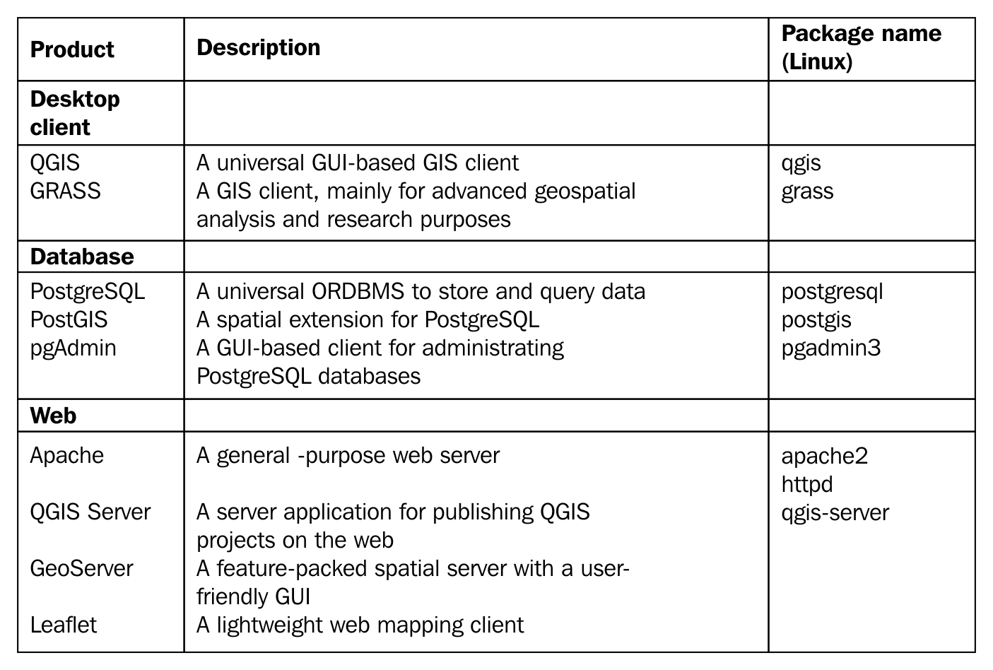
Installing the packages on Linux distributions is pretty straightforward. The dependencies are installed with the packages, when there are any. We only have to watch out for three things prior to installing the packages. First of all, the package name of the Apache web server can vary between different distributions. On distros using RPM packages (for example--Fedora, CentOS, and openSUSE), it is called httpd, while on the ones using DEB packages (for example--Debian and Ubuntu), it is called apache2. On Arch Linux, it is simply called apache.
The second consideration is related to distributions which do not update their packages frequently, like Debian. GeoServer has a hard dependency of a specific JRE (Java Runtime Environment). We must make sure we have it installed and configured as the default. We will walk through the Debian JRE installation process as it is the most popular Linux distribution with late official package updates. Debian Jessie, the latest stable release of the OS when writing these lines, is packed with OpenJDK 7, while GeoServer 2.11 requires JRE 8:
update-alternatives --config java
The last consideration before installing the packages is related to the actual version of QGIS. Most of the distributions offer the latest version in a decent time after release; however, some of them like Debian do not. For those distros, we can use QGIS's repository following the official guide at http://www.qgis.org/en/site/forusers/alldownloads.html.
After all things are set, we can proceed and install the required packages. The order should not matter. If done, let's take a look at GeoServer, which doesn't offer Linux packages to install. It offers two methods for Linux: a WAR for already installed Java servlets (such as Apache Tomcat), and a self-containing platform independent binary. We will use the latter as it's easier to set up:
      cd <geoserver's folder>/bin
      ./startup.sh
Installing the required software on Windows only requires a few installers as most of the packages are bundled into the OSGeo4W installer.
Don't worry if you end up with no solutions, we will concentrate on GeoServer, which runs perfectly on Windows. Just make sure Apache is installed and working (i.e. http://localhost returns a blank page or the OSGeo4W default page), as we will need it later.
Installing the software on macOS could be the most complicated of all (because of GRASS). However, thanks to William Kyngesburye, the compiled version of QGIS already contains a copy of GRASS along with other GIS software used by QGIS. In order to install QGIS, we have to download the disk image from http://www.kyngchaos.com/software/qgis.
PostgreSQL and PostGIS are also available from the same site, you will see the link on the left sidebar. pgAdmin, on the other hand, is available from another source: https://www.pgadmin.org/download/pgadmin-4-macos/. Finally, the GeoServer macOS image can be downloaded from http://geoserver.org/release/stable/, while its dependency of Java 8 can be downloaded from https://www.java.com/en/download/.
The only thing left is configuring the QGIS Server. As the OS X and macOS operating systems are shipped with an Apache web server, we don't have to install it. However, we have to make some configurations manually due to the lack of the FastCGI Apache module, on which QGIS Server relies. This configuration can be made based on the official guide at http://hub.qgis.org/projects/quantum-gis/wiki/QGIS_Server_Tutorial.
Congratulations! You're through the hardest part of this chapter. The following step is to make some initial configurations on the installed software to make them ready to use when we need them. First of all, let's open QGIS. At first glance, it has a lot of tools. However, most of them are very simple and self-explanatory. We can group the parts of the GUI as shown in the following image:
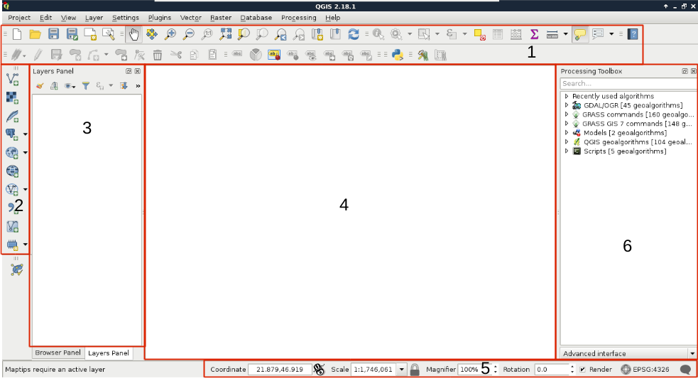
We can describe the distinct parts of the QGIS GUI as follows:
The only thing we will do now without having any data to display, is customizing the GUI. Let's click on Settings and choose the Options menu. In the first tab called General, we can see some styles to choose from. Don't forget to restart QGIS every time you choose a new style.
The next piece of software we look at is PostGIS via pgAdmin. If we open pgAdmin, the least we will see is an empty Server Groups item on the left panel. If this is the case, we have to define a new connection with the plug icon and fill out the form (Object | Create | Server in pgAdmin 4), as follows:
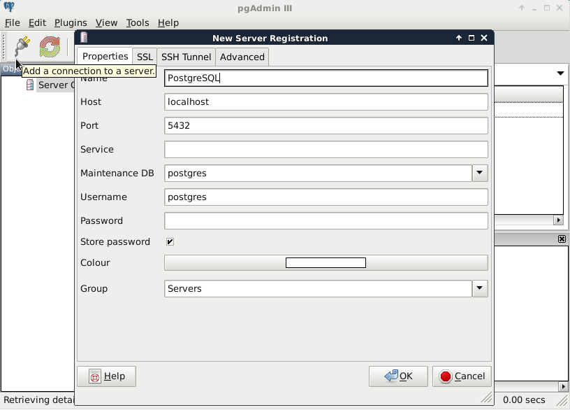
The Name can be anything we would like, it only acts as a named item in the list we can choose from. The Host, the Port, and the Username, on the other hand, have to be supplied properly. As we installed PostgreSQL locally, the host is 127.0.0.1, or simply localhost. As the default install comes with the default user postgres (we will refer to users as roles in the future due to the naming conventions of PostgreSQL), we should use that.
Upon connecting to the server, we can see a single database called postgres. This is the default database of the freshly installed PostgreSQL. As the next step, we create another database by right-clicking on Databases and selecting New Database. The database can be named as per our liking (I'm naming it spatial). The owner of the database should be the default postgres role in our case. The only other parameter we should define is the default character encoding of the database:
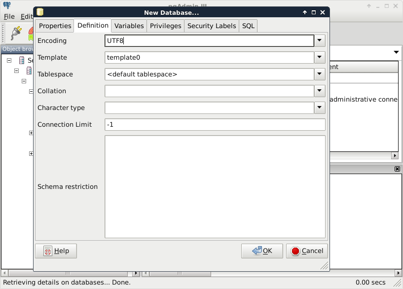
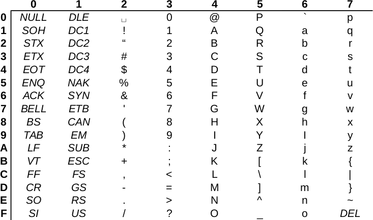
Choosing the template0 template is required as the default template's character encoding is a simple ASCII. You might be familiar with character encoding; however, refreshing our knowledge a little bit cannot hurt. In ASCII, every character is encoded on 8 bits, therefore, the number of characters which can be encoded is 28 = 256. Furthermore, in ASCII, only the first 7 bits (first 128 places) are reserved, the rest of them can be localized. The first 7 bits (in hexadecimal, 00-7F) can be visualized as in the following table. The italic values show control characters (https://en.wikipedia.org/wiki/C0_and_C1_control_codes#C0_.28ASCII_and_derivatives.29):
Open source GIS software offer a very high degree of freedom. Their license types can differ; however, they are all permissive licenses. That means we can use, distribute, modify, and distribute the modified versions of the software. We can also use them in commercial settings and even sell the software if we can find someone willing to buy it (as long as we sell the software with the source code under the same license). The only restriction is for companies who would like to sell their software under a proprietary license using open source components. They simply cannot do that with most of the software, although some of the licenses permit this kind of use, too.
There is one very important thing to watch out for when we use open source software and data. If somebody contributes often years of work to the community, at least proper attribution can be expected. Most of the open source licenses obligate this right of the copyright holder; however, we must distinguish software from data. Most of the licenses of open source software require the adapted product to reproduce the same license agreement. That is, we don't have to attribute the used software in a work, but we must include the original license with the copyright holders' name when we create an application with them. Data, on the other hand, is required to be attributed when we use it in our work.
There are a few licenses which do not obligate us to give proper attribution. These licenses state that the creator of the content waives every copyright and gives the product to the public to use without any restrictions. Two of the most common licenses of this kind are the Unlicense, which is a software license, and the Creative Commons Public Domain, which is in the GIS world mostly used as a data license.
Now that we have our software installed and configured, we can focus on collecting some open source data. Data collecting (or data capture) is one of the key expertise of a GIS professional and it often covers a major part of a project budget. Surveying is expensive (for example, equipment, amortization, staff, and so on); however, buying data can also be quite costly. On the other hand, there is open and free data out there, which can drastically reduce the cost of basic analysis. It has some drawbacks, though. For example, the licenses are much harder to attune with commercial activity, because some of them are more restrictive.
There are two types of data collection. The first one is primary data collection, where we measure spatial phenomena directly. We can measure the locations of different objects with GPS, the elevation with radar or lidar, the land cover with remote sensing. There are truly a lot of ways of data acquisition with different equipment. The second type is secondary data collection, where we convert already existing data for our use case. A typical secondary data collection method is digitizing objects from paper maps. In this section, we will acquire some open source primary data.
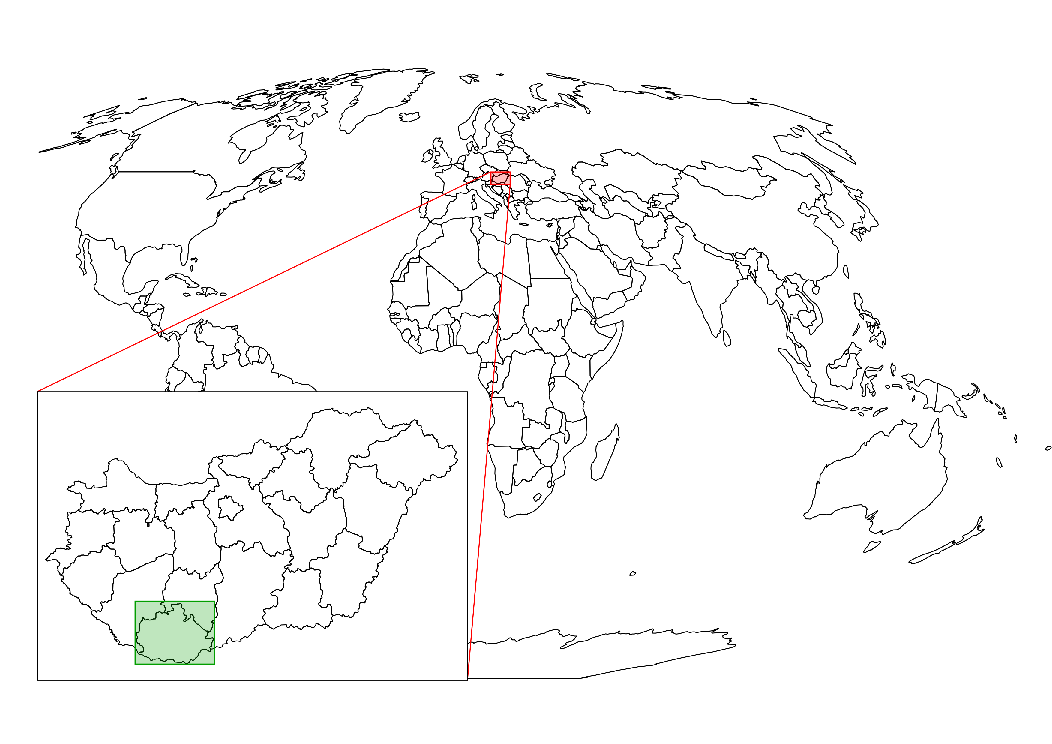
The only thing to consider is our study area. We should choose a relatively small administrative division, like a single county. For example, I'm choosing the county I live in as I'm quite familiar with it and it's small enough to make further analysis and visualization tasks fast and simple:
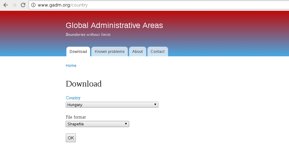
The first data we will download is the administrative boundaries of our country of choice. Open data for administrative divisions are easy to find for the first two levels, but it becomes more and more scarce for higher levels. The first level is always the countries' boundaries, while higher levels depend on the given country. There is a great source for acquiring the first three levels for every country in a fine resolution: GADM or Global Administrative Areas. We will talk about administration levels in more details in a later chapter. Let's download some data from http://www.gadm.org/country by selecting our study area, and the file format as Shapefile:
In the zipped archive, we will need the administrative boundaries, which contain our division of choice. If you aren't sure about the correct dataset, just extract everything and we will choose the correct one later.
The second vector dataset we download is the GeoNames archive for the country encasing our study area. GeoNames is a great place for finding data points. Every record in the database is a single point with a pair of coordinates and a lot of attribute data. Its most instinctive use case is for geocoding (linking names to locations). However, it can be a real treasure box for those who can link the rich attribute data to more meaningful objects. The country-level data dumps can be reached at http://download.geonames.org/export/dump/ through the countries' two-letter ISO codes.
GADM's license is very restrictive. We are free to use the downloaded data for personal and research purposes but we cannot redistribute it or use it in commercial settings. Technically, it isn't open source data as it does not give the four freedoms of using, modifying, redistributing the original version, and redistributing the modified version without restrictions. That's why the example dataset doesn't contain GADM's version of Luxembourg.
GeoNames has two datasets--a commercially licensed premium dataset and an open source one. The open source data can be used for commercial purposes without restrictions.
Data acquisition with instruments mounted on airborne vehicles is commonly called remote sensing. Mounting sensors on satellites is a common practice by space agencies (for example, NASA and ESA), and other resourceful companies. These are also the main source of open source data as both NASA and ESA grant free access to preprocessed data coming from these sensors. In this part of the book, we will download remote sensing data (often called imagery) from USGS's portal: Earth Explorer. It can be found at https://earthexplorer.usgs.gov/. As the first step, we have to register an account in order to download data.
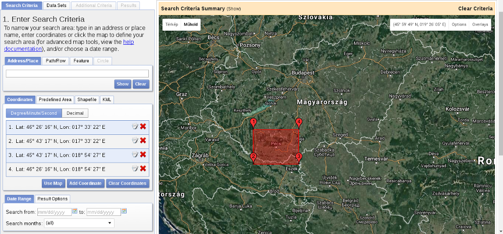
When we have an account, we should proceed to the Earth Explorer application and select our study area. We can select an area on the map by holding down the Shift button and drawing a rectangle with the mouse, as shown in the following screenshot:
As the next step, we should select some data from the Data Sets tab. There are two distinct types of remote sensing based on the type of sensor: active and passive. In active remote sensing, we emit some kind of signal from the instrument and measure its reflectance from the target surface. We make our measurement from the attributes of the reflected signal. Three very typical active remote sensing instruments are radar (radio detection and ranging) using radio waves, lidar (light detection and ranging) using laser, and sonar (sound navigation and ranging) using sound waves. The first dataset we download is SRTM (Shuttle Radar Topographic Mission), which is a DEM (digital elevation model) produced with a radar mounted on a space shuttle. For this, we select the Digital Elevation item and then SRTM. Under the SRTM menu, there are some different datasets from which we need the 1 Arc-Second Global. Finally, we push the Results button, which navigates us to the results of our query. In the results window, there are quite a few options for every item, as shown in the following screenshot:
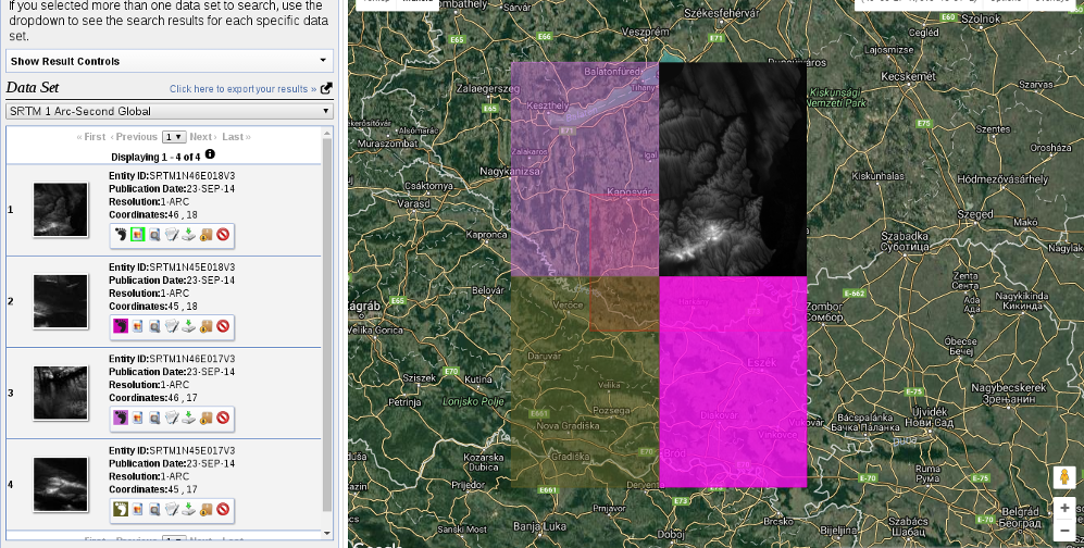
The first two options (Show Footprint and Show Browse Overlay) are very handy tools to show the selected imagery on the map. The footprint only shows the enveloping rectangle of the data, therefore, it is fast. Additionally, it colors every footprint differently, so we can identify them easily. The overlay tool is handy for getting a glance at the data without downloading it.
Finally, we download the tiles covering our study area. We can download them individually with the item's fifth option called Download Options. This offers some options from which we should select the BIL format as it has the best compression rate, thus, our download will be fast.
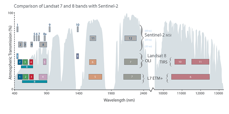
Let's get back to the Data Sets tab and select the next type of data we need to download--the Landsat data. These are measured with instruments of the other type--passive remote sensing. In passive remote sensing, we don't emit any signal, just record the electromagnetic radiance of our environment. This method is similar to the one used by our digital cameras except those record only the visible spectrum (about 380-450 nanometers) and compose an RGB picture from the three visible bands instantly. The Landsat satellites use radiometers to acquire multispectral images (bands). That is, they record images from spectral intervals, which can penetrate the atmosphere, and store each of them in different files. There is a great chart created by NASA (http://landsat.gsfc.nasa.gov/sentinel-2a-launches-our-compliments-our-complements/) which illustrates the bands of Landsat 7, Landsat 8, and Sentinel-2 along with the atmospheric opacity of the electromagnetic spectrum:
From the Landsat Archive, we need the Pre-Collection menu. From there, we select L8 OLI/TIRS and proceed to the results. With the footprints of the items, let's select an image which covers our study area. As Landsat images have a significant amount of overlap, there should be one image which, at least, mostly encases our study area. There are two additional information listed in every item--the row number and the path number. As these kinds of satellites are constantly orbiting Earth, we should be able to use their data for detecting changes. To assess this kind of use case (their main use case), their orbits are calculated so that, the satellites return to the same spot periodically (in case of Landsat, 18 days). This is why we can classify every image by their path and row information:
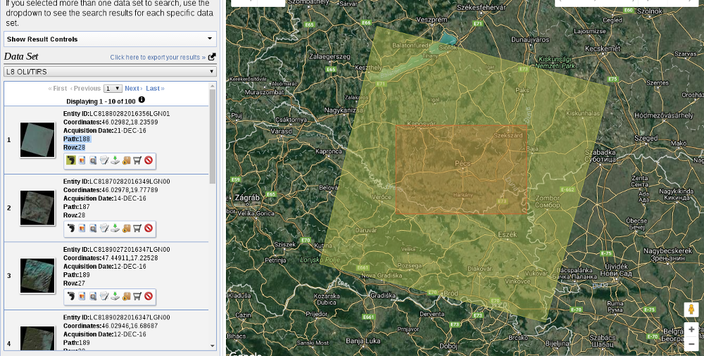
Let's note down the path and row information of the selected imagery and go to the Additional Criteria tab. We feed the path and row information to the WRS Path and WRS Row fields and go back to the results. Now the results are filtered down, which is quite convenient as the images are strongly affected by weather and seasonal effects. Let's choose a nice imagery with minimal cloud coverage and download its Level 1 GeoTIFF Data Product. From the archive, we will need the TIFF files of bands 1-6.
SRTM is in the public domain; therefore, it can be used without restrictions, and giving attribution is also optional. Landsat data is also open source; however, based on USGS's statement (https://landsat.usgs.gov/are-there-any-restrictions-use-or-redistribution-landsat-data), proper attribution is recommended.
The last dataset we put our hands on is the swiss army knife of open source GIS data. OpenStreetMap provides vector data with a great global coverage coming from measurements of individual contributors. OpenStreetMap has a topological structure; therefore, it's great for creating beautiful visualizations and routing services. On the other hand, its collaborative nature makes accuracy assessments hard. There are some studies regarding the accuracy of the whole data, or some of its subsets, but we cannot generalize those results as accuracy can greatly vary even in small areas.
One of the main strengths of OpenStreetMap data is its large collection and variety of data themes. There are administrative borders, natural reserves, military areas, buildings, roads, bus stops, even benches in the database. Although its data isn't surveyed with geodesic precision, its accuracy is good for a lot of cases: from everyday use to small-scale analysis where accuracy in the order of meters is good enough (usually, a handheld GPS has an accuracy of under 5 meters). Its collaborative nature can also be evaluated as a strength as mistakes are corrected rapidly and the content follows real-world changes (especially large ones) with a quick pace.
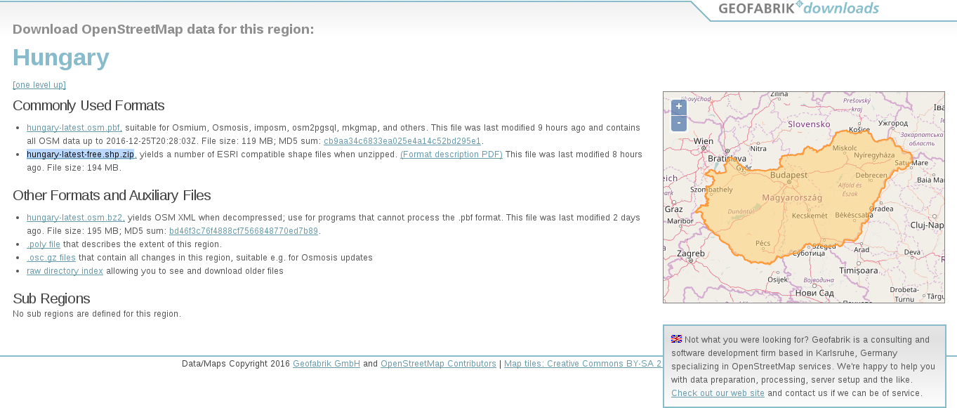
Accessing OpenStreetMap data can be tricky. There are some APIs and other means to query OSM, although either we need to know how to code or we get everything in one big file. There is one peculiar company which creates thematic data extracts from the actual content--Geofabrik. We can reach Geofabrik's download portal at http://download.geofabrik.de/. It allows us to download data in OSM's native PBF format (Protocolbuffer Binary Format), which is great for filling a PostGIS database with OSM data from the command line on a Linux system but cannot be opened with a desktop GIS client. It also serves XML data, which is more widely supported, but the most useful extracts for us are the shapefiles.
Due to various reasons, open source shapefiles are only exported by Geofabrik for small areas. We have to narrow down our search by clicking on links until the shapefile format (.shp.zip) is available. This means country-level extracts for smaller countries and regional extracts for larger or denser ones. The term dense refers to the amount of data stored in the OSM database for a given country. Let's download the shapefile for the smallest region enveloping our study area:
OpenStreetMap data is licensed under ODbL, an open source license, and therefore gives the four basic freedoms. However, it has two important conditions. The first one is obligatory attribution, while the second one is a share-alike condition. If we use OpenStreetMap data in our work, we must share the OSM part under an ODbL-compatible open source license.
ODbL differentiates three kind of products: collective database, derived database, and produced work. If we create a collective database (a database which has an OSM part), the share-alike policy only applies on the OSM part. If we create a derived database (make modifications to the OSM database), we must make the whole thing open source. If we create a map, a game, or any other work based on the OSM database, we can use any license we would like to. However, if we modify the OSM database during the process, we must make the modifications open source.
In this chapter, we installed the required open source GIS software, configured some of them, and downloaded a lot of open source data. We became familiar with open source products, licenses, and data sources. Now we can create an open source GIS working environment from zero and acquire some data to work with. We also gained some knowledge about data collection methods and their nature.
In the next chapter, we will visualize the downloaded data in QGIS. We will learn to use some of the most essential functionalities of a desktop GIS client while browsing our data. We will also learn some of the most basic attributes and specialities of different data types in GIS.
Despite the fact that some of the advanced GIS software suggest, we only need to know which buttons to press in order to get instant results, GIS is much more than that. We need to understand the basic concepts and the inner workings of a GIS in order to know the kind of analyses we can perform on our data. We must be able to come up with specific workflows, models which get us the most meaningful results. We also need to understand the reference frame of GIS, how our data behaves in such an environment, and how to interpret those results. In this chapter, we will learn about GIS data models by browsing our data in QGIS, and getting acquainted with its GUI.
In this chapter, we will cover the following topics:
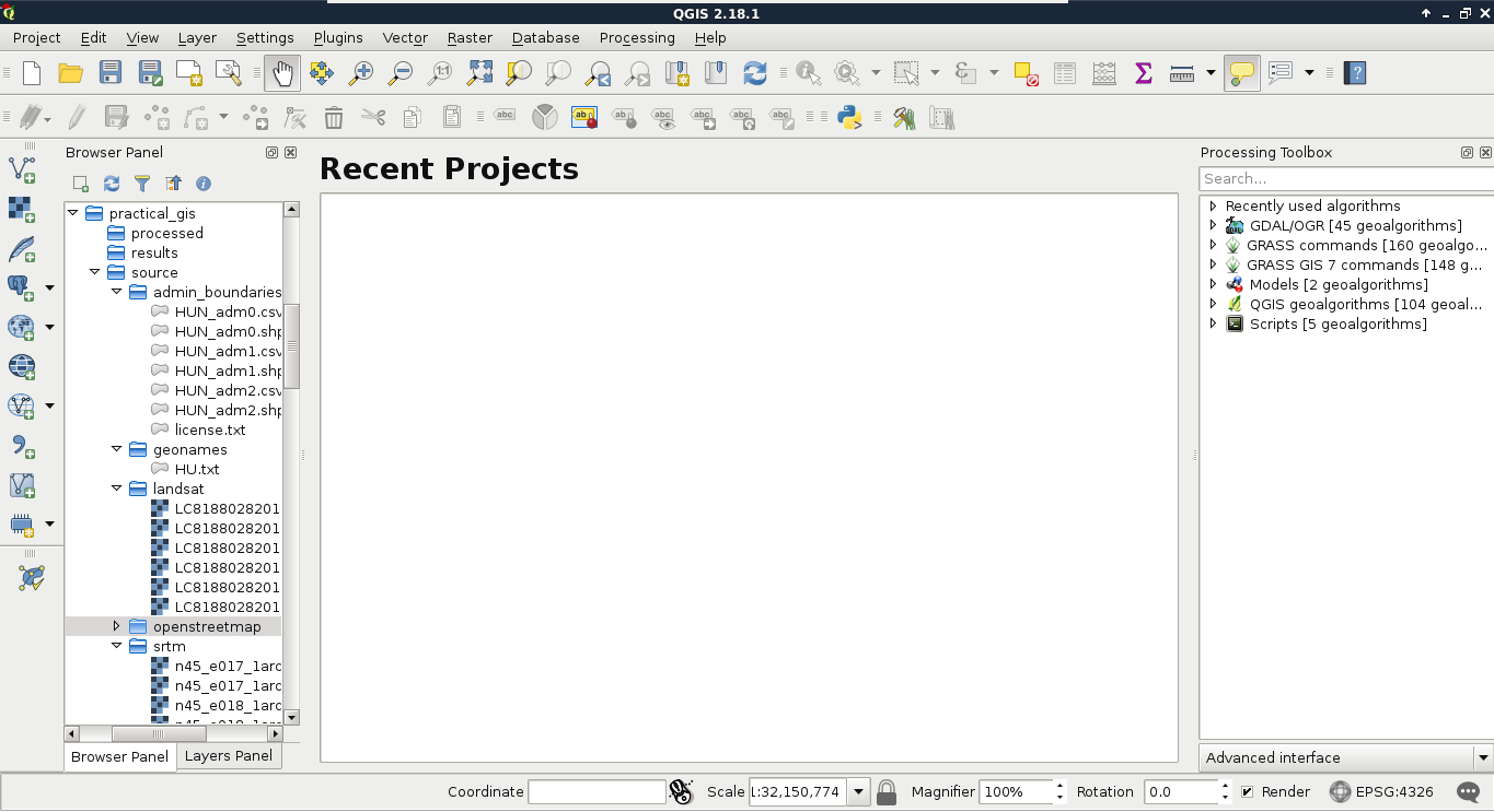
The first data type that we will use is raster data. It might be the most familiar to you, as it resembles traditional images. First of all, let's open QGIS. In the browser panel, we can immediately see our downloaded data if we navigate to our working directory. We can easily distinguish vector data from raster data by their icons. Raster layers have a dedicated icon of a 3x3 pixels image, while vector layers have an icon of a concave polygon:
We can drag and drop most of the data from the browser panel or, alternatively, use the Add Raster Layer button from the Add layer toolbar and browse the layer. The browser panel is more convenient for easily recognizable layers as it only lists the files we can open and hides auxiliary files with every kind of metadata. Let's drag one of the SRTM rasters to the canvas (or open one with Add Raster Layer). This is a traditional, single-band raster. It is displayed as a greyscale image with the minimum and maximum values displayed in the Layers Panel:
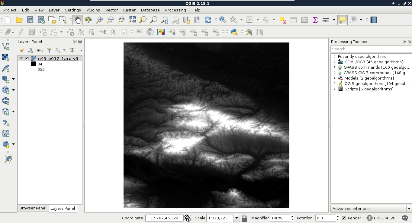
As you can see in the preceding screenshot, there is a regular grid with cells painted differently, just like an image. However, based on the maximum value of the data, its colors aren't hard coded into the file, like in an image. Furthermore, it has only a single band, not three or four bands for RGB(A). Let's examine the raster more carefully by zooming in until we can see individual cells. We can also query them for their values with the Identify Features tool by clicking on a cell (raster):
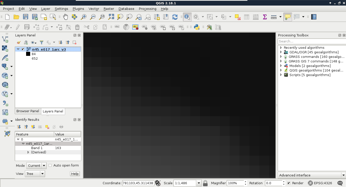
As you can see, we get a number for every cell, which can be quite out of the range of 0-255 representing color codes. These numbers seem arbitrary, and indeed, they are arbitrary. They usually represent some kind of real-world phenomenon, like in our case, the elevation from the mean sea level in meters.
These are the basic properties of the raster data model. Raster data are regular grids (matrices) made up from individual cells with some arbitrary values describing something. The values are only limited by the type of the storage. They can be in the range of bytes, 8-bit integers, 16-bit integers, floating point numbers, and so on. Rasters are always rectangular (like an image); however, they can give a feeling of having some other shape with a special kind of value: NULL or No-Data.
One of the most useful properties of raster data is that their coverage is continuous, while their data can change. They cover their entire extent with coincident cells. If we need a full and continuous coverage (that is, we need a value for every point describing a dynamically changing phenomenon), raster is an obvious choice. On the other hand, they have a fixed layout inherited from their resolution (the size of each cell). There are the following two implications from this property:
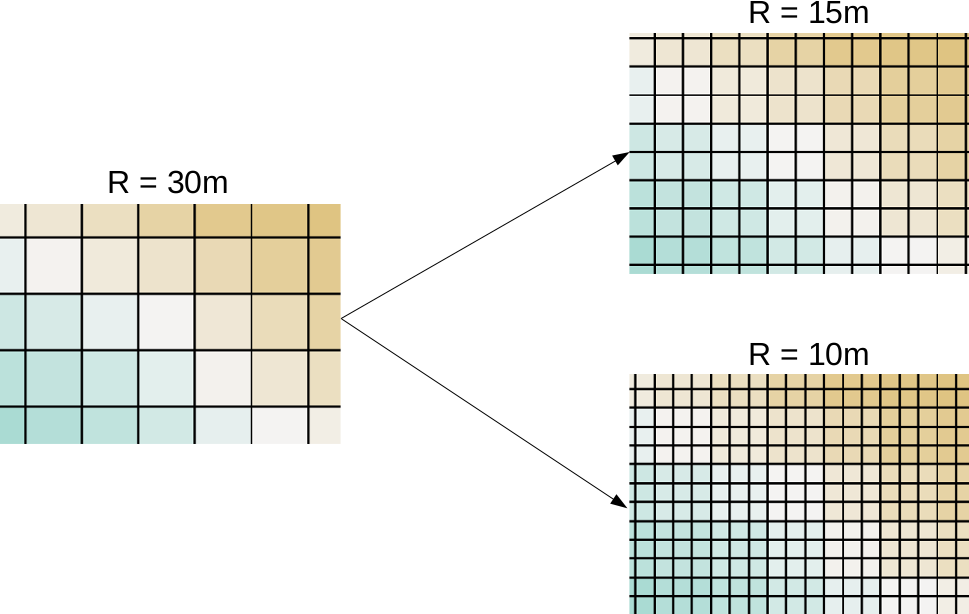
Of course, this property works in two ways. Rasters (especially with square cells) are generally easy and fast to visualize as they can be displayed as regular images. To make the visualization process even faster, QGIS builds pyramids from the opened rasters.
Using pyramids is a computer graphics technique adopted by GIS. Pyramids are downsampled (lower resolution) versions of the original raster layer stored in memory, and are built for various resolutions. By creating these pyramids in advance, QGIS can skip most of the resampling process on lower resolutions (zoom levels), which is the most time-consuming task in drawing rasters.
The last important property of a raster layer is its origin. As raster data behaves as two-dimensional matrices, it can be spatially referenced with only a pair of coordinates. These coordinates, unlike in graphics, are the lower left ones of the data. Let's see what QGIS can tell us about our raster layer. We can see its metadata by right-clicking on it in the Layers Panel, choosing Properties, and clicking on the Metadata tab:
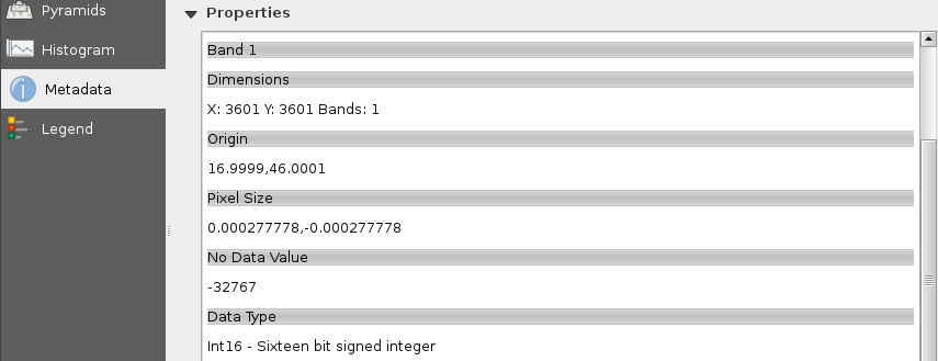
As you can see in the preceding screenshot, our raster layer has a number of rows and columns, one band, an Origin, a resolution (Pixel Size), a No-Data value, and a Data Type.
To sum up, the raster data model offers continuous coverage for a given extent with dynamically changing, discrete values in the form of a matrix. We can easily do matrix operations on rasters, but we can also convert them to vectors if it is a better fit for the analysis. The raster data model is mainly used when the type of the data desires it (for example, mapping continuous data, like elevation or terrain, weather, or temperature) and when it is the appropriate model for the measuring instrument (for example, aerial or satellite imaging).
To put it simply--absolutely not. Well, maybe in QGIS a little bit, but rasters have potential far beyond the needs of an average GIS analysis. First of all, rasters do not need to be in two-dimensional space. There are 3D rasters called voxels, which can be analyzed in their volume or cut to slices, visualized in a whole, in slices, or as isosurfaces for various values (Appendix 1.1).
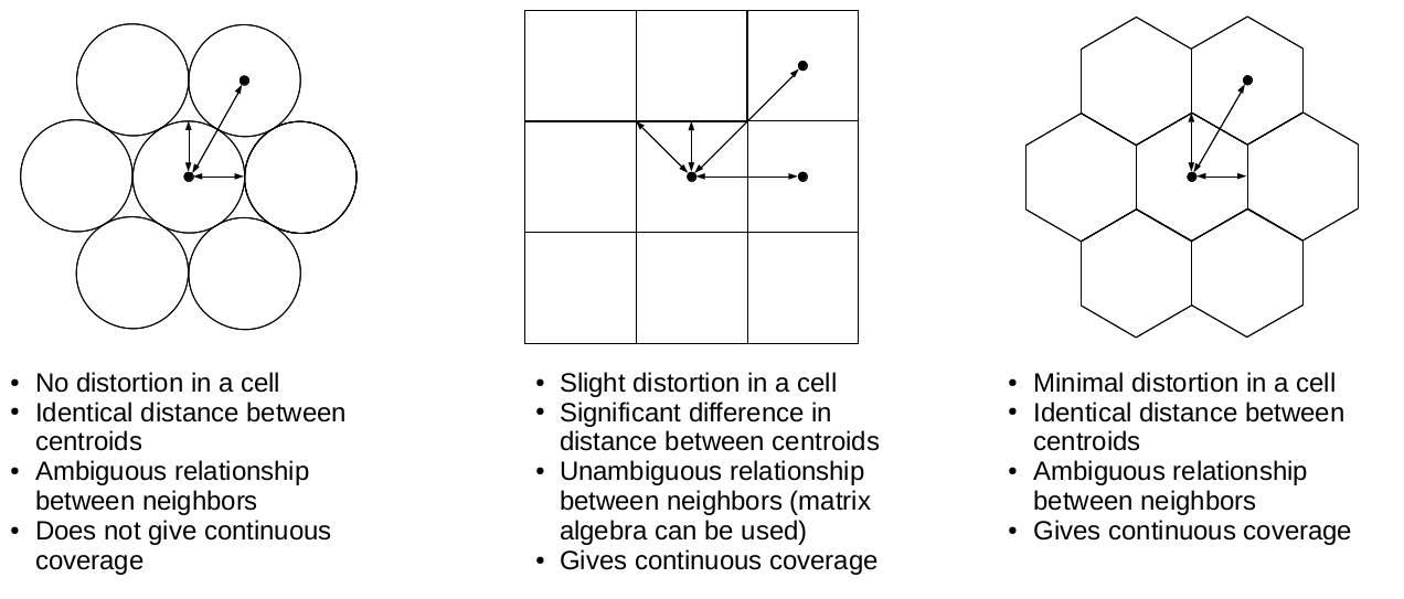
Furthermore, cells don't have to be squares. It is common practice to have different resolutions in different dimensions. Rasters with rectangular cells are supported by QGIS, and many other open source GIS clients. Rasters don't even need to have four sides. The distortions (we can call it sampling bias in some cases, mostly in statistics) caused by four-sided raster cells can be minimized with hexagons, regular shapes with the most sides capable of a complete coverage:
Okay, but can rasters only store a single thematic? No, rasters can have multiple bands, and we can even combine them to create RGB visualizations. Finally, as we contradicted almost every rule of the raster data model, do individual cells need to coincide (have the same resolution)? Well, technically, yes, but guess what? There are studies about a multi-resolution image format, which can store rasters with different sizes in the same layer. It's now only a matter of professional and business interest to create that format.
Now that you've learned the basics of raster data, let's examine vector data. This is the other fundamental data type which is used in GIS. Let's get some vector data at the top of that srtm layer. From the Browser Panel, we open up the administrative boundaries layer (the one with the shp extension) containing our study area, and the waterways and traffic layers from the OpenStreetMap data. We can also use the Add Vector Layer button from the side toolbar:
Now there are three vector layers with three different icons and representation types on our canvas. These are the three main vector types we can work with:
If we zoom around, we can see that unlike the raster layer, these layers do not pixelate. They remain as sharp as on lower zoom levels no matter how far we zoom in. Furthermore, if we use the Identify Features tool and click on a feature, it gets selected. We can see with this that our vector layers consist of arbitrary numbers of points, lines, and irregular shapes:
Vector data, unlike raster data, does not have a fixed layout. It can be represented as sets of coordinate pairs (or triplets or quads if they have more than two dimensions). The elementary unit of the vector data model is the feature. A feature represents one logically coherent real-world object--an entity. What we consider an entity depends on our needs. For example, if we would like to analyze a forest patch, we gather data from individual trees (entities) and represent them as single points (features). If we would like to analyze land cover, the whole forest patch can be the entity represented by a feature with a polygon geometry. We should take care not to mix different geometry types in a single layer though. It is permitted in some GIS software; however, as some of the geoprocessing algorithms only work on specific types, it can ruin our analysis.
Geometry is only part of a vector feature. To a single feature, we can add an arbitrary number of attributes. There are two typical distinct types of attributes--numeric and character string. Different GIS software can handle different subtypes, like integers, floating point numbers, or dates (which can be a main type in some GIS). From these attributes, the GIS software creates a consistent table for every vector layer, which can be used to analyze, query, and visualize features. This attribute table has rows representing features and typed columns representing unique attributes. If at least one feature has a given attribute, it is listed as a whole column with NULL values (or equivalent) in the other rows. This is one of the reasons we should strive for consistency no matter if the used GIS software forces it.
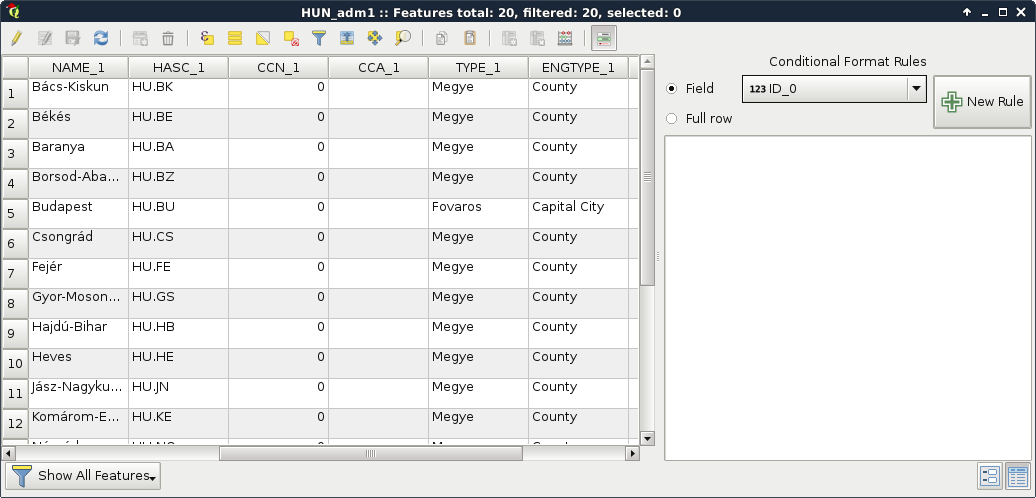
Let's open an attribute table by right-clicking on a vector layer in the Layers Panel and selecting Open Attribute Table. If we open the Conditional formatting panel in the attribute table, we can also see the type of the columns, as shown in the following screenshot:
To sum up, with the vector data model, we can represent entities with shapes consisting of nodes (start and end points) and vertices (mid points) which are coordinates. We can link as many attributes to these geometries as we like (or as the data exchange format permits). The model implies that we can hardly store gradients, as it is optimized to store discrete values associated with a feature. It has a somewhat constant accuracy as we can project the nodes and vertices one by one. Furthermore, the model does not suffer from distortions unlike the raster data model.
As vector geometries do not have a fixed layout, we can edit our features. Let's try it out by selecting the administrative boundaries layer in the Layers Panel and starting an edit session with the Toggle Editing tool.
We can see every node and vertex of our layer. We can modify these points to reshape our layer. Let's zoom in a little bit to see the individual vertices. From the now enabled editing tools, we select the Node Tool. If we click in a polygon with this tool, we can see its vertices highlighted and a list of numbers in the left panel. These are the coordinates of the selected geometry. We can move vertices and segments by dragging them to another part of the canvas. If we move some of the vertices from the neighboring polygon, we can see a gap appearing. This naive geometry model is called the Spaghetti model. Every feature has their sets of vertices individually and there isn't any relationship between them. Consider the following screenshot:
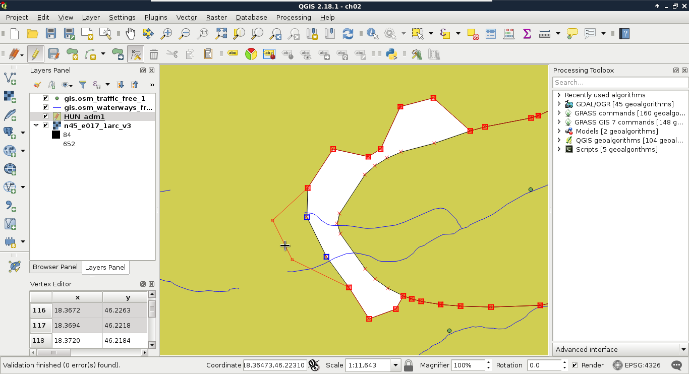
Finally, let's stop the edit session by clicking on the Toggle Editing button again. When it asks about saving the modifications, we should choose Stop without Saving and QGIS automatically restores the old geometries.
More complex geometries have more theoretical possibilities, which leads to added complexity. Defining a point is unequivocal, that is, it has only one coordinate tuple. Multi-points and line strings are neither much more complex--they consist of individual and connected coordinate tuples respectively. Polygons, on the other hand, can contain holes, the holes can contain islands (fills), and theoretically, these structures can be nested infinitesimally. This structure adds a decent complexity for a GIS software. For example, QGIS only supports polygons to the first level--with holes.
The real complexity, however, only comes with topology. Different features in a layer can have relationships with each other. For example, in our administrative boundary layer, polygons should share borders. They shouldn't have gaps and overlaps. Another great example is a river network. Streams flow into rivers, rivers flow into water bodies. In a vector model, they should be connected like in the real world.
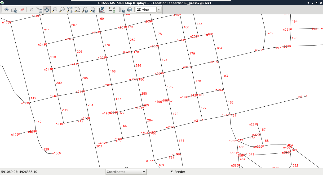
The topological geometry model (or vector model) is the sophisticated way to solve these kinds of relational problems. In this model, points are stored as nodes while other geometries form a hierarchical structure. Line segments contain references to nodes, line strings, and polygons consist of references to segments. By using this hierarchical structure, we can easily handle relationships. This way, if we change the position of a node, every geometry referring to the node changes. Take a look at the following screenshot:
Not every GIS software enforces a topological model. For example, in QGIS, we can toggle topological editing. Let's try it out by checking Enable topological editing in Settings | Snapping Options. If we edit the boundaries layer again, we can see the neighboring feature's geometry following our changes.
While QGIS does not enforce a topological model, it offers various tools for checking topological consistency. One of the tools is the built-in Topology Checker plugin. We can find the tool under the Add layer buttons.
If we activate the tool, a new panel appears docked under the Processing Toolbox. By clicking on Configure, we can add some topology rules to the opened vector layers. Let's add two simple rules to the administrative boundaries layer--they must not have gaps or overlaps. Consider the following screenshot:
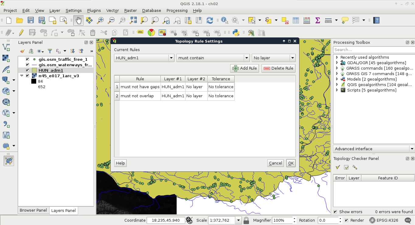
The only thing left to do is to click on the Validate All or Validate Extent button. If we have some errors, we can navigate between them by clicking on the items one by one.
The vector layers we opened so far were dedicated vector data exchange formats; therefore, they had every information coded in them needed for QGIS to open them. There are some cases when we get some data in a tabular format, like in a spreadsheet. These data usually contain points as coordinates in columns and attributes in other columns. They do not store any metadata about the vectors, which we have to gather from readme files, or the team members producing the data.
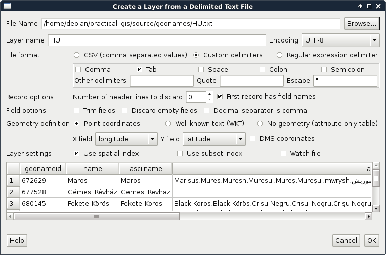
QGIS can handle one tabular format--CSV (Comma Separated Values), which is an ASCII file format, a simple text file containing tabular data. Every row is in a new line, while fields are separated with an arbitrary field separator character (the default one is the comma). The layout of such a layer is custom; therefore, we need to supply the required information about the table to QGIS. If we try to drag our GeoNames layer to the canvas, QGIS yields to a Layer is not valid error. To open these files, we need to use the Add Delimited Text Layer tool from the sidebar (comma icon):
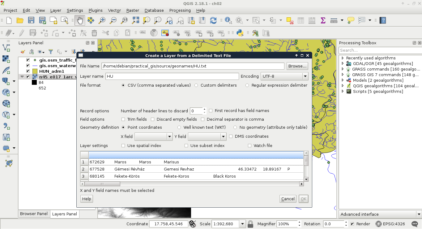
If we browse our GeoNames table, we can see that QGIS automatically creates a preview from the accessed data. We can also see that the preview is far from correct. It's time to consult the readme file coming with the GeoNames extract. In the first few lines, we can see the most important information--The data format is tab-delimited text in utf8 encoding. Let's select Custom delimiters and check Tab as a delimiter. Now we only need to supply the columns containing the coordinates. We can see there are no headers in the data. However, as the column descriptions are ordered in the readme file, we can conclude that the fifth column contains the latitude data (Y field), while the sixth column contains the longitude data (X field). This is the minimum information we can add the layer with:
When zooming around the map, we could notice the Scale changing in the status bar. GIS software (apart from web mapping solutions) usually use scales instead of zoom levels. The map scale is an important concept of cartography, and its use was inherited by GIS software. The scale shows the ratio (or representative fraction) between the map and the real world. It is a mapping between two physical units:

For example, a Scale of 1:250,000 means 1 centimeter on the map is 2500 meters (250,000 centimeters) in the real world. However, as the map scale is unitless, it also means 1 inch on the map is 250,000 inches in the real world, and so on. With the scale of the map, we can make explicit statements about its coverage and implicit statements about its accuracy. Large scale maps (for example, with a scale of 1:10,000) cover smaller areas with greater accuracy than medium scale maps (for example, with a scale of 1:500,000), which cover smaller areas with greater accuracy than small scale maps (for example, with a scale of 1:1,000,000).
We can easily imagine scales on paper maps, although the rule is the same as on the map canvas. On a 1:250,000 map, one centimeter on our computer screens equals 2500 meters in the real world. To calculate this value, GIS software use the DPI (dots per inch) value of our screens to produce accurate ratios.
By using scales instead of fixed zoom levels, GIS software offers a great amount of flexibility. For example, we can arbitrarily change the Scale value on our status bar and QGIS automatically jumps to that given scale. The definition of map scale will follow us along during our work as QGIS (like most of the GIS software) uses scale definitions in every zoom-related problem. Let's see one of them--the scale dependent display. We can set the minimum and maximum scales for every layer and QGIS won't render them out of those bounds. Let's right-click on one of the layers and select Properties. Under the General tab, we can check Scale dependent visibility. After that, we can provide bounds to that layer. By providing a minimum value of 1:500,000 to the layer and leaving the maximum value unbounded (0), we can see the layer disappearing on 1:500,001 and smaller scales:
In this chapter, we acquainted ourselves with the GUI of QGIS and explained about data models in GIS. With this knowledge, it will be easier to come up with specific workflows later as we have an idea how the input data work and what we can do with it. We also learned about one of the mandatory cartographic elements--the map scale.
In the next chapter, we will use our vector data in another way. We will make queries on our vector layers by using both their attribute data and geometries. Finally, we will learn how to join the attributes of different layers in order to make richer layers and give ourselves more options on further visualization and analysis tasks.
In the previous chapter, we learned how vector data compares to raster data. Although every feature can only represent one coherent entity, it is a way more powerful and flexible data model. With vectors, we can store a tremendous amount of attributes linked to an arbitrary number of features. There are some limitations but only with some data exchange formats. By using spatial databases, our limitations are completely gone. If you've worked on a study area with rich data, you might have already observed that QGIS has a hard time rendering the four vector layers for their entire extent. As we can store (and often use) much more data than we need for our workflow, we must be able to select our features of interest.
Sometimes, the problem is the complete opposite--we don't have enough data. We have features which lack just the attributes we need to accomplish our work. However, we can find other datasets with the required information, possibly in a less useful format. In those cases, we need to be able to join the attributes of the two layers, giving the correct attributes to the correct geometry types.
In this chapter, we will cover the following topics:
The first task in every work is to get used to the acquired data. We should investigate what kind of data it holds and what can we work with. We should formulate the most fundamental questions for successful work. Is there enough information for my analysis? Is it of the right type and format? Are there any No-Data values I should handle? If I need additional information, can I calculate them from the existing attributes? Some of these questions can be answered by looking at the attribute table, while some of them (especially when working with large vector data) can be answered by asking QGIS. To ask QGIS about vector layers, we have to use a specific language called SQL or Structured Query Language.
SQL is the query language of relational databases. Traditionally, it was developed to help make easy and powerful queries on relational tables. As attribute data can be considered tabular, its power for creating intuitive queries on vector layers is unquestionable. No matter if some modern GIS software uses an object-oriented structure for working with vector data internally, the tradition of using SQL, or near-SQL syntax for creating simple queries has survived. This language is very simple at its core, thus, it is easy to learn and understand. A simple query on a database looks like the following:
SELECT * FROM table WHERE column = value;
It uses the * wildcard for selecting everything from the table named table, where the content of the column named column matches value. In GIS software, like QGIS, this line can be translated to the following:
SELECT * FROM layer WHERE column = value;
Furthermore, as basic queries only allow selecting from one layer at a time, the query can be simplified as the software knows exactly which layer we would like to query. Therefore, this simple query can be formulated in a GIS as follows:
column = value
There is one final thing we have to keep in mind. Based on the software we use, these queries can be turned into real SQL queries used on internal relational tables, or parsed into something entirely different. As a result, GIS software can have their own SQL flavor with their corresponding syntactical conventions. In QGIS, the most important convention is how we differentiate column names from regular strings. Column names are enclosed in double quotation marks, while strings are enclosed in single ones. If we turn the previous query into a QGIS SQL syntax and consider value as a string, we get the following query:
"column" = 'value'
There are usually two kinds of selection methods in GIS software. There is one which highlights the selected features, making them visually distinguishable from an other one. Selected features by this soft selection method may or may not be the only candidates for further operations based on our choice. However, there is usually a hard selection called filtering. The difference is that the filtered-out features do not appear either on the canvas or in the attribute table. QGIS makes sure to exclude the filtered-out features from every further operation like they weren't there in the first place. There is one important difference between the style of selection and filtering--we can select features with the mouse; however, we can only filter with SQL expressions.
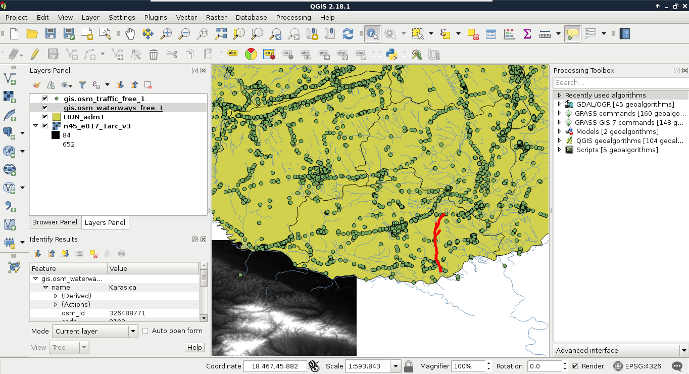
First, let's select a single feature with the mouse. To select features in QGIS, we have to select the vector layer containing the feature in the Layers Panel. Let's select the administrative boundaries layer then click on the Select Features by area or single click tool. Now we can select our study area by clicking it on the map canvas, as shown in this screenshot:
We can see the feature highlighted on the map and in the attribute table. If we open the attribute table of the layer, we can see our selected one distinguished as we have only a limited number of features in the current layer. If there are a lot of features in a layer, inspecting the selected features in the attribute table becomes harder. To solve this problem, QGIS offers an option to only show the selected features. To enable it, click on the Show All Features filter and select Show Selected Features:
The attribute table and the map canvas are interlinked in QGIS. If you click on the row number of a feature, it becomes selected and therefore, highlighted on the canvas.
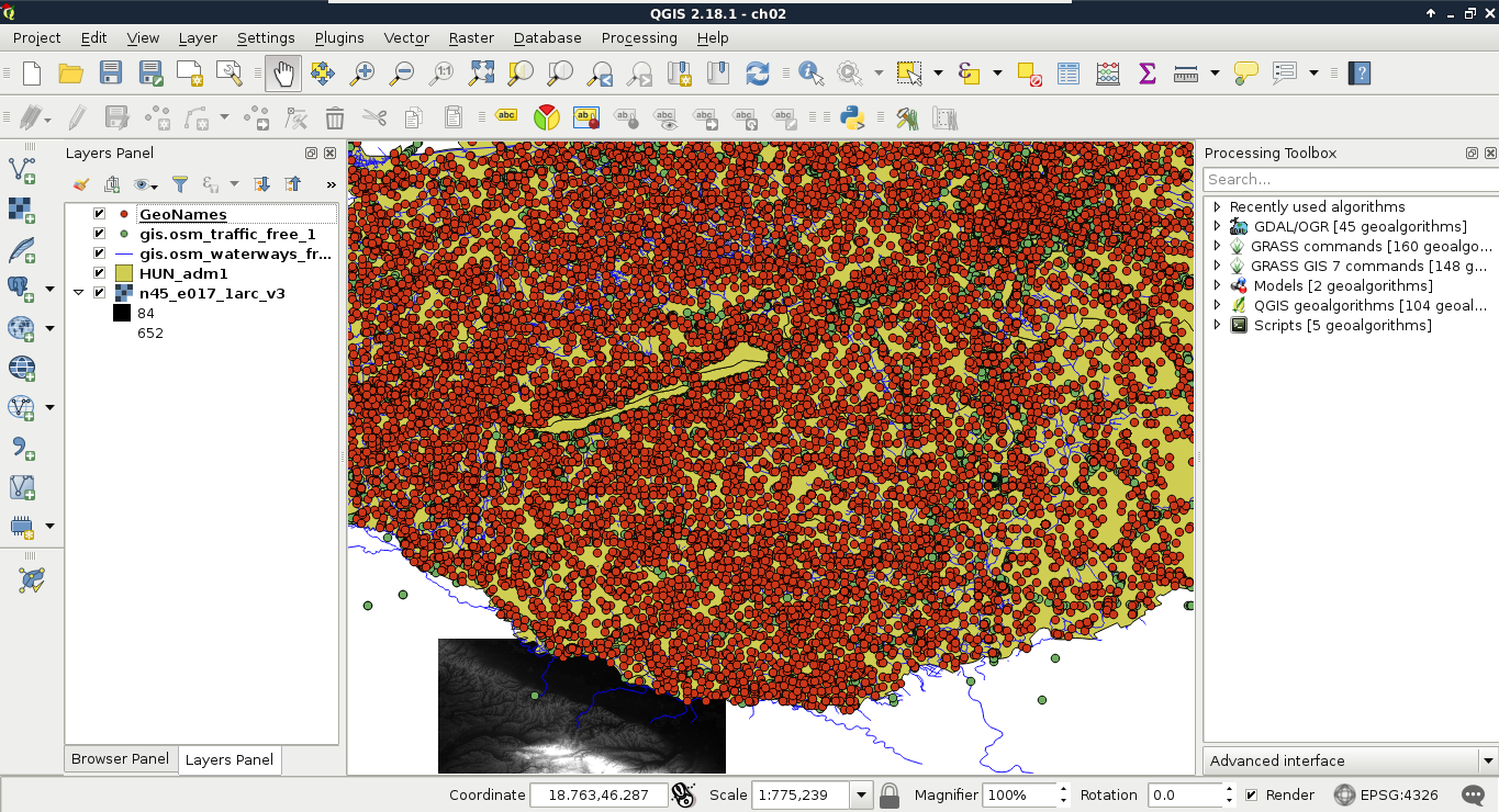
From the currently opened vector layers, the GeoNames layer has the largest attribute table with the most kinds of attributes. However, as the extract does not contain headers, it is quite hard to work with it. Fortunately, CSV files can be edited as regular text files or as spreadsheets. As the first step, let's open the GeoNames file with a text editor and prepend a header line to it. It is tab delimited; therefore, we need to separate the field names with tabs. The field names can be read out from the readme file in order. In the end, we should have a first line looking something like this:
    geonameid name asciiname alternatenames latitude longitude
      featureclass
    featurecode countrycode cc2 admin1 admin2 admin3 admin4 population
      elevation
    dem timezone modification
Now we can remove our GeoNames layer from the layer tree and add it again. In the form, we have to check the option First record has field names. If we do so, and name the latitude and longitude fields accordingly, we can see QGIS automatically filling the X and Y fields:
Let's select the modified GeoNames layer and open the Select features using an expression tool. We can see QGIS's expression builder, which offers a very convenient GUI with a lot of functions in the middle panel, and a small and handy description for the selected function in the left panel. We do not even have to type anything to use some of the basic queries as QGIS lists every field we can access under the Fields and Values menu. Furthermore, QGIS can also list all the unique values or just a small sample from a column by selecting it and pressing the appropriate button in the left panel:
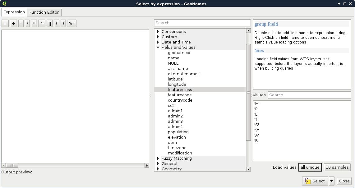
The basic SQL expressions that we can use are listed under the Operators menu. There, every operator is a valid PostgreSQL operator, most of them are commonly found in various GIS software. Let's start with some numeric comparisons. For that, we have to choose a numeric column. We can use the attribute table for that.
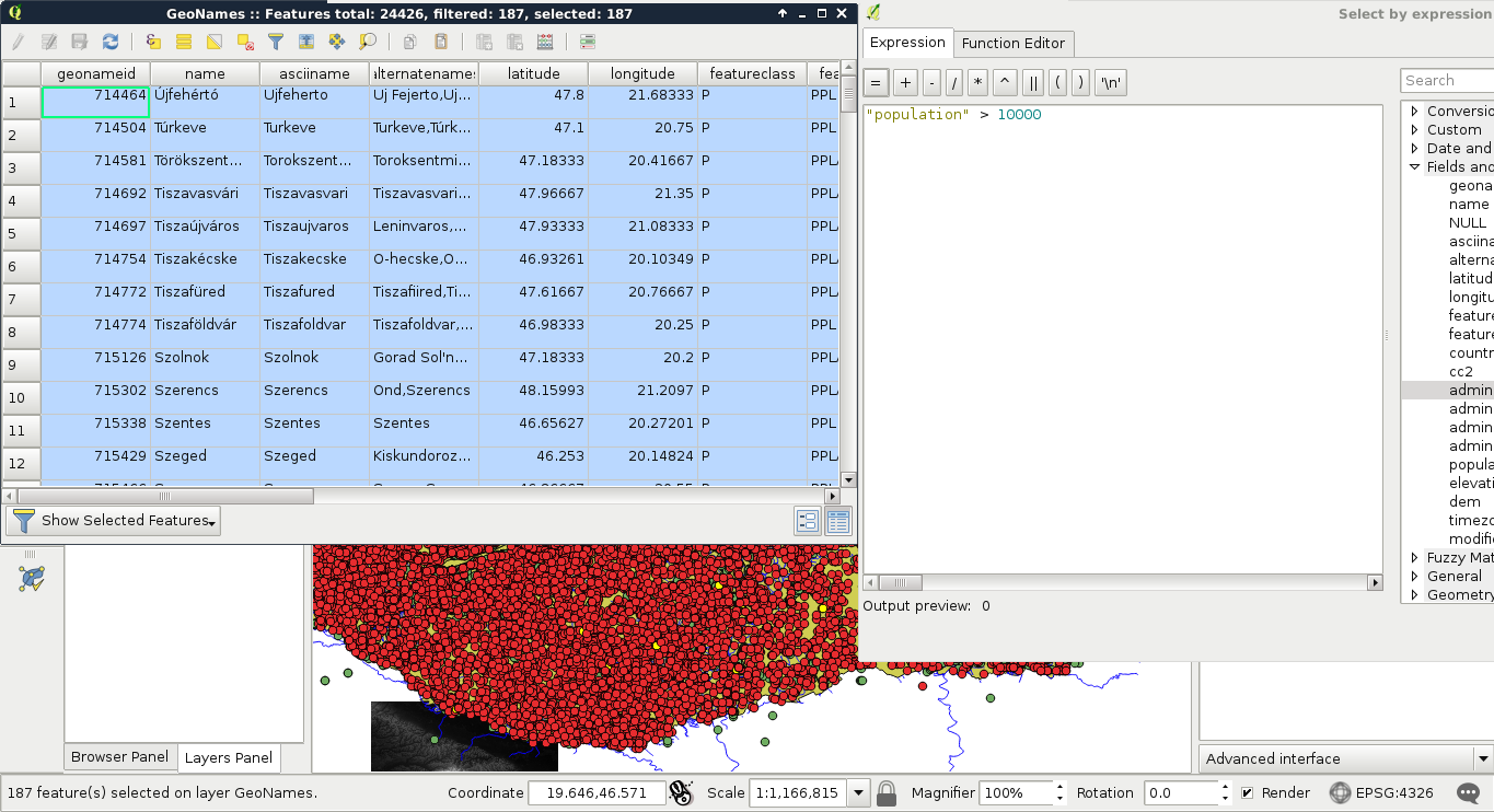
For basic numeric comparisons, let's choose the population column. In this first query, we would like to select every place where the population exceeds 10000 people. To get the result, we have to supply the following query:
"population" > 10000
We can now see the resulting features as on the following screenshot:
If we would like to invert the query, we have an easy task, which is as follows:
"population" <= 10000
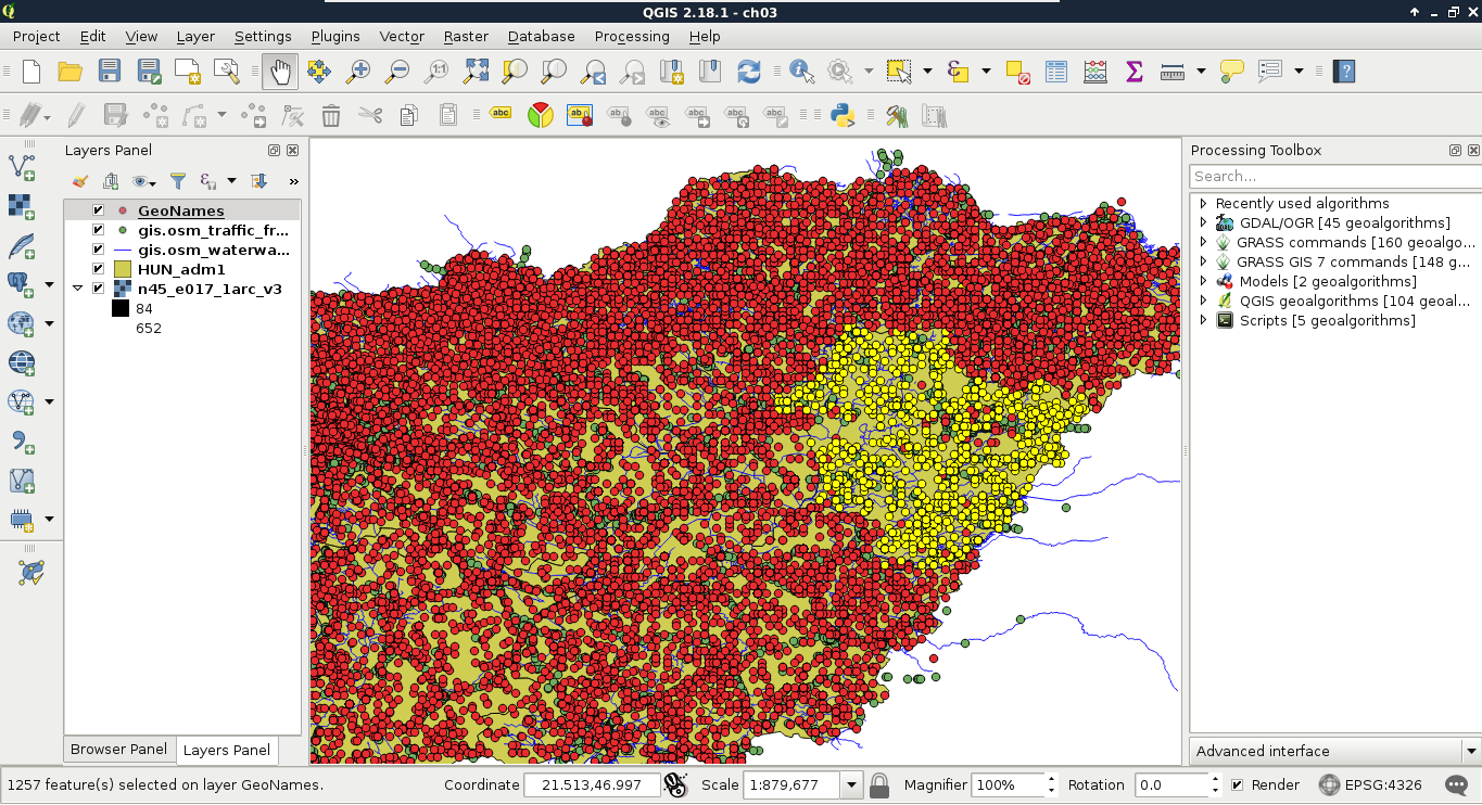
We could do this as population is a graduated value. It changes from place to place. But what happens when we work with categories represented as numbers? In this next query, we select every place belonging to the same administrative area. Let's choose an existing number in the admin1 column, and select them:
"admin1" = 10
The corresponding features are now selected on the map canvas:
The canvas in the preceding screenshot looks beautiful! But how can we invert this query? If you know about programming, then you must be thinking about linking two queries logically together. It would be a correct solution; however, we can use a specific operator for these kinds of tasks, which is as follows:
"admin1" <> 10
The <> operator selects everything which is not equal to the supplied value. The next attribute type that we should be able to handle is string. With strings, we usually use two kinds of operations--equality checking and pattern matching. According to the GeoNames readme, the featurecode column contains type categories in the character format. Let's choose every point representing the first administrative division (ADM1), as follows:
"featurecode" = 'ADM1'
Of course, the inverse of this query is exactly the same like in the previous query (<> operator).
As the next task, we would like to select every feature which represents some kind of administrative division. We don't know how many divisions are there in our layer and we wouldn't like to find out manually. What we know from http://www.geonames.org/export/codes.html is that every feature representing a non-historic administrative boundary is coded with ADM followed by a number. In our case, pattern matching comes to the rescue. We can formulate the query as follows:
"featurecode" LIKE 'ADM_'
In pattern matching, we use the LIKE operator instead of checking for equality, telling the query processor that we supplied a pattern as a value. In the pattern, we used the wildcard _, which represents exactly one character. Inverting this query is also irregular as we can negate LIKE with the NOT operator, as follows:
"featurecode" NOT LIKE 'ADM_'
Now let's expand this query to historical divisions. As we can see among the GeoNames codes, we could use two underscores. However, there is an even shorter solution--the % wildcard. It represents any number of characters. That is, it returns true for zero, one, two, or two billion characters if they fit into the pattern:
"featurecode" LIKE 'ADM%'
A better example would be to search among the alternate names column. There are a lot of names for every feature in a lot of languages. In the following query, I'm searching for a city named Pécs, which is called Pecs in English:
"alternatenames" LIKE '%Pecs%'
The preceding query returns the feature representing this city along with 11 other features, as there are more places containing its name (for example, neighboring settlements). As I know it is called Fünfkirchen in German, I can narrow down the search with the AND logical operator like this:
    "alternatenames" LIKE '%Pecs%' AND "alternatenames" LIKE
     '%Fünfkirchen%'
The two substrings can be anywhere in the alternate names column, but only those features get selected whose record contains both of the names. With this query, only one result remains--Pécs. We can use two logical operators to interlink different queries. With the AND operator, we look for the intersection of the two queries, while with the OR operator, we look for their union. If we would like to list counties with a population higher than 500000, we can run the following query:
"featurecode" = 'ADM1' AND "population" > 500000
On the other hand, if we would like to list every county along with every place with a population higher than 500000, we have to run the following query:
"featurecode" = 'ADM1' OR "population" > 500000
The last thing we should learn is how to handle null values. Nulls are special values, which are only present in a table if there is a missing value. It is not the same as 0, or an empty string. We can check for null values with the IS operator. If we would like to select every feature with a missing admin1 value, we can run the following query:
"admin1" IS NULL
Inverting this query is similar to pattern matching; we can negate IS with the NOT operator as follows:
"admin1" IS NOT NULL
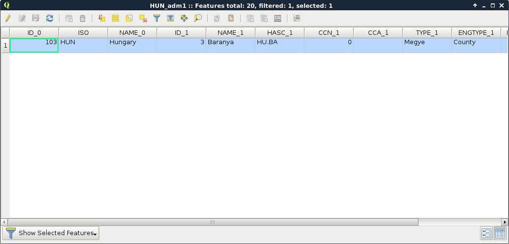
The filtering dialogue can be accessed by right-clicking on a layer in the Layers Panel and selecting Filter. As we can see in the dialogue, filtering expressions are much more restrictive in QGIS as they only allow us to write basic SQL queries with the fields of the layer. Let's inspect our study area in the administrative boundaries layer with the Identify Features tool, select a unique value like its name, and create a query selecting it. For me, the query looks like the following:
"NAME_1" = 'Baranya'
Applying the filter removes every feature from the canvas other than our study area:
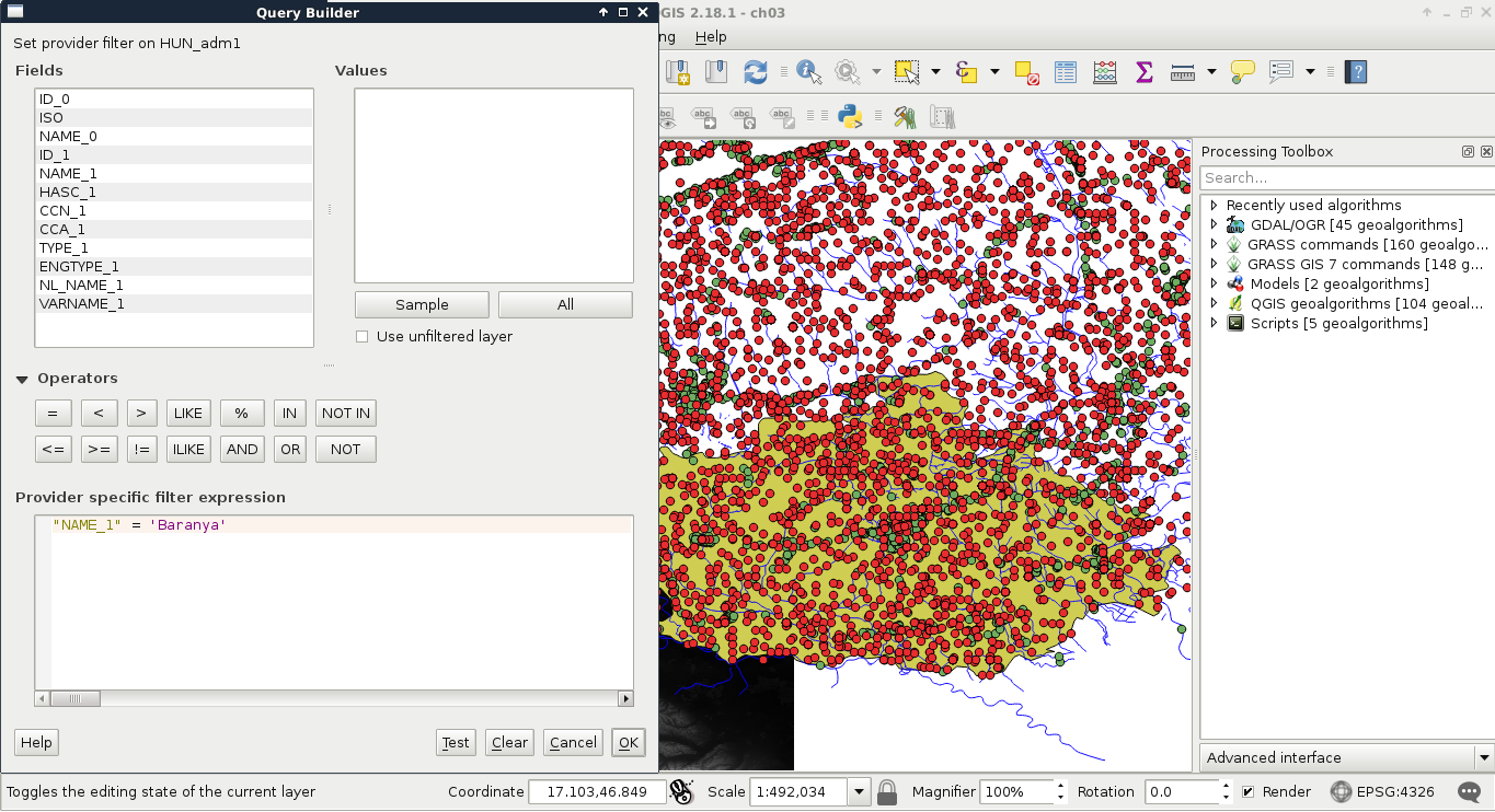
Now the only feature showing up on the canvas is our study area. If we look at the layer's attribute table, we can only see that feature. Now every operation is executed only on that feature. What we cannot accomplish with filtering is increasing the performance of subsequent queries and analyses. Rendering performance might be increased, but, for example, opening the attribute table requires QGIS to iterate through every feature and fill the table only with the filtered ones.
Let's practice filtering a little more by creating a filter for the GeoNames layer, selecting only points which represent first-level administrative boundaries. To do this, we have to supply the following query:
"featurecode" = 'ADM1'
We can not only select features by their attributes, but also by their spatial relationships. These queries are called spatial queries, or selecting features by their location. With this type of querying, we can select features intersecting or touching other features in other layers. The most convenient mode of spatial querying allows us to consider two layers at a time, and select features from one layer with respect to the locations of features in the other one. First of all, let's remove the filter from our GeoNames layer. Next, to access the spatial query tool in QGIS, we have to browse our Processing Toolbox. From QGIS geoalgorithms, we have to access Vector selection tools and open the Select by location tool:
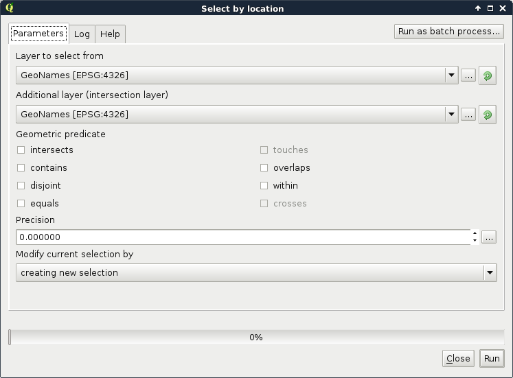
As we can see, QGIS offers us a lot of spatial predicates (relationship types) to choose from. Some of them are disabled as they do not make any sense in the current context (between two point layers). If we select other layers, we can see the disabled predicates changing. Let's discuss shortly what some of these predicates mean. In the following examples, we have a layer A from which we want to select features, and a layer B containing features we would like to compare our layer A to:
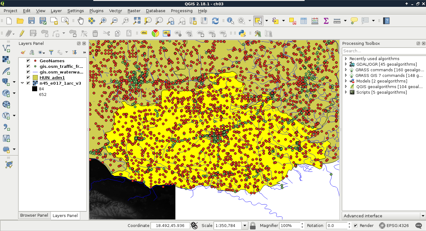
Let's select every feature from the GeoNames layer in our study area. As we have our study area filtered, we can safely pass the administrative layer as the Additional layer parameter. The only thing left to consider is the spatial predicate. Which one should we choose? You must be thinking about intersects or within. In our case, there is a fat chance that both of them yield to the same result. However, the correct one is intersects, as within does not consider points on the boundary of the polygon. After running the algorithm, we should see every point selected in our study area. Consider the following screenshot:
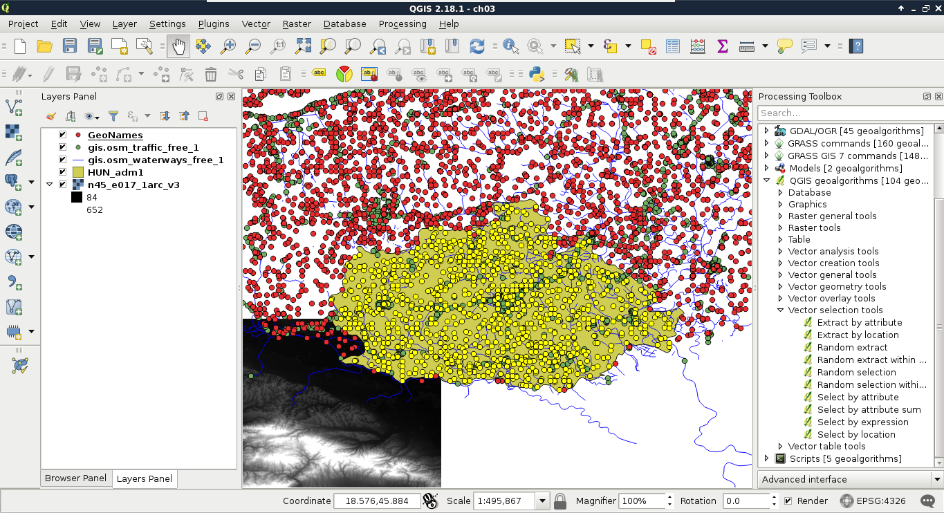
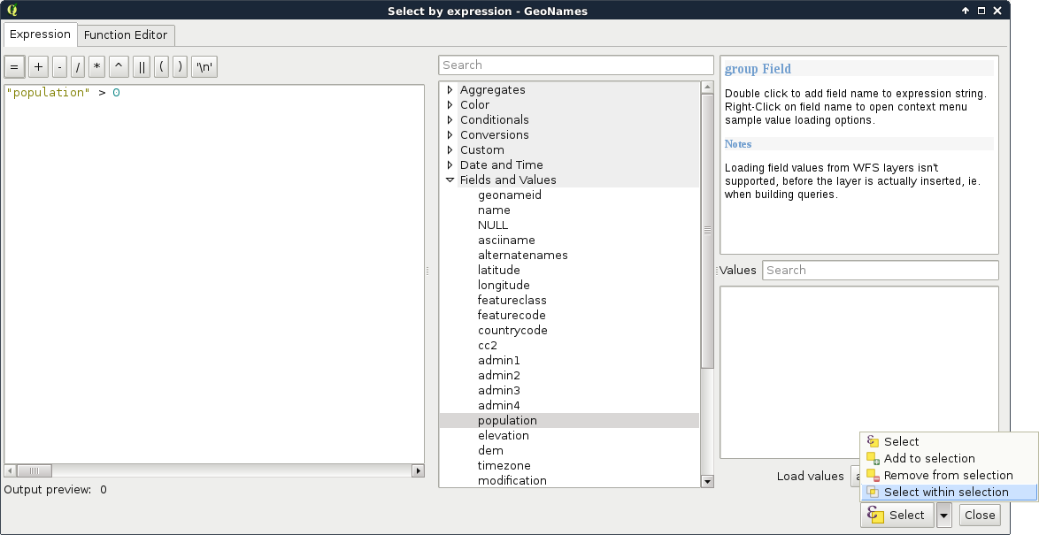
Lovely! The only problem, which I forgot to mention, is that we are only interested in features with a population value. The naive way to resolve this issue is to remove the selection, apply a filter on the GeoNames layer, and run the Select by location algorithm again. We can do better than that. If we open the query builder dialog, we can see some additional options next to Select by clicking on the arrow icon. We can add to the current selection, remove from it, and even select within the selection. For me, that is the most intuitive solution for this case. We just have to come up with a basic query and click on Select within selection:
"population" > 0
We discussed earlier that basic SQL expressions in GIS allow us to select features in only one layer. However, QGIS offers us numerous advanced options for querying even between layers. Unlike filtering, the query dialog allows us to use this extended functionality. These operations are functions which require some arguments as input and return values as output. As we can deal with many kinds of return values, let's discuss how queries work in QGIS.
First, we build an expression. QGIS runs the expression on every feature in the queried layer. If the expression returns true for the given feature, it becomes selected or processed. We can test this behavior by opening the query dialog and simply typing TRUE. Every feature gets selected in the layer as when this static value is evaluated, it yields to true for every feature. Following this analogy, if we type FALSE, none of the features get selected. What happens when we get a non-Boolean type as a return value? Well, it depends. If we get 0 or an empty string for a feature, it gets excluded, while if it is evaluated to another number, or a string, it gets selected. If we get an object as a result, that too counts as false.
If we use the advanced functionality of the query builder, we get access to numerous variables besides functions. Some of these variables, starting with $, represent something from the current feature. For example, $geometry represents the geometry of the processed feature, while $area represents the area of the geometry. Others, starting with @, store global values. Under the Variables menu, we can find a lot of these variables. Although they do not show the @ character in the middle panel, they will if we double click on them.
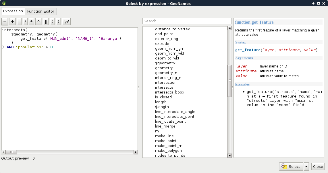
Let's create a query which does the same as our last one. We have to select every feature in our study area from the GeoNames layer which has a population value higher than 0. Under the Geometry menu in the middle panel, we can access a lot of spatial functions. The one we need in our case is intersects. We can see in the help panel that it requires two geometries and it returns true if the two geometries intersect. Accessing the geometries of the point features is easy as we have a variable for that. So far, our query looks like this:
intersects($geometry, )
Here comes the tricky part. We have to access a single constant geometry from another layer. If we browse through the available functions, we can almost instantly bump into the geometry function, which returns a geometry of a feature:
intersects($geometry, geometry( ))
As geometry can only process features, the last step is to extract the correct feature from the administrative boundaries layer. Under the Record menu, we can see the most convenient function for this task--get_feature. The function requires three arguments--the name or ID of a layer, the attribute column, and an attribute value. It's just a basic query in a functional form. After passing the required arguments, our query looks similar to the following:
    intersects($geometry, geometry(get_feature('HUN_adm1', 'NAME_1',
      'Baranya')))
Now we have a constant geometry, the geometries of the point features one by one, and a function checking for their intersections. The only thing left to supply is the population part. We can easily join that criterion with a logical operator as follows:
    intersects($geometry, geometry(get_feature(
      'HUN_adm1', 'NAME_1', 'Baranya'))) AND "population" > 0
For a visual example of the query, consider the following screenshot:
We can not only use the attribute tables of layers, but we can also extend, decrease, or modify them. These are very useful functions for maintaining a layer. For example, as data often comes in a general format with a lot of obsolete attributes, which is practically useless for our analysis, we can get rid of it in a matter of clicks. The size of the attribute table always has an impact on performance; therefore, it is beneficial to not store superfluous data.
In the first example, let's delete some values from our administrative boundaries layer. If we inspect its attribute table, we can see some unnecessary columns. In my table, ID_0 and CCN_1 have constant values, which have absolutely no meaning to me. The CCA_1 and NL_NAME_1 columns are filled with null values, while VARNAME_1 is scarcely filled, therefore, I cannot use them. Let's pick every unnecessary column and remember their names. In the attribute table's toolbar, we can see some tools related to data management. We can add and remove columns; however, those options are disabled. We can enable them by starting an edit session by clicking on the first, Toggle editing mode button. With the editing options enabled, we can proceed by activating the Delete field tool, selecting the columns we would like to remove, and approving the operation with the OK button:
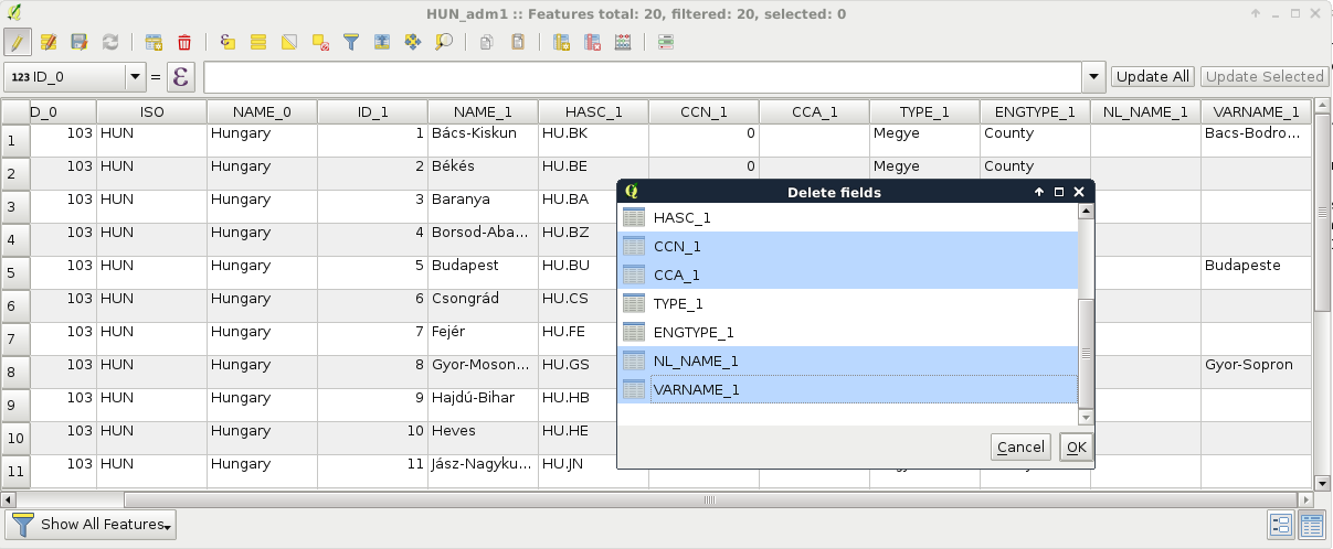
When the operation stops, we can see our unnecessary columns removed. If we save our edits, QGIS overwrites our layer and they are gone for good. Of course, we can change our mind or realize we accidentally removed some important data. In this case, we can restore the original conditions by not saving our edits.
While superfluous columns are often present in general data, it is not rare if we don't have the required attributes we would like to work with. If we are lucky, we can generate them based on other existing attributes, although we should not worry if this is not the case. If we can prepare a table which can be joined to the existing one on a matching column, we can easily join them together.
For this example, I prepared a small table containing descriptions of our GeoNames layer's featureclass and featurecodes columns based on the official GeoNames code page mentioned before. It is called geonames_desc.csv and you an access it from the supplementary material's ch03 folder or download it directly from https://gaborfarkas.github.io/practical_gis/ch03/geonames_desc.csv. The formatting of this table resembles the original GeoNames table as it is tab separated; however, it does not have any geometries. It only contains two columns--a code and a description. Let's open the table with the Add Delimited Text Layer tool. The first line is the header and the separator is the tab character. As we have no geometries, we should also state that by checking the No geometry option:
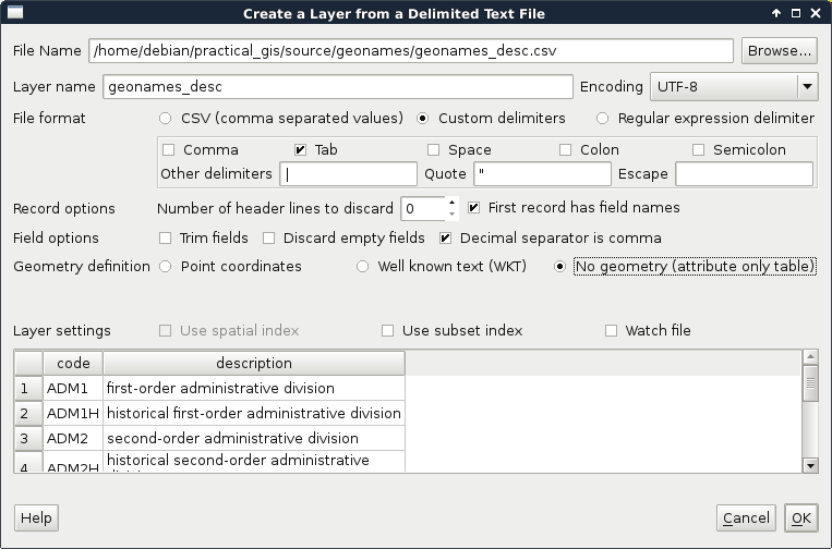
When the table is opened, we can see its entry in the Layers Panel. It has a special icon as it only consist of attributes. Now we can join the two layers. To start a join, we have to open the Properties of the target layer, in our case, GeoNames. There is a tab named Joins, which offers tools for managing different joins. These kinds of attribute joins do not result in overwriting the target layer, they are handled in memory; therefore, we can dynamically change them (add new ones, modify, and remove existing ones).
A successful join in QGIS needs some conditions to be met. We need a common column in both the tables as keys. These key columns hold the join conditions. The join procedure pairs these key columns together and joins the other columns of the joined layer accordingly. Therefore, to avoid ambiguities, we should have a target key column without null values and a joined key column with unique values. The key column of the joined table is never included in a join as it would introduce unnecessary redundancy. We can define a join the following way:
We can also select the columns that we would like to join from the target table. As we have only two columns and one of them is the key column, we don't have to limit them. There is one final option for the prefix. As we can have an arbitrary number of joins and different tables can have the same column names, QGIS offers us the ability to prefix the target table's column names with the table's name. We can safely remove the prefix as we won't have further joins. To confirm the join, we have to click on OK not only in the dialog but also in the Properties window as simply closing it is the same as clicking on Cancel:
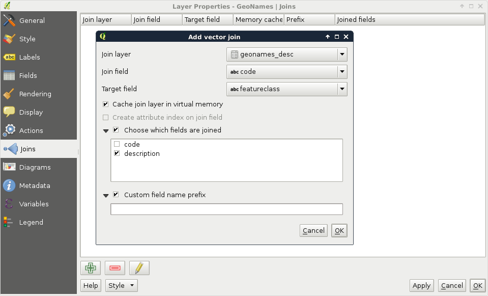
If we open the attribute table of our GeoNames layer, we can see the new description column appended. Furthermore, if we open the query builder, select the featureclass field, and query all the unique values, and do the same for the description field, we can see the number of unique values that match. Now let's edit the join in the Properties window. We can do that by selecting the join entry and clicking on the pencil icon. For the Target field, let's select the featurecode column. By inspecting the attribute table again, we can see that the values have changed and represent the description of the feature codes.
Attribute-based joins in QGIS work like left outer joins in SQL. QGIS takes every row from the target layer and matches a row from the joined table if it can. If there is no matching value, it fills the row with a null value. Every excess field is dropped from the joined table. For example, our description table contains descriptions for both feature classes and feature codes. Based on the key columns, one set of them is joined while the other is dropped.
Like queries, we can also perform joins based on the location of the target and reference features. For this task, we need geometries in both the layers. This is a very handy operation when there are no common columns for joining and making one would require excessive work. To avoid ambiguity, we must have a spatial relationship able to do a one-on-one mapping between features. If not, QGIS will either pick the first matching feature or attempt to calculate statistics from the multiple target candidates.
Let's have an example, say, we would like to fill our administrative boundaries layer with population data. Our GeoNames layer has this kind of data, but they do not have a common column. If we join the whole GeoNames layer to the polygons, we would get unpredictable results. Therefore, we need to filter our GeoNames layer in such a way that only one point remains for every polygon. We can build a filter like this; we only have to select the feature codes representing our administrative divisions. In my case, the first-level administrative division contains my study area; therefore, my filter looks like this:
"featurecode" = 'ADM1'
By applying the filter, we should get one point per administrative division:
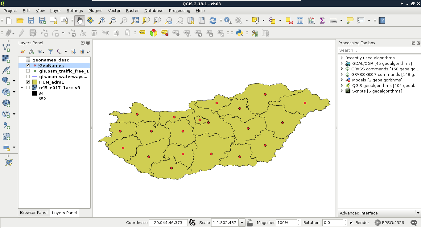
The only thing left to do now is to run the spatial join algorithm. We can find it in the Processing Toolbox. Under QGIS geoalgorithms, we have to expand the Vector general tools menu, where we can find the Join attributes by location tool. Its dialog is similar to the Select by location tool, thus, we have to provide two layers and a spatial predict. The Target vector layer is our administrative boundary layer, the Join vector layer is our GeoNames layer, while the spatial predict is intersects. Additionally, we have to provide a join method, which should be the default, and pick the first located feature. Finally, we have to provide a path to the output file as QGIS builds a new layer with the joined tables:
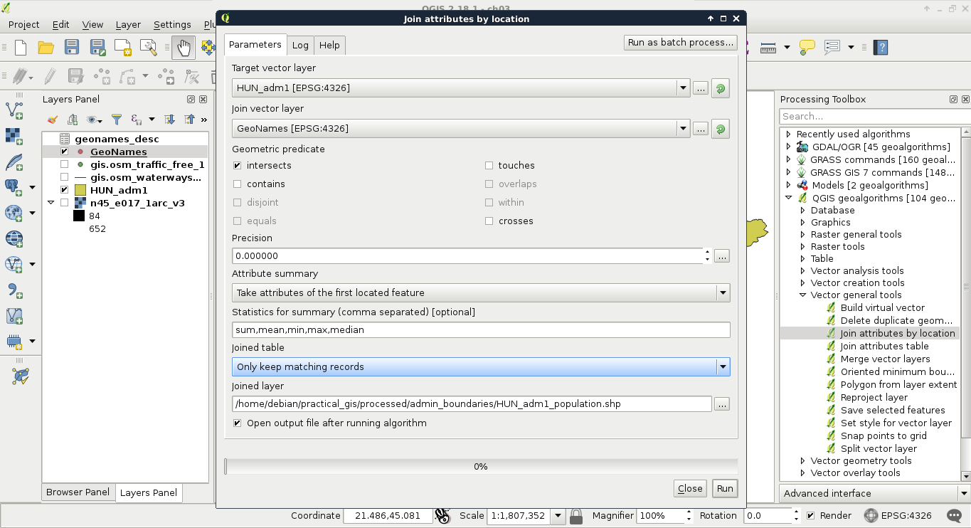
After the algorithm finishes, we can see our new layer added to the map. The only limitation of the spatial join in QGIS is the lack of options for selecting relevant columns. It joins every column from the joined layer to our target layer. We can remove every unnecessary column from the new layer's attribute table.
There are other ways to add or modify attribute data than joining tables together. If we start an edit session, we can directly modify attribute values in the layer's attribute table. It comes in handy when we have to modify the attributes a little bit manually. If manual work is not feasible, we have a convenient tool for creating and filling new columns automatically--the field calculator. We can access this tool from the attribute table of a layer, and from the main toolbar of QGIS by clicking on the abacus icon called Open Field Calculator. In the field calculator, we have a dialog similar to the query builder. We have access to every function that QGIS offers and some other options related to field creation. Let's open the field calculator for our new administrative boundaries layer.
In the dialog, we can choose between creating a new field and updating an existing one. In this example, we create a new column and fill it with the population density data. As our layer now contains population data, we can easily normalize it with the area of the polygons. We would like to create a new column; therefore, we can leave the Create a new field option checked. After we provide a name for our new column (in my case it will be popdensity), we have to assign a type to it. As population density is a numeric value, we can choose between two types--integer and floating point number (decimal number). Even though a data value of 1.5 people sounds rather silly, we strive for accuracy and choose the decimal type. We should also set up the format of our floating point numbers. Setting the precision to 2 is enough.
Now we only have to provide the expression of the field. If we leave that part empty, the column still gets added but with just null values. As we can calculate the population density (people per square kilometer) from the total population and the area, which is provided in square meters, we can build the following expression:
"population" / ($area / 1000000)
Or, if we would like to get our results in people per square mile, we can provide the following one:
"population" / ($area / 2589988)
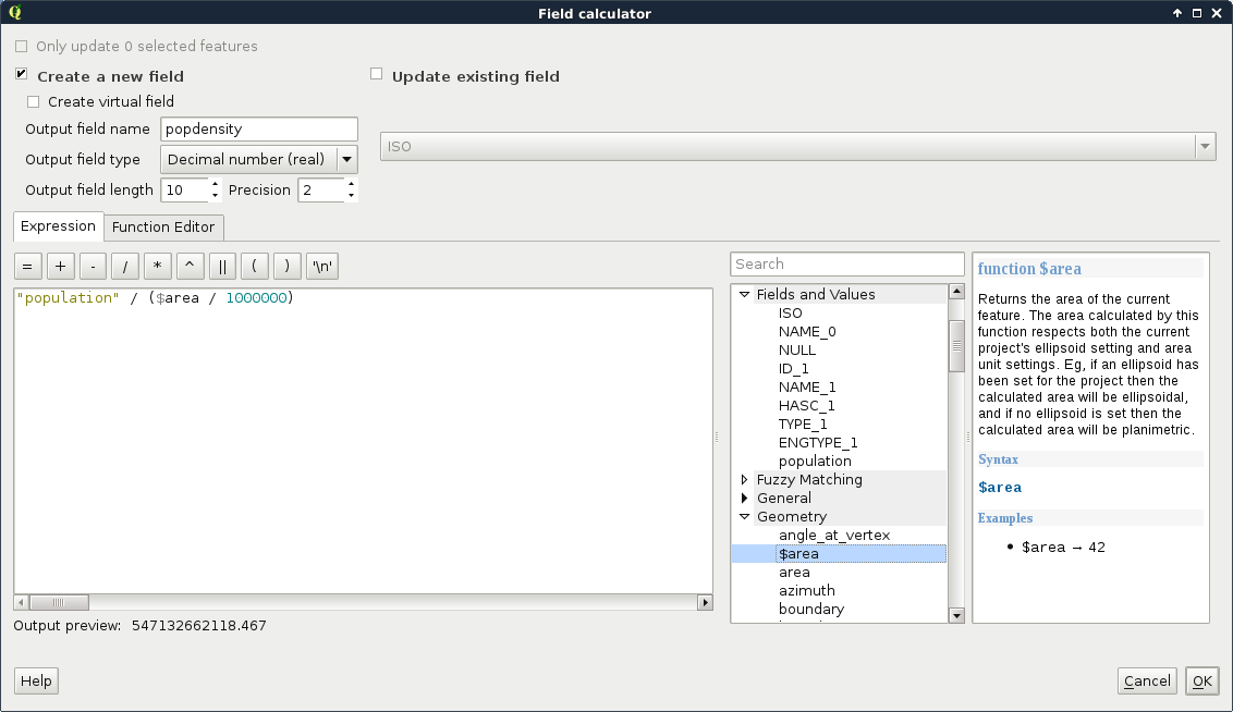
While working on this chapter's examples, you might have noticed that we cannot even start an edit session on our GeoNames layer. Why do different vector data types act differently? The answer is simple and it can be found in the implementation details. Every GIS software has to decide at one point how to handle vector data. They can build some kind of internal structure, read to and write from this structure, and handle every kind of vector data consistently during the workflow. This is one popular option. GRASS GIS does exactly this, additionally materializing this internal structure to make other processes more consistent and efficient.
QGIS, on the other hand, strives for extensibility and modularity before consistency. It utilizes one of the greatest features of object-oriented programming, polymorphism, to achieve this goal. It has a template class called qgsVectorDataProvider on which different data providers can implement their format-specific functionality. QGIS only communicates with this class, which can tell it the exact capabilities of the given implementation. For example, Shapefiles, among a lot of other vector formats, are handled by qgsOgrProvider, which can communicate with GDAL/OGR (Geospatial Data Abstraction Library), a library capable of reading and writing an excessive number of raster and vector formats. This way, this provider grants the capability of editing the given layer in place; therefore, we can start an edit session in QGIS. On the other hand, qgsDelimitedTextProvider doesn't offer the capabilities for editing the layer in any way; therefore, we cannot start an edit session until we change our layer's format to something more capable:
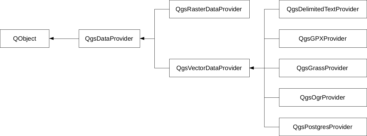
Of course, the preceding diagram only shows a few of the numerous providers that QGIS offers on the source code level. What can we do when we must edit a layer provided by an incapable vector provider? The answer is very simple--in spite of the capabilities of the given provider, once a vector layer is opened, QGIS can export it to any other supported format. Additionally, if we don't have to edit geometries, just add a few columns; QGIS has a concept for this which is called virtual fields. When we were in the field calculator, we saw an option of creating a virtual field. This is a pure QGIS concept with which we can add additional attributes on top of the existing ones in memory. Of course, we have to save the project if we would like to preserve them, or export the layer if we would like to materialize them.
In this chapter, we built on our knowledge of the vector data model and learned how to use vector data effectively with queries, filters, joins, and attribute manipulation. Great work! Now we can firmly use our vector layers to work only with the relevant part and derive more valuable information from the existing data.
In the next chapter, we will use our skills to style our data and create beautiful visualizations with it. We will also learn where, why, and how we should create a custom digital map instead of overlaying our data on already existing base maps. Additionally, we will learn how projections work and how they can aid us in our projects.
In the previous chapters, we learned about data models, and how we can use them for our needs. In this chapter, we will learn about a new GIS concept--the representation model. The representation model applies different styles and styling rules to our raw data, and creates the styled result we see on our map canvas, and later, on our digital or printed maps. By styling our maps we can decide which properties of the data are important to the readers. For example, in a thematic map showing population, we don't need the road network, while we shouldn't make a road map unnecessarily complex with population data. We can also enhance readability by adding cartographic elements to our map, like a scale bar, a navigation grid, a legend, or a north arrow.
In this chapter, we will cover the following topics:
Let's start with a gentle introduction to the representation model in GIS. For these examples, we will need our modified administrative boundaries layer, our GeoNames layer, our river network, and one of our elevation maps.
Not only do the data models of rasters and vectors differ, but also their representation models. As rendering in every decent GIS software is hardware-accelerated, raster data are converted to textures, while vector data are tessellated in the rendering pipeline. Hence, raster values have to be mapped to 8-bit or 24-bit textures (images), while the capabilities of vector visualization depend on the implementation. The minimum capabilities are drawing icons as textures, regular shapes, connected lines, and polygons with user-defined fill and stroke colors.
First, let's see our elevation model, opened in the second chapter. As we discussed before, this is the simplest rendering option that QGIS has to offer--a single-band grey representation. It simply clamps the raster values to a byte (0-255), and renders the result as an 8-bit texture. If we open the layer's properties and navigate to the Style tab, we can see the few options needed for such a visualization. QGIS needs a band, which is unambiguous as we have only one band, and the Contrast enhancement set to Stretch to MinMax.
Let's add some colors to this elevation model, and see how we can render it as a 24-bit image. For this, we have to change Rendering type to Singleband pseudocolor. This mode has a lot of options compared to the 8-bit mode, as it is more complex. QGIS needs to know how many colors it has to use, how to interpolate between colors, and what are the limits to the color intervals. QGIS offers a variety of predefined color ramps to choose from. As we are styling an elevation model, the BrBG color ramp is the best fit for our data. After choosing a color ramp, we can click on Classify, and QGIS automatically builds intervals for our data. As we can see, the classification results in painting the lowest points with brown, and the highest with green. We can easily invert this palette by checking in the Invert box. If we click on OK, we can see our colored elevation model:
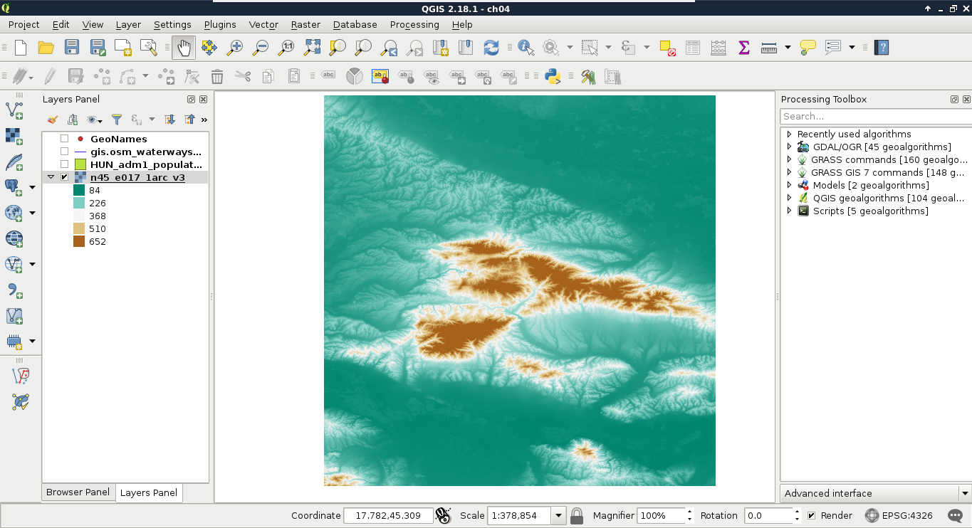
With the classification mode set to Continuous, we get equal intervals. The whole data range is partitioned into five equal parts, and the colors are assigned accordingly. This means, the distribution of the data are not uniform in the intervals. As my model contains values mostly between 84 and 150, I got a lot of green areas, and gradually, less brown areas.
Let's change that in such a way that every interval contains the same amount of values. We can do this by changing the classification mode to Quantile. If we apply the changes, we can see the coloring of our model changing in a more uniform way. As QGIS does not give an aesthetic color palette for terrain visualization by default, we can import other palettes installed, but not enabled. We can do this in the following way:
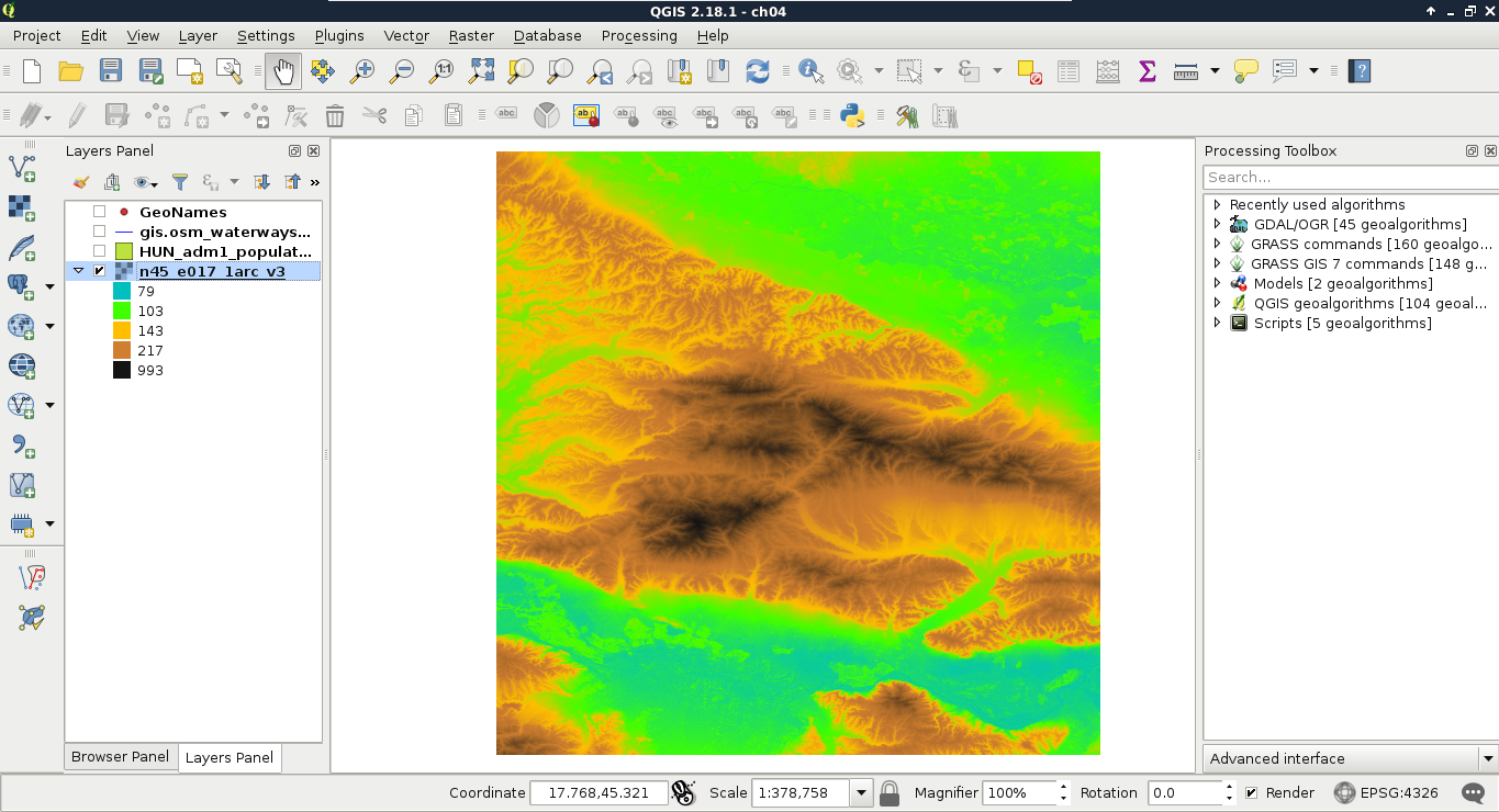
Let's move on to multi-band visualizations. A multi-band rendering mode needs to access three bands in the same raster. It does not matter if we have more or less bands, it just needs one band in each of the RGB channels. A very good candidate for multi-band visualization is our Landsat data. Each of the bands are 16-bit rasters (digital numbers quantized from actual reflectance data); however, they are contained in different files.
The easiest way to create a single raster from the bands is by creating a virtual raster. A virtual raster is a file that contains only references to the source rasters, therefore, it is small, but only a few software can handle it. Perform the following steps:
After running the tool, our Landsat layer appears on the map canvas. We can barely see any colors in it though, as the first six bands of the Landsat 8's Operation Land Imager (its multispectral instrument) have the following spectral properties:
| Band number | Name and use cases | Wavelength (µm) |
| 1 | Coastal blue (shallow waters, aerosol) | 0.433-0.453 |
| 2 | Blue (visible blue) | 0.450-0.515 |
| 3 | Green (visible green) | 0.525-0.600 |
| 4 | Red (visible red) | 0.630-0.680 |
| 5 | Near infrared (vegetation, plant health) | 0.845-0.885 |
| 6 | Shortwave infrared (humidity, soil type, rock type) | 1.560-1.660 |
Therefore, in order to get a colored image, we have to create a 4-3-2 combination. To achieve this, we have to open the Properties of our Landsat layer, navigate to Style, and choose Band 4 for Red band, Band 3 for Green band, and Band 2 for Blue band. Now we have a colored image, although the image is quite pale and bright:
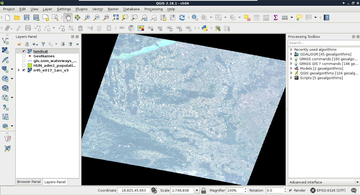
The bad news is that we have to calculate the original reflectance or radiance values, possibly with some atmospheric corrections, in order to get satellite imagery with the vivid colors that we are used to. However, we can get drastically better results even with some naive color enhancement techniques. To understand some of these techniques, let's learn why we got such a dull result. The type of the image is 16-bit unsigned integer. Therefore, it has a minimum value of 0, and a maximum value of 216 - 1 = 65,535. The visible bands (most likely due to the high reflectance of clouds) have maximum values near the absolute maximum, although the majority of their values range between 0 and 11,000.
When clamping values to a single byte, QGIS accepts user-defined values for minimum and maximum. If we provide values other than the minimum and maximum of our data, it truncates every value outside of this range to 0 and 255, and stretches only the in-between values. As a result, if we increase the maximum value, the values in between become less dominant, as they are stretched on a wider range. Hence, QGIS is smart--it saw that stretching to the whole data range of our Landsat imagery is hardly beneficial, as it would produce a very dark image. Therefore, it used a technique called cumulative cut, and cut the outer 2% of our data in order to remove distortions caused by outliers. However, this method also discarded some important values in the upper range. This is why we got a dull image:
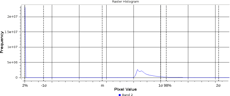
There is another popular stretching method called σ-stretching (sigma-stretching). It calculates the useful range from the mean (m) and the standard deviation (σ) of our data. The standard deviation is the density of our data in a quantified form. The more scattered our values are, the higher the standard deviation becomes, and vice versa. We can access this method by clicking on the Load min/max values menu in the Style tab. We have to check the Mean +/- standard deviation option, and simply click on Load, as 2σ is usually a good measure for excluding outliers, while keeping the important values.
If we apply our changes, we can finally see colors, although the image is still quite biased towards the upper range of the clamped values. To compensate, we can alter some values in the Color rendering menu of the Style tab. It might need a few tries to set the best values for your scene. I got a nice image with Brightness set to -90, Saturation set to 20, and Contrast set to 10:
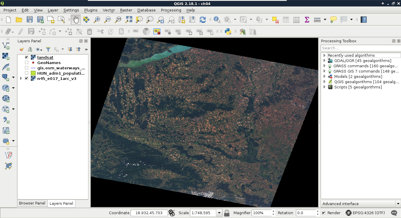
The resulting image is much more vivid, although it might be biased in one of the bands. My result, for example, has an unnatural reddish glow, which can be compensated by increasing the maximum value of the Red band.
Unlike raster data, which can be styled by their individual raster values, vector data can be styled statically, or by their attributes. Basic styling includes a simple style for a layer. For polygons, it is a simple fill with an outline, a simple line for lines, while for points, it is a scale independent circle with an outline. If we open the Properties window of a vector layer, and navigate to the Style tab, we can see the Single symbol method applied to the layer.
These are cascading styles, starting in a parent class, which is predefined for the geometry type and is unchangeable. These styles are truly cascading, therefore, if we change a global attribute, like the color on any member, the whole structure conforms. A parent class (bold font) can hold multiple children. By clicking on the first (and, by default, only) child, we can customize the attributes of the style. If we choose a different styling method, and it is a complex one, it will create its own parents and children, which can be parameterized individually. By doing this, or by adding more children to the main style, we can create more and more complex styles. For example, if we choose arrows wherever possible, we can make an unaesthetic, yet interesting, visualization. Consider the following screenshot:
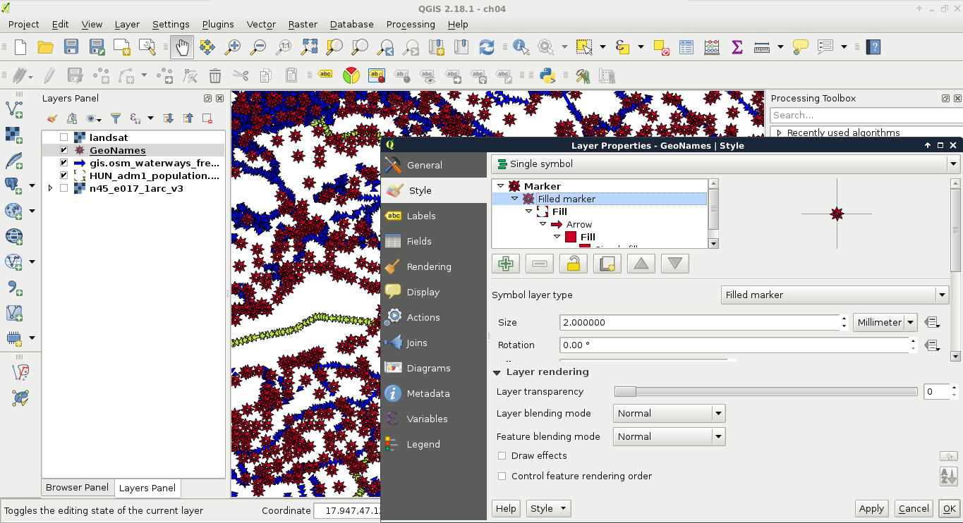
These simple styles are often used to show the existence of a feature, or several features. The other common styling method is thematic mapping. With thematic styles, we can represent attributes visually. There are two distinct types of thematic styles--categorized, and graduated symbols.
Categorized symbology is useful for visualizing distinct categories on nominal and ordinal scales. This method isn't type specific, thus we can use it with strings, numbers, and any other type of attributes. For example, we can show different countries, or hotels with different ratings with different colors. To try this out, let's open the Style tab of our administrative layer's Properties window as usual. Perform the following steps:
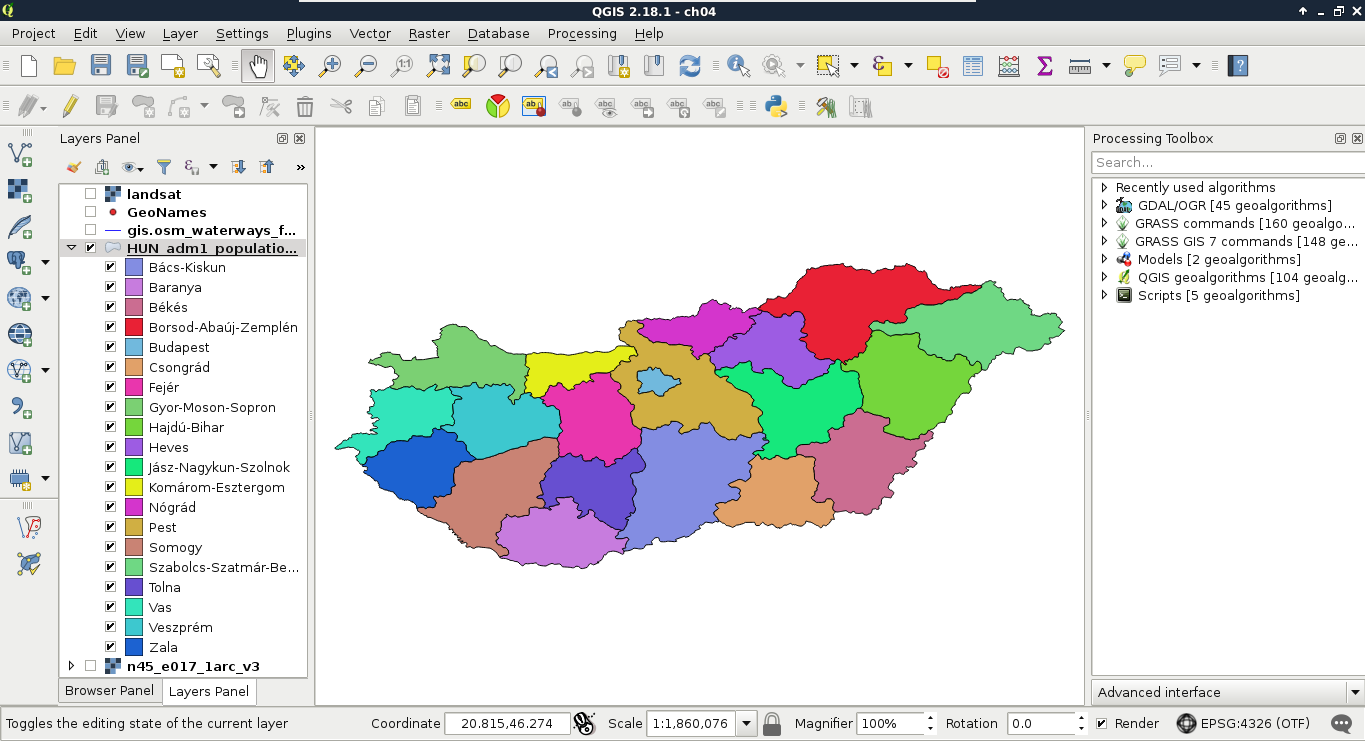
We cannot only see our boundaries colored with distinct colors, but also a legend associated with it in the Layers Panel. This is useful, as we can put these legends on our digital maps.
The other common method, graduated styling, is useful to show comparable attributes, effectively on interval and ratio scales. This method is type-specific, as we can only compare numbers directly. By using this method, QGIS creates intervals (bins), groups the attributes, links a color to every interval, and draws the features accordingly. We can apply graduated symbology to every geometry type, although the most common use cases are using a color ramp for shading polygons (choropleth map), and applying different icon sizes on points (proportional symbol map). First, let's apply a filter on our GeoNames layer (or its extract) to only show some of the settlements. With the following query we can filter only the seats of the administrative divisions:
"featurecode" LIKE 'PPLA%'
Now we can apply a graduated symbology by doing the following steps:
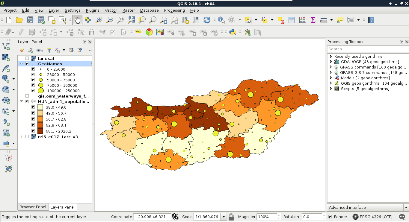
The custom ranges should always depend on the properties of the mapped data. For mapping settlements in Hungary excluding the capital city, I usually use intervals as per the preceding screenshot.
As we know, spatial data can come in different projections. However, we can work with only one projection at a time. In QGIS, we can see our project's projection on the right side of our status bar. It is denoted with EPSG:4326 for us, as this is the identifier of our projection. You might have noticed that since we added the Landsat layer, the projection changed to EPSG:4326 (OTF). This change occurred as the Landsat imagery is in another projection than our project, and QGIS automatically transformed the layer with an on-the-fly (OTF) transformation.
So, if we can transform anything to a well-recognized global projection, why should we care? We can use the Mercator projection that popular web maps (like Google Maps and OpenStreetMap) use, and overlay our data on them. Well, take a look back at the first chapter where I visualized my study area, and compare the shape of Hungary with the other images. On that map, you can see most of the countries with their real sizes, and Hungary with minimal distortions. That's true--projections lie. We simply cannot map a spherical surface to a plane without distortions. In order to understand the nature of these distortions, let's see how projections work in a nutshell.
First of all, let's get a bit technical. In GIS software, we do not use projections--we use Coordinate Reference Systems (CRSs) instead. A CRS has an ideal mathematical model of the Earth, a datum, and a projection, which maps the coordinates on the model to a flat surface.
Let's see how the projection we used since the beginning of the book works. It is the EPSG:4326, or Plate Carrée (flat square), which is a coordinate system with an equirectangular projection using the WGS84 (World Geodesic System 1984) ellipsoid.
We need a mathematical model to begin with, as the real shape of Earth is uneven, and therefore, very hard to represent mathematically. The most simple shape we can model Earth with is a sphere. As there is a great difference between the real size of Earth and the optimal sphere that it can be represented with, we can use a little more complex shape to increase overall accuracy--an ellipsoid. As Earth is a little flattened on the poles, an ellipsoid (technically an oblate spheroid) offers the best fit from simple shapes. It is used by most of the projections. An ellipsoid has two very important parameters--a size and flattening, which minimizes the difference from the shape of Earth for a use case. The WGS84 ellipsoid strives for the best overall accuracy.
The second thing we need is a datum. The datum is the referenced ellipsoid. By referencing an ellipsoid, we bind its center to somewhere in or on Earth. In the Plate Carrée, we have a WGS84 datum, which binds the center of the WGS84 ellipsoid to Earth's center of mass. This is a somewhat special case, which is very easy to understand, as Earth's center of mass does not change much, only our measurements get more accurate.
The last thing we need is a projection. A projection is a method to transform coordinates on our model to a flat surface. Therefore, we need a shape which can be flattened out seamlessly, and a function to map coordinates. Plate Carrée is a perspective projection. Perspective projections work like an object put into the path of light. It casts a shadow on the surface behind it, and that shadow is the projected image of the object (in our case, the reference ellipsoid). Let's imagine our ellipsoid as a totally transparent crystal spheroid with borders of the countries painted on it as narrow black lines. We can imagine that the properties of the shadow it casts depend on two factors--the place where we put our light source (perspective point), and the shape of the surface behind it (projection surface).
Based on the perspective point, we have a lot of options, although these are three distinct, specific cases which are used often in cartography:
Based on the projection surface, we also distinguish between these three distinct cases:
The Plate Carrée is one of the simplest perspective projections possible - it is an orthographic cylindrical projection. It is normal (the top and bottom sides of the cylinder are parallel to the Equator), thus it has a starting longitude (λ0) of 0°, and a starting latitude (φ0) of 0°. Hence, it is a simple linear mapping of geographic coordinates to the projected coordinates (x = λ, y = φ):
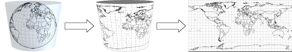
Let's see a local CRS for mapping the entire United States. NAD83 / Conus Albers (EPSG:5072) uses an ellipsoid called GRS80 (Geodetic Reference System 1980). It has almost the same properties as WGS84, and they had the same properties back in the time. However, WGS84 underwent some changes (realizations) to give a better fit for GPS systems, and therefore, its flattening became slightly different.
More importantly, NAD83 / Conus Albers uses a local datum--NAD83 (North American Datum 1983). That means, it is not referenced to Earth's center of mass, but to the North American plate. It is still referenced to the same planet, so the question arises--what's the difference? The answer is simple--plate tectonics. The coordinates on global datums are changing constantly due to plate movements. This is a very slow change (a few centimeters every year), however, it still can be an issue for high accuracy surveys and analyses. To avoid the urge for correcting old data, local datums are referenced to local places, and are moving with the plate underneath. This also means that global and local datums are slowly drifting apart. Consider the following diagram:
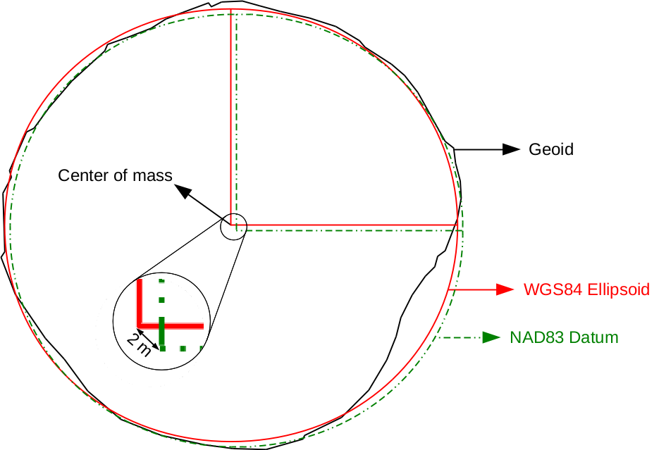
The geoid is the most accurate mathematical model we have for the Earth's shape. Its center is located in the center of Earth's mass. The WGS84 oblate spheroid is a much more general model, whose center is placed at the geoid's center. The difference between the two models is called geoid undulation, which is automatically height-corrected by GPS systems. As the NAD83 datum is referenced to the North American plate, its center slowly drifts apart from the center of the WGS84 ellipsoid.
The NAD83 / Conus Albers (EPSG:5072) uses an Albers projection. It is conic, therefore, the geographic coordinates are projected onto a cone, which, by flattening out, produces a half-circle-shaped map for its whole validity extent. However, there is a catch; it's not perspective. Therefore, the perspective point is meaningless in this concept. Non-perspective projections can only be defined mathematically, we cannot reproduce them with a light source.
Now that we know how projections work, let's discuss how should we choose the right projection for our work. We learned before that projections distort reality, as we cannot convert an ellipsoid to a flat surface. Projections have some properties, which are shape, area, direction, distance, scale, and bearing. From these properties, a single projection can only fully preserve a few, at the expense of other properties. Based on the preserved properties, we distinguish between the following types:
We did not talk about an important property of projections--scale. Only a few projections preserve scale, most of them distort it. However, the printed and digital maps always show a constant scale, usually with a scale bar. Also, we witnessed during our work that the scale always changes when we pan the map (Plate Carrée does not preserve scale). To overcome this issue, the scale value in these cases is an approximation based on the center of the map (or less often, some kind of average from different parts of it). It simply displays the exact scale in the center, and assumes that we know if our projection preserves or distorts scale to the edges.
Some of the CRSs do not need these kinds of considerations, as they are fitted on a small area. This means that distortions are mostly negligible in their validity extents. If we have a small enough area to map (just like our study area), we can choose such a CRS. For countries too big for an all-purpose CRS, there are multiple ones. There are CRSs to visualize the entire country with different properties, while there are also CRSs for smaller regions giving a better fit.
We do not need to know about all the existent CRSs to choose one. There are databases of CRSs which we can browse. The most widely used database is the EPSG (European Petrol Survey Group), which maintains an up-to-date catalogue of all of the popular CRSs. These CRSs identified by their EPSG codes (such as EPSG:4326 for Plate Carrée) are supported by all kinds of GIS software, such as QGIS. Let's select a CRS from an online version of this catalogue at http://epsg.io/. We can type our country's name in the search field, and the site will list all of the projections for our country. We can filter our results to see only projected CRSs (exclude datums) by clicking on Projected on the right-hand side:
What we have to remember is the EPSG code of our preferred CRS. For example, I will work with EPSG:23700 (HD72 / EOV) from now on. In QGIS, we can change our project's projection in the following way:
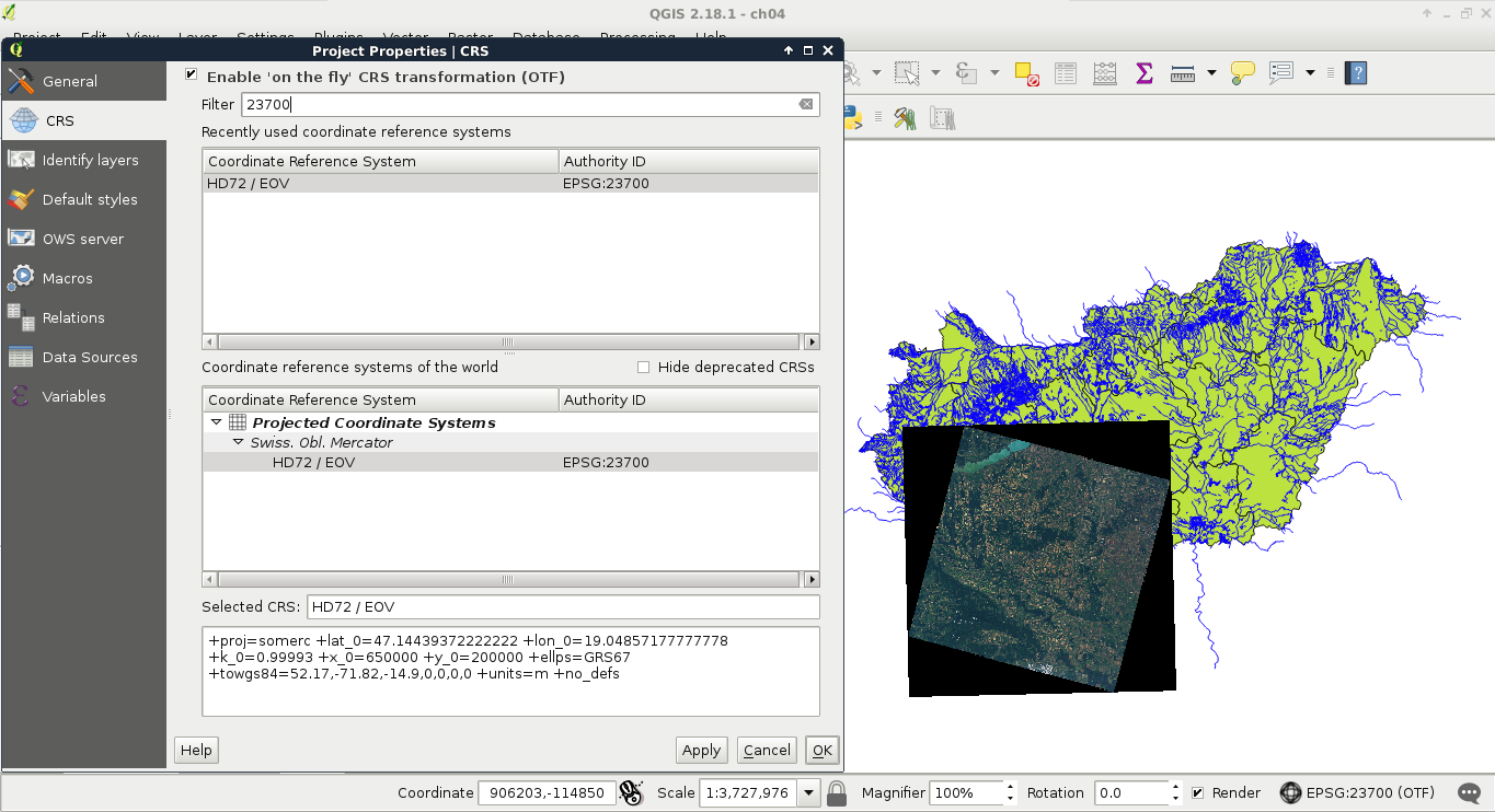
Let's see the consequences of using a more appropriate projection. If you have multiple projections for the country you are working with, choose a projection for the whole country for now. For this task, we need our administrative boundaries layer. First of all, to access the transformed metrics of our layer, we need to define an ellipsoid for measurements:
If we compare the new population density column with the older one, we can see some differences. The farther our country lies from the equator, the bigger the differences are.
In this example, we will create our first real map, a road map of our study area. We will start by a hybrid map like the one we can see in Google Maps by changing to satellite imagery. For this task, we will need the roads layer from the OSM dataset (gis.osm_roads_free_1), the rivers layer (gis.osm_waterways_free_1), the water bodies (gis.osm_water_a_free_1), and the land-use layer (gis.osm_landuse_a_free_1). We will also need the GeoNames and the administrative boundaries layer. First of all, to speed up our work, let's extract only the relevant features. We should do the following steps to every vector layer except the administrative boundaries. If some of your layers are not that large, you can skip these steps for those layers:
Road data from OpenStreetMap comes with a classification, which is very useful for creating road maps. This classification is stored in the fclass column in our layer. If we create a categorized symbology based on that column, we can see that there are a lot of classes. From those classes, only a few are appropriate to show at this scale:
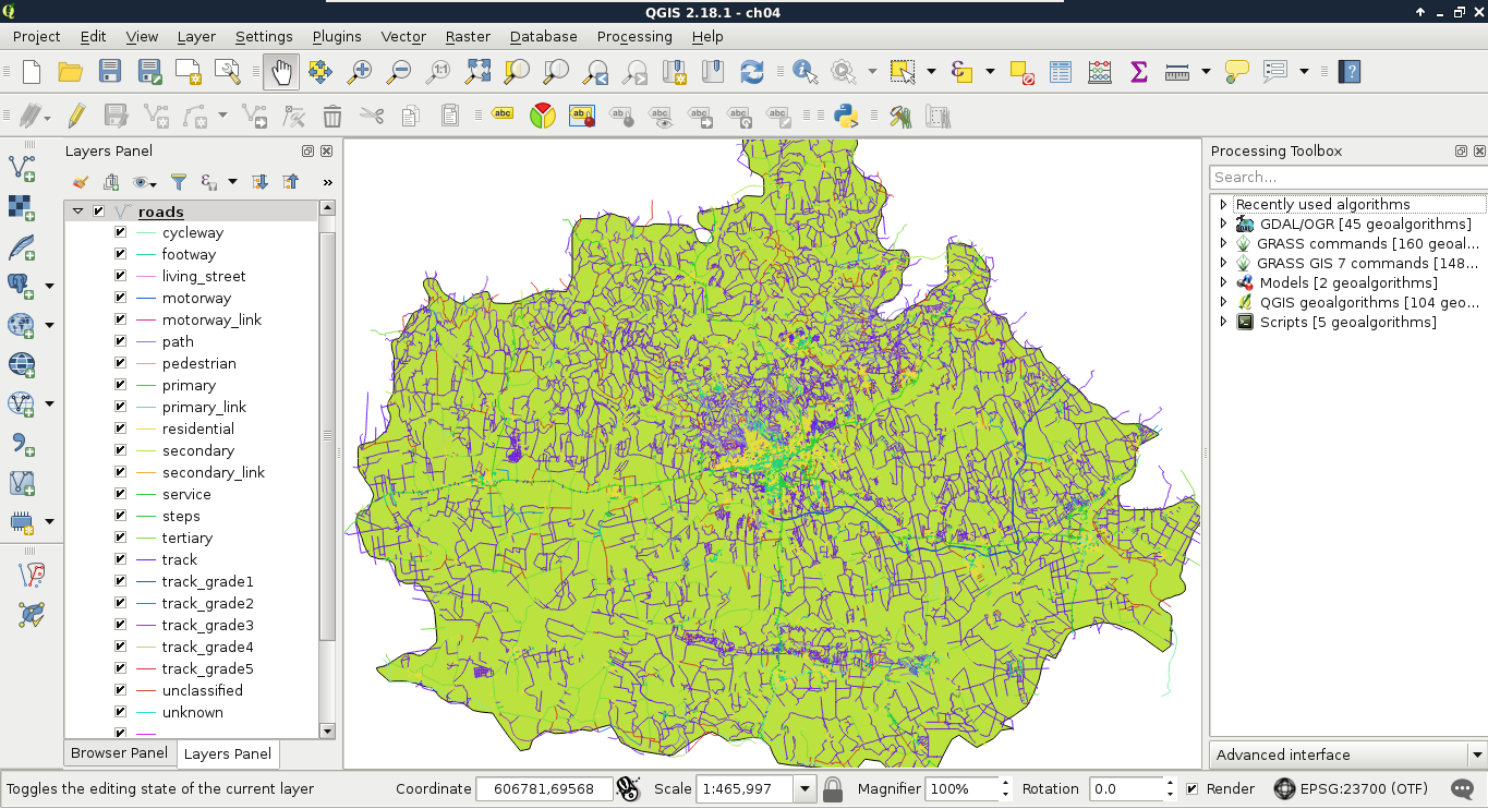
Furthermore, some of the classes belong to a single type. For example, the motorway and motorway_link classes distinguish between two subtypes of motorways. QGIS offers a great tool for these cases, called rule-based styling. Let's open the Style tab of our layer's Properties window, and choose Rule-based. We can remove the classification by selecting them all with the Shift key, and clicking on the minus button. For this scale, we will only show motorways, highways, and other important roads. We can add a rule with the plus button, which opens a dialog for creating a rule definition. By clicking on the ... button next to the Filter field, we can build our first definition as follows:
"fclass" LIKE 'motorway%'
Similar to Google Maps, we create a complex line style for motorways, a thick yellow line with a thin black outline. We can do this by stacking two line styles. A 1 millimeter-wide black line goes to the bottom, while a 0.8 millimeter-wide yellow line goes on the top. This will create a 0.8 millimeter-wide yellow line with a 0.1 millimeter-wide black outline on both sides. First, we create the black line, then add a new line with the plus button. Finally, we style the new line:
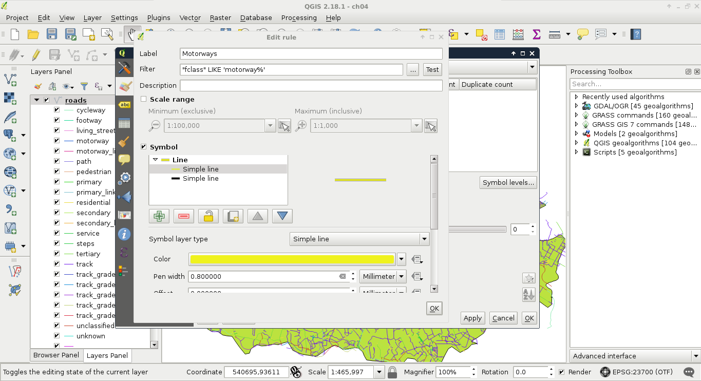
The other roads should be styled following the same analogy, just with narrower lines. For selecting the highways, we can use the following query:
"fclass" LIKE 'primary%'
I visualized highways with a 0.6 millimeter-wide yellow line on a 0.8 millimeter-wide black line. Other important roads can be selected with a similar query:
"fclass" LIKE 'secondary%'
For these roads, I created a single style, a 0.5 millimeter-wide grey line. By visualizing our roads on the top of the Landsat imagery, we can see our road map slowly getting in shape:
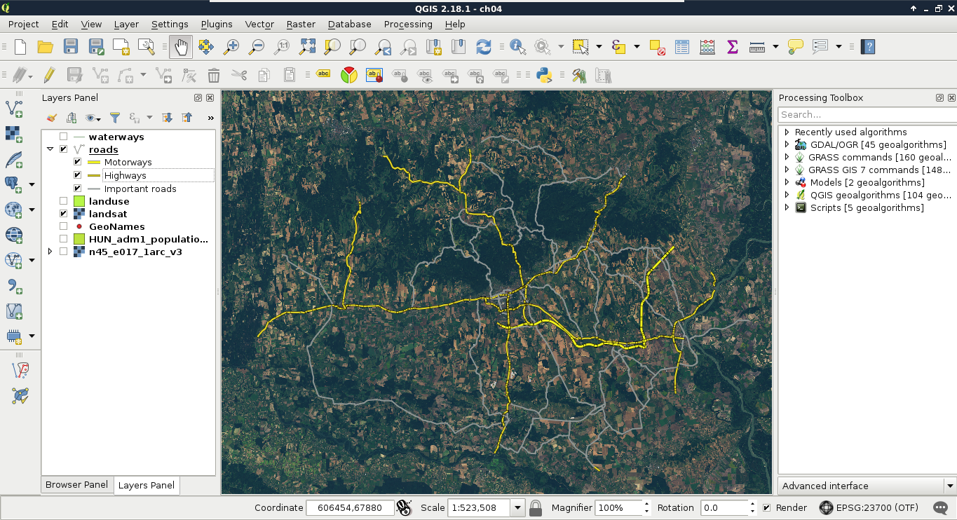
The only thing we lack is handling line connections properly. As we can see, our roads consist of several features. When those features connect, the ends of the lines are visible, and therefore, the whole image has a broken feeling. We can manipulate how those lines are rendered, though. As complex styles are rendered in different passes (layers), we can define their order. If we would like to create nice connections, we should render the black outlines first. As secondary roads are the least important, we should render them next. In the next pass, we should render highways, therefore, secondary roads connect into them directly, and only in the last pass we should render motorways. To define this order, we have to open the Symbol levels menu in our layer's Style tab. There, we just have to define the order with numbers. The higher the number, the later the style gets drawn.
If we create the ordering defined in this section, we get a more aesthetic result, as seen in the following screenshot:
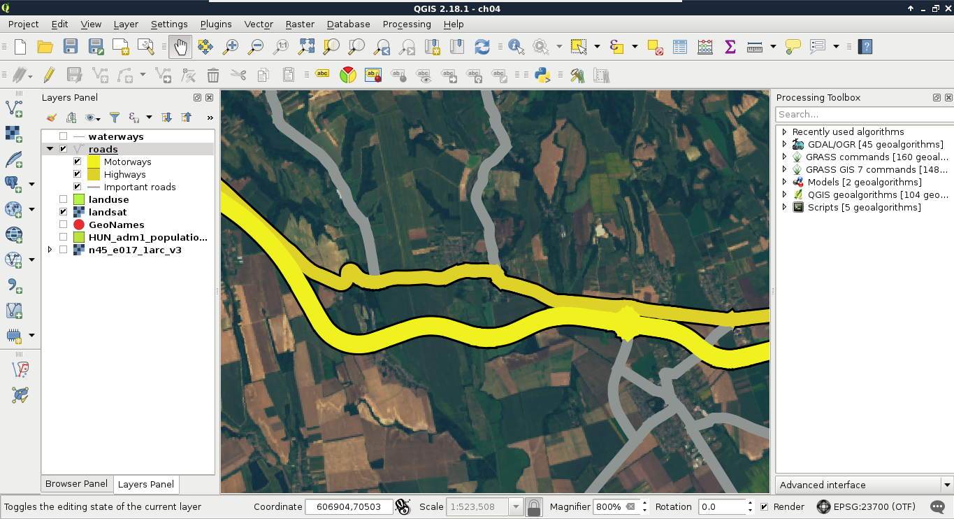
Now that we have some roads, we should also add some labels to them. Maps at this scale usually do not contain street names, but road numbers. For higher-degree roads, OpenStreetMaps delivers these road numbers in the ref column. First, let's create a simple labeling by opening the Labels tab in our layer's Properties. We can enable labeling by selecting the Show labels for this layer option, and choosing the ref column. If we apply this, we can see our road numbers on the canvas, however, it is far from an appealing map.
In the labeling window, we have a lot of options to customize our labels. Let's start with the Text tab. As the default text size is quite large, we can set our font size to 8 points. Also, change the color of the text to white, as it goes quite well with a colored background. The next tab we should see is the Background. Road labels are usually drawn in some kind of shield shape, like the tab's icon in QGIS. We can do that with a custom SVG icon, however, for the sake of simplicity, let's stick with a simple colored rectangle for now. We can enable backgrounds by checking in the Draw background box. Now we can customize the background with our preferred color or border style.
The next tab is an essential one for every labeling task--the Placement. In there, we can define if we would like to align our labels horizontally, parallel to the given feature, or curved along a line. If we choose Horizontal, we can only define a repeating interval. That is only important when our features are large enough. If we click on Apply, we can see our labels are much better, however, they are too dense for a nice map.
This phenomenon occurred as our roads consist of a lot of individual features, representing some segments. QGIS automatically labels these individual features; it does not matter if some of them form logically coherent units. There are two solutions to overcome this issue. The first one involves some fiddling, and does not guarantee correct results, while the second one is more exact, but we have to run a geoalgorithm to achieve it. Let's try out the fiddling one first. We have to open the Labels tab of our layer's Properties window, navigate to Rendering, and check in Merge connected lines to avoid duplicate labels. Now QGIS tries to merge connected features with the same attribute values in memory to avoid duplicate labels. If the labeling is still too dense, we can suppress labeling of features smaller than a specified value by filling in the corresponding field:
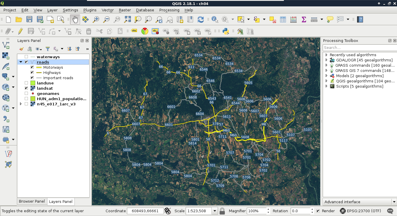
Although this method can help in creating correct labeling without the need of further geoprocessing, it did not work well in our case. The labels are still placed irregularly, some of them do not even appear.
The correct way to handle these cases is merging the lines in a way there will be only one feature for every unique value from the ref column. There is a tool for exactly this--dissolve. It needs an attribute to unify features with, and strives to merge connected features with the same attributes. If there are features which cannot be merged, it creates a multipart feature with the disconnected parts. We can dissolve our road layer in the following way:
After running the algorithm, we get a dissolved layer, which only has one feature for every road number. As the attributes which were the same for the new features are retained, we can style our new layer like our previous one. To make things even more simple, we can apply the same styling to our new roads layer in these two easy steps:
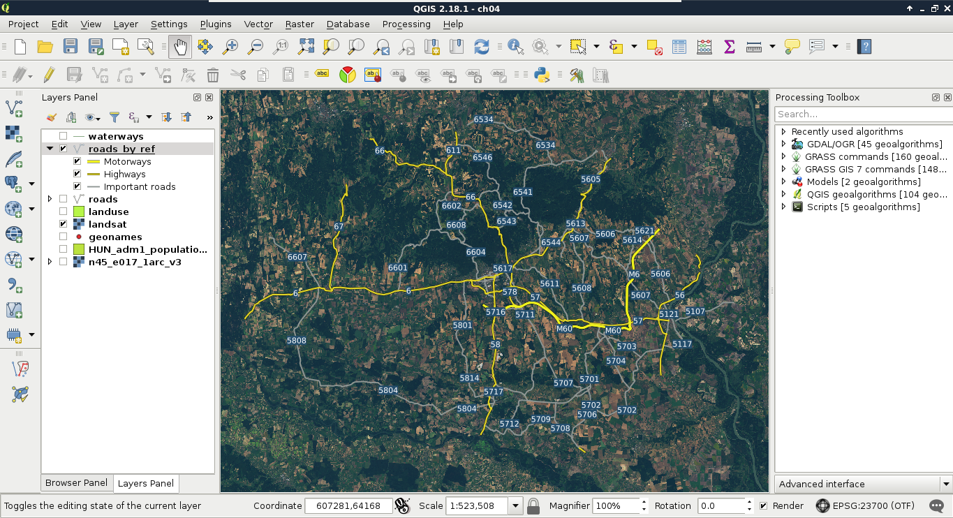
The only thing left is adding some town labels. We will use our GeoNames layer to visualize more important settlements as follows:
Now we can also see some of the settlements labeled on our map. If some of the labels got suppressed, we can modify the weights of the GeoNames and the roads layers in Labels | Rendering | Obstacles.
The core of a thematic map is surprisingly always its thematics. We can classify our maps based on the most important, most emphasized thematic (for example, we will end up with a road map), but it does not exclude adding more thematics for various cases. We can fill our map if it is too empty, or help the readers by adding more context. In this example, we replace our Landsat imagery by some thematics from the OpenStreetMap dataset. We will visualize land use types, rivers, and water bodies on our map. As we went through styling vector layers quite thoroughly before, we will only discuss the main guidelines to achieve nice results.
First of all, let's disable our Landsat layer, and enable the layers mentioned before. The first layer we will style is land use, as it will give the most context to the map. If we apply a categorized styling on that layer based on the fclass column, we can see similar results in the roads layer. There are many classes, most of them containing details, which are superfluous for this scale. To get rid of the unnecessary parts, and focus only on the important land use types, let's apply a rule-based styling:
As the default black outline would draw too much attention and distract readers, let's apply a 0 mm, No Pen outline style to every category. We can access the outline preferences by clicking on the Simple Fill child style element.
Now we will do a very cool thing. The water bodies layer not only stores lakes and other still water, but also larger rivers in a polygon format. We will not only show these lakes and rivers along with the linear river features, but also label them, making the labels run in the polygons of larger rivers. For this, let's place the river layer on top of the water bodies, and give them the same light blue color.
Next, navigate to the Labels tab of our rivers layer, and select Rule-based labeling. We apply only one rule, which only labels rivers, as we wouldn't like to load the map with labels of smaller waterways. We can build such an expression similarly to the other OSM layers as follows:
"fclass" = 'river'
In the Placement menu, we define the labels to run on a Curved path along the linear features. The only allowed position should be On line, therefore, we uncheck Above line after checking it in. Finally, in the Text menu, we specify the text color to be a darker shade of blue in order to make it go nicely with the rivers' color. I also specified another font, which enabled a Bold typeset.
As the linear features of the rivers run exactly in the middle of the outlines (in the streamline), our labels are run exactly in the middle of the polygons, along the streamlines, which looks really nice and professional:
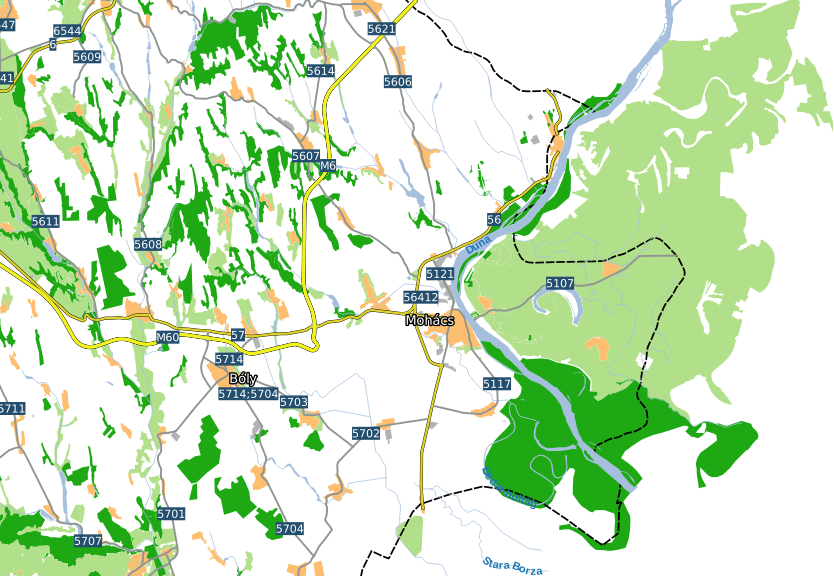
It's time to add one final piece to our map--topography. For this task, we will need our elevation layers. If we open them all at once, we can see that they have a little overlap, making some linear artifacts. To get rid of these disturbing lines, and to get a more manageable elevation layer at once, we first create a virtual raster from the elevation datasets. Similar to the Landsat imagery, we open Raster | Miscellaneous | Build Virtual Raster from the menu bar. We browse and select every SRTM raster, then select a destination file. We do not have to check anything else, as we would like to create a seamless mosaic from the input rasters, not store them in different bands. We just select a destination folder, and name our new layer. Don't forget to append the vrt extension manually to the file name.
The next step is to pull the new srtm layer strictly above the landuse layer. We are going to style it in a new way to show elevation with shading. Let's open its Style menu, and select the Hillshade option. It will create a shaded relief based on the provided altitude and azimuth values. Those values determine the Sun's location relative to the surface. The default values are generally good for a simple visualization. Finally, let's alter the Blending mode parameter. This parameter defines how our layer are blended with the layers underneath. If we choose Overlay, it blends the shading to the colored parts of our landuse layer, and leaves the white parts. We can also reduce the layer's transparency in the Transparency tab to make the colors less vibrant, and more like the original values:
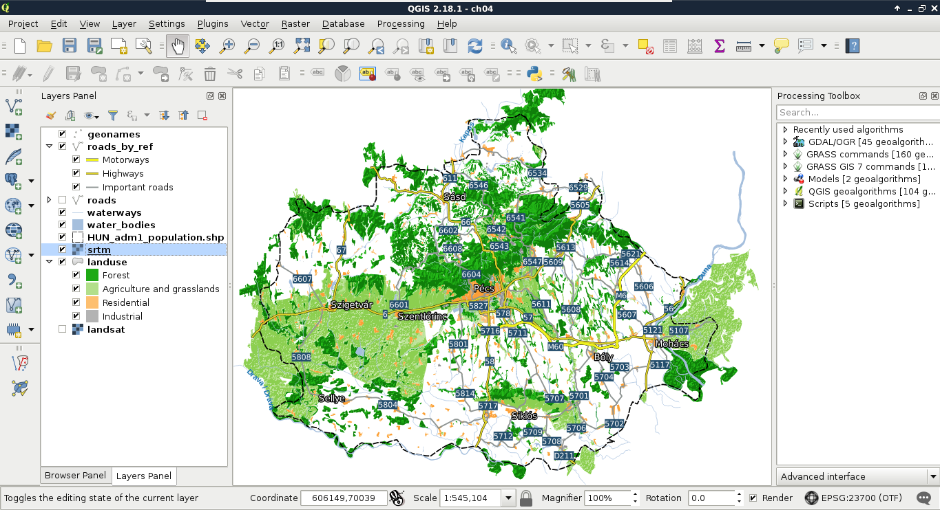
Splendid work! We managed to make the most important part of a real map--the content, or data frame. However, there are some more cartographic elements to add if we would like to call our composition a map instead of a spatial visualization. Some of the usual cartographic elements are the following:
Let's add some of these elements by using the Print Composer of QGIS. To open a new composer, we can use the New Print Composer button on the main toolbar. We can open as many composers as we want in QGIS. If we give them talkative names, it will be quite easy to navigate between them with the Composer Manager tool next to the New Print Composer button. Although the composer is opened in a separate window, we don't have to worry about losing the composition on closing QGIS. Composers are saved with the project.
In the composer window, we can access the layout properties of our map instantly. In the right panel, we can choose the paper size, and its orientation. On the left toolbar, we have access to the most important cartographic elements, which are added on demand as separate, configurable items. The first four tools are for item management. We can use the Select/Move item tool to move and resize items, and the Move item content tool to pan the map inside the data frame item. Under those tools, we can access the items which can be added.
First, let's add the dataframe to the map. To do this, click on the Add new map tool, and draw a rectangle on the canvas. Let's resize the map to match the paper's dimensions. Once an item is added, we can snap its borders to the borders of our canvas. Now we have access to the item's properties in the right panel. Under Item properties, we can see the parameters of our map content. The first thing to change is its scale. It has a different scale from the browser's canvas, as it is now calculated to match our paper's size. Let's modify it to a nice, round number. When we change the scale, QGIS automatically updates the map on our canvas. However, it does not render the map at panning or zooming unless we change the Cache property to Render. Changing it degrades performance, but updates the map at every change. When you've found the right scale to use, align the map on the canvas with the Move item content tool:
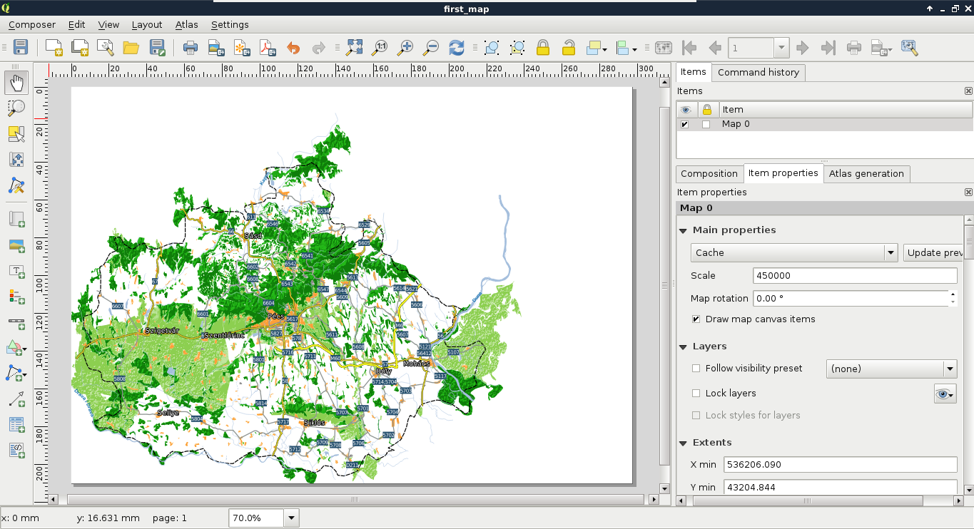
The next thing we add to the composition is a legend. We can create a legend by selecting the Add new legend tool, and drawing a rectangle on the canvas. As we can see, the legend is automatically created from the Layers Panel by default. As we have some layers which do not fit into the legend (for example, the srtm layer or the GeoNames layer), we can choose to manually customize the legend item. For this, we need to uncheck the Auto update box in the legend item's properties. Now we can delete superfluous entries by selecting them and clicking on the minus button. We can also rename the existing labels and groups, and change their order.
Let's get rid of the extra layers, and rename the rest of them to have more descriptive names. Also, there are two thematics (roads and land use) grouped, and two layers (waterways, administrative boundaries) ungrouped. To make the legend more consistent, let's create a custom group with the Add group button, name it as Other, and drag those entries into it. Finally, we should make the group fonts more consistent. The Other group has a different font, as it is a group, while the others are considered subgroups by QGIS.
To change this, you can right-click on the subgroups, and change their categorizations to group:
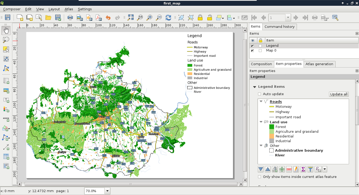
Next, we add some text content. Specifically, we add a title and proper attributions to the map. We can add custom text boxes with the Add new label button. Editing the label is not as interactive as in a vector editing software, but we can customize the label in its properties window in the right panel. The name of the layer should be concise, but descriptive. I used the name My first road map - a QGIS experiment. The attributions should go in a separate text box with a smaller font size. We should add the following four statements to the attributions:
Now let's add the final piece to our map--the scale and the scale bar. We can add them both with the Add new scalebar tool. It comes with a fixed size, which needs some tinkering to modify. The easiest way to reduce its size is to modify the number of units it shows under Segments | Fixed width. We can also choose between some templates in its Style menu.
The second scale bar should only contain the scale in a numeric form. To achieve this, we can choose the Numeric style:
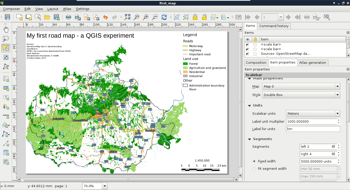
As a bonus task, let's add one final element to take up the empty space between the legend and the scale--an inset map. By adding additional data frames, we can focus on smaller areas in greater detail. Let's choose an area we would like to emphasize, and create a new data frame with the Add new map tool. If we resize it to fit the width of the legend and the scale bar, we end up with a large map and a small map showing exactly the same area. However, by using the Move item content tool, we can zoom and pan our new map to fit our needs.
QGIS offers a very handy tool for showing the extent of a data frame on another data frame. To access this property, let's select the large map's item, and navigate to Overviews. If we add an overview with the plus sign, and specify the reference to our second map in the Map frame property, we can see the extent of our inset map showing up on our main map. We can customize the look of this extent in the Frame style property:
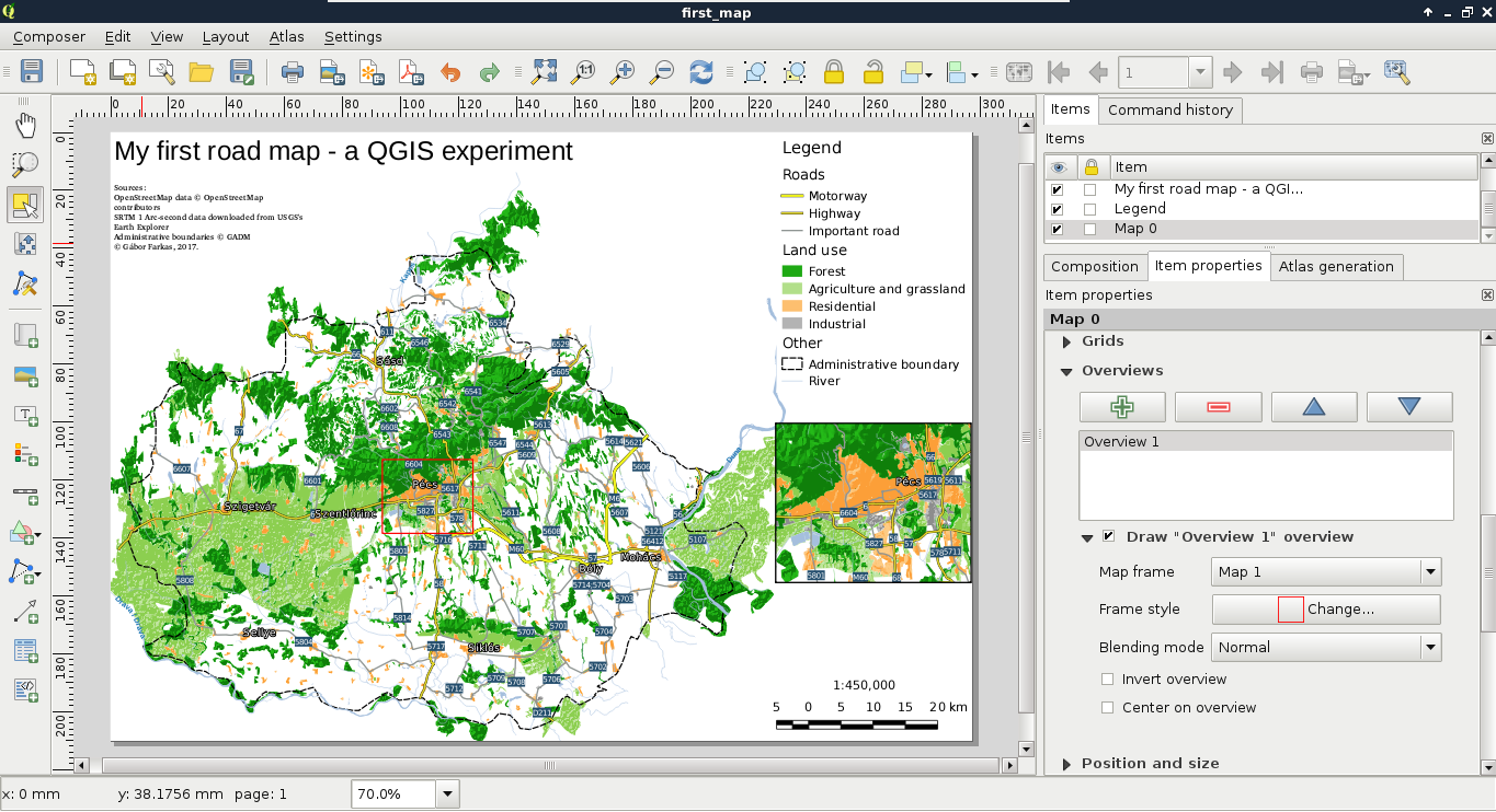
The only thing we did not add to our map is the north arrow, as our map is oriented towards North. Unfortunately, adding a north arrow is far from trivial in QGIS 2. The first step is to add an image with the Add image tool. Under the image item's properties, we can find the Search directories menu, which contains some of the default SVG images shipped with QGIS. Among them there are some north arrows. The only problem remaining if we have to add a north arrow is that our map is rotated. An image item, on the other hand, is not. To solve this problem, we can check the Sync with map checkbox in the Image rotation menu. If our map is not rotated by hand, but by the CRS used, we can use the True north option in North alignment (Appendix 1.2).
Congratulations! You have just created a nice map. Of course, it has some more or less obvious flaws, but I would have been very pleased if I could manage to create such a map back in my school days. Some of the flaws are more obvious, like polygons sticking out from the administrative boundary. Well of course, we can consider it artistic, but a proper map either clips its content to an irregular shape, or continues to show its thematic beyond it. We will fix that in the next chapter. Less obvious flaws are the occasional dangling lines disconnected from the visualized river and road networks, or the ill-placed labels, which would be quite hard to correct from QGIS. However, don't worry about these for now; just enjoy the feeling that you have just created a great map.
If you followed the entire chapter in one sitting, take a rest. That was a lot of knowledge compressed into a single chapter. Let it sink in. In the next chapter, we will dive into the flaws of our map, and try to correct some of them with QGIS if possible. We will learn about some of the possible export formats of digital maps, and their usefulness. Then we will learn about other spatial data exchange formats by exporting our layers, or just parts of them.
In the last chapter we learned how to utilize the representation model of GIS to create spatial visualizations and digital maps. Our final map is very nice, although it has some flaws remaining. In this chapter, we will fix some of the issues (for example, dangling lines, features sticking out of the study area) and learn how to export our map to two kinds of graphics--SVG (Scalable Vector Graphics) and image formats (for example, PNG). Then, we will go on to learn about different spatial data exchange formats. We will discuss their main properties and limitations to be able to choose the best for our project.
In this chapter we will cover the following topics:
As we saw in the previous chapter, even the simple task of making a map can involve some geoprocessing. Now we will dive further into using basic geoalgorithms to fix some of the more obvious flaws of our map before exporting it. The most basic geoalgorithms in GIS are buffer, clip, intersection, difference, union, and merge. Some experts also consider dissolve a basic geoalgorithm, although it involves merge and multipart conversion with some criteria. Now we will use clipping to get features only in our study area. Clipping is similar to extraction used in the previous chapter, although it not only selects features within a mask but also clips the features to its boundary. It's like placing a cookie-cutter shaped as our study area in our case and only keeping the parts underneath.
In order to clip our layers we need two things--an input layer, and a clip layer. The clip layer contains the cookie-cutter, while the input layer is clipped to the clip layer's shape. As we have a filter on our administrative boundaries layer, we have the perfect clip layer at hand. Any vector layer can act as an input layer, however we should only consider layers sticking out from our study area. For every input layer, we have to iterate the following steps one by one:
After running the algorithm, we get the clipped version of our input as a memory layer. This is the first format we discuss. It is a very important, very handy format for storing intermediate results. Memory layers differ from temporary layers, hence the latter are saved to a temporary folder as shapefiles and deleted once we restart our computer. Memory layers can be edited in place; we can do any modifications we see fit before saving the final results to the disk. There is only one thing we cannot do with memory layers--save them with our project. Once we close QGIS, the memory layers are gone for good, only their Layers Panel entries remain:
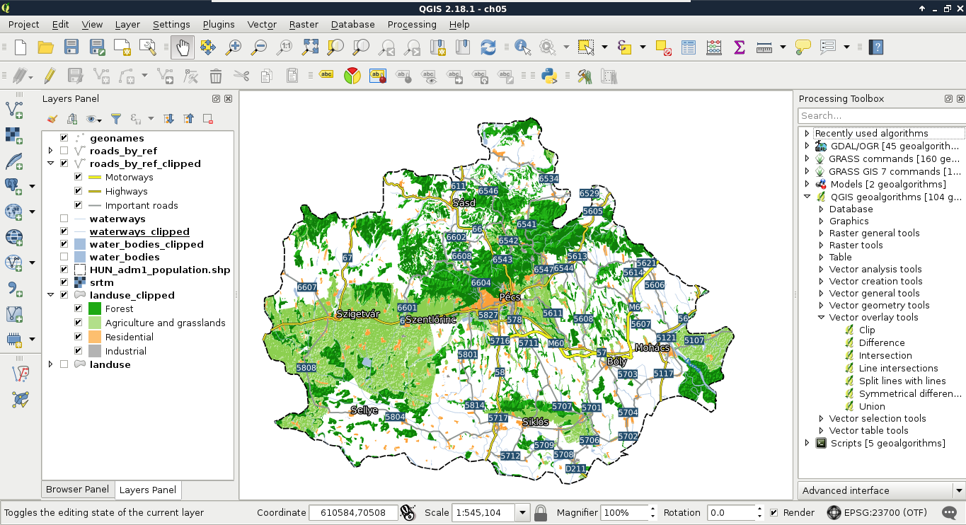
The next flaw we correct is much less obvious and could be argued to be an error. The background of our data frame is exactly the same as the rest of the paper. This can introduce some ambiguity, which we can resolve by changing the background in our study area to another color and creating an additional Other category for land use in our legend. The easiest way to do this would be adding a fill to the administrative boundary and pulling it down to the bottom of the layer list, therefore the rendering pipeline. The problem with this approach is our srtm layer gets blended into these new areas, creating a lot of noise. Fortunately, with some clever processing, we can create the negative of our land use layer using the following steps:
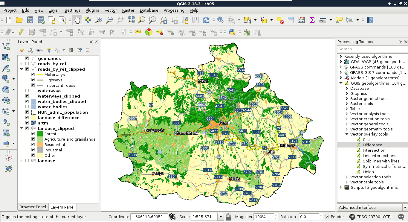
The Difference tool returns the difference between the geometries of the first layer and the second layer. It basically erases the second layer from the first layer and returns the results. Some of QGIS's geoalgorithms are error-prone and even can cause a crash. For example, the Difference tool crashed for me. If this happens, we can always choose GRASS GIS's equivalent algorithm. GRASS GIS is a professional, very stable, and quite fast software, although it has a quite steep learning curve and assumes its users are proficient GIS users with some programming knowledge.
We will discuss the peculiarities of GRASS GIS in a later chapter. For now, the required tool for achieving the same result is v.overlay, which can be accessed from GRASS (GIS 7) commands | Vector in the Processing Toolbox. This tool is a great example of GRASS GIS's philosophy. It requires two input layers (A and B), and we must be able to distinguish between them. The A layer is the input layer, while the B layer is the reference, or mask layer. Therefore, we need to specify our administrative boundaries layer for A and our land use layer for B. This tool groups some of the mostly identical basic geoalgorithms. The specified operator decides which algorithm it should run. The AND means clip, the OR means union, the NOT means difference, while the XOR means symmetrical difference (Appendix 1.3). After we define not as the operator, we only have to choose an output type, which cannot be a memory layer for any GRASS algorithm. We can either save the result to a temporary file or specify an output. As the two approaches are almost the same (disk usage occurs in both cases), specifying the output is recommended as we can restore it later from the saved project.
One of the perks of using memory layers is we can edit the features before saving them to disk. We can delete disconnected lines or add missing ones. This is a task which can be hardly automated. With sophisticated algorithms we could treat the road layer as a network and find disconnected parts automatically. However, it is a quite cumbersome approach in QGIS, while manual editing is feasible for such a low amount of features. Furthermore, in the rivers layer, it is far from trivial which parts belong to the main network as we would need the whole waterways layer for network analysis. If we select every feature shorter than an arbitrary threshold and delete them with the Delete Selected tool, we can easily remove connected but short segments.
We can also add some new features. For example, the Geofabrik extract does not contain water transports. If we have a ferry connecting important roads, we can add that feature manually and modify the road layer's style to show the new class:
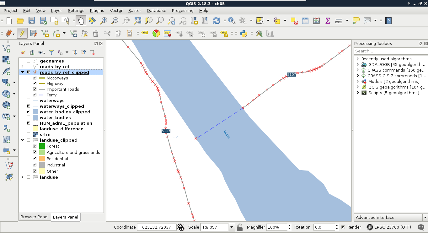
Now that we have included the modifications our map needs, we can export our map from the print composer. As we have a composer in our project, we can access it with the Composer Manager tool from the main toolbar. If the maps do not show anything, we can select their respective items and click on Update preview. The only thing we have to modify is the legend. The bad news is we need QGIS to recreate the whole legend with the legend item's Update all button and modify the result. Fortunately, this is quite an easy task:
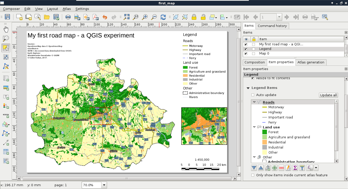
If the result looks good enough in its current form, we can export it directly to an image or PDF format. We can access the tools Export as image and Export as PDF from the main toolbar of the print composer.
After creating the best visualization possible in QGIS, we might still need some changes to be made. This process is called post-processing and can be done in various ways. We can edit the map in an image editor, or we can export the map in SVG format and edit it with a vector editor. With Scalable Vector Graphics, we can drop georeferencing but still keep our vectors using screen coordinates. Let's do that by exporting the map with the Export as SVG tool. On selecting the destination of our SVG file, a dialog pops up offering some options. We should check the Render map labels as outlines checkbox. This way, we can move labels easily.
If you open the result in a vector editor (such as Adobe Illustrator or Inkscape), you will realize that the blending options are gone. The SVG format does not support storing blending modes and every software uses its own mechanics for this. As QGIS exports different layers to different SVG layers, we can access the srtm layer (we have to fiddle a little bit to find it) and apply a blending mode available in the software. SVG export can create some artifacts (unwanted or erroneous rendering), but they can be handled by masking out the unwanted parts:
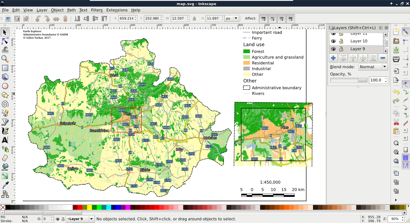
Being able to create digital maps from data is a useful skill, although in most of the time, we are using spatial data exchange formats to save our raw data. We are using these formats to save our edits, export a subset of our database to use it locally, or share our data with others. There are a vast amount of different spatial formats, and all of them has their peculiarities, their most appropriate use cases. We should be able to choose the most appropriate format for our case.
There are a wide variety of vector formats with quite distinct purposes. Some of the vector formats are created to fully support the specialities of the host software while others are more general ones. A unique property of vector GIS formats is that there isn't an all-purpose, all-in-one format. There are two main types of formats--binary and ASCII (text-based). Binary formats are more concise; however, they require parsing algorithms with binary magic directly developed to support them.
ASCII formats, on the other hand, are human-readable and some of them (like JSON and XML) are natively supported by several high-level programming languages (especially, fourth-generation languages). Others can be interpreted by easily implementable string manipulation techniques.
We can export layers from QGIS by right-clicking on their items in the Layers Panel and selecting Save As. In the dialog, we can not only specify the new file's destination, name, and format, but we can also save only selected features (if there are any) by checking the Save only selected features checkbox. If we would like to exclude one or more of the attribute columns, we can expand the menu Select fields to export and their export options and specify the columns that we would like to export. Finally, we can also specify a very important property of the vector layer--its CRS. If we select a CRS different from our layer's, QGIS automatically transforms our features to the selected destination CRS.
Shapefile is one of the oldest vector formats around. It is a general binary format supporting simple features (points, lines, polygons, and their multipart counterparts) and their attributes. It is widely supported by GIS software. The format was initially created for ArcView 2 and later open sourced by Esri. If we need a format which is most likely supported by the destination software, Shapefile is a safe choice. Shapefiles can only store one layer and every layer stored as a Shapefile usually consists of four different files. The shp file (which we browse if we manually open a Shapefile in QGIS) stores the geometry data in a binary format, the prj file stores the projection of the layer, the shx file stores indexing information for faster lookups, while the dbf file stores the attribute table of the layer in a relational style.
Since Shapefile is a 25-year-old format, it has more limitations than advantages. It cannot store topology, and neither the geometry file nor the attribute file can exceed 2 GB of physical size. These are the kinds of limitation we could live with, as the format is fast and widely supported. However, the biggest limitations come from the database format it uses in the dbf file--dBASE. There are numerous limitations of the old dBASE format, including a maximum field name (column) length of 10 characters, only three supported attribute types (integer, floating point, and text), and supporting only 255 fields per layer.
As the Shapefile format has numerous limitations, discussion about a competent alternative is a trending topic among GIS users and developers. Currently, there are some competitors taking the historical place of shapefiles, although there isn't a single all-purpose widely supported format yet. They are all capable of storing multiple layers in a single structure and do not have practical size limitations (140 TB for GeoPackage), neither in geometries, or in attributes. The portable SQLite database can store multiple vector layers in a single file, which can be accessed by SQLite and its spatial extension--SpatiaLite. It does not support topology, raster storage is not straightforward, and it is more of a general-purpose self-contained DBMS than a spatial format. The File Geodatabase by Esri is well-tailored to the ArcGIS data structure and can hold vectors, rasters, other type of layers (like topology layer) and even scripts in a single structure. However, it is not an open standard and has a limited, read-only compatibility with GDAL and, therefore, with QGIS. There is also a new standard with vector and raster support built on top of the SQLite format--the GeoPackage. It might become the general open source format of the future, although it still misses topology support and as it is a 2016 standard, it is not widely supported by GIS software. GDAL can read and write it, so you can try it out in QGIS.
WKT is short for Well-Known Text, while WKB is the abbreviation of Well-Known Binary. They are the ASCII and binary representations of the same format, mainly used by spatial extensions of (O)RDBMS software (such as PostGIS). They support 2D geometries and introduce some special types besides the simple ones (for example, curve, TIN, surface, and others). We can come across WKT representations of geometries mainly in official PostGIS and QGIS examples, as both like to use it. A WKT representation of a point looks like the following:
POINT (17.80554 46.04865)
The format is rarely used with files (it cannot even represent attributes), however, it is a very common format to communicate geometries to SQL-based software. There are extended versions of these formats called EWKT and EWKB, which were created by the team behind PostGIS, and are mainly used in it. It extends WKT and WKB by standardizing geometries in higher dimensions (up to four).
There are three notable spatial markup languages which use the XML (Extensible Markup Language) specification--GML (Geographic Markup Language), KML (Keyhole Markup Language), and OSM XML. All of them are XML-based formats, therefore, they are very verbose but also well-structured. Let's export our filtered GeoNames layer to GML and KML as discussed in the beginning of the chapter.
If we open the exported files with a text or code editor, we can see that they are structured according to the XML specification. There are tags enclosing geometries, properties, and other information. The main difference between the two files is the type handling. In the KML file, the type of every column is defined near the end of the file, while we cannot see any type definitions in the GML file. As the KML specification was popularized by Google to offer a data exchange format for Google Maps and Google Earth, those files are self-containing.
That is, all information is stored in a single file, which can be parsed by the desktop application Google Earth and the web application Google Maps in the same way:
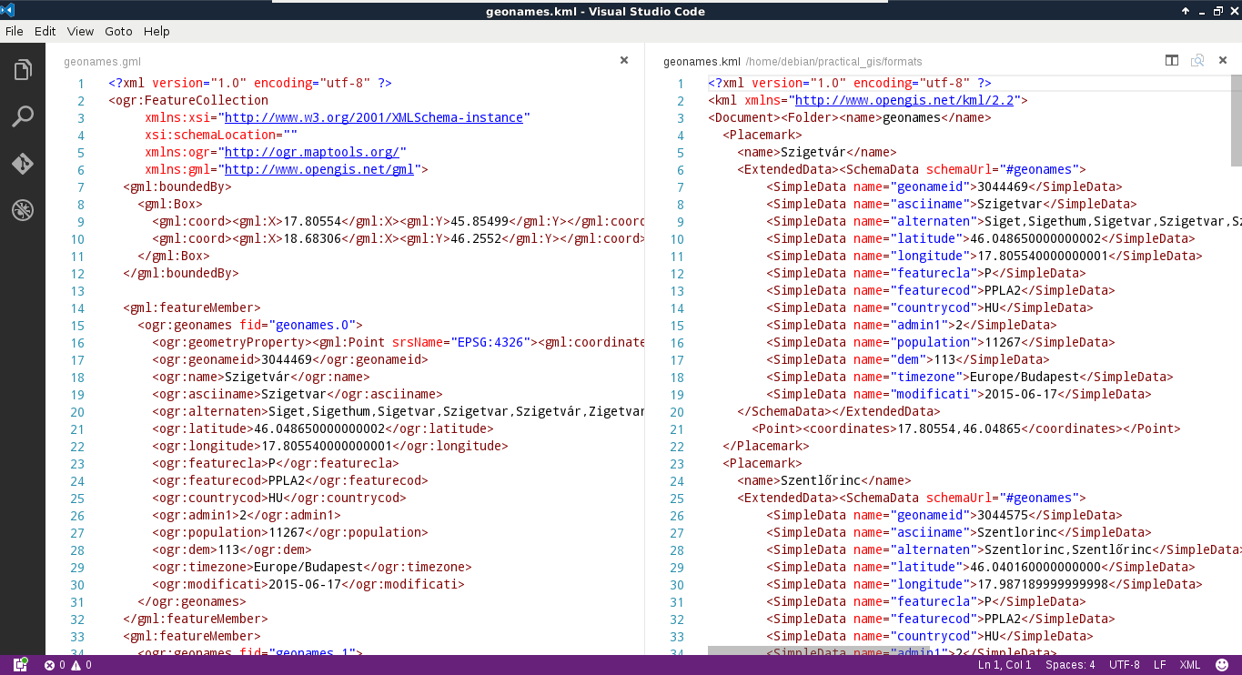
GML, on the other hand, was created to support web applications. Therefore, the intended (and most common) usage is via a server application (like MapServer or GeoServer) providing an XSD schema additionally linked in the GML response. The XSD schema contains metadata, like the bounding box of the layer, its projection, and the types of the columns. As we are now working in a sole desktop environment, we don't have such a server creating a schema for the exported layer. To overcome this issue, GDAL creates a gfs file containing this information.
The last one is a very unique format in multiple aspects. First of all, QGIS cannot write into OSM XML as it is used to export and hold a smaller amount of data from the OpenStreetMap database. We can get data in such a format directly from OpenStreetMap by zooming in on a sufficiently small area and using its Export tool. On the other hand, QGIS can read OSM XML, although the workflow is far from trivial. If we have an osm file, we can use the Vector | OpenStreetMap | Import Topology from XML tool to build an SQLite container from the OSM data. Next, we have to use the Vector | OpenStreetMap | Export Topology to SpatiaLite tool to build accessible layers from the OSM data in the SQLite container. We can only access the layers after the second step if we exported the data correctly.
We have to walk through this cumbersome workflow every time we process an OSM XML file due to its other peculiarity--OSM XML is the only markup language that stores topology. It reflects and inherits the OSM data model; it is fully topological. In the OSM database, every point is a node, lines and polygons (ways) consist of nodes, while other objects (relations) consist of ways and nodes (for example, multipart geometries). As a result, every vertex is only stored once, while every other occurrence refers to it. As OSM XML inherits this topological vector model, we have to build the topology in the first step in an SQLite container, while we also have to build layers with geometries accessible by QGIS in the second step:
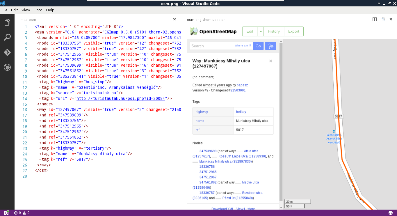
The last format that we'll now discuss is the GIS data exchange standard built upon the famous JavaScript exchange format--JSON (JavaScript Object Notation). GeoJSON is a very permissive format inheriting the object-oriented nature of JavaScript. Type and shape consistency is not required in the format; we can have as many attribute types in a column and as many geometry types in a layer as we want. By definition, the permitted types are integer, floating-point number, text, boolean, null, array, and object. The permitted geometry types are point, line, polygon, and their multipart versions. Let's export our filtered GeoNames layer to GeoJSON.
As we can see, the result is much more concise than the markup languages but we can still interpret the features as GeoJSON is also an ASCII format. It is mainly used by web applications to visualize static vector data. It is favored for its small size and, therefore, the smaller traffic it generates on being read by the client application.
Similar to vector data exchange formats, there are a lot of raster formats out there. There are formats storing rasters in binary form and in ASCII form. We can even save rasters like vectors in QGIS with the Save As tool accessed from the raster layer's context menu in the Layers Panel. If we see the save dialog with the srtm layer, it is slightly different from the vector version reflecting the specialities of the raster data model. We can set a CRS and ask QGIS to transform the raster to another CRS (it is called raster warping). We can also set the extent and the resolutions in both dimensions manually. There are some other options too; however, they are GeoTIFF-specific. What is very unusual, though, is that we can hardly access any format other than GeoTIFF from this menu.
Unlike vector data exchange formats, we have a general, all-purpose, widely supported raster format--GeoTIFF. Due to the existence and popularity of the highly capable TIFF specification for storing lossless image data, it was extended to store spatial data along their metadata (for example, projection and georeferencing). There are only two drawbacks of this format--its size and the web. As it only supports a few compressing methods, its lossy JPEG compression cannot race, for example, with the JPEG2000 standard if data loss is acceptable. Furthermore, web browsers cannot handle TIFF files; therefore, rasters have to be converted to regular images before using them in a web client application.
GeoTIFF offers a lot of options to work with. It can create internal pyramids for various resolutions for faster visualization. It can also utilize internal tiling to speed up processing when the raster is very large. It can even compress data with various algorithms. There are some lossless options like LZW or deflate (ZIP), and there is the lossy JPEG compression for a significantly smaller file size.
Until now, we only used vector processing, so let's see how raster processing is different in QGIS. Let's clip the SRTM raster to our study area. We can do it by following these easy steps:
Did the algorithm finish successfully? If it did, you can see the clipped layer on the map canvas. If not, don't worry, it didn't work for me either. Before fixing the issue, let's see how QGIS uses the raster processing tools. Unlike vector processing tools, QGIS has only a few of its own raster tools. It uses external tools to achieve raster processing, usually, via command line or Python. The tool we opened is a clever wrapper around GDAL's warp tool, whose main purpose is warping rasters between CRSs. But it can also clip the input raster in the process. We can even see the command that QGIS uses at the bottom of the window:
gdalwarp -q -cutline "/home/debian/practical_gis/processed
/admin_boundaries/HUN_adm1_population.shp|layerid=0|subset="NAME_1" =
'Baranya'" -tr 0.000277777777778 0.000277777777778 -of GTiff
/home/debian/practical_gis/processed/srtm/srtm.vrt /home/debian
/practical_gis/processed/srtm/srtm_clipped.tif
This architecture implies a very important specificity of raster processing in QGIS. We must have a physical copy of the data we use. In raster processing, memory layers are obsolete--we cannot even select them as mask layers in the Clipper tool.
The problem with our approach was the filter on our administrative boundary layer. QGIS couldn't manage to include the filter properly in the command-line call it created. To solve the issue, the easiest way is to export our administrative boundary layer. As we applied a filter, only one polygon gets exported. After the export, we can specify the new layer as mask and run the algorithm again:
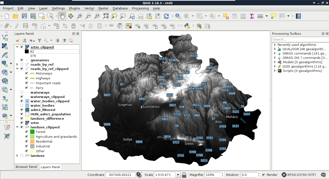
The other, slightly more advanced solution is to consult the documentation of GDAL's warp tool at http://www.gdal.org/gdalwarp.html and modify the call manually with the pencil-shaped Edit button. In the documentation, you will see that a filter on the cutting shape can be applied with the -cwhere parameter and a basic, regular SQL expression. Therefore, the same call should look like the following:
gdalwarp -q -cutline "/home/debian/practical_gis/processed
/admin_boundaries/HUN_adm1_population.shp" -cwhere "NAME_1 =
'Baranya'" -tr 0.000277777777778 0.000277777777778 -of GTiff
/home/debian/practical_gis/processed/srtm/srtm.vrt /home/debian
/practical_gis/processed/srtm/srtm_clipped.tif
We could see when we chose our destination folder that there are a lot more raster formats which QGIS can export to via GDAL and other tools. Most of the time, GeoTIFF is sufficient as it can use various compression methods, handle big rasters with the internal BigTIFF format, and use various data types. There are some cases, on the other hand, when GeoTIFF is not an appropriate data exchange format. For example, when I tried to export raster data from IDRISI 7 in GeoTIFF, QGIS could not handle the output. There might have been a problem with IDRISI's GeoTIFF implementation or a bug in QGIS's (GDAL's) GeoTIFF parser--it didn't really matter. GeoTIFF wasn't the appropriate data exchange format for that case and I had to find another one.
From the vast number of raster formats, some of the more widely supported ones are ERDAS's img format and Esri's various binary and ASCII data grid formats. These formats can include some auxiliary files besides the main data file for metadata. For example, the SRTM data we downloaded are in bil files, which is a binary raster format mainly used to store satellite imagery. It is categorized under the ESRI .hdr Labelled group in QGIS, as it comes with an ASCII header file containing some general information about the raster (for example, it uses the BIL format).
In this chapter, we learned about the most popular spatial data exchange formats for both vector and raster data. We learned not only their specialities but also how QGIS can create them. We also know now how to export our digital maps both as a regular image and in SVG for post-processing. Finally, we learned how to shrink our data or enhance our map by reducing the layers to only cover the relevant parts.
In the next chapter, we will look into the definition and types of databases and how spatial databases compare to them. We will discuss the possibilities of building our spatial data structure and build our very own database with PostGIS and QGIS. Additionally, we will see how QGIS communicates with PostGIS and how we can build basic PostGIS queries.
In the previous chapter, we learned about data exchange formats, which can be used to store our layers on our hard drive persistently in some files. Data exchange formats have the clear advantage of portability; however, we end up with files representing layers scattered through various folders. This isn't a problem when we have only a few layers or a well-designed folder structure, but it is not feasible for larger amounts of data. There is a solution for storing larger amounts of structured data in one easily accessible place--build a database. In this chapter, we will learn about databases in general, spatial databases, and how we can create a PostGIS database from QGIS easily.
We will cover the following topics in this chapter:
Let's start with a very brief introduction of databases. You might have more than enough knowledge about databases; if that is the case, you can safely skip to spatial databases. First of all, what is a database? A database is a collection of structured or semi-structured data, which can be, at least, updated and queried by the Database Management System (DBMS) or the library using it. Besides its very trivial benefit of storing a lot of data in the same place, the wrapper system usually offers methods for not only retrieving but also aggregating, filtering, or joining data. Furthermore, most of the DBMS and libraries are very well-optimized for their use cases, and therefore, offer faster solutions than working with traditional files and system calls.
The first and oldest database types are relational databases. They hold data in a well-structured form in tables. Tables consist of rows and columns. A column represents a single attribute of the data, which is stored as a specific data type. Rows represent a single data record, such as a customer’s contact details, or a vector feature. Relational databases are very often transactional databases (I could only name MySQL versions released before 2010 which are not transactional). The philosophy behind transactional databases can be expressed with the anagram ACID (Atomicity, Consistency, Isolation, Durability). These are the four very important properties that relational databases offer. These properties can be explained as follows:
As relational databases are basically a collections of tables (concerning only the stored data), this model highly resembles the vector data model. That is, vector data can be stored in relational databases quite painlessly, while storing and using raster data efficiently is more complicated. Although following the ACID principles makes relational databases very reliable for using both on personal computers and servers, their architecture makes them hardly scalable (for example, they are not the best choice for big data or very complex analysis). Furthermore, creating a good relational database requires some designing and considerations.
Relational databases are especially vulnerable to redundancy. Redundancy is not always a bad thing, for example, servers rely heavily on it to store data safely and to restore it entirely in case of a disk failure. However, redundancy can be harmful in a database. If we store the same columns in multiple tables, we can speed up queries, although we use up a lot more physical space and also make the database more vulnerable to corruption (for example, if we modify only one or a few occurrences of a redundant value). However, eliminating redundancy is not the best idea for every scenario. We can end up with a lot of tables storing only little chunks of information that we have to manage. It is a sensitive and, in most cases, subjective task to find the best normalization level (normal form) for the given relational database.
The vague termed NoSQL (not only SQL) database groups object-oriented databases. There is a very wide palette of different architectures (like document stores, column stores, graph databases, and so on). However, they have at least one common point--they store data as structured but not necessarily consistent objects. They are often not ACID-compliant, although they also offer reliability and stability in their own ways. As they store objects (not tables), stored data don't have to be consistent while redundancy is not a great issue.
NoSQL databases are generally used for different purposes than relational databases; therefore, a direct comparison is impractical. In general, object-oriented databases offer better scalability so they are almost exclusively chosen for big data over relational databases. They often use query languages other than SQL but it is also common to use APIs and function calls for querying and processing data. Finally, a lot of NoSQL DBMSs are vertically extendable, which means we can cluster them effortlessly and extend the servers they can use by putting more machines into the rack, giving them more resources.
Based on the previous statements, NoSQL databases are superior to relational databases in almost every aspect. So why should we even consider using relational databases? Well, NoSQL databases have several drawbacks--they are very difficult to set up, configure, and fill with data. Furthermore, it is harder to enforce data integrity, and the lack of transactional support in some NoSQL DBMSs make concurrent editing harder. With smaller datasets (that is, a few GBs), NoSQL databases give only a negligible performance boost. Thus, if relational databases can give a good fit for our data, setting up a NoSQL database is just not worth the time and effort.
What makes a database spatial? The answer shouldn't be searched for in the database but in the host DBMS. Spatial database management systems have some kind of spatial vision. They recognize spatial data and can offer some kind of dedicated functionality involving them. They have some exclusive validation methods for spatial data. Spatial functionality can be implemented at so many levels. Some of the spatial modules in DBMSs can only recognize points, lines, and polygons, while others offer full-scale GIS functionality even for raster data.
From the relational family, the two de facto standards in the open source segment are PostGIS and SpatiaLite. SpatiaLite is built upon SQLite, which is container-based, offering portable, single-file databases. It does not offer a full DBMS with some kind of interface; it is API-based. That is, it offers a lightweight library written in multiple languages to communicate with SQLite containers. It is a lightweight but robust way to have relational databases in any software. In the end, it is left to the software to use this library or not.
The other relational DBMS is PostGIS built on top of the PostgreSQL DBMS. PostgreSQL is an ORDBMS (Object Relational Database Management System), which means it can output objects instead of the traditional tabular format. This property makes it very convenient to create extensions for it. One of the many extensions that PostgreSQL has is PostGIS, which is not only a spatial index and some vector geometry types built on top of a DBMS, but a full-scale headless GIS. PostGIS is the most complete spatial database system up to date and as it is directly on top of the underlying database, its performance is a great argument in its favor.
If we have additional criteria, like strongly inconsistent data or big data, NoSQL spatial databases can come to the rescue. A lot of NoSQL DBMSs have spatial capabilities, although in most cases, they are only minimal vector-type support and spatial indexing. These specify the main spatial functionalities of NoSQL databases--using spatial data types and offering spatial queries. Some examples of spatially-enabled NoSQL DBMSs are the following:
PostGIS has a very big benefit over other DBMSs--QGIS can communicate with it very well. The same applies for SQLite containers and the GeoPackage format, but PostGIS offers the best capabilities as it can be deployed as a server and accessed from multiple clients even concurrently. For accessing a PostGIS database from QGIS, first we need to connect to it. Remember the database we created in Chapter 1, Setting Up Your Environment? We will use the data provided there to define and save a connection in QGIS:
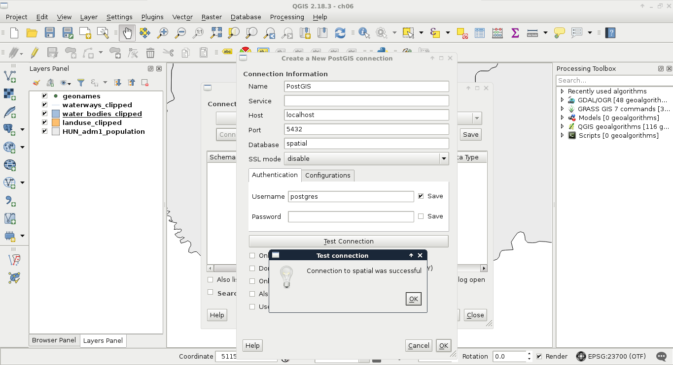
Now that we have defined a connection, we can use QGIS's database manager. We can access it from Database | DB Manager | DB Manager in the menu bar. There we can click on PostGIS and select the name of the connection we defined. We can see that we have a simple PostgreSQL database as we did not enable the PostGIS spatial extension yet. We have some permissions, though, which is nice as we can enable PostGIS directly from QGIS. To do this, we have to click on the SQL window button and type the following expression in the dialog:
CREATE EXTENSION postgis;
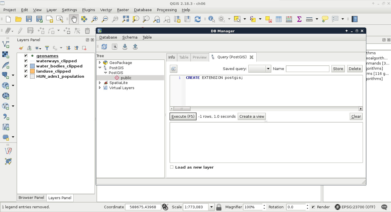
After executing and refreshing the connection (right-click on the connection's name and click on Re-connect), we can see some views and table created by the PostGIS extension. If we open the table spatial_ref_sys in QGIS and browse its content, we can take a glance at the CRSs PostGIS support (Appendix 1.4). Now our database is spatially enabled and we can start importing layers into it.
First of all, let's load the two layers saved on the disk--the GeoNames and the administrative boundaries layers. We can import layers with the Import layer/file button accessed from QGIS's database manager. QGIS automatically converts the specified layer to a PostGIS table by providing the required properties. We can import virtually any vector layer with the following steps:
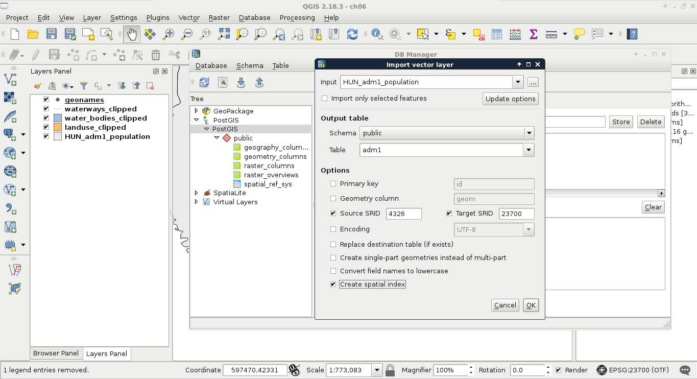
If we reconnect to the database, we can see the two imported tables. We can inspect them by clicking on them and navigating to the Table and Preview tabs. If we inspect the values stored in the tables, we can conclude that every value is loaded successfully. We have null values, integers, floating point values, and strings. The only problem is that we cannot define which columns we would like to import. If we delete the columns within QGIS, we would lose them also on the disk. Luckily, we can run the SQL queries within QGIS's database manager and drop the excessive columns manually:
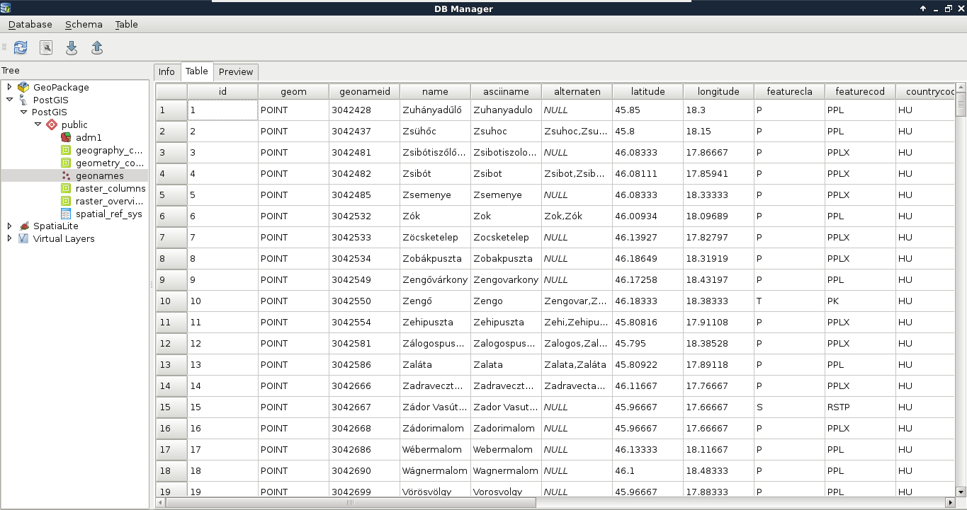
        ALTER TABLE tablename DROP COLUMN column1,
         DROP COLUMN column2, etc.;
Therefore, to drop the id_1, name_0 and iso columns of the adm1 layer, we can run the following expression:
        ALTER TABLE adm1 DROP COLUMN id_1, DROP COLUMN name_0,
         DROP COLUMN iso;
We had an easy task importing two basic layers into PostGIS--one with point geometries and one with polygon geometries. What happens when we have layers with mixed geometry types? Of course, mixing points, lines, and polygons are strongly discouraged, but mixing single and multipart geometries of the same type is a common thing. The only problem is that PostGIS doesn't allow us to do so.
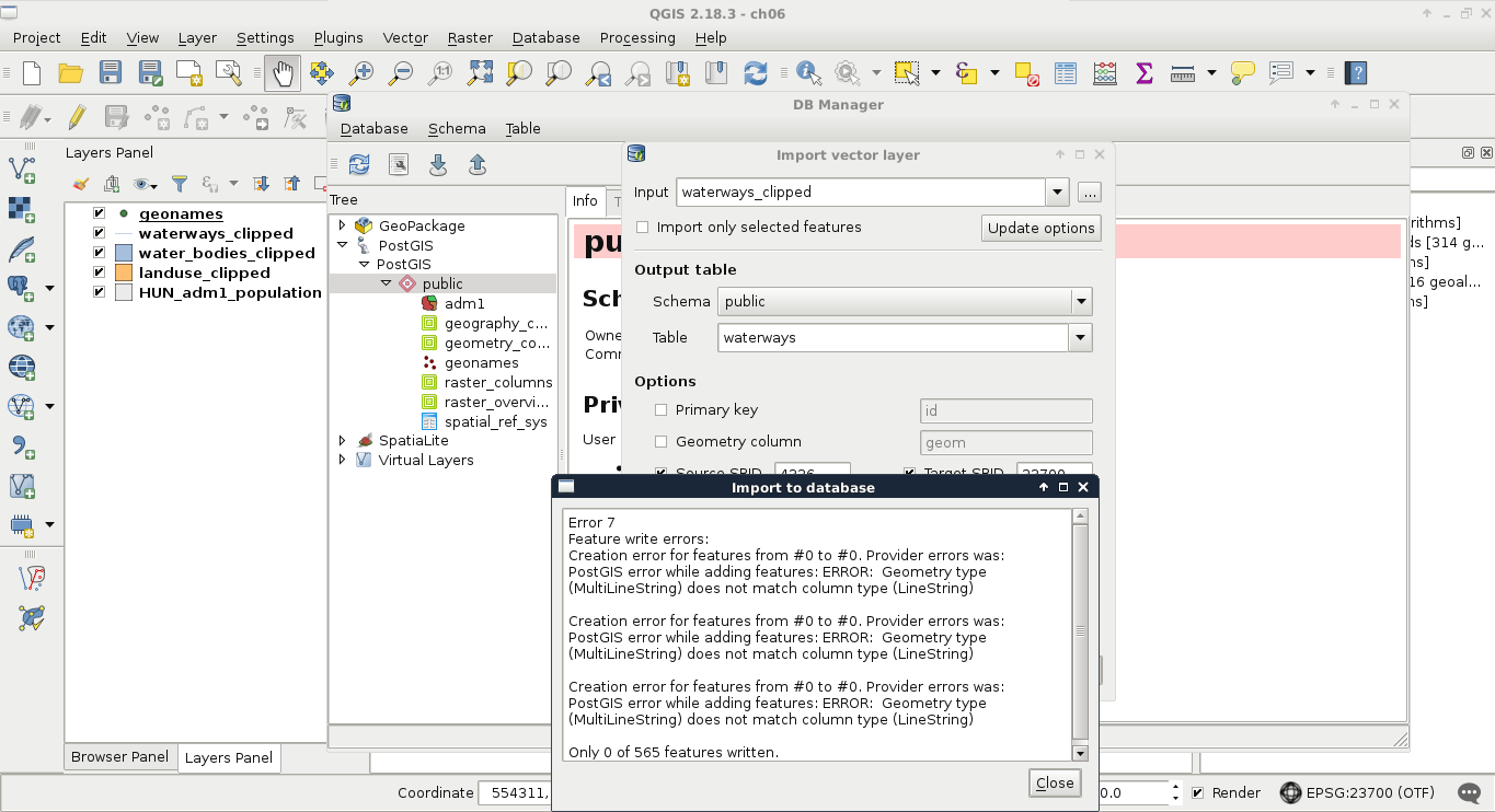
No matter how we try to import, if we have mixed geometry types, we end up with an error. Our layer has line string and multipart line string geometries mixed, while PostGIS only accepts one of them. The solution is simple though. We either have to explode multipart geometries or convert single geometries to multipart ones based on an attribute. Although we would get a little more optimal result if we stick with the lowest common denominator (in this case, multipart geometries), QGIS does a poor job in doing it. To convert our features to multipart geometries, we would need a column with duplicated values, therefore, we would lose data. As this is not an ideal solution, we have to convert our layer to single-part geometries, duplicating some of the data.
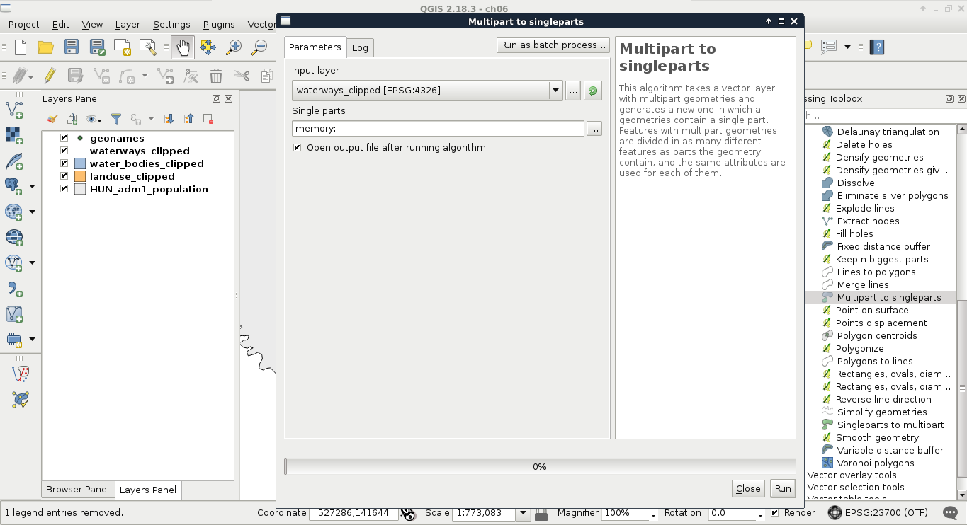
Now we can upload the resulting layer to PostGIS with the previous steps. If we put these steps and considerations together, we end up with this workflow to import every layer we need into PostGIS:
We will need the following layers added to the PostGIS database:
Now that we have a bunch of layers we did not clip or alter too much to import, we need an effective way to process them. First of all, we need to decide if we would like to add them to the canvas before processing. If we do so, we can spare the overhead time of reading in the layers and furthermore, build spatial indexes on them to speed up the clipping process. We can also leave them on disk and spare some clicks. Either way, let's apply the usual filter on our administrative boundaries layer and open the Clip tool from QGIS geoalgorithms | Vector overlay tools.
In the clipping tool, we can access batch processing by clicking on the Run as batch process button. There we can create as many rows as we need for processing each layer with minimal hassle. Now we face another dilemma. We can save every result as a memory layer, although we cannot name them. Therefore, we need to distinguish between the results manually. Fortunately, it isn't that hard in our case as we have one polygon layer, two line layers with very different densities, and two point layers:
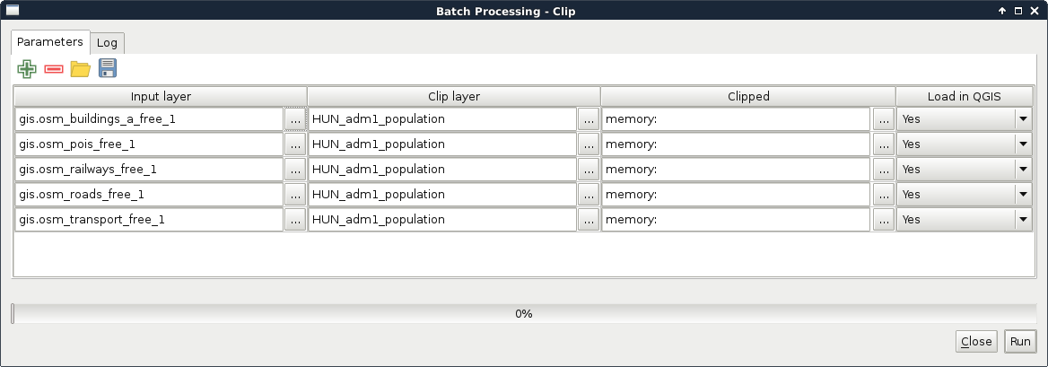
To distinguish between the two point layers, we can toggle the visibility of the original layers and the clipped layers and compare them visually. After guessing the names of the layers correctly, we can proceed and load them into PostGIS following the previous steps:
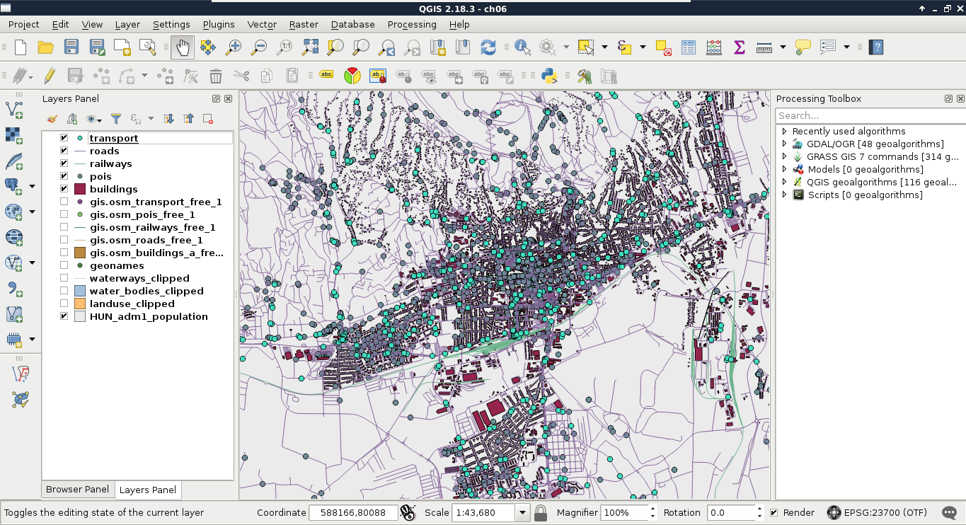
We used spatial indexing several times but we have still not discussed what is it. If you know about programming, you already have an idea about indexing. If not, it is like creating shortcuts to referred items. For example, we can index a column by creating an associative array (object if you like) and storing distinct values as keys and features having them as values. This way, we reduce the time complexity of a single selection from O(n) to O(1).
Spatial indexing is based on the same principle--we index geometries to reduce the time complexity of spatial algorithms. However, indexing geometries, even represented in a binary format, is unfeasible in almost every possible way. Hence, we usually use bounding boxes to index geometries. These structures are collectively called Bounding Volume Hierarchies (BVH), among which the R-tree is the most popular one. Both QGIS and PostGIS use R-Trees to index geometries. The R-tree stores the axis-oriented minimum bounding rectangles of geometries. That is, every rectangle is the smallest standing rectangle encompassing the whole geometry.
As the name suggests, these bounding rectangles are put into hierarchy. Bigger bounding rectangles of these rectangles get calculated based on the implementation. Simple implementations do less partitioning, balancing, and optimizations in the hierarchy, resulting in a performance hit when there are a lot of changes in the tree. However, it does not matter how carefully the R-tree is constructed; searching it remains the same: we start by querying the biggest rectangles, iterating through smaller rectangles in them, finally arriving to the bounding rectangles of our features of interest, effectively ending up with only relevant features in sublinear time (in average case). RBush, Vladimir Agafonkin's R-Tree implementation has a great demo showing how these structures work (for 50,000 features), as shown in the following image:
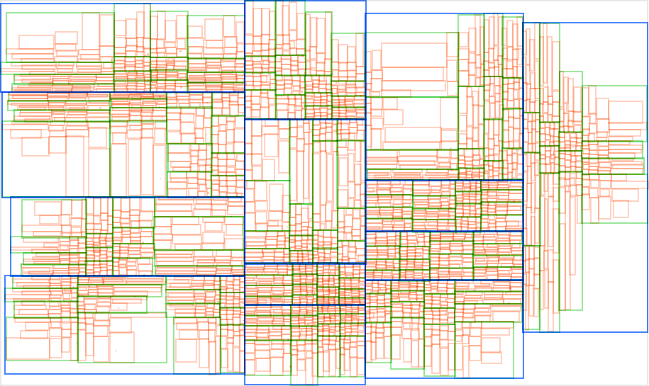
If we look at the PostGIS tables from QGIS, we can see some info about the spatial index QGIS created automatically; however, there is no detailed information. However, if we inspect one of our spatial tables in pgAdmin, we can see the exact SQL query creating the spatial index, which is as follows:
    CREATE INDEX sidx_adm1_geom
    ON adm1
    USING gist
    (geom);
So, a named index (sidx_adm1_geom) was created for our layer (adm1) based on the column containing geometries (geom). There is only one thing that is unclear--what is gist? Generalized Search Tree (GiST) is an indexing scheme which uses B-tree and, more importantly, gives a nice template to build other indexing mechanisms on. The creators of PostGIS used its extensibility to build their own R-tree implementation.
While PostgreSQL's, and therefore PostGIS's, structure is optimized to use vector data, we can also store raster data in a PostGIS database. The gains in this case are not as great as with vector data as QGIS will suffer a performance hit when it has to parse raster data from a PostGIS database instead of a file. On the other hand, PostGIS can query raster tables at various locations and, therefore, we can build expressions executing spatial analysis with mixed data. Furthermore, we might need to store rasters with vectors in a distributed system. One of the main pitfalls of adding raster data to a PostGIS database is that we cannot do it from QGIS. We have to use the command-line tool raster2pgsql.
Our first task is to locate the tool. If you are using Linux or macOS, you just have to open up a terminal to have instant access to the tool if PostGIS is installed properly. Windows users will have a harder time, though. If you are using Windows, you have to find the installation folder of raster2pgsql.exe. You have to open a command line there or navigate there with cd commands. If we have access to the tool, we can run it without parameters and see the help page:
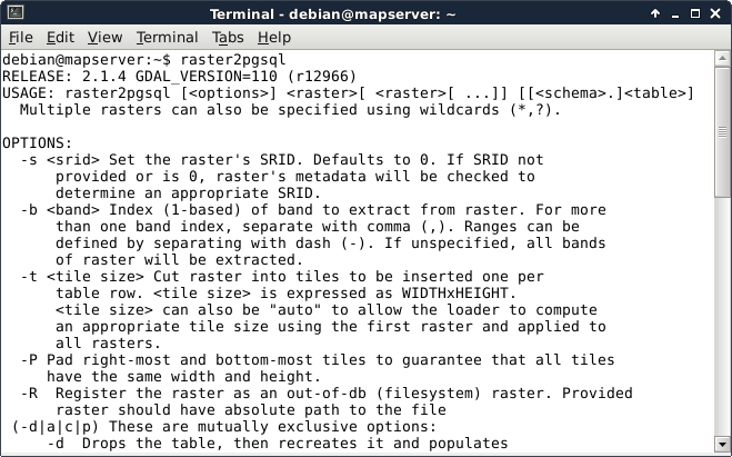
The next step is to prepare our raster layer. As raster2pgsql cannot warp rasters between projections, we have to create a transformed version if we are using a local projection. We can do this by saving the srtm layer in QGIS (with Save As from its context menu) with our local projection defined in the CRS field. Additionally, we can choose a High compression profile to decrease the file's size in the Create Options menu .
Now that we have raster2pgsql located and accessible and also our srtm layer exported in the projection which we would like to use in PostGIS, we can build our command for import as follows:
    raster2pgsql -t "auto" -I -d -C /home/debian/practical_gis
      /processed/srtm/srtm_23700.tif public.srtm > srtmimport.sql
Let's see how the flags and parameters which we provided work:
The last part of the command redirects the output of raster2pgsql to a file named srtmimport.sql. We can use that output to create our table in PostGIS. There are additional parameters we can use. If our raster does not contain projection data, for example, we can add -s SRID. That is, if we would like to import a WGS84 raster, it will be -s 4326.
The last step is to execute the resulting SQL file in PostGIS. For this, we can open up pgAdmin 3 and click on the Execute arbitrary SQL queries button (Tools | Query Tool in pgAdmin 4). There we can open our SQL file with the Open files button. Once pgAdmin reads the content, we can run our query with the Execute button. That's it. If we refresh our database manager's connection in QGIS, we can see our raster layer added to our PostGIS tables:
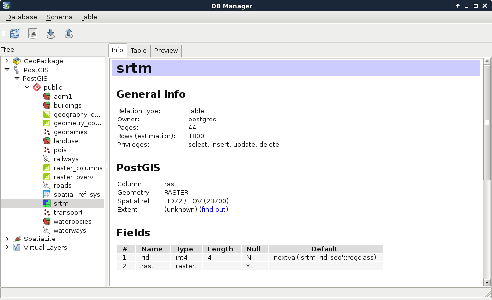
Great work! You just created a spatial database filled with every kind of data. Now let's visualize them in QGIS. First, get rid of the opened layers, and read the layers from PostGIS by dragging and dropping them from the database manager to the canvas. Visualizing PostGIS layers in QGIS is as easy as that. We don't even have to worry about changes in the database. By changing the scale of the map or clicking on the Refresh button in the main toolbar, QGIS will automatically incorporate every change occurred since the last refresh:
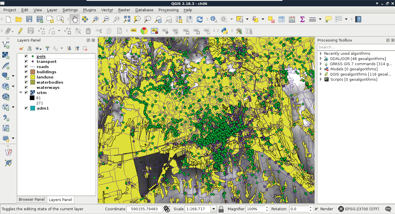
Now that we have access to our layers in PostGIS, let's try some queries. Visualizing a whole layer from a database can involve a lot of traffic as databases are often on remote servers distributing all kinds of data. To have only the required data which we would like to work with, we can query those tables and visualize only the results in QGIS. As a warm up, remove the administrative boundaries layer and build an expression querying it from the database.
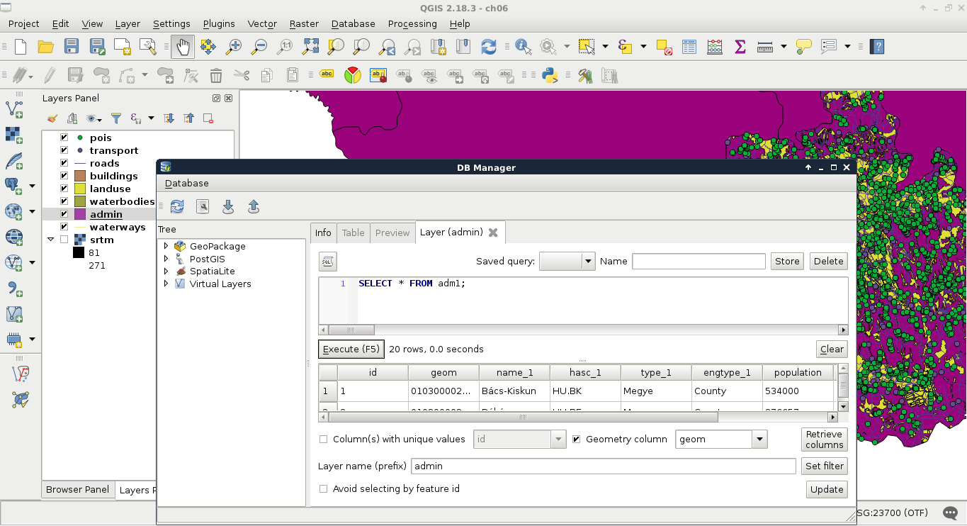
One of the best things in query layers is that we can modify the query on the go. If we close the SQL window, we can reopen it with our query by right-clicking on the queried layer's item in the Layers Panel and selecting Update Sql Layer. Let's update our query and select only our study area from the table. My query will look like the following:
SELECT * FROM adm1 WHERE name_1 = 'Baranya';
Additionally, vector data can hold a lot of attributes from which, often, only a few are relevant for our work. We can exclude some of the attribute columns by specifying only the relevant ones in the WHERE clause. There is one mandatory column that we have to include--the geometry column. Let's modify our query on the administrative boundaries layer to only have the geometry column and the corrected population density column of our study area. We don't even have to include the queried name_1 column as the rows get filtered on PostgreSQL's side.
SELECT geom, pd_correct FROM adm1 WHERE name_1 = 'Baranya';
If we open the attribute table of the updated layer, we can only see two columns, _uid_ and pd_correct. We don't have to bother with the _uid_ column though, as it is QGIS's internal ID added to the attribute table of the layer.
From now on, we will recreate some of the queries we did in QGIS before. For this, we have to upload our geonames_desc.csv file to our database. Let's open it in QGIS as we did before (Add Delimited Text Layer) and import it in PostGIS like we imported our vector layers. QGIS's database manager is a convenient tool for not only loading vector layers in a PostGIS database but also for loading regular tables. We can leave every option of the import tool on their default values.
In PostGIS, we can calculate additional columns from existing ones on the fly. We can define these additional columns with their expressions as we did with regular columns and even give them a name with the alias keyword AS. Let's retrieve the whole administrative boundaries layer and, additionally, query a recalculated population density column based on the population data stored in the layer:
    SELECT *, population / (ST_Area(geom) / 1000000) AS
      density FROM adm1;
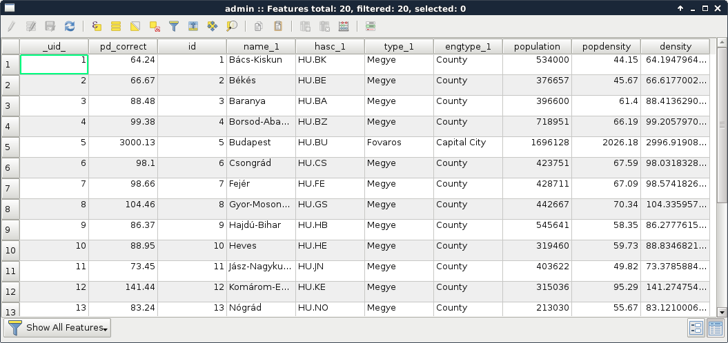
Great job! You just used your first PostGIS function, ST_Area, which returns the area of the given geometry. As we are in our local projection, we don't have to fear great distortions caused by a wrongly chosen projection. If we look at the attribute table, we can see some minor differences between the new density and the old pd_correct columns. That difference is due to the calculation of pd_correct on the surface of the WGS84 ellipsoid.
We can also do spatial queries in PostGIS. As we have features clipped to our study area, let's do something else. Select every POI inside the land use shapes. It shouldn't matter which land use shape contains the POIs, just select them all. We can do such a query with the following expression:
    SELECT p.* FROM pois p, landuse l WHERE
      ST_Intersects(p.geom, l.geom);
As we used two tables for a single query, we have to exactly define which table should be included in the results. Additionally, we can ease our work by giving a shorthand for our tables in the FROM part. We can do such a thing by adding the shorthand after the table name separated by a whitespace. Let's spice up the query a little bit. Select only those POIs which are in forest areas. If we think it through, we can achieve this by filtering the geometries of the land use layer. We can include a subquery doing just that. Modify the query as follows and click on Execute (do not load the results as the updated layer):
    SELECT p.* FROM pois p, landuse l WHERE ST_Intersects(
      p.geom, (SELECT l.geom WHERE l.fclass = 'forest'));
How long did it take for you? For me, it took about 80 seconds. Can you imagine QGIS loading for 80 seconds when you pan the map or zoom around? Me neither. Using subqueries in PostGIS is generally a bad way to solve problems achievable with simple queries. When we applied a filter on the land use layer and the results were correct, the filter was recalculated for every row PostGIS iterated through. PostgreSQL had no way to optimize this query and as a result it took very long. The correct way of doing this is by using a logical operator as follows:
    SELECT p.* FROM pois p, landuse l WHERE ST_Intersects(
      p.geom, l.geom) AND l.fclass = 'forest';
That's more like it. But why did it work? Because PostGIS does not make spatial queries, it creates spatial joins and applies filtering. If we alter the query to include fields from the land use table, we can see what's happening. We get every property of the intersecting land use features joined to the POIs (even their geometries). This is a classic example of an inner join:
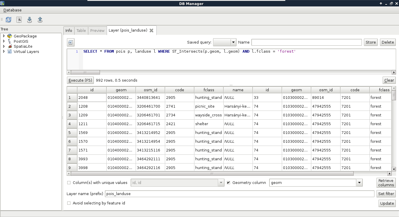
So, there we are. Joins and spatial joins. As we saw, we can do spatial joins fairly easily-- we just have to express the spatial predict with the appropriate PostGIS function in the WHERE clause. Of course, we can also use traditional join types both in regular and spatial joins. Let's create a regular join by joining the description table to our GeoNames layer. We discussed in a previous chapter that a join in QGIS is like a left outer join in an RDBMS. Therefore, we can use LEFT OUTER JOIN in our query to create similar results.
    SELECT g.*, gd.description
      FROM geonames g
      LEFT OUTER JOIN geonames_desc gd
      ON g.featurecod = gd.code;
Let's try a spatial join as the next task. Remember when we joined our filtered GeoNames layer to our administrative boundaries layer just to have population data in our polygon layer? We can reproduce those results with the following expression:
    SELECT a.*, g.population AS g_population
      FROM adm1 a
      INNER JOIN geonames g
      ON ST_Intersects(a.geom, g.geom) AND g.featurecod = 'ADM1';
There are two significant differences in this case. First, we only have an extract of our GeoNames layer containing points in our study area. Secondly, we already have a population column in our administrative boundaries layer. To fix the collision and make the layer readable by QGIS, we can give the population column of our GeoNames table an alias. As you can see, the inner join returned only the intersecting rows; therefore, we only got our study area back, the rest of the administrative boundaries layer got filtered out. We can get the whole layer, filled with data only where it is possible with the outer join, as stated before:
    SELECT a.*, g.population AS g_population
      FROM adm1 a
      LEFT OUTER JOIN geonames g
      ON ST_Intersects(a.geom, g.geom) AND g.featurecod = 'ADM1';
Now we have every feature with a g_population column filled with NULL values where there is no matching GeoNames feature. Of course, we have some other join types we can use. If our target table is in the SELECT clause and the joined table is in the JOIN clause, we can make the following joins in PostgreSQL:
In this chapter, we learned a lot about spatial databases. We learned how to create a PostGIS database easily and directly from QGIS. We also learned how to query those PostGIS tables and create visualizations in QGIS from them. We used basic queries, spatial queries, regular joins, and spatial joins to achieve our goals.
In the next chapter, we will dive deeper into PostgreSQL's and PostGIS's structure. We will learn about features easily accessible from pgAdmin. These features can make our work easier and our database more manageable.
In the previous chapter, we got introduced to the various types of spatial databases. We created and filled a PostGIS database with vector and raster layers. After that, we learned about the PostgreSQL SQL syntax, and executed some basic queries to get results which were previously only possible with geoalgorithms in QGIS. With our current knowledge, we would be able to integrate PostGIS into our workflow, and create some spatial analysis and visualization tasks using QGIS only as a thin client. That means, PostGIS does the hard lifting, while we only visualize the results in QGIS. However, we are yet to explain how to create good spatial databases with the intent of creating a distributed working environment. In this chapter, we will learn about some of PostgreSQL's and PostGIS's features, which can aid us in creating a stable and well-organized spatial database.
We will cover the following topics in this chapter :
Most of the activities in this chapter will take place in the pgAdmin environment. We will learn how to utilize the convenient functionality it offers to create a nice, well-structured database without thinking of long commands. Of course, GUI operations cannot be automated, and using the CLI is generally faster (if we know exactly how to use it); therefore, we will also see those commands, as pgAdmin actually builds them from the options we include, and lets us see the result. First of all, let's see what pgAdmin has to show us if we open our database:
As shown in the preceding screenshot, we can see the hierarchical structure of PostgreSQL having extensions, schemas which contain tables and functions, and roles.
So far, we used the public schema with the postgres role to create and fill our database. These are the default values, which are great for creating a local database, but far from ideal if we would like to create a remote GIS server. Let's discuss how roles and schemas work in PostgreSQL.
Roles are basically users that can log in, and do some stuff based on their permissions. Different roles can have different access levels to different databases. There are two kinds of roles--login roles and no-login roles (group roles). Group roles act as groups in operating systems; therefore, they can group multiple login roles, and manage their permissions in one place. Login roles are the typical users with passwords. The catch is, roles and group roles are independent from users and groups used by the operating system. System users cannot log in the database with their usernames, if a role was not created for them. Following this analogy, new users do not get roles created for them automatically by PostgreSQL.
Roles can have individual permissions, but they can also be managed by a group role. Similar to traditional users, roles can also have superuser (admin) capabilities. These superusers can modify roles and databases; therefore, they are quite dangerous to use as regular roles in a remote server. Additionally, they bypass every permission check, which makes them even more dangerous if exposed. The role postgres is a superuser role, which cannot be modified or dropped. It is completely fine to use in a local environment, as, by default, PostgreSQL does not accept connection requests from remote places, but only from the machine it is installed on.
Let's create two new login roles. One will be a regular GIS role with every kind of access to the GIS tables, while the other one will be a public role, which can only query the tables. It cannot modify them in any way; therefore, it will be safe to use by GeoServer, for example. We can create new roles by right-clicking on Login Roles, and selecting New Login Role. We must provide a name, and we should also add a password. As we do not want to create a superuser (having the postgres role is enough for that purpose), that's all we have to define. If we take a look at the last tab (SQL) after defining the required parameters, we can see the command that pgAdmin will use to create the role, which is as follows:
    CREATE ROLE gis LOGIN ENCRYPTED PASSWORD
    'md53929f8e603334cb5a8c5a632bcc3f3ac'
     VALID UNTIL 'infinity';
That is, it creates a role with CREATE ROLE, declares it as a login role with LOGIN, and, as it already calculated the hash of the password, it stores it directly with ENCRYPTED PASSWORD. It also includes a validity extent of infinity, which is superfluous.
If we wish to add a login role manually, we can simplify the command to the following:
CREATE ROLE gis LOGIN PASSWORD 'mypassword';
In this case, the password is provided in plain text, and the hash is calculated by PostgreSQL. We can try this method out by creating the other role from the command line by opening an SQL window (Execute arbitrary SQL queries in pgAdmin 3 and Tools | Query Tool in pgAdmin 4). If the tool is disabled, first select a database by clicking on it. If we run the following query, we should be able to see the new role created:
CREATE ROLE pubgis LOGIN PASSWORD 'pubpass';
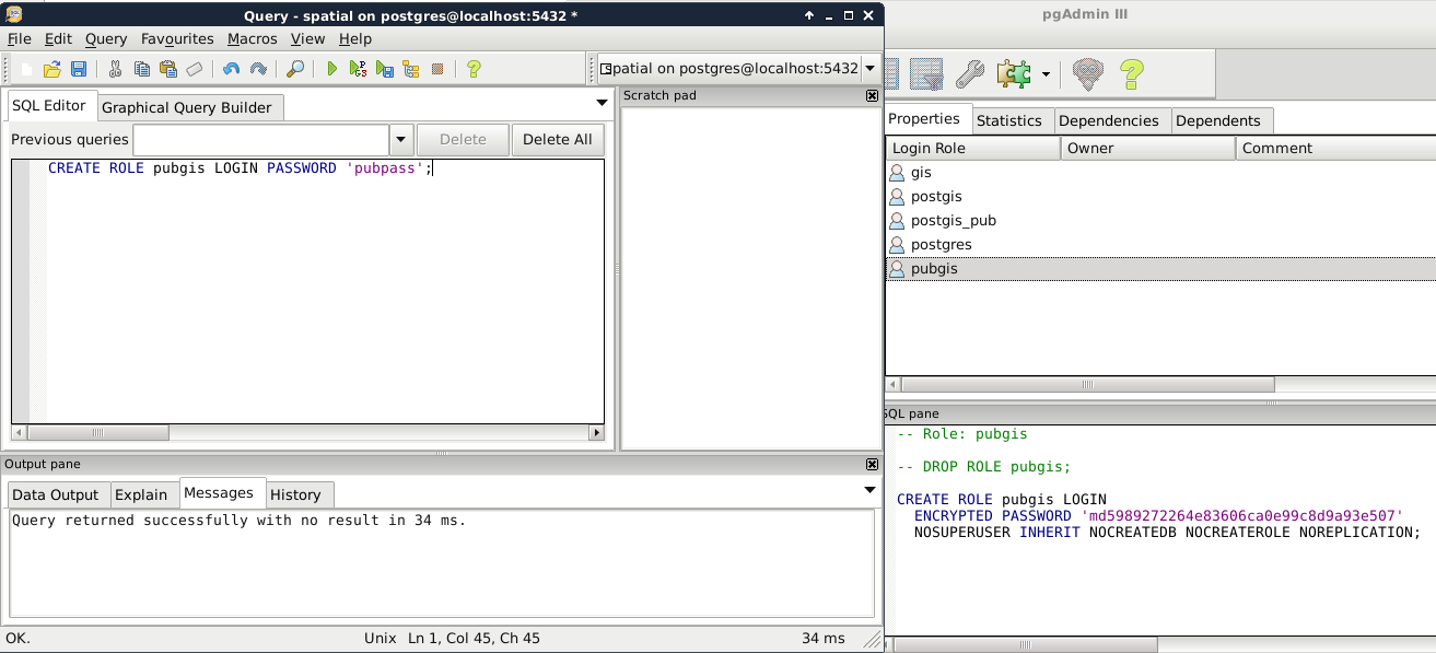
Now that we have some roles, we can give them privileges to administer or just query tables. However, doing so is very cumbersome, as these kinds of privileges do not apply on tables created later on. To solve this issue, PostgreSQL uses schemas to group tables and a lot of other things. In PostgreSQL, schemas are similar to folders in a file system. A database groups different schemas, while a single schema groups different tables. Schemas are like group roles for user management. The only difference is that using a schema is mandatory.
There are three different schemas--information_schema, pg_catalog, and public. The first two are system schemas used by the RDBMS internally, and showed as Catalogs in pgAdmin.
We should not alter those schemas in any way. The last is the default one in which we stored our data and PostGIS functionality. Having multiple schemas is a convenient way of organizing a big database, where only a single part contains spatial data. If we select the public schema, we can see the SQL command that creates it:
    CREATE SCHEMA public
     AUTHORIZATION postgres;

    GRANT ALL ON SCHEMA public TO postgres;
    GRANT ALL ON SCHEMA public TO public;
    COMMENT ON SCHEMA public
     IS 'standard public schema';
Apart from the comment section, every command is important when creating a schema. We have to create it with CREATE SCHEMA, assign an owner with AUTHORIZATION, and give privileges to roles with the GRANT expressions. By using GRANT ALL, PostgreSQL automatically gives every privilege to postgres and public. The only problem is that we don't have a public role. By giving every permission to public, PostgreSQL implicitly says that every role ever created in this database should have every privilege to this schema. Sounds dangerous? It is very convenient though if used carefully.
As a rule of thumb, we shouldn't keep any tables in the public schema which shouldn't be accessed and edited by every role. Let's put our spatial database in a dedicated schema with the following steps:
We are all set. Let's try out our new schema by doing a spatial query that we've already done before:
    SELECT g.* FROM landuse l, geonames g
    WHERE ST_Intersects(l.geom, g.geom);
The preceding query returns an error. As we moved our tables out of the public schema, we have to explicitly define the schema of the tables with the syntax schema.table. If we update our query appropriately, PostGIS returns the intersecting features:
    SELECT g.* FROM spatial.landuse l, spatial.geonames g
    WHERE ST_Intersects(l.geom, g.geom);
I'm completely sure you've already found out why PostGIS still works. As we left it in the public schema, its functionality remained exposed. Can we move it out to our new schema, and use its functions by prefixing them with the schema name? Not easily. PostGIS quite heavily relies on sitting in the public (or a similarly exposed) schema. However, as we witnessed, we can move out our spatial tables wherever we see them fit.
As the final task, let's open QGIS, and edit our PostGIS connection to use our new gis role. We have to use the database manager to get our layers again, as the project file for the previous chapter still thinks they are placed in the public schema, and, therefore, it cannot access them:
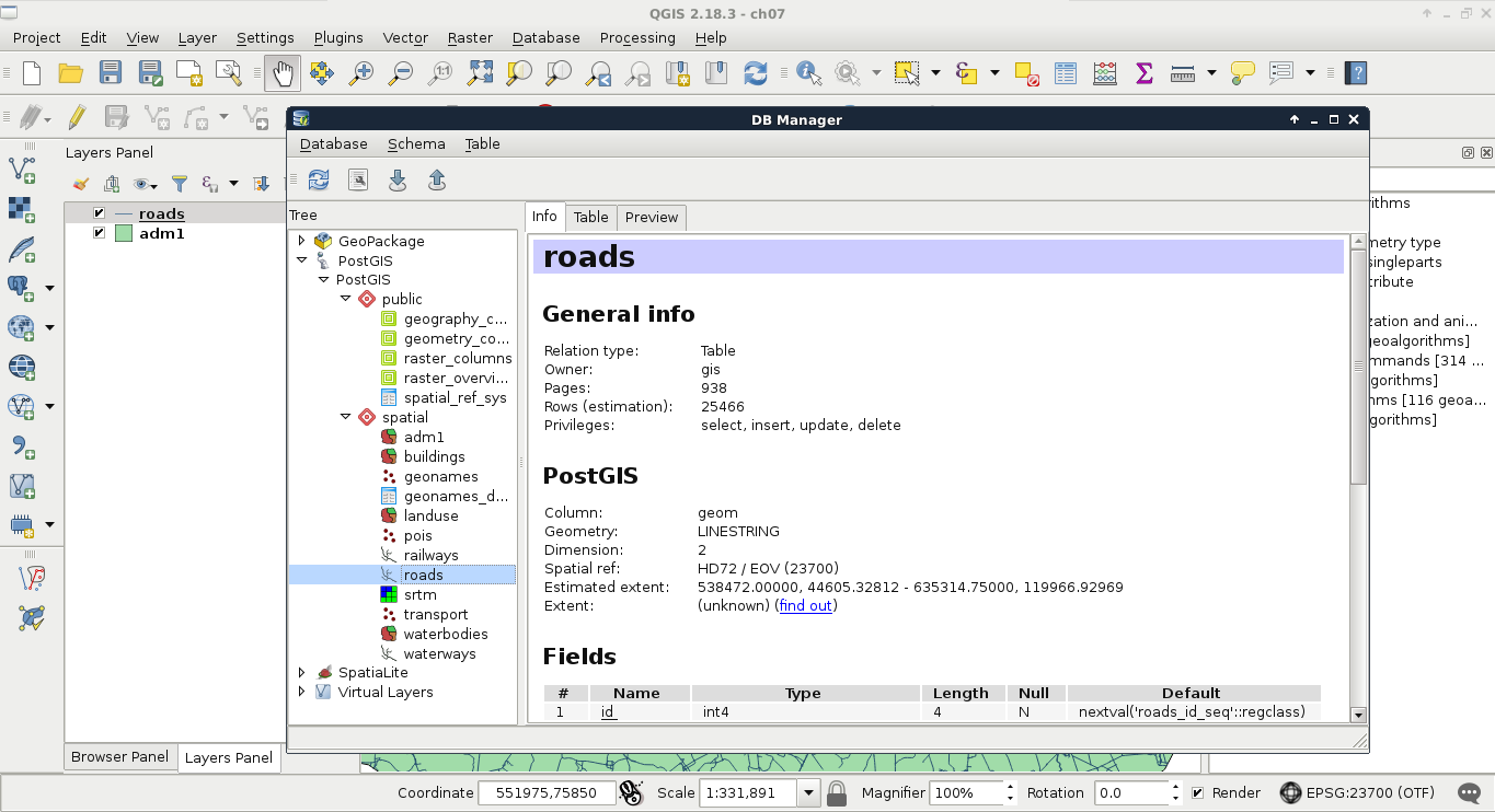
From the database and its schemas, we arrive at tables. As we know, databases can hold multiple schemas, while a single schema can hold multiple tables. Tables have typed columns and items as rows. What we did not discuss before is that tables can have a lot more properties. We can consider these constraints, rules, triggers, and indexes metadata, and we can set them with expressions, or from pgAdmin. If we inspect one of our tables, we can see the definition it was created with, which is as follows:
    CREATE TABLE spatial.adm1
    (
     id serial NOT NULL,
     geom geometry(Polygon,23700),
     name_1 character varying(75),
     hasc_1 character varying(15),
     type_1 character varying(50),
     engtype_1 character varying(50),
     population integer,
     popdensity double precision,
     pd_correct double precision,
     CONSTRAINT adm1_pkey PRIMARY KEY (id)
    )
    WITH (
     OIDS=FALSE
    );
If you've used an RDBMS before, this verbose CREATE TABLE expression resembles the usual ones; however, some of the lines are different. On the other hand, if we try to use a more regular expression, we end up with a similar table:
    CREATE TABLE spatial.test (
     id serial PRIMARY KEY NOT NULL,
     geom geometry(Point,23700),
     attr varchar(50)
    );
The first difference is that, in RDBMSs, keys are realized as constraints in the database. It is not just for keys, though. Almost every qualifier (except NOT NULL) is realized as a constraint. The most important qualifiers for tuning a database are NOT NULL, UNIQUE, PRIMARY KEY, and FOREIGN KEY. By adding the NOT NULL definition to a column, we explicitly tell PostgreSQL not to accept updates or new rows with an empty value for that field. Setting it for most of the columns is a good practice, as it can help to make the table more consistent. For example, it will prevent everyone from adding new features or updating existing ones without supplying the required attributes.
If we alter the spatial.test table created before with some updated definitions, we end up with two named constraints:
    ALTER TABLE spatial.test
     ADD UNIQUE (attr),
     ALTER COLUMN attr SET NOT NULL;
So far, we can see that PostgreSQL queries work in the concise way we might be used to. However, if we inspect the table in pgAdmin, it crafts more verbose, more explicit expressions to achieve the same results. We can also alter our tables in pgAdmin. We have to open the Properties of a table to reach the relevant options under the Columns and Constraints tabs. Under Columns, we can select any column, click on Change, and check the Not NULL checkbox in the Definition tab. For setting the unique constraint, we have to add a new, Unique item in the Constraints tab. In the dialog, we only have to provide the column name in the Column tab, and click on Add:
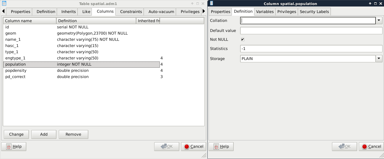
The last constraint we should explore is CHECK. We can create rules that the columns have to comply with before an update or insert occurs by using regular SQL expressions. For example, we can create a CHECK for the population column, and use the population > 0 expression to enforce a positive population value. Another reason to use a CHECK constraint is to validate the geometries themselves, as PostGIS only checks that they are using the right geometry type. For this task, we have to create a CHECK, as we would add a UNIQUE definition:
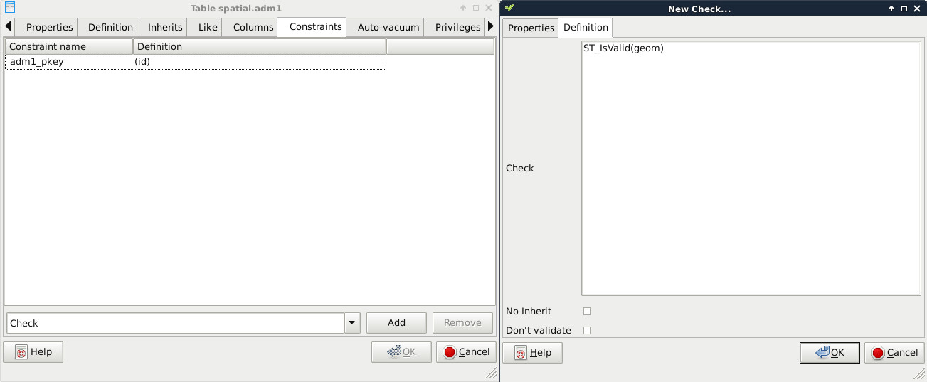
If we look at the SQL tab, we can see that defining a CHECK is very similar to defining other constraints with an expression:
    ALTER TABLE spatial.adm1
     ADD CHECK (ST_IsValid(geom));
Let's see a real world example. PostGIS has the capability to handle curves. Besides the regular points, lines, polygons, and their multipart counterparts, PostGIS handles the following geometry types:
Sometimes, we would like to store curves to have a representation which can be visualized instantly without post-processing. Unfortunately, there is no function in PostGIS which smoothes lines with a nice smoothing algorithm. To fill this gap, I created a small and primitive script, which converts corners to curves based on some rough approximations. First of all, let's get this script (createcurves.sql) from the supplementary material's ch07 folder, or download directly from https://gaborfarkas.github.io/practical_gis/ch07/createcurves.sql. We can open the file in pgAdmin's SQL window, and run the content as a regular SQL expression. When we are done, we should have access to the CreateCurve function.
In this example, we will build a table storing the curvy representation of our rivers table. First of all, we need to create a table which will contain our curves. We could save the results of a query directly into a table; however, we will also apply some logic, which is as follows:
We can apply some of this logic when we create the table with the correct table definition in an SQL window as follows:
    CREATE TABLE spatial.waterways_curve (
     id integer PRIMARY KEY UNIQUE REFERENCES spatial.waterways (id)
     ON DELETE CASCADE,
     geom geometry(CompoundCurve, 23700)
    );
With this preceding definition, we defined two columns: one for the IDs, and one for the geometries. The IDs are foreign keys, as they reference another column in another table. By adding the ON DELETE CASCADE definition, we ask PostgreSQL to delete referencing rows from this table when rows get deleted from the parent table. The geometry is defined as compound curves in our local projection (the number should reference your local SRID). This table definition alone fulfilled some of our requests. There is a great feature in PostgreSQL which we can apply to the rest of them--rules.
Before creating the rules, we should synchronize our new table with the waterways table. We can insert values into an existing table with the INSERT INTO expression. What is more exciting is that we can shape a SELECT statement to insert the results instantly into a destination table as follows:
    INSERT INTO spatial.waterways_curve (
     SELECT id, CreateCurve(geom) FROM spatial.waterways
    );
Rules are custom features of PostgreSQL, which allow us to define some logic when we select, update, delete, or insert rows in a table. In a rule, we can define if we would like to apply our custom logic besides the original query, or instead of it. In order to define a rule, we can select our waterways table in pgAdmin, right-click on Rules, and select New Rule:
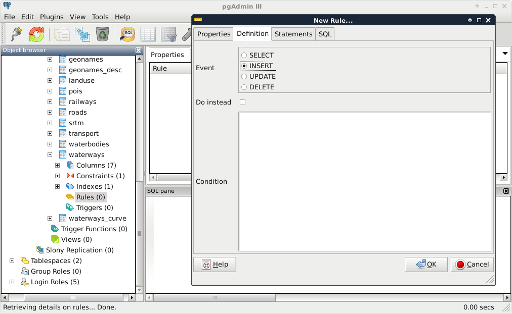
The rule maker of pgAdmin is a little bit scattered, as rules are quite complex. There are these three distinct tabs we need to fill in order to have a rule:
    INSERT INTO spatial.waterways VALUES (
     NEW.id, CreateCurve(NEW.geom)
    );
As we are now inserting literal values directly into a table, we have to provide the VALUES keyword. Other RDBMSs might also require us to provide the columns we would like to insert our values into; however, PostgreSQL is smart enough to find out that we only have two columns in the new table with matching types. There is one additional thing we need to keep in mind when writing rules and triggers--row variables. We can access the processed rows with the keywords NEW and OLD. Of course, we should only use the appropriate one from the two. That is, if we write a rule for an INSERT, we should use NEW. If we write a rule for an UPDATE, we can use both of them, while for DELETE events, we should only use OLD.
The second rule should occur when we update the waterways table. In this case, we should only update the curve table when a geometry changes; therefore, we need a condition besides the rule body:
    UPDATE spatial.waterways_curve SET geom = CreateCurve(NEW.geom)
     WHERE id = NEW.id;
As you can see, we can directly compare the new and old values of the updated row, but PostgreSQL has no idea how it should update the curve table. Therefore, we have to supply a WHERE clause defining where we would like to update our geometry if it differs from the old one. Of course, we can also use OLD.id, as the two should be the same.
We don't have to create a rule for deleting rows, as the cascading constraint on the foreign key will make sure that the rows deleted from the waterways table get deleted from the curve table. Let's see, instead, what we created in QGIS. First of all, we can see in the database manager that QGIS recognizes the compound curves we have as line geometries, as it also supports circular strings. If we open the layer, and zoom in to a corner, we can see our curves:
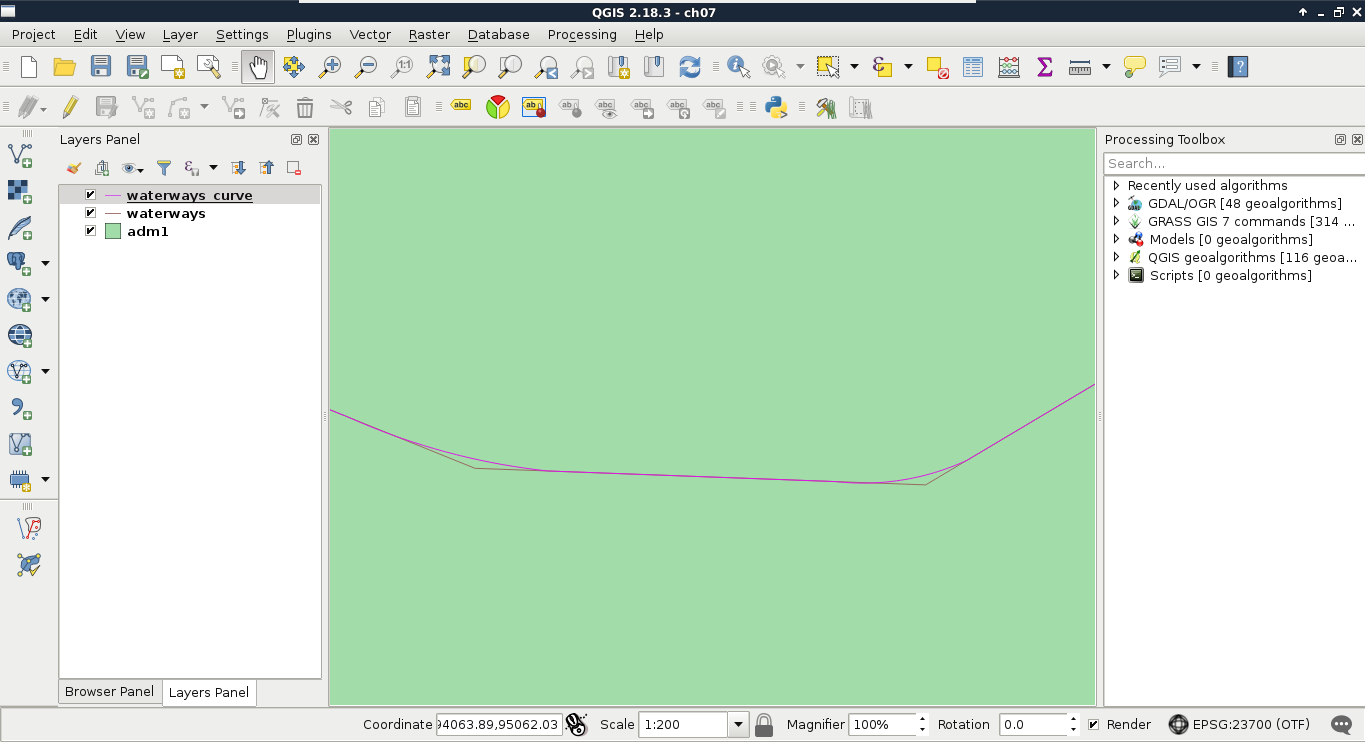
To check if everything works as expected, we have to edit our waterways table a little bit, in the following way:
If everything is configured properly, we should be able to see our curve layer following the edits we made in the waterways layer. The only problem left is that we can update the curve table manually, getting the tables out of synchronization. We can easily avoid this, however, by smart permission control. What do we know about rules? Only table owners can define them on tables; therefore, PostgreSQL will run them on behalf of the owner. Thus, we can fine-tune the privilege system in the following way:
Now we can modify the waterways table with the GIS role, but only the postgres superuser can modify the curve table. That is, we can only access the curves layer with the GIS role, but the rules we defined change the curve table accordingly and automatically when we modify the waterways table.
As we've already witnessed, using PostGIS has a great advantage of offering flexible results over traditional desktop GIS applications. That is, we can play with queries without filling the memory or disk with useless intermediate data showing wrong results. But how can we save the correct results once we've found out the right query to produce it? There are various ways of saving results in PostgreSQL. The most basic way is to save them right into a new table. All we have to do is to prefix our query with the CREATE TABLE tablename AS expression.
Let's try it out by creating another curve table with the following expression:
    CREATE TABLE spatial.tempcurve AS SELECT id,
     CreateCurve(geom) AS geom FROM spatial.waterways;
If we refresh the tables, or import the tempcurve table in QGIS, the geometries are the same as in our fine-tuned waterways_curve table. With these kinds of queries, PostgreSQL creates a regular table, finds out the column types from the queried columns, and fills this new table with the query results. The only differences from the PostgreSQL perspective in the two tables are the constraints and rules we added, which can be also defined on an existing table.
On the other hand, there is an important PostGIS difference between the two methods. PostgreSQL cannot find out the type of the geometries we have, therefore, it types the geometry column simply as geometry. That means, we lose the subtype information, and end up with a column which does not care for geometrical consistency. On top of that, it doesn't even care for the projection we use. Luckily, there's a method for telling PostgreSQL the subtype we would like to use--explicit typing. If we cast the results of CreateCurve to a compound curve geometry in our local projection, PostgreSQL can safely use our preferred subtype:
    CREATE TABLE spatial.tempcurve AS SELECT id,
     CreateCurve(geom)::geometry(CompoundCurve,23700) AS geom
     FROM spatial.waterways;
This method is very useful for storing quickly accessible versions of our results, but the tables we create this way remain static. Our heroic attempt at synchronizing the results with the data source was, of course, a very nice way to get rid of this obstacle. However, this is not always a practical method due to the hassle it involves. To create dynamic results, which change with the data source, we can build views. In PostgreSQL, views are special empty tables, which have a rule hooked on to their SELECT event. That rule simply executes the query we saved our view with. As a result, we can save our query in a view, which means that it gets executed every time we access the view. If we look at our public schema, we can see the views that PostGIS created. They dynamically query the database, and create catalogues of our data in it with lengthy and complex expressions. Let's create our own view the same way we created a table, as follows:
    CREATE VIEW spatial.tempcurve AS SELECT id,
     CreateCurve(geom)::geometry(CompoundCurve,23700) AS geom
     FROM spatial.waterways;
In QGIS, we can see that the new view is recognized as a view with its definition. However, if we load the layer, we also stumble on to the performance cut it introduced. As views are basically saved queries, which are executed every time the canvas is refreshed (for example, on panning and zooming), and the CreateCurve function is slow, storing this table as a view has a great performance impact:
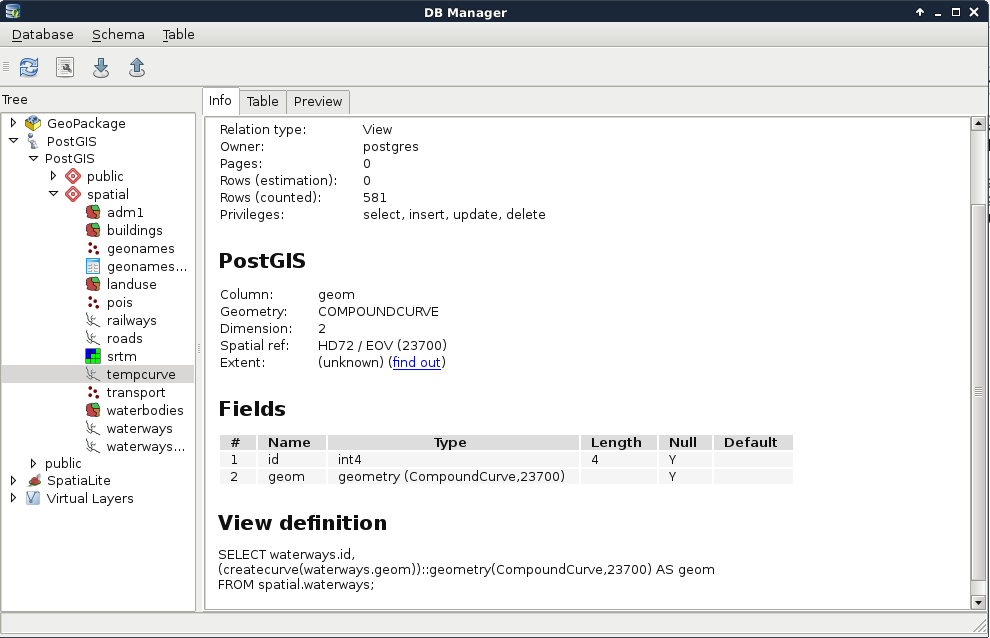
On the other hand, those PostGIS catalogues are only queried once in a while, and it is completely affordable to sacrifice some speed to have dynamic tables without the extra hassle. On those PostGIS views, we can identify some rules for inserting, updating, and deleting rows. They are needed, as views are generally modifiable. If we try to update, insert into, or delete from a view, PostgreSQL tries to find out which tables are affected, and applies the required operations on them. To override this behavior, we can define three simple rules on views using the following scheme:
    CREATE OR REPLACE RULE tablename_event AS
     ON event TO tablename DO INSTEAD NOTHING;
We can see an example of such rules on the following screenshot:
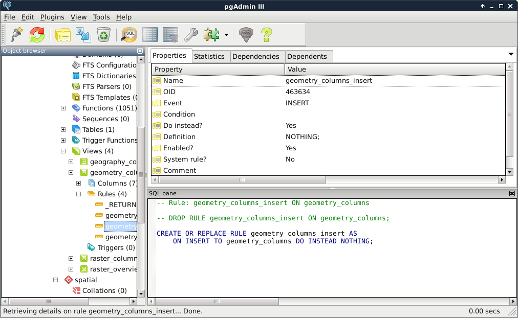
The event should be UPDATE, INSERT, or DELETE, while the tablename should be the view we would like to apply the rules on. Of course, we can do it with pgAdmin's GUI like we did before. In there, we only have to give the rule a name, select the event type, and check the Do instead checkbox. If we leave everything else blank, the simple rule given earlier gets created. By applying these rules on the three events, we can easily make our views read-only. If anyone would like to modify our tables via a protected view, those operation requests will simply bounce off the database.
What if we would like to create views with better performance? We shouldn't be so demanding, right? Well, PostgreSQL thinks otherwise, and happily offers us materialized views. These views store snapshots of the queries stored in them. We can create such a view by running the following query:
    CREATE MATERIALIZED VIEW spatial.tempcurve AS SELECT id,
     CreateCurve(geom)::geometry(CompoundCurve,23700) AS geom
     FROM spatial.waterways;
As a result, we get a view which has data in it, and is read-only by default. We cannot insert into it, update it, or remove rows from it. The only drawback is that it stores the snapshot of the query created at the time of execution. If we would like to incorporate changes in our materialized view, we have to refresh it manually as follows:
REFRESH MATERIALIZED VIEW spatial.tempcurve;
We already used some techniques to speed up queries, although we have a lot more possibilities in tuning queries for faster results. To get the most out of our database, let's see how queries work. First of all, in RDBMS jargon, tables, views, and other similar data structures are called relations. Relation data is stored in files consisting of static-sized blocks (pages). In PostgreSQL, each page takes 8 KB of disk space by default. These pages contain rows (also called tuples). A page can hold multiple tuples, but a tuple cannot span multiple pages. These tuples can be stored quite randomly through different pages; therefore, PostgreSQL has to scan through every page if we do not optimize the given relation. One of the optimization methods is using indexes on columns just like the geometry columns, other data types can be also indexed using the appropriate data structure.
There is another optimization method which can speed up sequential scans. We can sort our records based on an index we already have on the table. That is, if we have queries that need to select rows sequentially (for example, filtering based on a value), we can optimize these by using a column index to pre-sort the table data on disk. This causes matching rows to be stored in adjacent pages, thereby reducing the amount of reading from the disk. We can sort our waterways table with the following expression:
CLUSTER spatial.waterways USING sidx_waterways_geom;
In this preceding query, the sidx_waterways_geom value is the spatial index's name, which was automatically created by QGIS when we created the table. Of course, we can sort our tables using any index we create.
For the next set of tuning tips, we should understand how an SQL expression is turned into a query. In PostgreSQL, there are the following four main steps from an SQL query to the returned data:
For us, the most important part is planning. PostgreSQL has a lot of predefined ways to plan a query. As it strives for the best performance, it estimates the required time for a step, and chooses a sequence of steps with the least cost. But how can it estimate the cost of a step? It builds internal statistics on every column of every table, and uses them in sophisticated algorithms to estimate costs. We can see those statistics by looking at the PostgreSQL catalog's (pg_catalog) pg_stats view:
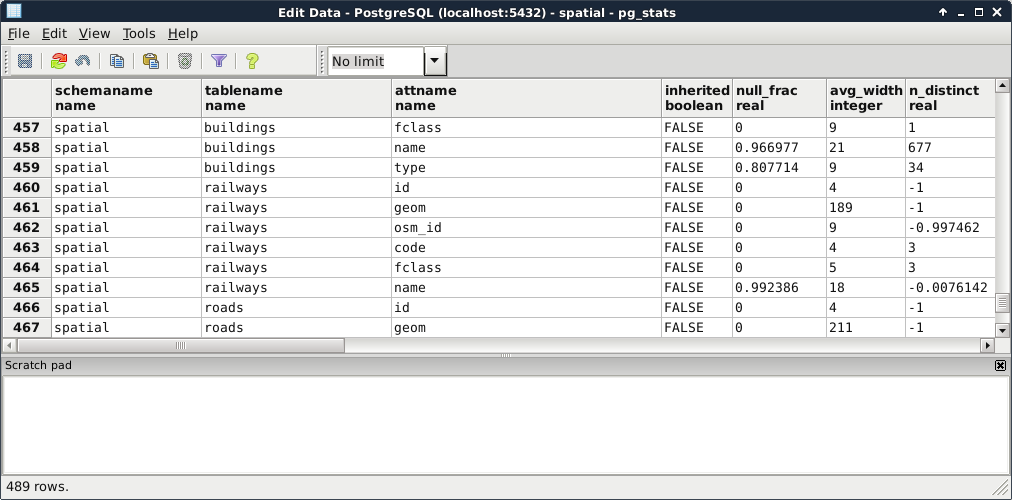
As the planner uses these precalculated statistics, it is very important to keep them up to date. While we don't modify a table, the statistics won't change. However on frequently changed tables, it is recommended not to wait on the automatic recalculations, and update the statistics manually. This update usually involves a clean-up, which we can do on our waterways_curve table by running the following expression:
VACUUM ANALYZE spatial.waterways_curve;
PostgreSQL does not remove the deleted rows from the disk immediately. Therefore, if we would like to free some space when we have some deleted rows, we can do it by vacuuming the table with the VACUUM statement. It also accepts the ANALYZE expression, which recalculates statistics on the table. Of course, we can use VACUUM without ANALYZE to only free up space, or ANALYZE without VACUUM to only recalculate statistics. It is just a good practice to run a complete maintenance by using them both.
Now that we know how important it is to have correct statistics, and how we can calculate them, we can move on to real query tuning. Analyzing the plan that PostgreSQL creates involves the most technical knowledge and experience. We should be able to identify the slow parts in the plan, and replace them with more optimal steps by altering the query. One of the most powerful tools of PostgreSQL writes the query plan to standard output. From the plan structured in a human readable form, we can start our analysis. We can invoke this tool by prefixing the query with EXPLAIN. This statement also accepts the ANALYZE expression, although it does not create any kind of statistics. It simply runs the query and puts out the real cost, which we can compare to the estimated cost. Remember that inefficient query from the last chapter? Let's turn it into a query plan like this:
    EXPLAIN ANALYZE SELECT p.* FROM spatial.pois p,
     spatial.landuse l WHERE ST_Intersects(p.geom,
     (SELECT l.geom WHERE l.fclass = 'forest'));
We can see the query plan generated as in the following screenshot:
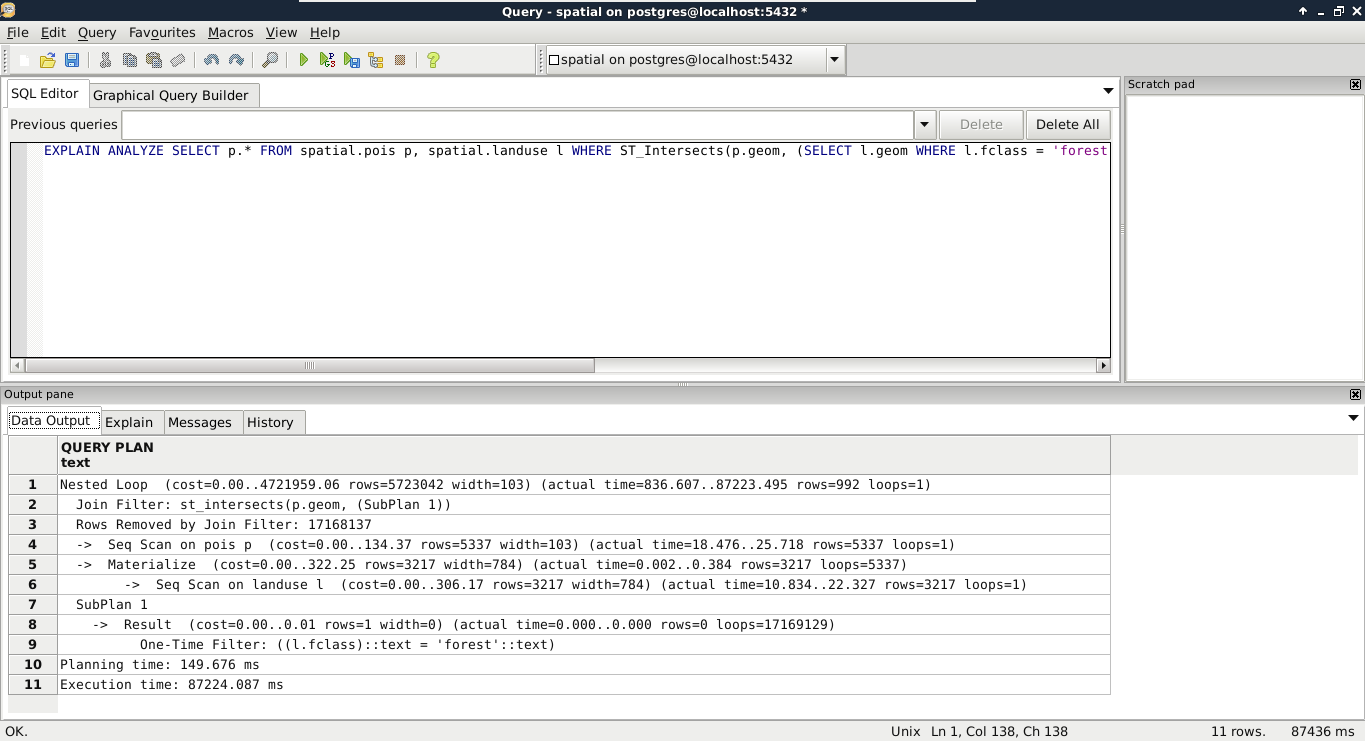
According to the query plan, in my case, we had to chew ourselves through about 5,700,000 rows. One of the problems is that this query cannot use indices, therefore, it has to read a lot of things into memory. The bigger problem is that it had to process more than 17 million rows, much more than estimated in the query plan. As PostGIS does spatial joins in such queries, and we provided a subquery as one of the arguments, PostGIS did a cross join creating every possible combination from the two tables. When I checked the row numbers in the tables, the POI table had 5,337 rows, while the land use table had 3,217 rows. If we multiply the two numbers, we get a value of 17,169,129. If we subtract the 17,168,137 rows removed by the join filter according to the executed query plan, we get the 992 relevant features. The result is correct, but we took the long way. Let's see what happens if we pull out our subquery into a virtual table, and use it in our main query:
    EXPLAIN ANALYZE WITH forest AS (SELECT geom
     FROM spatial.landuse l WHERE l.fclass = 'forest')
     SELECT p.* FROM spatial.pois p, forest f
     WHERE ST_Intersects(p.geom, f.geom);
By using WITH, we pulled out the geometries of forests into a CTE (Common Table Expression) table called forest. With this method, PostgreSQL was able to use the spatial index on the POI table, and executed the final join and filtering on a significantly smaller number of rows in significantly less time. Finally, let's see what happens when we check the plan for the final, simple query we crafted in the previous chapter:
    EXPLAIN ANALYZE SELECT p.* FROM spatial.pois p,
     spatial.landuse l
     WHERE ST_Intersects(p.geom, l.geom)
     AND l.fclass = 'forest';
The query simply filters down the features accordingly, and returns the results in a similar time. What is the lesson? We shouldn't overthink when we can express our needs with simple queries. PostgreSQL is smart enough to optimize our query and create the fastest plan.
There are some scenarios where we just cannot help PostgreSQL to create fast results. The operations we require have such a complexity that neither we, nor PostgreSQL, can optimize it. In such cases, we can modify the memory available to PostgreSQL, and speed up data processing by allowing it to store data in memory instead of writing on the disk and reading out again when needed. To modify the available memory, we have to modify the work_mem variable. Let's see the available memory with the following query:
SHOW work_mem;
The 4 MB RAM space seems a little low. However, if we see it from a real database perspective, it is completely reasonable. Databases are built for storing and distributing data over a network. In a usual database, there are numerous people connecting to the database, querying it, and some of them are also modifying it. The work_mem variable specifies how much RAM a single connection can take up. If we operate a small server with 20 GB of RAM, let's say we have 18 GB available for connections. That means, with the default 4 MB value, we can have less than 5,000 connections. For a medium-sized company operating a dynamic website from that database, allowing 5,000 people to browse its site concurrently might be even worse than optimal.
On the other hand, having a private network with a spatial database is a completely different scenario. Spatial queries are usually more complex than regular database operations, and complex analysis in PostGIS can take up a lot more memory. Let's say we have 20 people working in our private network using the same database on the same small server. In this case, we can let them have a little less than 1 GB of memory for their work. If we use the same server for other purposes, like other data processing tasks, or as an NFS (Network File System), we can still give our employees 128 MB of memory for their PostGIS related work. That is 32 times more than they would have by default, and only takes roughly 2 GB of RAM from our server.
In modern versions of PostgreSQL, we don't have to fiddle with configuration files located somewhere on our disk to change the system variables. We just have to connect to our database with a superuser role, use a convenient query to alter the configuration file, and another one for reloading it and applying the changes. To change the available memory to 128 MB, we can write the following query:
ALTER SYSTEM SET work_mem = '128MB';
Finally, to apply the changes, we can reload the configuration file with this query:
SELECT pg_reload_conf();
It's great fun to work with spatial databases. However, when we use a database extensively, we can lose a lot of valuable data in case of a failure. To minimize the damage involved in a server failure, we can, and we should, create backups of our database. In PostgreSQL, there are multiple great and powerful ways to create backups.
The traditional way of backing up a PostgreSQL database is to create static backups. This method uses the command-line tools pg_dump and pg_restore to create and restore the whole database, or parts of it. Of course, we do not have to use those CLI tools for backing up and restoring, as pgAdmin offers us a way to use of them via its GUI. The main advantage of using static backups is that we can save only parts of the database, like only our spatial data, or just one table. Its main disadvantage, of course, is its static nature. We have to refresh the backups manually if we would like to archive a more recent version of our database.
Let's see what happens if we back up one of our tables. We can do it by right-clicking on the table in pgAdmin and selecting Backup. In the dialog, we have numerous options. The most important is the file format. We can choose between four formats:
To try out the plain format, we should back up our geonames_desc table, as it does not have geometries; therefore, pg_dump will create a nicely readable output.
If we open the resulting file in a text or code editor, we can see a very well-structured set of SQL expressions creating the table, the constraints, the sequence, and inserting the data:
What PostgreSQL did not save is the schema that it should restore the table in. On the other hand, if we drop our geonames_desc table, and run the contents of this file in an SQL window, the table gets recreated in the spatial schema. If we inspect the start of the file, the script sets some PostgreSQL-specific variables. From the numerous variables, the following overwrites the search path for the transaction:
SET search_path = spatial, pg_catalog;
Since, in the search path, the spatial schema is set as first, PostgreSQL will automatically put everything in there.
We can also create compressed archives. Let's create a backup containing our entire spatial schema as follows:
One of the disadvantages of using pg_dump for creating backups is that it saves everything from the dumped objects. If we dump the entire database, it saves every PostGIS object (like functions) along our data. This is another good reason for using a different schema for the actual spatial data, as this way we can back up the relevant data only.
To restore the data dump, we have to specify the place where we would like to extract our archive. If we exported a table, we have to right-click on the schema we would like to insert it into, while, if we dumped a schema, we have to right-click on the database. There we have to select Restore. A great perk of using a compressed archive for a backup is that we can browse through the exported objects, and specify the ones we would like to restore:
In some setups, it is simply inconvenient to save static backups of a database on regular intervals. With continuous archiving, we can archive the changes made to our database, and roll back to a previous stable state on failure or corruption. With this archiving method, PostgreSQL automatically saves logs in a binary format to a destination location, and can restore the whole database from those logs if necessary. The main disadvantage of this method is that the whole cluster is saved, and there is no way to specify which parts we would like to archive.
First of all, what is a cluster? In PostgreSQL terms, a cluster contains every data stored in a PostgreSQL installation. A cluster can contain multiple databases containing multiple schemas with multiple tables. Using continuous archiving is crucial in production servers where corruption or data loss is a real threat, and the ability to roll back to a previous state is required.
First of all, let's find out where our PostgreSQL cluster is located on the disk. The default path is different on different operating systems, and, besides that, we can specify a custom location for our cluster. For example, as I use an SSD for the OS, and PostgreSQL would store its database on the SSD by default, I specified the postgres folder in a partition of my HDD mounted at /database for the database. We can see the path to our cluster by running the following query:
SHOW data_directory;
If we open the path we got from the previous query in a file manager, we will see the files and folders our PostgreSQL cluster consists of. From the folders located there, the pg_xlog contains the WALs (Write Ahead Logs) of our database transactions. WALs are part of PostgreSQL's ACID implementation, as it can restore the last stable state from these logs if something bad happens. They can be also used for continuous archiving by saving them before PostgreSQL recycles them:
To use continuous archiving, we need a base version of our cluster. This base version is the first checkpoint. From this checkpoint, logs are preserved, and we can restore previous states by restoring the first checkpoint, specifying a date, and letting PostgreSQL replay the logged transactions until the specified date. To enable WAL archiving, we have to set some system variables using a superuser role as follows:
Next, we have to set up the first checkpoint, and create a physical copy of this base version. We can put this backup wherever we like, although it should be placed somewhere along the WAL files.
      tar -czvf /home/debian/postgres_archive/basebackup.tar.gz
       /database/postgres.
Let's say the worst has happened, and our database is corrupted. In that case, our first task is to find out the last time our database was stable. We can guess, but in this case, guessing is a bad practice. We should look through our logs to see when our database went off. We don’t want to have to rollback more transactions than necessary, as this can have a significant impact on a production server. When we have a date, we can start recovering with PostgreSQL's PITR (Point-in-Time Recovery) technique:
        restore_command = 'cp /home/debian/postgres_archive/%f %p'
        recovery_target_time = '2017-02-21 13:00:00 GMT'
In this chapter, we discussed PostgreSQL's structure, its objects, and how PostGIS sits on the RDBMS. We also learned some of the architectural specialities of PostGIS. We came closer to fully understanding RDBMSs, what we should look out for when we use them, and how we can effectively create queries in them. Although we used pgAdmin, we also learned some useful expressions, which can be used directly in PostgreSQL's CLI. It will come in handy when you have to configure a PostgreSQL or PostGIS instance on a remote server only accessible through SSH.
In the next chapter, we will dive into geospatial analysis, and see how we can produce meaningful results from our raw data. We will set up a scenario where we are real estate agents serving a customer with very specific needs. To find out the best spots matching the given criteria, we will use various geoalgorithms via geoprocessing tools in QGIS.
In the previous chapter, we learned how spatial RDBMSs work on the example of PostGIS. We went through the typical data types, tables, views, functions, and other objects, while also discussing how we can construct a great spatial database, which can effectively enhance our work. Now that we can ease our job by using spatial databases, we will move on and learn about spatial analysis. To have a full-blown example on which we can work, let's assume we are very enthusiastic real estate agents. We are happy to go that extra mile to please our customers who have very specific conditions on their dream houses. The price and size of the house does not matter in this case, although its situation must meet certain criteria.
In this chapter, we will cover the following topics:
First of all, we should choose a small area to work with. A populated town or city is an obvious choice for this task. The first obstacle is that there aren't any freely available settlement polygon data in the formats we are used to. To tackle this, we can download the required data directly from OpenStreetMap. OSM offers a read-only web database for accessing its data, which is available through the Overpass API. From Overpass, we can request data through regular web requests, and the server sends the matching features as a response (Appendix 1.5). In QGIS, we can install a plugin written directly for this--QuickOSM. Therefore, our first task is to install the QuickOSM plugin as follows:
In QuickOSM, we can build Overpass requests in an interactive way. In Overpass, we can query features in a predefined area (for example, the extent of a layer), or use a name which can be geocoded to an area by OSM (for example, the name of an administrative boundary). If we open up the plugin, we can see that Overpass accepts key-value pairs according to OSM's tag specification. If we would like to request administrative boundaries, we have to use the admin_level tag as Key, and provide the appropriate level as a Value. We only need to find out the level for our country. Luckily, OSM maintains a detailed wiki about the tags it uses from where we can reach the admin_level related part at https://wiki.openstreetmap.org/wiki/Tag:boundary%3Dadministrative#admin_level:
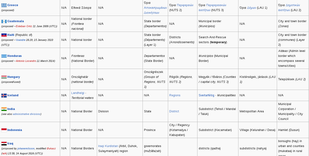
Now we can import our preferred city with the following steps:
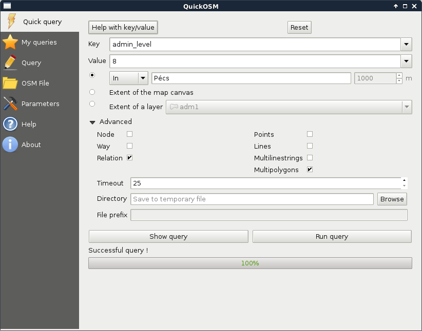
As we have a smaller region for our analysis, let's generate some data. We should create points representing houses for sale with street addresses, sizes, and prices. There are various ways to achieve this. As we already did some geoprocessing, please take a little break to think about a sequence of logical steps that you would take to create these random data.
In my opinion, the easiest way is to generate the points right on the streets. We can do that as follows:
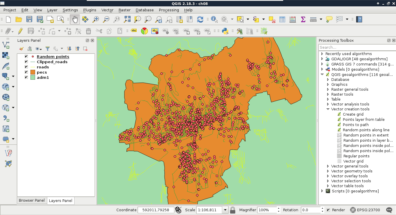
The next step is to fill our random points with data. First of all, we need to join the attributes of the roads layer to have the street names stored with our imaginary houses. The only problem is that QGIS's spatial join uses the problematic Select by location tool's algorithm. To see what I'm talking about, let's select points with it (QGIS geoalgorithms | Vector selection tools) using the intersects spatial predicate and our clipped lines layer as the intersection layer. For me, it did not select any points. One of the problems might be a precision mismatch between lines and points interpolated on them (Appendix 1.6); however, if we define a small Precision value, still only a portion of our points get selected. For me, a precision of 170 meters resulted in a full selection, where QGIS has no means to guarantee the correct street attributes get joined to the points.
What we already know about spatial queries in QGIS--checking point-polygon and line-polygon topological relationships--work well. Checking point-line relationships, on the other hand, does not. Therefore, the easiest workaround is to transform our points to polygons, join the street attributes to them, then join the polygon attributes back to the points. For this task, we can use the basic geoprocessing tool--buffer. It creates buffer zones around input features; therefore, if we supply a point layer to the tool, it creates regular polygons around them. The more segments a buffered point has, the more those polygons will resemble circles. There are two kind of buffer tools in QGIS--fixed buffer and variable buffer. The variable buffer tool creates buffer zones based on a numeric attribute field, while the fixed buffer tool creates buffer zones with a constant distance. Let's create those joins using the following steps:
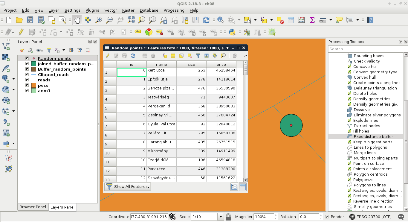
Two customers walk into our agency. They state their preferences, share some contact information, and leave. When we summarize their preferences, we are amused--the vague terms are totally identical. Both the customers stated the following criteria:
Additionally, both of them had a single, more specific request.
Our first task in such a case is to interpret the criteria, and translate them into the language of GIS. We have to create some exact steps from these preferences. Of course, having such vague criteria always leaves space to some subjectivity; therefore, the following interpretation accords to my experience:
We can get a partial result by only considering our vector layers, and running some vector analysis tools on them. There are different methods for different type of analysis; however, we can group the most frequently used methods into the following four groups:
Different GIS softwares are good at different analysis types. Although QGIS is a universal GIS, it offers a good coverage only in the most basic analysis types--overlay analysis and proximity analysis. PostGIS is exceptionally good in neighborhood analysis. As GRASS GIS forces the topological model on vector layers, it has the best capabilities in network analysis.
To fulfill most of our criteria, simple proximity analysis is enough. However, there are two types of criteria. Some of them state that our results have to exceed a distance, while the rest of them require the results to equal a certain distance. For the sake of simplicity, let's separate those requirements, and solve them one by one. The easiest way to do a proximity analysis with fixed distances is to buffer the features we want to compare our houses with, and use a spatial query to get matching results. We can delimit houses far enough from noise-polluted areas by the following (from now on, saving intermediate results as memory layers won't be emphasized):
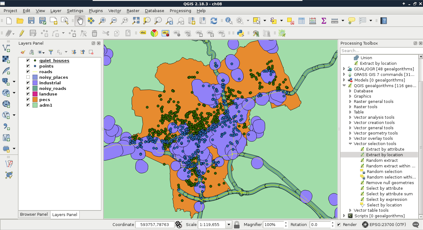
The second part is to delimit the areas that the potential homes should reside in. The first criterion is parks with playgrounds. Let's prepare our data as follows:
Now we could select or extract parks which have a playground in them. Before doing this, let's think it through again. Is this the correct method? What if there are some parks with playgrounds just outside of them?
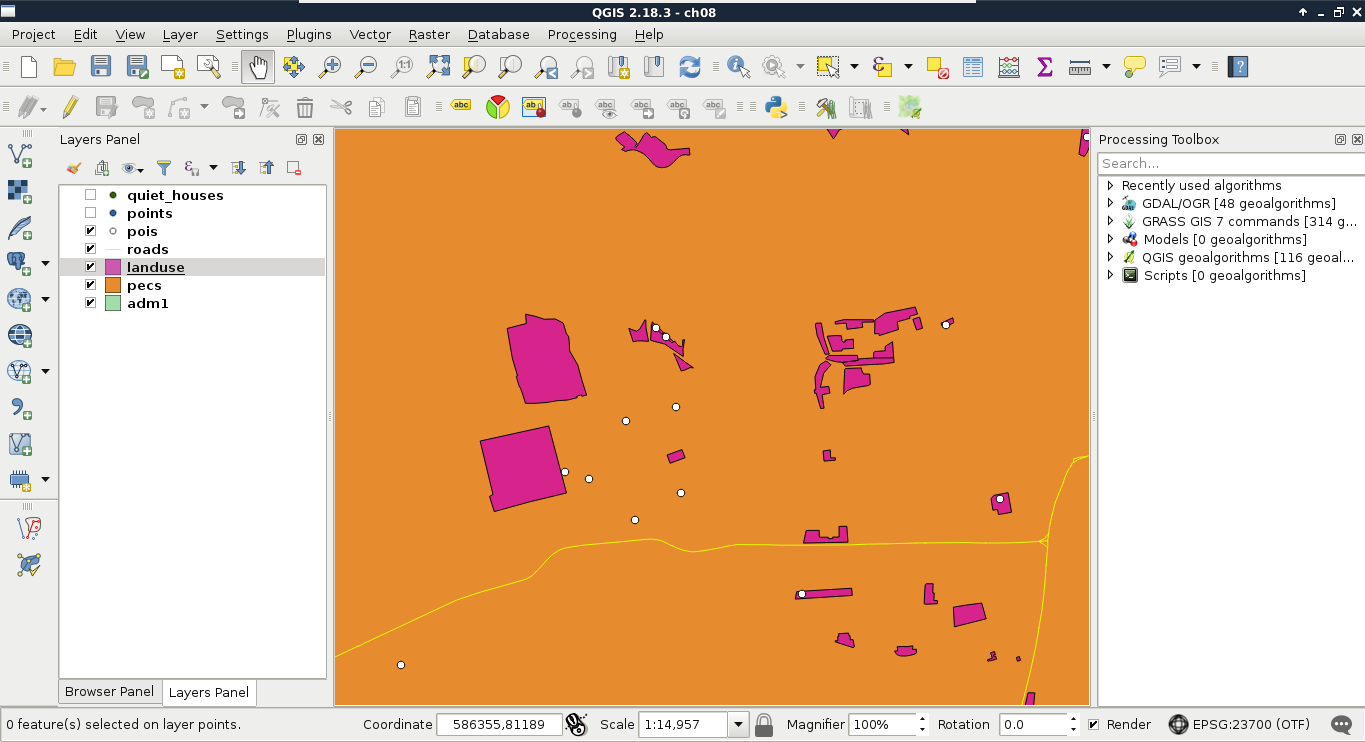
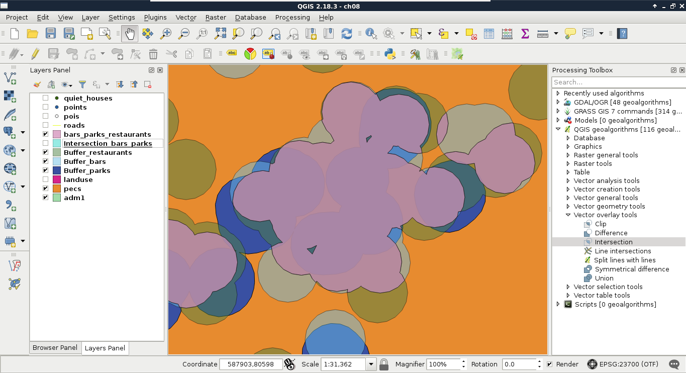
You must be wondering about a lot of things now. First of all, what's the difference between clipping and intersecting two layers? Not much, to be honest. Clipping is a special type of intersecting, where the second layer must be a polygon layer, and the attributes of the second layer don't get included in the input layer. Intersecting, on the other hand, can be used on any vector type. Furthermore, the attributes of the second layer are automatically joined to the input layer. To sum it up, clipping is a special type of intersection, where the algorithm knows that we only want to restrict a layer's geometries to some bounds, and nothing more.
As we stated before, if we use buffers for proximity analysis, half of it will be overlay analysis (checking if the input features reside in the proximity). One of the main use case of overlay analysis in proximity analysis is to create the right bounds for the upcoming selection or extraction. This work is basically set operations in two or more dimensions. Let's say we have a polygon A in a layer and a polygon B in another one.
Understanding why we used intersections in the second task is easy. We needed the intersections of the buffer zones, as each zone contained a specific criteria from which every one should be fulfilled by the results. However, why did we use union in the first task? The answer lies in negating, as it turns the logic upside down. Think of it like this--we need every house in the intersection of areas outside the two buffer layers. According to De Morgan's law (the intersection of two sets' complement is the complement of their union), we need every house in the area outside of the union of the two buffer layers.
The last criterion that both customers need is that the number of markets in the vicinity of the house should be at least two. This is another type of proximity analysis, as we do not need a binary answer (it is in the proximity of the other feature, or it isn't), we need to count the number of features. Count is one of the most basic statistical indicators in GIS. In my opinion, this step is somewhere between proximity analysis and neighborhood analysis (where we do not even care about proximity, just the distance).
We have several ways to achieve this step. We can buffer the markets without dissolving them, and execute a spatial query with statistics. On the other hand, that is not a clear way to get only the number of markets, as the result would contain some other statistics we do not care about. To get only counts, we can do this in reverse:
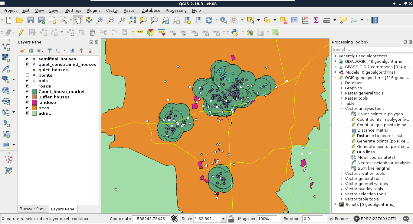
Congratulations on your first analysis! It was quite an adventure, right? What we've done is more than mere spatial analysis. We conceptualized a model, and made an analysis according to that. Our model stated that the vicinity of the requested amenities and features can be translated to 500 meters. Quiet places are places which are more than 200 meters away from busy roads, and more than 500 meters away from industrial places. Are these numbers exact? Of course not. They are approximations of real-world phenomena, and therefore, models.
What happens if one of the customers says that our analysis is faulty? Some of the results are too close to noisy places, others are too far from markets. We can try some other distances to make our model satisfy the customer better, although we would need to run the entire analysis every time. Luckily, in modern desktop GIS software like QGIS, there is a graphical modeler to create, save, and modify a step-by-step analysis by connecting algorithms to each other. It is like a block-based programming language for analysts. We can link existing algorithms (even models) together to create a graphical process model, that QGIS then interprets and executes.
We can access QGIS's graphical modeler from the menu bar via Processing | Graphical Modeler. First of all, we need to name our model, and categorize it in a group. I used the name House search and the group Vector. If we save a new model, we have to specify a file name, which can be anything as long as we don't change the default directory QGIS offers, and use a unique file name. If we close the model, we can see it under the category we specified. We can edit our existing models by right-clicking on them, and selecting Edit model:
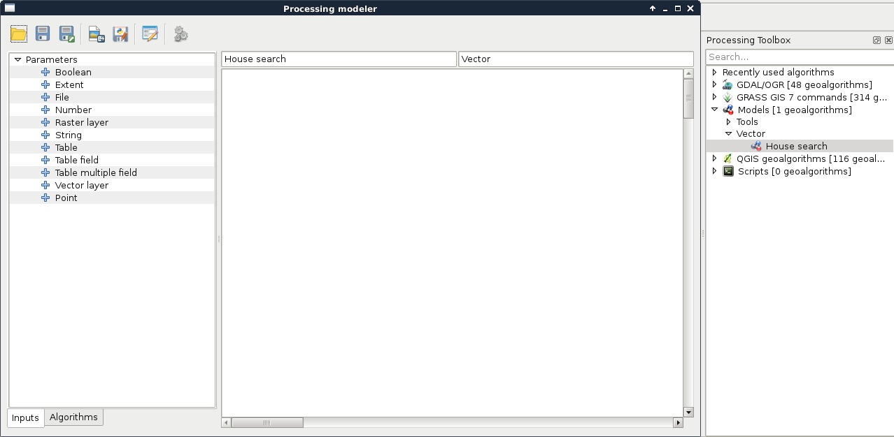
The graphical modeler has a lot of capabilities from which we will only use the most necessary ones to create our model. The left panel shows the inputs and algorithms we can use. We can simply drag and drop the needed blocks to the right panel, which is the canvas of our model. As the first step, let's create the quiet homes part. For this, we need three input vector layers--a point layer for the Houses, a line layer for the Roads, and a polygon layer for Land use. When we drop a Vector layer input to the canvas, we can specify the name and the type of the input layer:

Now, if we save our model, and run it with the Run model button or by opening it from the processing toolbox, we can see our three constrained input vector layers just like in any other QGIS algorithm. Now we need to drag and drop some algorithms from the Algorithms tab of the left panel, which will use our input layers:
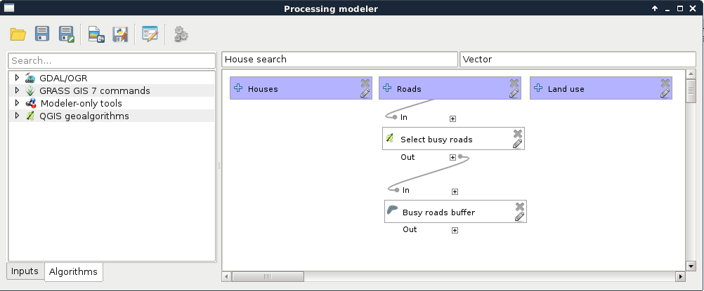
As we can see, we have access to some extra features besides the regular parameters that QGIS offers in the graphical modeler. These include the following:
Let's finish modeling the first step of our analysis with the following steps:
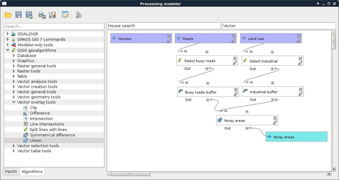
Now we can see something, which highly resembles the geoalgorithms we are used to in QGIS. It requires three inputs, and gives one output. Let's remove the filters from the required layers, specify them as input parameters, and run the query.
By running the model, we can notice a few things. First of all, the result is similar to the unified buffer zones we created step by step. However, we can do the whole workflow by simply pressing a single button. However, the model is seemingly quite slow. More precisely, dissolving the buffers slows down the whole process. We can do these few things about that:
For now, let's just finish the current part of the analysis:
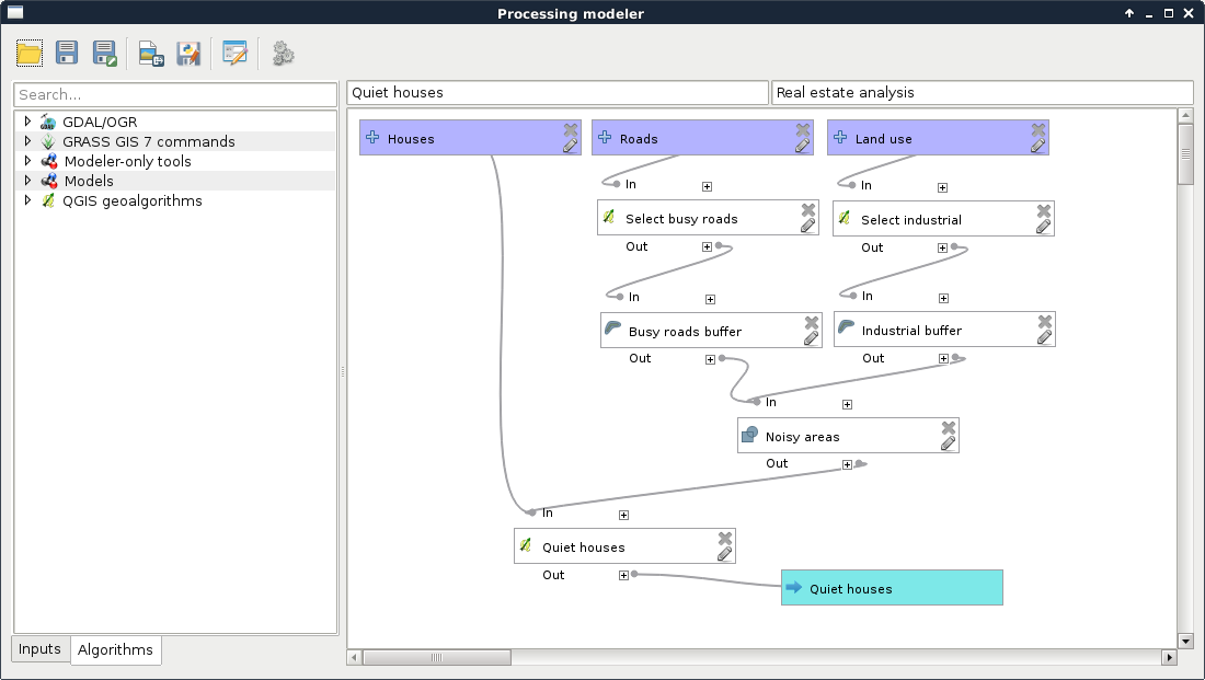
Now we have the Quiet houses produced by our model. The next part is to constrain those houses with the preferences of our customers. To keep our final model clean, we are going to separate different tasks. Let's create another model with a name like Constrained houses, and with the previous model's group name:
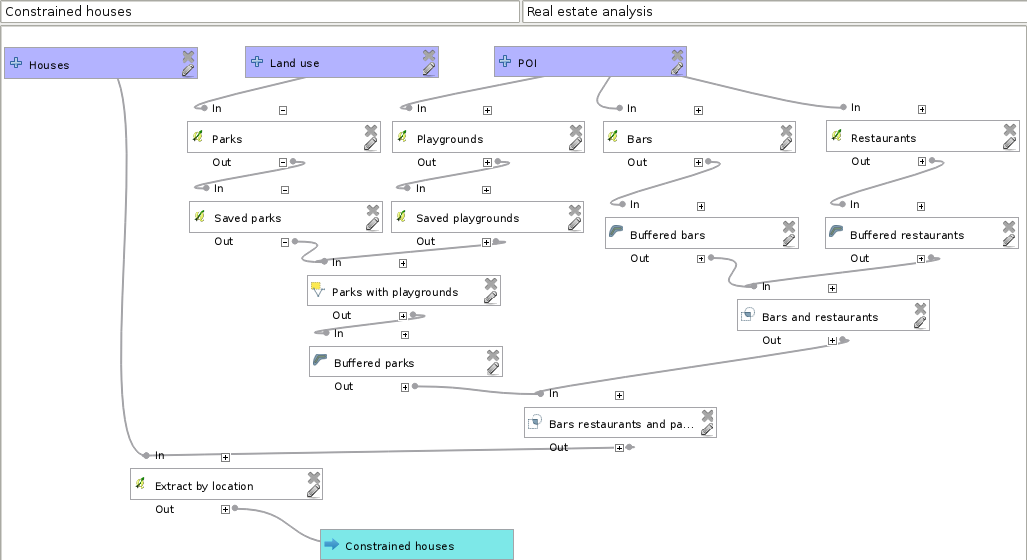
Our final model should contain every input, our other models, and the rest of the analysis:
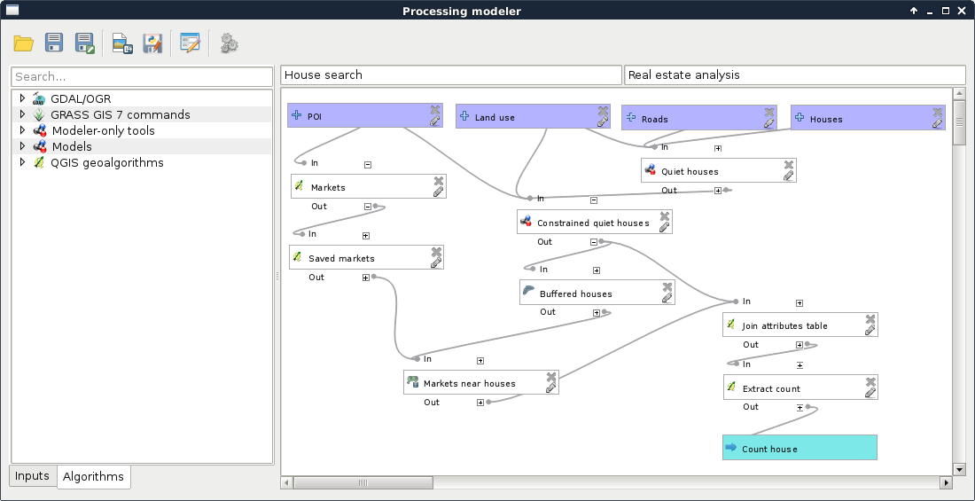
Let's test our model by running it and examining the results. If something really weird did not occur, we've got bad results. Not just slightly I must have done something wrong in my step-by-step workflow bad results, but really bad ones. Why did something like this happen? In a nutshell, QGIS does not have a concept about correct order. It interprets our model, and orders the algorithms based on inputs. Every algorithm has so many dependencies as inputs, which must be executed before them. Other algorithms are executed in an arbitrary order, which is good, as QGIS 3 will be able to run processing algorithms in parallel.
I'm sure you already found out the solution for this ordering problem--we must make sure that order does not matter. This can be achieved by chaining algorithms in a way that our steps do not rely on the state of the data. If we think it through, in our model, data has state only in a few cases; that is, when we use selections. We have the following two ways to resolve this problem:
Let's stick with the second option now. If we think about the possible orders of execution in our models, we can conclude that the Quiet houses model is safe. No matter in which order QGIS executes it, we will always get the same results. On the other hand, there are several incorrect paths in the Constrained houses model, and an additional one in our final model. In the Constrained houses model, we select three times from the same POI layer. If the second selection (bars) occurs after the playgrounds are selected, but before they are saved, we get incorrect results. Let's correct it by defining the Saved playgrounds step as a prerequisite to the Bars step:
Using the same procedure, we should make the Buffered bars step a prerequisite to the Restaurants step, as that is the second place where an error can occur. When done, let's inspect our final model. There we select the markets, and save them to another layer. However, what happens if our second model runs after the selection, but before the extraction? The correct selection is gone, and a wrong selection gets saved. To deal with this possibility, we have to make our Constrained quiet houses step a prerequisite to our Markets step. If we run our model again, the results should be the same as the ones gained from our step-by-step approach.
The third preference of both the customers are quite special ones, which cannot be incorporated into our model with mere vector analysis tools. One of the requirements is that solar panels can be used on the house efficiently. Of course, there are numerous factors to consider, like the exposure of the roof. However, the simplest feature such a house should have is the aspect of the land it is built on. If we are in the northern hemisphere, the terrain with northern aspect is mostly in shadow. In the southern hemisphere, the land with southern aspect is more shadowy. In reality, there are a lot more factors contributing to the solar energy potential (like latitude, climate, cast shadow, and so on), but for the sake of simplicity, let's just assume for now that the only factor is the aspect of the surface.
For solving surface-related problems, GIS has its most characteristic data type--DEM (Digital Elevation Model). DEMs are representations of a planet's surface (most often Earth). They can be in raster or vector (mesh) format, and can be visualized in 2D, or as a rubber sheet in 3D, which is not 2D, but neither is it true 3D (they are often called 2.5D because of this property). What makes DEMs a very valuable and useful data type is their wide variety of use cases. A lot of terrain-related information can be derived solely from the surface data. The two most basic derivatives are slope and aspect, where slope shows the steepness of the surface, while aspect shows its exposure.
DEMs in a regular grid format (raster) are usually the results of processing raw elevation data in vector format. These raw elevation data can be acquired in multiple ways, such as point clouds from RADAR or LiDAR measurements, digitized elevation contours, or individual GPS measurements. If the resulting vector data is dense enough, a regular grid can be constructed on them, and the individual data points in a cell can be averaged. If not, then spatial interpolation is the usual way of creating DEMs. There are a lot of spatial interpolation techniques, although there is a common concept in them--they take a number of points as input, and create a regular grid by interpolating additional points between existing ones as output (Appendix 1.9). Of course, these irregular elevation points can also form a Triangulated Irregular Network (TIN) if their Delaunay triangulation is calculated.
Let's satisfy the first customer by showing the houses with correct aspect values. First of all, we need the SRTM DEM we downloaded and clipped to our study area, then transformed to our projection. If we load it, we can use GDAL's raster processing algorithms to do some terrain analysis. As QGIS does not have many tools dedicated to raster analysis, it uses external modules. This implies one very important specificity of raster analysis in QGIS--we cannot use memory layers. We have to save every intermediate result to disk. This is the case in calculating the aspect of our DEM, which you can do as follows:
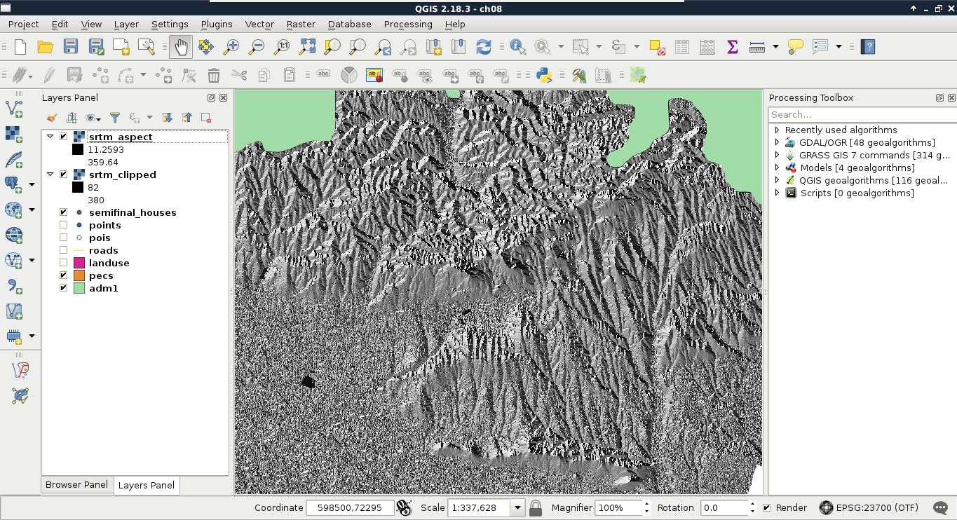
Now we have an aspect layer, which resembles the hillshading we used in a previous chapter. The only, and very significant difference is, that we did not calculate shadows cast to the surface by a light source from a specific direction, but the surface's absolute exposure. Before going on with the analysis, let's interpret the result. Values of the aspect map range from near 0 to near 360. This corresponds to exposure values expressed in degrees. More importantly, we must be able to map aspect values to directions. This sounds trivial; however, start directions can change from GIS to GIS. In QGIS, 0° and 360° correspond to North. Therefore, as we go clockwise (imagine a compass), 90° is East, 180° is South, and 270° is West. If we zoom in, and toggle the visibility of the underlying DEM, we can also see some areas without any values. There is a special value in aspect maps--flat. Flat surfaces can be denoted with a special value, such as -1, or like in our case, can be defined as NULL. We have to consider these flat values when we filter our points:
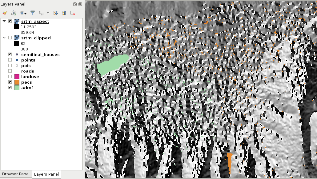
There is only one thing left--we have to sample the aspect map in the locations of our houses. Unfortunately, QGIS does not have a tool to achieve this task, but we can use GRASS GIS, which is really strong in raster analysis. Using GRASS has only one inconvenience--it won't create a column for the aspect values automatically:
Now we have the houses with the sampled aspect values. Therefore, we can select the final set of houses with an expression, such as the following:
"aspect" < 270 AND "aspect" > 90
Or, if we would like to be more restrictive, we can use this:
"aspect" < 225 AND "aspect" > 135
The final preference was that the house should be within a 15 minutes walking distance to the train and bus stations. We could calculate the time taken to reach a point from another one on a road network using network analysis. However, that method would not respect an important factor in walking--elevation. This is a kind of nontrivial analysis done on a DEM. Although neither QGIS, nor PostGIS offer a solution for this type of analysis, GRASS GIS has just the tool for us. This tool creates a cost surface, which represents walking time in seconds from one or more input points. For this, GRASS needs a DEM and an additional friction map. With the friction map, we can fine-tune the analysis, giving weights to some of the areas. For example, we can give a very high value to buildings, making GRASS think that it's almost impossible to walk through them. The friction map must be in the raster format, therefore, our first task is to create it from our vectors. For the sake of simplicity, let's only consider buildings, forests, and parks.
        CASE
        WHEN "fclass" = 'building' THEN 9000
        WHEN "fclass" = 'forest' THEN 2
        WHEN "fclass" = 'park' THEN 1
        END
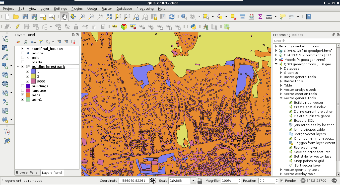
Now we have a vector friction layer, although GRASS needs a raster layer containing penalties. To transform our vector to raster, we can use GDAL's Rasterize module from Raster | Conversion. This module can create rasters from input vectors, although we should keep the differences of the two data models in mind:
Now that we have a concept about vector to raster transformation, let's create our friction map as follows:
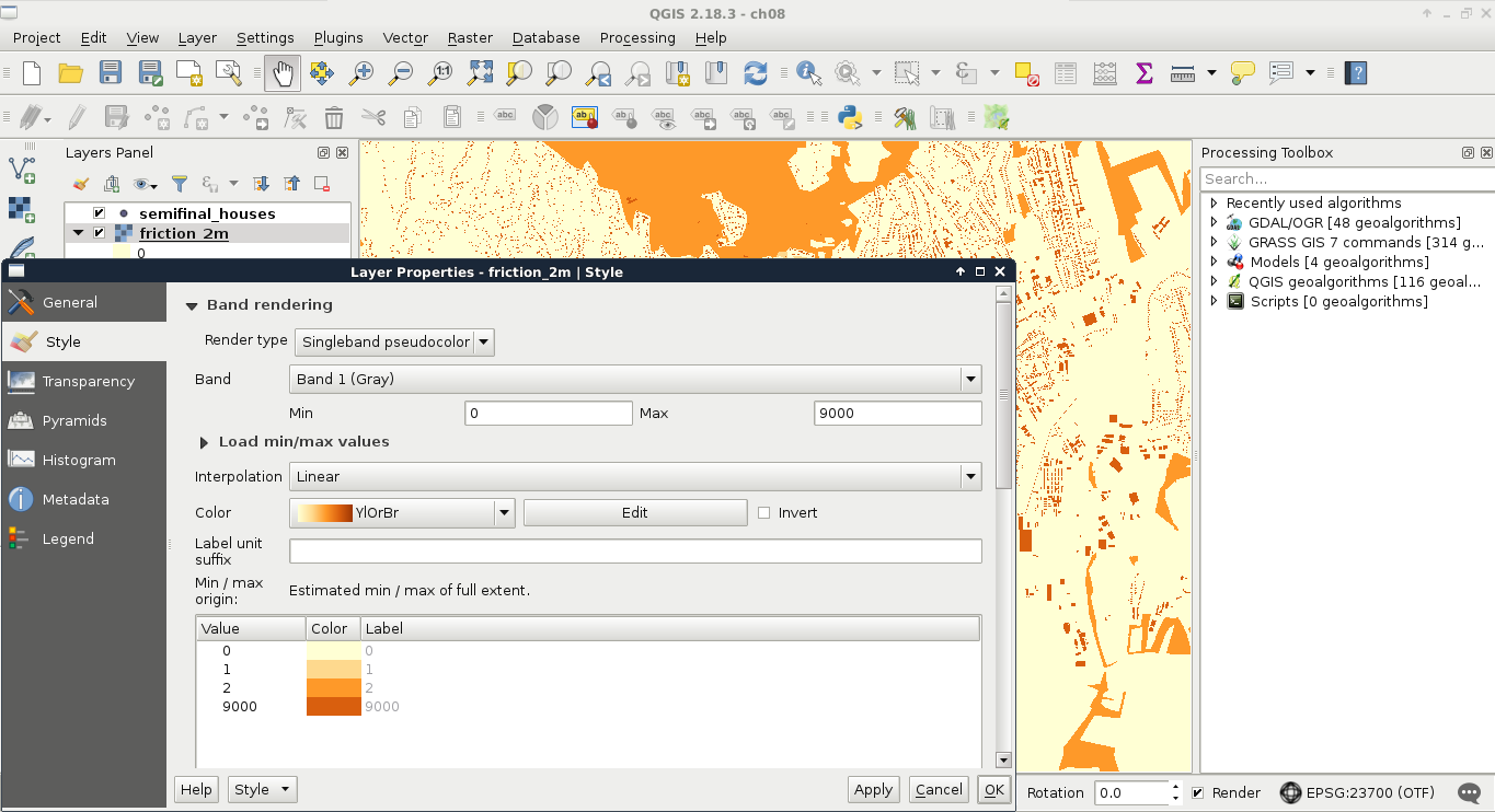
Besides the friction map, GRASS also needs an elevation map. However, we have some work to do on our SRTM DEM. First, as we have two raster layers with two resolutions, and it is no trivial matter for GRASS which one to choose, we have to resample our DEM to 2 meters. We should also clip the elevation raster to our town's boundary in order to reduce the required amount of calculations.
The final parameter we should provide is a vector layer with a number of points representing starting points. We need two cost layers, one for the bus stations, and one for the railway stations. These data can be accessed from the transport OSM layer we inserted into PostGIS. Let's load that layer, and clip it to the town's boundary. We can store the result in a memory layer. Now we are only a few steps away from the cost surfaces:
If we style the result, we can see how much time it takes to reach our houses from the railway stations. Now we have to repeat the previous steps with bus stations. To filter bus stations, we can use the expression "fclass" = 'bus_station':
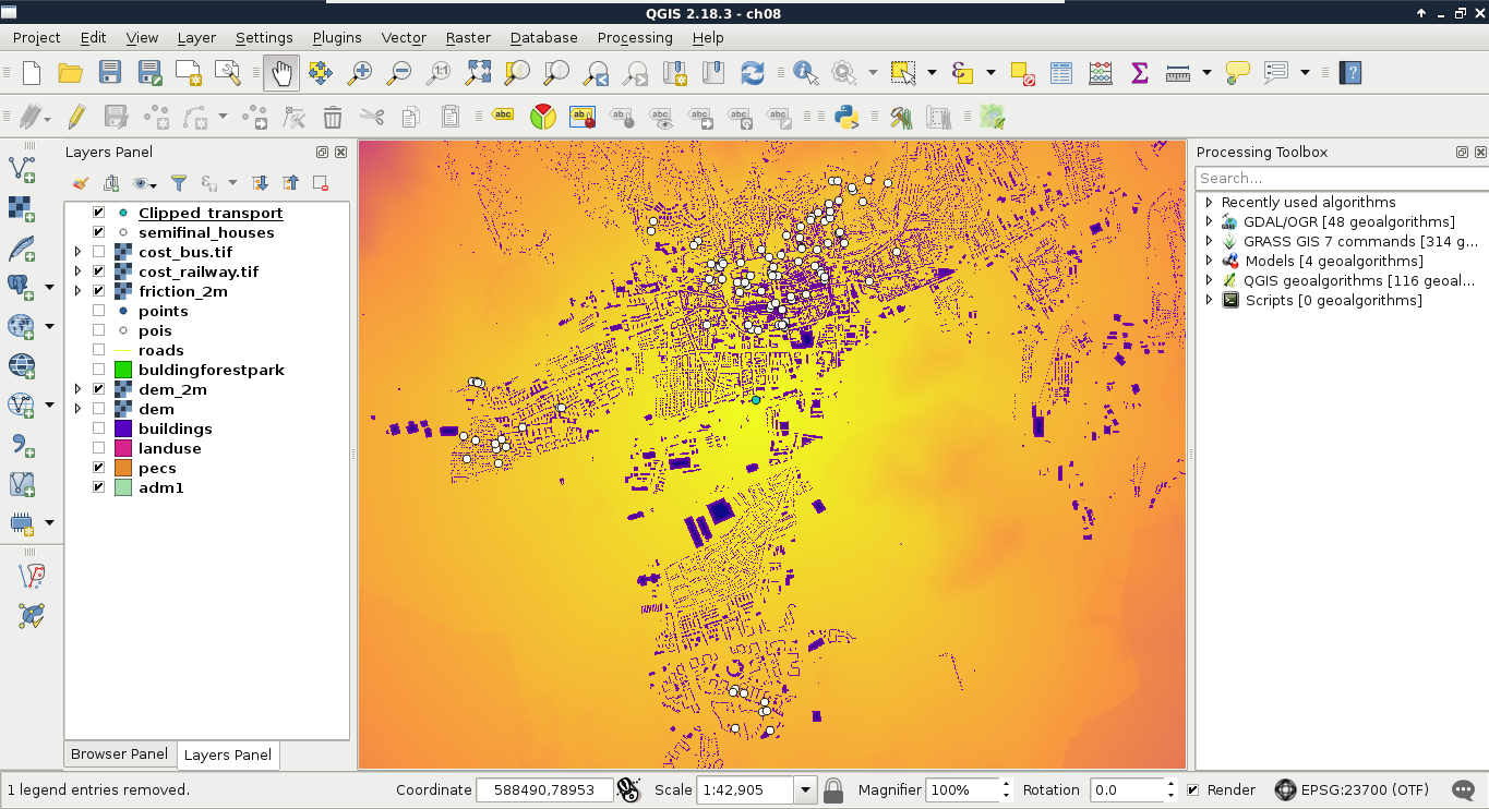
Almost there. We are only one step away from the final result--we need to sample both the cost maps at the houses' locations. Let's do this by following the steps we took earlier in this chapter:
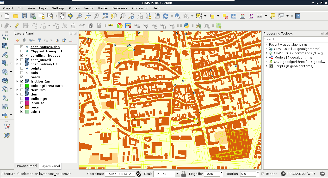
Congratulations! You just carried out your first vector analysis. It was a great adventure, wasn't it? In this chapter, you learned how to utilize vector layers to derive some valuable results from them. We learned about some of the more popular and useful vector analysis tools, and ventured into the more advanced realm of GIS. We also learned how you can make your workflow more flexible by building models from your steps.
In the next chapter, we will talk about spatial analysis in PostGIS. We will see how we can build queries executing spatial operations on our tables, creating the same results as in this chapter by nesting queries in QGIS's database manager.
In the last chapter, we did some vector analysis to get meaningful results from our data. We went through the steps of different types of vector analysis technique, and also built models to make our work more convenient. However, the execution of the algorithms still took some time, and you might wonder if there is a more effective way for achieving the same results.
In this chapter, we will explore the PostGIS way of vector analysis, which is faster and more flexible, as spatial operations executed with SQL queries can be saved and reproduced easily. With this approach, we can additionally stay in the realm of our spatial database, which means we do not have to worry about memory layers, temporary data, or saved layers scattered through our working folder. To make this approach comparable to the previous chapter, we will go through the same task, with the twist of doing everything in PostGIS, and using QGIS only as a thin client that is, using QGIS only for visualizing data.
In this chapter, we will cover the following topics:
First of all, we should upload our random houses in our spatial database. In order to do this, let's open QGIS's database manager through Database | DB Manager | DB Manager. Connect to the PostGIS database with the role we have--write privileges--and import the houses layer with Import layer/file. Of course, we have to open our raw houses layer, as it is not opened in QGIS. The options should be the same as before, which are as follows:
When we are done, let's visualize the uploaded houses layer in QGIS, and remove the one saved to the disk. If everything is fine, we should keep the DB manager window open, as we will execute our SQL queries there:
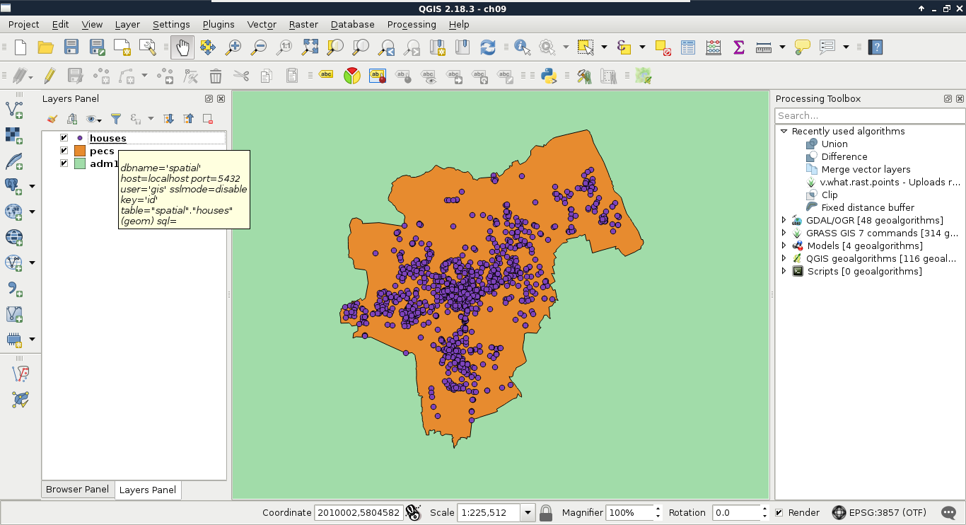
The first task in Chapter 8, Spatial Analysis in QGIS was to select every house which is at least 200 meters away from busy roads and 500 meters away from industrial areas. To complete this task, we created buffer zones around the problematic features and areas, calculated their union, and selected every disjoint house. Following the same approach, we can use two functions of PostGIS--ST_Intersects and ST_Buffer. We do not have to discuss ST_Intersects again, as we have already used it several times. ST_Buffer, on the other hand, is a different function. It does not act as a filtering function, but it creates and returns new geometries based on the input geometries and buffer distances. To buffer the busy roads of our roads layer, we can create the following expression:
    SELECT ST_Buffer(geom, 200) AS geom
     FROM spatial.roads r
     WHERE r.fclass LIKE 'motorway%' OR r.fclass LIKE 'primary%';
If we execute the expression with the Execute button, we can see the resulting geometries, while, if we load the result as a layer by checking the Load as a new layer box, filling out the required fields, and selecting Load now!, we can see the buffered roads in QGIS:
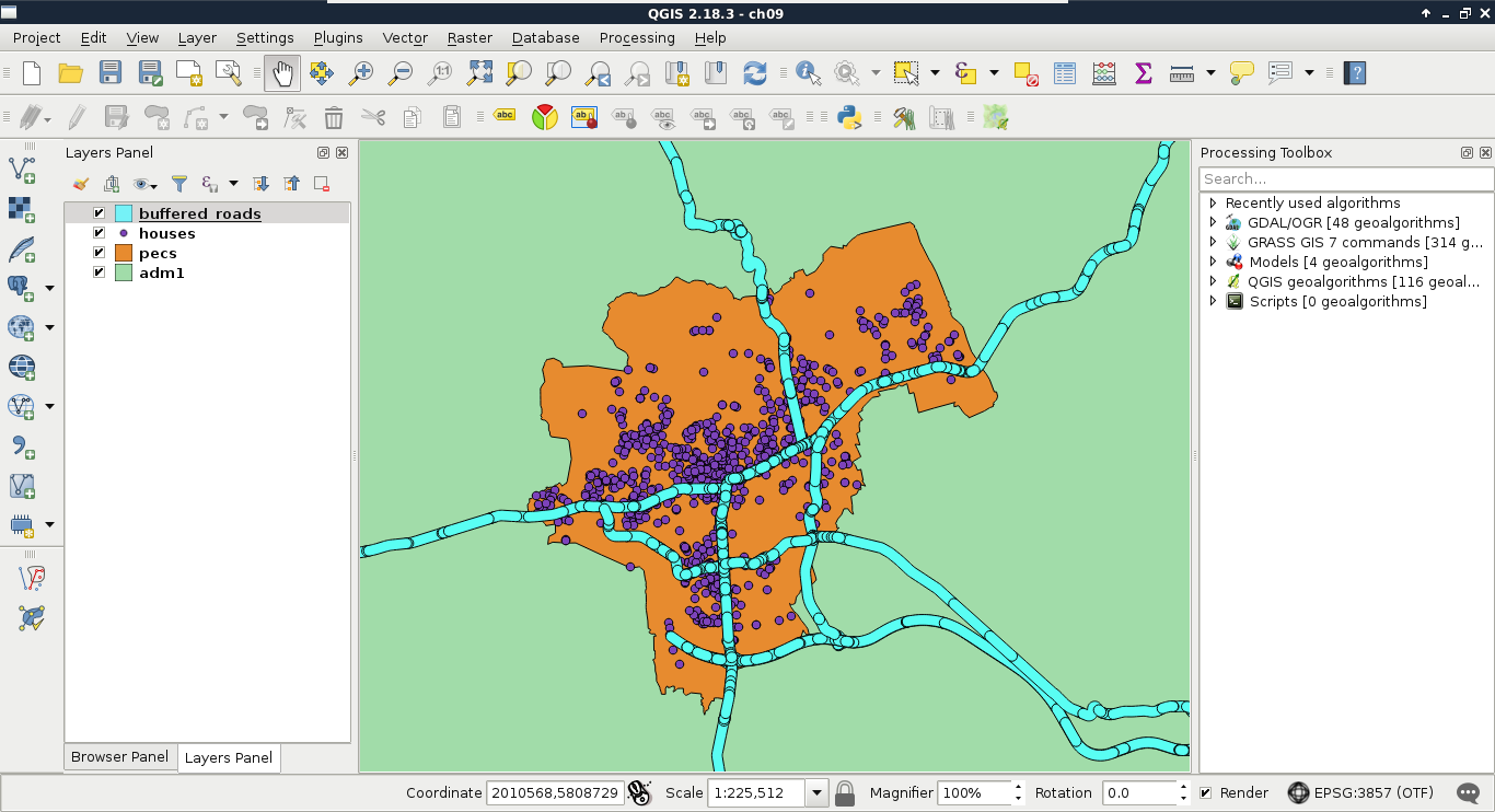
It is as easy as that. PostGIS iterates through the filtered roads, and buffers them on a row-by-row basis. It does not dissolve the results, or do anything else, but just returns the raw buffered geometries, and additionally, the attributes if we ask for them. As we will only use the geometries of the roads, we do not need any other attributes.
The only thing left to do is to check if our houses intersect with the buffer zones. As we only need a subset of the roads, which is effectively a subquery, we should precalculate the buffer zones in a CTE (Common Table Expression) table by using the WITH keyword as follows:
    WITH main_roads AS (
     SELECT ST_Buffer(geom, 200) AS geom
     FROM spatial.roads r
     WHERE r.fclass LIKE 'primary%' OR r.fclass LIKE 'motorway%')
    SELECT h.* FROM spatial.houses h, main_roads mr
     WHERE NOT ST_Intersects(h.geom, mr.geom);
Make sure to only execute the query; do not load as a layer. What did you get as a result? For me, this query returned more than 1 million rows. That's definitely a cross join between the individual buffer zones and the houses. Let's see if the results are correct, though. We can select only unique rows by using the DISTINCT operator after the SELECT keyword:
    WITH main_roads AS (
     SELECT ST_Buffer(geom, 200) AS geom FROM spatial.roads r
     WHERE r.fclass LIKE 'primary%' OR r.fclass LIKE 'motorway%')
    SELECT DISTINCT h.* FROM spatial.houses h, main_roads mr
     WHERE NOT ST_Intersects(h.geom, mr.geom);
The preceding query returns 1000 rows. That's the number of features we have in our houses layer.
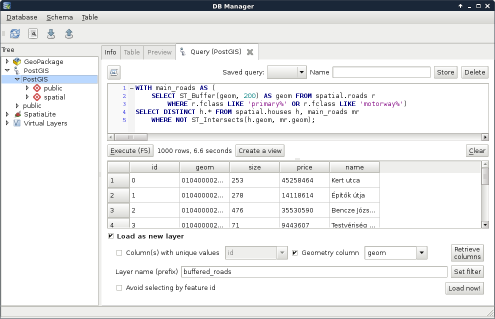
By creating a cross join, PostgreSQL returned every occurrence, where a house is disjoint with a buffer zone. That is, it returned every house multiple times. The magic we can use to solve this problem is to calculate the union of the buffer zones with ST_Union:
    WITH main_roads AS (
     SELECT ST_Union(ST_Buffer(geom, 200)) AS geom
     FROM spatial.roads r
     WHERE r.fclass LIKE 'primary%' OR r.fclass LIKE 'motorway%')
    SELECT h.* FROM spatial.houses h, main_roads mr
     WHERE NOT ST_Intersects(h.geom, mr.geom);
You must be wondering if this even makes any sense. If PostGIS goes row by row, why would it matter if we use union on every individual buffered geometry? The answer is that ST_Union is an aggregate function. Aggregate functions in PostGIS behave differently when they are called with one argument in a SELECT clause. They act on every returned row, and return a single geometry if there are no additional groupings defined. Now that the main_roads table has a single row, PostgreSQL behaves nicely, and returns only the disjoint features in less than a second.
The only thing left to do is to query houses which do not reside in the 500 meters buffer zone of industrial areas. For this, we need an additional CTE table with the union of the buffered industrial areas. In PostgreSQL, we can create multiple virtual tables in a single WITH clause by separating them with commas as follows:
    WITH main_roads AS (
     SELECT ST_Union(ST_Buffer(geom, 200)) AS geom
     FROM spatial.roads r
     WHERE r.fclass LIKE 'primary%' OR r.fclass LIKE 'motorway%'),
    industrial_areas AS (
     SELECT ST_Union(ST_Buffer(geom, 500)) AS geom
     FROM spatial.landuse l
     WHERE l.fclass = 'industrial' OR l.fclass = 'quarry')
    SELECT h.* FROM spatial.houses h, main_roads mr,
     industrial_areas ia
     WHERE NOT ST_Intersects(h.geom, mr.geom) AND NOT
     ST_Intersects(h.geom, ia.geom);
Quite a complex query, isn't it? On the other hand, it still returns the correct houses in less than a second, which is a serious performance boost. Let's load the results as a layer in QGIS, named something like quiet_houses_buffer:
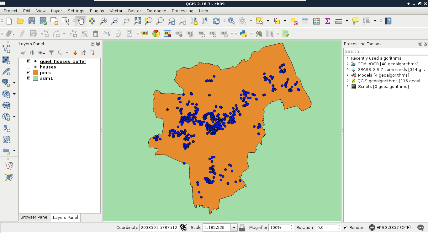
What is really great about PostGIS is that we do not have to rely on traditional ways of analysis. We can cook up new methods if they can be done on a row-by-row basis, and return correct results. For example, we do not have to buffer the constraint features, just measure their distances to the houses with ST_Distance. This way, we can use a more lightweight aggregate function--ST_Collect. It does not calculate the union of the input geometries, but just merges them into a single one. If we supply polygons, the resulting geometry will be a multipart polygon containing the input polygons as members.
Let's create a query using ST_Distance and ST_Collect:
    WITH main_roads AS (
     SELECT ST_Collect(geom) AS geom
     FROM spatial.roads r
     WHERE r.fclass LIKE 'primary%' OR r.fclass LIKE 'motorway%'),
    industrial_areas AS (
     SELECT ST_Collect(geom) AS geom FROM spatial.landuse l
     WHERE l.fclass = 'industrial' OR l.fclass = 'quarry')
    SELECT h.* FROM spatial.houses h, main_roads mr,
     industrial_areas ia
     WHERE ST_Distance(h.geom, mr.geom) > 200 AND ST_Distance(
      h.geom, ia.geom) > 500;
This method has a similar performance to the last one; however, it returned fewer features for me. If you experienced the same, load the results of this query in QGIS, and examine the difference.
If you also have some differences between the buffering and the distance measurement methods, follow me during the investigation. If not, just read along. First, let's see the problematic geometries in context. I only have one; therefore, it is more trivial to find out the source of the problem:
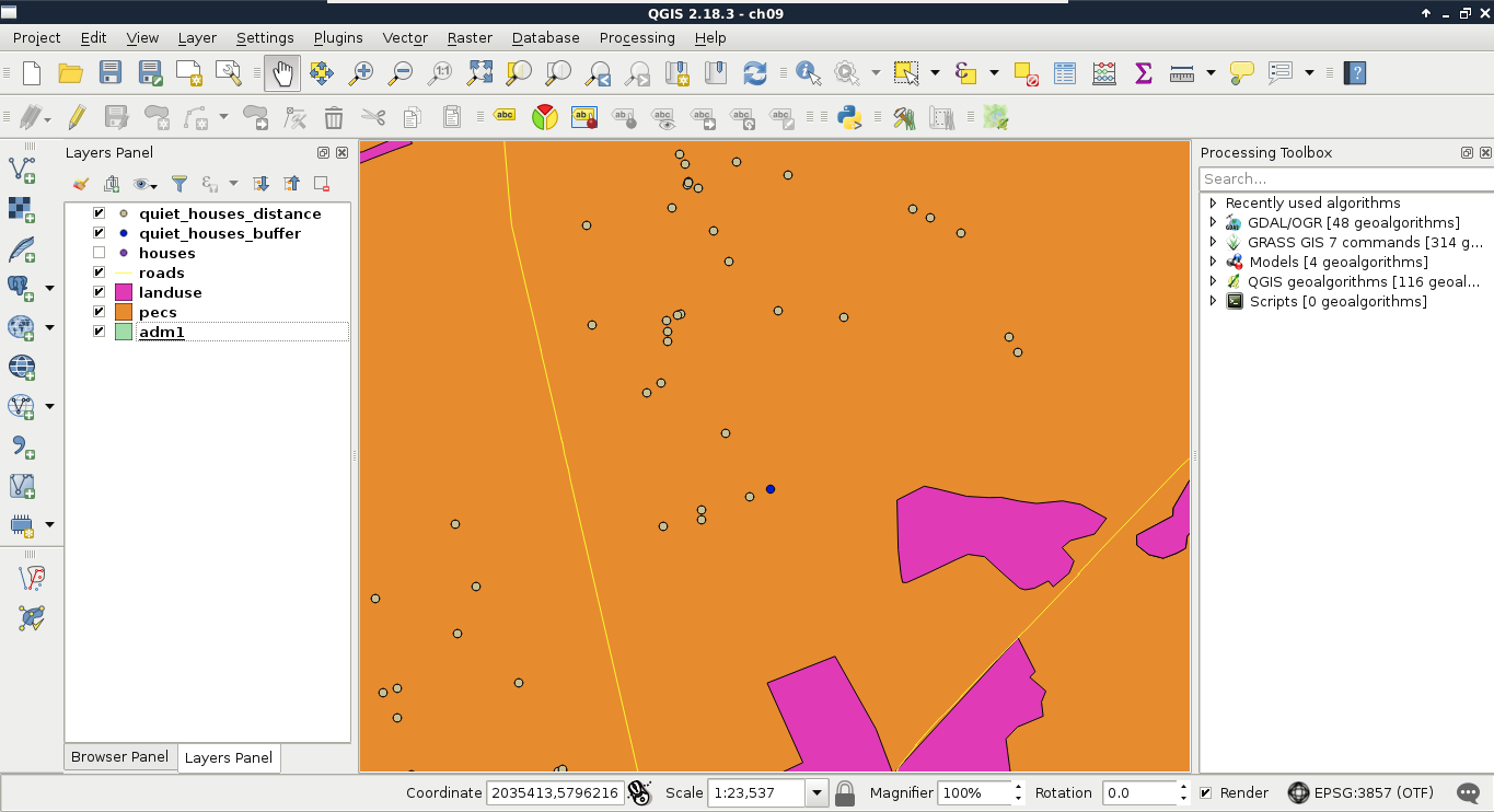
The main roads are far enough from the feature; therefore, the nearest industrial area should be the cause. If we create a 500-meters buffer zone around the layer, we should see that the feature lies outside of the buffer zone. However, ST_Distance thought otherwise. What we can also see is that the buffer zones are not circular; they have sides approximating the real buffer zones. The problem is that buffers are regular polygons, therefore, they consist of vertices connected by straight segments. That is, we cannot create true circular buffers. There is no problem when we buffer straight lines, the result becomes exact. The precision problem only arises when we buffer corners, and the buffer zones should be circular. We can, however, create better approximations by using more vertices for creating these circular arcs. In QGIS, we can use the Segments option in the buffer tools to specify the level of detail, and increase the precision of the result (Appendix 1.11).
PostGIS also allows us to specify the number of segments used for approximating a quarter circle. We can provide a third parameter to the ST_Buffer function, which represents the number of segments. Let's modify the query to use 25 segments for the approximation as follows:
    WITH main_roads AS (
     SELECT ST_Union(ST_Buffer(geom, 200, 25)) AS geom
     FROM spatial.roads r
     WHERE r.fclass LIKE 'primary%' OR r.fclass LIKE 'motorway%'),
    industrial_areas AS (
     SELECT ST_Union(ST_Buffer(geom, 500, 25)) AS geom
     FROM spatial.landuse l
     WHERE l.fclass = 'industrial' OR l.fclass = 'quarry')
    SELECT h.* FROM spatial.houses h, main_roads mr,
     industrial_areas ia
     WHERE NOT ST_Intersects(h.geom, mr.geom) AND NOT
     ST_Intersects(h.geom, ia.geom);
Now the results match the ones from using exact minimum distance measurements, although the query slowed down a bit, making the other query the obvious choice.
While using intersection checks with buffer zones only yields Boolean results (inside or outside), calculating the minimum distance from the reference geometry holds other advantages. For example, our customer can ask which of the houses are the farthest from those noisy areas. By querying the distances, we can easily answer that question. We can even order our results by the combined distances using ORDER BY at the end of our query. Let's remove the buffer-based query's layer, and modify the distance-based one's expression by right-clicking on it, and selecting Update Sql Layer:
    WITH main_roads AS (
     SELECT ST_Collect(geom) AS geom
     FROM spatial.roads r
     WHERE r.fclass LIKE 'primary%' OR r.fclass LIKE 'motorway%'),
    industrial_areas AS (
     SELECT ST_Collect(geom) AS geom
     FROM spatial.landuse l
     WHERE l.fclass = 'industrial' OR l.fclass = 'quarry')
    SELECT h.*, ST_Distance(h.geom, mr.geom) AS dist_road,
     ST_Distance(h.geom, ia.geom) AS dist_ind
     FROM spatial.houses h, main_roads mr, industrial_areas ia
     WHERE dist_road > 200 AND dist_ind > 500
    ORDER BY dist_road + dist_ind DESC;
In theory, we are now asking PostgreSQL to evaluate the two distance checks, and return them to us in the dist_road and dist_ind columns. Then we simply use those columns to select only the correct houses, and order the results in descending order.
What happens if we run this query? It returns an error with the message "dist_road" does not exists. We tried to use a field which had not yet been calculated when PostgreSQL tried to call it. We simply cannot use computed fields in other queries on the same level. Let's modify our query a little bit, as follows:
    WITH main_roads AS (
     SELECT ST_Collect(geom) AS geom
     FROM spatial.roads r
     WHERE r.fclass LIKE 'primary%' OR r.fclass LIKE 'motorway%'),
    industrial_areas AS (
     SELECT ST_Collect(geom) AS geom
     FROM spatial.landuse l
     WHERE l.fclass = 'industrial' OR l.fclass = 'quarry')
    SELECT h.*, ST_Distance(h.geom, mr.geom) AS dist_road,
     ST_Distance(h.geom, ia.geom) AS dist_ind
     FROM spatial.houses h, main_roads mr, industrial_areas ia
     WHERE ST_Distance(h.geom, mr.geom) > 200 AND ST_Distance(h.geom,
     ia.geom) > 500
    ORDER BY ST_Distance(h.geom, mr.geom) + ST_Distance(h.geom,
     ia.geom) DESC;
The new query works, although the distances are calculated three times, slowing down the execution, which is bad. On the other hand, we have the distance values, and our features are ordered based on their combined distances from noisy areas:
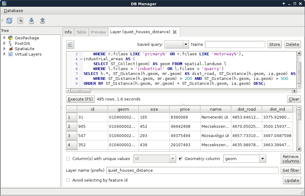
We should still do something about this query, as it is quite inconvenient to declare the same calculations multiple times. If we wish to change some of the distance columns, we would have to change them in three places. This is the case when a subquery proves useful. We can calculate the houses table with the distance columns as a new table called hwd (houses with distances). Then we can simply refer to the columns of that table in the other two occurrences:
    WITH main_roads AS (
     SELECT ST_Collect(geom) AS geom
     FROM spatial.roads r
     WHERE r.fclass LIKE 'primary%' OR r.fclass LIKE 'motorway%'),
    industrial_areas AS (
     SELECT ST_Collect(geom) AS geom
     FROM spatial.landuse l
     WHERE l.fclass = 'industrial' OR l.fclass = 'quarry')
    SELECT * FROM
     (SELECT h.*, ST_Distance(h.geom, mr.geom) AS dist_road,
     ST_Distance(h.geom, ia.geom) AS dist_ind
     FROM spatial.houses h, main_roads mr, industrial_areas ia) AS hwd
     WHERE hwd.dist_road > 200 AND hwd.dist_ind > 500
    ORDER BY hwd.dist_road + hwd.dist_ind DESC;
The calculation time is the same, as PostgreSQL has to query the distances for every house before it can query the relevant rows. Additionally, using subqueries makes the code harder to read and interpret. Luckily, PostgreSQL offers us an even better method for creating columns, which can be cross-referenced--lateral subqueries. By using the keyword LATERAL before a subquery, we only need to include the formulae for the dynamically calculated columns, and we can use them outside of the subquery.
Lateral subqueries can be added to the tables we select from, and, therefore, in the FROM clause. We only need to provide the computed columns and their formulae in the subquery as follows:
    WITH main_roads AS (
     SELECT ST_Collect(geom) AS geom FROM spatial.roads r
     WHERE r.fclass LIKE 'primary%' OR r.fclass LIKE 'motorway%'),
    industrial_areas AS (
     SELECT ST_Collect(geom) AS geom FROM spatial.landuse l
     WHERE l.fclass = 'industrial' OR l.fclass = 'quarry')
    SELECT h.*, hwd.dist_road, hwd.dist_ind
     FROM spatial.houses h, main_roads mr, industrial_areas ia,
     LATERAL (SELECT ST_Distance(h.geom, mr.geom) AS dist_road,
     ST_Distance(h.geom, ia.geom) AS dist_ind) AS hwd
     WHERE hwd.dist_road > 200 AND hwd.dist_ind > 500
    ORDER BY hwd.dist_road + hwd.dist_ind DESC;
With this query, we not only made the code more readable, but also increased its performance by almost 30%. As PostgreSQL could optimize our new lateral query better, we get similar performance as with the precise buffering technique, acquired the distances from the noisy areas, and ordered our features according to them. With this final optimization, there is no more doubt that distance calculations should be preferred over buffering in PostGIS for proximity analysis.
Finally, let's save the last query as a view without ordering the results. This way, we can ease our future work by having shorter, and thus, more manageable chunks of code. We can easily create a view from QGIS's DB Manager by prefixing the query with CREATE VIEW AS and the view's name. However, before creating a view, let's talk about naming conventions. If we work with a PostGIS database extensively, we will definitely end up with different kinds of tables like the following:
To distinguish between the different types of data, we should apply a naming convention. A good example would be prefixing different kinds of data with some abbreviations. This practice can help pgAdmin or other graphical interfaces to visually group and organize different kinds of data. We can name our views as vw_viewname or vwViewName, our temporal or final results as res_tableName or resTableName, and so on. It shouldn't really matter (although PostgreSQL will drop camel cases by default) as long as we keep to our rules, and name our tables consistently. Now as I'm naming my view vw_quiethouses, the query saving the view looks like the following:
    CREATE VIEW spatial.vw_quiethouses AS WITH main_roads AS (
     SELECT ST_Collect(geom) AS geom FROM spatial.roads r
     WHERE r.fclass LIKE 'primary%' OR r.fclass LIKE 'motorway%'),
    industrial_areas AS (
     SELECT ST_Collect(geom) AS geom FROM spatial.landuse l
     WHERE l.fclass = 'industrial' OR l.fclass = 'quarry')
    SELECT h.*, hwd.dist_road, hwd.dist_ind
     FROM spatial.houses h, main_roads mr, industrial_areas ia,
     LATERAL (SELECT ST_Distance(h.geom, mr.geom) AS dist_road,
     ST_Distance(h.geom, ia.geom) AS dist_ind) AS hwd
     WHERE hwd.dist_road > 200 AND hwd.dist_ind > 500;
We have two additional tasks to complete in order to match the common preferences of our customers. If you do not remember the exact preferences, here they are again:
The first three criteria can be easily matched building on the queries of the previous section. We only have to create three CTE tables or subqueries; one for the parks with playgrounds in their 200 meters vicinity, one for the restaurants, and one for the bars and pubs. After that, we only have to match our houses by using distance checks. Such a query can be formulated as follows:
    WITH parks_with_playgrounds AS (
     SELECT ST_Collect(l.geom) AS geom FROM spatial.landuse l,
     spatial.pois p
     WHERE l.fclass = 'park' AND p.fclass = 'playground' AND
    ST_DWithin(l.geom, p.geom, 200)),
    restaurants AS (
     SELECT ST_Collect(geom) AS geom FROM spatial.pois p
     WHERE p.fclass = 'restaurant'),
    bars AS (
     SELECT ST_Collect(geom) AS geom FROM spatial.pois p
     WHERE p.fclass = 'bar' OR p.fclass = 'pub')
    SELECT h.* FROM spatial.vw_quiethouses h,
     parks_with_playgrounds pwp, restaurants r, bars b
     WHERE ST_DWithin(h.geom, pwp.geom, 500) AND ST_DWithin(h.geom,
     r.geom, 500) AND ST_DWithin(h.geom, b.geom, 500);
The final expression works as the ones formulated before. We filter the raw tables by attributes and distances, and use some distance checks in the final query. The only difference is that as we do not need the exact distances, we used ST_DWithin instead of ST_Distance. ST_DWithin is a simple filtering function for selecting features based on a proximity. It has almost no performance penalty over ST_Distance, but offers a more concise way to formulate our query. It needs three arguments: two geometries, and a distance in the units of the input layers' SRID.
If we load the result as a layer, we can see our constrained quiet houses, which match the results created in QGIS at a first glance:
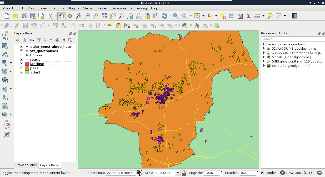
For the sake of simplicity and clarity, let's create another view from the result of this query. We just have to prefix our query with CREATE VIEW AS and the view's name:
    CREATE VIEW spatial.vw_quietconstrainedhouses AS WITH
     parks_with_playgrounds AS (
     SELECT ST_Collect(l.geom) AS geom FROM spatial.landuse l,
     spatial.pois p
     WHERE l.fclass = 'park' AND p.fclass = 'playground' AND
     ST_DWithin(l.geom, p.geom, 200)),
     restaurants AS (
     SELECT ST_Collect(geom) AS geom FROM spatial.pois p
     WHERE p.fclass = 'restaurant'),
     bars AS (
     SELECT ST_Collect(geom) AS geom FROM spatial.pois p
     WHERE p.fclass = 'bar' OR p.fclass = 'pub')
    SELECT h.* FROM spatial.vw_quiethouses h,
     parks_with_playgrounds pwp, restaurants r, bars b
     WHERE ST_DWithin(h.geom, pwp.geom, 500) AND ST_DWithin(h.geom,
     r.geom, 500) AND ST_DWithin(h.geom, b.geom, 500);
Although PostGIS is one of the state-of-the-art GIS softwares for effective spatial queries, aggregating effectively can sometimes be tricky. For this reason, we will go step by step through appealing to the final criterion. First of all, we need to select the markets from our POI table. This should be easy, as we just have to chain some queries on a single column together with the logical OR operator. Or we can use a more convenient operator created for similar tasks called IN. By using IN, we can supply a collection of values to check a single column against:
    SELECT geom FROM spatial.pois p
     WHERE p.fclass IN ('supermarket', 'convenience',
     'mall', 'general');
Let's put this table in a WITH clause, and go on with counting points.
    WITH markets AS (
     SELECT geom FROM spatial.pois p
     WHERE p.fclass IN ('supermarket', 'convenience',
     'mall', 'general'));
We used some aggregating functions before, but only for the sole purpose of returning a single aggregated value for an entire table. Aggregating a single column is trivial enough for PostgreSQL not to ask for any other parameters. However, if we would like to select multiple columns while aggregating, we have to specify our intention of creating groups explicitly by using a GROUP BY expression with a selected column name. We can create a simple grouping by querying the IDs of our houses layer along with the number of geometries in our markets layer. Counting can be done by utilizing count, one of the most basic aggregating function in PostgreSQL, as follows:
    WITH markets AS (
     SELECT geom FROM spatial.pois p WHERE p.fclass IN ('supermarket',
     'convenience', 'mall', 'general'))
    SELECT h.id, count(m.geom) AS count FROM spatial.houses h,
     markets m
     GROUP BY h.id;
Now we got 1,000 results, just as many houses we have. Every row has the total count of geometries in our markets layer, as we did not supply a condition for the selection. Basically, we got the cross join of the two tables, but grouped by the IDs of our houses table. As we aggregated the number of geometries in each group, and got every possible combination, we ended up with the same number of points for every group.
Let's supply a join condition to narrow down our results:
    WITH markets AS (
     SELECT geom FROM spatial.pois p WHERE p.fclass IN ('supermarket',
     'convenience', 'mall', 'general'))
    SELECT h.id, count(m.geom) AS count FROM spatial.houses h,
     markets m
     WHERE ST_DWithin(h.geom, m.geom, 500)
     GROUP BY h.id;
By providing the condition we should be able to see a subset of our data:
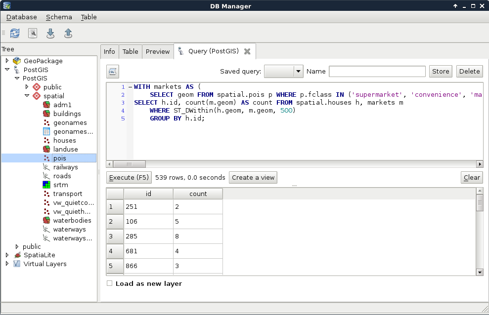
Now we get a real inner join; PostgreSQL only returned the rows matching the join conditions. That is, we got a table where every row with a geometry closer than 500 meters to a house got joined to it. From that table, PostgreSQL could easily aggregate the number of markets in the 500 meters vicinity of our houses. Note that we got back only a part of our tables, as features without markets (empty groups) got discarded. Let's take a note about that number, as we will need it later.
Before going further, let's rephrase this expression to include the INNER JOIN keywords. If we implicitly define a join, that is, separate layers in the FROM clause with commas, we can specify our join conditions in the WHERE clause. However, if we define a join explicitly, the conditions go in the ON clause:
    WITH markets AS (
     SELECT geom FROM spatial.pois p
     WHERE p.fclass IN ('supermarket', 'convenience',
     'mall', 'general'))
    SELECT h.id, count(m.geom) AS count
     FROM spatial.houses h INNER JOIN markets m
     ON ST_DWithin(h.geom, m.geom, 500)
     GROUP BY h.id;
Now we can easily change the join between our tables to an outer-left join in order to have the rest of the rows with 0 markets in their 500 meters radii:
    WITH markets AS (
     SELECT geom FROM spatial.pois p
     WHERE p.fclass IN ('supermarket', 'convenience',
     'mall', 'general'))
    SELECT h.id, count(m.geom) AS count
     FROM spatial.houses h LEFT JOIN markets m
     ON ST_DWithin(h.geom, m.geom, 500)
     GROUP BY h.id;
As the query's result shows, we have 1,000 rows, just like our houses table. Some of the rows have 0 values. However, are these results the same as the previous ones? We can do a quick validation by filtering out groups with 0 count values. If we get the same number of rows we noted previously, then we are probably on the right track. To select from groups, we cannot use a WHERE clause; we have to use a special clause designed for filtering groups--HAVING:
    WITH markets AS (
     SELECT geom FROM spatial.pois p
     WHERE p.fclass IN ('supermarket', 'convenience',
     'mall', 'general'))
    SELECT h.id, count(m.geom) AS count
     FROM spatial.houses h LEFT JOIN markets m
     ON ST_DWithin(h.geom, m.geom, 500)
     GROUP BY h.id HAVING count(m.geom) > 0;
For me, PostgreSQL returned the same number of rows; however, using LEFT JOIN and filtering with a HAVING clause slowed down the query. Before creating a CTE table along with markets from the result, we should rewrite our count table's query to its previous, faster form:
    WITH markets AS (
     SELECT geom FROM spatial.pois p
     WHERE p.fclass IN ('supermarket', 'convenience',
     'mall', 'general')),
     marketcount AS (SELECT h.id, count(m.geom) AS count
     FROM spatial.houses h, markets m
     WHERE ST_DWithin(h.geom, m.geom, 500)
     GROUP BY h.id);
Now the only thing left to do is to select the houses from our last view which have at least two markets in their vicinity:
    WITH markets AS (
     SELECT geom FROM spatial.pois p
     WHERE p.fclass IN ('supermarket', 'convenience',
     'mall', 'general')),
     marketcount AS (SELECT h.id, count(m.geom) AS count
     FROM spatial.houses h, markets m
     WHERE ST_DWithin(h.geom, m.geom, 500)
     GROUP BY h.id)
    SELECT h.* FROM spatial.vw_quietconstrainedhouses h,
     marketcount m
     WHERE h.id = m.id AND m.count >= 2;
By supplying the full query, we can see our semifinal results on our map:
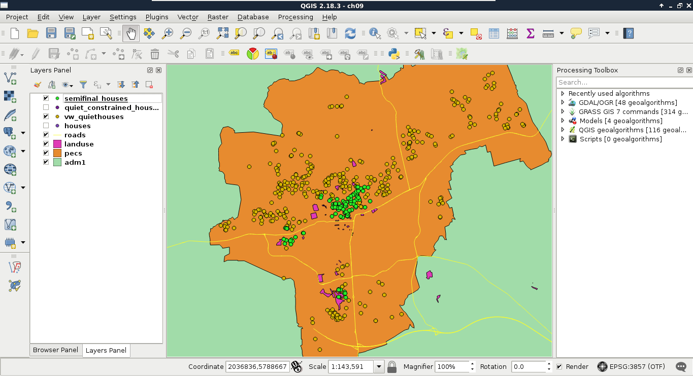
Look at that performance boost! For me, the whole analysis took about 1.3 seconds. On top of that, we can alter any parameter just by changing the view definitions. Additionally, we got the distances from the noisy places on which we can order our features. By ordering the result in a decreasing order, we can label our features according to that parameter, and show them to our customers on a map.
Finally, let's save our semifinal results as a third view:
    CREATE VIEW spatial.vw_semifinalhouses AS WITH markets AS (
     SELECT geom FROM spatial.pois p
     WHERE p.fclass IN ('supermarket', 'convenience',
     'mall', 'general')),
     marketcount AS (SELECT h.id, count(m.geom) AS count
     FROM spatial.houses h, markets m
     WHERE ST_DWithin(h.geom, m.geom, 500)
     GROUP BY h.id)
    SELECT h.* FROM spatial.vw_quietconstrainedhouses h, marketcount m
     WHERE h.id = m.id AND m.count >= 2;
As PostGIS has limited raster capabilities compared to the sophisticated algorithms that GRASS GIS has, we have no way to calculate walking distances in our spatial database. However, in PostGIS, we can query raster tables and carry out basic terrain analysis, like calculating aspect. Querying raster layers with points is a surprisingly fast operation in PostGIS, as it can use the bounding boxes of raster tiles for geometry indexing, transform our points to pixel coordinates in the correct tile, and get the corresponding value from the stored binary raster by calculating an offset in bytes. We can use the ST_Value function to query raster data as follows:
    SELECT h.*, ST_Value(r.rast, h.geom) AS elevation
     FROM spatial.vw_semifinalhouses h, spatial.srtm r
     WHERE ST_Intersects(r.rast, h.geom);
The only limitation of ST_Value is that it only accepts single-part points. Therefore, if we stored our houses as multipoint geometries, we need to extract the first geometry from them manually. If you got an error for the preceding query, that is a probable case. We can extract single-part geometries from a multipart geometry with the ST_GeometryN function, which needs a multipart geometry and a position as arguments. If we saved our houses table as multipoints, each geometry holds the single-part representation of our houses in its first position:
    SELECT h.*, ST_Value(r.rast, ST_GeometryN(h.geom, 1)) AS elevation
     FROM spatial.vw_semifinalhouses h, spatial.srtm r
     WHERE ST_Intersects(r.rast, h.geom);
Although raster queries are fast in PostGIS, raster calculations are quite slow, as PostGIS has to execute the required operations on the requested tiles. There are a lot of possibilities from which we will use the ST_Aspect function to calculate the aspect in the locations of our houses. It is quite easy to add this function to our query, as it only needs a raster as an input. Furthermore, we should modify our query to only return houses with a southern aspect:
    SELECT h.*, a.aspect FROM spatial.vw_semifinalhouses h,
     spatial.srtm r,
     LATERAL (SELECT ST_Value(ST_Aspect(r.rast), ST_GeometryN(h.geom,
     1)) AS aspect) AS a
     WHERE ST_Intersects(r.rast, h.geom) AND a.aspect < 225 AND
     a.aspect > 135;
Great work! We just fulfilled every criteria of one of our customers entirely in PostGIS. Although raster calculations are faster in QGIS and GRASS, and uploading rasters into PostGIS is cumbersome, it is worth considering uploading processed rasters to PostGIS for the convenience and performance of plain raster queries:
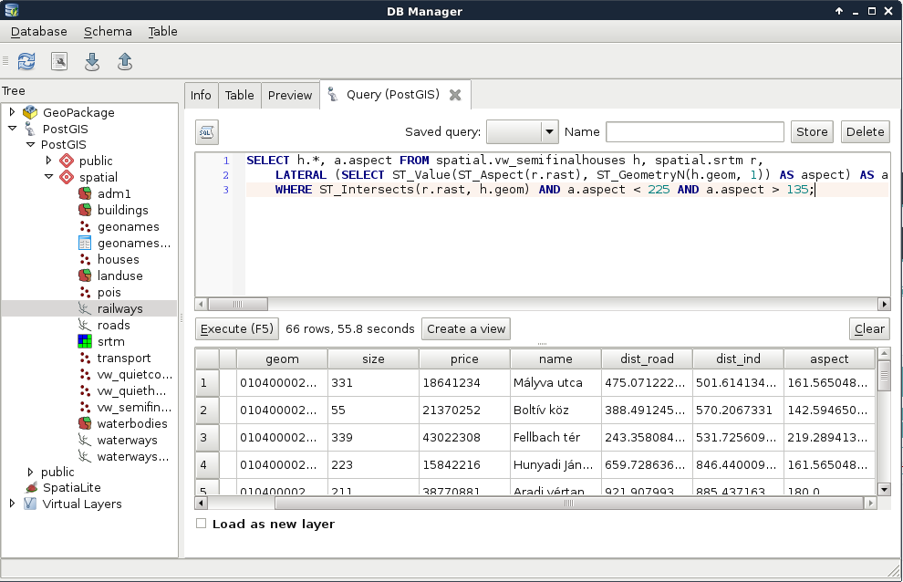
In this chapter, we learned how to improve the speed of our vector analysis by orders of magnitude. We simply used one of the state-of-the-art tools for quick vector analysis--PostGIS. We also learned more about vector analysis, some of their pitfalls, and how to get more out of our spatial database. We carried out a spatial analysis, which would have been cumbersome in other desktop GIS software, to gain valuable extra information from our data. Of course, PostGIS and PostgreSQL have capabilities far beyond the scope of this chapter; therefore, if you are planning to work with spatial relational databases, it is definitely worth digging in deeper, and reading additional sources focused on PostGIS.
In the next chapter, we will focus on raster analysis, and learn about the most essential raster tools. We will create a decision problem where we have to choose the best site based on some criteria. Finally, we will not only solve that problem, but additionally, use some statistical methods to evaluate the result and create a clear basis for a well-founded decision.
In the last chapter, we discussed vector analysis, and how we can perform it effectively. After explaining the basics in QGIS, we harnessed the power of PostGIS and carried out our analysis with unpaired speed. We also queried rasters, and executed a basic terrain analysis operation getting aspect values in the locations of our randomly generated houses as a result.
In this chapter, we will move on and discuss raster analysis in detail. We will learn how to use the most essential raster tools, and what kind of typical operations we can do with rasters. To spice up this chapter, first we create a scenario where we are decision makers. We search for the ideal site of our business, and we've already evaluated the criteria for the optimal site. The twist is that we are not looking for equally ideal sites, but searching for the best site for our purpose. Therefore, raw results showing possibilities are not enough in this case; we need an assessment evaluating those possibilities on which we can make our decision.
In this chapter, we will cover the following topics:
First of all, we need a scenario involving a problem for us to solve. In this chapter, we are decision makers looking for the best site for our business. We are supplying stores in multiple settlements scattered in our study area. More precisely, in every seat of the administrative division, we have stores to supply. We are looking for a site appropriate for holding our logistics center (that is, warehouse). As we will build the center, we do not need existing infrastructure on the site, although it should be economically feasible to build on it, and large enough to hold our 1 km2 building with some loading area to load and unload supplies. For the sake of simplicity, the shape of the building is not important, we are flexible enough to conform to the chosen site. Last, but not least, we don't need a single site. We need a list of the most suitable sites from which we can choose the best one for our business. Summarizing and expanding the preferences, we can get a nice list of criteria as follows:
By translating these criteria to the language of our GIS model, we can create a more specific list, which is as follows:
Additionally, to fully satisfy the preference of economical feasibility, we should add the following criterion:
Unlike our previous analysis, now that we do not have input points or areas to choose from, we have to delimit those areas based on different criteria. That alone raises the idea of using rasters. Additionally, this time we not only have Boolean criteria (inside or outside), but also have some continuous preferences (closer, or farther, the better). This factor calls for raster analysis. In raster analysis, we can consider almost the same classification as in vector analysis:
As you can see, the definitions have changed, as we cannot talk about geometries and attributes separately in case of raster data. Rasters offer full coverage of a rectangular area, therefore, if we use two perfectly aligned raster layers with coincident cells, the result will have the same cell number and cell size, and only the values matter. If not, a sophisticated GIS will resample one of the raster layers by simply aligning it with the other one, or interpolating its values during the process.
As we need to analyze the suitability of an area based on some preferences, we are basically doing an MCDA (Multi-criteria decision analysis). MCDA, in GIS, is generally done with raster data, and the final map shows the suitability of every cell in the study area. We can use MCDA for different purposes, like analyzing the suitability of the land for a specific species, or choosing the right site for a building with quantitative needs. During the process, we have to create raster maps for every criteria, then calculate the final suitability based on them. For this task, we differentiate between these two kinds of data:
In the end, we will have to create a single map by combining the different constraints and factors, showing the overall suitability of the cells calculated from the different factors, and masked by the union of the different constraints. There are several approaches and steps to execute an MCDA analysis, although in GIS, the most popular approach is to use the multi-criteria evaluation (MCE) method. By using this method alone, the result will have some uncertainty due to the involved subjectivity, although it will suit us in our task. First, let's break down our criteria to constraints and factors as follows:
Using this naive grouping, we have to process some of our data twice, as we have some overlaps between our constraints and our factors. However, we do not need to use those data as both constraints and factors. We can normalize our factors in a way that the constrained areas automatically get excluded from the result. Furthermore, as our DEM is already clipped to the borders of our study area, we do not have to create a raster layer from our study area. That is, we can regroup our tasks in the following way:
In order to create constraints, we need to convert our input features to raster maps. Before converting them, however, we need to open the correct layers, and apply filters on them to show only the suitable features:
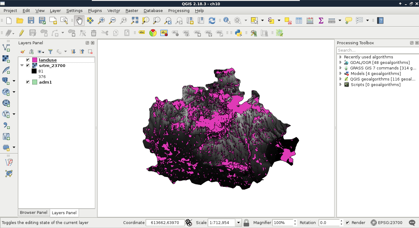
The next step is to create the required raster layers. This step involves calculating slope values from the DEM, and converting the vector layers to rasters:
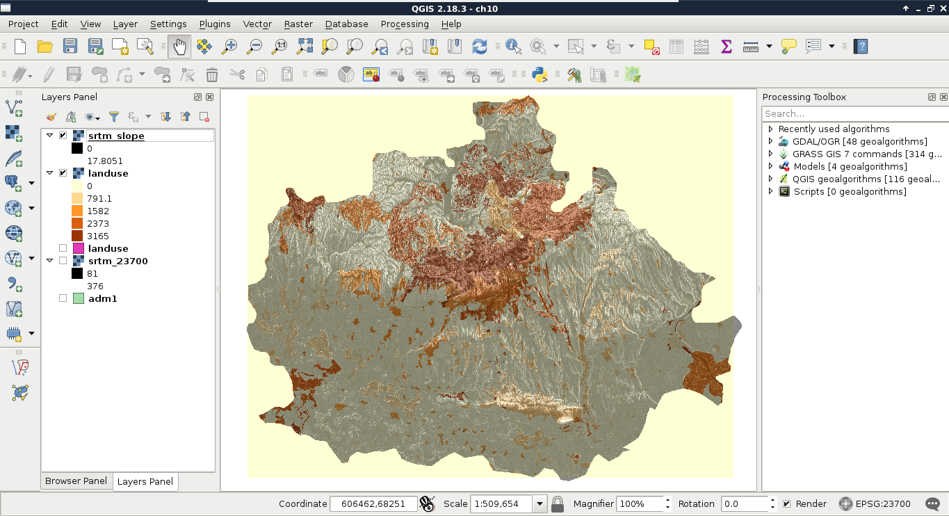
Now we have a problem. Our land use raster's extent is limited to the extent of the land use vector layer. That is, the raster does not cover our study area. If we leave it like this, we instantly fail one of our criteria, as we do not analyze the whole study area. We can overcome this issue by creating a base raster. The Rasterize tool has an option to overwrite an existing raster, and burn the rasterized features in it:
Now we have a continuous and a discrete raster layer, which should create a mask together somehow. Using vector data, we can easily overlay two layers, as both consist of the same types--geometries. We can compare geometries safely, and get geometries as a result. However, in case of raster data, the geometries are regular grids, and overlaying them makes little sense for any analysis. In this case, we overlay cell values which represent some kind of attribute. Considering this, how can we compare two completely different values? What can be the result of overlaying slope degrees and land use IDs? What is the intersection of 15° and 2831? The answer is simple--we can only get meaningful overlays from comparable layers. That is why we need to convert our slopes and land use to constraints--0% suitability and 100% suitability values.
When we assign new values to raster layers based on some rules, it is called reclassification. We can reclassify raster layers in QGIS by using the raster calculator. Let's open it from Raster | Raster Calculator. The raster calculator in QGIS is somewhat similar to the field calculator, although it has limited capabilities, which include the following:
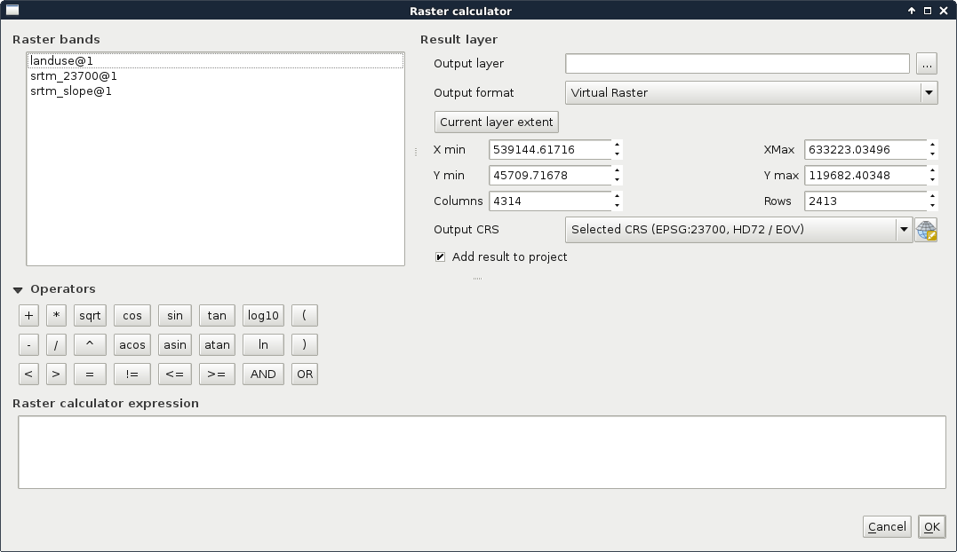
With these variables, constants, and operators, we need to create a function or expression which iterates through every cell of a single, or multiple raster layers. The resulting raster will contain the results of the function applied to the individual cells. As our constraint maps should only contain binary values, we can get our first results easily by using simple comparisons as follows:
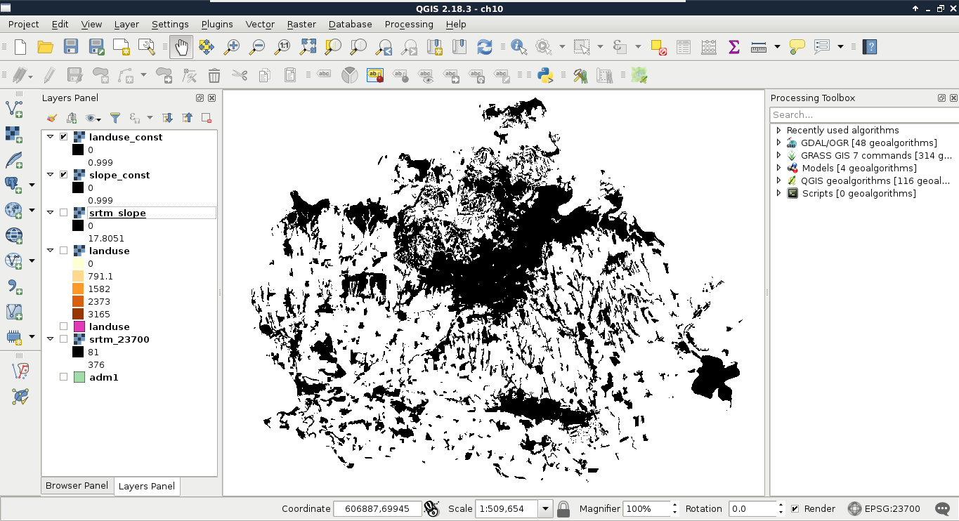
Now we have two binary constraint layers, which can be directly compared, as their values are on the same scale. Using binary layers A and B, we can define the two simplest set operations as follows:
What we basically need is the union of constraints (zeros). Logically thinking, we can get those by calculating the intersection of suitable cells (ones). Let's do that by opening the raster calculator, and creating a new GeoTIFF raster with the intersection of the two constraint layers as follows:
"landuse_const@1" * "slope_const@1"
Now we can see our binary layer containing our aggregated constraint areas:
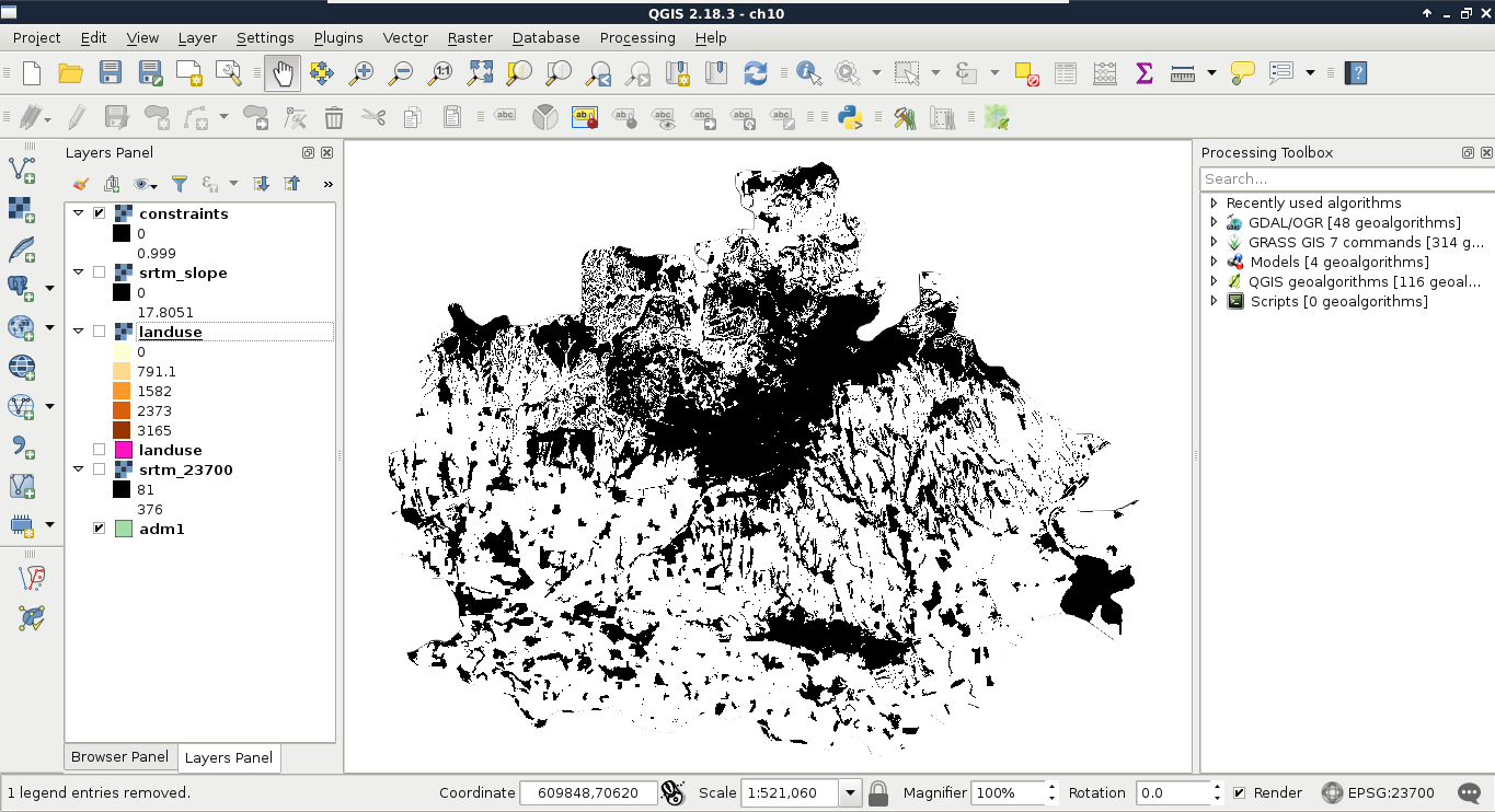
Now that we have our final constraint layer, which can be used as a simple mask, we can proceed and create our factors. First, we can remove every intermediary layer we worked with, as our factors use different vector layers as input:
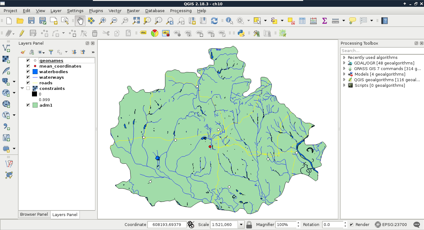
The easiest way to carry out a proximity analysis using rasters is GDAL's Proximity tool in QGIS. The tool requires a raster layer where features are described by cell values greater than zero. It takes the input raster, and creates the proximity grid--a raster with the same extent and resolution filled with distances from cells with values greater than zero. The behavior of the Proximity tool implies the following two things:
As we've already found out, we can supply an existing raster layer to the Rasterize tool:
The distance matrices visualized in QGIS should have a peculiar texture slightly resembling a beehive:
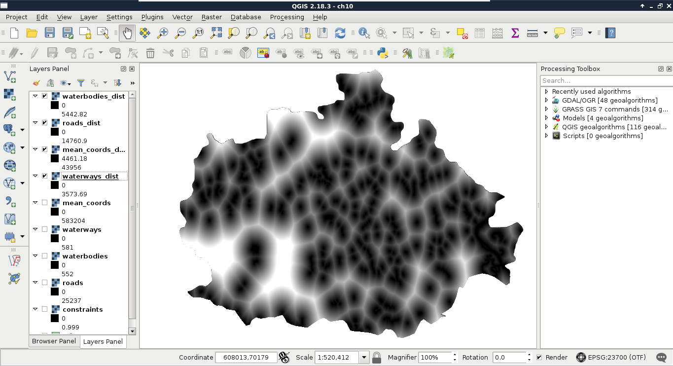
Now that we have the distance matrices we will use for our factors, we can get rid of the intermediary data (that is, vectors and rasterized features). The next problem is that we have a single criterion in two different layers. We need distances from waters, although we have distances from rivers and lakes separately. As both of them form the same preference, and their units are the same (that is, they are on the same scale), we can use set operations to make a single map out of them. The two essential set operations for non-binary raster layers A and B using the same scale look like the following:
For creating the final water distance map, we need the intersection of the waterways and waterbodies layers. Unfortunately, we do not have minimum and maximum operators in QGIS's raster calculator. On the other hand, with a little logic, we can get the same result. All we have to do is composite two expressions in a way that they form an if-else clause:
    ("waterbodies_dist@1" <= "waterways_dist@1") * "waterbodies_dist@1"
     + ("waterbodies_dist@1" > "waterways_dist@1") * "waterways_dist@1"
This preceding expression can be read as follows:
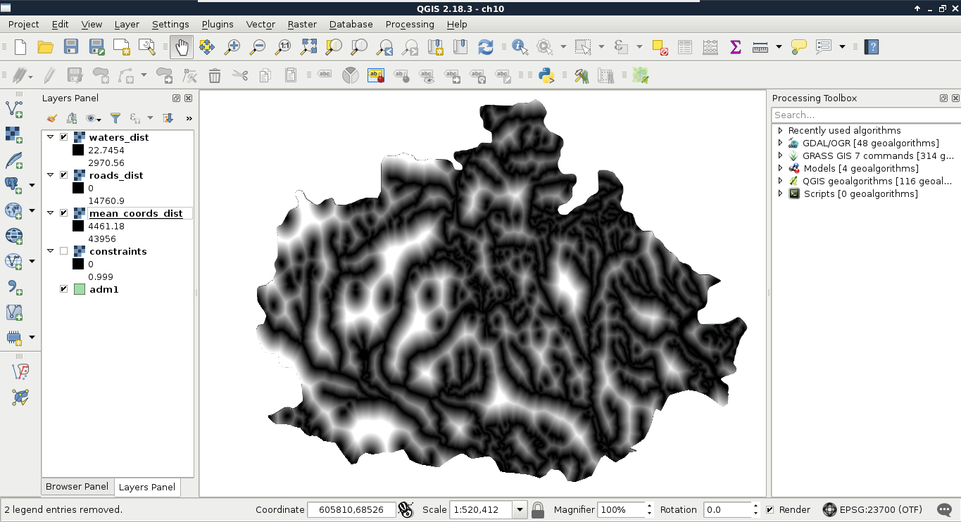
As we have the final distance layer for waters, the waterways and waterbodies layers are now obsolete, and we can safely remove them.
What we have now are three layers containing raw distance data. As these data are part of different criteria, we cannot directly compare them; we need to make them comparable first. We can do this by normalizing our data, which is also called fuzzification. Fuzzy values (μ) are unitless measures between 0 and 1, showing some kind of preference. In our case, they show suitability of the cells for a single criterion. As we discussed earlier, 0 means 0% (not suitable), while 1 means 100% (completely suitable).
The problem is that we need to model how values between the two edge cases compare to the normalized fuzzy values. For this, we can use a fuzzy membership function, which describes the relationship between raw data (crisp values) and fuzzy values. There are many membership functions with different parameters. The most simple one is the linear function, where we simply transform our data to a new range. This transformation only needs two parameters--a minimum and a maximum value. Using these values, we can transform our data to the range between 0 and 1. Of course, a linear function does not always fit a given phenomenon. In those cases, we can choose from other functions, among which the most popular in GIS are the sigmoid and the J-shaped functions:
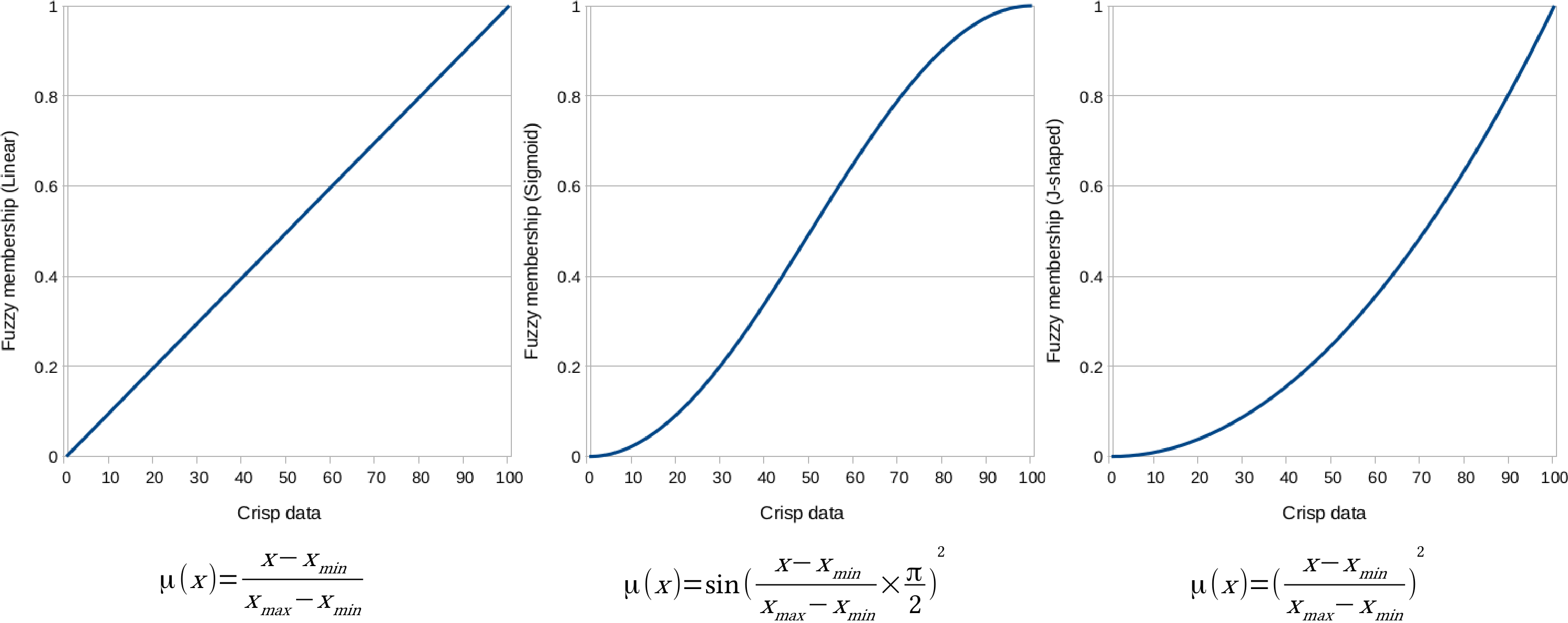
To solve this problem, we have to interpret the membership functions, and choose the appropriate one for our crisp data. The various membership functions are explained as follows:
First, let's use the J-shaped membership function on the waters layer, as follows:
        ("waters_dist@1" <= 200) * 0 + ("waters_dist@1" > 200) *
         (("waters_dist@1" - 200) / (max - 200)) ^ 2
Next, we should apply the linear membership function to the roads layer as follows:
        ("roads_dist@1" > 5000) * 0 + ("roads_dist@1" <= 5000) *
         (1 - ("roads_dist@1" / 5000))
By running the expression, we should be able to see two of our factor layers:
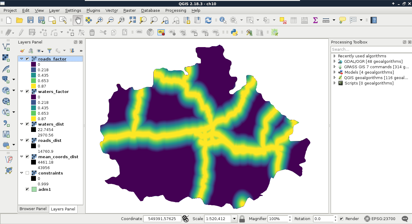
Finally, we use the sigmoid function for the mean coordinates layer like this:
1 - sin("mean_coords_dist@1" / max * (3.14159 / 2)) ^ 2
Now that we have all of our factors set up, we only need to create a single factor map out of them. We could simply overlay them, and calculate their intersection for a restrictive, or their union for a permissive suitability. However, we can also consider them as components of a composite map, and calculate their average as follows:
        ("mean_coords_factor@1" + "roads_factor@1" +
         "waters_factor@1") / 3
The result should be a beautiful, continuous raster map showing our factors:
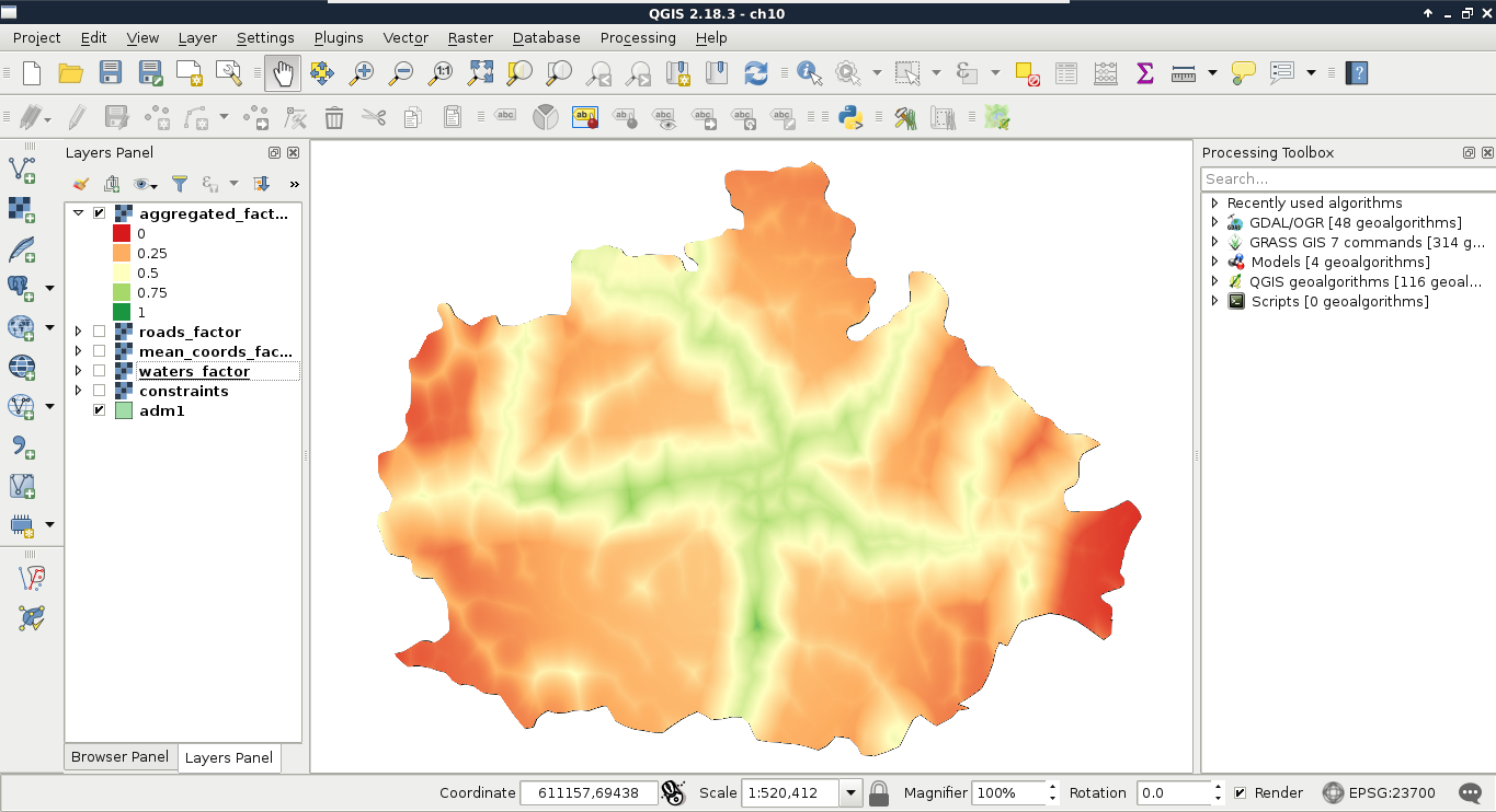
What is the problem with this approach? Some of our factors also contain constraints as zero values. By involving them in the calculation, the other two factors with higher suitability values can compensate those constrained cells. To get correct results, we have to manually handle the zero values in the roads and waters factor layers.
        ("roads_factor@1" > 0 AND "waters_factor@1" > 0) *
         ("mean_coords_factor@1" + "roads_factor@1" +
          "waters_factor@1") / 3
Now we have a less beautiful, but correct result. The only thing left to do is to simply overlay the constraints map with the aggregated factors, which is done using the following expression:
"aggregated_factors@1" * "constraints@1"
When the raster calculator is finished, we should be able to see our final suitability map:
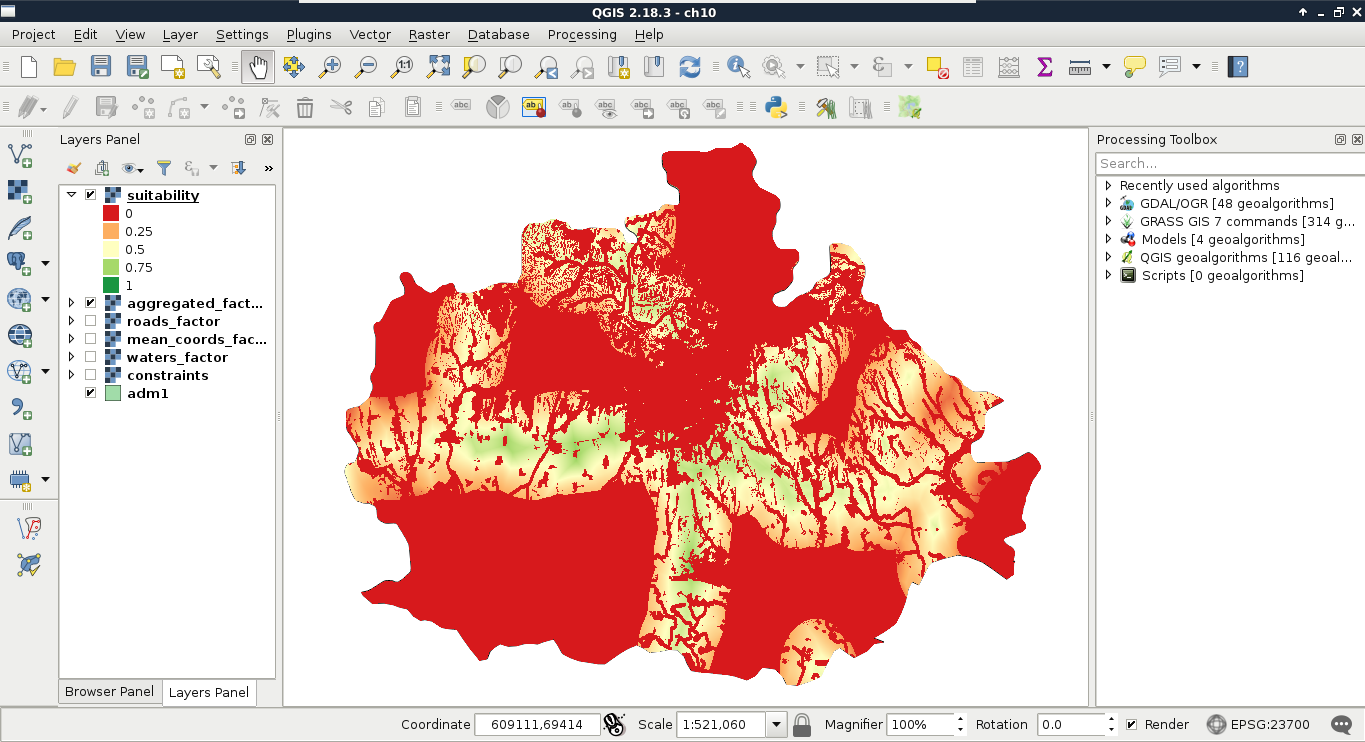
The final step is to defuzzify the final map to get crisp data that we can evaluate. This step is very simple in GIS, as the MCE is usually done in such a way that we can get percentage values if we multiply the fuzzy values by 100. As this is a very trivial operation, we do not even have to calculate the percentage map, only label the actual intervals:
| Value | Label | Suitability |
| 0-0.25 | 0-25% | Poor |
| 0.25-0.5 | 25-50% | Weak |
| 0.5-0.75 | 50-75% | Moderate |
| 0.75-1 | 75-100% | Excellent |
In GIS, statistics can be computed from both raster and vector data. However, even calculating raster statistics often involves some kind of vector data. For example, we would like to include some statistical indices in our assessment regarding the suitable areas. More precisely, we would like to include at least the minimum, maximum, and average slope, the minimum, maximum, and average suitability, the average distance from the mass point of the settlements, and the minimum distance from waters. For this task, we cannot use our rasters alone; we need to calculate indices from them only where they overlap with our suitable areas. For this, we need our suitable areas as polygons, and then we can leave the rest of the work to QGIS.
In order to get our suitable areas as polygons, we need to delimit them on our suitability layer. The most trivial first choice is to select every cell with an excellent rating. However, how many cells do we have with more than 75% suitability? If we have only a few, vectorizing them would make no sense, as every resulting polygon would fail the minimum area criterion. Furthermore, if we have some sites meeting the 1.5 km2 criterion, but the main roads go right through them, that is also a failure, as we cannot have a single site divided by a high traffic road.
In order to get the minimum suitability value that our analysis is viable with, we can limit the suitability layer to a range. Let's open Properties | Style, and choose Singleband gray for Render type. Now we can manually input the range we would like to check (0.75 as Min and 1 as Max first), and set Contrast enhancement to Clip to MinMax. This way, QGIS simply does not render cells outside of the provided range. By using this representation model, we only have to load the roads layer, and measure some of the visualized patches. We can measure an area with the Measure Area tool from the main toolbar. We have to select it manually by clicking on the arrow next to Measure Line, and choosing it. The tool works like the regular polygon drawing tool--a left-click adds a new vertex, while a right-click closes the polygon:
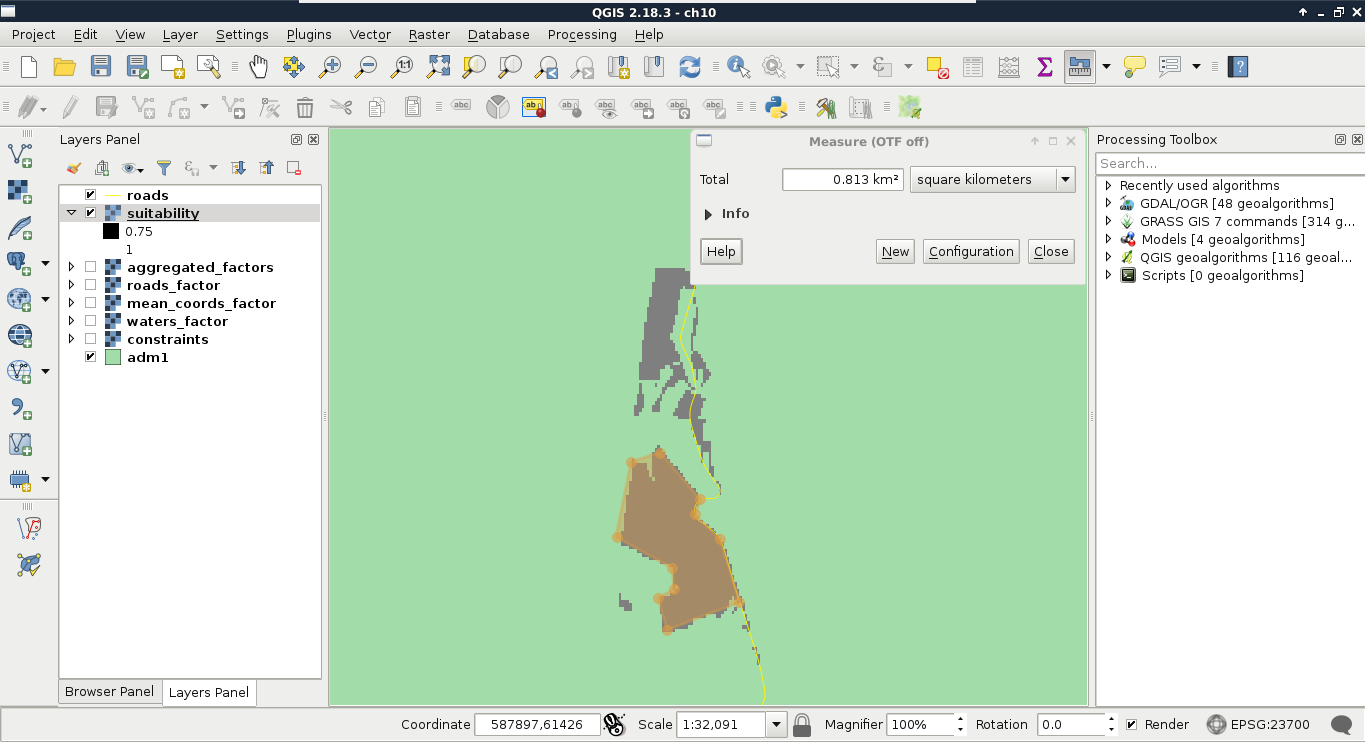
Now that we have an appropriate suitability value, we can vectorize our suitability map. We've already seen how vector-raster conversion works, but we did not encounter raster-vector conversion. As every raster layer consists of cells with fixed width and height values, the simplest approach is to convert every cell to a polygon. GDAL uses this approach, but in a more sophisticated way. It automatically dissolves neighboring cells with the same value. In order to harness this capability, we should provide a binary layer with zeros representing non-suitable cells, and ones representing suitable cells:
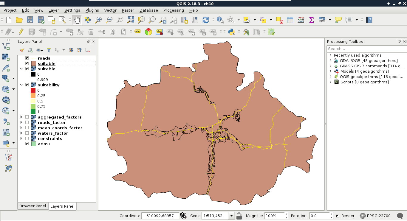
Now we have a nicely dissolved polygon layer with DN (digital number) values representing suitability in a binary format. We can apply a filter on the layer to only show suitable areas:
"DN" = 1
As the polygons do not respect the main roads, we need to cut them where the roads intersect them. This seems to be a trivial problem, although there are no simple ways to achieve this in QGIS. On the other hand, we can come up with a workaround, and convert our filtered polygons to lines, merge them with the roads, and create polygons from the merged layer.
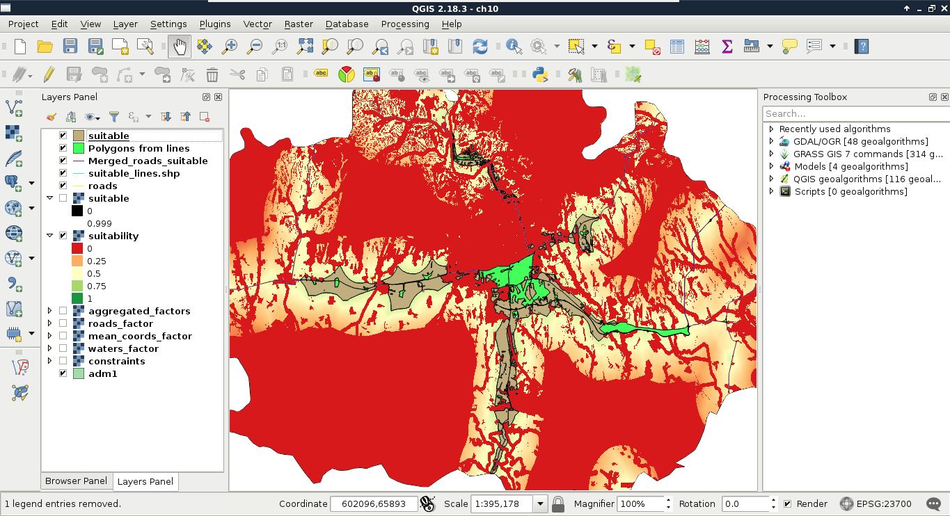
The last thing to do with our vector layer before calculating statistics is to get its attribute table in shape. If you looked at the attribute table of the polygonized lines, you would see that the algorithm automatically created two columns for the areas and the perimeters of the geometries. While we do not care about the perimeters in the analysis, creating an area column is very convenient, as we need to filter our polygons based on their areas. The only problem is that by clipping the layer, we unintentionally corrupted the area column. The other attribute we should add to our polygons is a unique ID to make them referable later:
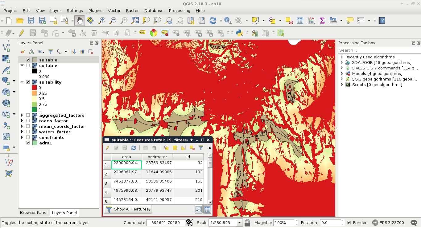
Although calculating statistics from a whole raster layer has its own advantages, now we need raster statistics from only the portions overlapping with our suitable areas. We can do this kind of calculation automatically by using zonal statistics. Zonal statistics require a raster layer and a polygon layer as inputs, then creates and fills up attribute columns with all kinds of statistical indices (like count, sum, average, standard deviation, and so on) in the output polygon layer. In order to calculate all the required statistics, we need all the input raster layers first:
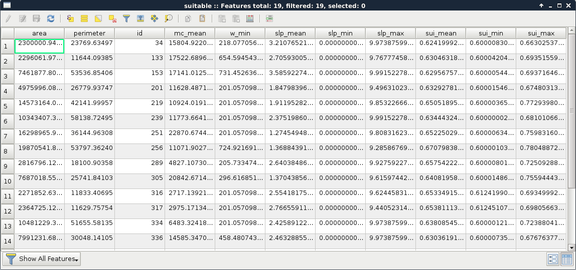
That's all. With a few clicks, we can get a lot of statistical indices from different raster layers and some polygons. On the other hand, those numbers are not comprehensive at all. For example, we do not know about the distribution of suitability values from some indices. As a matter of fact, having a histogram of the suitability values could enhance decision making, as we would see how common less suitable values, and the more suitable values in a site are. For that, we would need the histogram of the raster layer under our potentially suitable areas. Unfortunately, creating zonal histograms is not available in QGIS. Furthermore, the easiest approach involves a lot of manual labor. Let's create one or two histograms just to get the hang of it:
There are still several problems with this approach, although this is the closest we can get to a histogram in QGIS without scripting in Python or R. The problems include the following:
Getting vector statistics in QGIS is very straightforward. The method is similar to raster statistics, although as we can store as many attributes as we want in a vector layer, we can only calculate statistics from a single numeric column at a time. We can access the Show statistical summary tool from the main toolbar (purple Σ button), choose a layer, then choose a numeric column. To save the statistics to a file, we can use QGIS geoalgorithms | Vector table tools | Basic statistics for numeric fields. We can also calculate grouped statistics with QGIS geoalgorithms | Vector table tools | Statistics by categories.
The atlas generator is the most powerful feature of QGIS's print composer. It can create a lot of maps automatically based on a template we provide. The underlying concept is very basic--we have to provide a polygon layer with a column which has unique values. The print composer takes that layer, and creates a separate map page for every different value (therefore, feature) it can find in the provided column. Furthermore, it grants access to the current feature it uses for the given page. The real power comes from the QGIS expression builder, which enables us to set cartographic preferences automatically. With this, we can build a template for our atlas and use it to showcase each suitable area in its own map.
First of all, if we would like to create a front page with every suitable area on a single map, we have to create a feature enveloping the polygons from our suitable areas polygon layer. We can create such a polygon with QGIS geoalgorithms | Vector geometry tools | Convex hull. It takes a vector layer as an argument, and creates a single polygon containing the geometries of the input features:
Now we have every page of our atlas in the form of features in our coverage layer. We can proceed and make it by opening New Print Composer, and using the Add new map tool to draw the main data frame. We should leave some space for the required information on one of the sides. In order to begin working with an atlas, we have to set some parameters first:
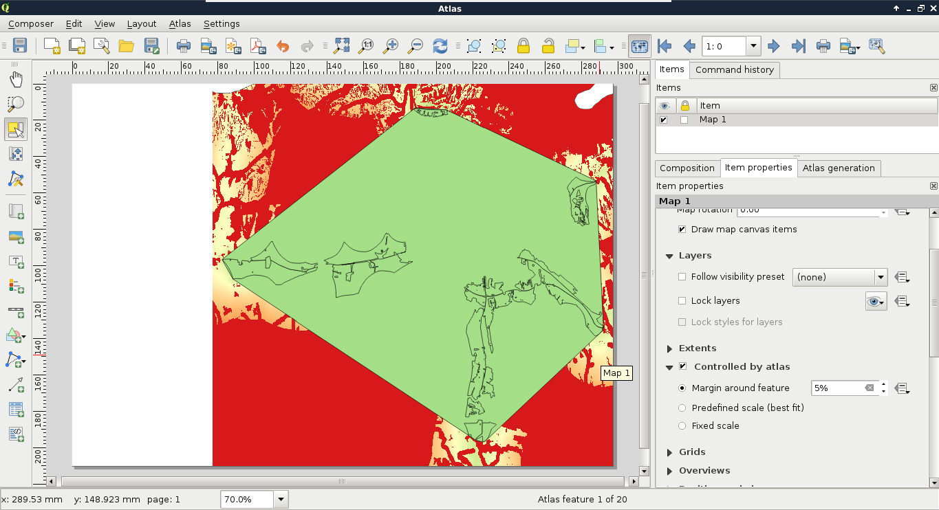
As the next step, we should style our layers in a way that they create an aesthetic composition in our atlas. For example, we should make the convex hull invisible, and remove the fills from the suitable sites:
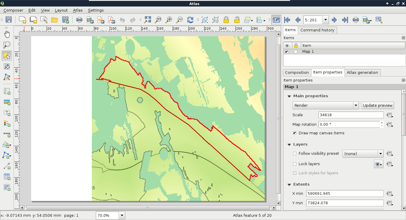
The second item we should add to our atlas is an overview map. This way, we can make sure we know where we are in the study area every time:
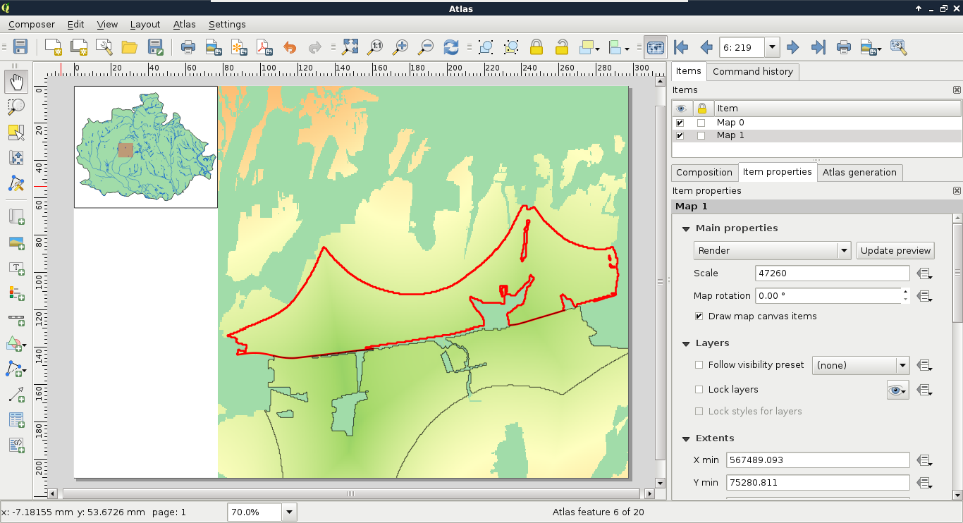
The next item we add is one of the most important parts of our atlas. It is the attributes of the atlas features. A simple way to achieve this would be to add an attribute table item with Add attribute table, although it cannot be customized enough to fit in our atlas. For these cases, QGIS's print composer offers a highly customizable item--the HTML frame. With that item, we can visualize any valid HTML document. Furthermore, we can use the expression builder to write expressions, which will be evaluated by QGIS and rendered in the HTML frame:
Now we just have to write our HTML containing the attributes of the features. A great thing in HTML is that plain text is a completely valid element. Therefore, we only need to know how to use one HTML element in order to fill our HTML frame, which is as follows:
The rest of the task is simple string concatenation (|| operator). We evaluate the attributes of the features (ID, area, and statistics), then concatenate them with the rest of the text and the <br> elements. Furthermore, as the HTML frame is an atlas-friendly item, the attributes of the current feature are automatically loaded, therefore, we can refer to the correct attribute with the name of the column. Finally, as the statistical indices are quite long, we should round them off with the round function. We can also divide the area by 1000000 to get the values in km2:
    [%'ID: ' || "id" || '<br>' ||
    'Area: ' || round(("area" / 1000000), 1) || ' km²<br>' ||
    'Min. suitability: ' || round("sui_min", 1) || '<br>' ||
    'Avg. suitability: ' || round("sui_mean", 1) || '<br>' ||
    'Max. suitability: ' || round("sui_max", 1) || '<br>' ||
    'Min. slope: ' || round("slp_min", 1) || '°<br>' ||
    'Avg. slope: ' || round("slp_mean", 1) || '°<br>' ||
    'Max. slope: ' || round("slp_max", 1) || '°<br>' ||
    'Min. distance to waters: ' || round("w_min", 1) || ' m<br>' ||
    'Avg. distance to center of mass:
     ' || round(("mc_mean" / 1000), 1) || ' km'%]
We should expand our expression a little bit. Although it shows the attributes of the atlas features nicely, we get a bunch of irrelevant numbers on the first page. Instead of visualizing them, we should print the title of the project, and the attributions on the first page. We can easily do this by extending our expression with the CASE conditional operator. We just have to specify the ID of the convex hull in the CASE clause, and put the attributes of the atlas features in the ELSE clause:
    [%CASE WHEN "id" = 0 THEN
     'Assessment of suitable areas for building a ' ||
     'warehouse in Baranya county. <br> Created ' ||
     'by: G. Farkas 2017 <br> OpenStreetMap data ' ||
     '© OpenStreetMap Contributors'
    ELSE
     'ID: ' || "id" || '<br>' ||
     'Area: ' || round(("area" / 1000000), 1) || ' km²<br>' ||
     'Min. suitability: ' || round("sui_min", 1) || '<br>' ||
     'Avg. suitability: ' || round("sui_mean", 1) || '<br>' ||
     'Max. suitability: ' || round("sui_max", 1) || '<br>' ||
     'Min. slope: ' || round("slp_min", 1) || '°<br>' ||
     'Avg. slope: ' || round("slp_mean", 1) || '°<br>' ||
     'Max. slope: ' || round("slp_max", 1) || '°<br>' ||
     'Min. distance to waters: ' || round("w_min", 1) || ' m<br>' ||
     'Avg. distance to center of mass: ' || round(("mc_mean" / 1000),
     1) || ' km'
    END%]
Now we can see our attributes when we focus on a feature, while the overview page shows only attribution:
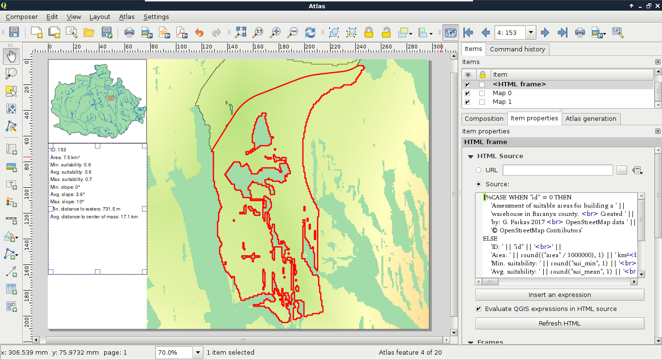
The final item we should add to our atlas is an image showing histograms. With data-defined override, we can get the correct histogram of every atlas feature if they are saved in the same folder, and contain the IDs of the features in their names:
When we see our composition, we will be able to see some histograms, if we have them saved as images:
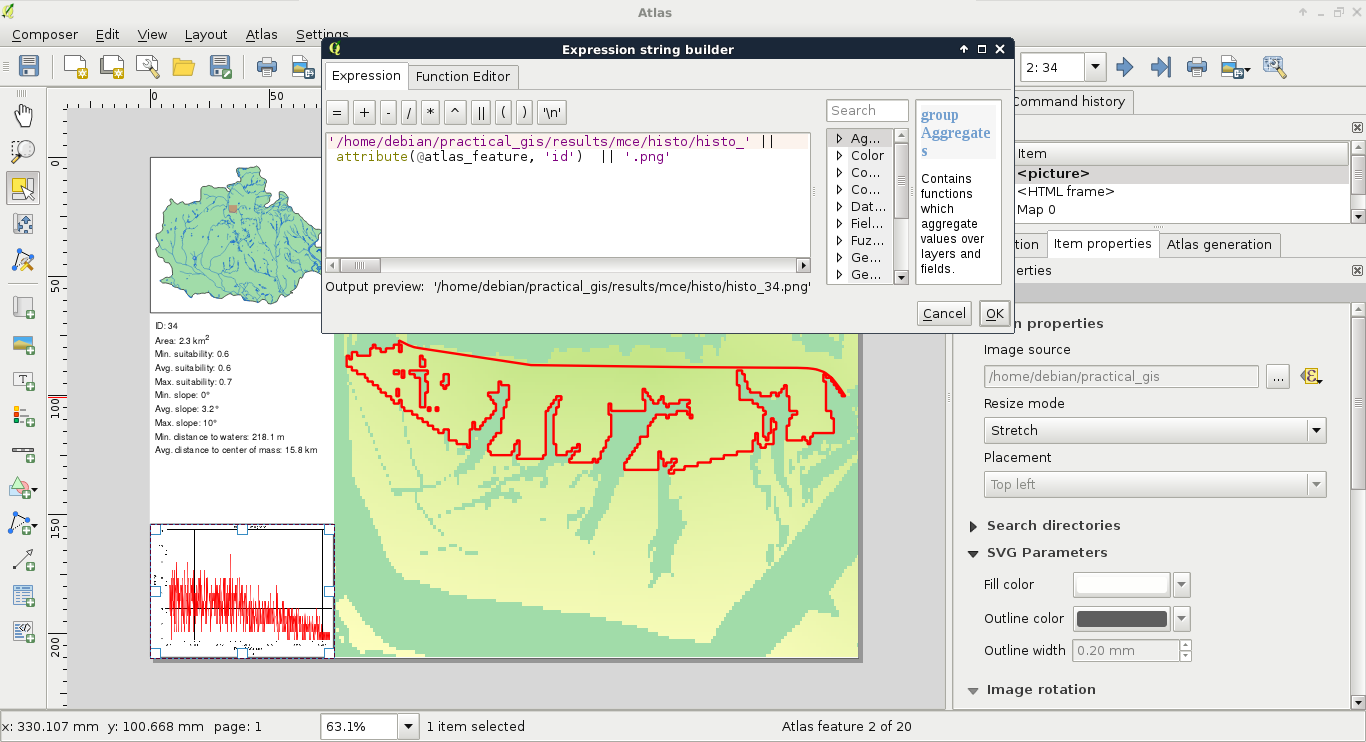
The only thing left to do is to export our atlas. By selecting the Export Atlas as Images button on the main toolbar, we can see that the atlas can be exported in image, SVG, and PDF formats. The most convenient way of exporting is to save the entire atlas in a single PDF, where every atlas page is rendered on a separate page:
Congratulations! You just carried out your first raster analysis with MCE. It is valuable to have the ability to use raster data effectively, and to create suitability analysis on demand. The best thing is that we were able to do the analysis with free and open source data. In this chapter, we learned how to effectively use and analyze raster data. We created a suitability map for an imaginary cause of building a warehouse based on a set of criteria. We were able to delimit suitable areas, and calculate statistics on them to further help making a good decision. Finally, we automated the map making process by creating an atlas with every important piece of information on every suitable site.
In the next chapter, we will leave the realm of desktop GIS, and dwell on web mapping. We will learn the basics of the server side of web mapping systems. First, we will serve our data with QGIS for instant and easy publication, then start to learn GeoServer, which is a far more capable software for publishing spatial data on the web. We will learn the most basic standards we can use with web mapping, and how we can utilize them for different results.
In the previous chapter, we learned about advanced raster analysis. We learned how to use the most essential raster-based tools by doing a complete suitability analysis based on open data. In order to make a better decision, we calculated some statistical indices on our suitable areas. Finally, to complete the assignment, we created an atlas from the results.
In this chapter, we will learn the basics of web mapping, more precisely, how client-server interaction works in the realm of spatial information technologies. We will focus on the server side, and on one of the most important aspects of web mapping--spatial data exchange. We will learn about spatial data formats and services readable by browsers, therefore, widely used for web mapping. Finally, we will learn how to use QGIS Server and GeoServer for publishing data on the web.
In this chapter, we will cover the following topics:
In order to understand how spatial data on the web works, we first need to get a picture about the architecture of the web. The web resides on the Internet, where we have to deal with two kinds of software--servers and clients:
The Internet is designed to be an infinitely expandable network of computers. Therefore, servers and clients are only the end points of this network--there are additional nodes doing other tasks. For example, there are DNS servers, which map IP addresses to domain names; routers and switches forward the traffic. The web is one of the largest portions of the Internet, sharing specific, standardized content between end points. For creating a web application, the midpoints are out of concern. We only need to know how to configure web servers (backend), and how to write content for web clients (frontend).
In order to have a working architecture, the web is powered by standards instead of software. These are open standards, which define the intended behavior of every step in serving and receiving data on the web, mostly maintained by a large number of experts and companies forming the World Wide Web Consortium (W3C). This way, anyone can develop a web server or a web client, which is guaranteed to work with any website if these standards are followed. If not, for example, a web browser that places two line breaks on every <br> element, it is called a bug. No matter if the developers reason that this is an intended feature, as two-line breaks look much better than a single one, the standard is wrong. What do we gain from this strong standardization? We do not have to worry about compatibility issues. The standards make sure we can use Apache, nginx, Node.JS, or any other web server application as a web server, and the hosted files will work on any web browser following them. We only need to make sure that the web server we choose is capable enough for our needs, and the configuration is correct.
These standards are very specific, therefore, very long and complex. That is why we won't discuss them in detail but grab some of the more important parts from our perspective. In a web architecture, we have a web server, and a client capable of communicating with it (most often a web browser):
We can see the generalized scheme of the client-server architecture in the following figure:
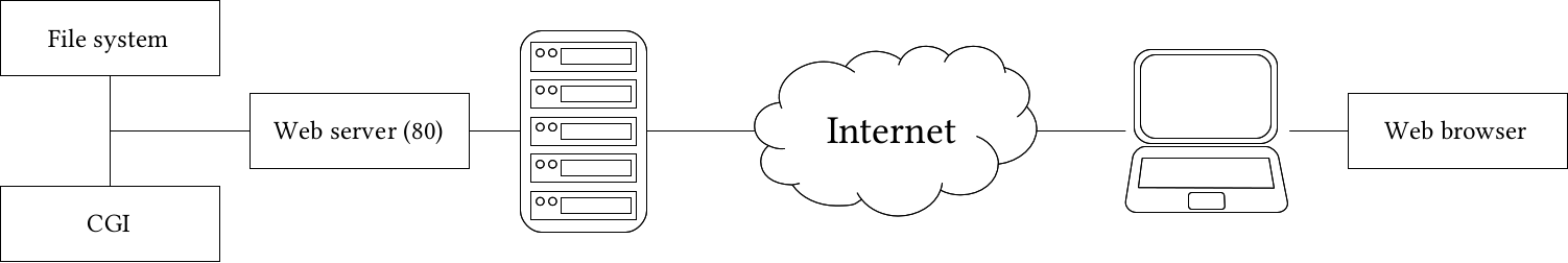
The next step is the communication between web servers and web clients. There are various standardized requests that a client can send to a web server, which serves content accordingly. The response is also standardized, therefore, the client can interpret it:
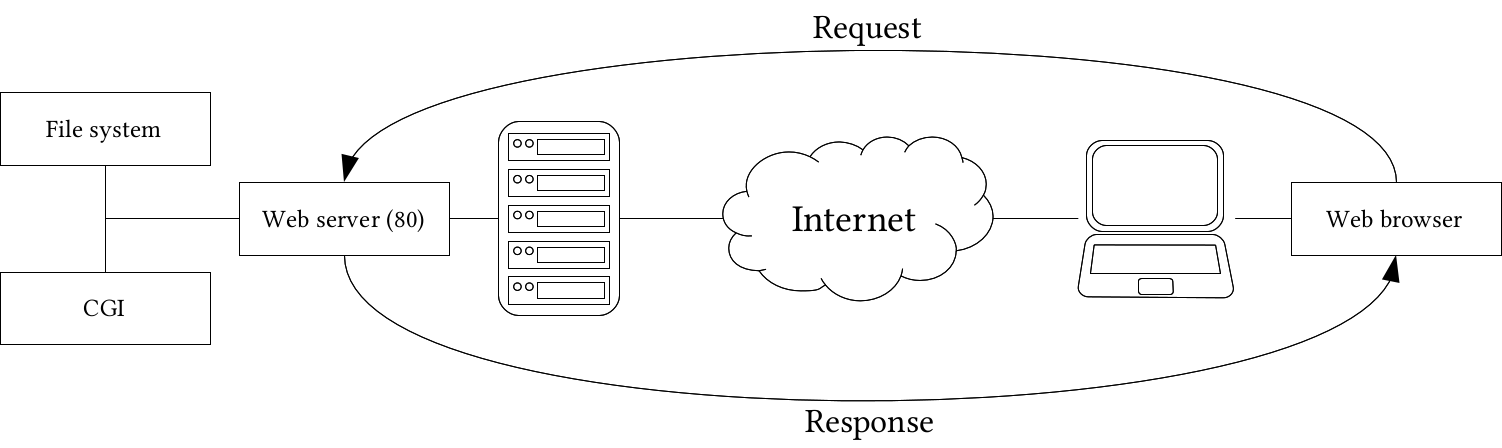
The only question that remains is; how can spatial data be inserted into this architecture? Well, they can be stored as static resources in vector formats like KML or GeoJSON. The browser can read the content of these structured text files, and client-side web mapping software can use them. Publishing raster layers is a little more tricky. As web browsers do not have a concept about raster data, they need those layers as regular images. Therefore, we have to create a representation model on the server side, and send the resulting images to the client. The usual way of storing pre-rendered raster layers is to tile them, and serve the tiles. Then, if the client-side web mapping software knows the tiling scheme, it can create an interactive map by requesting visible tiles, and sewing them together. For this, we need to create tiles for various zoom levels (fixed scales) for the entire extent of our raster layer. In order to improve compatibility, there are various open source tiling standards. Two of the more popular standards are OpenStreetMap's slippy map, and OSGeo's TMS (tile map service).
The other way to serve maps is, of course, via a CGI application. QGIS Server, for example, is a completely valid CGI application we can use with any web server. By sending parameters in a URL, we can get an image containing the requested layers rendered by QGIS Server on the fly. To make this concept a little bit more complex, there is also GeoServer, which is written in Java. Java is an exceptional language for writing web applications, as web servers cannot invoke those software directly as CGI scripts. In order to use a Java web application, we need a Java servlet, which is a specialized web server for running it. The platform-independent binary version of GeoServer is bundled with Jetty, a lightweight Java servlet listening on port 8080:
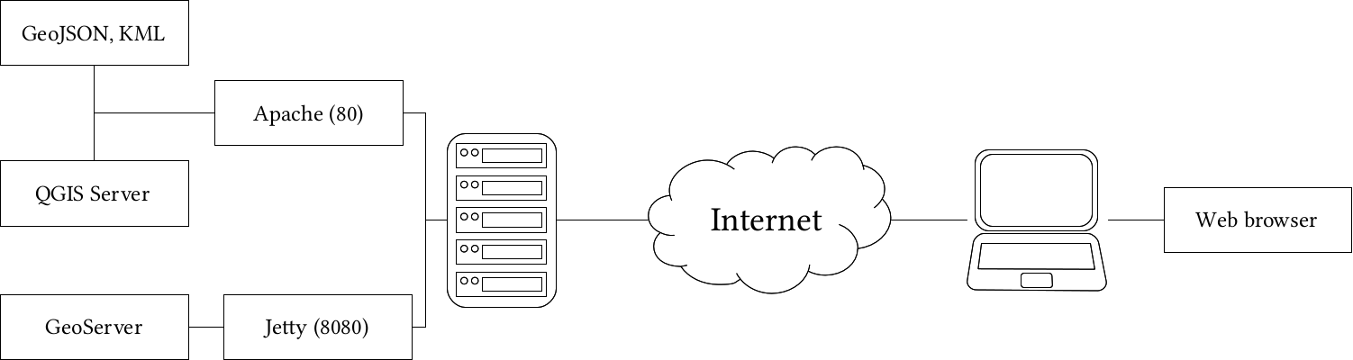
Using spatial servers instead of static files has a lot of advantages. For example, spatial servers can read out layers from spatial databases, therefore, we can always provide up-to-date data. We can also send only extracts of large datasets querying them by various means, or reproject them on the fly. As spatial servers need to be invoked by using some parameters, their interfaces are also standardized. Most of those standards are also maintained by experts and organizations forming the Open Geospatial Consortium (OGC). They define interfaces, that is, the communication between web clients and spatial servers. From the various OGC standards, there are some targeting the web. They are called Open Web Services (OWS), and define general spatial data transmission over the web. These standards are as follows:
While OWS standards allow communicating through GET and POST requests, both QGIS Server and GeoServer are mainly used with GET requests, therefore, parameterized URLs. There are some common parameters for every service, which are listed as follows:
If we put this together, we can craft an URL, which can query a spatial server's WMS capabilities the following way:
    http://mysite.com/spatialserver?
     Service=WMS&Version=1.3.0&Request=GetCapabilities
QGIS offers a very easy and convenient way to publish QGIS projects with its own spatial server. It is the CGI application QGIS Server, which we have already configured in Chapter 1, Setting Up Your Environment.
Similar to the popular UMN MapServer, QGIS Server is a simple CGI application which does not track the published data. While MapServer needs a configuration file where paths to the data sources are defined along with other configuration parameters, QGIS Server needs a QGIS project file, which contains the paths along with other information, like styling. We can provide the project file's absolute path in a map parameter.
Let's craft a URL which queries the WMS capabilities of QGIS Server using one of our QGIS projects. As we are on the same machine as the server, we can use the placeholder localhost instead of a domain name or an IP address:
    http://localhost/cgi-bin/qgis_mapserv.fcgi?
     map=/home/debian/practical_gis/
      ch10.qgs&Service=WMS&Version=1.3.0&Request=GetCapabilities
The response should look similar to the following:
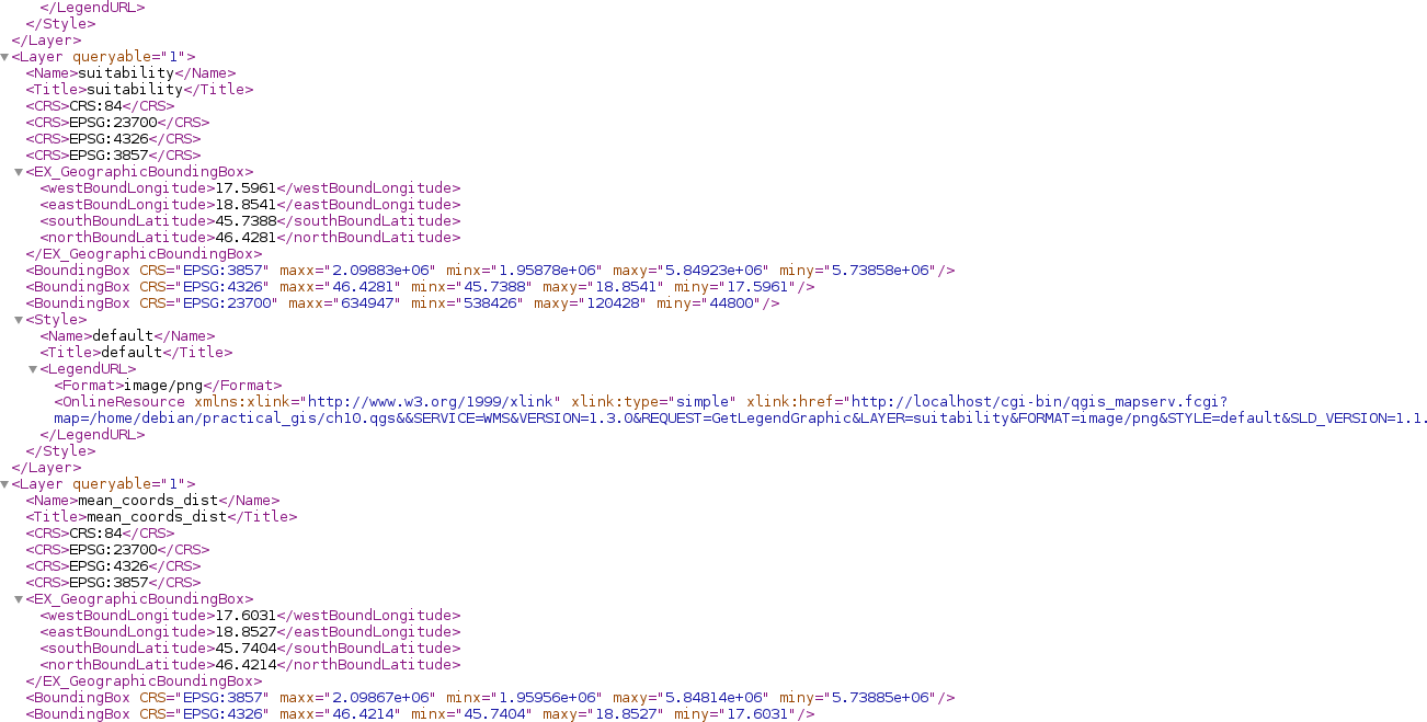
A long XML response shows if we have a working QGIS Server, which can access our projects. By installing QGIS Server, it automatically integrates itself in QGIS, and makes our projects publishable with WMS. To see what those published maps look like, we can use QGIS as a client. In order to load a WMS layer, we need to connect to a spatial server publishing WMS layers first, using the following steps:
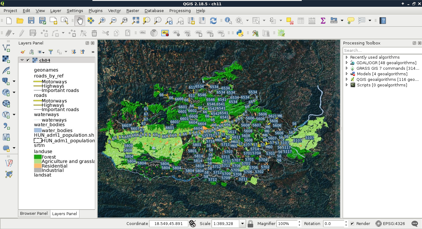
We can see the styled layers, although there are two very conspicuous problems--there are some layers published which we had disabled in our project, and it uses the projection EPSG:4326, making the map look distorted. The overall composition is not very aesthetic, which we can resolve by opening the project in QGIS:
As QGIS Server serves projects, we can configure the behavior of the QGIS Server in the project properties. There are several general sections in the dialog which are useful for basic configuration, like the following:
For now, let's only exclude the disabled layers from the WMS service.
Now we have a stack of styled layers ready to use in a web application:
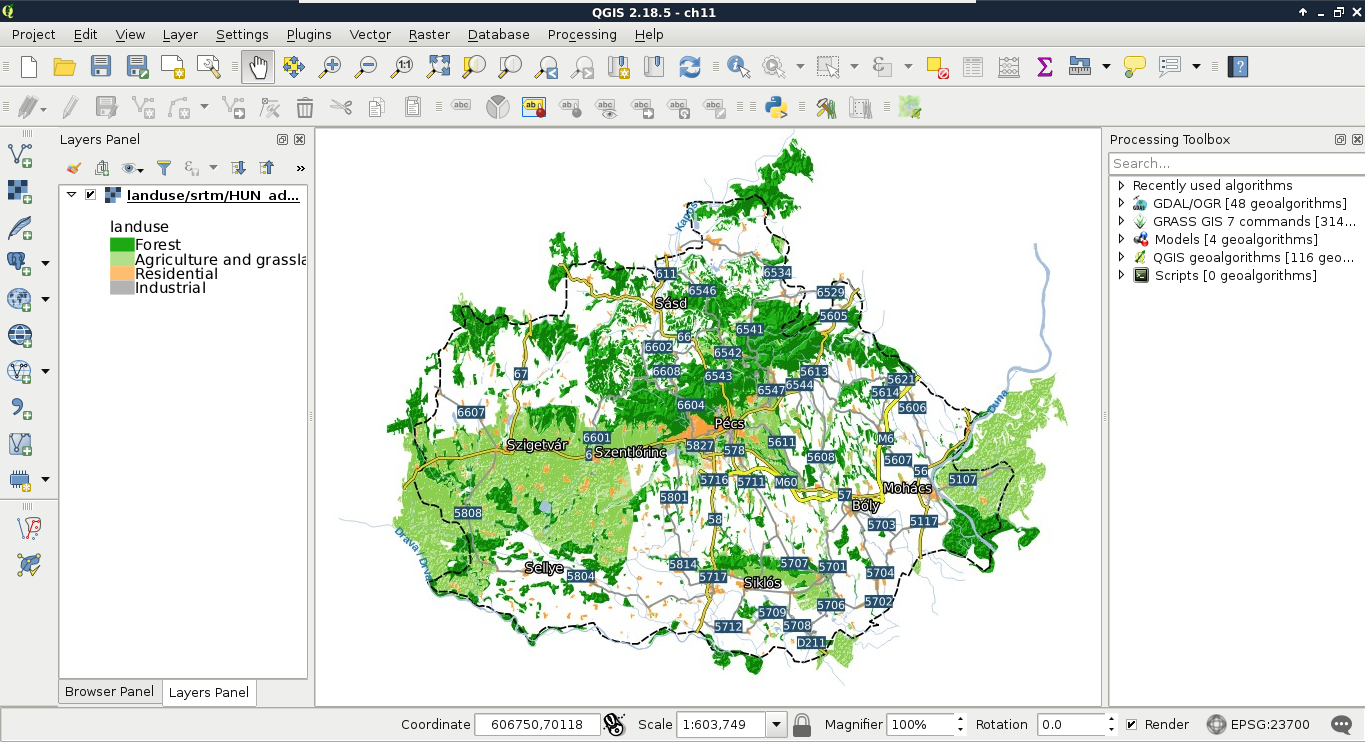
The image we see is the same as we will see on our webpage if we use the layers with web-mapping software. This is the greatest benefit of using QGIS Server--as it uses the same libraries as QGIS, the served images will be the same as we can see in the project's styled layers in QGIS.
Publishing data with QGIS Server is indeed very easy, although being a simple CGI application, it has limited capabilities. Unlike QGIS Server or UMN MapServer, GeoServer is a full-blown web application. That is, it has an internal data structure used for storing a lot of things including styles, authentication data (profiles), and references to raw spatial data. GeoServer is a Java web application, therefore, it needs a Java servlet to work (included in the default binaries). Therefore, if we start GeoServer with the technique described in Chapter 1, Setting Up Your Environment, we have to wait until the Java virtual machine starts up and the application initializes itself. Once GeoServer is running, we can access it from a browser by connecting to the 8080 port of our local server, and access the geoserver application as follows:
http://localhost:8080/geoserver
As GeoServer uses authentication, first we have to log in with the default admin credentials. The default admin username is admin, while the default password for this user is geoserver:
As GeoServer is a full application with users and authentication, the first and most important thing to change is the master and admin passwords. The master password belongs to the superuser root, which is a fixed administrator user. Unlike the user admin, it cannot be removed, therefore, GeoServer remains manageable no matter if the admin account is accidentally removed:
As we can see, there are three categories we can use in user management. There are regular users with user names, passwords, and individual permissions. There are groups, which can ease user management. A single user can be assigned to multiple groups. There is also a special category--roles. Roles are similar to groups, as a single user can use multiple roles. Using roles is significant in several aspects of permission management (for example, restricting access to services). In GeoServer roles are like responsibilities (e.g. admin, editor, user). Groups are grouping users and roles together so that common security combinations can be easily applied.
The second thing we should configure is the metadata of the services. As GeoServer uses an internal data structure to store and provide spatial data added to it, metadata is configured for the entire application, not for individual projects. There are two kinds of metadata in GeoServer--global and service related. We can access global metadata that contains information describing the server's owner or maintainer by opening About & Status | Contact Information. Service-related metadata can be set by accessing the service settings under the Services section. Besides setting metadata, we can modify the behavior of the given service.
When it comes to data sources, GeoServer offers a hierarchical structure that consists of workspaces, stores, and layers. GeoServer's architecture is simple enough to understand quickly, still, there are some tricky parts that need to be discussed:
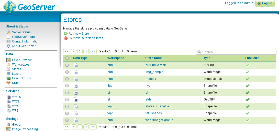
If we go through Data | Workspaces, Data | Stores, and Data | Layers, we can see that every default store is put into a workspace, and layers from that store inherit the name of the workspace. Putting stores into a workspace is mandatory. Using a workspace is only optional for styles. This is because if we put a style into a workspace, it can only be used for layers in the same workspace, otherwise, it can be used globally. Workspaces behave similar to schemas in PostgreSQL. Layers can have the same name in different workspaces, and if we access layers globally, we should refer to them with their fully qualified names in the form of workspace:layer.
GeoServer offers several ways to access its services. The most general way is to use its global endpoint ows in the following format:
http://localhost:8080/geoserver/ows
By using this endpoint, we can supply every OWS parameter required for a valid request. For example, to get the WMS capabilities of GeoServer, we can use the following URL:
    http://localhost:8080/geoserver/ows?
     Service=WMS&Version=1.3.0&Request=GetCapabilities
GeoServer has quite advanced rewrite rules, therefore, we can specify the service name after, or instead of ows. Thus, to get the same result, we can write the request the following ways:
    http://localhost:8080/geoserver/ows/wms?
     Version=1.3.0&Request=GetCapabilities

    http://localhost:8080/geoserver/wms?
     Version=1.3.0&Request=GetCapabilities
Alternatively, if we would like to only access the content of a single workspace, we can use a virtual endpoint by including the name of the workspace in the URL as follows:
    http://localhost:8080/geoserver/topp/ows?
     Service=WMS&Version=1.3.0&Request=GetCapabilities
The tricky part comes while defining custom service behavior to workspaces. As we could see from the capabilities of GeoServer's WMS service, it can provide WMS images in every known CRS. In order to demonstrate this custom behavior, let's restrict the CRSs of the topp workspace to EPSG:4326 and EPSG:3857:
Let's connect to the global endpoint of GeoServer, and query its WMS capabilities (http://localhost:8080/geoserver/ows?Service=WMS&Version=1.3.0&Request=GetCapabilities). Next, query its capabilities using the topp virtual endpoint (http://localhost:8080/geoserver/topp/ows?Service=WMS&Version=1.3.0&Request=GetCapabilities). As you can see, the virtual endpoint has now limited CRS capabilities, while the global endpoint can still provide layers from the topp workspace in any projection GeoServer knows. This is the tricky part of managing workspaces. As the global endpoint has to provide every published layer with every service enabled in the global configuration, it cannot use workspace-specific configuration. On the other hand, when using a virtual endpoint, GeoServer will try to use configuration for the corresponding workspace. If it cannot find any, it simply falls back to the global service configuration.
Before adding some data to GeoServer, let's create a new workspace for it. This way, the data will be safely separated, and we will be able to access the content by using a virtual endpoint:
Now we can start defining stores for our data sources. GeoServer does not create internal copies of the input data. It only uses references to the input files or databases, and reads the underlying spatial data on demand:
Although GeoServer has somewhat limited knowledge about spatial formats, it still offers stores for the three formats we used previously in this book--Shapefile, PostGIS, and GeoTIFF.
As you can see, if we use a store which can provide multiple layers, we can access every layer by their names. On the other hand, if the store is a single file which can contain only one layer, we can only access that single layer from the specific store. Before publishing a layer, let's add three more single file stores.
As we now have our data sources configured, we can start publishing relevant layers. Let's start with some of our vector layers:
Now we have a published layer, which we can preview easily from GeoServer. The only thing we have to do is to go to Data | Layer Preview, and select the OpenLayers option in the row of the newly published layer. The result shows what the layer will look like when accessed through GeoServer's WMS service. Although GeoServer uses OpenLayers for creating its previews, the map's content will look the same in any other web-mapping application.
The suitable areas layer in the preview window should look like the following:
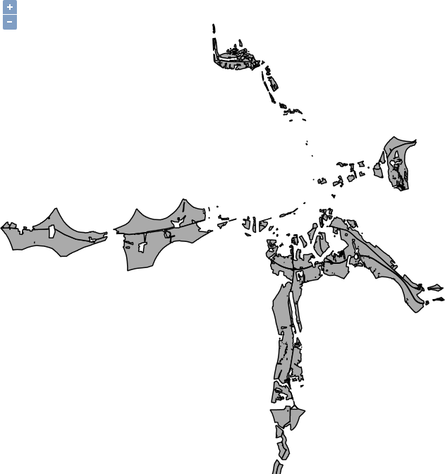
It's time to publish some raster layers. Publishing raster layers is a little different, but only requires one extra consideration:
Now we can require individual layers, but how can we create compositions? Well, of course, we can define multiple layer names in a single GetMap request, although this approach can be quite inconvenient, especially, when we would like to stack a lot of layers. On the other hand, GeoServer has the capability of grouping layers to form a server-side composition. The only limitation of this approach is that it can only be used for WMS requests with layers in a single workspace:
If we preview the newly created layer group, we can see the raw composition, that is, every component with their default styling stacked on each other. Now it is only a matter of styling to get a similar map like in our QGIS project:
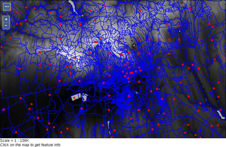
One of the greatest perks of GeoServer is its internal tiling and tile-caching capability. It uses GeoWebCache, which is integrated into GeoServer, and enabled by default. Of course, this behavior can be also considered a downside, as cached tiles always use up some disk space. GeoServer's default tiling behavior is dynamic. It creates tiles on demand, and stores them until expiration for reuse. Tiling can greatly increase the speed of serving images, with the expense of additional disk usage. Although there are multiple tiling services served by GeoServer, every one of them can be served with the same tiles (gridset). Only the layout differs, which is calculated by GeoServer before serving the right tiles.
If we go to Data | Layers, and inspect a layer by clicking on its name, we can see the default tiling and tile caching options in the Tile Caching tab. As we can see, tile caching is enabled for two formats (PNG and JPEG) by default. Furthermore, tiles can be generated for two gridsets, one using the EPSG:4326 CRS, and one using the EPSG:9009013 CRS. Finally, tiles can be generated for every style associated with the given layer, which is only the default style by default.
If we go into Tile Caching | Gridsets, we can open the properties of the two enabled gridsets, and check their properties. Gridsets tile up the whole extent of a CRS, and create a layout for every zoom level. They start with only a few tiles for the smallest zoom level, and increase quadratically with every defined new zoom level. If we calculate the theoretic maximum of stored tiles for the EPSG:4326 gridset, we get the value 11,728,124,029,610. For the other gridset, we get a much higher value of 1,537,228,672,809,129,200. These are the number of tiles which can be stored by GeoServer, theoretically, for both of the image formats. According to GeoSolution's presentation at https://www.slideshare.net/geosolutions/geoserver-in-production-we-do-it-here-is-how-foss4g-2016 (they are contributors to the GeoServer project), GeoWebCache's tile storing mechanism is very efficient, as about 58,377 tiles can fit into a single megabyte. Still, to store a layer in both of the default gridsets in a single format, we would need about 24 exabytes of space. I do not think we would need any more proof that managing tile caching is a very good practice, otherwise, GeoWebCache can fill up every bit of free disk space it can use quite quickly.
The first thing we can configure is the disk quota. Despite the large space requirement of tiles, we shouldn't give up on serving tiled variants of WMS images, as they are beneficial if used wisely. We can restrict the space GeoWebCache can take up, and let it create tiles for whatever layers we would like to give a boost. If it reaches its quota, it will free up some space by removing or overwriting unused tiles:
Now we can deal with the tiled variants of our layers. Despite having a quota, we should not leave GeoWebCache filled with tiles we do not need. We can manage tile layers by going to Data | Layers, opening a layer, and navigating to the Tile Caching tab like we did previously:
As our GeoServer is not public, do not bother with the tile setup for now. Let's create a tiled variant for our new layer group in our local projection instead:
Now we can preview the tiled version of our layer group in our CRS by navigating to Tile Caching | Tile Layers, finding the row of our group layer, and selecting the appropriate gridset and format combination from its Preview column:
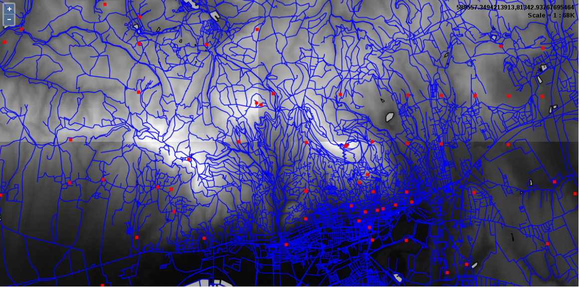
We can instantly see the greatest benefit of using tiled layers when we browse the preview. The first time when we pan or zoom around, GeoServer takes some time to render the tiles. Then, if we navigate to already visited areas, it loads the content instantly. If we navigate to Tile Caching | Disk Quota, we can also see our disk slowly filling up by browsing the preview. You may ask now: where are the tiles? They are stored in GeoServer's data_dir/gwc folder. Tiling provided by GeoWebCache does not only mean that a separate module does tile providing and caching; it also means that we can only request tiled resources from a third endpoint--gwc:
http://localhost:8080/geoserver/gwc
As GeoServer provides various tiling services from which only WMTS is an OGC standard (therefore, has similar parameters to WMS, WFS, and WCS providers), tile requests are slightly different. We have to specify the service in the path of the URL, and can use service-related parameters after that. For example, to query the WMTS capabilities of our GeoServer, we can use the following URL:
    http://localhost:8080/geoserver/gwc/service/wmts?
     Version=1.0.0&Request=GetCapabilities
In this chapter, we gained some basic but essential understanding about the architecture of the web. We learned how to easily provide spatial data with QGIS Server. We also learned some of the basic principles of GeoServer, and how we can create a starting configuration, which we can later expand by gaining additional experience with the system. We discussed standardized OGC services called OWS, and how they work in practice. We managed to not only add some of our own spatial data to GeoServer and visualize the results, but also see how we can tile them, speeding up the server's response.
In the next chapter, we will learn about styling spatial data in GeoServer. Styling is not only one of the corner points of publishing spatial data, but also a weak point of GeoServer, as it offers way more possibilities than documentation. Creating styles can look cumbersome, fiddling, and way too scary to get into. We will see how we can better understand SLD styling, and what other, more efficient tools we can get our hands on.
In the previous chapter, we covered the basics of sharing content over the web. We discussed how the web works, and how we can send spatial data over it. Then, we set up QGIS Server to see how spatial data are rendered as regular images and visualized in a client. Then we went on and configured GeoServer to have a reliable spatial server in our service, even capable of tiling up rendered images, and not only providing, but also caching those tiles.
In this chapter, we will learn about styling vector and raster data in GeoServer. We will cover the basic symbolizers we can use, and the syntax of the style language used by GeoServer--SLD (Styled Layer Descriptor). After you understand how SLD works, we'll go on and study the more convenient GeoServer CSS, which is a concise, CSS (Cascading Style Sheet)-based language available in GeoServer through an extension.
In this chapter, we will cover the following topics:
In GeoServer, we can manage style items the way we managed layers. Unlike layers, we can make styles global by not assigning them to a single workspace. This makes them usable with layers in different workspaces. On the other hand, as styles can be very specific (that is, they can use rules based on attribute data), we can also make them local by assigning them to a workspace. The styling scheme of GeoServer is very similar to QGIS and any other GIS software. We can use point, line, polygon, and raster symbolizers to describe visual properties. These symbolizers can be explained as follows:
Of course, styles only affect image outputs (like WMS or WMTS). There are numerous styles shipped with GeoServer. When we publish a layer, we have to assign a default style for it. If we skip this step, GeoServer automatically assigns an internal style for the given layer based on its type. Layers can have multiple styles. In a query, we can provide a style parameter, which requests a style name other than the default style of the requested layer. If the requested style exists, and it is assigned to the requested layer in GeoServer, it provides images styled according to the request.
We can see GeoServer's default styles by navigating to Data | Styles. As you can see, the default styles are global, therefore, we can use them with our layers if they fit. Let's open the style named simple_streams by clicking on it. The window we opened is the style editor, where we have access to these four style management tabs:
The long and intimidating text in the style editor field is the style definition of the style we opened. As you can see, the style editor is accessible in every tab, making editing very convenient. There are also some of these following useful tools in the form of buttons, which we can use with our modified styles:
Let's play around a little with this style to get a hang of the process:
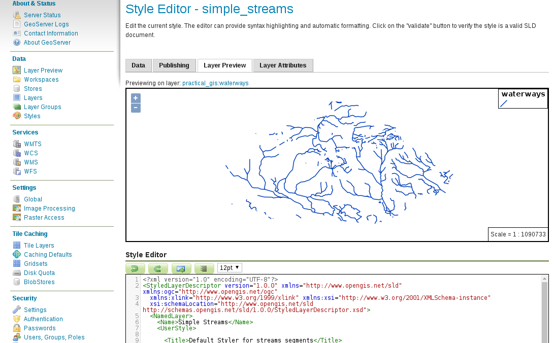
GeoServer's renderer uses, and is basically built around, the SLD (Styled Layer Descriptor) specification. SLD is an XML (Extensible Markup Language) extension specified by OGC. It allows rich representation of the underlying spatial data regardless of their type. As SLD is XML based, it is a structured text using tags, attributes, and values. In order to understand SLD better, let's go through the description of the style we opened before.
The first line in grey describes that the content as a valid XML document of version 1.0 with a UTF-8 character encoding. In the other lines, we can see the body of the SLD. As in every valid XML document, most of the elements have an opening (<TagName>) and a closing (</TagName>) tag. Between the two tags, the content of the element is described, whether it is a simple value, or a group of other elements. The body tag of an SLD document is <StyledLayerDescriptor>, which we can see in the second, and the last line. Opening tags can also have some attributes if applicable (for example, <StyledLayerDescriptor version="1.0.0">). The attributes of the <StyledLayerDescriptor> element are static, and out of concern, as they will be automatically generated if we generate a template for our new style. There are some additional elements we should understand to create a basic style. They are as follows:
Let's start by styling some vector layers that we have. First of all, as we have a river style, we should style our water bodies accordingly. Water bodies should have an outline with the same color as our rivers, and a fill with a lighter shade of blue. As we already have a river color, we can simply copy it out and apply to our new style. To find a lighter shade of blue, we can use an online color picker widget. There is a great widget created by Google, accessible by simply searching for html color picker in Google Search:
Let's style our waters by editing an existing style as follows:
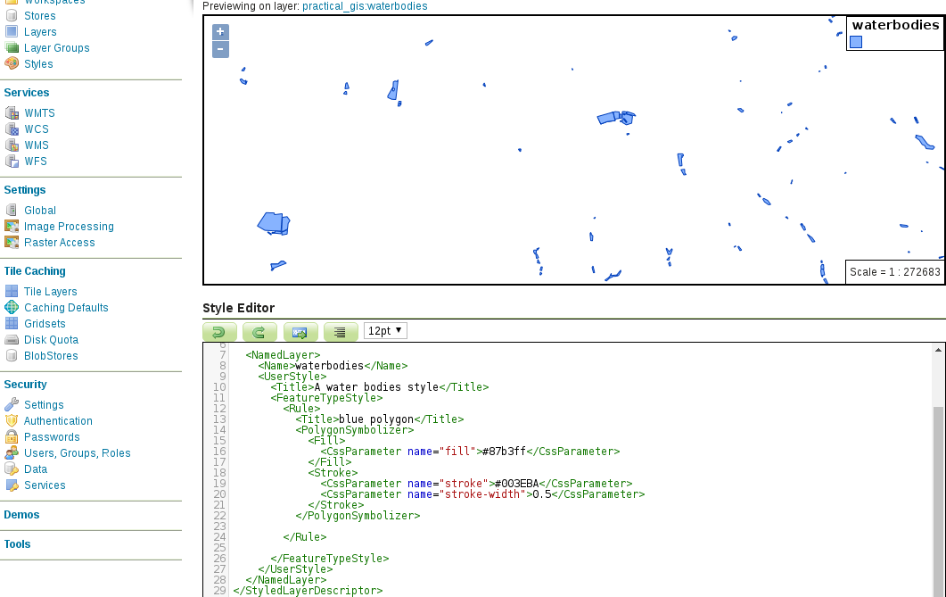
The last part was very simple. Next, let's style our administrative boundaries. From that layer, we only need our study area visualized with a dashed outline:
<CssParameter name="stroke-dasharray">5 5</CssParameter>
        <ogc:Filter>
         <ogc:PropertyIsEqualTo>
          <ogc:PropertyName>name_1</ogc:PropertyName>
          <ogc:Literal>Baranya</ogc:Literal>
         </ogc:PropertyIsEqualTo>
        </ogc:Filter>
Finally, let's create a style for our GeoNames layer showing only labels for the seats of the administrative divisions:
        <ogc:Filter>
         <ogc:PropertyIsLike wildCard="%" singleChar="_" escape="\">
          <ogc:PropertyName>featurecod</ogc:PropertyName>
          <ogc:Literal>PPLA%</ogc:Literal>
         </ogc:PropertyIsLike>
        </ogc:Filter>
        <TextSymbolizer>
         <Label>
          <ogc:PropertyName>name</ogc:PropertyName>
         </Label>
         <Font>
          <CssParameter name="font-family">DejaVu Sans</CssParameter>
          <CssParameter name="font-size">12</CssParameter>
          <CssParameter name="font-style">normal</CssParameter>
         </Font>
         <Halo>
          <Fill>
           <CssParameter name="fill">#000000</CssParameter>
          </Fill>
         </Halo>
         <Fill>
          <CssParameter name="fill">#FFFFFF</CssParameter>
         </Fill>
        </TextSymbolizer>
Let's see how our layer group changed due to these SLD styles. First of all, we need to change its styling. As a layer group can have different styling than the components individually, we have to explicitly set the styles applied to the members of the group:
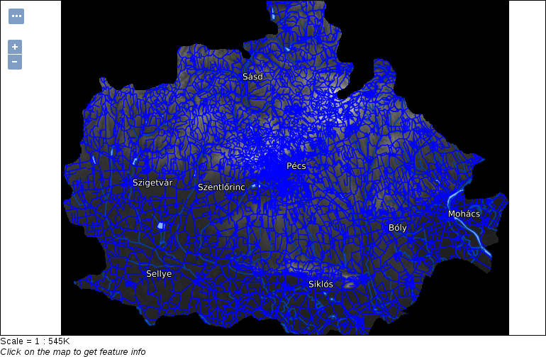
When working with rasters, we have much less options in GeoServer, just like in QGIS. For singleband rasters, like our DEM, we can create a color ramp on which GeoServer interpolates the values of the raster data. We can define breakpoints on the color ramp with colors and raster values. In order to do this, first we need the minimum and maximum values of our SRTM DEM:
        <ColorMap>
         <ColorMapEntry color="#000000" quantity="80"/>
         <ColorMapEntry color="#FFFFFF" quantity="659"/>
        </ColorMap>
Now we have a perfectly fine grayscale DEM. How can we use it aesthetically though? In QGIS, we applied an on-the-fly hillshading, and blended it in our land use layer. Unfortunately, GeoServer is not capable of using a hillshading effect, although we can try blending it in our land use layer. Blending is not part of the SLD specification, but available in GeoServer through a vendor option. Vendor options are parameters, which are not parts of the standard, but implemented in a spatial server to grant additional capabilities. Vendor options are defined with <VendorOption> elements, and are GeoServer-specific, therefore, not portable between different OWS servers.
<VendorOption name="composite">overlay</VendorOption>
If we look at our group layer, we can see that blending modes in GeoServer work differently than in QGIS. The overlay mode keeps every cell from the DEM where there is a white background. Unfortunately, in GeoServer, we have to choose between alpha blending and color blending. With alpha blending, we can show our DEM only where we have land use polygons, but we lose their styling. With color blending, we cannot exclude the DEM where there aren't any land use polygons. To make the composition a little bit more appealing, we can constrain the DEM layer with its blending mode to a maximum scale. As a result, we will only see it on higher zoom levels, where its behavior won't distract us.
<MaxScaleDenominator>100000</MaxScaleDenominator>
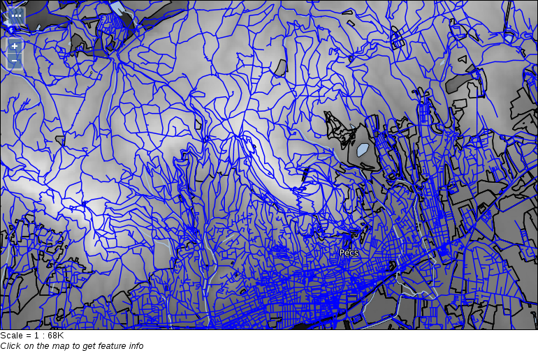
We have seen that SLD has very powerful styling capabilities, although due to XML's verbose nature, SLD documents can easily become unmanageable with the style's complexity. XML is great for computers; they can easily parse and serialize documents in this format. However, they are inconvenient for humans. There is another styling language created for defining styles in a more concise manner--CSS (Cascading Style Sheet). CSS fits human logic better; we just need to understand its cascading behavior. Cascading, in this sense, can be understood with this rule--every matching definition gets applied, but on collision, the most specific definition wins. Let's look at an example. With the following snippet, we can style our GeoNames layer:
    * {
      mark-size: 6;
    }
    [featurecode LIKE 'PPLA%'] {
      mark: symbol('circle');
    }
    [featurecode LIKE 'PPLA%'] [population > 100000] {
      mark-size: 8;
    }
The least specific rule is the * wildcard, which selects every feature. According to that style, every feature should have a symbolizer size of 6 pixels. According to the second rule, only seats of administrative divisions should be visualized--with circles. The third rule is the most specific: it defines that seats with a population greater than 100,000 people should have an increased symbol size. What do we get in the end? Only seats are shown with a circle symbolizer. They are rendered with a 6 pixels size. Seats with a population greater than 100,000 people are rendered with an 8 pixels circle size. As the third selector is more specific than the first one, mark-size: 8 simply overrides mark-size: 6.
The syntax of CSS is very intuitive once we get a grasp of it. Stylesheets written in CSS consist of rule blocks. Each block defines a single set of rules the renderer should apply on logically coherent items (features or raster cells in our case). Every block has two parts--a selector and a declaration block. A declaration block (in braces) has individual declarations as key-value pairs separated by a colon, and terminated by a semicolon. The most basic selector is *, which selects everything. It is like creating a <Rule> element in SLD without any filters. In square brackets, we can define filter expressions. We can put multiple selectors together to form a more specific selector. If we separate multiple selectors with whitespaces, we form a logical AND, while if we separate them with commas, we form a logical OR operation between them.
As GeoServer's renderer is built around the SLD specification, its CSS also has SLD capabilities--just with another, more convenient syntax. That is, we can use SLD rules without nesting elements into each other, keeping only the important parts of styling. Of course, as the language is different, there are also changes in the syntax.
In order to have CSS capabilities in GeoServer, we first have to download and install the extension. As it is an official extension, we can download it from GeoServer's download page at http://geoserver.org/release/stable/:
First, let's style the land use polygons. It would be very cumbersome to set up all the filters in SLD, however, in CSS, we have an easy job creating different categories.
        /* @title Forest */
        [fclass = 'forest'] {
         fill: #1ea914;
        }
        /* @title Grassland */
        [fclass = 'farm'], [fclass = 'grass'], [fclass = 'meadow'],
         [fclass = 'vineyard'], [fclass = 'allotments'] {
          fill: #b2df8a;
         }
         /* @title Residential */
         [fclass = 'residential'] {
           fill: #fdbf6f;
         }
         /* @title Industrial */
         [fclass = 'industrial'], [fclass = 'quarry'] {
           fill: #b3b3b3;
         }
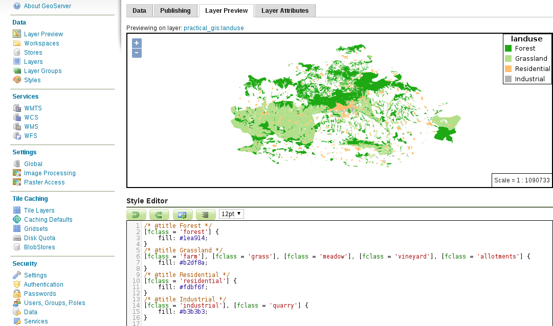
Next, let's create some complex styling to visualize our main roads similar to the visualization we created in QGIS:
        /* @title Important roads */
        [fclass LIKE 'secondary%'] {
         stroke: #8f9593;
         stroke-width: 1;
        }
        /* @title Motorways */
        [fclass LIKE 'motorway%'] {
         stroke: #000000, #eff21e;
         stroke-width: 4, 3;
        }
        /* @title Highways */
        [fclass LIKE 'primary%'] {
         stroke: #000000, #ded228;
         stroke-width: 3, 2;
        }
Our complex line styles should look like the following:
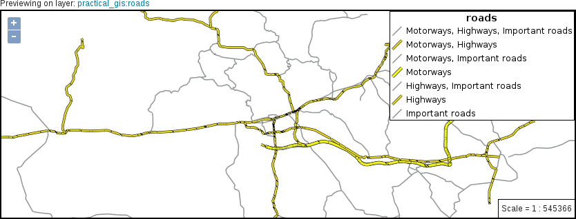
        /* @title Motorways */
        [fclass LIKE 'motorway%'] {
         stroke: #000000, #eff21e;
         stroke-width: 4, 3;
         z-index: 1, 4;
        }
        /* @title Highways */
        [fclass LIKE 'primary%'] {
         stroke: #000000, #ded228;
         stroke-width: 3, 2;
         z-index: 1, 3;
        }
        /* @title Important roads */
        [fclass LIKE 'secondary%'] {
         stroke: #8f9593;
         stroke-width: 1;
         z-index: 2;
        }
Now we should be able to see clean lines rendered by GeoServer:
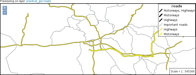
        * {
         stroke-linecap: round;
        }
        [fclass LIKE 'motorway%'], [fclass LIKE 'primary%'],
         [fclass LIKE 'secondary%'] {
          label: [ref];
          font-family: DejaVu Sans;
          font-fill: #ffffff;
          shield: symbol('square');
         }
label-anchor: 0.5 0.5;
-gt-label-group: true;
         -gt-shield-resize: stretch;
         -gt-shield-margin: 2;
        :shield {
         fill: #244e6d;
        }
Putting the whole code together, we get a label description similar to the following:
        [fclass LIKE 'motorway%'], [fclass LIKE 'primary%'],
         [fclass LIKE 'secondary%'] {
         label: [ref];
         font-family: DejaVu Sans;
         font-fill: #ffffff;
         label-anchor: 0.5 0.5;
         shield: symbol('square');
         -gt-label-group: true;
         -gt-shield-resize: stretch;
         -gt-shield-margin: 2;
        }
        :shield {
         fill: #244e6d;
        }
If we apply the final style as the default on the roads layer, and override the road layer's style of our layer group in Data | Layer Groups, we can see our final composition in Data | Layer Preview:
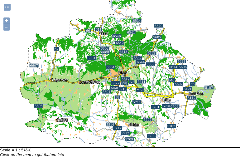
As a final task, let's style our suitability raster layer. We should use the same color ramp that QGIS calculated for us. That is, we have five breakpoints: 0, 0.25, 0.5, 0.75, and 1. The color ramp is red to green, with the colors #ff0000, #fdae61, #ffffc0, #a6d96a, and #1a9641 at the breakpoints:
        raster-color-map:
          color-map-entry(#ff0000, 0)
          color-map-entry(#fdae61, 0.25)
          color-map-entry(#ffffc0, 0.5)
          color-map-entry(#a6d96a, 0.75)
          color-map-entry(#1a9641, 1);
color-map-entry(#ff0000, 0, 0)
The red parts are gone, however, GeoServer not only interpolates colors between breakpoints, but also opacity values. That is, the opacity between 0 and 0.25 is constantly changing, introducing a dull reddish color in that interval. To make things worse, layers beneath the suitability layer will be visible in those areas, distorting the colors even more. The logical solution would be to increase the value of the lowest color map entry by an arbitrarily low value (like 0.00001). The problem is, GeoServer not only interpolates on a color ramp, but also extrapolates. That is, if we do not set zero values to fully transparent, we always get them styled according to the color of the lowest color map entry. The only thing we can do is to introduce another entry, which jumps the opacity of the layer back to normal on values slightly bigger than 0.
color-map-entry(#ff0000, 0.00001, 1)
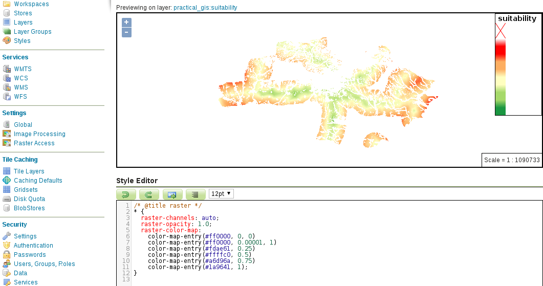
In this chapter, we learned the basics of styling data in GeoServer. We discussed the symbolizers we can use, how XML and the XML-based SLD styling language work, and finally, how we can create styles easily with CSS. You were introduced to the syntax of the aforementioned styling languages, and now can create styles for our vector and raster maps from simple visualization purposes to more advanced cartographic use cases.
In the next chapter, we will learn about the client side. We will explain how client-side web mapping software works, and how we can utilize them to request spatial data from the server's file system or a spatial server. We will also see how we can use spatial data with JavaScript, and how we can script a web mapping software to create interactive maps with already-styled images and raw vector data.
In the previous chapter, we learned how to style spatial data in GeoServer. We started with a simple symbology for raw vector and raster data and proceeded to more advanced and also more aesthetic cartographic representations. We ended with a group layer resembling the composition we created with QGIS's print composer. We also looked at some other independent vector and raster layers, styled and ready for use.
Now we will use our styled data and create some client-side interactive maps to showcase our results. We will use JavaScript to create a web map that can not only use our already styled vector and raster data as image layers using WMS, but can also use raw vector data with WFS. We will cover how to make our maps more interactive by styling vector data on the client side and enabling our users to query them without sending additional requests to the server.
In this chapter, we will cover the following topics:
In Chapter 11, Showcasing Your Data, we discussed how data is transferred over the Web and how servers work. In order to have a better understanding of the Web, let's discuss how web clients interpret server responses in more detail. As we already know, servers either store web content in a static format, or they generate it on the fly with CGI scripts or other web applications. We also know that these contents are usually plain text, structured text, or media files. The most common content a web client has to interpret is in structured text format, containing elements we would like to show, styles we would like to apply to our elements, and scripts we would like to run on the client side:
What happens to these documents in the web client? First of all, the client sends a request to the destination URL. If we did not provide a resource name and just a path, the request will default to the index.html document in the provided path. Then, if a web server listens on the other side, the communication gets established, and the transaction we discussed earlier occurs. The client receives a response, which is some kind of resource (most often an HTML document). If the HTML document contains links to other resources (for example, stylesheets, scripts, and media elements), the client requests these items individually and interprets their content. If a stylesheet is requested, the client applies the styles found in there, while if a script is requested, it parses and executes it.
Let's assume the resource is an HTML document. The client parses the elements written in HTML and creates an object model from it, called a DOM (Document Object Model). The DOM is the object-oriented representation of the HTML document using a tree structure. Every element is an object, with the various attributes the element can hold. We can interact with the DOM, query, modify, insert, and remove individual elements in it. Of course, we need a way to interact with the DOM. As web clients expose their DOM trees through their JavaScript interfaces, we can manipulate DOM elements through JavaScript. For example we can query input values and act accordingly. To make this interaction more convenient, the JavaScript DOM API comes with a built-in event model, that is, we can register event listeners on DOM elements, and the registered functions get executed automatically every time the event occurs.
To understand the client side better, let's make a simple web page containing some basic information about our map. First of all, we need to get our web server's root directory. As web servers can only see a portion of the filesystem, they can only serve our documents if they are placed in the portion they can use. Apache comes with a default web page, which can help us locate this root folder without searching for configuration files. If we open http://localhost in a browser, we can see the greeting document we are searching for. The document's name in the filesystem is index with a varying extension (for example, html, html.en, and phtml).
The location of the web server's root folder can vary between different operating systems, versions, and distributions.
After we locate the root folder of our Apache web server, we are only a few steps away from creating our first web page:
HTML has a syntax similar to XML and SLD. The basic principles are the same; we use opening and closing tags, tag attributes, and content. The content can be plain text or other HTML elements. There are only a few elements that we will use to create our web map:
There are some basic rules and guidelines to create a good HTML document. Every element should go in the <html> root element. The root element usually has a single attribute (for example, lang="en"), containing the language abbreviation of the page. Furthermore, it should only contain the <head> and <body> elements. The <head> element should contain everything that is not for direct visualization. Elements such as <title>, <link>, and <meta> should all go into the <head> section. Additionally, JavaScript libraries needed for the web page's custom code should also go into the <head> section. The <body> section should contain the rest of the elements, that is, everything that should be rendered. It can also contain the web page's custom scripts, especially if they are changing the other elements; therefore, they require the DOM tree to be set up by the client when they run. A minimal functional example of the aforementioned elements looks like the following:
<html lang="en">
  <head>
    <title>Your page's title</title>
    <meta charset="utf-8">
    <link href="yourstylesheet.css" rel="stylesheet">
    <script src="yourscript.js" type="text/javascript">
  </head>
  <body>
    The content of your web page.
  </body>
</html>
Apart from the custom attributes specific elements can hold, we should be able to apply some general attributes, mostly on visual elements. With the id attribute, we can assign a unique identifier to individual elements. Using IDs, we can style these elements individually and also get their object references through JavaScript. This is the way in which we can register listener functions to elements, modify them, or query their attributes in our custom code. With the class attribute, we can group elements. Using classes is mostly used to style visually coherent elements with a single CSS rule.
Now that we know about the basic principles, let's create our HTML document. The web page should have a title and a UTF-8 character encoding in its <head> section. In the <body> section, we should have a header with a greeting text and two <div> elements. The first one will contain the map, while the second one will contain a short description. As we would like to be able to select between multiple maps, we should have at least four buttons under the <div> elements. The four maps we will create are the road map, the constrained houses from our PostGIS analysis, the suitability map, and the road map in our local projection.
After putting the required elements together, we should get a simple HTML document similar to the following:
    <html lang="en">
     <head>
       <title>Map gallery</title>
       <meta charset="utf-8">
     </head>
     <body>
       <h1>Welcome to my interactive map gallery!</h1>
       <div id="map"></div>
       <div id="description">
         <p id="description_text"></p>
       </div>
       <input id="roadmap" type="button" class="mapchooser"
        value="Road map">
       <input id="suitability" type="button" class="mapchooser"
        value="Suitability">
       <input id="houses" type="button" class="mapchooser"
        value="Houses">
       <input id="roadmap_23700" type="button" class="mapchooser"
        value="Road map (EPSG:23700)">
     </body>
    </html>
If we save our edits made to our HTML document and open it in our browser (http://localhost/map.html), we will able to see our raw HTML elements rendered with their default styles:
Although the syntax is the same, regular CSS differs from GeoServer's CSS. We already know that CSS rules consist of selectors and declaration blocks, which contain declarations in the form of key-value pairs. There are three kinds of basic selectors we should be able to use in CSS. We can style every tag in an HTML document by supplying the tag's name in a selector. For example, a div selector selects every <div> element in the document. We can constrict the selection to a specific class using .classname and to a specific ID using #idname. Selection based on multiple criteria (the AND logical operator) can be achieved by writing the corresponding selectors together. By writing div.map, we select every <div> element that has a map class. We can also define a union (the OR logical operator) by separating different selectors with commas. Writing div, .map selects every element that is either a <div> element or has a map class. Finally, by separating different selectors with only whitespaces, we can look for parent-children relations. By writing div .map, we select every element with a map class, which is directly nested into a <div> element. There are also special pseudo selectors that check for specific events. For example, if we use a :hover pseudo selector with a div selector and write div:hover, the declarations are only applied when we are hovering over a <div> element with our cursor.
Let's learn some basic styling tricks by styling our document:
        <head>
         <title>Map gallery</title>
         <meta charset="utf-8">
         <link href="map.css" rel="stylesheet">
        </head>
        div {
         height: 80%;
        }
        #map {
         width: 60%;
        }

        #description {
         width: 40%;
        }
        div {
         height: 80%;
         display: inline-block;
        }

        #map {
         width: 60%;
         float: left;
        }
border: 1px solid black;
        #map {
         width: 60%;
         float: left;
         border: 1px solid black;
         border-radius: 5px;
         box-sizing: border-box;
        }
        div {
         height: 80%;
         display: inline-block;
         padding-bottom: 1em;
        }

        p {
         padding-left: 1em;
        }
Our basic map gallery should look similar to the following:
Finally, let's style our buttons. We can go wild here without worrying about breaking the page design:
        .mapchooser {
         height: 40px;
         border: 1px solid black;
         border-radius: 5px;
         background-color: white;
        }
        .mapchooser:active {
         border: 2px solid black;
         background-color: grey;
         color: white;
        }
We can use as many CSS rules as we would like on our buttons, although using the simple rules provided here still brings a significant change in the design of our buttons:
The third component of a web page is the custom code we script our page with. We can make our page more dynamic and interactive by executing different tasks on different events, for example, on a press of a button. Web clients use the JavaScript language for these kinds of client-side tasks. They expose their DOM trees, making them accessible and modifiable by us. JavaScript started as a high-level basic scripting language for very simple automation tasks. Nowadays, it can be considered a full-fledged high-level object-oriented programming language. DOM manipulation is just one of the many things it can do, including the interpretation and manipulation of binary input. It can be used in imperative style, object-oriented style, and--to some extent--functional style. For the sake of simplicity, we will stick with a minimal subset of its capabilities and write simple yet effective procedural code.
Let's discuss the syntax of JavaScript briefly. In the code we will use, we will encounter some basic types that behave differently, such as literals:
A non-literal type we should also be able to use is the function. Functions group individual statements (commands) and execute them sequentially. We can call a function by its name and some parameters. The number of parameters a function can accept always depends on the given function (functions accept zero or more parameters). The correct syntax calls the function's name and places the different parameters after it in parentheses, separated by commas (for example, myFunction(x, y, z)). There must be no whitespaces between the function's name and the opening parenthesis:
    // We have a function named addNums requiring two numbers
       and returning the sum of them.
       addNums(2, 5);
We should also know how to use variables. Variables can be declared in multiple ways, although using the var keyword fits our needs. A variable declaration needs the var keyword, a variable name, and, optionally, an assignment with an initial value:
    var x; //Declaring a variable named x.
    var x = 2; //Declaring a variable named x initialized with a
     value of 2.
Accessing variables can be done by simply providing the name of the variable. Different types act differently, though. Arrays and objects can contain multiple elements, which can be accessed directly. Individual array elements can be accessed by their index numbers with the subscript operator (brackets) starting with the index number 0, while object elements can be accessed by separating the object's name and the key's name with the dot operator (point):
    var x = 2;
    var array = [9, 4, 7];
    var object = {x: 5};

    x; //2
    array[1]; //4
    object.x; //5
Finally, most of the statements must be terminated. There are some exceptions, such as control flow statements (for example, loops and conditionals); however, in the case of declarations, assignments, and function calls, it is mandatory. The symbol we should terminate our statements with is the semicolon. Although statements can be terminated with line breaks instead of semicolons, and the code will run in most cases, it is a very bad practice, as it makes the code vulnerable. For example, if we want to compress our script without using semicolons, the whole code will break.
For now, let's create a script that shows the description of a map when we click on the button representing it. First of all, we just declare a variable containing a single description and show it on our web page:
        <body>
         [...]
         <input id="roadmap_23700" type="button" class="mapchooser"
         value="Road map (EPSG:23700)">
         <script src="map.js" type="text/javascript"></script>
        </body>
        var roadmap = 'Road map of Baranya county. Land use types,
         important roads, major settlements, and basic hydrology
         are visualized.';
var description = document.getElementById('description_text');
description.textContent = roadmap;
By refreshing the page, we will be able to see the description of our road map next to the map container:
In order to register these lines to the click event of our first button, we have to make a procedure from them. Procedures in JavaScript are functions, which we already know how to call. We only have to learn how to make one. Creating a function involves the function keyword, some parameters our function will use in parentheses, and a code block in braces. The code block contains the statements our function will execute on call:
        var updateMap = function() {
         var roadmap = 'Road map of Baranya county. Land use types,
         important roads, major settlements, and basic hydrology
         are visualized.';
         var description = document.getElementById('description_text');
         description.textContent = roadmap;
        };
        var roadbutton = document.getElementById('roadmap');
        roadbutton.onclick = updateMap;
Great work! Now we have the placeholder text, and we can change it to our description with a click of a button. The only problem is that we have to repeat this process for every button we have. On the other hand, we can shape our function into a more general form that can find out the assignable text based on the ID of the clicked button. Then, we can register the same function to every button we have. The basis for our new logic is to create an object that stores the descriptions of the maps with keys representing the IDs of the corresponding buttons. In the event listener, we will read the correct description based on the clicked button's ID:
        var descriptions = {
          roadmap: 'Road map of Baranya county. Land use types,
           important roads, major settlements, and basic hydrology
           are visualized.',
          suitability: 'Suitability map of Baranya county for
           building a new warehouse for a logistic company having
           stores in major settlements.',
          houses: 'Real estates in Pecs residing in nice,
           quiet areas with shops, restaurants, bars, parks,
           and playgrounds nearby.',
          roadmap_23700: 'Road map of Baranya county in EOV
           projection.
           Land use types, important roads, major settlements,
           and basic hydrology are visualized.'
        };
        var updateMap = function(evt) {
         var description =
          document.getElementById('description_text');
         description.textContent = descriptions[evt.target.id];
        };
        document.getElementById('roadmap').onclick = updateMap;
        document.getElementById('suitability').onclick = updateMap;
        document.getElementById('houses').onclick = updateMap;
        document.getElementById('roadmap_23700').onclick = updateMap;
Now we have everything in place except our maps. To create interactive maps, we can use external web mapping libraries written in JavaScript. One such library is Leaflet, which is perfectly capable of creating simple interactive maps. Leaflet has a simple and intuitive API, which is very easy to use. All we need is the library's code base and stylesheet loaded in our HTML document. Let's include Leaflet in our web page:
        <script src="leaflet/leaflet.js" type="text/javascript">
        </script>
<link href="leaflet/leaflet.css" rel="stylesheet">
Now that we have a reference to Leaflet's various methods, we can start creating web maps using its API. The API consists of methods exposed to the users of the library. Every good API has a thorough documentation on how to use the different methods, and Leaflet is not an exception. We can reach its API documentation at http://leafletjs.com/reference-1.0.3.html.
The first map we create should be the road map we created in GeoServer. We have to set up a blank map and load a WMS layer in it. Once it's working, we can bind the map to the appropriate button:
        var map = L.map('map', {
         center: [46.06, 18.25],
         zoom: 9
        });
The map canvas is there, although it has some visual glitches. The problem is that Leaflet also uses <div> elements to create its containers, while we defined some styles on every <div> element. That is why creating styling rules that are too general can lead to broken design:
        var wms = L.tileLayer.wms('http://localhost:8080/geoserver/ows', {
         layers: 'practical_gis:road_map',
         format: 'image/png'
        });
map.addLayer(wms);
Our map is working, although we still need to bind it to our first button. We do not have to give up the general function we created, though. As object values can be anything, we can create a second object containing our buttons' IDs as keys and the functions creating our maps as values.
var maps = {};
        maps.roadmap = function() {
          var map = L.map('map', {
            center: [46.06, 18.25],
            zoom: 9
          });

          L.tileLayer.wms('http://localhost:8080/geoserver/ows', {
            layers: 'practical_gis:road_map',
            format: 'image/png'
          }).addTo(map);
        };
maps[evt.target.id]();
If we save our changes and refresh our page, we can see our road map by pressing the corresponding button:
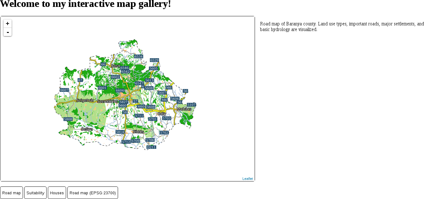
For the next next task, let's create a map with our suitable zones. In this task, let's have an OpenStreetMap base map, the suitability layer from GeoServer as an overlay map, and the suitable zones as another overlay map:
        maps.suitability = function() {
         var map = L.map('map', {
         center: [46.08, 18.24],
         zoom: 10
         });
        };
        L.tileLayer(
         'http://{s}.tile.openstreetmap.org/
         {z}/{x}/{y}.png').addTo(map);
        L.tileLayer.wms('http://localhost:8080/geoserver/ows', {
         layers: 'practical_gis:suitability',
         format: 'image/png',
         transparent: 'true'
        }).addTo(map);
        L.tileLayer.wms('http://localhost:8080/geoserver/ows', {
         layers: 'practical_gis:suitable',
         format: 'image/png',
         transparent: 'true'
        }).addTo(map);
Now we should be able to see our second map in action:
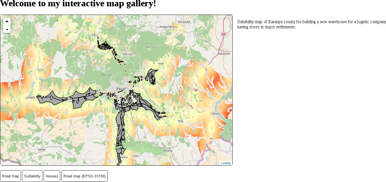
Now our second map loads, although we cannot change maps without reloading the page. The problem is that Leaflet recognizes if the provided container already has a loaded map and won't load another one until it is properly destroyed. We can destroy an existing Leaflet map; however, we need to understand another concept first--variable scope. In JavaScript, similarly to other programming languages, a variable cannot be accessed outside its valid scope. A valid scope in JavaScript is a function. We saved our map objects to variables in separate functions; therefore, they cannot see each other. Moreover, if we would like to access these map variables outside their functions, we would get an error. However, in these functions, we can access variables declared outside of them, just like we accessed our maps and descriptions objects. The solution is that we have to move our map declaration outside of the functions; by doing this, we can access the existing map instance (if any) before creating another one.
var map;
        if (map != undefined) {
         map.remove();
        }
One of the greatest strengths of Leaflet is its clean code base and great extensibility. The base Leaflet library is very small and lightweight; therefore, it has limited capabilities. However, a lot of developers have created a variety of interesting and useful plugins that can integrate into Leaflet, extending it to match our needs. The only weakness of this decentralized workflow is the lack of rigor and cohesion in plugins. Their quality (for example, documentation) can vary; therefore, we might need to fiddle quite a bit with some of them before getting meaningful results. We can check out a recommended list of plugins at http://leafletjs.com/plugins.html. Of course, there is no guarantee a listed plugin will be easy to use, although it is a good indicator of its quality.
When it comes to web mapping and vector data, one of the most popular formats is GeoJSON. GeoJSON extends JSON, which is basically JavaScript's number one storage format. JSON is created to be concise while still able to represent almost every type in JavaScript. Therefore, we can save the states of web applications, for example, in order to resume them later. GeoJSON is also a concise format that can represent the basic geometry types and can be parsed by JavaScript easily. The only problem is that we have to load our GeoJSON files in our script. Although Leaflet knows how to handle GeoJSON objects, to load external content on the fly, we need to understand yet another concept--AJAX. On the other hand, there is a Leaflet plugin that can automatically load the content of a GeoJSON file with only URL. Let's create our third map using this plugin:
        <script src="leaflet/leaflet.ajax.min.js"
         type="text/javascript"></script>
        map = L.map('map', {
         center: [46.08, 18.24],
         zoom: 12
        });
        L.tileLayer(
         'http://{s}.tile.openstreetmap.org/
         {z}/{x}/{y}.png').addTo(map);
L.geoJson.ajax('houses.geojson').addTo(map);
If we click on the third button after refreshing the page, we can see our houses on the map:
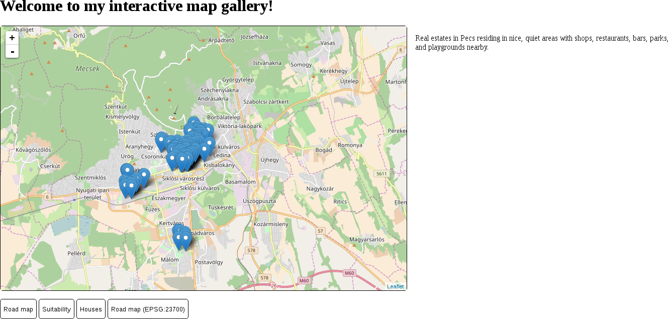
As we can see, Leaflet loads vector points as marker images by default. When we load some lines or polygons, it simply renders it as QGIS or GeoServer did. Let's load some polygons, but with WFS this time. Using WFS requests is another unsupported feature in Leaflet, which we can still use with another extension:
        <script src="leaflet/Leaflet-WFST.min.js"
         type="text/javascript"></script>
        L.wfs({
         url: 'http://localhost:8080/geoserver/ows',
         typeNS: 'practical_gis',
         typeName: 'suitable',
         geometryField: 'the_geom'
        }).addTo(map);
If we display our suitability map, we can see the OSM base layer and the suitability layer, but no polygons. What happened? You might have already opened the developer tools for potential error messages and seen a message similar to the following:
        XMLHttpRequest cannot load http://localhost:8080/geoserver/ows?.
         No 'Access-Control-Allow-Origin' header is present on the
         requested resource. Origin 'http://localhost' is therefore
         not allowed access.
We stumbled upon two very characteristic concepts of web development--same-origin policy and CORS (cross-origin resource sharing). The same-origin policy is a security measure that prevents browsers from mixing content from different servers. The path of the first document a web client loads determines the origin. From then on, the same-origin policy prevents the browser from loading anything that is not on exactly the same domain and exactly the same port. There are, of course, exceptions handled by CORS. These exceptions are typically scripts linked in <script> elements, stylesheets linked in <link> elements, images and other media, embedded content in <iframe> elements, and web fonts.
One of the things that the same-origin policy is always applied to is AJAX calls. WFS features, just like our GeoJSON file, are requested using AJAX, therefore the same-origin policy applies. The problem is that our GeoServer listens on and responds to port 8080, while our origin is at port 80. In the end, our web page cannot request resources other than images from GeoServer. The solution is simple; CORS can be enabled for any kind of resource on the server side using special headers in server responses. Enabling CORS in our GeoServer is slightly more complicated, though:
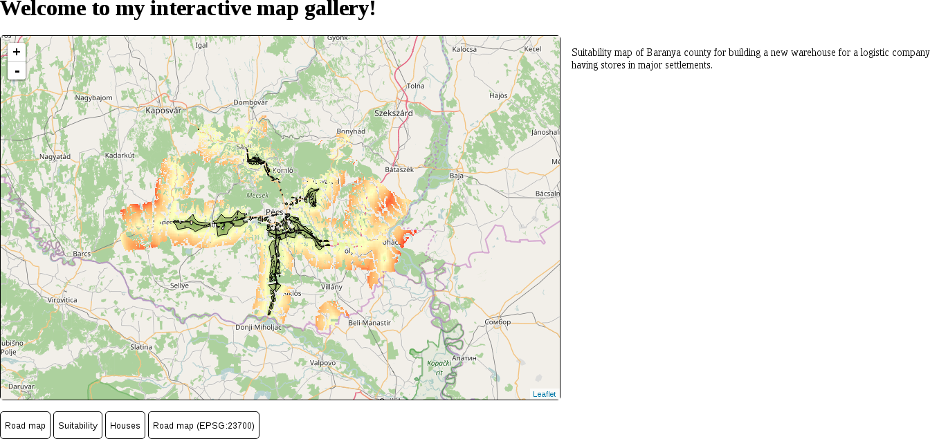
As we can see, Leaflet represents vector points with marker images, while it draws lines and polygons just like QGIS does. The next thing we should learn is how we can customize the styles of the vector features we display in our web maps. Both the L.wfs and L.geoJson.ajax functions accept additional styling parameters we provide. Styling is done by passing a style object to the vector layer's function containing supported styling parameters. The complete list of parameters can be seen on the base vector class's API documentation page: http://leafletjs.com/reference-1.0.3.html#path. Using the properties in the provided list, let's change our polygons to better match the suitability maps we created in QGIS:
        L.wfs({
          url: 'http://localhost:8080/geoserver/ows',
          typeNS: 'practical_gis',
          typeName: 'suitable',
          geometryField: 'the_geom',
          style: {
            fillOpacity: 0,
            color: '#000000',
            weight: 1
          }
        }).addTo(map);
By opening our sustainability map again, we should be able to see our new polygons:
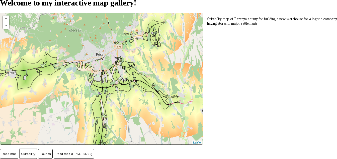
Customizing a single symbol for every vector feature in a layer is very easy in Leaflet. However, sometimes we would like to add thematics to our maps, such as attribute-based symbology. The style parameter of vector layers can aid us in this, as it also accepts a function. The function needs to be able to evaluate the style for every feature and return it in the end. Let's create a style for our houses map that visualizes our houses according to their prices:
        L.geoJson.ajax('houses.geojson', {
         style: function(feature) {

         }
        }).addTo(map);
var fill = '#00ff00';
        if (feature.properties.price > 10000000) {
         fill = '#ffff00';
        }
        if (feature.properties.price > 30000000) {
         fill = '#ff0000';
        }
        var styleObject = {
         radius: 5,
         fillColor: fill,
         color: '#000000',
         weight: 1,
         fillOpacity: 1
        };
return styleObject;
If we reload our houses layer, it still contains the usual blue markers. The problem is that vector points are visualized as marker images, and marker images cannot be styled as vector features. We have to override this default behavior of Leaflet and visualize our vector points as circles. There are two functions we can use for this. The pointToLayer property can be supplied on point layers to specify how Leaflet should draw the vector point. It has to be a function with two parameters: feature and coordinates. The coordinates parameter passes the WGS 84 coordinates of the processed point directly; therefore, we can easily create another symbol from them. The function must return the vector object that can be directly used by Leaflet to draw our point. We can create a stylable circle with the L.circleMarker function, which only requires two WGS 84 coordinates.
        pointToLayer: function(feature, coords) {

        }
return L.circleMarker(coords);
The initialization call of our GeoJSON layer now should look like the following:
        L.geoJson.ajax('houses.geojson', {
          style: function(feature) {
            var fill = '#00ff00';
            if (feature.properties.price > 10000000) {
              fill = '#ffff00';
            }
            if (feature.properties.price > 30000000) {
              fill = '#ff0000';
            }
            var styleObject = {
              radius: 5,
              fillColor: fill,
              color: '#000000',
              weight: 1,
              fillOpacity: 1
            };
            return styleObject;
          },
          pointToLayer: function(feature, coords) {
            return L.circleMarker(coords);
          }
        }).addTo(map);
We can inspect our new thematic house map by refreshing the page and loading the map:
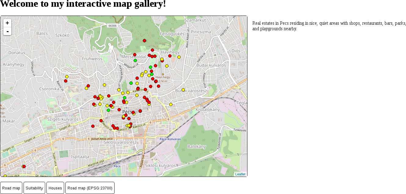
A truly great feature of Leaflet is its convenient popup management. We don't have to create any kind of popup mechanism (HTML elements, close button, or custom code on different events); Leaflet can create full-fledged popups automatically just by providing an HTML string. An HTML string is a simple string that can contain HTML tags. The HTML tags are interpreted rather than printed directly, and the resulting DOM structure is rendered instead. Let's create some popup content for our houses layer:
        onEachFeature: function(feature, layer) {

        }
        var htmlString = 'House on ' + feature.properties.name +
         '.<br>Size: ' + feature.properties.size + ' m²<br>Price:
         ' + feature.properties.price + ' HUF';
layer.bindPopup(htmlString);
Our house map now annotates some of the attributes of our houses:
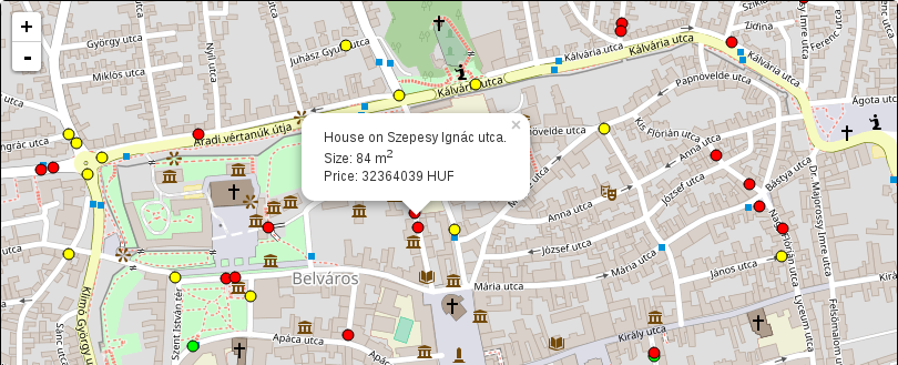
Leaflet can use some projections out of the box, of which two have cartographic significance--EPSG:3857 and EPSG:4326. The default projection is the Web Mercator, while the WGS 84 projection has to be specified in the map's crs property. The crs property's value must be a valid Leaflet projection object. This object contains methods to transform coordinates around and has predefined zoom levels fitting the given projection, among other things. Let's try out the WGS 84 projection on our road map first:
        map = L.map('map', {
         center: [46.06, 18.25],
         zoom: 9,
         crs: L.CRS.EPSG4326
        });
        L.tileLayer.wms('http://localhost:8080/geoserver/ows', {
         layers: 'practical_gis:road_map',
         format: 'image/png'
        }).addTo(map);
To use other projections, we can use yet another plugin. This plugin can utilize PROJ.4's JavaScript port--Proj4.js. It can create regular projection objects that Leaflet can use from projection definitions. Let's create a projection object representing our local projection:
        <script src="leaflet/proj4.js" type="text/javascript">
        </script>
        <script src="leaflet/proj4leaflet.js" type="text/javascript">
        </script>
        var localProj = new L.Proj.CRS('EPSG:23700',
         '+proj=somerc +lat_0=47.14439372222222
          +lon_0=19.04857177777778 +k_0=0.99993 +x_0=650000
          +y_0=200000 +ellps=GRS67 +towgs84=52.17,
          -71.82,-14.9,0,0,0,0 +units=m +no_defs',
         {
           resolutions: [4096, 2048, 1024, 512, 256, 128, 64, 32,
            16, 8, 4, 2, 1]
         });
        map = L.map('map', {
         center: [46.08, 18.24],
         zoom: 4,
         crs: localProj
        });
Our fourth map is now working, and showing our road map in our local projection:
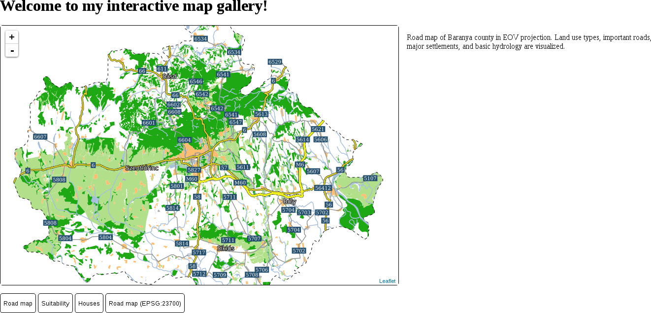
Congratulations! You just created several different web maps using different techniques. In this chapter, we learned how the client side of the web works and how we can utilize a web mapping library for our mapping needs. We can now use Leaflet to easily share our maps on the Web. We can load image layers, vector layers, style vector data, popups, and even custom projections. We also discussed some of the basic concepts of the frontend, such as the interaction of HTML, CSS, and JavaScript elements, or CORS.
This is the end of our journey. We learned a lot of things about GIS from the theory behind data models by creating a spatial database to publish the results on the Web. We did our best to understand how spatial data works and how it can be analyzed through various means. We got some meaningful results from our example data, which is completely open source (in most cases), just like the software we used. Take a good rest, but don't forget--this is only the beginning of a long journey if you wish to master the art of GIS. I hope you will not only apply this knowledge to practical problems, but will also find joy in doing so.
Appendix 1.1: Isosurfaces (800 mm and 1200 mm precipitation) visualized on the Digital Elevation Model of Slovakia provided by the sample slovakia3d dataset for GRASS GIS:
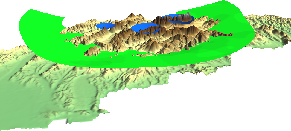
Appendix 1.2: The same map we created in Chapter 2, Accessing GIS Data With QGIS, only with a CRS using an Albers Conic projection (EPSG:102008). The map is not North-aligned; therefore, a north arrow was used with the North alignment parameter set to True north:
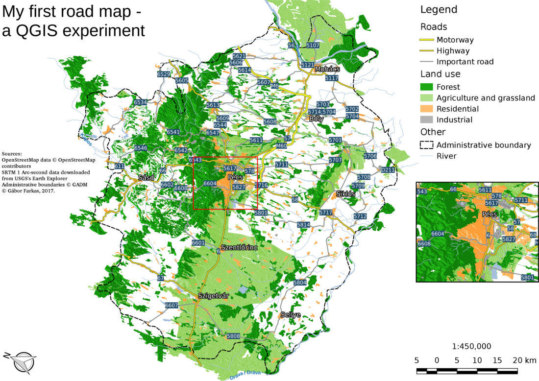
Appendix 1.3: Some of the basic geoalgorithms visualized. a: the two input layers (A and B per GRASS's v.overlay), b: clip (and), c: union (or), d: difference (nor), e: symmetrical difference (xor):
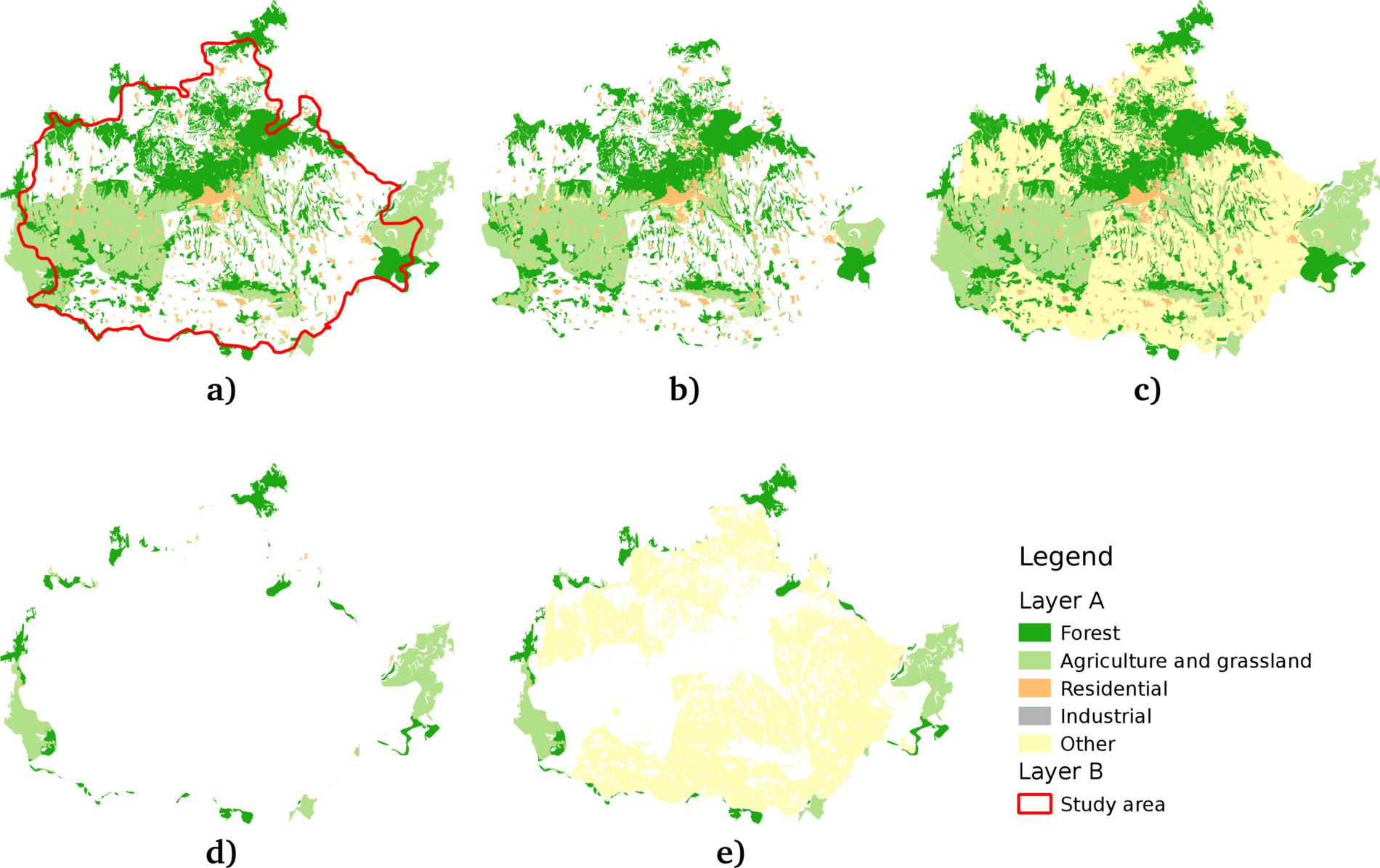
Appendix 1.4: Some of the Coordinate Reference System's PostGIS support. The selected one is the EPSG:4326 CRS used by the book in the early chapters:
Appendix 1.5: Settlement data of my study area downloaded from the OpenStreetMap database via the QuickOSM plugin using the Overpass API:
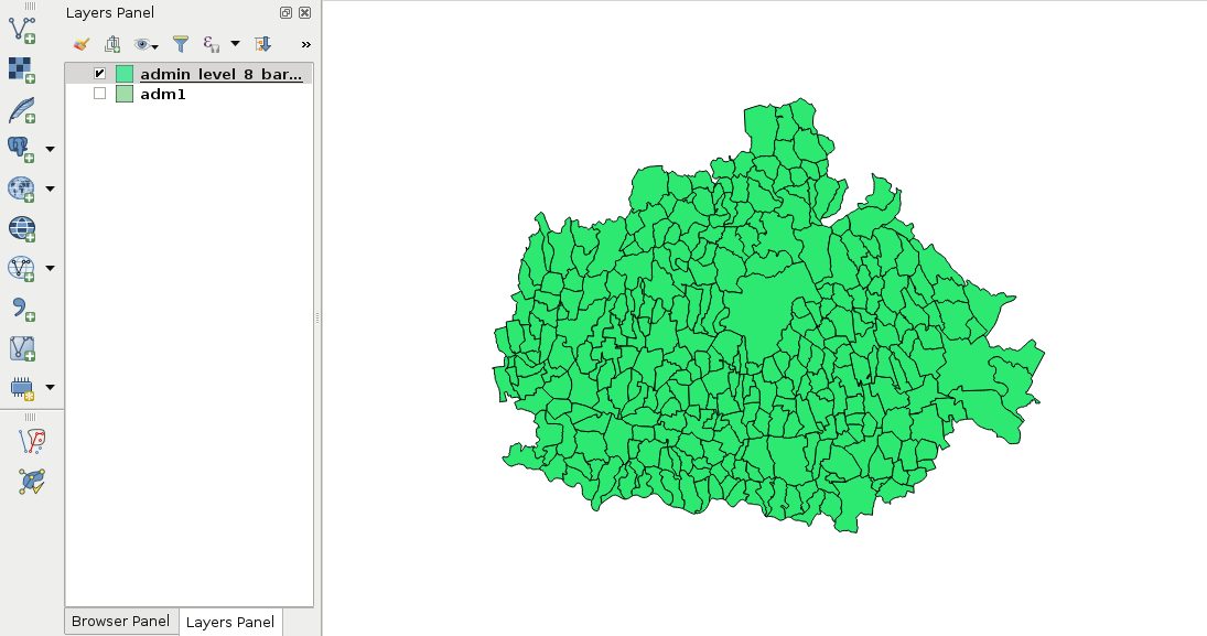
Appendix 1.6: Linear interpolation of point vi on the line segment between points v0 and v1 based on a factor f. If v1 - v0 divided by 1/f leaves a remainder, the interpolated coordinate needs more precision (left). If not, the interpolated coordinate will have the same precision (right). In GIS, however, it is a common practice to store coordinates with a fixed precision in a single vector layer:
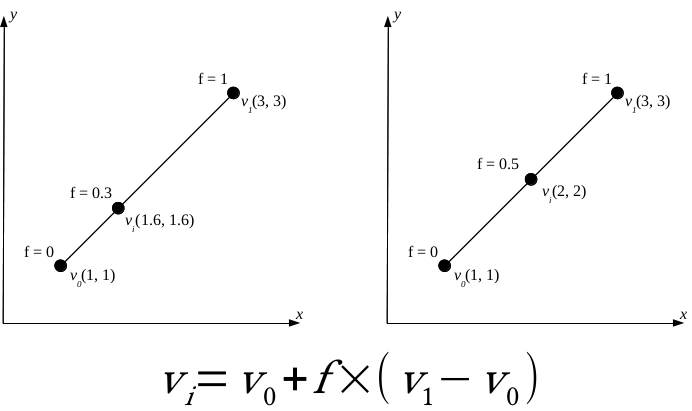
Appendix 1.7: Difference between precise proximity analysis with buffering (green points), and selecting features with precision values (yellow points) in QGIS. Every green point is selected, but there are some points excluded from the precise results:
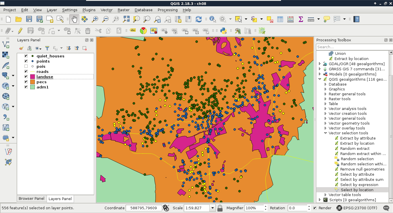
Appendix 1.8: Do you need an Extract by expression tool in QGIS? Build one yourself! You can easily create such a model by requiring a Vector layer input of any type, a String input for the expression, and linking the Select by expression and the Save selected features tools together:
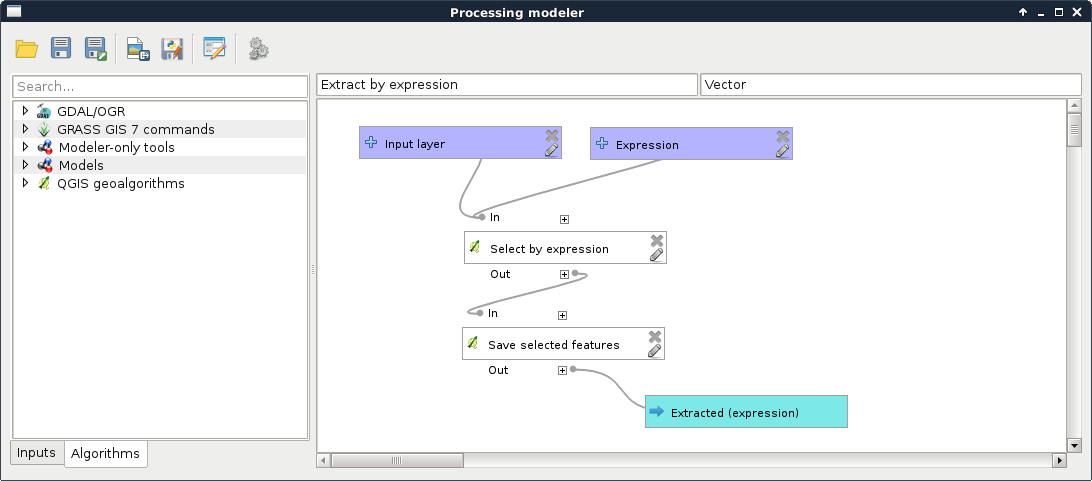
Appendix 1.9: Interpolated surface from contour lines visualized in 3D with the contour lines displayed on the interpolated surface:
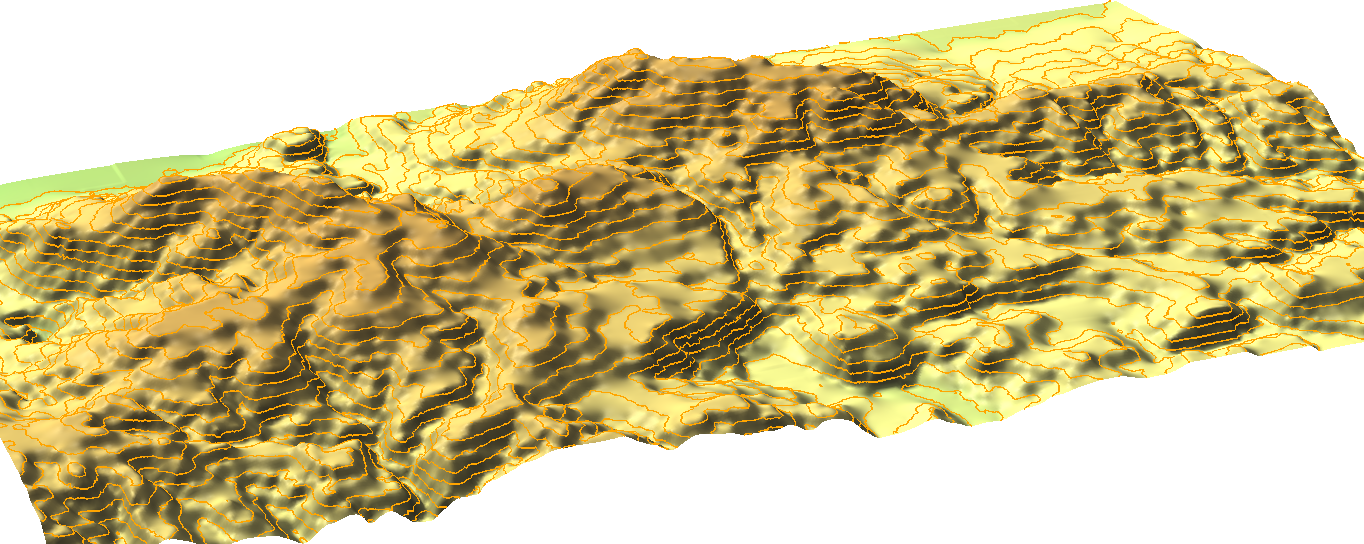
Appendix 1.10: The same vector layer transformed to raster with a resolution of 5 meters (left) and 2 meters (right). By using 5 meters, two of the possible houses overlap with buildings; thus, get cut off roads in the walking time analysis:
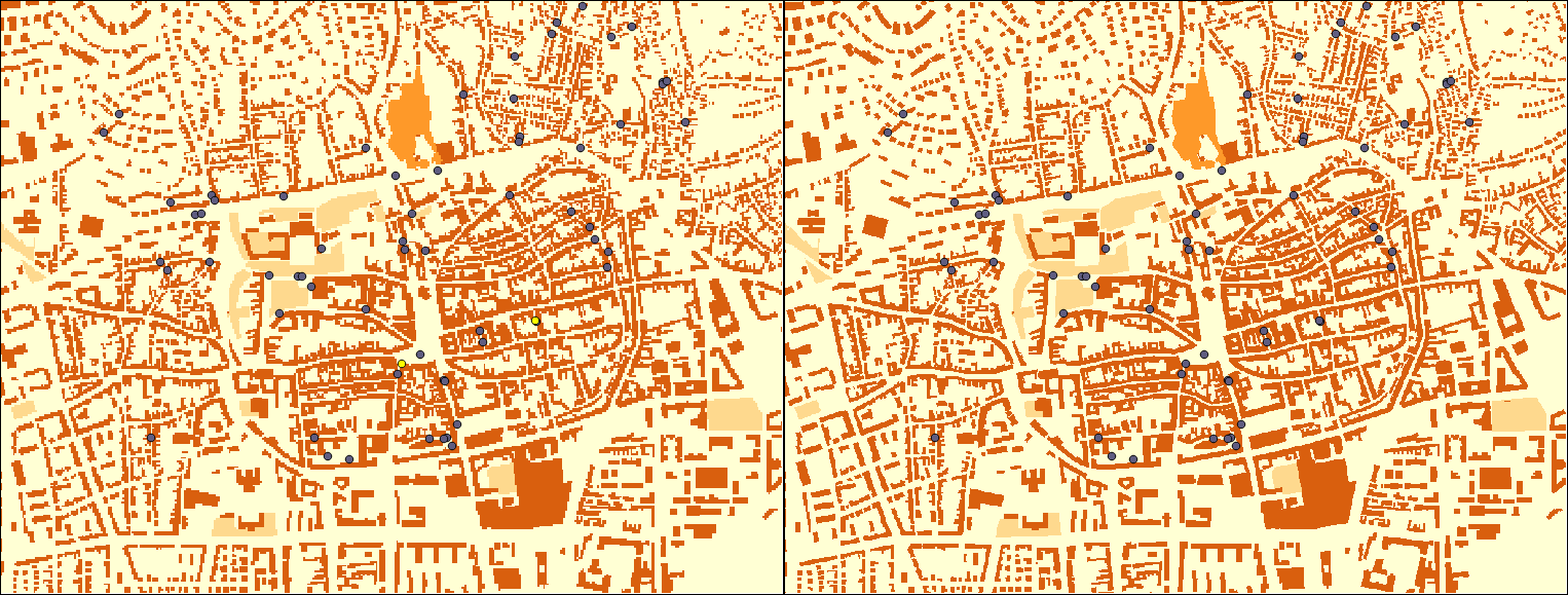
Appendix 1.11: Buffer zones with a different number of segments are used for more precise approximations. The yellow point lies outside of the buffer zones created with 5 and 10 segments; however, it is only a matter of precision as it is located inside the zones as proven by the buffers created with 15 and 50 segments:
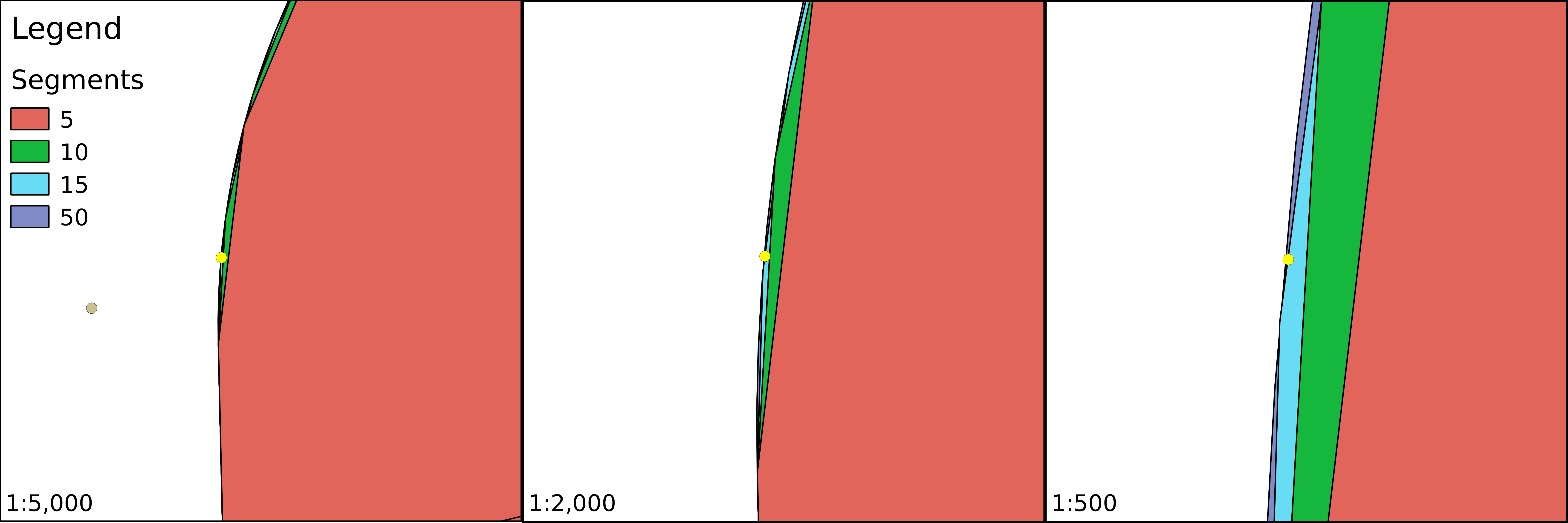
Appendix 1.12: Three popular distance types in GIS. In the Manhattan distance (left), we can go only in one dimension at a time; in the euclidean distance (center), we can move in two dimensions at a time; while in the case of the great-circle distance (right), we can move in three dimensions at a time, but only on the surface of a sphere. Note that the Manhattan distance between the same pair of points does not change, no matter how many breaks (turns) we use:
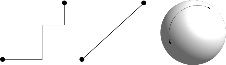
Appendix 1.13: Using clipped layers with NoData values in GDAL's Proximity tool introducing edge effects (left). NoData values are reclassified to zeroes, which wouldn't be a problem; however, distances are calculated from the edges, like they were features. It does not matter if we clip the distance matrix again (right), the edge effects are already introduced to the analysis:
Appendix 1.14: Other popular fuzzy membership functions. Some of them are similar to the ones described in Chapter 10, A Typical GIS Problem, although with slightly different shapes and different formulas. The formulas were created with the assumption that the whole data range is fuzzified. If not, cell values below or above the threshold should be handled. In the formulas, variables denoted with m are break points or turning points, while variables denoted with s are defining the shape of the functions.
The natural number e is not included in QGIS's raster calculator, although, similarly to π, it can be hard coded as 2.7182:
Appendix 1.15: Using an OpenStreetMap base layer under the suitability map. The suitability map has a transparency of 30%:
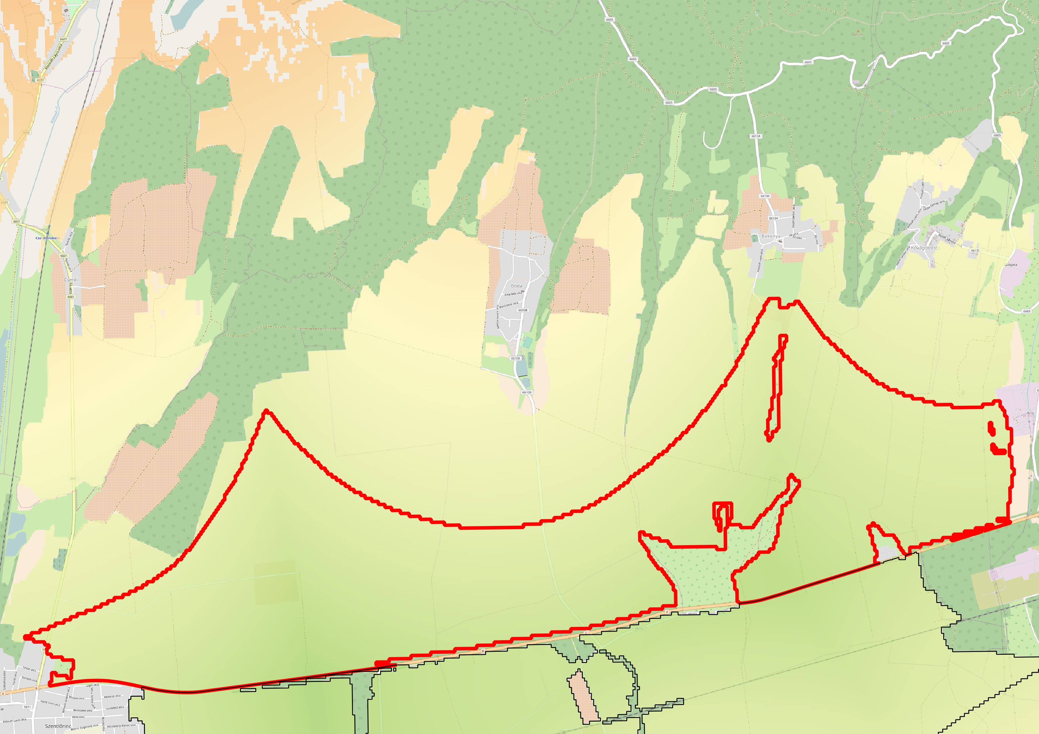
Appendix 1.16: A server machine hosting two web servers (one for running Java web applications), a PostgreSQL database, and an SSH server. Clients can query those servers with the appropriate client-side applications:
Appendix 1.17: Hillshaded land uses polygons in GeoServer. You can achieve the same by using Raster | Analysis | DEM in QGIS with the default Hillshade mode to create a static relief raster. Then, you can clip the relief to the area of the polygons using Raster | Extraction | Clipper with the option of cropping the result to the cutline. Finally, you have to load the resulting raster into GeoServer, and blend it into the land use layer using an overlay composition:
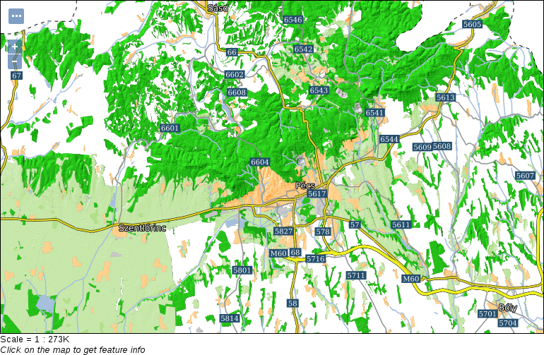
Appendix 1.18: Common line cap and line join styles used in vector graphic software:
BIRMINGHAM - MUMBAI
Copyright © 2017 Packt Publishing
All rights reserved. No part of this book may be reproduced, stored in a retrieval system, or transmitted in any form or by any means, without the prior written permission of the publisher, except in the case of brief quotations embedded in critical articles or reviews.
Every effort has been made in the preparation of this book to ensure the accuracy of the information presented. However, the information contained in this book is sold without warranty, either express or implied. Neither the author, nor Packt Publishing, and its dealers and distributors will be held liable for any damages caused or alleged to be caused directly or indirectly by this book.
Packt Publishing has endeavored to provide trademark information about all of the companies and products mentioned in this book by the appropriate use of capitals. However, Packt Publishing cannot guarantee the accuracy of this information.
First published: June 2017
Production reference: 1080617
ISBN 978-1-78712-332-8
|
Author |
Copy Editor Sonia Mathur |
|
Reviewers Mark Lewin David Bianco |
Project Coordinator Prajakta Naik |
|
Commissioning Editor Aaron Lazar |
Proofreader Safis Editing |
|
Acquisition Editor Angad Singh |
Indexer Mariammal Chettiyar |
|
Content Development Editor Lawrence Veigas |
Graphics Abhinash Sahu |
|
Technical Editor Abhishek Sharma |
Production Coordinator Shantanu Zagade |
Gábor Farkas is a PhD student in the University of Pécs's Institute of Geography. He holds a master's degree in geography, although he moved from traditional geography to pure geoinformatics in his early studies. He often studies geoinformatical solutions in his free time, keeps up with the latest trends, and is an open source enthusiast. He loves to work with GRASS GIS, PostGIS, and QGIS, but his all time favorite is Web GIS, which mostly covers his main research interest.
Mark Lewin has been developing, teaching, and writing about software for over 16 years. His main interest is GIS and web mapping. Working for ESRI, the world's largest GIS company, he acted as a consultant, trainer, course author, and a frequent speaker at industry events. He has subsequently expanded his knowledge to include a wide variety of open source mapping technologies and a handful of relevant JavaScript frameworks including Node.js, Dojo, and JQuery.
Mark now works for Oracle’s MySQL curriculum team, focusing on creating great learning experiences for DBAs and developers, but remains crazy about web mapping.
He is the author of books such as Leaflet.js Succinctly, Go Succinctly, and Go Web Development Succinctly for Syncfusion. He is also the co-author of the forthcoming second edition of Building Web and Mobile ArcGIS Server Applications with JavaScript, which is to be published by Packt.
For support files and downloads related to your book, please visit www.PacktPub.com.
Did you know that Packt offers eBook versions of every book published, with PDF and ePub files available? You can upgrade to the eBook version at www.PacktPub.com and as a print book customer, you are entitled to a discount on the eBook copy. Get in touch with us at service@packtpub.com for more details.
At www.PacktPub.com, you can also read a collection of free technical articles, sign up for a range of free newsletters and receive exclusive discounts and offers on Packt books and eBooks.
![]()
Get the most in-demand software skills with Mapt. Mapt gives you full access to all Packt books and video courses, as well as industry-leading tools to help you plan your personal development and advance your career.
Thanks for purchasing this Packt book. At Packt, quality is at the heart of our editorial process. To help us improve, please leave us an honest review on this book's Amazon page at https://www.amazon.com/dp/1787123324.
If you'd like to join our team of regular reviewers, you can e-mail us at customerreviews@packtpub.com. We award our regular reviewers with free eBooks and videos in exchange for their valuable feedback. Help us be relentless in improving our products!
In the past, professional spatial analysis in the business sector was equivalent to buying an ArcGIS license, storing the data in some kind of Esri database, and publishing results with the ArcGIS Server. These trends seem to be changing in the favor of open source software. As FOSS (free and open source software) products are gaining more and more power due to the hard work of the enthusiastic open source GIS community, they pique the curiosity of the business sector at a growing rate. With the increasing number of FOSS GIS experts and consulting companies, both training and documentation--the two determining factors that open source GIS products traditionally lacked--are becoming more available.
Chapter 1, Setting Up Your Environment, guides you through the basic steps of creating an open source software infrastructure you can carry out your analyses with. It also introduces you to popular open data sources you can freely use in your workflow.
Chapter 2, Accessing GIS Data with QGIS, teaches you about the basic data models used in GIS. It discusses the peculiarities of these data models in detail, and also makes you familiar with the GUI of QGIS by browsing through some data.
Chapter 3, Using Vector Data Effectively, shows you how you can interact with vector data in the GIS software. It discusses GUI-based queries, SQL-based queries, and basic attribute data management. You will get accommodated to the vector data model and can use the attributes associated to the vector features in various ways.
Chapter 4, Creating Digital Maps, discusses the basics of digital map making by going through an exhaustive yet simple example in QGIS. It introduces you to the concept of projections and spatial reference systems, and the various steps of creating a digital map.
Chapter 5, Exporting Your Data, guides you through the most widely used vector and raster data formats in GIS. It discusses the strengths and weaknesses of the various formats, and also gives you some insight on under what circumstances you should choose a particular spatial data format.
Chapter 6, Feeding a PostGIS Database, guides you through the process of making a spatial database with PostGIS. It discusses how to create a new database, and how to fill it with various kinds of spatial data using QGIS. You will also learn how to manage existing PostGIS tables from QGIS.
Chapter 7, A PostGIS Overview, shows what other options you have with your PostGIS database. It leaves QGIS and talks about important PostgreSQL and PostGIS concepts by managing the database created in the previous chapter through PostgreSQL's administration software, pgAdmin.
Chapter 8, Spatial Analysis in QGIS, goes back to QGIS in order to discuss vector data analysis and spatial modeling. It shows you how different geometry types can be used to get some meaningful results based on the features' spatial relationship. It goes through the practical textbook example of delimiting houses based on some customer preferences.
Chapter 9, Spatial Analysis on Steroids - Using PostGIS, reiterates the example of the previous chapter, but entirely in PostGIS. It shows how a good software choice for the given task can enhance productivity by minimizing manual labor and automating the entire workflow. It also introduces you to the world of PostGIS spatial functions by going through the analysis again.
Chapter 10, A Typical GIS Problem, shows raster analysis, where spatial databases do not excel. It discusses typical raster operations by going through a decision making process. It sheds light on typical considerations related to the raster data model during an analysis, while also introducing some powerful tools and valuable methodology required to make a good decision based on spatial factors and constraints.
Chapter 11, Showcasing Your Data, goes on to the Web stack, and discusses the basics of the Web, the client-server architecture, and spatial servers. It goes into details on how to use the QGIS Server to create quick visualizations, and how to use GeoServer to build a powerful spatial server with great capabilities.
Chapter 12, Styling Your Data in GeoServer, discusses the basic vector and raster symbology usable in GeoServer. It goes through the styling process by using traditional SLD documents. When the concepts are clear, it introduces the powerful and convenient GeoServer CSS, which is also based on SLD.
Chapter 13, Creating a Web Map, jumps to the client side of the Web and shows you how to create simple web maps using the server architecture created before, and the lightweight web mapping library--Leaflet. It guides you through the process of creating a basic web map, ranging from creating an HTML document to scripting it with JavaScript.
Appendix shows additional information and interesting use cases of the learned material through images and short descriptions.
For this book, you will need to have a computer with mid-class computing capabilities. As the open source GIS software is not that demanding, you don't have to worry about your hardware specification when running the software, although some of the raster processing tools will run pretty long (about 5-10 minutes) on slower machines.
What you need to take care of is that you have administrator privileges on the machine you are using, or the software is set up correctly by an administrator. If you don't have administrator privileges, you need to write the privilege at least to the folder used by the web server to serve content.
The aim of this book is to carry on this trend and demonstrate how even advanced spatial analysis is convenient with an open source product, and how this software is a capable competitor of proprietary solutions. The examples from which you will learn how to harness the power of the capable GIS software, QGIS; the powerful spatial ORDBMS (object-relational database management system), PostGIS; and the user-friendly geospatial server, GeoServer are aimed at IT professionals looking for cheap alternatives to costly proprietary GIS solutions with or without basic GIS training.
On the other hand, anyone can learn the basics of these great open source products from this practical guide. If you are a decision maker looking for easily producible results, a CTO looking for the right software, or a student craving for an easy-to-follow guide, it doesn't matter. This book presents you the bare minimum of the GIS knowledge required for effective work with spatial data, and thorough but easy-to-follow examples for utilizing open source software for this work.
In this book, you will find a number of text styles that distinguish between different kinds of information. Here are some examples of these styles and an explanation of their meaning.
Code words in text, database table names, folder names, filenames, file extensions, pathnames, dummy URLs, and user input are shown as follows: "It uses the * wildcard for selecting everything from the table named table, where the content of the column named column matches value."
A block of code is set as follows:
    SELECT ST_Buffer(geom, 200) AS geom
     FROM spatial.roads r
     WHERE r.fclass LIKE 'motorway%' OR r.fclass LIKE 'primary%';
Any command-line input or output is written as follows:
update-alternatives --config java
New terms and important words are shown in bold. Words that you see on the screen, for example, in menus or dialog boxes, appear in the text like this: "If we open the Properties window of a vector layer and navigate to the Style tab, we can see the Single symbol method applied to the layer."
Feedback from our readers is always welcome. Let us know what you think about this book—what you liked or disliked. Reader feedback is important for us as it helps us develop titles that you will really get the most out of.
To send us general feedback, simply e-mail feedback@packtpub.com, and mention the book's title in the subject of your message.
If there is a topic that you have expertise in and you are interested in either writing or contributing to a book, see our author guide at www.packtpub.com/authors.
Now that you are the proud owner of a Packt book, we have a number of things to help you to get the most from your purchase.
You can download the example code files for this book from your account at http://www.packtpub.com. If you purchased this book elsewhere, you can visit http://www.packtpub.com/support and register to have the files e-mailed directly to you.
You can download the code files by following these steps:
Once the file is downloaded, please make sure that you unzip or extract the folder using the latest version of:
The code bundle for the book is also hosted on GitHub at https://github.com/PacktPublishing/Practical-GIS. We also have other code bundles from our rich catalog of books and videos available at https://github.com/PacktPublishing/. Check them out!
We also provide you with a PDF file that has color images of the screenshots/diagrams used in this book. The color images will help you better understand the changes in the output. You can download this file from https://www.packtpub.com/sites/default/files/downloads/PracticalGIS_ColorImages.pdf.
Although we have taken every care to ensure the accuracy of our content, mistakes do happen. If you find a mistake in one of our books—maybe a mistake in the text or the code—we would be grateful if you could report this to us. By doing so, you can save other readers from frustration and help us improve subsequent versions of this book. If you find any errata, please report them by visiting http://www.packtpub.com/submit-errata, selecting your book, clicking on the Errata Submission Form link, and entering the details of your errata. Once your errata are verified, your submission will be accepted and the errata will be uploaded to our website or added to any list of existing errata under the Errata section of that title.
To view the previously submitted errata, go to https://www.packtpub.com/books/content/support and enter the name of the book in the search field. The required information will appear under the Errata section.
Piracy of copyrighted material on the Internet is an ongoing problem across all media. At Packt, we take the protection of our copyright and licenses very seriously. If you come across any illegal copies of our works in any form on the Internet, please provide us with the location address or website name immediately so that we can pursue a remedy.
Please contact us at copyright@packtpub.com with a link to the suspected pirated material.
We appreciate your help in protecting our authors and our ability to bring you valuable content.
If you have a problem with any aspect of this book, you can contact us at questions@packtpub.com, and we will do our best to address the problem.
The development of open source GIS technologies has reached a state where they can seamlessly replace proprietary software in the recent years. They are convenient, capable tools for analyzing geospatial data. They offer solutions from basic analysis to more advanced, even scientific, workflows. Moreover, there are tons of open geographical data out there, and some of them can even be used for commercial purposes. In this chapter, we will acquaint ourselves with the open source software used in this book, install and configure them with an emphasis on typical pitfalls, and learn about some of the most popular sources of open data out there.
In this chapter, we will cover the following topics:
Before jumping into the installation process, let's discuss geographic information systems (GIS) a little bit. GIS is a system for collecting, manipulating, managing, visualizing, analyzing, and publishing spatial data. Although these functionalities can be bundled in a single software, by definition, GIS is not a software, it is rather a set of functionalities. It can help you to make better decisions, and to get more in-depth results from data based on their spatial relationships.
The most important part of the former definition is spatial data. GIS handles data based on their locations in a coordinate reference system. This means, despite GIS mainly being used for handling and processing geographical data (data that can be mapped to the surface of Earth), it can be used for anything with dimensions. For example, a fictional land like Middle-Earth, the Milky Way, the surface of Mars, the human body, or a single atom. The possibilities are endless; however, for most of them, there are specialized tools that are more feasible to use.
The functionalities of a GIS outline the required capabilities of a GIS expert. Experts need to be able to collect data either by surveying, accessing an other's measurements, or digitizing paper maps, just to mention a few methods. Collecting data is only the first step. Experts need to know how to manage this data. This functionality assumes knowledge not only in spatial data formats but also in database management. Some of the data just cannot fit into a single file. There can be various reasons behind this; for example, the data size or the need for more sophisticated reading and writing operations. Experts also need to visualize, manipulate, and analyze this data. This is the part where GIS clients come in, as they have the capabilities to render, edit, and process datasets. Finally, experts need to be able to create visualizations from the results in order to show them, verify decisions, or just help people interpreting spatial patterns. This phase was traditionally done via paper maps and digital maps, but nowadays, web mapping is also a very popular means of publishing data.
From these capabilities, we will learn how to access data from freely available data sources, store and manage them in a database, visualize and analyze them with a GIS client, and publish them on the Web.
Most of the software used in this book is platform-dependent; therefore, they have different ways of getting installed on different operating systems. I assume you have enough experience with your current OS to install software, and thus, we will focus on the possible product-related pitfalls in a given OS. We will cover the three most popular operating systems--Linux, Windows, and macOS. If you don't need the database or the web stack, you can skip the installation of the related software and jump through the examples using them.
The list of the software stack used in this book can be found in the following thematically grouped table:
Installing the packages on Linux distributions is pretty straightforward. The dependencies are installed with the packages, when there are any. We only have to watch out for three things prior to installing the packages. First of all, the package name of the Apache web server can vary between different distributions. On distros using RPM packages (for example--Fedora, CentOS, and openSUSE), it is called httpd, while on the ones using DEB packages (for example--Debian and Ubuntu), it is called apache2. On Arch Linux, it is simply called apache.
The second consideration is related to distributions which do not update their packages frequently, like Debian. GeoServer has a hard dependency of a specific JRE (Java Runtime Environment). We must make sure we have it installed and configured as the default. We will walk through the Debian JRE installation process as it is the most popular Linux distribution with late official package updates. Debian Jessie, the latest stable release of the OS when writing these lines, is packed with OpenJDK 7, while GeoServer 2.11 requires JRE 8:
update-alternatives --config java
The last consideration before installing the packages is related to the actual version of QGIS. Most of the distributions offer the latest version in a decent time after release; however, some of them like Debian do not. For those distros, we can use QGIS's repository following the official guide at http://www.qgis.org/en/site/forusers/alldownloads.html.
After all things are set, we can proceed and install the required packages. The order should not matter. If done, let's take a look at GeoServer, which doesn't offer Linux packages to install. It offers two methods for Linux: a WAR for already installed Java servlets (such as Apache Tomcat), and a self-containing platform independent binary. We will use the latter as it's easier to set up:
      cd <geoserver's folder>/bin
      ./startup.sh
Installing the required software on Windows only requires a few installers as most of the packages are bundled into the OSGeo4W installer.
Don't worry if you end up with no solutions, we will concentrate on GeoServer, which runs perfectly on Windows. Just make sure Apache is installed and working (i.e. http://localhost returns a blank page or the OSGeo4W default page), as we will need it later.
Installing the software on macOS could be the most complicated of all (because of GRASS). However, thanks to William Kyngesburye, the compiled version of QGIS already contains a copy of GRASS along with other GIS software used by QGIS. In order to install QGIS, we have to download the disk image from http://www.kyngchaos.com/software/qgis.
PostgreSQL and PostGIS are also available from the same site, you will see the link on the left sidebar. pgAdmin, on the other hand, is available from another source: https://www.pgadmin.org/download/pgadmin-4-macos/. Finally, the GeoServer macOS image can be downloaded from http://geoserver.org/release/stable/, while its dependency of Java 8 can be downloaded from https://www.java.com/en/download/.
The only thing left is configuring the QGIS Server. As the OS X and macOS operating systems are shipped with an Apache web server, we don't have to install it. However, we have to make some configurations manually due to the lack of the FastCGI Apache module, on which QGIS Server relies. This configuration can be made based on the official guide at http://hub.qgis.org/projects/quantum-gis/wiki/QGIS_Server_Tutorial.
Congratulations! You're through the hardest part of this chapter. The following step is to make some initial configurations on the installed software to make them ready to use when we need them. First of all, let's open QGIS. At first glance, it has a lot of tools. However, most of them are very simple and self-explanatory. We can group the parts of the GUI as shown in the following image:
We can describe the distinct parts of the QGIS GUI as follows:
The only thing we will do now without having any data to display, is customizing the GUI. Let's click on Settings and choose the Options menu. In the first tab called General, we can see some styles to choose from. Don't forget to restart QGIS every time you choose a new style.
The next piece of software we look at is PostGIS via pgAdmin. If we open pgAdmin, the least we will see is an empty Server Groups item on the left panel. If this is the case, we have to define a new connection with the plug icon and fill out the form (Object | Create | Server in pgAdmin 4), as follows:
The Name can be anything we would like, it only acts as a named item in the list we can choose from. The Host, the Port, and the Username, on the other hand, have to be supplied properly. As we installed PostgreSQL locally, the host is 127.0.0.1, or simply localhost. As the default install comes with the default user postgres (we will refer to users as roles in the future due to the naming conventions of PostgreSQL), we should use that.
Upon connecting to the server, we can see a single database called postgres. This is the default database of the freshly installed PostgreSQL. As the next step, we create another database by right-clicking on Databases and selecting New Database. The database can be named as per our liking (I'm naming it spatial). The owner of the database should be the default postgres role in our case. The only other parameter we should define is the default character encoding of the database:
Choosing the template0 template is required as the default template's character encoding is a simple ASCII. You might be familiar with character encoding; however, refreshing our knowledge a little bit cannot hurt. In ASCII, every character is encoded on 8 bits, therefore, the number of characters which can be encoded is 28 = 256. Furthermore, in ASCII, only the first 7 bits (first 128 places) are reserved, the rest of them can be localized. The first 7 bits (in hexadecimal, 00-7F) can be visualized as in the following table. The italic values show control characters (https://en.wikipedia.org/wiki/C0_and_C1_control_codes#C0_.28ASCII_and_derivatives.29):
Open source GIS software offer a very high degree of freedom. Their license types can differ; however, they are all permissive licenses. That means we can use, distribute, modify, and distribute the modified versions of the software. We can also use them in commercial settings and even sell the software if we can find someone willing to buy it (as long as we sell the software with the source code under the same license). The only restriction is for companies who would like to sell their software under a proprietary license using open source components. They simply cannot do that with most of the software, although some of the licenses permit this kind of use, too.
There is one very important thing to watch out for when we use open source software and data. If somebody contributes often years of work to the community, at least proper attribution can be expected. Most of the open source licenses obligate this right of the copyright holder; however, we must distinguish software from data. Most of the licenses of open source software require the adapted product to reproduce the same license agreement. That is, we don't have to attribute the used software in a work, but we must include the original license with the copyright holders' name when we create an application with them. Data, on the other hand, is required to be attributed when we use it in our work.
There are a few licenses which do not obligate us to give proper attribution. These licenses state that the creator of the content waives every copyright and gives the product to the public to use without any restrictions. Two of the most common licenses of this kind are the Unlicense, which is a software license, and the Creative Commons Public Domain, which is in the GIS world mostly used as a data license.
Now that we have our software installed and configured, we can focus on collecting some open source data. Data collecting (or data capture) is one of the key expertise of a GIS professional and it often covers a major part of a project budget. Surveying is expensive (for example, equipment, amortization, staff, and so on); however, buying data can also be quite costly. On the other hand, there is open and free data out there, which can drastically reduce the cost of basic analysis. It has some drawbacks, though. For example, the licenses are much harder to attune with commercial activity, because some of them are more restrictive.
There are two types of data collection. The first one is primary data collection, where we measure spatial phenomena directly. We can measure the locations of different objects with GPS, the elevation with radar or lidar, the land cover with remote sensing. There are truly a lot of ways of data acquisition with different equipment. The second type is secondary data collection, where we convert already existing data for our use case. A typical secondary data collection method is digitizing objects from paper maps. In this section, we will acquire some open source primary data.
The only thing to consider is our study area. We should choose a relatively small administrative division, like a single county. For example, I'm choosing the county I live in as I'm quite familiar with it and it's small enough to make further analysis and visualization tasks fast and simple:
The first data we will download is the administrative boundaries of our country of choice. Open data for administrative divisions are easy to find for the first two levels, but it becomes more and more scarce for higher levels. The first level is always the countries' boundaries, while higher levels depend on the given country. There is a great source for acquiring the first three levels for every country in a fine resolution: GADM or Global Administrative Areas. We will talk about administration levels in more details in a later chapter. Let's download some data from http://www.gadm.org/country by selecting our study area, and the file format as Shapefile:
In the zipped archive, we will need the administrative boundaries, which contain our division of choice. If you aren't sure about the correct dataset, just extract everything and we will choose the correct one later.
The second vector dataset we download is the GeoNames archive for the country encasing our study area. GeoNames is a great place for finding data points. Every record in the database is a single point with a pair of coordinates and a lot of attribute data. Its most instinctive use case is for geocoding (linking names to locations). However, it can be a real treasure box for those who can link the rich attribute data to more meaningful objects. The country-level data dumps can be reached at http://download.geonames.org/export/dump/ through the countries' two-letter ISO codes.
GADM's license is very restrictive. We are free to use the downloaded data for personal and research purposes but we cannot redistribute it or use it in commercial settings. Technically, it isn't open source data as it does not give the four freedoms of using, modifying, redistributing the original version, and redistributing the modified version without restrictions. That's why the example dataset doesn't contain GADM's version of Luxembourg.
GeoNames has two datasets--a commercially licensed premium dataset and an open source one. The open source data can be used for commercial purposes without restrictions.
Data acquisition with instruments mounted on airborne vehicles is commonly called remote sensing. Mounting sensors on satellites is a common practice by space agencies (for example, NASA and ESA), and other resourceful companies. These are also the main source of open source data as both NASA and ESA grant free access to preprocessed data coming from these sensors. In this part of the book, we will download remote sensing data (often called imagery) from USGS's portal: Earth Explorer. It can be found at https://earthexplorer.usgs.gov/. As the first step, we have to register an account in order to download data.
When we have an account, we should proceed to the Earth Explorer application and select our study area. We can select an area on the map by holding down the Shift button and drawing a rectangle with the mouse, as shown in the following screenshot:
As the next step, we should select some data from the Data Sets tab. There are two distinct types of remote sensing based on the type of sensor: active and passive. In active remote sensing, we emit some kind of signal from the instrument and measure its reflectance from the target surface. We make our measurement from the attributes of the reflected signal. Three very typical active remote sensing instruments are radar (radio detection and ranging) using radio waves, lidar (light detection and ranging) using laser, and sonar (sound navigation and ranging) using sound waves. The first dataset we download is SRTM (Shuttle Radar Topographic Mission), which is a DEM (digital elevation model) produced with a radar mounted on a space shuttle. For this, we select the Digital Elevation item and then SRTM. Under the SRTM menu, there are some different datasets from which we need the 1 Arc-Second Global. Finally, we push the Results button, which navigates us to the results of our query. In the results window, there are quite a few options for every item, as shown in the following screenshot:
The first two options (Show Footprint and Show Browse Overlay) are very handy tools to show the selected imagery on the map. The footprint only shows the enveloping rectangle of the data, therefore, it is fast. Additionally, it colors every footprint differently, so we can identify them easily. The overlay tool is handy for getting a glance at the data without downloading it.
Finally, we download the tiles covering our study area. We can download them individually with the item's fifth option called Download Options. This offers some options from which we should select the BIL format as it has the best compression rate, thus, our download will be fast.
Let's get back to the Data Sets tab and select the next type of data we need to download--the Landsat data. These are measured with instruments of the other type--passive remote sensing. In passive remote sensing, we don't emit any signal, just record the electromagnetic radiance of our environment. This method is similar to the one used by our digital cameras except those record only the visible spectrum (about 380-450 nanometers) and compose an RGB picture from the three visible bands instantly. The Landsat satellites use radiometers to acquire multispectral images (bands). That is, they record images from spectral intervals, which can penetrate the atmosphere, and store each of them in different files. There is a great chart created by NASA (http://landsat.gsfc.nasa.gov/sentinel-2a-launches-our-compliments-our-complements/) which illustrates the bands of Landsat 7, Landsat 8, and Sentinel-2 along with the atmospheric opacity of the electromagnetic spectrum:
From the Landsat Archive, we need the Pre-Collection menu. From there, we select L8 OLI/TIRS and proceed to the results. With the footprints of the items, let's select an image which covers our study area. As Landsat images have a significant amount of overlap, there should be one image which, at least, mostly encases our study area. There are two additional information listed in every item--the row number and the path number. As these kinds of satellites are constantly orbiting Earth, we should be able to use their data for detecting changes. To assess this kind of use case (their main use case), their orbits are calculated so that, the satellites return to the same spot periodically (in case of Landsat, 18 days). This is why we can classify every image by their path and row information:
Let's note down the path and row information of the selected imagery and go to the Additional Criteria tab. We feed the path and row information to the WRS Path and WRS Row fields and go back to the results. Now the results are filtered down, which is quite convenient as the images are strongly affected by weather and seasonal effects. Let's choose a nice imagery with minimal cloud coverage and download its Level 1 GeoTIFF Data Product. From the archive, we will need the TIFF files of bands 1-6.
SRTM is in the public domain; therefore, it can be used without restrictions, and giving attribution is also optional. Landsat data is also open source; however, based on USGS's statement (https://landsat.usgs.gov/are-there-any-restrictions-use-or-redistribution-landsat-data), proper attribution is recommended.
The last dataset we put our hands on is the swiss army knife of open source GIS data. OpenStreetMap provides vector data with a great global coverage coming from measurements of individual contributors. OpenStreetMap has a topological structure; therefore, it's great for creating beautiful visualizations and routing services. On the other hand, its collaborative nature makes accuracy assessments hard. There are some studies regarding the accuracy of the whole data, or some of its subsets, but we cannot generalize those results as accuracy can greatly vary even in small areas.
One of the main strengths of OpenStreetMap data is its large collection and variety of data themes. There are administrative borders, natural reserves, military areas, buildings, roads, bus stops, even benches in the database. Although its data isn't surveyed with geodesic precision, its accuracy is good for a lot of cases: from everyday use to small-scale analysis where accuracy in the order of meters is good enough (usually, a handheld GPS has an accuracy of under 5 meters). Its collaborative nature can also be evaluated as a strength as mistakes are corrected rapidly and the content follows real-world changes (especially large ones) with a quick pace.
Accessing OpenStreetMap data can be tricky. There are some APIs and other means to query OSM, although either we need to know how to code or we get everything in one big file. There is one peculiar company which creates thematic data extracts from the actual content--Geofabrik. We can reach Geofabrik's download portal at http://download.geofabrik.de/. It allows us to download data in OSM's native PBF format (Protocolbuffer Binary Format), which is great for filling a PostGIS database with OSM data from the command line on a Linux system but cannot be opened with a desktop GIS client. It also serves XML data, which is more widely supported, but the most useful extracts for us are the shapefiles.
Due to various reasons, open source shapefiles are only exported by Geofabrik for small areas. We have to narrow down our search by clicking on links until the shapefile format (.shp.zip) is available. This means country-level extracts for smaller countries and regional extracts for larger or denser ones. The term dense refers to the amount of data stored in the OSM database for a given country. Let's download the shapefile for the smallest region enveloping our study area:
OpenStreetMap data is licensed under ODbL, an open source license, and therefore gives the four basic freedoms. However, it has two important conditions. The first one is obligatory attribution, while the second one is a share-alike condition. If we use OpenStreetMap data in our work, we must share the OSM part under an ODbL-compatible open source license.
ODbL differentiates three kind of products: collective database, derived database, and produced work. If we create a collective database (a database which has an OSM part), the share-alike policy only applies on the OSM part. If we create a derived database (make modifications to the OSM database), we must make the whole thing open source. If we create a map, a game, or any other work based on the OSM database, we can use any license we would like to. However, if we modify the OSM database during the process, we must make the modifications open source.
In this chapter, we installed the required open source GIS software, configured some of them, and downloaded a lot of open source data. We became familiar with open source products, licenses, and data sources. Now we can create an open source GIS working environment from zero and acquire some data to work with. We also gained some knowledge about data collection methods and their nature.
In the next chapter, we will visualize the downloaded data in QGIS. We will learn to use some of the most essential functionalities of a desktop GIS client while browsing our data. We will also learn some of the most basic attributes and specialities of different data types in GIS.
Despite the fact that some of the advanced GIS software suggest, we only need to know which buttons to press in order to get instant results, GIS is much more than that. We need to understand the basic concepts and the inner workings of a GIS in order to know the kind of analyses we can perform on our data. We must be able to come up with specific workflows, models which get us the most meaningful results. We also need to understand the reference frame of GIS, how our data behaves in such an environment, and how to interpret those results. In this chapter, we will learn about GIS data models by browsing our data in QGIS, and getting acquainted with its GUI.
In this chapter, we will cover the following topics:
The first data type that we will use is raster data. It might be the most familiar to you, as it resembles traditional images. First of all, let's open QGIS. In the browser panel, we can immediately see our downloaded data if we navigate to our working directory. We can easily distinguish vector data from raster data by their icons. Raster layers have a dedicated icon of a 3x3 pixels image, while vector layers have an icon of a concave polygon:
We can drag and drop most of the data from the browser panel or, alternatively, use the Add Raster Layer button from the Add layer toolbar and browse the layer. The browser panel is more convenient for easily recognizable layers as it only lists the files we can open and hides auxiliary files with every kind of metadata. Let's drag one of the SRTM rasters to the canvas (or open one with Add Raster Layer). This is a traditional, single-band raster. It is displayed as a greyscale image with the minimum and maximum values displayed in the Layers Panel:
As you can see in the preceding screenshot, there is a regular grid with cells painted differently, just like an image. However, based on the maximum value of the data, its colors aren't hard coded into the file, like in an image. Furthermore, it has only a single band, not three or four bands for RGB(A). Let's examine the raster more carefully by zooming in until we can see individual cells. We can also query them for their values with the Identify Features tool by clicking on a cell (raster):
As you can see, we get a number for every cell, which can be quite out of the range of 0-255 representing color codes. These numbers seem arbitrary, and indeed, they are arbitrary. They usually represent some kind of real-world phenomenon, like in our case, the elevation from the mean sea level in meters.
These are the basic properties of the raster data model. Raster data are regular grids (matrices) made up from individual cells with some arbitrary values describing something. The values are only limited by the type of the storage. They can be in the range of bytes, 8-bit integers, 16-bit integers, floating point numbers, and so on. Rasters are always rectangular (like an image); however, they can give a feeling of having some other shape with a special kind of value: NULL or No-Data.
One of the most useful properties of raster data is that their coverage is continuous, while their data can change. They cover their entire extent with coincident cells. If we need a full and continuous coverage (that is, we need a value for every point describing a dynamically changing phenomenon), raster is an obvious choice. On the other hand, they have a fixed layout inherited from their resolution (the size of each cell). There are the following two implications from this property:
Of course, this property works in two ways. Rasters (especially with square cells) are generally easy and fast to visualize as they can be displayed as regular images. To make the visualization process even faster, QGIS builds pyramids from the opened rasters.
Using pyramids is a computer graphics technique adopted by GIS. Pyramids are downsampled (lower resolution) versions of the original raster layer stored in memory, and are built for various resolutions. By creating these pyramids in advance, QGIS can skip most of the resampling process on lower resolutions (zoom levels), which is the most time-consuming task in drawing rasters.
The last important property of a raster layer is its origin. As raster data behaves as two-dimensional matrices, it can be spatially referenced with only a pair of coordinates. These coordinates, unlike in graphics, are the lower left ones of the data. Let's see what QGIS can tell us about our raster layer. We can see its metadata by right-clicking on it in the Layers Panel, choosing Properties, and clicking on the Metadata tab:
As you can see in the preceding screenshot, our raster layer has a number of rows and columns, one band, an Origin, a resolution (Pixel Size), a No-Data value, and a Data Type.
To sum up, the raster data model offers continuous coverage for a given extent with dynamically changing, discrete values in the form of a matrix. We can easily do matrix operations on rasters, but we can also convert them to vectors if it is a better fit for the analysis. The raster data model is mainly used when the type of the data desires it (for example, mapping continuous data, like elevation or terrain, weather, or temperature) and when it is the appropriate model for the measuring instrument (for example, aerial or satellite imaging).
To put it simply--absolutely not. Well, maybe in QGIS a little bit, but rasters have potential far beyond the needs of an average GIS analysis. First of all, rasters do not need to be in two-dimensional space. There are 3D rasters called voxels, which can be analyzed in their volume or cut to slices, visualized in a whole, in slices, or as isosurfaces for various values (Appendix 1.1).
Furthermore, cells don't have to be squares. It is common practice to have different resolutions in different dimensions. Rasters with rectangular cells are supported by QGIS, and many other open source GIS clients. Rasters don't even need to have four sides. The distortions (we can call it sampling bias in some cases, mostly in statistics) caused by four-sided raster cells can be minimized with hexagons, regular shapes with the most sides capable of a complete coverage:
Okay, but can rasters only store a single thematic? No, rasters can have multiple bands, and we can even combine them to create RGB visualizations. Finally, as we contradicted almost every rule of the raster data model, do individual cells need to coincide (have the same resolution)? Well, technically, yes, but guess what? There are studies about a multi-resolution image format, which can store rasters with different sizes in the same layer. It's now only a matter of professional and business interest to create that format.
Now that you've learned the basics of raster data, let's examine vector data. This is the other fundamental data type which is used in GIS. Let's get some vector data at the top of that srtm layer. From the Browser Panel, we open up the administrative boundaries layer (the one with the shp extension) containing our study area, and the waterways and traffic layers from the OpenStreetMap data. We can also use the Add Vector Layer button from the side toolbar:
Now there are three vector layers with three different icons and representation types on our canvas. These are the three main vector types we can work with:
If we zoom around, we can see that unlike the raster layer, these layers do not pixelate. They remain as sharp as on lower zoom levels no matter how far we zoom in. Furthermore, if we use the Identify Features tool and click on a feature, it gets selected. We can see with this that our vector layers consist of arbitrary numbers of points, lines, and irregular shapes:
Vector data, unlike raster data, does not have a fixed layout. It can be represented as sets of coordinate pairs (or triplets or quads if they have more than two dimensions). The elementary unit of the vector data model is the feature. A feature represents one logically coherent real-world object--an entity. What we consider an entity depends on our needs. For example, if we would like to analyze a forest patch, we gather data from individual trees (entities) and represent them as single points (features). If we would like to analyze land cover, the whole forest patch can be the entity represented by a feature with a polygon geometry. We should take care not to mix different geometry types in a single layer though. It is permitted in some GIS software; however, as some of the geoprocessing algorithms only work on specific types, it can ruin our analysis.
Geometry is only part of a vector feature. To a single feature, we can add an arbitrary number of attributes. There are two typical distinct types of attributes--numeric and character string. Different GIS software can handle different subtypes, like integers, floating point numbers, or dates (which can be a main type in some GIS). From these attributes, the GIS software creates a consistent table for every vector layer, which can be used to analyze, query, and visualize features. This attribute table has rows representing features and typed columns representing unique attributes. If at least one feature has a given attribute, it is listed as a whole column with NULL values (or equivalent) in the other rows. This is one of the reasons we should strive for consistency no matter if the used GIS software forces it.
Let's open an attribute table by right-clicking on a vector layer in the Layers Panel and selecting Open Attribute Table. If we open the Conditional formatting panel in the attribute table, we can also see the type of the columns, as shown in the following screenshot:
To sum up, with the vector data model, we can represent entities with shapes consisting of nodes (start and end points) and vertices (mid points) which are coordinates. We can link as many attributes to these geometries as we like (or as the data exchange format permits). The model implies that we can hardly store gradients, as it is optimized to store discrete values associated with a feature. It has a somewhat constant accuracy as we can project the nodes and vertices one by one. Furthermore, the model does not suffer from distortions unlike the raster data model.
As vector geometries do not have a fixed layout, we can edit our features. Let's try it out by selecting the administrative boundaries layer in the Layers Panel and starting an edit session with the Toggle Editing tool.
We can see every node and vertex of our layer. We can modify these points to reshape our layer. Let's zoom in a little bit to see the individual vertices. From the now enabled editing tools, we select the Node Tool. If we click in a polygon with this tool, we can see its vertices highlighted and a list of numbers in the left panel. These are the coordinates of the selected geometry. We can move vertices and segments by dragging them to another part of the canvas. If we move some of the vertices from the neighboring polygon, we can see a gap appearing. This naive geometry model is called the Spaghetti model. Every feature has their sets of vertices individually and there isn't any relationship between them. Consider the following screenshot:
Finally, let's stop the edit session by clicking on the Toggle Editing button again. When it asks about saving the modifications, we should choose Stop without Saving and QGIS automatically restores the old geometries.
More complex geometries have more theoretical possibilities, which leads to added complexity. Defining a point is unequivocal, that is, it has only one coordinate tuple. Multi-points and line strings are neither much more complex--they consist of individual and connected coordinate tuples respectively. Polygons, on the other hand, can contain holes, the holes can contain islands (fills), and theoretically, these structures can be nested infinitesimally. This structure adds a decent complexity for a GIS software. For example, QGIS only supports polygons to the first level--with holes.
The real complexity, however, only comes with topology. Different features in a layer can have relationships with each other. For example, in our administrative boundary layer, polygons should share borders. They shouldn't have gaps and overlaps. Another great example is a river network. Streams flow into rivers, rivers flow into water bodies. In a vector model, they should be connected like in the real world.
The topological geometry model (or vector model) is the sophisticated way to solve these kinds of relational problems. In this model, points are stored as nodes while other geometries form a hierarchical structure. Line segments contain references to nodes, line strings, and polygons consist of references to segments. By using this hierarchical structure, we can easily handle relationships. This way, if we change the position of a node, every geometry referring to the node changes. Take a look at the following screenshot:
Not every GIS software enforces a topological model. For example, in QGIS, we can toggle topological editing. Let's try it out by checking Enable topological editing in Settings | Snapping Options. If we edit the boundaries layer again, we can see the neighboring feature's geometry following our changes.
While QGIS does not enforce a topological model, it offers various tools for checking topological consistency. One of the tools is the built-in Topology Checker plugin. We can find the tool under the Add layer buttons.
If we activate the tool, a new panel appears docked under the Processing Toolbox. By clicking on Configure, we can add some topology rules to the opened vector layers. Let's add two simple rules to the administrative boundaries layer--they must not have gaps or overlaps. Consider the following screenshot:
The only thing left to do is to click on the Validate All or Validate Extent button. If we have some errors, we can navigate between them by clicking on the items one by one.
The vector layers we opened so far were dedicated vector data exchange formats; therefore, they had every information coded in them needed for QGIS to open them. There are some cases when we get some data in a tabular format, like in a spreadsheet. These data usually contain points as coordinates in columns and attributes in other columns. They do not store any metadata about the vectors, which we have to gather from readme files, or the team members producing the data.
QGIS can handle one tabular format--CSV (Comma Separated Values), which is an ASCII file format, a simple text file containing tabular data. Every row is in a new line, while fields are separated with an arbitrary field separator character (the default one is the comma). The layout of such a layer is custom; therefore, we need to supply the required information about the table to QGIS. If we try to drag our GeoNames layer to the canvas, QGIS yields to a Layer is not valid error. To open these files, we need to use the Add Delimited Text Layer tool from the sidebar (comma icon):
If we browse our GeoNames table, we can see that QGIS automatically creates a preview from the accessed data. We can also see that the preview is far from correct. It's time to consult the readme file coming with the GeoNames extract. In the first few lines, we can see the most important information--The data format is tab-delimited text in utf8 encoding. Let's select Custom delimiters and check Tab as a delimiter. Now we only need to supply the columns containing the coordinates. We can see there are no headers in the data. However, as the column descriptions are ordered in the readme file, we can conclude that the fifth column contains the latitude data (Y field), while the sixth column contains the longitude data (X field). This is the minimum information we can add the layer with:
When zooming around the map, we could notice the Scale changing in the status bar. GIS software (apart from web mapping solutions) usually use scales instead of zoom levels. The map scale is an important concept of cartography, and its use was inherited by GIS software. The scale shows the ratio (or representative fraction) between the map and the real world. It is a mapping between two physical units:
For example, a Scale of 1:250,000 means 1 centimeter on the map is 2500 meters (250,000 centimeters) in the real world. However, as the map scale is unitless, it also means 1 inch on the map is 250,000 inches in the real world, and so on. With the scale of the map, we can make explicit statements about its coverage and implicit statements about its accuracy. Large scale maps (for example, with a scale of 1:10,000) cover smaller areas with greater accuracy than medium scale maps (for example, with a scale of 1:500,000), which cover smaller areas with greater accuracy than small scale maps (for example, with a scale of 1:1,000,000).
We can easily imagine scales on paper maps, although the rule is the same as on the map canvas. On a 1:250,000 map, one centimeter on our computer screens equals 2500 meters in the real world. To calculate this value, GIS software use the DPI (dots per inch) value of our screens to produce accurate ratios.
By using scales instead of fixed zoom levels, GIS software offers a great amount of flexibility. For example, we can arbitrarily change the Scale value on our status bar and QGIS automatically jumps to that given scale. The definition of map scale will follow us along during our work as QGIS (like most of the GIS software) uses scale definitions in every zoom-related problem. Let's see one of them--the scale dependent display. We can set the minimum and maximum scales for every layer and QGIS won't render them out of those bounds. Let's right-click on one of the layers and select Properties. Under the General tab, we can check Scale dependent visibility. After that, we can provide bounds to that layer. By providing a minimum value of 1:500,000 to the layer and leaving the maximum value unbounded (0), we can see the layer disappearing on 1:500,001 and smaller scales:
In this chapter, we acquainted ourselves with the GUI of QGIS and explained about data models in GIS. With this knowledge, it will be easier to come up with specific workflows later as we have an idea how the input data work and what we can do with it. We also learned about one of the mandatory cartographic elements--the map scale.
In the next chapter, we will use our vector data in another way. We will make queries on our vector layers by using both their attribute data and geometries. Finally, we will learn how to join the attributes of different layers in order to make richer layers and give ourselves more options on further visualization and analysis tasks.
In the previous chapter, we learned how vector data compares to raster data. Although every feature can only represent one coherent entity, it is a way more powerful and flexible data model. With vectors, we can store a tremendous amount of attributes linked to an arbitrary number of features. There are some limitations but only with some data exchange formats. By using spatial databases, our limitations are completely gone. If you've worked on a study area with rich data, you might have already observed that QGIS has a hard time rendering the four vector layers for their entire extent. As we can store (and often use) much more data than we need for our workflow, we must be able to select our features of interest.
Sometimes, the problem is the complete opposite--we don't have enough data. We have features which lack just the attributes we need to accomplish our work. However, we can find other datasets with the required information, possibly in a less useful format. In those cases, we need to be able to join the attributes of the two layers, giving the correct attributes to the correct geometry types.
In this chapter, we will cover the following topics:
The first task in every work is to get used to the acquired data. We should investigate what kind of data it holds and what can we work with. We should formulate the most fundamental questions for successful work. Is there enough information for my analysis? Is it of the right type and format? Are there any No-Data values I should handle? If I need additional information, can I calculate them from the existing attributes? Some of these questions can be answered by looking at the attribute table, while some of them (especially when working with large vector data) can be answered by asking QGIS. To ask QGIS about vector layers, we have to use a specific language called SQL or Structured Query Language.
SQL is the query language of relational databases. Traditionally, it was developed to help make easy and powerful queries on relational tables. As attribute data can be considered tabular, its power for creating intuitive queries on vector layers is unquestionable. No matter if some modern GIS software uses an object-oriented structure for working with vector data internally, the tradition of using SQL, or near-SQL syntax for creating simple queries has survived. This language is very simple at its core, thus, it is easy to learn and understand. A simple query on a database looks like the following:
SELECT * FROM table WHERE column = value;
It uses the * wildcard for selecting everything from the table named table, where the content of the column named column matches value. In GIS software, like QGIS, this line can be translated to the following:
SELECT * FROM layer WHERE column = value;
Furthermore, as basic queries only allow selecting from one layer at a time, the query can be simplified as the software knows exactly which layer we would like to query. Therefore, this simple query can be formulated in a GIS as follows:
column = value
There is one final thing we have to keep in mind. Based on the software we use, these queries can be turned into real SQL queries used on internal relational tables, or parsed into something entirely different. As a result, GIS software can have their own SQL flavor with their corresponding syntactical conventions. In QGIS, the most important convention is how we differentiate column names from regular strings. Column names are enclosed in double quotation marks, while strings are enclosed in single ones. If we turn the previous query into a QGIS SQL syntax and consider value as a string, we get the following query:
"column" = 'value'
There are usually two kinds of selection methods in GIS software. There is one which highlights the selected features, making them visually distinguishable from an other one. Selected features by this soft selection method may or may not be the only candidates for further operations based on our choice. However, there is usually a hard selection called filtering. The difference is that the filtered-out features do not appear either on the canvas or in the attribute table. QGIS makes sure to exclude the filtered-out features from every further operation like they weren't there in the first place. There is one important difference between the style of selection and filtering--we can select features with the mouse; however, we can only filter with SQL expressions.
First, let's select a single feature with the mouse. To select features in QGIS, we have to select the vector layer containing the feature in the Layers Panel. Let's select the administrative boundaries layer then click on the Select Features by area or single click tool. Now we can select our study area by clicking it on the map canvas, as shown in this screenshot:
We can see the feature highlighted on the map and in the attribute table. If we open the attribute table of the layer, we can see our selected one distinguished as we have only a limited number of features in the current layer. If there are a lot of features in a layer, inspecting the selected features in the attribute table becomes harder. To solve this problem, QGIS offers an option to only show the selected features. To enable it, click on the Show All Features filter and select Show Selected Features:
The attribute table and the map canvas are interlinked in QGIS. If you click on the row number of a feature, it becomes selected and therefore, highlighted on the canvas.
From the currently opened vector layers, the GeoNames layer has the largest attribute table with the most kinds of attributes. However, as the extract does not contain headers, it is quite hard to work with it. Fortunately, CSV files can be edited as regular text files or as spreadsheets. As the first step, let's open the GeoNames file with a text editor and prepend a header line to it. It is tab delimited; therefore, we need to separate the field names with tabs. The field names can be read out from the readme file in order. In the end, we should have a first line looking something like this:
    geonameid name asciiname alternatenames latitude longitude
      featureclass
    featurecode countrycode cc2 admin1 admin2 admin3 admin4 population
      elevation
    dem timezone modification
Now we can remove our GeoNames layer from the layer tree and add it again. In the form, we have to check the option First record has field names. If we do so, and name the latitude and longitude fields accordingly, we can see QGIS automatically filling the X and Y fields:
Let's select the modified GeoNames layer and open the Select features using an expression tool. We can see QGIS's expression builder, which offers a very convenient GUI with a lot of functions in the middle panel, and a small and handy description for the selected function in the left panel. We do not even have to type anything to use some of the basic queries as QGIS lists every field we can access under the Fields and Values menu. Furthermore, QGIS can also list all the unique values or just a small sample from a column by selecting it and pressing the appropriate button in the left panel:
The basic SQL expressions that we can use are listed under the Operators menu. There, every operator is a valid PostgreSQL operator, most of them are commonly found in various GIS software. Let's start with some numeric comparisons. For that, we have to choose a numeric column. We can use the attribute table for that.
For basic numeric comparisons, let's choose the population column. In this first query, we would like to select every place where the population exceeds 10000 people. To get the result, we have to supply the following query:
"population" > 10000
We can now see the resulting features as on the following screenshot:
If we would like to invert the query, we have an easy task, which is as follows:
"population" <= 10000
We could do this as population is a graduated value. It changes from place to place. But what happens when we work with categories represented as numbers? In this next query, we select every place belonging to the same administrative area. Let's choose an existing number in the admin1 column, and select them:
"admin1" = 10
The corresponding features are now selected on the map canvas:
The canvas in the preceding screenshot looks beautiful! But how can we invert this query? If you know about programming, then you must be thinking about linking two queries logically together. It would be a correct solution; however, we can use a specific operator for these kinds of tasks, which is as follows:
"admin1" <> 10
The <> operator selects everything which is not equal to the supplied value. The next attribute type that we should be able to handle is string. With strings, we usually use two kinds of operations--equality checking and pattern matching. According to the GeoNames readme, the featurecode column contains type categories in the character format. Let's choose every point representing the first administrative division (ADM1), as follows:
"featurecode" = 'ADM1'
Of course, the inverse of this query is exactly the same like in the previous query (<> operator).
As the next task, we would like to select every feature which represents some kind of administrative division. We don't know how many divisions are there in our layer and we wouldn't like to find out manually. What we know from http://www.geonames.org/export/codes.html is that every feature representing a non-historic administrative boundary is coded with ADM followed by a number. In our case, pattern matching comes to the rescue. We can formulate the query as follows:
"featurecode" LIKE 'ADM_'
In pattern matching, we use the LIKE operator instead of checking for equality, telling the query processor that we supplied a pattern as a value. In the pattern, we used the wildcard _, which represents exactly one character. Inverting this query is also irregular as we can negate LIKE with the NOT operator, as follows:
"featurecode" NOT LIKE 'ADM_'
Now let's expand this query to historical divisions. As we can see among the GeoNames codes, we could use two underscores. However, there is an even shorter solution--the % wildcard. It represents any number of characters. That is, it returns true for zero, one, two, or two billion characters if they fit into the pattern:
"featurecode" LIKE 'ADM%'
A better example would be to search among the alternate names column. There are a lot of names for every feature in a lot of languages. In the following query, I'm searching for a city named Pécs, which is called Pecs in English:
"alternatenames" LIKE '%Pecs%'
The preceding query returns the feature representing this city along with 11 other features, as there are more places containing its name (for example, neighboring settlements). As I know it is called Fünfkirchen in German, I can narrow down the search with the AND logical operator like this:
    "alternatenames" LIKE '%Pecs%' AND "alternatenames" LIKE
     '%Fünfkirchen%'
The two substrings can be anywhere in the alternate names column, but only those features get selected whose record contains both of the names. With this query, only one result remains--Pécs. We can use two logical operators to interlink different queries. With the AND operator, we look for the intersection of the two queries, while with the OR operator, we look for their union. If we would like to list counties with a population higher than 500000, we can run the following query:
"featurecode" = 'ADM1' AND "population" > 500000
On the other hand, if we would like to list every county along with every place with a population higher than 500000, we have to run the following query:
"featurecode" = 'ADM1' OR "population" > 500000
The last thing we should learn is how to handle null values. Nulls are special values, which are only present in a table if there is a missing value. It is not the same as 0, or an empty string. We can check for null values with the IS operator. If we would like to select every feature with a missing admin1 value, we can run the following query:
"admin1" IS NULL
Inverting this query is similar to pattern matching; we can negate IS with the NOT operator as follows:
"admin1" IS NOT NULL
The filtering dialogue can be accessed by right-clicking on a layer in the Layers Panel and selecting Filter. As we can see in the dialogue, filtering expressions are much more restrictive in QGIS as they only allow us to write basic SQL queries with the fields of the layer. Let's inspect our study area in the administrative boundaries layer with the Identify Features tool, select a unique value like its name, and create a query selecting it. For me, the query looks like the following:
"NAME_1" = 'Baranya'
Applying the filter removes every feature from the canvas other than our study area:
Now the only feature showing up on the canvas is our study area. If we look at the layer's attribute table, we can only see that feature. Now every operation is executed only on that feature. What we cannot accomplish with filtering is increasing the performance of subsequent queries and analyses. Rendering performance might be increased, but, for example, opening the attribute table requires QGIS to iterate through every feature and fill the table only with the filtered ones.
Let's practice filtering a little more by creating a filter for the GeoNames layer, selecting only points which represent first-level administrative boundaries. To do this, we have to supply the following query:
"featurecode" = 'ADM1'
We can not only select features by their attributes, but also by their spatial relationships. These queries are called spatial queries, or selecting features by their location. With this type of querying, we can select features intersecting or touching other features in other layers. The most convenient mode of spatial querying allows us to consider two layers at a time, and select features from one layer with respect to the locations of features in the other one. First of all, let's remove the filter from our GeoNames layer. Next, to access the spatial query tool in QGIS, we have to browse our Processing Toolbox. From QGIS geoalgorithms, we have to access Vector selection tools and open the Select by location tool:
As we can see, QGIS offers us a lot of spatial predicates (relationship types) to choose from. Some of them are disabled as they do not make any sense in the current context (between two point layers). If we select other layers, we can see the disabled predicates changing. Let's discuss shortly what some of these predicates mean. In the following examples, we have a layer A from which we want to select features, and a layer B containing features we would like to compare our layer A to:
Let's select every feature from the GeoNames layer in our study area. As we have our study area filtered, we can safely pass the administrative layer as the Additional layer parameter. The only thing left to consider is the spatial predicate. Which one should we choose? You must be thinking about intersects or within. In our case, there is a fat chance that both of them yield to the same result. However, the correct one is intersects, as within does not consider points on the boundary of the polygon. After running the algorithm, we should see every point selected in our study area. Consider the following screenshot:
Lovely! The only problem, which I forgot to mention, is that we are only interested in features with a population value. The naive way to resolve this issue is to remove the selection, apply a filter on the GeoNames layer, and run the Select by location algorithm again. We can do better than that. If we open the query builder dialog, we can see some additional options next to Select by clicking on the arrow icon. We can add to the current selection, remove from it, and even select within the selection. For me, that is the most intuitive solution for this case. We just have to come up with a basic query and click on Select within selection:
"population" > 0
We discussed earlier that basic SQL expressions in GIS allow us to select features in only one layer. However, QGIS offers us numerous advanced options for querying even between layers. Unlike filtering, the query dialog allows us to use this extended functionality. These operations are functions which require some arguments as input and return values as output. As we can deal with many kinds of return values, let's discuss how queries work in QGIS.
First, we build an expression. QGIS runs the expression on every feature in the queried layer. If the expression returns true for the given feature, it becomes selected or processed. We can test this behavior by opening the query dialog and simply typing TRUE. Every feature gets selected in the layer as when this static value is evaluated, it yields to true for every feature. Following this analogy, if we type FALSE, none of the features get selected. What happens when we get a non-Boolean type as a return value? Well, it depends. If we get 0 or an empty string for a feature, it gets excluded, while if it is evaluated to another number, or a string, it gets selected. If we get an object as a result, that too counts as false.
If we use the advanced functionality of the query builder, we get access to numerous variables besides functions. Some of these variables, starting with $, represent something from the current feature. For example, $geometry represents the geometry of the processed feature, while $area represents the area of the geometry. Others, starting with @, store global values. Under the Variables menu, we can find a lot of these variables. Although they do not show the @ character in the middle panel, they will if we double click on them.
Let's create a query which does the same as our last one. We have to select every feature in our study area from the GeoNames layer which has a population value higher than 0. Under the Geometry menu in the middle panel, we can access a lot of spatial functions. The one we need in our case is intersects. We can see in the help panel that it requires two geometries and it returns true if the two geometries intersect. Accessing the geometries of the point features is easy as we have a variable for that. So far, our query looks like this:
intersects($geometry, )
Here comes the tricky part. We have to access a single constant geometry from another layer. If we browse through the available functions, we can almost instantly bump into the geometry function, which returns a geometry of a feature:
intersects($geometry, geometry( ))
As geometry can only process features, the last step is to extract the correct feature from the administrative boundaries layer. Under the Record menu, we can see the most convenient function for this task--get_feature. The function requires three arguments--the name or ID of a layer, the attribute column, and an attribute value. It's just a basic query in a functional form. After passing the required arguments, our query looks similar to the following:
    intersects($geometry, geometry(get_feature('HUN_adm1', 'NAME_1',
      'Baranya')))
Now we have a constant geometry, the geometries of the point features one by one, and a function checking for their intersections. The only thing left to supply is the population part. We can easily join that criterion with a logical operator as follows:
    intersects($geometry, geometry(get_feature(
      'HUN_adm1', 'NAME_1', 'Baranya'))) AND "population" > 0
For a visual example of the query, consider the following screenshot:
We can not only use the attribute tables of layers, but we can also extend, decrease, or modify them. These are very useful functions for maintaining a layer. For example, as data often comes in a general format with a lot of obsolete attributes, which is practically useless for our analysis, we can get rid of it in a matter of clicks. The size of the attribute table always has an impact on performance; therefore, it is beneficial to not store superfluous data.
In the first example, let's delete some values from our administrative boundaries layer. If we inspect its attribute table, we can see some unnecessary columns. In my table, ID_0 and CCN_1 have constant values, which have absolutely no meaning to me. The CCA_1 and NL_NAME_1 columns are filled with null values, while VARNAME_1 is scarcely filled, therefore, I cannot use them. Let's pick every unnecessary column and remember their names. In the attribute table's toolbar, we can see some tools related to data management. We can add and remove columns; however, those options are disabled. We can enable them by starting an edit session by clicking on the first, Toggle editing mode button. With the editing options enabled, we can proceed by activating the Delete field tool, selecting the columns we would like to remove, and approving the operation with the OK button:
When the operation stops, we can see our unnecessary columns removed. If we save our edits, QGIS overwrites our layer and they are gone for good. Of course, we can change our mind or realize we accidentally removed some important data. In this case, we can restore the original conditions by not saving our edits.
While superfluous columns are often present in general data, it is not rare if we don't have the required attributes we would like to work with. If we are lucky, we can generate them based on other existing attributes, although we should not worry if this is not the case. If we can prepare a table which can be joined to the existing one on a matching column, we can easily join them together.
For this example, I prepared a small table containing descriptions of our GeoNames layer's featureclass and featurecodes columns based on the official GeoNames code page mentioned before. It is called geonames_desc.csv and you an access it from the supplementary material's ch03 folder or download it directly from https://gaborfarkas.github.io/practical_gis/ch03/geonames_desc.csv. The formatting of this table resembles the original GeoNames table as it is tab separated; however, it does not have any geometries. It only contains two columns--a code and a description. Let's open the table with the Add Delimited Text Layer tool. The first line is the header and the separator is the tab character. As we have no geometries, we should also state that by checking the No geometry option:
When the table is opened, we can see its entry in the Layers Panel. It has a special icon as it only consist of attributes. Now we can join the two layers. To start a join, we have to open the Properties of the target layer, in our case, GeoNames. There is a tab named Joins, which offers tools for managing different joins. These kinds of attribute joins do not result in overwriting the target layer, they are handled in memory; therefore, we can dynamically change them (add new ones, modify, and remove existing ones).
A successful join in QGIS needs some conditions to be met. We need a common column in both the tables as keys. These key columns hold the join conditions. The join procedure pairs these key columns together and joins the other columns of the joined layer accordingly. Therefore, to avoid ambiguities, we should have a target key column without null values and a joined key column with unique values. The key column of the joined table is never included in a join as it would introduce unnecessary redundancy. We can define a join the following way:
We can also select the columns that we would like to join from the target table. As we have only two columns and one of them is the key column, we don't have to limit them. There is one final option for the prefix. As we can have an arbitrary number of joins and different tables can have the same column names, QGIS offers us the ability to prefix the target table's column names with the table's name. We can safely remove the prefix as we won't have further joins. To confirm the join, we have to click on OK not only in the dialog but also in the Properties window as simply closing it is the same as clicking on Cancel:
If we open the attribute table of our GeoNames layer, we can see the new description column appended. Furthermore, if we open the query builder, select the featureclass field, and query all the unique values, and do the same for the description field, we can see the number of unique values that match. Now let's edit the join in the Properties window. We can do that by selecting the join entry and clicking on the pencil icon. For the Target field, let's select the featurecode column. By inspecting the attribute table again, we can see that the values have changed and represent the description of the feature codes.
Attribute-based joins in QGIS work like left outer joins in SQL. QGIS takes every row from the target layer and matches a row from the joined table if it can. If there is no matching value, it fills the row with a null value. Every excess field is dropped from the joined table. For example, our description table contains descriptions for both feature classes and feature codes. Based on the key columns, one set of them is joined while the other is dropped.
Like queries, we can also perform joins based on the location of the target and reference features. For this task, we need geometries in both the layers. This is a very handy operation when there are no common columns for joining and making one would require excessive work. To avoid ambiguity, we must have a spatial relationship able to do a one-on-one mapping between features. If not, QGIS will either pick the first matching feature or attempt to calculate statistics from the multiple target candidates.
Let's have an example, say, we would like to fill our administrative boundaries layer with population data. Our GeoNames layer has this kind of data, but they do not have a common column. If we join the whole GeoNames layer to the polygons, we would get unpredictable results. Therefore, we need to filter our GeoNames layer in such a way that only one point remains for every polygon. We can build a filter like this; we only have to select the feature codes representing our administrative divisions. In my case, the first-level administrative division contains my study area; therefore, my filter looks like this:
"featurecode" = 'ADM1'
By applying the filter, we should get one point per administrative division:
The only thing left to do now is to run the spatial join algorithm. We can find it in the Processing Toolbox. Under QGIS geoalgorithms, we have to expand the Vector general tools menu, where we can find the Join attributes by location tool. Its dialog is similar to the Select by location tool, thus, we have to provide two layers and a spatial predict. The Target vector layer is our administrative boundary layer, the Join vector layer is our GeoNames layer, while the spatial predict is intersects. Additionally, we have to provide a join method, which should be the default, and pick the first located feature. Finally, we have to provide a path to the output file as QGIS builds a new layer with the joined tables:
After the algorithm finishes, we can see our new layer added to the map. The only limitation of the spatial join in QGIS is the lack of options for selecting relevant columns. It joins every column from the joined layer to our target layer. We can remove every unnecessary column from the new layer's attribute table.
There are other ways to add or modify attribute data than joining tables together. If we start an edit session, we can directly modify attribute values in the layer's attribute table. It comes in handy when we have to modify the attributes a little bit manually. If manual work is not feasible, we have a convenient tool for creating and filling new columns automatically--the field calculator. We can access this tool from the attribute table of a layer, and from the main toolbar of QGIS by clicking on the abacus icon called Open Field Calculator. In the field calculator, we have a dialog similar to the query builder. We have access to every function that QGIS offers and some other options related to field creation. Let's open the field calculator for our new administrative boundaries layer.
In the dialog, we can choose between creating a new field and updating an existing one. In this example, we create a new column and fill it with the population density data. As our layer now contains population data, we can easily normalize it with the area of the polygons. We would like to create a new column; therefore, we can leave the Create a new field option checked. After we provide a name for our new column (in my case it will be popdensity), we have to assign a type to it. As population density is a numeric value, we can choose between two types--integer and floating point number (decimal number). Even though a data value of 1.5 people sounds rather silly, we strive for accuracy and choose the decimal type. We should also set up the format of our floating point numbers. Setting the precision to 2 is enough.
Now we only have to provide the expression of the field. If we leave that part empty, the column still gets added but with just null values. As we can calculate the population density (people per square kilometer) from the total population and the area, which is provided in square meters, we can build the following expression:
"population" / ($area / 1000000)
Or, if we would like to get our results in people per square mile, we can provide the following one:
"population" / ($area / 2589988)
While working on this chapter's examples, you might have noticed that we cannot even start an edit session on our GeoNames layer. Why do different vector data types act differently? The answer is simple and it can be found in the implementation details. Every GIS software has to decide at one point how to handle vector data. They can build some kind of internal structure, read to and write from this structure, and handle every kind of vector data consistently during the workflow. This is one popular option. GRASS GIS does exactly this, additionally materializing this internal structure to make other processes more consistent and efficient.
QGIS, on the other hand, strives for extensibility and modularity before consistency. It utilizes one of the greatest features of object-oriented programming, polymorphism, to achieve this goal. It has a template class called qgsVectorDataProvider on which different data providers can implement their format-specific functionality. QGIS only communicates with this class, which can tell it the exact capabilities of the given implementation. For example, Shapefiles, among a lot of other vector formats, are handled by qgsOgrProvider, which can communicate with GDAL/OGR (Geospatial Data Abstraction Library), a library capable of reading and writing an excessive number of raster and vector formats. This way, this provider grants the capability of editing the given layer in place; therefore, we can start an edit session in QGIS. On the other hand, qgsDelimitedTextProvider doesn't offer the capabilities for editing the layer in any way; therefore, we cannot start an edit session until we change our layer's format to something more capable:
Of course, the preceding diagram only shows a few of the numerous providers that QGIS offers on the source code level. What can we do when we must edit a layer provided by an incapable vector provider? The answer is very simple--in spite of the capabilities of the given provider, once a vector layer is opened, QGIS can export it to any other supported format. Additionally, if we don't have to edit geometries, just add a few columns; QGIS has a concept for this which is called virtual fields. When we were in the field calculator, we saw an option of creating a virtual field. This is a pure QGIS concept with which we can add additional attributes on top of the existing ones in memory. Of course, we have to save the project if we would like to preserve them, or export the layer if we would like to materialize them.
In this chapter, we built on our knowledge of the vector data model and learned how to use vector data effectively with queries, filters, joins, and attribute manipulation. Great work! Now we can firmly use our vector layers to work only with the relevant part and derive more valuable information from the existing data.
In the next chapter, we will use our skills to style our data and create beautiful visualizations with it. We will also learn where, why, and how we should create a custom digital map instead of overlaying our data on already existing base maps. Additionally, we will learn how projections work and how they can aid us in our projects.
In the previous chapters, we learned about data models, and how we can use them for our needs. In this chapter, we will learn about a new GIS concept--the representation model. The representation model applies different styles and styling rules to our raw data, and creates the styled result we see on our map canvas, and later, on our digital or printed maps. By styling our maps we can decide which properties of the data are important to the readers. For example, in a thematic map showing population, we don't need the road network, while we shouldn't make a road map unnecessarily complex with population data. We can also enhance readability by adding cartographic elements to our map, like a scale bar, a navigation grid, a legend, or a north arrow.
In this chapter, we will cover the following topics:
Let's start with a gentle introduction to the representation model in GIS. For these examples, we will need our modified administrative boundaries layer, our GeoNames layer, our river network, and one of our elevation maps.
Not only do the data models of rasters and vectors differ, but also their representation models. As rendering in every decent GIS software is hardware-accelerated, raster data are converted to textures, while vector data are tessellated in the rendering pipeline. Hence, raster values have to be mapped to 8-bit or 24-bit textures (images), while the capabilities of vector visualization depend on the implementation. The minimum capabilities are drawing icons as textures, regular shapes, connected lines, and polygons with user-defined fill and stroke colors.
First, let's see our elevation model, opened in the second chapter. As we discussed before, this is the simplest rendering option that QGIS has to offer--a single-band grey representation. It simply clamps the raster values to a byte (0-255), and renders the result as an 8-bit texture. If we open the layer's properties and navigate to the Style tab, we can see the few options needed for such a visualization. QGIS needs a band, which is unambiguous as we have only one band, and the Contrast enhancement set to Stretch to MinMax.
Let's add some colors to this elevation model, and see how we can render it as a 24-bit image. For this, we have to change Rendering type to Singleband pseudocolor. This mode has a lot of options compared to the 8-bit mode, as it is more complex. QGIS needs to know how many colors it has to use, how to interpolate between colors, and what are the limits to the color intervals. QGIS offers a variety of predefined color ramps to choose from. As we are styling an elevation model, the BrBG color ramp is the best fit for our data. After choosing a color ramp, we can click on Classify, and QGIS automatically builds intervals for our data. As we can see, the classification results in painting the lowest points with brown, and the highest with green. We can easily invert this palette by checking in the Invert box. If we click on OK, we can see our colored elevation model:
With the classification mode set to Continuous, we get equal intervals. The whole data range is partitioned into five equal parts, and the colors are assigned accordingly. This means, the distribution of the data are not uniform in the intervals. As my model contains values mostly between 84 and 150, I got a lot of green areas, and gradually, less brown areas.
Let's change that in such a way that every interval contains the same amount of values. We can do this by changing the classification mode to Quantile. If we apply the changes, we can see the coloring of our model changing in a more uniform way. As QGIS does not give an aesthetic color palette for terrain visualization by default, we can import other palettes installed, but not enabled. We can do this in the following way:
Let's move on to multi-band visualizations. A multi-band rendering mode needs to access three bands in the same raster. It does not matter if we have more or less bands, it just needs one band in each of the RGB channels. A very good candidate for multi-band visualization is our Landsat data. Each of the bands are 16-bit rasters (digital numbers quantized from actual reflectance data); however, they are contained in different files.
The easiest way to create a single raster from the bands is by creating a virtual raster. A virtual raster is a file that contains only references to the source rasters, therefore, it is small, but only a few software can handle it. Perform the following steps:
After running the tool, our Landsat layer appears on the map canvas. We can barely see any colors in it though, as the first six bands of the Landsat 8's Operation Land Imager (its multispectral instrument) have the following spectral properties:
| Band number | Name and use cases | Wavelength (µm) |
| 1 | Coastal blue (shallow waters, aerosol) | 0.433-0.453 |
| 2 | Blue (visible blue) | 0.450-0.515 |
| 3 | Green (visible green) | 0.525-0.600 |
| 4 | Red (visible red) | 0.630-0.680 |
| 5 | Near infrared (vegetation, plant health) | 0.845-0.885 |
| 6 | Shortwave infrared (humidity, soil type, rock type) | 1.560-1.660 |
Therefore, in order to get a colored image, we have to create a 4-3-2 combination. To achieve this, we have to open the Properties of our Landsat layer, navigate to Style, and choose Band 4 for Red band, Band 3 for Green band, and Band 2 for Blue band. Now we have a colored image, although the image is quite pale and bright:
The bad news is that we have to calculate the original reflectance or radiance values, possibly with some atmospheric corrections, in order to get satellite imagery with the vivid colors that we are used to. However, we can get drastically better results even with some naive color enhancement techniques. To understand some of these techniques, let's learn why we got such a dull result. The type of the image is 16-bit unsigned integer. Therefore, it has a minimum value of 0, and a maximum value of 216 - 1 = 65,535. The visible bands (most likely due to the high reflectance of clouds) have maximum values near the absolute maximum, although the majority of their values range between 0 and 11,000.
When clamping values to a single byte, QGIS accepts user-defined values for minimum and maximum. If we provide values other than the minimum and maximum of our data, it truncates every value outside of this range to 0 and 255, and stretches only the in-between values. As a result, if we increase the maximum value, the values in between become less dominant, as they are stretched on a wider range. Hence, QGIS is smart--it saw that stretching to the whole data range of our Landsat imagery is hardly beneficial, as it would produce a very dark image. Therefore, it used a technique called cumulative cut, and cut the outer 2% of our data in order to remove distortions caused by outliers. However, this method also discarded some important values in the upper range. This is why we got a dull image:
There is another popular stretching method called σ-stretching (sigma-stretching). It calculates the useful range from the mean (m) and the standard deviation (σ) of our data. The standard deviation is the density of our data in a quantified form. The more scattered our values are, the higher the standard deviation becomes, and vice versa. We can access this method by clicking on the Load min/max values menu in the Style tab. We have to check the Mean +/- standard deviation option, and simply click on Load, as 2σ is usually a good measure for excluding outliers, while keeping the important values.
If we apply our changes, we can finally see colors, although the image is still quite biased towards the upper range of the clamped values. To compensate, we can alter some values in the Color rendering menu of the Style tab. It might need a few tries to set the best values for your scene. I got a nice image with Brightness set to -90, Saturation set to 20, and Contrast set to 10:
The resulting image is much more vivid, although it might be biased in one of the bands. My result, for example, has an unnatural reddish glow, which can be compensated by increasing the maximum value of the Red band.
Unlike raster data, which can be styled by their individual raster values, vector data can be styled statically, or by their attributes. Basic styling includes a simple style for a layer. For polygons, it is a simple fill with an outline, a simple line for lines, while for points, it is a scale independent circle with an outline. If we open the Properties window of a vector layer, and navigate to the Style tab, we can see the Single symbol method applied to the layer.
These are cascading styles, starting in a parent class, which is predefined for the geometry type and is unchangeable. These styles are truly cascading, therefore, if we change a global attribute, like the color on any member, the whole structure conforms. A parent class (bold font) can hold multiple children. By clicking on the first (and, by default, only) child, we can customize the attributes of the style. If we choose a different styling method, and it is a complex one, it will create its own parents and children, which can be parameterized individually. By doing this, or by adding more children to the main style, we can create more and more complex styles. For example, if we choose arrows wherever possible, we can make an unaesthetic, yet interesting, visualization. Consider the following screenshot:
These simple styles are often used to show the existence of a feature, or several features. The other common styling method is thematic mapping. With thematic styles, we can represent attributes visually. There are two distinct types of thematic styles--categorized, and graduated symbols.
Categorized symbology is useful for visualizing distinct categories on nominal and ordinal scales. This method isn't type specific, thus we can use it with strings, numbers, and any other type of attributes. For example, we can show different countries, or hotels with different ratings with different colors. To try this out, let's open the Style tab of our administrative layer's Properties window as usual. Perform the following steps:
We cannot only see our boundaries colored with distinct colors, but also a legend associated with it in the Layers Panel. This is useful, as we can put these legends on our digital maps.
The other common method, graduated styling, is useful to show comparable attributes, effectively on interval and ratio scales. This method is type-specific, as we can only compare numbers directly. By using this method, QGIS creates intervals (bins), groups the attributes, links a color to every interval, and draws the features accordingly. We can apply graduated symbology to every geometry type, although the most common use cases are using a color ramp for shading polygons (choropleth map), and applying different icon sizes on points (proportional symbol map). First, let's apply a filter on our GeoNames layer (or its extract) to only show some of the settlements. With the following query we can filter only the seats of the administrative divisions:
"featurecode" LIKE 'PPLA%'
Now we can apply a graduated symbology by doing the following steps:
The custom ranges should always depend on the properties of the mapped data. For mapping settlements in Hungary excluding the capital city, I usually use intervals as per the preceding screenshot.
As we know, spatial data can come in different projections. However, we can work with only one projection at a time. In QGIS, we can see our project's projection on the right side of our status bar. It is denoted with EPSG:4326 for us, as this is the identifier of our projection. You might have noticed that since we added the Landsat layer, the projection changed to EPSG:4326 (OTF). This change occurred as the Landsat imagery is in another projection than our project, and QGIS automatically transformed the layer with an on-the-fly (OTF) transformation.
So, if we can transform anything to a well-recognized global projection, why should we care? We can use the Mercator projection that popular web maps (like Google Maps and OpenStreetMap) use, and overlay our data on them. Well, take a look back at the first chapter where I visualized my study area, and compare the shape of Hungary with the other images. On that map, you can see most of the countries with their real sizes, and Hungary with minimal distortions. That's true--projections lie. We simply cannot map a spherical surface to a plane without distortions. In order to understand the nature of these distortions, let's see how projections work in a nutshell.
First of all, let's get a bit technical. In GIS software, we do not use projections--we use Coordinate Reference Systems (CRSs) instead. A CRS has an ideal mathematical model of the Earth, a datum, and a projection, which maps the coordinates on the model to a flat surface.
Let's see how the projection we used since the beginning of the book works. It is the EPSG:4326, or Plate Carrée (flat square), which is a coordinate system with an equirectangular projection using the WGS84 (World Geodesic System 1984) ellipsoid.
We need a mathematical model to begin with, as the real shape of Earth is uneven, and therefore, very hard to represent mathematically. The most simple shape we can model Earth with is a sphere. As there is a great difference between the real size of Earth and the optimal sphere that it can be represented with, we can use a little more complex shape to increase overall accuracy--an ellipsoid. As Earth is a little flattened on the poles, an ellipsoid (technically an oblate spheroid) offers the best fit from simple shapes. It is used by most of the projections. An ellipsoid has two very important parameters--a size and flattening, which minimizes the difference from the shape of Earth for a use case. The WGS84 ellipsoid strives for the best overall accuracy.
The second thing we need is a datum. The datum is the referenced ellipsoid. By referencing an ellipsoid, we bind its center to somewhere in or on Earth. In the Plate Carrée, we have a WGS84 datum, which binds the center of the WGS84 ellipsoid to Earth's center of mass. This is a somewhat special case, which is very easy to understand, as Earth's center of mass does not change much, only our measurements get more accurate.
The last thing we need is a projection. A projection is a method to transform coordinates on our model to a flat surface. Therefore, we need a shape which can be flattened out seamlessly, and a function to map coordinates. Plate Carrée is a perspective projection. Perspective projections work like an object put into the path of light. It casts a shadow on the surface behind it, and that shadow is the projected image of the object (in our case, the reference ellipsoid). Let's imagine our ellipsoid as a totally transparent crystal spheroid with borders of the countries painted on it as narrow black lines. We can imagine that the properties of the shadow it casts depend on two factors--the place where we put our light source (perspective point), and the shape of the surface behind it (projection surface).
Based on the perspective point, we have a lot of options, although these are three distinct, specific cases which are used often in cartography:
Based on the projection surface, we also distinguish between these three distinct cases:
The Plate Carrée is one of the simplest perspective projections possible - it is an orthographic cylindrical projection. It is normal (the top and bottom sides of the cylinder are parallel to the Equator), thus it has a starting longitude (λ0) of 0°, and a starting latitude (φ0) of 0°. Hence, it is a simple linear mapping of geographic coordinates to the projected coordinates (x = λ, y = φ):
Let's see a local CRS for mapping the entire United States. NAD83 / Conus Albers (EPSG:5072) uses an ellipsoid called GRS80 (Geodetic Reference System 1980). It has almost the same properties as WGS84, and they had the same properties back in the time. However, WGS84 underwent some changes (realizations) to give a better fit for GPS systems, and therefore, its flattening became slightly different.
More importantly, NAD83 / Conus Albers uses a local datum--NAD83 (North American Datum 1983). That means, it is not referenced to Earth's center of mass, but to the North American plate. It is still referenced to the same planet, so the question arises--what's the difference? The answer is simple--plate tectonics. The coordinates on global datums are changing constantly due to plate movements. This is a very slow change (a few centimeters every year), however, it still can be an issue for high accuracy surveys and analyses. To avoid the urge for correcting old data, local datums are referenced to local places, and are moving with the plate underneath. This also means that global and local datums are slowly drifting apart. Consider the following diagram:
The geoid is the most accurate mathematical model we have for the Earth's shape. Its center is located in the center of Earth's mass. The WGS84 oblate spheroid is a much more general model, whose center is placed at the geoid's center. The difference between the two models is called geoid undulation, which is automatically height-corrected by GPS systems. As the NAD83 datum is referenced to the North American plate, its center slowly drifts apart from the center of the WGS84 ellipsoid.
The NAD83 / Conus Albers (EPSG:5072) uses an Albers projection. It is conic, therefore, the geographic coordinates are projected onto a cone, which, by flattening out, produces a half-circle-shaped map for its whole validity extent. However, there is a catch; it's not perspective. Therefore, the perspective point is meaningless in this concept. Non-perspective projections can only be defined mathematically, we cannot reproduce them with a light source.
Now that we know how projections work, let's discuss how should we choose the right projection for our work. We learned before that projections distort reality, as we cannot convert an ellipsoid to a flat surface. Projections have some properties, which are shape, area, direction, distance, scale, and bearing. From these properties, a single projection can only fully preserve a few, at the expense of other properties. Based on the preserved properties, we distinguish between the following types:
We did not talk about an important property of projections--scale. Only a few projections preserve scale, most of them distort it. However, the printed and digital maps always show a constant scale, usually with a scale bar. Also, we witnessed during our work that the scale always changes when we pan the map (Plate Carrée does not preserve scale). To overcome this issue, the scale value in these cases is an approximation based on the center of the map (or less often, some kind of average from different parts of it). It simply displays the exact scale in the center, and assumes that we know if our projection preserves or distorts scale to the edges.
Some of the CRSs do not need these kinds of considerations, as they are fitted on a small area. This means that distortions are mostly negligible in their validity extents. If we have a small enough area to map (just like our study area), we can choose such a CRS. For countries too big for an all-purpose CRS, there are multiple ones. There are CRSs to visualize the entire country with different properties, while there are also CRSs for smaller regions giving a better fit.
We do not need to know about all the existent CRSs to choose one. There are databases of CRSs which we can browse. The most widely used database is the EPSG (European Petrol Survey Group), which maintains an up-to-date catalogue of all of the popular CRSs. These CRSs identified by their EPSG codes (such as EPSG:4326 for Plate Carrée) are supported by all kinds of GIS software, such as QGIS. Let's select a CRS from an online version of this catalogue at http://epsg.io/. We can type our country's name in the search field, and the site will list all of the projections for our country. We can filter our results to see only projected CRSs (exclude datums) by clicking on Projected on the right-hand side:
What we have to remember is the EPSG code of our preferred CRS. For example, I will work with EPSG:23700 (HD72 / EOV) from now on. In QGIS, we can change our project's projection in the following way:
Let's see the consequences of using a more appropriate projection. If you have multiple projections for the country you are working with, choose a projection for the whole country for now. For this task, we need our administrative boundaries layer. First of all, to access the transformed metrics of our layer, we need to define an ellipsoid for measurements:
If we compare the new population density column with the older one, we can see some differences. The farther our country lies from the equator, the bigger the differences are.
In this example, we will create our first real map, a road map of our study area. We will start by a hybrid map like the one we can see in Google Maps by changing to satellite imagery. For this task, we will need the roads layer from the OSM dataset (gis.osm_roads_free_1), the rivers layer (gis.osm_waterways_free_1), the water bodies (gis.osm_water_a_free_1), and the land-use layer (gis.osm_landuse_a_free_1). We will also need the GeoNames and the administrative boundaries layer. First of all, to speed up our work, let's extract only the relevant features. We should do the following steps to every vector layer except the administrative boundaries. If some of your layers are not that large, you can skip these steps for those layers:
Road data from OpenStreetMap comes with a classification, which is very useful for creating road maps. This classification is stored in the fclass column in our layer. If we create a categorized symbology based on that column, we can see that there are a lot of classes. From those classes, only a few are appropriate to show at this scale:
Furthermore, some of the classes belong to a single type. For example, the motorway and motorway_link classes distinguish between two subtypes of motorways. QGIS offers a great tool for these cases, called rule-based styling. Let's open the Style tab of our layer's Properties window, and choose Rule-based. We can remove the classification by selecting them all with the Shift key, and clicking on the minus button. For this scale, we will only show motorways, highways, and other important roads. We can add a rule with the plus button, which opens a dialog for creating a rule definition. By clicking on the ... button next to the Filter field, we can build our first definition as follows:
"fclass" LIKE 'motorway%'
Similar to Google Maps, we create a complex line style for motorways, a thick yellow line with a thin black outline. We can do this by stacking two line styles. A 1 millimeter-wide black line goes to the bottom, while a 0.8 millimeter-wide yellow line goes on the top. This will create a 0.8 millimeter-wide yellow line with a 0.1 millimeter-wide black outline on both sides. First, we create the black line, then add a new line with the plus button. Finally, we style the new line:
The other roads should be styled following the same analogy, just with narrower lines. For selecting the highways, we can use the following query:
"fclass" LIKE 'primary%'
I visualized highways with a 0.6 millimeter-wide yellow line on a 0.8 millimeter-wide black line. Other important roads can be selected with a similar query:
"fclass" LIKE 'secondary%'
For these roads, I created a single style, a 0.5 millimeter-wide grey line. By visualizing our roads on the top of the Landsat imagery, we can see our road map slowly getting in shape:
The only thing we lack is handling line connections properly. As we can see, our roads consist of several features. When those features connect, the ends of the lines are visible, and therefore, the whole image has a broken feeling. We can manipulate how those lines are rendered, though. As complex styles are rendered in different passes (layers), we can define their order. If we would like to create nice connections, we should render the black outlines first. As secondary roads are the least important, we should render them next. In the next pass, we should render highways, therefore, secondary roads connect into them directly, and only in the last pass we should render motorways. To define this order, we have to open the Symbol levels menu in our layer's Style tab. There, we just have to define the order with numbers. The higher the number, the later the style gets drawn.
If we create the ordering defined in this section, we get a more aesthetic result, as seen in the following screenshot:
Now that we have some roads, we should also add some labels to them. Maps at this scale usually do not contain street names, but road numbers. For higher-degree roads, OpenStreetMaps delivers these road numbers in the ref column. First, let's create a simple labeling by opening the Labels tab in our layer's Properties. We can enable labeling by selecting the Show labels for this layer option, and choosing the ref column. If we apply this, we can see our road numbers on the canvas, however, it is far from an appealing map.
In the labeling window, we have a lot of options to customize our labels. Let's start with the Text tab. As the default text size is quite large, we can set our font size to 8 points. Also, change the color of the text to white, as it goes quite well with a colored background. The next tab we should see is the Background. Road labels are usually drawn in some kind of shield shape, like the tab's icon in QGIS. We can do that with a custom SVG icon, however, for the sake of simplicity, let's stick with a simple colored rectangle for now. We can enable backgrounds by checking in the Draw background box. Now we can customize the background with our preferred color or border style.
The next tab is an essential one for every labeling task--the Placement. In there, we can define if we would like to align our labels horizontally, parallel to the given feature, or curved along a line. If we choose Horizontal, we can only define a repeating interval. That is only important when our features are large enough. If we click on Apply, we can see our labels are much better, however, they are too dense for a nice map.
This phenomenon occurred as our roads consist of a lot of individual features, representing some segments. QGIS automatically labels these individual features; it does not matter if some of them form logically coherent units. There are two solutions to overcome this issue. The first one involves some fiddling, and does not guarantee correct results, while the second one is more exact, but we have to run a geoalgorithm to achieve it. Let's try out the fiddling one first. We have to open the Labels tab of our layer's Properties window, navigate to Rendering, and check in Merge connected lines to avoid duplicate labels. Now QGIS tries to merge connected features with the same attribute values in memory to avoid duplicate labels. If the labeling is still too dense, we can suppress labeling of features smaller than a specified value by filling in the corresponding field:
Although this method can help in creating correct labeling without the need of further geoprocessing, it did not work well in our case. The labels are still placed irregularly, some of them do not even appear.
The correct way to handle these cases is merging the lines in a way there will be only one feature for every unique value from the ref column. There is a tool for exactly this--dissolve. It needs an attribute to unify features with, and strives to merge connected features with the same attributes. If there are features which cannot be merged, it creates a multipart feature with the disconnected parts. We can dissolve our road layer in the following way:
After running the algorithm, we get a dissolved layer, which only has one feature for every road number. As the attributes which were the same for the new features are retained, we can style our new layer like our previous one. To make things even more simple, we can apply the same styling to our new roads layer in these two easy steps:
The only thing left is adding some town labels. We will use our GeoNames layer to visualize more important settlements as follows:
Now we can also see some of the settlements labeled on our map. If some of the labels got suppressed, we can modify the weights of the GeoNames and the roads layers in Labels | Rendering | Obstacles.
The core of a thematic map is surprisingly always its thematics. We can classify our maps based on the most important, most emphasized thematic (for example, we will end up with a road map), but it does not exclude adding more thematics for various cases. We can fill our map if it is too empty, or help the readers by adding more context. In this example, we replace our Landsat imagery by some thematics from the OpenStreetMap dataset. We will visualize land use types, rivers, and water bodies on our map. As we went through styling vector layers quite thoroughly before, we will only discuss the main guidelines to achieve nice results.
First of all, let's disable our Landsat layer, and enable the layers mentioned before. The first layer we will style is land use, as it will give the most context to the map. If we apply a categorized styling on that layer based on the fclass column, we can see similar results in the roads layer. There are many classes, most of them containing details, which are superfluous for this scale. To get rid of the unnecessary parts, and focus only on the important land use types, let's apply a rule-based styling:
As the default black outline would draw too much attention and distract readers, let's apply a 0 mm, No Pen outline style to every category. We can access the outline preferences by clicking on the Simple Fill child style element.
Now we will do a very cool thing. The water bodies layer not only stores lakes and other still water, but also larger rivers in a polygon format. We will not only show these lakes and rivers along with the linear river features, but also label them, making the labels run in the polygons of larger rivers. For this, let's place the river layer on top of the water bodies, and give them the same light blue color.
Next, navigate to the Labels tab of our rivers layer, and select Rule-based labeling. We apply only one rule, which only labels rivers, as we wouldn't like to load the map with labels of smaller waterways. We can build such an expression similarly to the other OSM layers as follows:
"fclass" = 'river'
In the Placement menu, we define the labels to run on a Curved path along the linear features. The only allowed position should be On line, therefore, we uncheck Above line after checking it in. Finally, in the Text menu, we specify the text color to be a darker shade of blue in order to make it go nicely with the rivers' color. I also specified another font, which enabled a Bold typeset.
As the linear features of the rivers run exactly in the middle of the outlines (in the streamline), our labels are run exactly in the middle of the polygons, along the streamlines, which looks really nice and professional:
It's time to add one final piece to our map--topography. For this task, we will need our elevation layers. If we open them all at once, we can see that they have a little overlap, making some linear artifacts. To get rid of these disturbing lines, and to get a more manageable elevation layer at once, we first create a virtual raster from the elevation datasets. Similar to the Landsat imagery, we open Raster | Miscellaneous | Build Virtual Raster from the menu bar. We browse and select every SRTM raster, then select a destination file. We do not have to check anything else, as we would like to create a seamless mosaic from the input rasters, not store them in different bands. We just select a destination folder, and name our new layer. Don't forget to append the vrt extension manually to the file name.
The next step is to pull the new srtm layer strictly above the landuse layer. We are going to style it in a new way to show elevation with shading. Let's open its Style menu, and select the Hillshade option. It will create a shaded relief based on the provided altitude and azimuth values. Those values determine the Sun's location relative to the surface. The default values are generally good for a simple visualization. Finally, let's alter the Blending mode parameter. This parameter defines how our layer are blended with the layers underneath. If we choose Overlay, it blends the shading to the colored parts of our landuse layer, and leaves the white parts. We can also reduce the layer's transparency in the Transparency tab to make the colors less vibrant, and more like the original values:
Splendid work! We managed to make the most important part of a real map--the content, or data frame. However, there are some more cartographic elements to add if we would like to call our composition a map instead of a spatial visualization. Some of the usual cartographic elements are the following:
Let's add some of these elements by using the Print Composer of QGIS. To open a new composer, we can use the New Print Composer button on the main toolbar. We can open as many composers as we want in QGIS. If we give them talkative names, it will be quite easy to navigate between them with the Composer Manager tool next to the New Print Composer button. Although the composer is opened in a separate window, we don't have to worry about losing the composition on closing QGIS. Composers are saved with the project.
In the composer window, we can access the layout properties of our map instantly. In the right panel, we can choose the paper size, and its orientation. On the left toolbar, we have access to the most important cartographic elements, which are added on demand as separate, configurable items. The first four tools are for item management. We can use the Select/Move item tool to move and resize items, and the Move item content tool to pan the map inside the data frame item. Under those tools, we can access the items which can be added.
First, let's add the dataframe to the map. To do this, click on the Add new map tool, and draw a rectangle on the canvas. Let's resize the map to match the paper's dimensions. Once an item is added, we can snap its borders to the borders of our canvas. Now we have access to the item's properties in the right panel. Under Item properties, we can see the parameters of our map content. The first thing to change is its scale. It has a different scale from the browser's canvas, as it is now calculated to match our paper's size. Let's modify it to a nice, round number. When we change the scale, QGIS automatically updates the map on our canvas. However, it does not render the map at panning or zooming unless we change the Cache property to Render. Changing it degrades performance, but updates the map at every change. When you've found the right scale to use, align the map on the canvas with the Move item content tool:
The next thing we add to the composition is a legend. We can create a legend by selecting the Add new legend tool, and drawing a rectangle on the canvas. As we can see, the legend is automatically created from the Layers Panel by default. As we have some layers which do not fit into the legend (for example, the srtm layer or the GeoNames layer), we can choose to manually customize the legend item. For this, we need to uncheck the Auto update box in the legend item's properties. Now we can delete superfluous entries by selecting them and clicking on the minus button. We can also rename the existing labels and groups, and change their order.
Let's get rid of the extra layers, and rename the rest of them to have more descriptive names. Also, there are two thematics (roads and land use) grouped, and two layers (waterways, administrative boundaries) ungrouped. To make the legend more consistent, let's create a custom group with the Add group button, name it as Other, and drag those entries into it. Finally, we should make the group fonts more consistent. The Other group has a different font, as it is a group, while the others are considered subgroups by QGIS.
To change this, you can right-click on the subgroups, and change their categorizations to group:
Next, we add some text content. Specifically, we add a title and proper attributions to the map. We can add custom text boxes with the Add new label button. Editing the label is not as interactive as in a vector editing software, but we can customize the label in its properties window in the right panel. The name of the layer should be concise, but descriptive. I used the name My first road map - a QGIS experiment. The attributions should go in a separate text box with a smaller font size. We should add the following four statements to the attributions:
Now let's add the final piece to our map--the scale and the scale bar. We can add them both with the Add new scalebar tool. It comes with a fixed size, which needs some tinkering to modify. The easiest way to reduce its size is to modify the number of units it shows under Segments | Fixed width. We can also choose between some templates in its Style menu.
The second scale bar should only contain the scale in a numeric form. To achieve this, we can choose the Numeric style:
As a bonus task, let's add one final element to take up the empty space between the legend and the scale--an inset map. By adding additional data frames, we can focus on smaller areas in greater detail. Let's choose an area we would like to emphasize, and create a new data frame with the Add new map tool. If we resize it to fit the width of the legend and the scale bar, we end up with a large map and a small map showing exactly the same area. However, by using the Move item content tool, we can zoom and pan our new map to fit our needs.
QGIS offers a very handy tool for showing the extent of a data frame on another data frame. To access this property, let's select the large map's item, and navigate to Overviews. If we add an overview with the plus sign, and specify the reference to our second map in the Map frame property, we can see the extent of our inset map showing up on our main map. We can customize the look of this extent in the Frame style property:
The only thing we did not add to our map is the north arrow, as our map is oriented towards North. Unfortunately, adding a north arrow is far from trivial in QGIS 2. The first step is to add an image with the Add image tool. Under the image item's properties, we can find the Search directories menu, which contains some of the default SVG images shipped with QGIS. Among them there are some north arrows. The only problem remaining if we have to add a north arrow is that our map is rotated. An image item, on the other hand, is not. To solve this problem, we can check the Sync with map checkbox in the Image rotation menu. If our map is not rotated by hand, but by the CRS used, we can use the True north option in North alignment (Appendix 1.2).
Congratulations! You have just created a nice map. Of course, it has some more or less obvious flaws, but I would have been very pleased if I could manage to create such a map back in my school days. Some of the flaws are more obvious, like polygons sticking out from the administrative boundary. Well of course, we can consider it artistic, but a proper map either clips its content to an irregular shape, or continues to show its thematic beyond it. We will fix that in the next chapter. Less obvious flaws are the occasional dangling lines disconnected from the visualized river and road networks, or the ill-placed labels, which would be quite hard to correct from QGIS. However, don't worry about these for now; just enjoy the feeling that you have just created a great map.
If you followed the entire chapter in one sitting, take a rest. That was a lot of knowledge compressed into a single chapter. Let it sink in. In the next chapter, we will dive into the flaws of our map, and try to correct some of them with QGIS if possible. We will learn about some of the possible export formats of digital maps, and their usefulness. Then we will learn about other spatial data exchange formats by exporting our layers, or just parts of them.
In the last chapter we learned how to utilize the representation model of GIS to create spatial visualizations and digital maps. Our final map is very nice, although it has some flaws remaining. In this chapter, we will fix some of the issues (for example, dangling lines, features sticking out of the study area) and learn how to export our map to two kinds of graphics--SVG (Scalable Vector Graphics) and image formats (for example, PNG). Then, we will go on to learn about different spatial data exchange formats. We will discuss their main properties and limitations to be able to choose the best for our project.
In this chapter we will cover the following topics:
As we saw in the previous chapter, even the simple task of making a map can involve some geoprocessing. Now we will dive further into using basic geoalgorithms to fix some of the more obvious flaws of our map before exporting it. The most basic geoalgorithms in GIS are buffer, clip, intersection, difference, union, and merge. Some experts also consider dissolve a basic geoalgorithm, although it involves merge and multipart conversion with some criteria. Now we will use clipping to get features only in our study area. Clipping is similar to extraction used in the previous chapter, although it not only selects features within a mask but also clips the features to its boundary. It's like placing a cookie-cutter shaped as our study area in our case and only keeping the parts underneath.
In order to clip our layers we need two things--an input layer, and a clip layer. The clip layer contains the cookie-cutter, while the input layer is clipped to the clip layer's shape. As we have a filter on our administrative boundaries layer, we have the perfect clip layer at hand. Any vector layer can act as an input layer, however we should only consider layers sticking out from our study area. For every input layer, we have to iterate the following steps one by one:
After running the algorithm, we get the clipped version of our input as a memory layer. This is the first format we discuss. It is a very important, very handy format for storing intermediate results. Memory layers differ from temporary layers, hence the latter are saved to a temporary folder as shapefiles and deleted once we restart our computer. Memory layers can be edited in place; we can do any modifications we see fit before saving the final results to the disk. There is only one thing we cannot do with memory layers--save them with our project. Once we close QGIS, the memory layers are gone for good, only their Layers Panel entries remain:
The next flaw we correct is much less obvious and could be argued to be an error. The background of our data frame is exactly the same as the rest of the paper. This can introduce some ambiguity, which we can resolve by changing the background in our study area to another color and creating an additional Other category for land use in our legend. The easiest way to do this would be adding a fill to the administrative boundary and pulling it down to the bottom of the layer list, therefore the rendering pipeline. The problem with this approach is our srtm layer gets blended into these new areas, creating a lot of noise. Fortunately, with some clever processing, we can create the negative of our land use layer using the following steps:
The Difference tool returns the difference between the geometries of the first layer and the second layer. It basically erases the second layer from the first layer and returns the results. Some of QGIS's geoalgorithms are error-prone and even can cause a crash. For example, the Difference tool crashed for me. If this happens, we can always choose GRASS GIS's equivalent algorithm. GRASS GIS is a professional, very stable, and quite fast software, although it has a quite steep learning curve and assumes its users are proficient GIS users with some programming knowledge.
We will discuss the peculiarities of GRASS GIS in a later chapter. For now, the required tool for achieving the same result is v.overlay, which can be accessed from GRASS (GIS 7) commands | Vector in the Processing Toolbox. This tool is a great example of GRASS GIS's philosophy. It requires two input layers (A and B), and we must be able to distinguish between them. The A layer is the input layer, while the B layer is the reference, or mask layer. Therefore, we need to specify our administrative boundaries layer for A and our land use layer for B. This tool groups some of the mostly identical basic geoalgorithms. The specified operator decides which algorithm it should run. The AND means clip, the OR means union, the NOT means difference, while the XOR means symmetrical difference (Appendix 1.3). After we define not as the operator, we only have to choose an output type, which cannot be a memory layer for any GRASS algorithm. We can either save the result to a temporary file or specify an output. As the two approaches are almost the same (disk usage occurs in both cases), specifying the output is recommended as we can restore it later from the saved project.
One of the perks of using memory layers is we can edit the features before saving them to disk. We can delete disconnected lines or add missing ones. This is a task which can be hardly automated. With sophisticated algorithms we could treat the road layer as a network and find disconnected parts automatically. However, it is a quite cumbersome approach in QGIS, while manual editing is feasible for such a low amount of features. Furthermore, in the rivers layer, it is far from trivial which parts belong to the main network as we would need the whole waterways layer for network analysis. If we select every feature shorter than an arbitrary threshold and delete them with the Delete Selected tool, we can easily remove connected but short segments.
We can also add some new features. For example, the Geofabrik extract does not contain water transports. If we have a ferry connecting important roads, we can add that feature manually and modify the road layer's style to show the new class:
Now that we have included the modifications our map needs, we can export our map from the print composer. As we have a composer in our project, we can access it with the Composer Manager tool from the main toolbar. If the maps do not show anything, we can select their respective items and click on Update preview. The only thing we have to modify is the legend. The bad news is we need QGIS to recreate the whole legend with the legend item's Update all button and modify the result. Fortunately, this is quite an easy task:
If the result looks good enough in its current form, we can export it directly to an image or PDF format. We can access the tools Export as image and Export as PDF from the main toolbar of the print composer.
After creating the best visualization possible in QGIS, we might still need some changes to be made. This process is called post-processing and can be done in various ways. We can edit the map in an image editor, or we can export the map in SVG format and edit it with a vector editor. With Scalable Vector Graphics, we can drop georeferencing but still keep our vectors using screen coordinates. Let's do that by exporting the map with the Export as SVG tool. On selecting the destination of our SVG file, a dialog pops up offering some options. We should check the Render map labels as outlines checkbox. This way, we can move labels easily.
If you open the result in a vector editor (such as Adobe Illustrator or Inkscape), you will realize that the blending options are gone. The SVG format does not support storing blending modes and every software uses its own mechanics for this. As QGIS exports different layers to different SVG layers, we can access the srtm layer (we have to fiddle a little bit to find it) and apply a blending mode available in the software. SVG export can create some artifacts (unwanted or erroneous rendering), but they can be handled by masking out the unwanted parts:
Being able to create digital maps from data is a useful skill, although in most of the time, we are using spatial data exchange formats to save our raw data. We are using these formats to save our edits, export a subset of our database to use it locally, or share our data with others. There are a vast amount of different spatial formats, and all of them has their peculiarities, their most appropriate use cases. We should be able to choose the most appropriate format for our case.
There are a wide variety of vector formats with quite distinct purposes. Some of the vector formats are created to fully support the specialities of the host software while others are more general ones. A unique property of vector GIS formats is that there isn't an all-purpose, all-in-one format. There are two main types of formats--binary and ASCII (text-based). Binary formats are more concise; however, they require parsing algorithms with binary magic directly developed to support them.
ASCII formats, on the other hand, are human-readable and some of them (like JSON and XML) are natively supported by several high-level programming languages (especially, fourth-generation languages). Others can be interpreted by easily implementable string manipulation techniques.
We can export layers from QGIS by right-clicking on their items in the Layers Panel and selecting Save As. In the dialog, we can not only specify the new file's destination, name, and format, but we can also save only selected features (if there are any) by checking the Save only selected features checkbox. If we would like to exclude one or more of the attribute columns, we can expand the menu Select fields to export and their export options and specify the columns that we would like to export. Finally, we can also specify a very important property of the vector layer--its CRS. If we select a CRS different from our layer's, QGIS automatically transforms our features to the selected destination CRS.
Shapefile is one of the oldest vector formats around. It is a general binary format supporting simple features (points, lines, polygons, and their multipart counterparts) and their attributes. It is widely supported by GIS software. The format was initially created for ArcView 2 and later open sourced by Esri. If we need a format which is most likely supported by the destination software, Shapefile is a safe choice. Shapefiles can only store one layer and every layer stored as a Shapefile usually consists of four different files. The shp file (which we browse if we manually open a Shapefile in QGIS) stores the geometry data in a binary format, the prj file stores the projection of the layer, the shx file stores indexing information for faster lookups, while the dbf file stores the attribute table of the layer in a relational style.
Since Shapefile is a 25-year-old format, it has more limitations than advantages. It cannot store topology, and neither the geometry file nor the attribute file can exceed 2 GB of physical size. These are the kinds of limitation we could live with, as the format is fast and widely supported. However, the biggest limitations come from the database format it uses in the dbf file--dBASE. There are numerous limitations of the old dBASE format, including a maximum field name (column) length of 10 characters, only three supported attribute types (integer, floating point, and text), and supporting only 255 fields per layer.
As the Shapefile format has numerous limitations, discussion about a competent alternative is a trending topic among GIS users and developers. Currently, there are some competitors taking the historical place of shapefiles, although there isn't a single all-purpose widely supported format yet. They are all capable of storing multiple layers in a single structure and do not have practical size limitations (140 TB for GeoPackage), neither in geometries, or in attributes. The portable SQLite database can store multiple vector layers in a single file, which can be accessed by SQLite and its spatial extension--SpatiaLite. It does not support topology, raster storage is not straightforward, and it is more of a general-purpose self-contained DBMS than a spatial format. The File Geodatabase by Esri is well-tailored to the ArcGIS data structure and can hold vectors, rasters, other type of layers (like topology layer) and even scripts in a single structure. However, it is not an open standard and has a limited, read-only compatibility with GDAL and, therefore, with QGIS. There is also a new standard with vector and raster support built on top of the SQLite format--the GeoPackage. It might become the general open source format of the future, although it still misses topology support and as it is a 2016 standard, it is not widely supported by GIS software. GDAL can read and write it, so you can try it out in QGIS.
WKT is short for Well-Known Text, while WKB is the abbreviation of Well-Known Binary. They are the ASCII and binary representations of the same format, mainly used by spatial extensions of (O)RDBMS software (such as PostGIS). They support 2D geometries and introduce some special types besides the simple ones (for example, curve, TIN, surface, and others). We can come across WKT representations of geometries mainly in official PostGIS and QGIS examples, as both like to use it. A WKT representation of a point looks like the following:
POINT (17.80554 46.04865)
The format is rarely used with files (it cannot even represent attributes), however, it is a very common format to communicate geometries to SQL-based software. There are extended versions of these formats called EWKT and EWKB, which were created by the team behind PostGIS, and are mainly used in it. It extends WKT and WKB by standardizing geometries in higher dimensions (up to four).
There are three notable spatial markup languages which use the XML (Extensible Markup Language) specification--GML (Geographic Markup Language), KML (Keyhole Markup Language), and OSM XML. All of them are XML-based formats, therefore, they are very verbose but also well-structured. Let's export our filtered GeoNames layer to GML and KML as discussed in the beginning of the chapter.
If we open the exported files with a text or code editor, we can see that they are structured according to the XML specification. There are tags enclosing geometries, properties, and other information. The main difference between the two files is the type handling. In the KML file, the type of every column is defined near the end of the file, while we cannot see any type definitions in the GML file. As the KML specification was popularized by Google to offer a data exchange format for Google Maps and Google Earth, those files are self-containing.
That is, all information is stored in a single file, which can be parsed by the desktop application Google Earth and the web application Google Maps in the same way:
GML, on the other hand, was created to support web applications. Therefore, the intended (and most common) usage is via a server application (like MapServer or GeoServer) providing an XSD schema additionally linked in the GML response. The XSD schema contains metadata, like the bounding box of the layer, its projection, and the types of the columns. As we are now working in a sole desktop environment, we don't have such a server creating a schema for the exported layer. To overcome this issue, GDAL creates a gfs file containing this information.
The last one is a very unique format in multiple aspects. First of all, QGIS cannot write into OSM XML as it is used to export and hold a smaller amount of data from the OpenStreetMap database. We can get data in such a format directly from OpenStreetMap by zooming in on a sufficiently small area and using its Export tool. On the other hand, QGIS can read OSM XML, although the workflow is far from trivial. If we have an osm file, we can use the Vector | OpenStreetMap | Import Topology from XML tool to build an SQLite container from the OSM data. Next, we have to use the Vector | OpenStreetMap | Export Topology to SpatiaLite tool to build accessible layers from the OSM data in the SQLite container. We can only access the layers after the second step if we exported the data correctly.
We have to walk through this cumbersome workflow every time we process an OSM XML file due to its other peculiarity--OSM XML is the only markup language that stores topology. It reflects and inherits the OSM data model; it is fully topological. In the OSM database, every point is a node, lines and polygons (ways) consist of nodes, while other objects (relations) consist of ways and nodes (for example, multipart geometries). As a result, every vertex is only stored once, while every other occurrence refers to it. As OSM XML inherits this topological vector model, we have to build the topology in the first step in an SQLite container, while we also have to build layers with geometries accessible by QGIS in the second step:
The last format that we'll now discuss is the GIS data exchange standard built upon the famous JavaScript exchange format--JSON (JavaScript Object Notation). GeoJSON is a very permissive format inheriting the object-oriented nature of JavaScript. Type and shape consistency is not required in the format; we can have as many attribute types in a column and as many geometry types in a layer as we want. By definition, the permitted types are integer, floating-point number, text, boolean, null, array, and object. The permitted geometry types are point, line, polygon, and their multipart versions. Let's export our filtered GeoNames layer to GeoJSON.
As we can see, the result is much more concise than the markup languages but we can still interpret the features as GeoJSON is also an ASCII format. It is mainly used by web applications to visualize static vector data. It is favored for its small size and, therefore, the smaller traffic it generates on being read by the client application.
Similar to vector data exchange formats, there are a lot of raster formats out there. There are formats storing rasters in binary form and in ASCII form. We can even save rasters like vectors in QGIS with the Save As tool accessed from the raster layer's context menu in the Layers Panel. If we see the save dialog with the srtm layer, it is slightly different from the vector version reflecting the specialities of the raster data model. We can set a CRS and ask QGIS to transform the raster to another CRS (it is called raster warping). We can also set the extent and the resolutions in both dimensions manually. There are some other options too; however, they are GeoTIFF-specific. What is very unusual, though, is that we can hardly access any format other than GeoTIFF from this menu.
Unlike vector data exchange formats, we have a general, all-purpose, widely supported raster format--GeoTIFF. Due to the existence and popularity of the highly capable TIFF specification for storing lossless image data, it was extended to store spatial data along their metadata (for example, projection and georeferencing). There are only two drawbacks of this format--its size and the web. As it only supports a few compressing methods, its lossy JPEG compression cannot race, for example, with the JPEG2000 standard if data loss is acceptable. Furthermore, web browsers cannot handle TIFF files; therefore, rasters have to be converted to regular images before using them in a web client application.
GeoTIFF offers a lot of options to work with. It can create internal pyramids for various resolutions for faster visualization. It can also utilize internal tiling to speed up processing when the raster is very large. It can even compress data with various algorithms. There are some lossless options like LZW or deflate (ZIP), and there is the lossy JPEG compression for a significantly smaller file size.
Until now, we only used vector processing, so let's see how raster processing is different in QGIS. Let's clip the SRTM raster to our study area. We can do it by following these easy steps:
Did the algorithm finish successfully? If it did, you can see the clipped layer on the map canvas. If not, don't worry, it didn't work for me either. Before fixing the issue, let's see how QGIS uses the raster processing tools. Unlike vector processing tools, QGIS has only a few of its own raster tools. It uses external tools to achieve raster processing, usually, via command line or Python. The tool we opened is a clever wrapper around GDAL's warp tool, whose main purpose is warping rasters between CRSs. But it can also clip the input raster in the process. We can even see the command that QGIS uses at the bottom of the window:
gdalwarp -q -cutline "/home/debian/practical_gis/processed
/admin_boundaries/HUN_adm1_population.shp|layerid=0|subset="NAME_1" =
'Baranya'" -tr 0.000277777777778 0.000277777777778 -of GTiff
/home/debian/practical_gis/processed/srtm/srtm.vrt /home/debian
/practical_gis/processed/srtm/srtm_clipped.tif
This architecture implies a very important specificity of raster processing in QGIS. We must have a physical copy of the data we use. In raster processing, memory layers are obsolete--we cannot even select them as mask layers in the Clipper tool.
The problem with our approach was the filter on our administrative boundary layer. QGIS couldn't manage to include the filter properly in the command-line call it created. To solve the issue, the easiest way is to export our administrative boundary layer. As we applied a filter, only one polygon gets exported. After the export, we can specify the new layer as mask and run the algorithm again:
The other, slightly more advanced solution is to consult the documentation of GDAL's warp tool at http://www.gdal.org/gdalwarp.html and modify the call manually with the pencil-shaped Edit button. In the documentation, you will see that a filter on the cutting shape can be applied with the -cwhere parameter and a basic, regular SQL expression. Therefore, the same call should look like the following:
gdalwarp -q -cutline "/home/debian/practical_gis/processed
/admin_boundaries/HUN_adm1_population.shp" -cwhere "NAME_1 =
'Baranya'" -tr 0.000277777777778 0.000277777777778 -of GTiff
/home/debian/practical_gis/processed/srtm/srtm.vrt /home/debian
/practical_gis/processed/srtm/srtm_clipped.tif
We could see when we chose our destination folder that there are a lot more raster formats which QGIS can export to via GDAL and other tools. Most of the time, GeoTIFF is sufficient as it can use various compression methods, handle big rasters with the internal BigTIFF format, and use various data types. There are some cases, on the other hand, when GeoTIFF is not an appropriate data exchange format. For example, when I tried to export raster data from IDRISI 7 in GeoTIFF, QGIS could not handle the output. There might have been a problem with IDRISI's GeoTIFF implementation or a bug in QGIS's (GDAL's) GeoTIFF parser--it didn't really matter. GeoTIFF wasn't the appropriate data exchange format for that case and I had to find another one.
From the vast number of raster formats, some of the more widely supported ones are ERDAS's img format and Esri's various binary and ASCII data grid formats. These formats can include some auxiliary files besides the main data file for metadata. For example, the SRTM data we downloaded are in bil files, which is a binary raster format mainly used to store satellite imagery. It is categorized under the ESRI .hdr Labelled group in QGIS, as it comes with an ASCII header file containing some general information about the raster (for example, it uses the BIL format).
In this chapter, we learned about the most popular spatial data exchange formats for both vector and raster data. We learned not only their specialities but also how QGIS can create them. We also know now how to export our digital maps both as a regular image and in SVG for post-processing. Finally, we learned how to shrink our data or enhance our map by reducing the layers to only cover the relevant parts.
In the next chapter, we will look into the definition and types of databases and how spatial databases compare to them. We will discuss the possibilities of building our spatial data structure and build our very own database with PostGIS and QGIS. Additionally, we will see how QGIS communicates with PostGIS and how we can build basic PostGIS queries.
In the previous chapter, we learned about data exchange formats, which can be used to store our layers on our hard drive persistently in some files. Data exchange formats have the clear advantage of portability; however, we end up with files representing layers scattered through various folders. This isn't a problem when we have only a few layers or a well-designed folder structure, but it is not feasible for larger amounts of data. There is a solution for storing larger amounts of structured data in one easily accessible place--build a database. In this chapter, we will learn about databases in general, spatial databases, and how we can create a PostGIS database from QGIS easily.
We will cover the following topics in this chapter:
Let's start with a very brief introduction of databases. You might have more than enough knowledge about databases; if that is the case, you can safely skip to spatial databases. First of all, what is a database? A database is a collection of structured or semi-structured data, which can be, at least, updated and queried by the Database Management System (DBMS) or the library using it. Besides its very trivial benefit of storing a lot of data in the same place, the wrapper system usually offers methods for not only retrieving but also aggregating, filtering, or joining data. Furthermore, most of the DBMS and libraries are very well-optimized for their use cases, and therefore, offer faster solutions than working with traditional files and system calls.
The first and oldest database types are relational databases. They hold data in a well-structured form in tables. Tables consist of rows and columns. A column represents a single attribute of the data, which is stored as a specific data type. Rows represent a single data record, such as a customer’s contact details, or a vector feature. Relational databases are very often transactional databases (I could only name MySQL versions released before 2010 which are not transactional). The philosophy behind transactional databases can be expressed with the anagram ACID (Atomicity, Consistency, Isolation, Durability). These are the four very important properties that relational databases offer. These properties can be explained as follows:
As relational databases are basically a collections of tables (concerning only the stored data), this model highly resembles the vector data model. That is, vector data can be stored in relational databases quite painlessly, while storing and using raster data efficiently is more complicated. Although following the ACID principles makes relational databases very reliable for using both on personal computers and servers, their architecture makes them hardly scalable (for example, they are not the best choice for big data or very complex analysis). Furthermore, creating a good relational database requires some designing and considerations.
Relational databases are especially vulnerable to redundancy. Redundancy is not always a bad thing, for example, servers rely heavily on it to store data safely and to restore it entirely in case of a disk failure. However, redundancy can be harmful in a database. If we store the same columns in multiple tables, we can speed up queries, although we use up a lot more physical space and also make the database more vulnerable to corruption (for example, if we modify only one or a few occurrences of a redundant value). However, eliminating redundancy is not the best idea for every scenario. We can end up with a lot of tables storing only little chunks of information that we have to manage. It is a sensitive and, in most cases, subjective task to find the best normalization level (normal form) for the given relational database.
The vague termed NoSQL (not only SQL) database groups object-oriented databases. There is a very wide palette of different architectures (like document stores, column stores, graph databases, and so on). However, they have at least one common point--they store data as structured but not necessarily consistent objects. They are often not ACID-compliant, although they also offer reliability and stability in their own ways. As they store objects (not tables), stored data don't have to be consistent while redundancy is not a great issue.
NoSQL databases are generally used for different purposes than relational databases; therefore, a direct comparison is impractical. In general, object-oriented databases offer better scalability so they are almost exclusively chosen for big data over relational databases. They often use query languages other than SQL but it is also common to use APIs and function calls for querying and processing data. Finally, a lot of NoSQL DBMSs are vertically extendable, which means we can cluster them effortlessly and extend the servers they can use by putting more machines into the rack, giving them more resources.
Based on the previous statements, NoSQL databases are superior to relational databases in almost every aspect. So why should we even consider using relational databases? Well, NoSQL databases have several drawbacks--they are very difficult to set up, configure, and fill with data. Furthermore, it is harder to enforce data integrity, and the lack of transactional support in some NoSQL DBMSs make concurrent editing harder. With smaller datasets (that is, a few GBs), NoSQL databases give only a negligible performance boost. Thus, if relational databases can give a good fit for our data, setting up a NoSQL database is just not worth the time and effort.
What makes a database spatial? The answer shouldn't be searched for in the database but in the host DBMS. Spatial database management systems have some kind of spatial vision. They recognize spatial data and can offer some kind of dedicated functionality involving them. They have some exclusive validation methods for spatial data. Spatial functionality can be implemented at so many levels. Some of the spatial modules in DBMSs can only recognize points, lines, and polygons, while others offer full-scale GIS functionality even for raster data.
From the relational family, the two de facto standards in the open source segment are PostGIS and SpatiaLite. SpatiaLite is built upon SQLite, which is container-based, offering portable, single-file databases. It does not offer a full DBMS with some kind of interface; it is API-based. That is, it offers a lightweight library written in multiple languages to communicate with SQLite containers. It is a lightweight but robust way to have relational databases in any software. In the end, it is left to the software to use this library or not.
The other relational DBMS is PostGIS built on top of the PostgreSQL DBMS. PostgreSQL is an ORDBMS (Object Relational Database Management System), which means it can output objects instead of the traditional tabular format. This property makes it very convenient to create extensions for it. One of the many extensions that PostgreSQL has is PostGIS, which is not only a spatial index and some vector geometry types built on top of a DBMS, but a full-scale headless GIS. PostGIS is the most complete spatial database system up to date and as it is directly on top of the underlying database, its performance is a great argument in its favor.
If we have additional criteria, like strongly inconsistent data or big data, NoSQL spatial databases can come to the rescue. A lot of NoSQL DBMSs have spatial capabilities, although in most cases, they are only minimal vector-type support and spatial indexing. These specify the main spatial functionalities of NoSQL databases--using spatial data types and offering spatial queries. Some examples of spatially-enabled NoSQL DBMSs are the following:
PostGIS has a very big benefit over other DBMSs--QGIS can communicate with it very well. The same applies for SQLite containers and the GeoPackage format, but PostGIS offers the best capabilities as it can be deployed as a server and accessed from multiple clients even concurrently. For accessing a PostGIS database from QGIS, first we need to connect to it. Remember the database we created in Chapter 1, Setting Up Your Environment? We will use the data provided there to define and save a connection in QGIS:
Now that we have defined a connection, we can use QGIS's database manager. We can access it from Database | DB Manager | DB Manager in the menu bar. There we can click on PostGIS and select the name of the connection we defined. We can see that we have a simple PostgreSQL database as we did not enable the PostGIS spatial extension yet. We have some permissions, though, which is nice as we can enable PostGIS directly from QGIS. To do this, we have to click on the SQL window button and type the following expression in the dialog:
CREATE EXTENSION postgis;
After executing and refreshing the connection (right-click on the connection's name and click on Re-connect), we can see some views and table created by the PostGIS extension. If we open the table spatial_ref_sys in QGIS and browse its content, we can take a glance at the CRSs PostGIS support (Appendix 1.4). Now our database is spatially enabled and we can start importing layers into it.
First of all, let's load the two layers saved on the disk--the GeoNames and the administrative boundaries layers. We can import layers with the Import layer/file button accessed from QGIS's database manager. QGIS automatically converts the specified layer to a PostGIS table by providing the required properties. We can import virtually any vector layer with the following steps:
If we reconnect to the database, we can see the two imported tables. We can inspect them by clicking on them and navigating to the Table and Preview tabs. If we inspect the values stored in the tables, we can conclude that every value is loaded successfully. We have null values, integers, floating point values, and strings. The only problem is that we cannot define which columns we would like to import. If we delete the columns within QGIS, we would lose them also on the disk. Luckily, we can run the SQL queries within QGIS's database manager and drop the excessive columns manually:
        ALTER TABLE tablename DROP COLUMN column1,
         DROP COLUMN column2, etc.;
Therefore, to drop the id_1, name_0 and iso columns of the adm1 layer, we can run the following expression:
        ALTER TABLE adm1 DROP COLUMN id_1, DROP COLUMN name_0,
         DROP COLUMN iso;
We had an easy task importing two basic layers into PostGIS--one with point geometries and one with polygon geometries. What happens when we have layers with mixed geometry types? Of course, mixing points, lines, and polygons are strongly discouraged, but mixing single and multipart geometries of the same type is a common thing. The only problem is that PostGIS doesn't allow us to do so.
No matter how we try to import, if we have mixed geometry types, we end up with an error. Our layer has line string and multipart line string geometries mixed, while PostGIS only accepts one of them. The solution is simple though. We either have to explode multipart geometries or convert single geometries to multipart ones based on an attribute. Although we would get a little more optimal result if we stick with the lowest common denominator (in this case, multipart geometries), QGIS does a poor job in doing it. To convert our features to multipart geometries, we would need a column with duplicated values, therefore, we would lose data. As this is not an ideal solution, we have to convert our layer to single-part geometries, duplicating some of the data.
Now we can upload the resulting layer to PostGIS with the previous steps. If we put these steps and considerations together, we end up with this workflow to import every layer we need into PostGIS:
We will need the following layers added to the PostGIS database:
Now that we have a bunch of layers we did not clip or alter too much to import, we need an effective way to process them. First of all, we need to decide if we would like to add them to the canvas before processing. If we do so, we can spare the overhead time of reading in the layers and furthermore, build spatial indexes on them to speed up the clipping process. We can also leave them on disk and spare some clicks. Either way, let's apply the usual filter on our administrative boundaries layer and open the Clip tool from QGIS geoalgorithms | Vector overlay tools.
In the clipping tool, we can access batch processing by clicking on the Run as batch process button. There we can create as many rows as we need for processing each layer with minimal hassle. Now we face another dilemma. We can save every result as a memory layer, although we cannot name them. Therefore, we need to distinguish between the results manually. Fortunately, it isn't that hard in our case as we have one polygon layer, two line layers with very different densities, and two point layers:
To distinguish between the two point layers, we can toggle the visibility of the original layers and the clipped layers and compare them visually. After guessing the names of the layers correctly, we can proceed and load them into PostGIS following the previous steps:
We used spatial indexing several times but we have still not discussed what is it. If you know about programming, you already have an idea about indexing. If not, it is like creating shortcuts to referred items. For example, we can index a column by creating an associative array (object if you like) and storing distinct values as keys and features having them as values. This way, we reduce the time complexity of a single selection from O(n) to O(1).
Spatial indexing is based on the same principle--we index geometries to reduce the time complexity of spatial algorithms. However, indexing geometries, even represented in a binary format, is unfeasible in almost every possible way. Hence, we usually use bounding boxes to index geometries. These structures are collectively called Bounding Volume Hierarchies (BVH), among which the R-tree is the most popular one. Both QGIS and PostGIS use R-Trees to index geometries. The R-tree stores the axis-oriented minimum bounding rectangles of geometries. That is, every rectangle is the smallest standing rectangle encompassing the whole geometry.
As the name suggests, these bounding rectangles are put into hierarchy. Bigger bounding rectangles of these rectangles get calculated based on the implementation. Simple implementations do less partitioning, balancing, and optimizations in the hierarchy, resulting in a performance hit when there are a lot of changes in the tree. However, it does not matter how carefully the R-tree is constructed; searching it remains the same: we start by querying the biggest rectangles, iterating through smaller rectangles in them, finally arriving to the bounding rectangles of our features of interest, effectively ending up with only relevant features in sublinear time (in average case). RBush, Vladimir Agafonkin's R-Tree implementation has a great demo showing how these structures work (for 50,000 features), as shown in the following image:
If we look at the PostGIS tables from QGIS, we can see some info about the spatial index QGIS created automatically; however, there is no detailed information. However, if we inspect one of our spatial tables in pgAdmin, we can see the exact SQL query creating the spatial index, which is as follows:
    CREATE INDEX sidx_adm1_geom
    ON adm1
    USING gist
    (geom);
So, a named index (sidx_adm1_geom) was created for our layer (adm1) based on the column containing geometries (geom). There is only one thing that is unclear--what is gist? Generalized Search Tree (GiST) is an indexing scheme which uses B-tree and, more importantly, gives a nice template to build other indexing mechanisms on. The creators of PostGIS used its extensibility to build their own R-tree implementation.
While PostgreSQL's, and therefore PostGIS's, structure is optimized to use vector data, we can also store raster data in a PostGIS database. The gains in this case are not as great as with vector data as QGIS will suffer a performance hit when it has to parse raster data from a PostGIS database instead of a file. On the other hand, PostGIS can query raster tables at various locations and, therefore, we can build expressions executing spatial analysis with mixed data. Furthermore, we might need to store rasters with vectors in a distributed system. One of the main pitfalls of adding raster data to a PostGIS database is that we cannot do it from QGIS. We have to use the command-line tool raster2pgsql.
Our first task is to locate the tool. If you are using Linux or macOS, you just have to open up a terminal to have instant access to the tool if PostGIS is installed properly. Windows users will have a harder time, though. If you are using Windows, you have to find the installation folder of raster2pgsql.exe. You have to open a command line there or navigate there with cd commands. If we have access to the tool, we can run it without parameters and see the help page:
The next step is to prepare our raster layer. As raster2pgsql cannot warp rasters between projections, we have to create a transformed version if we are using a local projection. We can do this by saving the srtm layer in QGIS (with Save As from its context menu) with our local projection defined in the CRS field. Additionally, we can choose a High compression profile to decrease the file's size in the Create Options menu .
Now that we have raster2pgsql located and accessible and also our srtm layer exported in the projection which we would like to use in PostGIS, we can build our command for import as follows:
    raster2pgsql -t "auto" -I -d -C /home/debian/practical_gis
      /processed/srtm/srtm_23700.tif public.srtm > srtmimport.sql
Let's see how the flags and parameters which we provided work:
The last part of the command redirects the output of raster2pgsql to a file named srtmimport.sql. We can use that output to create our table in PostGIS. There are additional parameters we can use. If our raster does not contain projection data, for example, we can add -s SRID. That is, if we would like to import a WGS84 raster, it will be -s 4326.
The last step is to execute the resulting SQL file in PostGIS. For this, we can open up pgAdmin 3 and click on the Execute arbitrary SQL queries button (Tools | Query Tool in pgAdmin 4). There we can open our SQL file with the Open files button. Once pgAdmin reads the content, we can run our query with the Execute button. That's it. If we refresh our database manager's connection in QGIS, we can see our raster layer added to our PostGIS tables:
Great work! You just created a spatial database filled with every kind of data. Now let's visualize them in QGIS. First, get rid of the opened layers, and read the layers from PostGIS by dragging and dropping them from the database manager to the canvas. Visualizing PostGIS layers in QGIS is as easy as that. We don't even have to worry about changes in the database. By changing the scale of the map or clicking on the Refresh button in the main toolbar, QGIS will automatically incorporate every change occurred since the last refresh:
Now that we have access to our layers in PostGIS, let's try some queries. Visualizing a whole layer from a database can involve a lot of traffic as databases are often on remote servers distributing all kinds of data. To have only the required data which we would like to work with, we can query those tables and visualize only the results in QGIS. As a warm up, remove the administrative boundaries layer and build an expression querying it from the database.
One of the best things in query layers is that we can modify the query on the go. If we close the SQL window, we can reopen it with our query by right-clicking on the queried layer's item in the Layers Panel and selecting Update Sql Layer. Let's update our query and select only our study area from the table. My query will look like the following:
SELECT * FROM adm1 WHERE name_1 = 'Baranya';
Additionally, vector data can hold a lot of attributes from which, often, only a few are relevant for our work. We can exclude some of the attribute columns by specifying only the relevant ones in the WHERE clause. There is one mandatory column that we have to include--the geometry column. Let's modify our query on the administrative boundaries layer to only have the geometry column and the corrected population density column of our study area. We don't even have to include the queried name_1 column as the rows get filtered on PostgreSQL's side.
SELECT geom, pd_correct FROM adm1 WHERE name_1 = 'Baranya';
If we open the attribute table of the updated layer, we can only see two columns, _uid_ and pd_correct. We don't have to bother with the _uid_ column though, as it is QGIS's internal ID added to the attribute table of the layer.
From now on, we will recreate some of the queries we did in QGIS before. For this, we have to upload our geonames_desc.csv file to our database. Let's open it in QGIS as we did before (Add Delimited Text Layer) and import it in PostGIS like we imported our vector layers. QGIS's database manager is a convenient tool for not only loading vector layers in a PostGIS database but also for loading regular tables. We can leave every option of the import tool on their default values.
In PostGIS, we can calculate additional columns from existing ones on the fly. We can define these additional columns with their expressions as we did with regular columns and even give them a name with the alias keyword AS. Let's retrieve the whole administrative boundaries layer and, additionally, query a recalculated population density column based on the population data stored in the layer:
    SELECT *, population / (ST_Area(geom) / 1000000) AS
      density FROM adm1;
Great job! You just used your first PostGIS function, ST_Area, which returns the area of the given geometry. As we are in our local projection, we don't have to fear great distortions caused by a wrongly chosen projection. If we look at the attribute table, we can see some minor differences between the new density and the old pd_correct columns. That difference is due to the calculation of pd_correct on the surface of the WGS84 ellipsoid.
We can also do spatial queries in PostGIS. As we have features clipped to our study area, let's do something else. Select every POI inside the land use shapes. It shouldn't matter which land use shape contains the POIs, just select them all. We can do such a query with the following expression:
    SELECT p.* FROM pois p, landuse l WHERE
      ST_Intersects(p.geom, l.geom);
As we used two tables for a single query, we have to exactly define which table should be included in the results. Additionally, we can ease our work by giving a shorthand for our tables in the FROM part. We can do such a thing by adding the shorthand after the table name separated by a whitespace. Let's spice up the query a little bit. Select only those POIs which are in forest areas. If we think it through, we can achieve this by filtering the geometries of the land use layer. We can include a subquery doing just that. Modify the query as follows and click on Execute (do not load the results as the updated layer):
    SELECT p.* FROM pois p, landuse l WHERE ST_Intersects(
      p.geom, (SELECT l.geom WHERE l.fclass = 'forest'));
How long did it take for you? For me, it took about 80 seconds. Can you imagine QGIS loading for 80 seconds when you pan the map or zoom around? Me neither. Using subqueries in PostGIS is generally a bad way to solve problems achievable with simple queries. When we applied a filter on the land use layer and the results were correct, the filter was recalculated for every row PostGIS iterated through. PostgreSQL had no way to optimize this query and as a result it took very long. The correct way of doing this is by using a logical operator as follows:
    SELECT p.* FROM pois p, landuse l WHERE ST_Intersects(
      p.geom, l.geom) AND l.fclass = 'forest';
That's more like it. But why did it work? Because PostGIS does not make spatial queries, it creates spatial joins and applies filtering. If we alter the query to include fields from the land use table, we can see what's happening. We get every property of the intersecting land use features joined to the POIs (even their geometries). This is a classic example of an inner join:
So, there we are. Joins and spatial joins. As we saw, we can do spatial joins fairly easily-- we just have to express the spatial predict with the appropriate PostGIS function in the WHERE clause. Of course, we can also use traditional join types both in regular and spatial joins. Let's create a regular join by joining the description table to our GeoNames layer. We discussed in a previous chapter that a join in QGIS is like a left outer join in an RDBMS. Therefore, we can use LEFT OUTER JOIN in our query to create similar results.
    SELECT g.*, gd.description
      FROM geonames g
      LEFT OUTER JOIN geonames_desc gd
      ON g.featurecod = gd.code;
Let's try a spatial join as the next task. Remember when we joined our filtered GeoNames layer to our administrative boundaries layer just to have population data in our polygon layer? We can reproduce those results with the following expression:
    SELECT a.*, g.population AS g_population
      FROM adm1 a
      INNER JOIN geonames g
      ON ST_Intersects(a.geom, g.geom) AND g.featurecod = 'ADM1';
There are two significant differences in this case. First, we only have an extract of our GeoNames layer containing points in our study area. Secondly, we already have a population column in our administrative boundaries layer. To fix the collision and make the layer readable by QGIS, we can give the population column of our GeoNames table an alias. As you can see, the inner join returned only the intersecting rows; therefore, we only got our study area back, the rest of the administrative boundaries layer got filtered out. We can get the whole layer, filled with data only where it is possible with the outer join, as stated before:
    SELECT a.*, g.population AS g_population
      FROM adm1 a
      LEFT OUTER JOIN geonames g
      ON ST_Intersects(a.geom, g.geom) AND g.featurecod = 'ADM1';
Now we have every feature with a g_population column filled with NULL values where there is no matching GeoNames feature. Of course, we have some other join types we can use. If our target table is in the SELECT clause and the joined table is in the JOIN clause, we can make the following joins in PostgreSQL:
In this chapter, we learned a lot about spatial databases. We learned how to create a PostGIS database easily and directly from QGIS. We also learned how to query those PostGIS tables and create visualizations in QGIS from them. We used basic queries, spatial queries, regular joins, and spatial joins to achieve our goals.
In the next chapter, we will dive deeper into PostgreSQL's and PostGIS's structure. We will learn about features easily accessible from pgAdmin. These features can make our work easier and our database more manageable.
In the previous chapter, we got introduced to the various types of spatial databases. We created and filled a PostGIS database with vector and raster layers. After that, we learned about the PostgreSQL SQL syntax, and executed some basic queries to get results which were previously only possible with geoalgorithms in QGIS. With our current knowledge, we would be able to integrate PostGIS into our workflow, and create some spatial analysis and visualization tasks using QGIS only as a thin client. That means, PostGIS does the hard lifting, while we only visualize the results in QGIS. However, we are yet to explain how to create good spatial databases with the intent of creating a distributed working environment. In this chapter, we will learn about some of PostgreSQL's and PostGIS's features, which can aid us in creating a stable and well-organized spatial database.
We will cover the following topics in this chapter :
Most of the activities in this chapter will take place in the pgAdmin environment. We will learn how to utilize the convenient functionality it offers to create a nice, well-structured database without thinking of long commands. Of course, GUI operations cannot be automated, and using the CLI is generally faster (if we know exactly how to use it); therefore, we will also see those commands, as pgAdmin actually builds them from the options we include, and lets us see the result. First of all, let's see what pgAdmin has to show us if we open our database:
As shown in the preceding screenshot, we can see the hierarchical structure of PostgreSQL having extensions, schemas which contain tables and functions, and roles.
So far, we used the public schema with the postgres role to create and fill our database. These are the default values, which are great for creating a local database, but far from ideal if we would like to create a remote GIS server. Let's discuss how roles and schemas work in PostgreSQL.
Roles are basically users that can log in, and do some stuff based on their permissions. Different roles can have different access levels to different databases. There are two kinds of roles--login roles and no-login roles (group roles). Group roles act as groups in operating systems; therefore, they can group multiple login roles, and manage their permissions in one place. Login roles are the typical users with passwords. The catch is, roles and group roles are independent from users and groups used by the operating system. System users cannot log in the database with their usernames, if a role was not created for them. Following this analogy, new users do not get roles created for them automatically by PostgreSQL.
Roles can have individual permissions, but they can also be managed by a group role. Similar to traditional users, roles can also have superuser (admin) capabilities. These superusers can modify roles and databases; therefore, they are quite dangerous to use as regular roles in a remote server. Additionally, they bypass every permission check, which makes them even more dangerous if exposed. The role postgres is a superuser role, which cannot be modified or dropped. It is completely fine to use in a local environment, as, by default, PostgreSQL does not accept connection requests from remote places, but only from the machine it is installed on.
Let's create two new login roles. One will be a regular GIS role with every kind of access to the GIS tables, while the other one will be a public role, which can only query the tables. It cannot modify them in any way; therefore, it will be safe to use by GeoServer, for example. We can create new roles by right-clicking on Login Roles, and selecting New Login Role. We must provide a name, and we should also add a password. As we do not want to create a superuser (having the postgres role is enough for that purpose), that's all we have to define. If we take a look at the last tab (SQL) after defining the required parameters, we can see the command that pgAdmin will use to create the role, which is as follows:
    CREATE ROLE gis LOGIN ENCRYPTED PASSWORD
    'md53929f8e603334cb5a8c5a632bcc3f3ac'
     VALID UNTIL 'infinity';
That is, it creates a role with CREATE ROLE, declares it as a login role with LOGIN, and, as it already calculated the hash of the password, it stores it directly with ENCRYPTED PASSWORD. It also includes a validity extent of infinity, which is superfluous.
If we wish to add a login role manually, we can simplify the command to the following:
CREATE ROLE gis LOGIN PASSWORD 'mypassword';
In this case, the password is provided in plain text, and the hash is calculated by PostgreSQL. We can try this method out by creating the other role from the command line by opening an SQL window (Execute arbitrary SQL queries in pgAdmin 3 and Tools | Query Tool in pgAdmin 4). If the tool is disabled, first select a database by clicking on it. If we run the following query, we should be able to see the new role created:
CREATE ROLE pubgis LOGIN PASSWORD 'pubpass';
Now that we have some roles, we can give them privileges to administer or just query tables. However, doing so is very cumbersome, as these kinds of privileges do not apply on tables created later on. To solve this issue, PostgreSQL uses schemas to group tables and a lot of other things. In PostgreSQL, schemas are similar to folders in a file system. A database groups different schemas, while a single schema groups different tables. Schemas are like group roles for user management. The only difference is that using a schema is mandatory.
There are three different schemas--information_schema, pg_catalog, and public. The first two are system schemas used by the RDBMS internally, and showed as Catalogs in pgAdmin.
We should not alter those schemas in any way. The last is the default one in which we stored our data and PostGIS functionality. Having multiple schemas is a convenient way of organizing a big database, where only a single part contains spatial data. If we select the public schema, we can see the SQL command that creates it:
    CREATE SCHEMA public
     AUTHORIZATION postgres;

    GRANT ALL ON SCHEMA public TO postgres;
    GRANT ALL ON SCHEMA public TO public;
    COMMENT ON SCHEMA public
     IS 'standard public schema';
Apart from the comment section, every command is important when creating a schema. We have to create it with CREATE SCHEMA, assign an owner with AUTHORIZATION, and give privileges to roles with the GRANT expressions. By using GRANT ALL, PostgreSQL automatically gives every privilege to postgres and public. The only problem is that we don't have a public role. By giving every permission to public, PostgreSQL implicitly says that every role ever created in this database should have every privilege to this schema. Sounds dangerous? It is very convenient though if used carefully.
As a rule of thumb, we shouldn't keep any tables in the public schema which shouldn't be accessed and edited by every role. Let's put our spatial database in a dedicated schema with the following steps:
We are all set. Let's try out our new schema by doing a spatial query that we've already done before:
    SELECT g.* FROM landuse l, geonames g
    WHERE ST_Intersects(l.geom, g.geom);
The preceding query returns an error. As we moved our tables out of the public schema, we have to explicitly define the schema of the tables with the syntax schema.table. If we update our query appropriately, PostGIS returns the intersecting features:
    SELECT g.* FROM spatial.landuse l, spatial.geonames g
    WHERE ST_Intersects(l.geom, g.geom);
I'm completely sure you've already found out why PostGIS still works. As we left it in the public schema, its functionality remained exposed. Can we move it out to our new schema, and use its functions by prefixing them with the schema name? Not easily. PostGIS quite heavily relies on sitting in the public (or a similarly exposed) schema. However, as we witnessed, we can move out our spatial tables wherever we see them fit.
As the final task, let's open QGIS, and edit our PostGIS connection to use our new gis role. We have to use the database manager to get our layers again, as the project file for the previous chapter still thinks they are placed in the public schema, and, therefore, it cannot access them:
From the database and its schemas, we arrive at tables. As we know, databases can hold multiple schemas, while a single schema can hold multiple tables. Tables have typed columns and items as rows. What we did not discuss before is that tables can have a lot more properties. We can consider these constraints, rules, triggers, and indexes metadata, and we can set them with expressions, or from pgAdmin. If we inspect one of our tables, we can see the definition it was created with, which is as follows:
    CREATE TABLE spatial.adm1
    (
     id serial NOT NULL,
     geom geometry(Polygon,23700),
     name_1 character varying(75),
     hasc_1 character varying(15),
     type_1 character varying(50),
     engtype_1 character varying(50),
     population integer,
     popdensity double precision,
     pd_correct double precision,
     CONSTRAINT adm1_pkey PRIMARY KEY (id)
    )
    WITH (
     OIDS=FALSE
    );
If you've used an RDBMS before, this verbose CREATE TABLE expression resembles the usual ones; however, some of the lines are different. On the other hand, if we try to use a more regular expression, we end up with a similar table:
    CREATE TABLE spatial.test (
     id serial PRIMARY KEY NOT NULL,
     geom geometry(Point,23700),
     attr varchar(50)
    );
The first difference is that, in RDBMSs, keys are realized as constraints in the database. It is not just for keys, though. Almost every qualifier (except NOT NULL) is realized as a constraint. The most important qualifiers for tuning a database are NOT NULL, UNIQUE, PRIMARY KEY, and FOREIGN KEY. By adding the NOT NULL definition to a column, we explicitly tell PostgreSQL not to accept updates or new rows with an empty value for that field. Setting it for most of the columns is a good practice, as it can help to make the table more consistent. For example, it will prevent everyone from adding new features or updating existing ones without supplying the required attributes.
If we alter the spatial.test table created before with some updated definitions, we end up with two named constraints:
    ALTER TABLE spatial.test
     ADD UNIQUE (attr),
     ALTER COLUMN attr SET NOT NULL;
So far, we can see that PostgreSQL queries work in the concise way we might be used to. However, if we inspect the table in pgAdmin, it crafts more verbose, more explicit expressions to achieve the same results. We can also alter our tables in pgAdmin. We have to open the Properties of a table to reach the relevant options under the Columns and Constraints tabs. Under Columns, we can select any column, click on Change, and check the Not NULL checkbox in the Definition tab. For setting the unique constraint, we have to add a new, Unique item in the Constraints tab. In the dialog, we only have to provide the column name in the Column tab, and click on Add:
The last constraint we should explore is CHECK. We can create rules that the columns have to comply with before an update or insert occurs by using regular SQL expressions. For example, we can create a CHECK for the population column, and use the population > 0 expression to enforce a positive population value. Another reason to use a CHECK constraint is to validate the geometries themselves, as PostGIS only checks that they are using the right geometry type. For this task, we have to create a CHECK, as we would add a UNIQUE definition:
If we look at the SQL tab, we can see that defining a CHECK is very similar to defining other constraints with an expression:
    ALTER TABLE spatial.adm1
     ADD CHECK (ST_IsValid(geom));
Let's see a real world example. PostGIS has the capability to handle curves. Besides the regular points, lines, polygons, and their multipart counterparts, PostGIS handles the following geometry types:
Sometimes, we would like to store curves to have a representation which can be visualized instantly without post-processing. Unfortunately, there is no function in PostGIS which smoothes lines with a nice smoothing algorithm. To fill this gap, I created a small and primitive script, which converts corners to curves based on some rough approximations. First of all, let's get this script (createcurves.sql) from the supplementary material's ch07 folder, or download directly from https://gaborfarkas.github.io/practical_gis/ch07/createcurves.sql. We can open the file in pgAdmin's SQL window, and run the content as a regular SQL expression. When we are done, we should have access to the CreateCurve function.
In this example, we will build a table storing the curvy representation of our rivers table. First of all, we need to create a table which will contain our curves. We could save the results of a query directly into a table; however, we will also apply some logic, which is as follows:
We can apply some of this logic when we create the table with the correct table definition in an SQL window as follows:
    CREATE TABLE spatial.waterways_curve (
     id integer PRIMARY KEY UNIQUE REFERENCES spatial.waterways (id)
     ON DELETE CASCADE,
     geom geometry(CompoundCurve, 23700)
    );
With this preceding definition, we defined two columns: one for the IDs, and one for the geometries. The IDs are foreign keys, as they reference another column in another table. By adding the ON DELETE CASCADE definition, we ask PostgreSQL to delete referencing rows from this table when rows get deleted from the parent table. The geometry is defined as compound curves in our local projection (the number should reference your local SRID). This table definition alone fulfilled some of our requests. There is a great feature in PostgreSQL which we can apply to the rest of them--rules.
Before creating the rules, we should synchronize our new table with the waterways table. We can insert values into an existing table with the INSERT INTO expression. What is more exciting is that we can shape a SELECT statement to insert the results instantly into a destination table as follows:
    INSERT INTO spatial.waterways_curve (
     SELECT id, CreateCurve(geom) FROM spatial.waterways
    );
Rules are custom features of PostgreSQL, which allow us to define some logic when we select, update, delete, or insert rows in a table. In a rule, we can define if we would like to apply our custom logic besides the original query, or instead of it. In order to define a rule, we can select our waterways table in pgAdmin, right-click on Rules, and select New Rule:
The rule maker of pgAdmin is a little bit scattered, as rules are quite complex. There are these three distinct tabs we need to fill in order to have a rule:
    INSERT INTO spatial.waterways VALUES (
     NEW.id, CreateCurve(NEW.geom)
    );
As we are now inserting literal values directly into a table, we have to provide the VALUES keyword. Other RDBMSs might also require us to provide the columns we would like to insert our values into; however, PostgreSQL is smart enough to find out that we only have two columns in the new table with matching types. There is one additional thing we need to keep in mind when writing rules and triggers--row variables. We can access the processed rows with the keywords NEW and OLD. Of course, we should only use the appropriate one from the two. That is, if we write a rule for an INSERT, we should use NEW. If we write a rule for an UPDATE, we can use both of them, while for DELETE events, we should only use OLD.
The second rule should occur when we update the waterways table. In this case, we should only update the curve table when a geometry changes; therefore, we need a condition besides the rule body:
    UPDATE spatial.waterways_curve SET geom = CreateCurve(NEW.geom)
     WHERE id = NEW.id;
As you can see, we can directly compare the new and old values of the updated row, but PostgreSQL has no idea how it should update the curve table. Therefore, we have to supply a WHERE clause defining where we would like to update our geometry if it differs from the old one. Of course, we can also use OLD.id, as the two should be the same.
We don't have to create a rule for deleting rows, as the cascading constraint on the foreign key will make sure that the rows deleted from the waterways table get deleted from the curve table. Let's see, instead, what we created in QGIS. First of all, we can see in the database manager that QGIS recognizes the compound curves we have as line geometries, as it also supports circular strings. If we open the layer, and zoom in to a corner, we can see our curves:
To check if everything works as expected, we have to edit our waterways table a little bit, in the following way:
If everything is configured properly, we should be able to see our curve layer following the edits we made in the waterways layer. The only problem left is that we can update the curve table manually, getting the tables out of synchronization. We can easily avoid this, however, by smart permission control. What do we know about rules? Only table owners can define them on tables; therefore, PostgreSQL will run them on behalf of the owner. Thus, we can fine-tune the privilege system in the following way:
Now we can modify the waterways table with the GIS role, but only the postgres superuser can modify the curve table. That is, we can only access the curves layer with the GIS role, but the rules we defined change the curve table accordingly and automatically when we modify the waterways table.
As we've already witnessed, using PostGIS has a great advantage of offering flexible results over traditional desktop GIS applications. That is, we can play with queries without filling the memory or disk with useless intermediate data showing wrong results. But how can we save the correct results once we've found out the right query to produce it? There are various ways of saving results in PostgreSQL. The most basic way is to save them right into a new table. All we have to do is to prefix our query with the CREATE TABLE tablename AS expression.
Let's try it out by creating another curve table with the following expression:
    CREATE TABLE spatial.tempcurve AS SELECT id,
     CreateCurve(geom) AS geom FROM spatial.waterways;
If we refresh the tables, or import the tempcurve table in QGIS, the geometries are the same as in our fine-tuned waterways_curve table. With these kinds of queries, PostgreSQL creates a regular table, finds out the column types from the queried columns, and fills this new table with the query results. The only differences from the PostgreSQL perspective in the two tables are the constraints and rules we added, which can be also defined on an existing table.
On the other hand, there is an important PostGIS difference between the two methods. PostgreSQL cannot find out the type of the geometries we have, therefore, it types the geometry column simply as geometry. That means, we lose the subtype information, and end up with a column which does not care for geometrical consistency. On top of that, it doesn't even care for the projection we use. Luckily, there's a method for telling PostgreSQL the subtype we would like to use--explicit typing. If we cast the results of CreateCurve to a compound curve geometry in our local projection, PostgreSQL can safely use our preferred subtype:
    CREATE TABLE spatial.tempcurve AS SELECT id,
     CreateCurve(geom)::geometry(CompoundCurve,23700) AS geom
     FROM spatial.waterways;
This method is very useful for storing quickly accessible versions of our results, but the tables we create this way remain static. Our heroic attempt at synchronizing the results with the data source was, of course, a very nice way to get rid of this obstacle. However, this is not always a practical method due to the hassle it involves. To create dynamic results, which change with the data source, we can build views. In PostgreSQL, views are special empty tables, which have a rule hooked on to their SELECT event. That rule simply executes the query we saved our view with. As a result, we can save our query in a view, which means that it gets executed every time we access the view. If we look at our public schema, we can see the views that PostGIS created. They dynamically query the database, and create catalogues of our data in it with lengthy and complex expressions. Let's create our own view the same way we created a table, as follows:
    CREATE VIEW spatial.tempcurve AS SELECT id,
     CreateCurve(geom)::geometry(CompoundCurve,23700) AS geom
     FROM spatial.waterways;
In QGIS, we can see that the new view is recognized as a view with its definition. However, if we load the layer, we also stumble on to the performance cut it introduced. As views are basically saved queries, which are executed every time the canvas is refreshed (for example, on panning and zooming), and the CreateCurve function is slow, storing this table as a view has a great performance impact:
On the other hand, those PostGIS catalogues are only queried once in a while, and it is completely affordable to sacrifice some speed to have dynamic tables without the extra hassle. On those PostGIS views, we can identify some rules for inserting, updating, and deleting rows. They are needed, as views are generally modifiable. If we try to update, insert into, or delete from a view, PostgreSQL tries to find out which tables are affected, and applies the required operations on them. To override this behavior, we can define three simple rules on views using the following scheme:
    CREATE OR REPLACE RULE tablename_event AS
     ON event TO tablename DO INSTEAD NOTHING;
We can see an example of such rules on the following screenshot:
The event should be UPDATE, INSERT, or DELETE, while the tablename should be the view we would like to apply the rules on. Of course, we can do it with pgAdmin's GUI like we did before. In there, we only have to give the rule a name, select the event type, and check the Do instead checkbox. If we leave everything else blank, the simple rule given earlier gets created. By applying these rules on the three events, we can easily make our views read-only. If anyone would like to modify our tables via a protected view, those operation requests will simply bounce off the database.
What if we would like to create views with better performance? We shouldn't be so demanding, right? Well, PostgreSQL thinks otherwise, and happily offers us materialized views. These views store snapshots of the queries stored in them. We can create such a view by running the following query:
    CREATE MATERIALIZED VIEW spatial.tempcurve AS SELECT id,
     CreateCurve(geom)::geometry(CompoundCurve,23700) AS geom
     FROM spatial.waterways;
As a result, we get a view which has data in it, and is read-only by default. We cannot insert into it, update it, or remove rows from it. The only drawback is that it stores the snapshot of the query created at the time of execution. If we would like to incorporate changes in our materialized view, we have to refresh it manually as follows:
REFRESH MATERIALIZED VIEW spatial.tempcurve;
We already used some techniques to speed up queries, although we have a lot more possibilities in tuning queries for faster results. To get the most out of our database, let's see how queries work. First of all, in RDBMS jargon, tables, views, and other similar data structures are called relations. Relation data is stored in files consisting of static-sized blocks (pages). In PostgreSQL, each page takes 8 KB of disk space by default. These pages contain rows (also called tuples). A page can hold multiple tuples, but a tuple cannot span multiple pages. These tuples can be stored quite randomly through different pages; therefore, PostgreSQL has to scan through every page if we do not optimize the given relation. One of the optimization methods is using indexes on columns just like the geometry columns, other data types can be also indexed using the appropriate data structure.
There is another optimization method which can speed up sequential scans. We can sort our records based on an index we already have on the table. That is, if we have queries that need to select rows sequentially (for example, filtering based on a value), we can optimize these by using a column index to pre-sort the table data on disk. This causes matching rows to be stored in adjacent pages, thereby reducing the amount of reading from the disk. We can sort our waterways table with the following expression:
CLUSTER spatial.waterways USING sidx_waterways_geom;
In this preceding query, the sidx_waterways_geom value is the spatial index's name, which was automatically created by QGIS when we created the table. Of course, we can sort our tables using any index we create.
For the next set of tuning tips, we should understand how an SQL expression is turned into a query. In PostgreSQL, there are the following four main steps from an SQL query to the returned data:
For us, the most important part is planning. PostgreSQL has a lot of predefined ways to plan a query. As it strives for the best performance, it estimates the required time for a step, and chooses a sequence of steps with the least cost. But how can it estimate the cost of a step? It builds internal statistics on every column of every table, and uses them in sophisticated algorithms to estimate costs. We can see those statistics by looking at the PostgreSQL catalog's (pg_catalog) pg_stats view:
As the planner uses these precalculated statistics, it is very important to keep them up to date. While we don't modify a table, the statistics won't change. However on frequently changed tables, it is recommended not to wait on the automatic recalculations, and update the statistics manually. This update usually involves a clean-up, which we can do on our waterways_curve table by running the following expression:
VACUUM ANALYZE spatial.waterways_curve;
PostgreSQL does not remove the deleted rows from the disk immediately. Therefore, if we would like to free some space when we have some deleted rows, we can do it by vacuuming the table with the VACUUM statement. It also accepts the ANALYZE expression, which recalculates statistics on the table. Of course, we can use VACUUM without ANALYZE to only free up space, or ANALYZE without VACUUM to only recalculate statistics. It is just a good practice to run a complete maintenance by using them both.
Now that we know how important it is to have correct statistics, and how we can calculate them, we can move on to real query tuning. Analyzing the plan that PostgreSQL creates involves the most technical knowledge and experience. We should be able to identify the slow parts in the plan, and replace them with more optimal steps by altering the query. One of the most powerful tools of PostgreSQL writes the query plan to standard output. From the plan structured in a human readable form, we can start our analysis. We can invoke this tool by prefixing the query with EXPLAIN. This statement also accepts the ANALYZE expression, although it does not create any kind of statistics. It simply runs the query and puts out the real cost, which we can compare to the estimated cost. Remember that inefficient query from the last chapter? Let's turn it into a query plan like this:
    EXPLAIN ANALYZE SELECT p.* FROM spatial.pois p,
     spatial.landuse l WHERE ST_Intersects(p.geom,
     (SELECT l.geom WHERE l.fclass = 'forest'));
We can see the query plan generated as in the following screenshot:
According to the query plan, in my case, we had to chew ourselves through about 5,700,000 rows. One of the problems is that this query cannot use indices, therefore, it has to read a lot of things into memory. The bigger problem is that it had to process more than 17 million rows, much more than estimated in the query plan. As PostGIS does spatial joins in such queries, and we provided a subquery as one of the arguments, PostGIS did a cross join creating every possible combination from the two tables. When I checked the row numbers in the tables, the POI table had 5,337 rows, while the land use table had 3,217 rows. If we multiply the two numbers, we get a value of 17,169,129. If we subtract the 17,168,137 rows removed by the join filter according to the executed query plan, we get the 992 relevant features. The result is correct, but we took the long way. Let's see what happens if we pull out our subquery into a virtual table, and use it in our main query:
    EXPLAIN ANALYZE WITH forest AS (SELECT geom
     FROM spatial.landuse l WHERE l.fclass = 'forest')
     SELECT p.* FROM spatial.pois p, forest f
     WHERE ST_Intersects(p.geom, f.geom);
By using WITH, we pulled out the geometries of forests into a CTE (Common Table Expression) table called forest. With this method, PostgreSQL was able to use the spatial index on the POI table, and executed the final join and filtering on a significantly smaller number of rows in significantly less time. Finally, let's see what happens when we check the plan for the final, simple query we crafted in the previous chapter:
    EXPLAIN ANALYZE SELECT p.* FROM spatial.pois p,
     spatial.landuse l
     WHERE ST_Intersects(p.geom, l.geom)
     AND l.fclass = 'forest';
The query simply filters down the features accordingly, and returns the results in a similar time. What is the lesson? We shouldn't overthink when we can express our needs with simple queries. PostgreSQL is smart enough to optimize our query and create the fastest plan.
There are some scenarios where we just cannot help PostgreSQL to create fast results. The operations we require have such a complexity that neither we, nor PostgreSQL, can optimize it. In such cases, we can modify the memory available to PostgreSQL, and speed up data processing by allowing it to store data in memory instead of writing on the disk and reading out again when needed. To modify the available memory, we have to modify the work_mem variable. Let's see the available memory with the following query:
SHOW work_mem;
The 4 MB RAM space seems a little low. However, if we see it from a real database perspective, it is completely reasonable. Databases are built for storing and distributing data over a network. In a usual database, there are numerous people connecting to the database, querying it, and some of them are also modifying it. The work_mem variable specifies how much RAM a single connection can take up. If we operate a small server with 20 GB of RAM, let's say we have 18 GB available for connections. That means, with the default 4 MB value, we can have less than 5,000 connections. For a medium-sized company operating a dynamic website from that database, allowing 5,000 people to browse its site concurrently might be even worse than optimal.
On the other hand, having a private network with a spatial database is a completely different scenario. Spatial queries are usually more complex than regular database operations, and complex analysis in PostGIS can take up a lot more memory. Let's say we have 20 people working in our private network using the same database on the same small server. In this case, we can let them have a little less than 1 GB of memory for their work. If we use the same server for other purposes, like other data processing tasks, or as an NFS (Network File System), we can still give our employees 128 MB of memory for their PostGIS related work. That is 32 times more than they would have by default, and only takes roughly 2 GB of RAM from our server.
In modern versions of PostgreSQL, we don't have to fiddle with configuration files located somewhere on our disk to change the system variables. We just have to connect to our database with a superuser role, use a convenient query to alter the configuration file, and another one for reloading it and applying the changes. To change the available memory to 128 MB, we can write the following query:
ALTER SYSTEM SET work_mem = '128MB';
Finally, to apply the changes, we can reload the configuration file with this query:
SELECT pg_reload_conf();
It's great fun to work with spatial databases. However, when we use a database extensively, we can lose a lot of valuable data in case of a failure. To minimize the damage involved in a server failure, we can, and we should, create backups of our database. In PostgreSQL, there are multiple great and powerful ways to create backups.
The traditional way of backing up a PostgreSQL database is to create static backups. This method uses the command-line tools pg_dump and pg_restore to create and restore the whole database, or parts of it. Of course, we do not have to use those CLI tools for backing up and restoring, as pgAdmin offers us a way to use of them via its GUI. The main advantage of using static backups is that we can save only parts of the database, like only our spatial data, or just one table. Its main disadvantage, of course, is its static nature. We have to refresh the backups manually if we would like to archive a more recent version of our database.
Let's see what happens if we back up one of our tables. We can do it by right-clicking on the table in pgAdmin and selecting Backup. In the dialog, we have numerous options. The most important is the file format. We can choose between four formats:
To try out the plain format, we should back up our geonames_desc table, as it does not have geometries; therefore, pg_dump will create a nicely readable output.
If we open the resulting file in a text or code editor, we can see a very well-structured set of SQL expressions creating the table, the constraints, the sequence, and inserting the data:
What PostgreSQL did not save is the schema that it should restore the table in. On the other hand, if we drop our geonames_desc table, and run the contents of this file in an SQL window, the table gets recreated in the spatial schema. If we inspect the start of the file, the script sets some PostgreSQL-specific variables. From the numerous variables, the following overwrites the search path for the transaction:
SET search_path = spatial, pg_catalog;
Since, in the search path, the spatial schema is set as first, PostgreSQL will automatically put everything in there.
We can also create compressed archives. Let's create a backup containing our entire spatial schema as follows:
One of the disadvantages of using pg_dump for creating backups is that it saves everything from the dumped objects. If we dump the entire database, it saves every PostGIS object (like functions) along our data. This is another good reason for using a different schema for the actual spatial data, as this way we can back up the relevant data only.
To restore the data dump, we have to specify the place where we would like to extract our archive. If we exported a table, we have to right-click on the schema we would like to insert it into, while, if we dumped a schema, we have to right-click on the database. There we have to select Restore. A great perk of using a compressed archive for a backup is that we can browse through the exported objects, and specify the ones we would like to restore:
In some setups, it is simply inconvenient to save static backups of a database on regular intervals. With continuous archiving, we can archive the changes made to our database, and roll back to a previous stable state on failure or corruption. With this archiving method, PostgreSQL automatically saves logs in a binary format to a destination location, and can restore the whole database from those logs if necessary. The main disadvantage of this method is that the whole cluster is saved, and there is no way to specify which parts we would like to archive.
First of all, what is a cluster? In PostgreSQL terms, a cluster contains every data stored in a PostgreSQL installation. A cluster can contain multiple databases containing multiple schemas with multiple tables. Using continuous archiving is crucial in production servers where corruption or data loss is a real threat, and the ability to roll back to a previous state is required.
First of all, let's find out where our PostgreSQL cluster is located on the disk. The default path is different on different operating systems, and, besides that, we can specify a custom location for our cluster. For example, as I use an SSD for the OS, and PostgreSQL would store its database on the SSD by default, I specified the postgres folder in a partition of my HDD mounted at /database for the database. We can see the path to our cluster by running the following query:
SHOW data_directory;
If we open the path we got from the previous query in a file manager, we will see the files and folders our PostgreSQL cluster consists of. From the folders located there, the pg_xlog contains the WALs (Write Ahead Logs) of our database transactions. WALs are part of PostgreSQL's ACID implementation, as it can restore the last stable state from these logs if something bad happens. They can be also used for continuous archiving by saving them before PostgreSQL recycles them:
To use continuous archiving, we need a base version of our cluster. This base version is the first checkpoint. From this checkpoint, logs are preserved, and we can restore previous states by restoring the first checkpoint, specifying a date, and letting PostgreSQL replay the logged transactions until the specified date. To enable WAL archiving, we have to set some system variables using a superuser role as follows:
Next, we have to set up the first checkpoint, and create a physical copy of this base version. We can put this backup wherever we like, although it should be placed somewhere along the WAL files.
      tar -czvf /home/debian/postgres_archive/basebackup.tar.gz
       /database/postgres.
Let's say the worst has happened, and our database is corrupted. In that case, our first task is to find out the last time our database was stable. We can guess, but in this case, guessing is a bad practice. We should look through our logs to see when our database went off. We don’t want to have to rollback more transactions than necessary, as this can have a significant impact on a production server. When we have a date, we can start recovering with PostgreSQL's PITR (Point-in-Time Recovery) technique:
        restore_command = 'cp /home/debian/postgres_archive/%f %p'
        recovery_target_time = '2017-02-21 13:00:00 GMT'
In this chapter, we discussed PostgreSQL's structure, its objects, and how PostGIS sits on the RDBMS. We also learned some of the architectural specialities of PostGIS. We came closer to fully understanding RDBMSs, what we should look out for when we use them, and how we can effectively create queries in them. Although we used pgAdmin, we also learned some useful expressions, which can be used directly in PostgreSQL's CLI. It will come in handy when you have to configure a PostgreSQL or PostGIS instance on a remote server only accessible through SSH.
In the next chapter, we will dive into geospatial analysis, and see how we can produce meaningful results from our raw data. We will set up a scenario where we are real estate agents serving a customer with very specific needs. To find out the best spots matching the given criteria, we will use various geoalgorithms via geoprocessing tools in QGIS.
In the previous chapter, we learned how spatial RDBMSs work on the example of PostGIS. We went through the typical data types, tables, views, functions, and other objects, while also discussing how we can construct a great spatial database, which can effectively enhance our work. Now that we can ease our job by using spatial databases, we will move on and learn about spatial analysis. To have a full-blown example on which we can work, let's assume we are very enthusiastic real estate agents. We are happy to go that extra mile to please our customers who have very specific conditions on their dream houses. The price and size of the house does not matter in this case, although its situation must meet certain criteria.
In this chapter, we will cover the following topics:
First of all, we should choose a small area to work with. A populated town or city is an obvious choice for this task. The first obstacle is that there aren't any freely available settlement polygon data in the formats we are used to. To tackle this, we can download the required data directly from OpenStreetMap. OSM offers a read-only web database for accessing its data, which is available through the Overpass API. From Overpass, we can request data through regular web requests, and the server sends the matching features as a response (Appendix 1.5). In QGIS, we can install a plugin written directly for this--QuickOSM. Therefore, our first task is to install the QuickOSM plugin as follows:
In QuickOSM, we can build Overpass requests in an interactive way. In Overpass, we can query features in a predefined area (for example, the extent of a layer), or use a name which can be geocoded to an area by OSM (for example, the name of an administrative boundary). If we open up the plugin, we can see that Overpass accepts key-value pairs according to OSM's tag specification. If we would like to request administrative boundaries, we have to use the admin_level tag as Key, and provide the appropriate level as a Value. We only need to find out the level for our country. Luckily, OSM maintains a detailed wiki about the tags it uses from where we can reach the admin_level related part at https://wiki.openstreetmap.org/wiki/Tag:boundary%3Dadministrative#admin_level:
Now we can import our preferred city with the following steps:
As we have a smaller region for our analysis, let's generate some data. We should create points representing houses for sale with street addresses, sizes, and prices. There are various ways to achieve this. As we already did some geoprocessing, please take a little break to think about a sequence of logical steps that you would take to create these random data.
In my opinion, the easiest way is to generate the points right on the streets. We can do that as follows:
The next step is to fill our random points with data. First of all, we need to join the attributes of the roads layer to have the street names stored with our imaginary houses. The only problem is that QGIS's spatial join uses the problematic Select by location tool's algorithm. To see what I'm talking about, let's select points with it (QGIS geoalgorithms | Vector selection tools) using the intersects spatial predicate and our clipped lines layer as the intersection layer. For me, it did not select any points. One of the problems might be a precision mismatch between lines and points interpolated on them (Appendix 1.6); however, if we define a small Precision value, still only a portion of our points get selected. For me, a precision of 170 meters resulted in a full selection, where QGIS has no means to guarantee the correct street attributes get joined to the points.
What we already know about spatial queries in QGIS--checking point-polygon and line-polygon topological relationships--work well. Checking point-line relationships, on the other hand, does not. Therefore, the easiest workaround is to transform our points to polygons, join the street attributes to them, then join the polygon attributes back to the points. For this task, we can use the basic geoprocessing tool--buffer. It creates buffer zones around input features; therefore, if we supply a point layer to the tool, it creates regular polygons around them. The more segments a buffered point has, the more those polygons will resemble circles. There are two kind of buffer tools in QGIS--fixed buffer and variable buffer. The variable buffer tool creates buffer zones based on a numeric attribute field, while the fixed buffer tool creates buffer zones with a constant distance. Let's create those joins using the following steps:
Two customers walk into our agency. They state their preferences, share some contact information, and leave. When we summarize their preferences, we are amused--the vague terms are totally identical. Both the customers stated the following criteria:
Additionally, both of them had a single, more specific request.
Our first task in such a case is to interpret the criteria, and translate them into the language of GIS. We have to create some exact steps from these preferences. Of course, having such vague criteria always leaves space to some subjectivity; therefore, the following interpretation accords to my experience:
We can get a partial result by only considering our vector layers, and running some vector analysis tools on them. There are different methods for different type of analysis; however, we can group the most frequently used methods into the following four groups:
Different GIS softwares are good at different analysis types. Although QGIS is a universal GIS, it offers a good coverage only in the most basic analysis types--overlay analysis and proximity analysis. PostGIS is exceptionally good in neighborhood analysis. As GRASS GIS forces the topological model on vector layers, it has the best capabilities in network analysis.
To fulfill most of our criteria, simple proximity analysis is enough. However, there are two types of criteria. Some of them state that our results have to exceed a distance, while the rest of them require the results to equal a certain distance. For the sake of simplicity, let's separate those requirements, and solve them one by one. The easiest way to do a proximity analysis with fixed distances is to buffer the features we want to compare our houses with, and use a spatial query to get matching results. We can delimit houses far enough from noise-polluted areas by the following (from now on, saving intermediate results as memory layers won't be emphasized):
The second part is to delimit the areas that the potential homes should reside in. The first criterion is parks with playgrounds. Let's prepare our data as follows:
Now we could select or extract parks which have a playground in them. Before doing this, let's think it through again. Is this the correct method? What if there are some parks with playgrounds just outside of them?
You must be wondering about a lot of things now. First of all, what's the difference between clipping and intersecting two layers? Not much, to be honest. Clipping is a special type of intersecting, where the second layer must be a polygon layer, and the attributes of the second layer don't get included in the input layer. Intersecting, on the other hand, can be used on any vector type. Furthermore, the attributes of the second layer are automatically joined to the input layer. To sum it up, clipping is a special type of intersection, where the algorithm knows that we only want to restrict a layer's geometries to some bounds, and nothing more.
As we stated before, if we use buffers for proximity analysis, half of it will be overlay analysis (checking if the input features reside in the proximity). One of the main use case of overlay analysis in proximity analysis is to create the right bounds for the upcoming selection or extraction. This work is basically set operations in two or more dimensions. Let's say we have a polygon A in a layer and a polygon B in another one.
Understanding why we used intersections in the second task is easy. We needed the intersections of the buffer zones, as each zone contained a specific criteria from which every one should be fulfilled by the results. However, why did we use union in the first task? The answer lies in negating, as it turns the logic upside down. Think of it like this--we need every house in the intersection of areas outside the two buffer layers. According to De Morgan's law (the intersection of two sets' complement is the complement of their union), we need every house in the area outside of the union of the two buffer layers.
The last criterion that both customers need is that the number of markets in the vicinity of the house should be at least two. This is another type of proximity analysis, as we do not need a binary answer (it is in the proximity of the other feature, or it isn't), we need to count the number of features. Count is one of the most basic statistical indicators in GIS. In my opinion, this step is somewhere between proximity analysis and neighborhood analysis (where we do not even care about proximity, just the distance).
We have several ways to achieve this step. We can buffer the markets without dissolving them, and execute a spatial query with statistics. On the other hand, that is not a clear way to get only the number of markets, as the result would contain some other statistics we do not care about. To get only counts, we can do this in reverse:
Congratulations on your first analysis! It was quite an adventure, right? What we've done is more than mere spatial analysis. We conceptualized a model, and made an analysis according to that. Our model stated that the vicinity of the requested amenities and features can be translated to 500 meters. Quiet places are places which are more than 200 meters away from busy roads, and more than 500 meters away from industrial places. Are these numbers exact? Of course not. They are approximations of real-world phenomena, and therefore, models.
What happens if one of the customers says that our analysis is faulty? Some of the results are too close to noisy places, others are too far from markets. We can try some other distances to make our model satisfy the customer better, although we would need to run the entire analysis every time. Luckily, in modern desktop GIS software like QGIS, there is a graphical modeler to create, save, and modify a step-by-step analysis by connecting algorithms to each other. It is like a block-based programming language for analysts. We can link existing algorithms (even models) together to create a graphical process model, that QGIS then interprets and executes.
We can access QGIS's graphical modeler from the menu bar via Processing | Graphical Modeler. First of all, we need to name our model, and categorize it in a group. I used the name House search and the group Vector. If we save a new model, we have to specify a file name, which can be anything as long as we don't change the default directory QGIS offers, and use a unique file name. If we close the model, we can see it under the category we specified. We can edit our existing models by right-clicking on them, and selecting Edit model:
The graphical modeler has a lot of capabilities from which we will only use the most necessary ones to create our model. The left panel shows the inputs and algorithms we can use. We can simply drag and drop the needed blocks to the right panel, which is the canvas of our model. As the first step, let's create the quiet homes part. For this, we need three input vector layers--a point layer for the Houses, a line layer for the Roads, and a polygon layer for Land use. When we drop a Vector layer input to the canvas, we can specify the name and the type of the input layer:
Now, if we save our model, and run it with the Run model button or by opening it from the processing toolbox, we can see our three constrained input vector layers just like in any other QGIS algorithm. Now we need to drag and drop some algorithms from the Algorithms tab of the left panel, which will use our input layers:
As we can see, we have access to some extra features besides the regular parameters that QGIS offers in the graphical modeler. These include the following:
Let's finish modeling the first step of our analysis with the following steps:
Now we can see something, which highly resembles the geoalgorithms we are used to in QGIS. It requires three inputs, and gives one output. Let's remove the filters from the required layers, specify them as input parameters, and run the query.
By running the model, we can notice a few things. First of all, the result is similar to the unified buffer zones we created step by step. However, we can do the whole workflow by simply pressing a single button. However, the model is seemingly quite slow. More precisely, dissolving the buffers slows down the whole process. We can do these few things about that:
For now, let's just finish the current part of the analysis:
Now we have the Quiet houses produced by our model. The next part is to constrain those houses with the preferences of our customers. To keep our final model clean, we are going to separate different tasks. Let's create another model with a name like Constrained houses, and with the previous model's group name:
Our final model should contain every input, our other models, and the rest of the analysis:
Let's test our model by running it and examining the results. If something really weird did not occur, we've got bad results. Not just slightly I must have done something wrong in my step-by-step workflow bad results, but really bad ones. Why did something like this happen? In a nutshell, QGIS does not have a concept about correct order. It interprets our model, and orders the algorithms based on inputs. Every algorithm has so many dependencies as inputs, which must be executed before them. Other algorithms are executed in an arbitrary order, which is good, as QGIS 3 will be able to run processing algorithms in parallel.
I'm sure you already found out the solution for this ordering problem--we must make sure that order does not matter. This can be achieved by chaining algorithms in a way that our steps do not rely on the state of the data. If we think it through, in our model, data has state only in a few cases; that is, when we use selections. We have the following two ways to resolve this problem:
Let's stick with the second option now. If we think about the possible orders of execution in our models, we can conclude that the Quiet houses model is safe. No matter in which order QGIS executes it, we will always get the same results. On the other hand, there are several incorrect paths in the Constrained houses model, and an additional one in our final model. In the Constrained houses model, we select three times from the same POI layer. If the second selection (bars) occurs after the playgrounds are selected, but before they are saved, we get incorrect results. Let's correct it by defining the Saved playgrounds step as a prerequisite to the Bars step:
Using the same procedure, we should make the Buffered bars step a prerequisite to the Restaurants step, as that is the second place where an error can occur. When done, let's inspect our final model. There we select the markets, and save them to another layer. However, what happens if our second model runs after the selection, but before the extraction? The correct selection is gone, and a wrong selection gets saved. To deal with this possibility, we have to make our Constrained quiet houses step a prerequisite to our Markets step. If we run our model again, the results should be the same as the ones gained from our step-by-step approach.
The third preference of both the customers are quite special ones, which cannot be incorporated into our model with mere vector analysis tools. One of the requirements is that solar panels can be used on the house efficiently. Of course, there are numerous factors to consider, like the exposure of the roof. However, the simplest feature such a house should have is the aspect of the land it is built on. If we are in the northern hemisphere, the terrain with northern aspect is mostly in shadow. In the southern hemisphere, the land with southern aspect is more shadowy. In reality, there are a lot more factors contributing to the solar energy potential (like latitude, climate, cast shadow, and so on), but for the sake of simplicity, let's just assume for now that the only factor is the aspect of the surface.
For solving surface-related problems, GIS has its most characteristic data type--DEM (Digital Elevation Model). DEMs are representations of a planet's surface (most often Earth). They can be in raster or vector (mesh) format, and can be visualized in 2D, or as a rubber sheet in 3D, which is not 2D, but neither is it true 3D (they are often called 2.5D because of this property). What makes DEMs a very valuable and useful data type is their wide variety of use cases. A lot of terrain-related information can be derived solely from the surface data. The two most basic derivatives are slope and aspect, where slope shows the steepness of the surface, while aspect shows its exposure.
DEMs in a regular grid format (raster) are usually the results of processing raw elevation data in vector format. These raw elevation data can be acquired in multiple ways, such as point clouds from RADAR or LiDAR measurements, digitized elevation contours, or individual GPS measurements. If the resulting vector data is dense enough, a regular grid can be constructed on them, and the individual data points in a cell can be averaged. If not, then spatial interpolation is the usual way of creating DEMs. There are a lot of spatial interpolation techniques, although there is a common concept in them--they take a number of points as input, and create a regular grid by interpolating additional points between existing ones as output (Appendix 1.9). Of course, these irregular elevation points can also form a Triangulated Irregular Network (TIN) if their Delaunay triangulation is calculated.
Let's satisfy the first customer by showing the houses with correct aspect values. First of all, we need the SRTM DEM we downloaded and clipped to our study area, then transformed to our projection. If we load it, we can use GDAL's raster processing algorithms to do some terrain analysis. As QGIS does not have many tools dedicated to raster analysis, it uses external modules. This implies one very important specificity of raster analysis in QGIS--we cannot use memory layers. We have to save every intermediate result to disk. This is the case in calculating the aspect of our DEM, which you can do as follows:
Now we have an aspect layer, which resembles the hillshading we used in a previous chapter. The only, and very significant difference is, that we did not calculate shadows cast to the surface by a light source from a specific direction, but the surface's absolute exposure. Before going on with the analysis, let's interpret the result. Values of the aspect map range from near 0 to near 360. This corresponds to exposure values expressed in degrees. More importantly, we must be able to map aspect values to directions. This sounds trivial; however, start directions can change from GIS to GIS. In QGIS, 0° and 360° correspond to North. Therefore, as we go clockwise (imagine a compass), 90° is East, 180° is South, and 270° is West. If we zoom in, and toggle the visibility of the underlying DEM, we can also see some areas without any values. There is a special value in aspect maps--flat. Flat surfaces can be denoted with a special value, such as -1, or like in our case, can be defined as NULL. We have to consider these flat values when we filter our points:
There is only one thing left--we have to sample the aspect map in the locations of our houses. Unfortunately, QGIS does not have a tool to achieve this task, but we can use GRASS GIS, which is really strong in raster analysis. Using GRASS has only one inconvenience--it won't create a column for the aspect values automatically:
Now we have the houses with the sampled aspect values. Therefore, we can select the final set of houses with an expression, such as the following:
"aspect" < 270 AND "aspect" > 90
Or, if we would like to be more restrictive, we can use this:
"aspect" < 225 AND "aspect" > 135
The final preference was that the house should be within a 15 minutes walking distance to the train and bus stations. We could calculate the time taken to reach a point from another one on a road network using network analysis. However, that method would not respect an important factor in walking--elevation. This is a kind of nontrivial analysis done on a DEM. Although neither QGIS, nor PostGIS offer a solution for this type of analysis, GRASS GIS has just the tool for us. This tool creates a cost surface, which represents walking time in seconds from one or more input points. For this, GRASS needs a DEM and an additional friction map. With the friction map, we can fine-tune the analysis, giving weights to some of the areas. For example, we can give a very high value to buildings, making GRASS think that it's almost impossible to walk through them. The friction map must be in the raster format, therefore, our first task is to create it from our vectors. For the sake of simplicity, let's only consider buildings, forests, and parks.
        CASE
        WHEN "fclass" = 'building' THEN 9000
        WHEN "fclass" = 'forest' THEN 2
        WHEN "fclass" = 'park' THEN 1
        END
Now we have a vector friction layer, although GRASS needs a raster layer containing penalties. To transform our vector to raster, we can use GDAL's Rasterize module from Raster | Conversion. This module can create rasters from input vectors, although we should keep the differences of the two data models in mind:
Now that we have a concept about vector to raster transformation, let's create our friction map as follows:
Besides the friction map, GRASS also needs an elevation map. However, we have some work to do on our SRTM DEM. First, as we have two raster layers with two resolutions, and it is no trivial matter for GRASS which one to choose, we have to resample our DEM to 2 meters. We should also clip the elevation raster to our town's boundary in order to reduce the required amount of calculations.
The final parameter we should provide is a vector layer with a number of points representing starting points. We need two cost layers, one for the bus stations, and one for the railway stations. These data can be accessed from the transport OSM layer we inserted into PostGIS. Let's load that layer, and clip it to the town's boundary. We can store the result in a memory layer. Now we are only a few steps away from the cost surfaces:
If we style the result, we can see how much time it takes to reach our houses from the railway stations. Now we have to repeat the previous steps with bus stations. To filter bus stations, we can use the expression "fclass" = 'bus_station':
Almost there. We are only one step away from the final result--we need to sample both the cost maps at the houses' locations. Let's do this by following the steps we took earlier in this chapter:
Congratulations! You just carried out your first vector analysis. It was a great adventure, wasn't it? In this chapter, you learned how to utilize vector layers to derive some valuable results from them. We learned about some of the more popular and useful vector analysis tools, and ventured into the more advanced realm of GIS. We also learned how you can make your workflow more flexible by building models from your steps.
In the next chapter, we will talk about spatial analysis in PostGIS. We will see how we can build queries executing spatial operations on our tables, creating the same results as in this chapter by nesting queries in QGIS's database manager.
In the last chapter, we did some vector analysis to get meaningful results from our data. We went through the steps of different types of vector analysis technique, and also built models to make our work more convenient. However, the execution of the algorithms still took some time, and you might wonder if there is a more effective way for achieving the same results.
In this chapter, we will explore the PostGIS way of vector analysis, which is faster and more flexible, as spatial operations executed with SQL queries can be saved and reproduced easily. With this approach, we can additionally stay in the realm of our spatial database, which means we do not have to worry about memory layers, temporary data, or saved layers scattered through our working folder. To make this approach comparable to the previous chapter, we will go through the same task, with the twist of doing everything in PostGIS, and using QGIS only as a thin client that is, using QGIS only for visualizing data.
In this chapter, we will cover the following topics:
First of all, we should upload our random houses in our spatial database. In order to do this, let's open QGIS's database manager through Database | DB Manager | DB Manager. Connect to the PostGIS database with the role we have--write privileges--and import the houses layer with Import layer/file. Of course, we have to open our raw houses layer, as it is not opened in QGIS. The options should be the same as before, which are as follows:
When we are done, let's visualize the uploaded houses layer in QGIS, and remove the one saved to the disk. If everything is fine, we should keep the DB manager window open, as we will execute our SQL queries there:
The first task in Chapter 8, Spatial Analysis in QGIS was to select every house which is at least 200 meters away from busy roads and 500 meters away from industrial areas. To complete this task, we created buffer zones around the problematic features and areas, calculated their union, and selected every disjoint house. Following the same approach, we can use two functions of PostGIS--ST_Intersects and ST_Buffer. We do not have to discuss ST_Intersects again, as we have already used it several times. ST_Buffer, on the other hand, is a different function. It does not act as a filtering function, but it creates and returns new geometries based on the input geometries and buffer distances. To buffer the busy roads of our roads layer, we can create the following expression:
    SELECT ST_Buffer(geom, 200) AS geom
     FROM spatial.roads r
     WHERE r.fclass LIKE 'motorway%' OR r.fclass LIKE 'primary%';
If we execute the expression with the Execute button, we can see the resulting geometries, while, if we load the result as a layer by checking the Load as a new layer box, filling out the required fields, and selecting Load now!, we can see the buffered roads in QGIS:
It is as easy as that. PostGIS iterates through the filtered roads, and buffers them on a row-by-row basis. It does not dissolve the results, or do anything else, but just returns the raw buffered geometries, and additionally, the attributes if we ask for them. As we will only use the geometries of the roads, we do not need any other attributes.
The only thing left to do is to check if our houses intersect with the buffer zones. As we only need a subset of the roads, which is effectively a subquery, we should precalculate the buffer zones in a CTE (Common Table Expression) table by using the WITH keyword as follows:
    WITH main_roads AS (
     SELECT ST_Buffer(geom, 200) AS geom
     FROM spatial.roads r
     WHERE r.fclass LIKE 'primary%' OR r.fclass LIKE 'motorway%')
    SELECT h.* FROM spatial.houses h, main_roads mr
     WHERE NOT ST_Intersects(h.geom, mr.geom);
Make sure to only execute the query; do not load as a layer. What did you get as a result? For me, this query returned more than 1 million rows. That's definitely a cross join between the individual buffer zones and the houses. Let's see if the results are correct, though. We can select only unique rows by using the DISTINCT operator after the SELECT keyword:
    WITH main_roads AS (
     SELECT ST_Buffer(geom, 200) AS geom FROM spatial.roads r
     WHERE r.fclass LIKE 'primary%' OR r.fclass LIKE 'motorway%')
    SELECT DISTINCT h.* FROM spatial.houses h, main_roads mr
     WHERE NOT ST_Intersects(h.geom, mr.geom);
The preceding query returns 1000 rows. That's the number of features we have in our houses layer.
By creating a cross join, PostgreSQL returned every occurrence, where a house is disjoint with a buffer zone. That is, it returned every house multiple times. The magic we can use to solve this problem is to calculate the union of the buffer zones with ST_Union:
    WITH main_roads AS (
     SELECT ST_Union(ST_Buffer(geom, 200)) AS geom
     FROM spatial.roads r
     WHERE r.fclass LIKE 'primary%' OR r.fclass LIKE 'motorway%')
    SELECT h.* FROM spatial.houses h, main_roads mr
     WHERE NOT ST_Intersects(h.geom, mr.geom);
You must be wondering if this even makes any sense. If PostGIS goes row by row, why would it matter if we use union on every individual buffered geometry? The answer is that ST_Union is an aggregate function. Aggregate functions in PostGIS behave differently when they are called with one argument in a SELECT clause. They act on every returned row, and return a single geometry if there are no additional groupings defined. Now that the main_roads table has a single row, PostgreSQL behaves nicely, and returns only the disjoint features in less than a second.
The only thing left to do is to query houses which do not reside in the 500 meters buffer zone of industrial areas. For this, we need an additional CTE table with the union of the buffered industrial areas. In PostgreSQL, we can create multiple virtual tables in a single WITH clause by separating them with commas as follows:
    WITH main_roads AS (
     SELECT ST_Union(ST_Buffer(geom, 200)) AS geom
     FROM spatial.roads r
     WHERE r.fclass LIKE 'primary%' OR r.fclass LIKE 'motorway%'),
    industrial_areas AS (
     SELECT ST_Union(ST_Buffer(geom, 500)) AS geom
     FROM spatial.landuse l
     WHERE l.fclass = 'industrial' OR l.fclass = 'quarry')
    SELECT h.* FROM spatial.houses h, main_roads mr,
     industrial_areas ia
     WHERE NOT ST_Intersects(h.geom, mr.geom) AND NOT
     ST_Intersects(h.geom, ia.geom);
Quite a complex query, isn't it? On the other hand, it still returns the correct houses in less than a second, which is a serious performance boost. Let's load the results as a layer in QGIS, named something like quiet_houses_buffer:
What is really great about PostGIS is that we do not have to rely on traditional ways of analysis. We can cook up new methods if they can be done on a row-by-row basis, and return correct results. For example, we do not have to buffer the constraint features, just measure their distances to the houses with ST_Distance. This way, we can use a more lightweight aggregate function--ST_Collect. It does not calculate the union of the input geometries, but just merges them into a single one. If we supply polygons, the resulting geometry will be a multipart polygon containing the input polygons as members.
Let's create a query using ST_Distance and ST_Collect:
    WITH main_roads AS (
     SELECT ST_Collect(geom) AS geom
     FROM spatial.roads r
     WHERE r.fclass LIKE 'primary%' OR r.fclass LIKE 'motorway%'),
    industrial_areas AS (
     SELECT ST_Collect(geom) AS geom FROM spatial.landuse l
     WHERE l.fclass = 'industrial' OR l.fclass = 'quarry')
    SELECT h.* FROM spatial.houses h, main_roads mr,
     industrial_areas ia
     WHERE ST_Distance(h.geom, mr.geom) > 200 AND ST_Distance(
      h.geom, ia.geom) > 500;
This method has a similar performance to the last one; however, it returned fewer features for me. If you experienced the same, load the results of this query in QGIS, and examine the difference.
If you also have some differences between the buffering and the distance measurement methods, follow me during the investigation. If not, just read along. First, let's see the problematic geometries in context. I only have one; therefore, it is more trivial to find out the source of the problem:
The main roads are far enough from the feature; therefore, the nearest industrial area should be the cause. If we create a 500-meters buffer zone around the layer, we should see that the feature lies outside of the buffer zone. However, ST_Distance thought otherwise. What we can also see is that the buffer zones are not circular; they have sides approximating the real buffer zones. The problem is that buffers are regular polygons, therefore, they consist of vertices connected by straight segments. That is, we cannot create true circular buffers. There is no problem when we buffer straight lines, the result becomes exact. The precision problem only arises when we buffer corners, and the buffer zones should be circular. We can, however, create better approximations by using more vertices for creating these circular arcs. In QGIS, we can use the Segments option in the buffer tools to specify the level of detail, and increase the precision of the result (Appendix 1.11).
PostGIS also allows us to specify the number of segments used for approximating a quarter circle. We can provide a third parameter to the ST_Buffer function, which represents the number of segments. Let's modify the query to use 25 segments for the approximation as follows:
    WITH main_roads AS (
     SELECT ST_Union(ST_Buffer(geom, 200, 25)) AS geom
     FROM spatial.roads r
     WHERE r.fclass LIKE 'primary%' OR r.fclass LIKE 'motorway%'),
    industrial_areas AS (
     SELECT ST_Union(ST_Buffer(geom, 500, 25)) AS geom
     FROM spatial.landuse l
     WHERE l.fclass = 'industrial' OR l.fclass = 'quarry')
    SELECT h.* FROM spatial.houses h, main_roads mr,
     industrial_areas ia
     WHERE NOT ST_Intersects(h.geom, mr.geom) AND NOT
     ST_Intersects(h.geom, ia.geom);
Now the results match the ones from using exact minimum distance measurements, although the query slowed down a bit, making the other query the obvious choice.
While using intersection checks with buffer zones only yields Boolean results (inside or outside), calculating the minimum distance from the reference geometry holds other advantages. For example, our customer can ask which of the houses are the farthest from those noisy areas. By querying the distances, we can easily answer that question. We can even order our results by the combined distances using ORDER BY at the end of our query. Let's remove the buffer-based query's layer, and modify the distance-based one's expression by right-clicking on it, and selecting Update Sql Layer:
    WITH main_roads AS (
     SELECT ST_Collect(geom) AS geom
     FROM spatial.roads r
     WHERE r.fclass LIKE 'primary%' OR r.fclass LIKE 'motorway%'),
    industrial_areas AS (
     SELECT ST_Collect(geom) AS geom
     FROM spatial.landuse l
     WHERE l.fclass = 'industrial' OR l.fclass = 'quarry')
    SELECT h.*, ST_Distance(h.geom, mr.geom) AS dist_road,
     ST_Distance(h.geom, ia.geom) AS dist_ind
     FROM spatial.houses h, main_roads mr, industrial_areas ia
     WHERE dist_road > 200 AND dist_ind > 500
    ORDER BY dist_road + dist_ind DESC;
In theory, we are now asking PostgreSQL to evaluate the two distance checks, and return them to us in the dist_road and dist_ind columns. Then we simply use those columns to select only the correct houses, and order the results in descending order.
What happens if we run this query? It returns an error with the message "dist_road" does not exists. We tried to use a field which had not yet been calculated when PostgreSQL tried to call it. We simply cannot use computed fields in other queries on the same level. Let's modify our query a little bit, as follows:
    WITH main_roads AS (
     SELECT ST_Collect(geom) AS geom
     FROM spatial.roads r
     WHERE r.fclass LIKE 'primary%' OR r.fclass LIKE 'motorway%'),
    industrial_areas AS (
     SELECT ST_Collect(geom) AS geom
     FROM spatial.landuse l
     WHERE l.fclass = 'industrial' OR l.fclass = 'quarry')
    SELECT h.*, ST_Distance(h.geom, mr.geom) AS dist_road,
     ST_Distance(h.geom, ia.geom) AS dist_ind
     FROM spatial.houses h, main_roads mr, industrial_areas ia
     WHERE ST_Distance(h.geom, mr.geom) > 200 AND ST_Distance(h.geom,
     ia.geom) > 500
    ORDER BY ST_Distance(h.geom, mr.geom) + ST_Distance(h.geom,
     ia.geom) DESC;
The new query works, although the distances are calculated three times, slowing down the execution, which is bad. On the other hand, we have the distance values, and our features are ordered based on their combined distances from noisy areas:
We should still do something about this query, as it is quite inconvenient to declare the same calculations multiple times. If we wish to change some of the distance columns, we would have to change them in three places. This is the case when a subquery proves useful. We can calculate the houses table with the distance columns as a new table called hwd (houses with distances). Then we can simply refer to the columns of that table in the other two occurrences:
    WITH main_roads AS (
     SELECT ST_Collect(geom) AS geom
     FROM spatial.roads r
     WHERE r.fclass LIKE 'primary%' OR r.fclass LIKE 'motorway%'),
    industrial_areas AS (
     SELECT ST_Collect(geom) AS geom
     FROM spatial.landuse l
     WHERE l.fclass = 'industrial' OR l.fclass = 'quarry')
    SELECT * FROM
     (SELECT h.*, ST_Distance(h.geom, mr.geom) AS dist_road,
     ST_Distance(h.geom, ia.geom) AS dist_ind
     FROM spatial.houses h, main_roads mr, industrial_areas ia) AS hwd
     WHERE hwd.dist_road > 200 AND hwd.dist_ind > 500
    ORDER BY hwd.dist_road + hwd.dist_ind DESC;
The calculation time is the same, as PostgreSQL has to query the distances for every house before it can query the relevant rows. Additionally, using subqueries makes the code harder to read and interpret. Luckily, PostgreSQL offers us an even better method for creating columns, which can be cross-referenced--lateral subqueries. By using the keyword LATERAL before a subquery, we only need to include the formulae for the dynamically calculated columns, and we can use them outside of the subquery.
Lateral subqueries can be added to the tables we select from, and, therefore, in the FROM clause. We only need to provide the computed columns and their formulae in the subquery as follows:
    WITH main_roads AS (
     SELECT ST_Collect(geom) AS geom FROM spatial.roads r
     WHERE r.fclass LIKE 'primary%' OR r.fclass LIKE 'motorway%'),
    industrial_areas AS (
     SELECT ST_Collect(geom) AS geom FROM spatial.landuse l
     WHERE l.fclass = 'industrial' OR l.fclass = 'quarry')
    SELECT h.*, hwd.dist_road, hwd.dist_ind
     FROM spatial.houses h, main_roads mr, industrial_areas ia,
     LATERAL (SELECT ST_Distance(h.geom, mr.geom) AS dist_road,
     ST_Distance(h.geom, ia.geom) AS dist_ind) AS hwd
     WHERE hwd.dist_road > 200 AND hwd.dist_ind > 500
    ORDER BY hwd.dist_road + hwd.dist_ind DESC;
With this query, we not only made the code more readable, but also increased its performance by almost 30%. As PostgreSQL could optimize our new lateral query better, we get similar performance as with the precise buffering technique, acquired the distances from the noisy areas, and ordered our features according to them. With this final optimization, there is no more doubt that distance calculations should be preferred over buffering in PostGIS for proximity analysis.
Finally, let's save the last query as a view without ordering the results. This way, we can ease our future work by having shorter, and thus, more manageable chunks of code. We can easily create a view from QGIS's DB Manager by prefixing the query with CREATE VIEW AS and the view's name. However, before creating a view, let's talk about naming conventions. If we work with a PostGIS database extensively, we will definitely end up with different kinds of tables like the following:
To distinguish between the different types of data, we should apply a naming convention. A good example would be prefixing different kinds of data with some abbreviations. This practice can help pgAdmin or other graphical interfaces to visually group and organize different kinds of data. We can name our views as vw_viewname or vwViewName, our temporal or final results as res_tableName or resTableName, and so on. It shouldn't really matter (although PostgreSQL will drop camel cases by default) as long as we keep to our rules, and name our tables consistently. Now as I'm naming my view vw_quiethouses, the query saving the view looks like the following:
    CREATE VIEW spatial.vw_quiethouses AS WITH main_roads AS (
     SELECT ST_Collect(geom) AS geom FROM spatial.roads r
     WHERE r.fclass LIKE 'primary%' OR r.fclass LIKE 'motorway%'),
    industrial_areas AS (
     SELECT ST_Collect(geom) AS geom FROM spatial.landuse l
     WHERE l.fclass = 'industrial' OR l.fclass = 'quarry')
    SELECT h.*, hwd.dist_road, hwd.dist_ind
     FROM spatial.houses h, main_roads mr, industrial_areas ia,
     LATERAL (SELECT ST_Distance(h.geom, mr.geom) AS dist_road,
     ST_Distance(h.geom, ia.geom) AS dist_ind) AS hwd
     WHERE hwd.dist_road > 200 AND hwd.dist_ind > 500;
We have two additional tasks to complete in order to match the common preferences of our customers. If you do not remember the exact preferences, here they are again:
The first three criteria can be easily matched building on the queries of the previous section. We only have to create three CTE tables or subqueries; one for the parks with playgrounds in their 200 meters vicinity, one for the restaurants, and one for the bars and pubs. After that, we only have to match our houses by using distance checks. Such a query can be formulated as follows:
    WITH parks_with_playgrounds AS (
     SELECT ST_Collect(l.geom) AS geom FROM spatial.landuse l,
     spatial.pois p
     WHERE l.fclass = 'park' AND p.fclass = 'playground' AND
    ST_DWithin(l.geom, p.geom, 200)),
    restaurants AS (
     SELECT ST_Collect(geom) AS geom FROM spatial.pois p
     WHERE p.fclass = 'restaurant'),
    bars AS (
     SELECT ST_Collect(geom) AS geom FROM spatial.pois p
     WHERE p.fclass = 'bar' OR p.fclass = 'pub')
    SELECT h.* FROM spatial.vw_quiethouses h,
     parks_with_playgrounds pwp, restaurants r, bars b
     WHERE ST_DWithin(h.geom, pwp.geom, 500) AND ST_DWithin(h.geom,
     r.geom, 500) AND ST_DWithin(h.geom, b.geom, 500);
The final expression works as the ones formulated before. We filter the raw tables by attributes and distances, and use some distance checks in the final query. The only difference is that as we do not need the exact distances, we used ST_DWithin instead of ST_Distance. ST_DWithin is a simple filtering function for selecting features based on a proximity. It has almost no performance penalty over ST_Distance, but offers a more concise way to formulate our query. It needs three arguments: two geometries, and a distance in the units of the input layers' SRID.
If we load the result as a layer, we can see our constrained quiet houses, which match the results created in QGIS at a first glance:
For the sake of simplicity and clarity, let's create another view from the result of this query. We just have to prefix our query with CREATE VIEW AS and the view's name:
CREATE VIEW spatial.vw_quietconstrainedhouses AS WITH
parks_with_playgrounds AS (
SELECT ST_Collect(l.geom) AS geom FROM spatial.landuse l,
spatial.pois p
WHERE l.fclass = 'park' AND p.fclass = 'playground' AND
ST_DWithin(l.geom, p.geom, 200)),
restaurants AS (
SELECT ST_Collect(geom) AS geom FROM spatial.pois p
WHERE p.fclass = 'restaurant'),
bars AS (
SELECT ST_Collect(geom) AS geom FROM spatial.pois p
WHERE p.fclass = 'bar' OR p.fclass = 'pub')
SELECT h.* FROM spatial.vw_quiethouses h,
parks_with_playgrounds pwp, restaurants r, bars b
WHERE ST_DWithin(h.geom, pwp.geom, 500) AND ST_DWithin(h.geom,
r.geom, 500) AND ST_DWithin(h.geom, b.geom, 500);
Although PostGIS is one of the state-of-the-art GIS softwares for effective spatial queries, aggregating effectively can sometimes be tricky. For this reason, we will go step by step through appealing to the final criterion. First of all, we need to select the markets from our POI table. This should be easy, as we just have to chain some queries on a single column together with the logical OR operator. Or we can use a more convenient operator created for similar tasks called IN. By using IN, we can supply a collection of values to check a single column against:
SELECT geom FROM spatial.pois p
WHERE p.fclass IN ('supermarket', 'convenience',
'mall', 'general');
Let's put this table in a WITH clause, and go on with counting points.
WITH markets AS (
SELECT geom FROM spatial.pois p
WHERE p.fclass IN ('supermarket', 'convenience',
'mall', 'general'));
We used some aggregating functions before, but only for the sole purpose of returning a single aggregated value for an entire table. Aggregating a single column is trivial enough for PostgreSQL not to ask for any other parameters. However, if we would like to select multiple columns while aggregating, we have to specify our intention of creating groups explicitly by using a GROUP BY expression with a selected column name. We can create a simple grouping by querying the IDs of our houses layer along with the number of geometries in our markets layer. Counting can be done by utilizing count, one of the most basic aggregating function in PostgreSQL, as follows:
WITH markets AS (
SELECT geom FROM spatial.pois p WHERE p.fclass IN ('supermarket',
'convenience', 'mall', 'general'))
SELECT h.id, count(m.geom) AS count FROM spatial.houses h,
markets m
GROUP BY h.id;
Now we got 1,000 results, just as many houses we have. Every row has the total count of geometries in our markets layer, as we did not supply a condition for the selection. Basically, we got the cross join of the two tables, but grouped by the IDs of our houses table. As we aggregated the number of geometries in each group, and got every possible combination, we ended up with the same number of points for every group.
Let's supply a join condition to narrow down our results:
WITH markets AS (
SELECT geom FROM spatial.pois p WHERE p.fclass IN ('supermarket',
'convenience', 'mall', 'general'))
SELECT h.id, count(m.geom) AS count FROM spatial.houses h,
markets m
WHERE ST_DWithin(h.geom, m.geom, 500)
GROUP BY h.id;
By providing the condition we should be able to see a subset of our data:
Now we get a real inner join; PostgreSQL only returned the rows matching the join conditions. That is, we got a table where every row with a geometry closer than 500 meters to a house got joined to it. From that table, PostgreSQL could easily aggregate the number of markets in the 500 meters vicinity of our houses. Note that we got back only a part of our tables, as features without markets (empty groups) got discarded. Let's take a note about that number, as we will need it later.
Before going further, let's rephrase this expression to include the INNER JOIN keywords. If we implicitly define a join, that is, separate layers in the FROM clause with commas, we can specify our join conditions in the WHERE clause. However, if we define a join explicitly, the conditions go in the ON clause:
WITH markets AS (
SELECT geom FROM spatial.pois p
WHERE p.fclass IN ('supermarket', 'convenience',
'mall', 'general'))
SELECT h.id, count(m.geom) AS count
FROM spatial.houses h INNER JOIN markets m
ON ST_DWithin(h.geom, m.geom, 500)
GROUP BY h.id;
Now we can easily change the join between our tables to an outer-left join in order to have the rest of the rows with 0 markets in their 500 meters radii:
WITH markets AS (
SELECT geom FROM spatial.pois p
WHERE p.fclass IN ('supermarket', 'convenience',
'mall', 'general'))
SELECT h.id, count(m.geom) AS count
FROM spatial.houses h LEFT JOIN markets m
ON ST_DWithin(h.geom, m.geom, 500)
GROUP BY h.id;
As the query's result shows, we have 1,000 rows, just like our houses table. Some of the rows have 0 values. However, are these results the same as the previous ones? We can do a quick validation by filtering out groups with 0 count values. If we get the same number of rows we noted previously, then we are probably on the right track. To select from groups, we cannot use a WHERE clause; we have to use a special clause designed for filtering groups--HAVING:
WITH markets AS (
SELECT geom FROM spatial.pois p
WHERE p.fclass IN ('supermarket', 'convenience',
'mall', 'general'))
SELECT h.id, count(m.geom) AS count
FROM spatial.houses h LEFT JOIN markets m
ON ST_DWithin(h.geom, m.geom, 500)
GROUP BY h.id HAVING count(m.geom) > 0;
For me, PostgreSQL returned the same number of rows; however, using LEFT JOIN and filtering with a HAVING clause slowed down the query. Before creating a CTE table along with markets from the result, we should rewrite our count table's query to its previous, faster form:
WITH markets AS (
SELECT geom FROM spatial.pois p
WHERE p.fclass IN ('supermarket', 'convenience',
'mall', 'general')),
marketcount AS (SELECT h.id, count(m.geom) AS count
FROM spatial.houses h, markets m
WHERE ST_DWithin(h.geom, m.geom, 500)
GROUP BY h.id);
Now the only thing left to do is to select the houses from our last view which have at least two markets in their vicinity:
WITH markets AS (
SELECT geom FROM spatial.pois p
WHERE p.fclass IN ('supermarket', 'convenience',
'mall', 'general')),
marketcount AS (SELECT h.id, count(m.geom) AS count
FROM spatial.houses h, markets m
WHERE ST_DWithin(h.geom, m.geom, 500)
GROUP BY h.id)
SELECT h.* FROM spatial.vw_quietconstrainedhouses h,
marketcount m
WHERE h.id = m.id AND m.count >= 2;
By supplying the full query, we can see our semifinal results on our map:
Look at that performance boost! For me, the whole analysis took about 1.3 seconds. On top of that, we can alter any parameter just by changing the view definitions. Additionally, we got the distances from the noisy places on which we can order our features. By ordering the result in a decreasing order, we can label our features according to that parameter, and show them to our customers on a map.
Finally, let's save our semifinal results as a third view:
CREATE VIEW spatial.vw_semifinalhouses AS WITH markets AS (
SELECT geom FROM spatial.pois p
WHERE p.fclass IN ('supermarket', 'convenience',
'mall', 'general')),
marketcount AS (SELECT h.id, count(m.geom) AS count
FROM spatial.houses h, markets m
WHERE ST_DWithin(h.geom, m.geom, 500)
GROUP BY h.id)
SELECT h.* FROM spatial.vw_quietconstrainedhouses h, marketcount m
WHERE h.id = m.id AND m.count >= 2;
As PostGIS has limited raster capabilities compared to the sophisticated algorithms that GRASS GIS has, we have no way to calculate walking distances in our spatial database. However, in PostGIS, we can query raster tables and carry out basic terrain analysis, like calculating aspect. Querying raster layers with points is a surprisingly fast operation in PostGIS, as it can use the bounding boxes of raster tiles for geometry indexing, transform our points to pixel coordinates in the correct tile, and get the corresponding value from the stored binary raster by calculating an offset in bytes. We can use the ST_Value function to query raster data as follows:
SELECT h.*, ST_Value(r.rast, h.geom) AS elevation
FROM spatial.vw_semifinalhouses h, spatial.srtm r
WHERE ST_Intersects(r.rast, h.geom);
The only limitation of ST_Value is that it only accepts single-part points. Therefore, if we stored our houses as multipoint geometries, we need to extract the first geometry from them manually. If you got an error for the preceding query, that is a probable case. We can extract single-part geometries from a multipart geometry with the ST_GeometryN function, which needs a multipart geometry and a position as arguments. If we saved our houses table as multipoints, each geometry holds the single-part representation of our houses in its first position:
SELECT h.*, ST_Value(r.rast, ST_GeometryN(h.geom, 1)) AS elevation
FROM spatial.vw_semifinalhouses h, spatial.srtm r
WHERE ST_Intersects(r.rast, h.geom);
Although raster queries are fast in PostGIS, raster calculations are quite slow, as PostGIS has to execute the required operations on the requested tiles. There are a lot of possibilities from which we will use the ST_Aspect function to calculate the aspect in the locations of our houses. It is quite easy to add this function to our query, as it only needs a raster as an input. Furthermore, we should modify our query to only return houses with a southern aspect:
SELECT h.*, a.aspect FROM spatial.vw_semifinalhouses h,
spatial.srtm r,
LATERAL (SELECT ST_Value(ST_Aspect(r.rast), ST_GeometryN(h.geom,
1)) AS aspect) AS a
WHERE ST_Intersects(r.rast, h.geom) AND a.aspect < 225 AND
a.aspect > 135;
Great work! We just fulfilled every criteria of one of our customers entirely in PostGIS. Although raster calculations are faster in QGIS and GRASS, and uploading rasters into PostGIS is cumbersome, it is worth considering uploading processed rasters to PostGIS for the convenience and performance of plain raster queries:
In this chapter, we learned how to improve the speed of our vector analysis by orders of magnitude. We simply used one of the state-of-the-art tools for quick vector analysis--PostGIS. We also learned more about vector analysis, some of their pitfalls, and how to get more out of our spatial database. We carried out a spatial analysis, which would have been cumbersome in other desktop GIS software, to gain valuable extra information from our data. Of course, PostGIS and PostgreSQL have capabilities far beyond the scope of this chapter; therefore, if you are planning to work with spatial relational databases, it is definitely worth digging in deeper, and reading additional sources focused on PostGIS.
In the next chapter, we will focus on raster analysis, and learn about the most essential raster tools. We will create a decision problem where we have to choose the best site based on some criteria. Finally, we will not only solve that problem, but additionally, use some statistical methods to evaluate the result and create a clear basis for a well-founded decision.
In the last chapter, we discussed vector analysis, and how we can perform it effectively. After explaining the basics in QGIS, we harnessed the power of PostGIS and carried out our analysis with unpaired speed. We also queried rasters, and executed a basic terrain analysis operation getting aspect values in the locations of our randomly generated houses as a result.
In this chapter, we will move on and discuss raster analysis in detail. We will learn how to use the most essential raster tools, and what kind of typical operations we can do with rasters. To spice up this chapter, first we create a scenario where we are decision makers. We search for the ideal site of our business, and we've already evaluated the criteria for the optimal site. The twist is that we are not looking for equally ideal sites, but searching for the best site for our purpose. Therefore, raw results showing possibilities are not enough in this case; we need an assessment evaluating those possibilities on which we can make our decision.
In this chapter, we will cover the following topics:
First of all, we need a scenario involving a problem for us to solve. In this chapter, we are decision makers looking for the best site for our business. We are supplying stores in multiple settlements scattered in our study area. More precisely, in every seat of the administrative division, we have stores to supply. We are looking for a site appropriate for holding our logistics center (that is, warehouse). As we will build the center, we do not need existing infrastructure on the site, although it should be economically feasible to build on it, and large enough to hold our 1 km2 building with some loading area to load and unload supplies. For the sake of simplicity, the shape of the building is not important, we are flexible enough to conform to the chosen site. Last, but not least, we don't need a single site. We need a list of the most suitable sites from which we can choose the best one for our business. Summarizing and expanding the preferences, we can get a nice list of criteria as follows:
By translating these criteria to the language of our GIS model, we can create a more specific list, which is as follows:
Additionally, to fully satisfy the preference of economical feasibility, we should add the following criterion:
Unlike our previous analysis, now that we do not have input points or areas to choose from, we have to delimit those areas based on different criteria. That alone raises the idea of using rasters. Additionally, this time we not only have Boolean criteria (inside or outside), but also have some continuous preferences (closer, or farther, the better). This factor calls for raster analysis. In raster analysis, we can consider almost the same classification as in vector analysis:
As you can see, the definitions have changed, as we cannot talk about geometries and attributes separately in case of raster data. Rasters offer full coverage of a rectangular area, therefore, if we use two perfectly aligned raster layers with coincident cells, the result will have the same cell number and cell size, and only the values matter. If not, a sophisticated GIS will resample one of the raster layers by simply aligning it with the other one, or interpolating its values during the process.
As we need to analyze the suitability of an area based on some preferences, we are basically doing an MCDA (Multi-criteria decision analysis). MCDA, in GIS, is generally done with raster data, and the final map shows the suitability of every cell in the study area. We can use MCDA for different purposes, like analyzing the suitability of the land for a specific species, or choosing the right site for a building with quantitative needs. During the process, we have to create raster maps for every criteria, then calculate the final suitability based on them. For this task, we differentiate between these two kinds of data:
In the end, we will have to create a single map by combining the different constraints and factors, showing the overall suitability of the cells calculated from the different factors, and masked by the union of the different constraints. There are several approaches and steps to execute an MCDA analysis, although in GIS, the most popular approach is to use the multi-criteria evaluation (MCE) method. By using this method alone, the result will have some uncertainty due to the involved subjectivity, although it will suit us in our task. First, let's break down our criteria to constraints and factors as follows:
Using this naive grouping, we have to process some of our data twice, as we have some overlaps between our constraints and our factors. However, we do not need to use those data as both constraints and factors. We can normalize our factors in a way that the constrained areas automatically get excluded from the result. Furthermore, as our DEM is already clipped to the borders of our study area, we do not have to create a raster layer from our study area. That is, we can regroup our tasks in the following way:
In order to create constraints, we need to convert our input features to raster maps. Before converting them, however, we need to open the correct layers, and apply filters on them to show only the suitable features:
The next step is to create the required raster layers. This step involves calculating slope values from the DEM, and converting the vector layers to rasters:
Now we have a problem. Our land use raster's extent is limited to the extent of the land use vector layer. That is, the raster does not cover our study area. If we leave it like this, we instantly fail one of our criteria, as we do not analyze the whole study area. We can overcome this issue by creating a base raster. The Rasterize tool has an option to overwrite an existing raster, and burn the rasterized features in it:
Now we have a continuous and a discrete raster layer, which should create a mask together somehow. Using vector data, we can easily overlay two layers, as both consist of the same types--geometries. We can compare geometries safely, and get geometries as a result. However, in case of raster data, the geometries are regular grids, and overlaying them makes little sense for any analysis. In this case, we overlay cell values which represent some kind of attribute. Considering this, how can we compare two completely different values? What can be the result of overlaying slope degrees and land use IDs? What is the intersection of 15° and 2831? The answer is simple--we can only get meaningful overlays from comparable layers. That is why we need to convert our slopes and land use to constraints--0% suitability and 100% suitability values.
When we assign new values to raster layers based on some rules, it is called reclassification. We can reclassify raster layers in QGIS by using the raster calculator. Let's open it from Raster | Raster Calculator. The raster calculator in QGIS is somewhat similar to the field calculator, although it has limited capabilities, which include the following:
With these variables, constants, and operators, we need to create a function or expression which iterates through every cell of a single, or multiple raster layers. The resulting raster will contain the results of the function applied to the individual cells. As our constraint maps should only contain binary values, we can get our first results easily by using simple comparisons as follows:
Now we have two binary constraint layers, which can be directly compared, as their values are on the same scale. Using binary layers A and B, we can define the two simplest set operations as follows:
What we basically need is the union of constraints (zeros). Logically thinking, we can get those by calculating the intersection of suitable cells (ones). Let's do that by opening the raster calculator, and creating a new GeoTIFF raster with the intersection of the two constraint layers as follows:
"landuse_const@1" * "slope_const@1"
Now we can see our binary layer containing our aggregated constraint areas:
Now that we have our final constraint layer, which can be used as a simple mask, we can proceed and create our factors. First, we can remove every intermediary layer we worked with, as our factors use different vector layers as input:
The easiest way to carry out a proximity analysis using rasters is GDAL's Proximity tool in QGIS. The tool requires a raster layer where features are described by cell values greater than zero. It takes the input raster, and creates the proximity grid--a raster with the same extent and resolution filled with distances from cells with values greater than zero. The behavior of the Proximity tool implies the following two things:
As we've already found out, we can supply an existing raster layer to the Rasterize tool:
The distance matrices visualized in QGIS should have a peculiar texture slightly resembling a beehive:
Now that we have the distance matrices we will use for our factors, we can get rid of the intermediary data (that is, vectors and rasterized features). The next problem is that we have a single criterion in two different layers. We need distances from waters, although we have distances from rivers and lakes separately. As both of them form the same preference, and their units are the same (that is, they are on the same scale), we can use set operations to make a single map out of them. The two essential set operations for non-binary raster layers A and B using the same scale look like the following:
For creating the final water distance map, we need the intersection of the waterways and waterbodies layers. Unfortunately, we do not have minimum and maximum operators in QGIS's raster calculator. On the other hand, with a little logic, we can get the same result. All we have to do is composite two expressions in a way that they form an if-else clause:
("waterbodies_dist@1" <= "waterways_dist@1") * "waterbodies_dist@1"
+ ("waterbodies_dist@1" > "waterways_dist@1") * "waterways_dist@1"
This preceding expression can be read as follows:
As we have the final distance layer for waters, the waterways and waterbodies layers are now obsolete, and we can safely remove them.
What we have now are three layers containing raw distance data. As these data are part of different criteria, we cannot directly compare them; we need to make them comparable first. We can do this by normalizing our data, which is also called fuzzification. Fuzzy values (μ) are unitless measures between 0 and 1, showing some kind of preference. In our case, they show suitability of the cells for a single criterion. As we discussed earlier, 0 means 0% (not suitable), while 1 means 100% (completely suitable).
The problem is that we need to model how values between the two edge cases compare to the normalized fuzzy values. For this, we can use a fuzzy membership function, which describes the relationship between raw data (crisp values) and fuzzy values. There are many membership functions with different parameters. The most simple one is the linear function, where we simply transform our data to a new range. This transformation only needs two parameters--a minimum and a maximum value. Using these values, we can transform our data to the range between 0 and 1. Of course, a linear function does not always fit a given phenomenon. In those cases, we can choose from other functions, among which the most popular in GIS are the sigmoid and the J-shaped functions:
To solve this problem, we have to interpret the membership functions, and choose the appropriate one for our crisp data. The various membership functions are explained as follows:
First, let's use the J-shaped membership function on the waters layer, as follows:
("waters_dist@1" <= 200) * 0 + ("waters_dist@1" > 200) *
(("waters_dist@1" - 200) / (max - 200)) ^ 2
Next, we should apply the linear membership function to the roads layer as follows:
("roads_dist@1" > 5000) * 0 + ("roads_dist@1" <= 5000) *
(1 - ("roads_dist@1" / 5000))
By running the expression, we should be able to see two of our factor layers:
Finally, we use the sigmoid function for the mean coordinates layer like this:
1 - sin("mean_coords_dist@1" / max * (3.14159 / 2)) ^ 2
Now that we have all of our factors set up, we only need to create a single factor map out of them. We could simply overlay them, and calculate their intersection for a restrictive, or their union for a permissive suitability. However, we can also consider them as components of a composite map, and calculate their average as follows:
("mean_coords_factor@1" + "roads_factor@1" +
"waters_factor@1") / 3
The result should be a beautiful, continuous raster map showing our factors:
What is the problem with this approach? Some of our factors also contain constraints as zero values. By involving them in the calculation, the other two factors with higher suitability values can compensate those constrained cells. To get correct results, we have to manually handle the zero values in the roads and waters factor layers.
("roads_factor@1" > 0 AND "waters_factor@1" > 0) *
("mean_coords_factor@1" + "roads_factor@1" +
"waters_factor@1") / 3
Now we have a less beautiful, but correct result. The only thing left to do is to simply overlay the constraints map with the aggregated factors, which is done using the following expression:
"aggregated_factors@1" * "constraints@1"
When the raster calculator is finished, we should be able to see our final suitability map:
The final step is to defuzzify the final map to get crisp data that we can evaluate. This step is very simple in GIS, as the MCE is usually done in such a way that we can get percentage values if we multiply the fuzzy values by 100. As this is a very trivial operation, we do not even have to calculate the percentage map, only label the actual intervals:
| Value | Label | Suitability |
| 0-0.25 | 0-25% | Poor |
| 0.25-0.5 | 25-50% | Weak |
| 0.5-0.75 | 50-75% | Moderate |
| 0.75-1 | 75-100% | Excellent |
In GIS, statistics can be computed from both raster and vector data. However, even calculating raster statistics often involves some kind of vector data. For example, we would like to include some statistical indices in our assessment regarding the suitable areas. More precisely, we would like to include at least the minimum, maximum, and average slope, the minimum, maximum, and average suitability, the average distance from the mass point of the settlements, and the minimum distance from waters. For this task, we cannot use our rasters alone; we need to calculate indices from them only where they overlap with our suitable areas. For this, we need our suitable areas as polygons, and then we can leave the rest of the work to QGIS.
In order to get our suitable areas as polygons, we need to delimit them on our suitability layer. The most trivial first choice is to select every cell with an excellent rating. However, how many cells do we have with more than 75% suitability? If we have only a few, vectorizing them would make no sense, as every resulting polygon would fail the minimum area criterion. Furthermore, if we have some sites meeting the 1.5 km2 criterion, but the main roads go right through them, that is also a failure, as we cannot have a single site divided by a high traffic road.
In order to get the minimum suitability value that our analysis is viable with, we can limit the suitability layer to a range. Let's open Properties | Style, and choose Singleband gray for Render type. Now we can manually input the range we would like to check (0.75 as Min and 1 as Max first), and set Contrast enhancement to Clip to MinMax. This way, QGIS simply does not render cells outside of the provided range. By using this representation model, we only have to load the roads layer, and measure some of the visualized patches. We can measure an area with the Measure Area tool from the main toolbar. We have to select it manually by clicking on the arrow next to Measure Line, and choosing it. The tool works like the regular polygon drawing tool--a left-click adds a new vertex, while a right-click closes the polygon:
Now that we have an appropriate suitability value, we can vectorize our suitability map. We've already seen how vector-raster conversion works, but we did not encounter raster-vector conversion. As every raster layer consists of cells with fixed width and height values, the simplest approach is to convert every cell to a polygon. GDAL uses this approach, but in a more sophisticated way. It automatically dissolves neighboring cells with the same value. In order to harness this capability, we should provide a binary layer with zeros representing non-suitable cells, and ones representing suitable cells:
Now we have a nicely dissolved polygon layer with DN (digital number) values representing suitability in a binary format. We can apply a filter on the layer to only show suitable areas:
"DN" = 1
As the polygons do not respect the main roads, we need to cut them where the roads intersect them. This seems to be a trivial problem, although there are no simple ways to achieve this in QGIS. On the other hand, we can come up with a workaround, and convert our filtered polygons to lines, merge them with the roads, and create polygons from the merged layer.
The last thing to do with our vector layer before calculating statistics is to get its attribute table in shape. If you looked at the attribute table of the polygonized lines, you would see that the algorithm automatically created two columns for the areas and the perimeters of the geometries. While we do not care about the perimeters in the analysis, creating an area column is very convenient, as we need to filter our polygons based on their areas. The only problem is that by clipping the layer, we unintentionally corrupted the area column. The other attribute we should add to our polygons is a unique ID to make them referable later:
Although calculating statistics from a whole raster layer has its own advantages, now we need raster statistics from only the portions overlapping with our suitable areas. We can do this kind of calculation automatically by using zonal statistics. Zonal statistics require a raster layer and a polygon layer as inputs, then creates and fills up attribute columns with all kinds of statistical indices (like count, sum, average, standard deviation, and so on) in the output polygon layer. In order to calculate all the required statistics, we need all the input raster layers first:
That's all. With a few clicks, we can get a lot of statistical indices from different raster layers and some polygons. On the other hand, those numbers are not comprehensive at all. For example, we do not know about the distribution of suitability values from some indices. As a matter of fact, having a histogram of the suitability values could enhance decision making, as we would see how common less suitable values, and the more suitable values in a site are. For that, we would need the histogram of the raster layer under our potentially suitable areas. Unfortunately, creating zonal histograms is not available in QGIS. Furthermore, the easiest approach involves a lot of manual labor. Let's create one or two histograms just to get the hang of it:
There are still several problems with this approach, although this is the closest we can get to a histogram in QGIS without scripting in Python or R. The problems include the following:
Getting vector statistics in QGIS is very straightforward. The method is similar to raster statistics, although as we can store as many attributes as we want in a vector layer, we can only calculate statistics from a single numeric column at a time. We can access the Show statistical summary tool from the main toolbar (purple Σ button), choose a layer, then choose a numeric column. To save the statistics to a file, we can use QGIS geoalgorithms | Vector table tools | Basic statistics for numeric fields. We can also calculate grouped statistics with QGIS geoalgorithms | Vector table tools | Statistics by categories.
The atlas generator is the most powerful feature of QGIS's print composer. It can create a lot of maps automatically based on a template we provide. The underlying concept is very basic--we have to provide a polygon layer with a column which has unique values. The print composer takes that layer, and creates a separate map page for every different value (therefore, feature) it can find in the provided column. Furthermore, it grants access to the current feature it uses for the given page. The real power comes from the QGIS expression builder, which enables us to set cartographic preferences automatically. With this, we can build a template for our atlas and use it to showcase each suitable area in its own map.
First of all, if we would like to create a front page with every suitable area on a single map, we have to create a feature enveloping the polygons from our suitable areas polygon layer. We can create such a polygon with QGIS geoalgorithms | Vector geometry tools | Convex hull. It takes a vector layer as an argument, and creates a single polygon containing the geometries of the input features:
Now we have every page of our atlas in the form of features in our coverage layer. We can proceed and make it by opening New Print Composer, and using the Add new map tool to draw the main data frame. We should leave some space for the required information on one of the sides. In order to begin working with an atlas, we have to set some parameters first:
As the next step, we should style our layers in a way that they create an aesthetic composition in our atlas. For example, we should make the convex hull invisible, and remove the fills from the suitable sites:
The second item we should add to our atlas is an overview map. This way, we can make sure we know where we are in the study area every time:
The next item we add is one of the most important parts of our atlas. It is the attributes of the atlas features. A simple way to achieve this would be to add an attribute table item with Add attribute table, although it cannot be customized enough to fit in our atlas. For these cases, QGIS's print composer offers a highly customizable item--the HTML frame. With that item, we can visualize any valid HTML document. Furthermore, we can use the expression builder to write expressions, which will be evaluated by QGIS and rendered in the HTML frame:
Now we just have to write our HTML containing the attributes of the features. A great thing in HTML is that plain text is a completely valid element. Therefore, we only need to know how to use one HTML element in order to fill our HTML frame, which is as follows:
The rest of the task is simple string concatenation (|| operator). We evaluate the attributes of the features (ID, area, and statistics), then concatenate them with the rest of the text and the <br> elements. Furthermore, as the HTML frame is an atlas-friendly item, the attributes of the current feature are automatically loaded, therefore, we can refer to the correct attribute with the name of the column. Finally, as the statistical indices are quite long, we should round them off with the round function. We can also divide the area by 1000000 to get the values in km2:
[%'ID: ' || "id" || '<br>' ||
'Area: ' || round(("area" / 1000000), 1) || ' km²<br>' ||
'Min. suitability: ' || round("sui_min", 1) || '<br>' ||
'Avg. suitability: ' || round("sui_mean", 1) || '<br>' ||
'Max. suitability: ' || round("sui_max", 1) || '<br>' ||
'Min. slope: ' || round("slp_min", 1) || '°<br>' ||
'Avg. slope: ' || round("slp_mean", 1) || '°<br>' ||
'Max. slope: ' || round("slp_max", 1) || '°<br>' ||
'Min. distance to waters: ' || round("w_min", 1) || ' m<br>' ||
'Avg. distance to center of mass:
' || round(("mc_mean" / 1000), 1) || ' km'%]
We should expand our expression a little bit. Although it shows the attributes of the atlas features nicely, we get a bunch of irrelevant numbers on the first page. Instead of visualizing them, we should print the title of the project, and the attributions on the first page. We can easily do this by extending our expression with the CASE conditional operator. We just have to specify the ID of the convex hull in the CASE clause, and put the attributes of the atlas features in the ELSE clause:
[%CASE WHEN "id" = 0 THEN
'Assessment of suitable areas for building a ' ||
'warehouse in Baranya county. <br> Created ' ||
'by: G. Farkas 2017 <br> OpenStreetMap data ' ||
'© OpenStreetMap Contributors'
ELSE
'ID: ' || "id" || '<br>' ||
'Area: ' || round(("area" / 1000000), 1) || ' km²<br>' ||
'Min. suitability: ' || round("sui_min", 1) || '<br>' ||
'Avg. suitability: ' || round("sui_mean", 1) || '<br>' ||
'Max. suitability: ' || round("sui_max", 1) || '<br>' ||
'Min. slope: ' || round("slp_min", 1) || '°<br>' ||
'Avg. slope: ' || round("slp_mean", 1) || '°<br>' ||
'Max. slope: ' || round("slp_max", 1) || '°<br>' ||
'Min. distance to waters: ' || round("w_min", 1) || ' m<br>' ||
'Avg. distance to center of mass: ' || round(("mc_mean" / 1000),
1) || ' km'
END%]
Now we can see our attributes when we focus on a feature, while the overview page shows only attribution:
The final item we should add to our atlas is an image showing histograms. With data-defined override, we can get the correct histogram of every atlas feature if they are saved in the same folder, and contain the IDs of the features in their names:
When we see our composition, we will be able to see some histograms, if we have them saved as images:
The only thing left to do is to export our atlas. By selecting the Export Atlas as Images button on the main toolbar, we can see that the atlas can be exported in image, SVG, and PDF formats. The most convenient way of exporting is to save the entire atlas in a single PDF, where every atlas page is rendered on a separate page:
Congratulations! You just carried out your first raster analysis with MCE. It is valuable to have the ability to use raster data effectively, and to create suitability analysis on demand. The best thing is that we were able to do the analysis with free and open source data. In this chapter, we learned how to effectively use and analyze raster data. We created a suitability map for an imaginary cause of building a warehouse based on a set of criteria. We were able to delimit suitable areas, and calculate statistics on them to further help making a good decision. Finally, we automated the map making process by creating an atlas with every important piece of information on every suitable site.
In the next chapter, we will leave the realm of desktop GIS, and dwell on web mapping. We will learn the basics of the server side of web mapping systems. First, we will serve our data with QGIS for instant and easy publication, then start to learn GeoServer, which is a far more capable software for publishing spatial data on the web. We will learn the most basic standards we can use with web mapping, and how we can utilize them for different results.
In the previous chapter, we learned about advanced raster analysis. We learned how to use the most essential raster-based tools by doing a complete suitability analysis based on open data. In order to make a better decision, we calculated some statistical indices on our suitable areas. Finally, to complete the assignment, we created an atlas from the results.
In this chapter, we will learn the basics of web mapping, more precisely, how client-server interaction works in the realm of spatial information technologies. We will focus on the server side, and on one of the most important aspects of web mapping--spatial data exchange. We will learn about spatial data formats and services readable by browsers, therefore, widely used for web mapping. Finally, we will learn how to use QGIS Server and GeoServer for publishing data on the web.
In this chapter, we will cover the following topics:
In order to understand how spatial data on the web works, we first need to get a picture about the architecture of the web. The web resides on the Internet, where we have to deal with two kinds of software--servers and clients:
The Internet is designed to be an infinitely expandable network of computers. Therefore, servers and clients are only the end points of this network--there are additional nodes doing other tasks. For example, there are DNS servers, which map IP addresses to domain names; routers and switches forward the traffic. The web is one of the largest portions of the Internet, sharing specific, standardized content between end points. For creating a web application, the midpoints are out of concern. We only need to know how to configure web servers (backend), and how to write content for web clients (frontend).
In order to have a working architecture, the web is powered by standards instead of software. These are open standards, which define the intended behavior of every step in serving and receiving data on the web, mostly maintained by a large number of experts and companies forming the World Wide Web Consortium (W3C). This way, anyone can develop a web server or a web client, which is guaranteed to work with any website if these standards are followed. If not, for example, a web browser that places two line breaks on every <br> element, it is called a bug. No matter if the developers reason that this is an intended feature, as two-line breaks look much better than a single one, the standard is wrong. What do we gain from this strong standardization? We do not have to worry about compatibility issues. The standards make sure we can use Apache, nginx, Node.JS, or any other web server application as a web server, and the hosted files will work on any web browser following them. We only need to make sure that the web server we choose is capable enough for our needs, and the configuration is correct.
These standards are very specific, therefore, very long and complex. That is why we won't discuss them in detail but grab some of the more important parts from our perspective. In a web architecture, we have a web server, and a client capable of communicating with it (most often a web browser):
We can see the generalized scheme of the client-server architecture in the following figure:
The next step is the communication between web servers and web clients. There are various standardized requests that a client can send to a web server, which serves content accordingly. The response is also standardized, therefore, the client can interpret it:
The only question that remains is; how can spatial data be inserted into this architecture? Well, they can be stored as static resources in vector formats like KML or GeoJSON. The browser can read the content of these structured text files, and client-side web mapping software can use them. Publishing raster layers is a little more tricky. As web browsers do not have a concept about raster data, they need those layers as regular images. Therefore, we have to create a representation model on the server side, and send the resulting images to the client. The usual way of storing pre-rendered raster layers is to tile them, and serve the tiles. Then, if the client-side web mapping software knows the tiling scheme, it can create an interactive map by requesting visible tiles, and sewing them together. For this, we need to create tiles for various zoom levels (fixed scales) for the entire extent of our raster layer. In order to improve compatibility, there are various open source tiling standards. Two of the more popular standards are OpenStreetMap's slippy map, and OSGeo's TMS (tile map service).
The other way to serve maps is, of course, via a CGI application. QGIS Server, for example, is a completely valid CGI application we can use with any web server. By sending parameters in a URL, we can get an image containing the requested layers rendered by QGIS Server on the fly. To make this concept a little bit more complex, there is also GeoServer, which is written in Java. Java is an exceptional language for writing web applications, as web servers cannot invoke those software directly as CGI scripts. In order to use a Java web application, we need a Java servlet, which is a specialized web server for running it. The platform-independent binary version of GeoServer is bundled with Jetty, a lightweight Java servlet listening on port 8080:
Using spatial servers instead of static files has a lot of advantages. For example, spatial servers can read out layers from spatial databases, therefore, we can always provide up-to-date data. We can also send only extracts of large datasets querying them by various means, or reproject them on the fly. As spatial servers need to be invoked by using some parameters, their interfaces are also standardized. Most of those standards are also maintained by experts and organizations forming the Open Geospatial Consortium (OGC). They define interfaces, that is, the communication between web clients and spatial servers. From the various OGC standards, there are some targeting the web. They are called Open Web Services (OWS), and define general spatial data transmission over the web. These standards are as follows:
While OWS standards allow communicating through GET and POST requests, both QGIS Server and GeoServer are mainly used with GET requests, therefore, parameterized URLs. There are some common parameters for every service, which are listed as follows:
If we put this together, we can craft an URL, which can query a spatial server's WMS capabilities the following way:
http://mysite.com/spatialserver?
Service=WMS&Version=1.3.0&Request=GetCapabilities
QGIS offers a very easy and convenient way to publish QGIS projects with its own spatial server. It is the CGI application QGIS Server, which we have already configured in Chapter 1, Setting Up Your Environment.
Similar to the popular UMN MapServer, QGIS Server is a simple CGI application which does not track the published data. While MapServer needs a configuration file where paths to the data sources are defined along with other configuration parameters, QGIS Server needs a QGIS project file, which contains the paths along with other information, like styling. We can provide the project file's absolute path in a map parameter.
Let's craft a URL which queries the WMS capabilities of QGIS Server using one of our QGIS projects. As we are on the same machine as the server, we can use the placeholder localhost instead of a domain name or an IP address:
http://localhost/cgi-bin/qgis_mapserv.fcgi?
map=/home/debian/practical_gis/
ch10.qgs&Service=WMS&Version=1.3.0&Request=GetCapabilities
The response should look similar to the following:
A long XML response shows if we have a working QGIS Server, which can access our projects. By installing QGIS Server, it automatically integrates itself in QGIS, and makes our projects publishable with WMS. To see what those published maps look like, we can use QGIS as a client. In order to load a WMS layer, we need to connect to a spatial server publishing WMS layers first, using the following steps:
We can see the styled layers, although there are two very conspicuous problems--there are some layers published which we had disabled in our project, and it uses the projection EPSG:4326, making the map look distorted. The overall composition is not very aesthetic, which we can resolve by opening the project in QGIS:
As QGIS Server serves projects, we can configure the behavior of the QGIS Server in the project properties. There are several general sections in the dialog which are useful for basic configuration, like the following:
For now, let's only exclude the disabled layers from the WMS service.
Now we have a stack of styled layers ready to use in a web application:
The image we see is the same as we will see on our webpage if we use the layers with web-mapping software. This is the greatest benefit of using QGIS Server--as it uses the same libraries as QGIS, the served images will be the same as we can see in the project's styled layers in QGIS.
Publishing data with QGIS Server is indeed very easy, although being a simple CGI application, it has limited capabilities. Unlike QGIS Server or UMN MapServer, GeoServer is a full-blown web application. That is, it has an internal data structure used for storing a lot of things including styles, authentication data (profiles), and references to raw spatial data. GeoServer is a Java web application, therefore, it needs a Java servlet to work (included in the default binaries). Therefore, if we start GeoServer with the technique described in Chapter 1, Setting Up Your Environment, we have to wait until the Java virtual machine starts up and the application initializes itself. Once GeoServer is running, we can access it from a browser by connecting to the 8080 port of our local server, and access the geoserver application as follows:
http://localhost:8080/geoserver
As GeoServer uses authentication, first we have to log in with the default admin credentials. The default admin username is admin, while the default password for this user is geoserver:
As GeoServer is a full application with users and authentication, the first and most important thing to change is the master and admin passwords. The master password belongs to the superuser root, which is a fixed administrator user. Unlike the user admin, it cannot be removed, therefore, GeoServer remains manageable no matter if the admin account is accidentally removed:
As we can see, there are three categories we can use in user management. There are regular users with user names, passwords, and individual permissions. There are groups, which can ease user management. A single user can be assigned to multiple groups. There is also a special category--roles. Roles are similar to groups, as a single user can use multiple roles. Using roles is significant in several aspects of permission management (for example, restricting access to services). In GeoServer roles are like responsibilities (e.g. admin, editor, user). Groups are grouping users and roles together so that common security combinations can be easily applied.
The second thing we should configure is the metadata of the services. As GeoServer uses an internal data structure to store and provide spatial data added to it, metadata is configured for the entire application, not for individual projects. There are two kinds of metadata in GeoServer--global and service related. We can access global metadata that contains information describing the server's owner or maintainer by opening About & Status | Contact Information. Service-related metadata can be set by accessing the service settings under the Services section. Besides setting metadata, we can modify the behavior of the given service.
When it comes to data sources, GeoServer offers a hierarchical structure that consists of workspaces, stores, and layers. GeoServer's architecture is simple enough to understand quickly, still, there are some tricky parts that need to be discussed:
If we go through Data | Workspaces, Data | Stores, and Data | Layers, we can see that every default store is put into a workspace, and layers from that store inherit the name of the workspace. Putting stores into a workspace is mandatory. Using a workspace is only optional for styles. This is because if we put a style into a workspace, it can only be used for layers in the same workspace, otherwise, it can be used globally. Workspaces behave similar to schemas in PostgreSQL. Layers can have the same name in different workspaces, and if we access layers globally, we should refer to them with their fully qualified names in the form of workspace:layer.
GeoServer offers several ways to access its services. The most general way is to use its global endpoint ows in the following format:
http://localhost:8080/geoserver/ows
By using this endpoint, we can supply every OWS parameter required for a valid request. For example, to get the WMS capabilities of GeoServer, we can use the following URL:
http://localhost:8080/geoserver/ows?
Service=WMS&Version=1.3.0&Request=GetCapabilities
GeoServer has quite advanced rewrite rules, therefore, we can specify the service name after, or instead of ows. Thus, to get the same result, we can write the request the following ways:
http://localhost:8080/geoserver/ows/wms?
Version=1.3.0&Request=GetCapabilities
http://localhost:8080/geoserver/wms?
Version=1.3.0&Request=GetCapabilities
Alternatively, if we would like to only access the content of a single workspace, we can use a virtual endpoint by including the name of the workspace in the URL as follows:
http://localhost:8080/geoserver/topp/ows?
Service=WMS&Version=1.3.0&Request=GetCapabilities
The tricky part comes while defining custom service behavior to workspaces. As we could see from the capabilities of GeoServer's WMS service, it can provide WMS images in every known CRS. In order to demonstrate this custom behavior, let's restrict the CRSs of the topp workspace to EPSG:4326 and EPSG:3857:
Let's connect to the global endpoint of GeoServer, and query its WMS capabilities (http://localhost:8080/geoserver/ows?Service=WMS&Version=1.3.0&Request=GetCapabilities). Next, query its capabilities using the topp virtual endpoint (http://localhost:8080/geoserver/topp/ows?Service=WMS&Version=1.3.0&Request=GetCapabilities). As you can see, the virtual endpoint has now limited CRS capabilities, while the global endpoint can still provide layers from the topp workspace in any projection GeoServer knows. This is the tricky part of managing workspaces. As the global endpoint has to provide every published layer with every service enabled in the global configuration, it cannot use workspace-specific configuration. On the other hand, when using a virtual endpoint, GeoServer will try to use configuration for the corresponding workspace. If it cannot find any, it simply falls back to the global service configuration.
Before adding some data to GeoServer, let's create a new workspace for it. This way, the data will be safely separated, and we will be able to access the content by using a virtual endpoint:
Now we can start defining stores for our data sources. GeoServer does not create internal copies of the input data. It only uses references to the input files or databases, and reads the underlying spatial data on demand:
Although GeoServer has somewhat limited knowledge about spatial formats, it still offers stores for the three formats we used previously in this book--Shapefile, PostGIS, and GeoTIFF.
As you can see, if we use a store which can provide multiple layers, we can access every layer by their names. On the other hand, if the store is a single file which can contain only one layer, we can only access that single layer from the specific store. Before publishing a layer, let's add three more single file stores.
As we now have our data sources configured, we can start publishing relevant layers. Let's start with some of our vector layers:
Now we have a published layer, which we can preview easily from GeoServer. The only thing we have to do is to go to Data | Layer Preview, and select the OpenLayers option in the row of the newly published layer. The result shows what the layer will look like when accessed through GeoServer's WMS service. Although GeoServer uses OpenLayers for creating its previews, the map's content will look the same in any other web-mapping application.
The suitable areas layer in the preview window should look like the following:
It's time to publish some raster layers. Publishing raster layers is a little different, but only requires one extra consideration:
Now we can require individual layers, but how can we create compositions? Well, of course, we can define multiple layer names in a single GetMap request, although this approach can be quite inconvenient, especially, when we would like to stack a lot of layers. On the other hand, GeoServer has the capability of grouping layers to form a server-side composition. The only limitation of this approach is that it can only be used for WMS requests with layers in a single workspace:
If we preview the newly created layer group, we can see the raw composition, that is, every component with their default styling stacked on each other. Now it is only a matter of styling to get a similar map like in our QGIS project:
One of the greatest perks of GeoServer is its internal tiling and tile-caching capability. It uses GeoWebCache, which is integrated into GeoServer, and enabled by default. Of course, this behavior can be also considered a downside, as cached tiles always use up some disk space. GeoServer's default tiling behavior is dynamic. It creates tiles on demand, and stores them until expiration for reuse. Tiling can greatly increase the speed of serving images, with the expense of additional disk usage. Although there are multiple tiling services served by GeoServer, every one of them can be served with the same tiles (gridset). Only the layout differs, which is calculated by GeoServer before serving the right tiles.
If we go to Data | Layers, and inspect a layer by clicking on its name, we can see the default tiling and tile caching options in the Tile Caching tab. As we can see, tile caching is enabled for two formats (PNG and JPEG) by default. Furthermore, tiles can be generated for two gridsets, one using the EPSG:4326 CRS, and one using the EPSG:9009013 CRS. Finally, tiles can be generated for every style associated with the given layer, which is only the default style by default.
If we go into Tile Caching | Gridsets, we can open the properties of the two enabled gridsets, and check their properties. Gridsets tile up the whole extent of a CRS, and create a layout for every zoom level. They start with only a few tiles for the smallest zoom level, and increase quadratically with every defined new zoom level. If we calculate the theoretic maximum of stored tiles for the EPSG:4326 gridset, we get the value 11,728,124,029,610. For the other gridset, we get a much higher value of 1,537,228,672,809,129,200. These are the number of tiles which can be stored by GeoServer, theoretically, for both of the image formats. According to GeoSolution's presentation at https://www.slideshare.net/geosolutions/geoserver-in-production-we-do-it-here-is-how-foss4g-2016 (they are contributors to the GeoServer project), GeoWebCache's tile storing mechanism is very efficient, as about 58,377 tiles can fit into a single megabyte. Still, to store a layer in both of the default gridsets in a single format, we would need about 24 exabytes of space. I do not think we would need any more proof that managing tile caching is a very good practice, otherwise, GeoWebCache can fill up every bit of free disk space it can use quite quickly.
The first thing we can configure is the disk quota. Despite the large space requirement of tiles, we shouldn't give up on serving tiled variants of WMS images, as they are beneficial if used wisely. We can restrict the space GeoWebCache can take up, and let it create tiles for whatever layers we would like to give a boost. If it reaches its quota, it will free up some space by removing or overwriting unused tiles:
Now we can deal with the tiled variants of our layers. Despite having a quota, we should not leave GeoWebCache filled with tiles we do not need. We can manage tile layers by going to Data | Layers, opening a layer, and navigating to the Tile Caching tab like we did previously:
As our GeoServer is not public, do not bother with the tile setup for now. Let's create a tiled variant for our new layer group in our local projection instead:
Now we can preview the tiled version of our layer group in our CRS by navigating to Tile Caching | Tile Layers, finding the row of our group layer, and selecting the appropriate gridset and format combination from its Preview column:
We can instantly see the greatest benefit of using tiled layers when we browse the preview. The first time when we pan or zoom around, GeoServer takes some time to render the tiles. Then, if we navigate to already visited areas, it loads the content instantly. If we navigate to Tile Caching | Disk Quota, we can also see our disk slowly filling up by browsing the preview. You may ask now: where are the tiles? They are stored in GeoServer's data_dir/gwc folder. Tiling provided by GeoWebCache does not only mean that a separate module does tile providing and caching; it also means that we can only request tiled resources from a third endpoint--gwc:
http://localhost:8080/geoserver/gwc
As GeoServer provides various tiling services from which only WMTS is an OGC standard (therefore, has similar parameters to WMS, WFS, and WCS providers), tile requests are slightly different. We have to specify the service in the path of the URL, and can use service-related parameters after that. For example, to query the WMTS capabilities of our GeoServer, we can use the following URL:
http://localhost:8080/geoserver/gwc/service/wmts?
Version=1.0.0&Request=GetCapabilities
In this chapter, we gained some basic but essential understanding about the architecture of the web. We learned how to easily provide spatial data with QGIS Server. We also learned some of the basic principles of GeoServer, and how we can create a starting configuration, which we can later expand by gaining additional experience with the system. We discussed standardized OGC services called OWS, and how they work in practice. We managed to not only add some of our own spatial data to GeoServer and visualize the results, but also see how we can tile them, speeding up the server's response.
In the next chapter, we will learn about styling spatial data in GeoServer. Styling is not only one of the corner points of publishing spatial data, but also a weak point of GeoServer, as it offers way more possibilities than documentation. Creating styles can look cumbersome, fiddling, and way too scary to get into. We will see how we can better understand SLD styling, and what other, more efficient tools we can get our hands on.
In the previous chapter, we covered the basics of sharing content over the web. We discussed how the web works, and how we can send spatial data over it. Then, we set up QGIS Server to see how spatial data are rendered as regular images and visualized in a client. Then we went on and configured GeoServer to have a reliable spatial server in our service, even capable of tiling up rendered images, and not only providing, but also caching those tiles.
In this chapter, we will learn about styling vector and raster data in GeoServer. We will cover the basic symbolizers we can use, and the syntax of the style language used by GeoServer--SLD (Styled Layer Descriptor). After you understand how SLD works, we'll go on and study the more convenient GeoServer CSS, which is a concise, CSS (Cascading Style Sheet)-based language available in GeoServer through an extension.
In this chapter, we will cover the following topics:
In GeoServer, we can manage style items the way we managed layers. Unlike layers, we can make styles global by not assigning them to a single workspace. This makes them usable with layers in different workspaces. On the other hand, as styles can be very specific (that is, they can use rules based on attribute data), we can also make them local by assigning them to a workspace. The styling scheme of GeoServer is very similar to QGIS and any other GIS software. We can use point, line, polygon, and raster symbolizers to describe visual properties. These symbolizers can be explained as follows:
Of course, styles only affect image outputs (like WMS or WMTS). There are numerous styles shipped with GeoServer. When we publish a layer, we have to assign a default style for it. If we skip this step, GeoServer automatically assigns an internal style for the given layer based on its type. Layers can have multiple styles. In a query, we can provide a style parameter, which requests a style name other than the default style of the requested layer. If the requested style exists, and it is assigned to the requested layer in GeoServer, it provides images styled according to the request.
We can see GeoServer's default styles by navigating to Data | Styles. As you can see, the default styles are global, therefore, we can use them with our layers if they fit. Let's open the style named simple_streams by clicking on it. The window we opened is the style editor, where we have access to these four style management tabs:
The long and intimidating text in the style editor field is the style definition of the style we opened. As you can see, the style editor is accessible in every tab, making editing very convenient. There are also some of these following useful tools in the form of buttons, which we can use with our modified styles:
Let's play around a little with this style to get a hang of the process:
GeoServer's renderer uses, and is basically built around, the SLD (Styled Layer Descriptor) specification. SLD is an XML (Extensible Markup Language) extension specified by OGC. It allows rich representation of the underlying spatial data regardless of their type. As SLD is XML based, it is a structured text using tags, attributes, and values. In order to understand SLD better, let's go through the description of the style we opened before.
The first line in grey describes that the content as a valid XML document of version 1.0 with a UTF-8 character encoding. In the other lines, we can see the body of the SLD. As in every valid XML document, most of the elements have an opening (<TagName>) and a closing (</TagName>) tag. Between the two tags, the content of the element is described, whether it is a simple value, or a group of other elements. The body tag of an SLD document is <StyledLayerDescriptor>, which we can see in the second, and the last line. Opening tags can also have some attributes if applicable (for example, <StyledLayerDescriptor version="1.0.0">). The attributes of the <StyledLayerDescriptor> element are static, and out of concern, as they will be automatically generated if we generate a template for our new style. There are some additional elements we should understand to create a basic style. They are as follows:
Let's start by styling some vector layers that we have. First of all, as we have a river style, we should style our water bodies accordingly. Water bodies should have an outline with the same color as our rivers, and a fill with a lighter shade of blue. As we already have a river color, we can simply copy it out and apply to our new style. To find a lighter shade of blue, we can use an online color picker widget. There is a great widget created by Google, accessible by simply searching for html color picker in Google Search:
Let's style our waters by editing an existing style as follows:
The last part was very simple. Next, let's style our administrative boundaries. From that layer, we only need our study area visualized with a dashed outline:
<CssParameter name="stroke-dasharray">5 5</CssParameter>
<ogc:Filter>
<ogc:PropertyIsEqualTo>
<ogc:PropertyName>name_1</ogc:PropertyName>
<ogc:Literal>Baranya</ogc:Literal>
</ogc:PropertyIsEqualTo>
</ogc:Filter>
Finally, let's create a style for our GeoNames layer showing only labels for the seats of the administrative divisions:
<ogc:Filter>
<ogc:PropertyIsLike wildCard="%" singleChar="_" escape="\">
<ogc:PropertyName>featurecod</ogc:PropertyName>
<ogc:Literal>PPLA%</ogc:Literal>
</ogc:PropertyIsLike>
</ogc:Filter>
<TextSymbolizer>
<Label>
<ogc:PropertyName>name</ogc:PropertyName>
</Label>
<Font>
<CssParameter name="font-family">DejaVu Sans</CssParameter>
<CssParameter name="font-size">12</CssParameter>
<CssParameter name="font-style">normal</CssParameter>
</Font>
<Halo>
<Fill>
<CssParameter name="fill">#000000</CssParameter>
</Fill>
</Halo>
<Fill>
<CssParameter name="fill">#FFFFFF</CssParameter>
</Fill>
</TextSymbolizer>
Let's see how our layer group changed due to these SLD styles. First of all, we need to change its styling. As a layer group can have different styling than the components individually, we have to explicitly set the styles applied to the members of the group:
When working with rasters, we have much less options in GeoServer, just like in QGIS. For singleband rasters, like our DEM, we can create a color ramp on which GeoServer interpolates the values of the raster data. We can define breakpoints on the color ramp with colors and raster values. In order to do this, first we need the minimum and maximum values of our SRTM DEM:
<ColorMap>
<ColorMapEntry color="#000000" quantity="80"/>
<ColorMapEntry color="#FFFFFF" quantity="659"/>
</ColorMap>
Now we have a perfectly fine grayscale DEM. How can we use it aesthetically though? In QGIS, we applied an on-the-fly hillshading, and blended it in our land use layer. Unfortunately, GeoServer is not capable of using a hillshading effect, although we can try blending it in our land use layer. Blending is not part of the SLD specification, but available in GeoServer through a vendor option. Vendor options are parameters, which are not parts of the standard, but implemented in a spatial server to grant additional capabilities. Vendor options are defined with <VendorOption> elements, and are GeoServer-specific, therefore, not portable between different OWS servers.
<VendorOption name="composite">overlay</VendorOption>
If we look at our group layer, we can see that blending modes in GeoServer work differently than in QGIS. The overlay mode keeps every cell from the DEM where there is a white background. Unfortunately, in GeoServer, we have to choose between alpha blending and color blending. With alpha blending, we can show our DEM only where we have land use polygons, but we lose their styling. With color blending, we cannot exclude the DEM where there aren't any land use polygons. To make the composition a little bit more appealing, we can constrain the DEM layer with its blending mode to a maximum scale. As a result, we will only see it on higher zoom levels, where its behavior won't distract us.
<MaxScaleDenominator>100000</MaxScaleDenominator>
We have seen that SLD has very powerful styling capabilities, although due to XML's verbose nature, SLD documents can easily become unmanageable with the style's complexity. XML is great for computers; they can easily parse and serialize documents in this format. However, they are inconvenient for humans. There is another styling language created for defining styles in a more concise manner--CSS (Cascading Style Sheet). CSS fits human logic better; we just need to understand its cascading behavior. Cascading, in this sense, can be understood with this rule--every matching definition gets applied, but on collision, the most specific definition wins. Let's look at an example. With the following snippet, we can style our GeoNames layer:
* {
mark-size: 6;
}
[featurecode LIKE 'PPLA%'] {
mark: symbol('circle');
}
[featurecode LIKE 'PPLA%'] [population > 100000] {
mark-size: 8;
}
The least specific rule is the * wildcard, which selects every feature. According to that style, every feature should have a symbolizer size of 6 pixels. According to the second rule, only seats of administrative divisions should be visualized--with circles. The third rule is the most specific: it defines that seats with a population greater than 100,000 people should have an increased symbol size. What do we get in the end? Only seats are shown with a circle symbolizer. They are rendered with a 6 pixels size. Seats with a population greater than 100,000 people are rendered with an 8 pixels circle size. As the third selector is more specific than the first one, mark-size: 8 simply overrides mark-size: 6.
The syntax of CSS is very intuitive once we get a grasp of it. Stylesheets written in CSS consist of rule blocks. Each block defines a single set of rules the renderer should apply on logically coherent items (features or raster cells in our case). Every block has two parts--a selector and a declaration block. A declaration block (in braces) has individual declarations as key-value pairs separated by a colon, and terminated by a semicolon. The most basic selector is *, which selects everything. It is like creating a <Rule> element in SLD without any filters. In square brackets, we can define filter expressions. We can put multiple selectors together to form a more specific selector. If we separate multiple selectors with whitespaces, we form a logical AND, while if we separate them with commas, we form a logical OR operation between them.
As GeoServer's renderer is built around the SLD specification, its CSS also has SLD capabilities--just with another, more convenient syntax. That is, we can use SLD rules without nesting elements into each other, keeping only the important parts of styling. Of course, as the language is different, there are also changes in the syntax.
In order to have CSS capabilities in GeoServer, we first have to download and install the extension. As it is an official extension, we can download it from GeoServer's download page at http://geoserver.org/release/stable/:
First, let's style the land use polygons. It would be very cumbersome to set up all the filters in SLD, however, in CSS, we have an easy job creating different categories.
/* @title Forest */
[fclass = 'forest'] {
fill: #1ea914;
}
/* @title Grassland */
[fclass = 'farm'], [fclass = 'grass'], [fclass = 'meadow'],
[fclass = 'vineyard'], [fclass = 'allotments'] {
fill: #b2df8a;
}
/* @title Residential */
[fclass = 'residential'] {
fill: #fdbf6f;
}
/* @title Industrial */
[fclass = 'industrial'], [fclass = 'quarry'] {
fill: #b3b3b3;
}
Next, let's create some complex styling to visualize our main roads similar to the visualization we created in QGIS:
/* @title Important roads */
[fclass LIKE 'secondary%'] {
stroke: #8f9593;
stroke-width: 1;
}
/* @title Motorways */
[fclass LIKE 'motorway%'] {
stroke: #000000, #eff21e;
stroke-width: 4, 3;
}
/* @title Highways */
[fclass LIKE 'primary%'] {
stroke: #000000, #ded228;
stroke-width: 3, 2;
}
Our complex line styles should look like the following:
/* @title Motorways */
[fclass LIKE 'motorway%'] {
stroke: #000000, #eff21e;
stroke-width: 4, 3;
z-index: 1, 4;
}
/* @title Highways */
[fclass LIKE 'primary%'] {
stroke: #000000, #ded228;
stroke-width: 3, 2;
z-index: 1, 3;
}
/* @title Important roads */
[fclass LIKE 'secondary%'] {
stroke: #8f9593;
stroke-width: 1;
z-index: 2;
}
Now we should be able to see clean lines rendered by GeoServer:
* {
stroke-linecap: round;
}
[fclass LIKE 'motorway%'], [fclass LIKE 'primary%'],
[fclass LIKE 'secondary%'] {
label: [ref];
font-family: DejaVu Sans;
font-fill: #ffffff;
shield: symbol('square');
}
label-anchor: 0.5 0.5;
-gt-label-group: true;
-gt-shield-resize: stretch;
-gt-shield-margin: 2;
:shield {
fill: #244e6d;
}
Putting the whole code together, we get a label description similar to the following:
[fclass LIKE 'motorway%'], [fclass LIKE 'primary%'],
[fclass LIKE 'secondary%'] {
label: [ref];
font-family: DejaVu Sans;
font-fill: #ffffff;
label-anchor: 0.5 0.5;
shield: symbol('square');
-gt-label-group: true;
-gt-shield-resize: stretch;
-gt-shield-margin: 2;
}
:shield {
fill: #244e6d;
}
If we apply the final style as the default on the roads layer, and override the road layer's style of our layer group in Data | Layer Groups, we can see our final composition in Data | Layer Preview:
As a final task, let's style our suitability raster layer. We should use the same color ramp that QGIS calculated for us. That is, we have five breakpoints: 0, 0.25, 0.5, 0.75, and 1. The color ramp is red to green, with the colors #ff0000, #fdae61, #ffffc0, #a6d96a, and #1a9641 at the breakpoints:
raster-color-map:
color-map-entry(#ff0000, 0)
color-map-entry(#fdae61, 0.25)
color-map-entry(#ffffc0, 0.5)
color-map-entry(#a6d96a, 0.75)
color-map-entry(#1a9641, 1);
color-map-entry(#ff0000, 0, 0)
The red parts are gone, however, GeoServer not only interpolates colors between breakpoints, but also opacity values. That is, the opacity between 0 and 0.25 is constantly changing, introducing a dull reddish color in that interval. To make things worse, layers beneath the suitability layer will be visible in those areas, distorting the colors even more. The logical solution would be to increase the value of the lowest color map entry by an arbitrarily low value (like 0.00001). The problem is, GeoServer not only interpolates on a color ramp, but also extrapolates. That is, if we do not set zero values to fully transparent, we always get them styled according to the color of the lowest color map entry. The only thing we can do is to introduce another entry, which jumps the opacity of the layer back to normal on values slightly bigger than 0.
color-map-entry(#ff0000, 0.00001, 1)
In this chapter, we learned the basics of styling data in GeoServer. We discussed the symbolizers we can use, how XML and the XML-based SLD styling language work, and finally, how we can create styles easily with CSS. You were introduced to the syntax of the aforementioned styling languages, and now can create styles for our vector and raster maps from simple visualization purposes to more advanced cartographic use cases.
In the next chapter, we will learn about the client side. We will explain how client-side web mapping software works, and how we can utilize them to request spatial data from the server's file system or a spatial server. We will also see how we can use spatial data with JavaScript, and how we can script a web mapping software to create interactive maps with already-styled images and raw vector data.
In the previous chapter, we learned how to style spatial data in GeoServer. We started with a simple symbology for raw vector and raster data and proceeded to more advanced and also more aesthetic cartographic representations. We ended with a group layer resembling the composition we created with QGIS's print composer. We also looked at some other independent vector and raster layers, styled and ready for use.
Now we will use our styled data and create some client-side interactive maps to showcase our results. We will use JavaScript to create a web map that can not only use our already styled vector and raster data as image layers using WMS, but can also use raw vector data with WFS. We will cover how to make our maps more interactive by styling vector data on the client side and enabling our users to query them without sending additional requests to the server.
In this chapter, we will cover the following topics:
In Chapter 11, Showcasing Your Data, we discussed how data is transferred over the Web and how servers work. In order to have a better understanding of the Web, let's discuss how web clients interpret server responses in more detail. As we already know, servers either store web content in a static format, or they generate it on the fly with CGI scripts or other web applications. We also know that these contents are usually plain text, structured text, or media files. The most common content a web client has to interpret is in structured text format, containing elements we would like to show, styles we would like to apply to our elements, and scripts we would like to run on the client side:
What happens to these documents in the web client? First of all, the client sends a request to the destination URL. If we did not provide a resource name and just a path, the request will default to the index.html document in the provided path. Then, if a web server listens on the other side, the communication gets established, and the transaction we discussed earlier occurs. The client receives a response, which is some kind of resource (most often an HTML document). If the HTML document contains links to other resources (for example, stylesheets, scripts, and media elements), the client requests these items individually and interprets their content. If a stylesheet is requested, the client applies the styles found in there, while if a script is requested, it parses and executes it.
Let's assume the resource is an HTML document. The client parses the elements written in HTML and creates an object model from it, called a DOM (Document Object Model). The DOM is the object-oriented representation of the HTML document using a tree structure. Every element is an object, with the various attributes the element can hold. We can interact with the DOM, query, modify, insert, and remove individual elements in it. Of course, we need a way to interact with the DOM. As web clients expose their DOM trees through their JavaScript interfaces, we can manipulate DOM elements through JavaScript. For example we can query input values and act accordingly. To make this interaction more convenient, the JavaScript DOM API comes with a built-in event model, that is, we can register event listeners on DOM elements, and the registered functions get executed automatically every time the event occurs.
To understand the client side better, let's make a simple web page containing some basic information about our map. First of all, we need to get our web server's root directory. As web servers can only see a portion of the filesystem, they can only serve our documents if they are placed in the portion they can use. Apache comes with a default web page, which can help us locate this root folder without searching for configuration files. If we open http://localhost in a browser, we can see the greeting document we are searching for. The document's name in the filesystem is index with a varying extension (for example, html, html.en, and phtml).
The location of the web server's root folder can vary between different operating systems, versions, and distributions.
After we locate the root folder of our Apache web server, we are only a few steps away from creating our first web page:
HTML has a syntax similar to XML and SLD. The basic principles are the same; we use opening and closing tags, tag attributes, and content. The content can be plain text or other HTML elements. There are only a few elements that we will use to create our web map:
There are some basic rules and guidelines to create a good HTML document. Every element should go in the <html> root element. The root element usually has a single attribute (for example, lang="en"), containing the language abbreviation of the page. Furthermore, it should only contain the <head> and <body> elements. The <head> element should contain everything that is not for direct visualization. Elements such as <title>, <link>, and <meta> should all go into the <head> section. Additionally, JavaScript libraries needed for the web page's custom code should also go into the <head> section. The <body> section should contain the rest of the elements, that is, everything that should be rendered. It can also contain the web page's custom scripts, especially if they are changing the other elements; therefore, they require the DOM tree to be set up by the client when they run. A minimal functional example of the aforementioned elements looks like the following:
<html lang="en">
<head>
<title>Your page's title</title>
<meta charset="utf-8">
<link href="yourstylesheet.css" rel="stylesheet">
<script src="yourscript.js" type="text/javascript">
</head>
<body>
The content of your web page.
</body>
</html>
Apart from the custom attributes specific elements can hold, we should be able to apply some general attributes, mostly on visual elements. With the id attribute, we can assign a unique identifier to individual elements. Using IDs, we can style these elements individually and also get their object references through JavaScript. This is the way in which we can register listener functions to elements, modify them, or query their attributes in our custom code. With the class attribute, we can group elements. Using classes is mostly used to style visually coherent elements with a single CSS rule.
Now that we know about the basic principles, let's create our HTML document. The web page should have a title and a UTF-8 character encoding in its <head> section. In the <body> section, we should have a header with a greeting text and two <div> elements. The first one will contain the map, while the second one will contain a short description. As we would like to be able to select between multiple maps, we should have at least four buttons under the <div> elements. The four maps we will create are the road map, the constrained houses from our PostGIS analysis, the suitability map, and the road map in our local projection.
After putting the required elements together, we should get a simple HTML document similar to the following:
<html lang="en">
<head>
<title>Map gallery</title>
<meta charset="utf-8">
</head>
<body>
<h1>Welcome to my interactive map gallery!</h1>
<div id="map"></div>
<div id="description">
<p id="description_text"></p>
</div>
<input id="roadmap" type="button" class="mapchooser"
value="Road map">
<input id="suitability" type="button" class="mapchooser"
value="Suitability">
<input id="houses" type="button" class="mapchooser"
value="Houses">
<input id="roadmap_23700" type="button" class="mapchooser"
value="Road map (EPSG:23700)">
</body>
</html>
If we save our edits made to our HTML document and open it in our browser (http://localhost/map.html), we will able to see our raw HTML elements rendered with their default styles:
Although the syntax is the same, regular CSS differs from GeoServer's CSS. We already know that CSS rules consist of selectors and declaration blocks, which contain declarations in the form of key-value pairs. There are three kinds of basic selectors we should be able to use in CSS. We can style every tag in an HTML document by supplying the tag's name in a selector. For example, a div selector selects every <div> element in the document. We can constrict the selection to a specific class using .classname and to a specific ID using #idname. Selection based on multiple criteria (the AND logical operator) can be achieved by writing the corresponding selectors together. By writing div.map, we select every <div> element that has a map class. We can also define a union (the OR logical operator) by separating different selectors with commas. Writing div, .map selects every element that is either a <div> element or has a map class. Finally, by separating different selectors with only whitespaces, we can look for parent-children relations. By writing div .map, we select every element with a map class, which is directly nested into a <div> element. There are also special pseudo selectors that check for specific events. For example, if we use a :hover pseudo selector with a div selector and write div:hover, the declarations are only applied when we are hovering over a <div> element with our cursor.
Let's learn some basic styling tricks by styling our document:
<head>
<title>Map gallery</title>
<meta charset="utf-8">
<link href="map.css" rel="stylesheet">
</head>
div {
height: 80%;
}
#map {
width: 60%;
}
#description {
width: 40%;
}
div {
height: 80%;
display: inline-block;
}
#map {
width: 60%;
float: left;
}
border: 1px solid black;
#map {
width: 60%;
float: left;
border: 1px solid black;
border-radius: 5px;
box-sizing: border-box;
}
div {
height: 80%;
display: inline-block;
padding-bottom: 1em;
}
p {
padding-left: 1em;
}
Our basic map gallery should look similar to the following:
Finally, let's style our buttons. We can go wild here without worrying about breaking the page design:
.mapchooser {
height: 40px;
border: 1px solid black;
border-radius: 5px;
background-color: white;
}
.mapchooser:active {
border: 2px solid black;
background-color: grey;
color: white;
}
We can use as many CSS rules as we would like on our buttons, although using the simple rules provided here still brings a significant change in the design of our buttons:
The third component of a web page is the custom code we script our page with. We can make our page more dynamic and interactive by executing different tasks on different events, for example, on a press of a button. Web clients use the JavaScript language for these kinds of client-side tasks. They expose their DOM trees, making them accessible and modifiable by us. JavaScript started as a high-level basic scripting language for very simple automation tasks. Nowadays, it can be considered a full-fledged high-level object-oriented programming language. DOM manipulation is just one of the many things it can do, including the interpretation and manipulation of binary input. It can be used in imperative style, object-oriented style, and--to some extent--functional style. For the sake of simplicity, we will stick with a minimal subset of its capabilities and write simple yet effective procedural code.
Let's discuss the syntax of JavaScript briefly. In the code we will use, we will encounter some basic types that behave differently, such as literals:
A non-literal type we should also be able to use is the function. Functions group individual statements (commands) and execute them sequentially. We can call a function by its name and some parameters. The number of parameters a function can accept always depends on the given function (functions accept zero or more parameters). The correct syntax calls the function's name and places the different parameters after it in parentheses, separated by commas (for example, myFunction(x, y, z)). There must be no whitespaces between the function's name and the opening parenthesis:
// We have a function named addNums requiring two numbers
and returning the sum of them.
addNums(2, 5);
We should also know how to use variables. Variables can be declared in multiple ways, although using the var keyword fits our needs. A variable declaration needs the var keyword, a variable name, and, optionally, an assignment with an initial value:
var x; //Declaring a variable named x.
var x = 2; //Declaring a variable named x initialized with a
value of 2.
Accessing variables can be done by simply providing the name of the variable. Different types act differently, though. Arrays and objects can contain multiple elements, which can be accessed directly. Individual array elements can be accessed by their index numbers with the subscript operator (brackets) starting with the index number 0, while object elements can be accessed by separating the object's name and the key's name with the dot operator (point):
var x = 2;
var array = [9, 4, 7];
var object = {x: 5};
x; //2
array[1]; //4
object.x; //5
Finally, most of the statements must be terminated. There are some exceptions, such as control flow statements (for example, loops and conditionals); however, in the case of declarations, assignments, and function calls, it is mandatory. The symbol we should terminate our statements with is the semicolon. Although statements can be terminated with line breaks instead of semicolons, and the code will run in most cases, it is a very bad practice, as it makes the code vulnerable. For example, if we want to compress our script without using semicolons, the whole code will break.
For now, let's create a script that shows the description of a map when we click on the button representing it. First of all, we just declare a variable containing a single description and show it on our web page:
<body>
[...]
<input id="roadmap_23700" type="button" class="mapchooser"
value="Road map (EPSG:23700)">
<script src="map.js" type="text/javascript"></script>
</body>
var roadmap = 'Road map of Baranya county. Land use types,
important roads, major settlements, and basic hydrology
are visualized.';
var description = document.getElementById('description_text');
description.textContent = roadmap;
By refreshing the page, we will be able to see the description of our road map next to the map container:
In order to register these lines to the click event of our first button, we have to make a procedure from them. Procedures in JavaScript are functions, which we already know how to call. We only have to learn how to make one. Creating a function involves the function keyword, some parameters our function will use in parentheses, and a code block in braces. The code block contains the statements our function will execute on call:
var updateMap = function() {
var roadmap = 'Road map of Baranya county. Land use types,
important roads, major settlements, and basic hydrology
are visualized.';
var description = document.getElementById('description_text');
description.textContent = roadmap;
};
var roadbutton = document.getElementById('roadmap');
roadbutton.onclick = updateMap;
Great work! Now we have the placeholder text, and we can change it to our description with a click of a button. The only problem is that we have to repeat this process for every button we have. On the other hand, we can shape our function into a more general form that can find out the assignable text based on the ID of the clicked button. Then, we can register the same function to every button we have. The basis for our new logic is to create an object that stores the descriptions of the maps with keys representing the IDs of the corresponding buttons. In the event listener, we will read the correct description based on the clicked button's ID:
var descriptions = {
roadmap: 'Road map of Baranya county. Land use types,
important roads, major settlements, and basic hydrology
are visualized.',
suitability: 'Suitability map of Baranya county for
building a new warehouse for a logistic company having
stores in major settlements.',
houses: 'Real estates in Pecs residing in nice,
quiet areas with shops, restaurants, bars, parks,
and playgrounds nearby.',
roadmap_23700: 'Road map of Baranya county in EOV
projection.
Land use types, important roads, major settlements,
and basic hydrology are visualized.'
};
var updateMap = function(evt) {
var description =
document.getElementById('description_text');
description.textContent = descriptions[evt.target.id];
};
document.getElementById('roadmap').onclick = updateMap;
document.getElementById('suitability').onclick = updateMap;
document.getElementById('houses').onclick = updateMap;
document.getElementById('roadmap_23700').onclick = updateMap;
Now we have everything in place except our maps. To create interactive maps, we can use external web mapping libraries written in JavaScript. One such library is Leaflet, which is perfectly capable of creating simple interactive maps. Leaflet has a simple and intuitive API, which is very easy to use. All we need is the library's code base and stylesheet loaded in our HTML document. Let's include Leaflet in our web page:
<script src="leaflet/leaflet.js" type="text/javascript">
</script>
<link href="leaflet/leaflet.css" rel="stylesheet">
Now that we have a reference to Leaflet's various methods, we can start creating web maps using its API. The API consists of methods exposed to the users of the library. Every good API has a thorough documentation on how to use the different methods, and Leaflet is not an exception. We can reach its API documentation at http://leafletjs.com/reference-1.0.3.html.
The first map we create should be the road map we created in GeoServer. We have to set up a blank map and load a WMS layer in it. Once it's working, we can bind the map to the appropriate button:
var map = L.map('map', {
center: [46.06, 18.25],
zoom: 9
});
The map canvas is there, although it has some visual glitches. The problem is that Leaflet also uses <div> elements to create its containers, while we defined some styles on every <div> element. That is why creating styling rules that are too general can lead to broken design:
var wms = L.tileLayer.wms('http://localhost:8080/geoserver/ows', {
layers: 'practical_gis:road_map',
format: 'image/png'
});
map.addLayer(wms);
Our map is working, although we still need to bind it to our first button. We do not have to give up the general function we created, though. As object values can be anything, we can create a second object containing our buttons' IDs as keys and the functions creating our maps as values.
var maps = {};
maps.roadmap = function() {
var map = L.map('map', {
center: [46.06, 18.25],
zoom: 9
});
L.tileLayer.wms('http://localhost:8080/geoserver/ows', {
layers: 'practical_gis:road_map',
format: 'image/png'
}).addTo(map);
};
maps[evt.target.id]();
If we save our changes and refresh our page, we can see our road map by pressing the corresponding button:
For the next next task, let's create a map with our suitable zones. In this task, let's have an OpenStreetMap base map, the suitability layer from GeoServer as an overlay map, and the suitable zones as another overlay map:
maps.suitability = function() {
var map = L.map('map', {
center: [46.08, 18.24],
zoom: 10
});
};
L.tileLayer(
'http://{s}.tile.openstreetmap.org/
{z}/{x}/{y}.png').addTo(map);
L.tileLayer.wms('http://localhost:8080/geoserver/ows', {
layers: 'practical_gis:suitability',
format: 'image/png',
transparent: 'true'
}).addTo(map);
L.tileLayer.wms('http://localhost:8080/geoserver/ows', {
layers: 'practical_gis:suitable',
format: 'image/png',
transparent: 'true'
}).addTo(map);
Now we should be able to see our second map in action:
Now our second map loads, although we cannot change maps without reloading the page. The problem is that Leaflet recognizes if the provided container already has a loaded map and won't load another one until it is properly destroyed. We can destroy an existing Leaflet map; however, we need to understand another concept first--variable scope. In JavaScript, similarly to other programming languages, a variable cannot be accessed outside its valid scope. A valid scope in JavaScript is a function. We saved our map objects to variables in separate functions; therefore, they cannot see each other. Moreover, if we would like to access these map variables outside their functions, we would get an error. However, in these functions, we can access variables declared outside of them, just like we accessed our maps and descriptions objects. The solution is that we have to move our map declaration outside of the functions; by doing this, we can access the existing map instance (if any) before creating another one.
var map;
if (map != undefined) {
map.remove();
}
One of the greatest strengths of Leaflet is its clean code base and great extensibility. The base Leaflet library is very small and lightweight; therefore, it has limited capabilities. However, a lot of developers have created a variety of interesting and useful plugins that can integrate into Leaflet, extending it to match our needs. The only weakness of this decentralized workflow is the lack of rigor and cohesion in plugins. Their quality (for example, documentation) can vary; therefore, we might need to fiddle quite a bit with some of them before getting meaningful results. We can check out a recommended list of plugins at http://leafletjs.com/plugins.html. Of course, there is no guarantee a listed plugin will be easy to use, although it is a good indicator of its quality.
When it comes to web mapping and vector data, one of the most popular formats is GeoJSON. GeoJSON extends JSON, which is basically JavaScript's number one storage format. JSON is created to be concise while still able to represent almost every type in JavaScript. Therefore, we can save the states of web applications, for example, in order to resume them later. GeoJSON is also a concise format that can represent the basic geometry types and can be parsed by JavaScript easily. The only problem is that we have to load our GeoJSON files in our script. Although Leaflet knows how to handle GeoJSON objects, to load external content on the fly, we need to understand yet another concept--AJAX. On the other hand, there is a Leaflet plugin that can automatically load the content of a GeoJSON file with only URL. Let's create our third map using this plugin:
<script src="leaflet/leaflet.ajax.min.js"
type="text/javascript"></script>
map = L.map('map', {
center: [46.08, 18.24],
zoom: 12
});
L.tileLayer(
'http://{s}.tile.openstreetmap.org/
{z}/{x}/{y}.png').addTo(map);
L.geoJson.ajax('houses.geojson').addTo(map);
If we click on the third button after refreshing the page, we can see our houses on the map:
As we can see, Leaflet loads vector points as marker images by default. When we load some lines or polygons, it simply renders it as QGIS or GeoServer did. Let's load some polygons, but with WFS this time. Using WFS requests is another unsupported feature in Leaflet, which we can still use with another extension:
<script src="leaflet/Leaflet-WFST.min.js"
type="text/javascript"></script>
L.wfs({
url: 'http://localhost:8080/geoserver/ows',
typeNS: 'practical_gis',
typeName: 'suitable',
geometryField: 'the_geom'
}).addTo(map);
If we display our suitability map, we can see the OSM base layer and the suitability layer, but no polygons. What happened? You might have already opened the developer tools for potential error messages and seen a message similar to the following:
XMLHttpRequest cannot load http://localhost:8080/geoserver/ows?.
No 'Access-Control-Allow-Origin' header is present on the
requested resource. Origin 'http://localhost' is therefore
not allowed access.
We stumbled upon two very characteristic concepts of web development--same-origin policy and CORS (cross-origin resource sharing). The same-origin policy is a security measure that prevents browsers from mixing content from different servers. The path of the first document a web client loads determines the origin. From then on, the same-origin policy prevents the browser from loading anything that is not on exactly the same domain and exactly the same port. There are, of course, exceptions handled by CORS. These exceptions are typically scripts linked in <script> elements, stylesheets linked in <link> elements, images and other media, embedded content in <iframe> elements, and web fonts.
One of the things that the same-origin policy is always applied to is AJAX calls. WFS features, just like our GeoJSON file, are requested using AJAX, therefore the same-origin policy applies. The problem is that our GeoServer listens on and responds to port 8080, while our origin is at port 80. In the end, our web page cannot request resources other than images from GeoServer. The solution is simple; CORS can be enabled for any kind of resource on the server side using special headers in server responses. Enabling CORS in our GeoServer is slightly more complicated, though:
As we can see, Leaflet represents vector points with marker images, while it draws lines and polygons just like QGIS does. The next thing we should learn is how we can customize the styles of the vector features we display in our web maps. Both the L.wfs and L.geoJson.ajax functions accept additional styling parameters we provide. Styling is done by passing a style object to the vector layer's function containing supported styling parameters. The complete list of parameters can be seen on the base vector class's API documentation page: http://leafletjs.com/reference-1.0.3.html#path. Using the properties in the provided list, let's change our polygons to better match the suitability maps we created in QGIS:
L.wfs({
url: 'http://localhost:8080/geoserver/ows',
typeNS: 'practical_gis',
typeName: 'suitable',
geometryField: 'the_geom',
style: {
fillOpacity: 0,
color: '#000000',
weight: 1
}
}).addTo(map);
By opening our sustainability map again, we should be able to see our new polygons:
Customizing a single symbol for every vector feature in a layer is very easy in Leaflet. However, sometimes we would like to add thematics to our maps, such as attribute-based symbology. The style parameter of vector layers can aid us in this, as it also accepts a function. The function needs to be able to evaluate the style for every feature and return it in the end. Let's create a style for our houses map that visualizes our houses according to their prices:
L.geoJson.ajax('houses.geojson', {
style: function(feature) {
}
}).addTo(map);
var fill = '#00ff00';
if (feature.properties.price > 10000000) {
fill = '#ffff00';
}
if (feature.properties.price > 30000000) {
fill = '#ff0000';
}
var styleObject = {
radius: 5,
fillColor: fill,
color: '#000000',
weight: 1,
fillOpacity: 1
};
return styleObject;
If we reload our houses layer, it still contains the usual blue markers. The problem is that vector points are visualized as marker images, and marker images cannot be styled as vector features. We have to override this default behavior of Leaflet and visualize our vector points as circles. There are two functions we can use for this. The pointToLayer property can be supplied on point layers to specify how Leaflet should draw the vector point. It has to be a function with two parameters: feature and coordinates. The coordinates parameter passes the WGS 84 coordinates of the processed point directly; therefore, we can easily create another symbol from them. The function must return the vector object that can be directly used by Leaflet to draw our point. We can create a stylable circle with the L.circleMarker function, which only requires two WGS 84 coordinates.
pointToLayer: function(feature, coords) {
}
return L.circleMarker(coords);
The initialization call of our GeoJSON layer now should look like the following:
L.geoJson.ajax('houses.geojson', {
style: function(feature) {
var fill = '#00ff00';
if (feature.properties.price > 10000000) {
fill = '#ffff00';
}
if (feature.properties.price > 30000000) {
fill = '#ff0000';
}
var styleObject = {
radius: 5,
fillColor: fill,
color: '#000000',
weight: 1,
fillOpacity: 1
};
return styleObject;
},
pointToLayer: function(feature, coords) {
return L.circleMarker(coords);
}
}).addTo(map);
We can inspect our new thematic house map by refreshing the page and loading the map:
A truly great feature of Leaflet is its convenient popup management. We don't have to create any kind of popup mechanism (HTML elements, close button, or custom code on different events); Leaflet can create full-fledged popups automatically just by providing an HTML string. An HTML string is a simple string that can contain HTML tags. The HTML tags are interpreted rather than printed directly, and the resulting DOM structure is rendered instead. Let's create some popup content for our houses layer:
onEachFeature: function(feature, layer) {
}
var htmlString = 'House on ' + feature.properties.name +
'.<br>Size: ' + feature.properties.size + ' m²<br>Price:
' + feature.properties.price + ' HUF';
layer.bindPopup(htmlString);
Our house map now annotates some of the attributes of our houses:
Leaflet can use some projections out of the box, of which two have cartographic significance--EPSG:3857 and EPSG:4326. The default projection is the Web Mercator, while the WGS 84 projection has to be specified in the map's crs property. The crs property's value must be a valid Leaflet projection object. This object contains methods to transform coordinates around and has predefined zoom levels fitting the given projection, among other things. Let's try out the WGS 84 projection on our road map first:
map = L.map('map', {
center: [46.06, 18.25],
zoom: 9,
crs: L.CRS.EPSG4326
});
L.tileLayer.wms('http://localhost:8080/geoserver/ows', {
layers: 'practical_gis:road_map',
format: 'image/png'
}).addTo(map);
To use other projections, we can use yet another plugin. This plugin can utilize PROJ.4's JavaScript port--Proj4.js. It can create regular projection objects that Leaflet can use from projection definitions. Let's create a projection object representing our local projection:
<script src="leaflet/proj4.js" type="text/javascript">
</script>
<script src="leaflet/proj4leaflet.js" type="text/javascript">
</script>
var localProj = new L.Proj.CRS('EPSG:23700',
'+proj=somerc +lat_0=47.14439372222222
+lon_0=19.04857177777778 +k_0=0.99993 +x_0=650000
+y_0=200000 +ellps=GRS67 +towgs84=52.17,
-71.82,-14.9,0,0,0,0 +units=m +no_defs',
{
resolutions: [4096, 2048, 1024, 512, 256, 128, 64, 32,
16, 8, 4, 2, 1]
});
map = L.map('map', {
center: [46.08, 18.24],
zoom: 4,
crs: localProj
});
Our fourth map is now working, and showing our road map in our local projection:
Congratulations! You just created several different web maps using different techniques. In this chapter, we learned how the client side of the web works and how we can utilize a web mapping library for our mapping needs. We can now use Leaflet to easily share our maps on the Web. We can load image layers, vector layers, style vector data, popups, and even custom projections. We also discussed some of the basic concepts of the frontend, such as the interaction of HTML, CSS, and JavaScript elements, or CORS.
This is the end of our journey. We learned a lot of things about GIS from the theory behind data models by creating a spatial database to publish the results on the Web. We did our best to understand how spatial data works and how it can be analyzed through various means. We got some meaningful results from our example data, which is completely open source (in most cases), just like the software we used. Take a good rest, but don't forget--this is only the beginning of a long journey if you wish to master the art of GIS. I hope you will not only apply this knowledge to practical problems, but will also find joy in doing so.
Appendix 1.1: Isosurfaces (800 mm and 1200 mm precipitation) visualized on the Digital Elevation Model of Slovakia provided by the sample slovakia3d dataset for GRASS GIS:
Appendix 1.2: The same map we created in Chapter 2, Accessing GIS Data With QGIS, only with a CRS using an Albers Conic projection (EPSG:102008). The map is not North-aligned; therefore, a north arrow was used with the North alignment parameter set to True north:
Appendix 1.3: Some of the basic geoalgorithms visualized. a: the two input layers (A and B per GRASS's v.overlay), b: clip (and), c: union (or), d: difference (nor), e: symmetrical difference (xor):
Appendix 1.4: Some of the Coordinate Reference System's PostGIS support. The selected one is the EPSG:4326 CRS used by the book in the early chapters:
Appendix 1.5: Settlement data of my study area downloaded from the OpenStreetMap database via the QuickOSM plugin using the Overpass API:
Appendix 1.6: Linear interpolation of point vi on the line segment between points v0 and v1 based on a factor f. If v1 - v0 divided by 1/f leaves a remainder, the interpolated coordinate needs more precision (left). If not, the interpolated coordinate will have the same precision (right). In GIS, however, it is a common practice to store coordinates with a fixed precision in a single vector layer:
Appendix 1.7: Difference between precise proximity analysis with buffering (green points), and selecting features with precision values (yellow points) in QGIS. Every green point is selected, but there are some points excluded from the precise results:
Appendix 1.8: Do you need an Extract by expression tool in QGIS? Build one yourself! You can easily create such a model by requiring a Vector layer input of any type, a String input for the expression, and linking the Select by expression and the Save selected features tools together:
Appendix 1.9: Interpolated surface from contour lines visualized in 3D with the contour lines displayed on the interpolated surface:
Appendix 1.10: The same vector layer transformed to raster with a resolution of 5 meters (left) and 2 meters (right). By using 5 meters, two of the possible houses overlap with buildings; thus, get cut off roads in the walking time analysis:
Appendix 1.11: Buffer zones with a different number of segments are used for more precise approximations. The yellow point lies outside of the buffer zones created with 5 and 10 segments; however, it is only a matter of precision as it is located inside the zones as proven by the buffers created with 15 and 50 segments:
Appendix 1.12: Three popular distance types in GIS. In the Manhattan distance (left), we can go only in one dimension at a time; in the euclidean distance (center), we can move in two dimensions at a time; while in the case of the great-circle distance (right), we can move in three dimensions at a time, but only on the surface of a sphere. Note that the Manhattan distance between the same pair of points does not change, no matter how many breaks (turns) we use:
Appendix 1.13: Using clipped layers with NoData values in GDAL's Proximity tool introducing edge effects (left). NoData values are reclassified to zeroes, which wouldn't be a problem; however, distances are calculated from the edges, like they were features. It does not matter if we clip the distance matrix again (right), the edge effects are already introduced to the analysis:
Appendix 1.14: Other popular fuzzy membership functions. Some of them are similar to the ones described in Chapter 10, A Typical GIS Problem, although with slightly different shapes and different formulas. The formulas were created with the assumption that the whole data range is fuzzified. If not, cell values below or above the threshold should be handled. In the formulas, variables denoted with m are break points or turning points, while variables denoted with s are defining the shape of the functions.
The natural number e is not included in QGIS's raster calculator, although, similarly to π, it can be hard coded as 2.7182:
Appendix 1.15: Using an OpenStreetMap base layer under the suitability map. The suitability map has a transparency of 30%:
Appendix 1.16: A server machine hosting two web servers (one for running Java web applications), a PostgreSQL database, and an SSH server. Clients can query those servers with the appropriate client-side applications:
Appendix 1.17: Hillshaded land uses polygons in GeoServer. You can achieve the same by using Raster | Analysis | DEM in QGIS with the default Hillshade mode to create a static relief raster. Then, you can clip the relief to the area of the polygons using Raster | Extraction | Clipper with the option of cropping the result to the cutline. Finally, you have to load the resulting raster into GeoServer, and blend it into the land use layer using an overlay composition:
Appendix 1.18: Common line cap and line join styles used in vector graphic software: