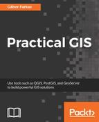
Now that we have some roads, we should also add some labels to them. Maps at this scale usually do not contain street names, but road numbers. For higher-degree roads, OpenStreetMaps delivers these road numbers in the ref column. First, let's create a simple labeling by opening the Labels tab in our layer's Properties. We can enable labeling by selecting the Show labels for this layer option, and choosing the ref column. If we apply this, we can see our road numbers on the canvas, however, it is far from an appealing map.
In the labeling window, we have a lot of options to customize our labels. Let's start with the Text tab. As the default text size is quite large, we can set our font size to 8 points. Also, change the color of the text to white, as it goes quite well with a colored background. The next tab we should see is the Background. Road labels are usually drawn in some kind of shield shape, like the tab's icon in QGIS. We can do that with a custom SVG icon, however, for the sake of simplicity, let's stick with a simple colored rectangle for now. We can enable backgrounds by checking in the Draw background box. Now we can customize the background with our preferred color or border style.
The next tab is an essential one for every labeling task--the Placement. In there, we can define if we would like to align our labels horizontally, parallel to the given feature, or curved along a line. If we choose Horizontal, we can only define a repeating interval. That is only important when our features are large enough. If we click on Apply, we can see our labels are much better, however, they are too dense for a nice map.
This phenomenon occurred as our roads consist of a lot of individual features, representing some segments. QGIS automatically labels these individual features; it does not matter if some of them form logically coherent units. There are two solutions to overcome this issue. The first one involves some fiddling, and does not guarantee correct results, while the second one is more exact, but we have to run a geoalgorithm to achieve it. Let's try out the fiddling one first. We have to open the Labels tab of our layer's Properties window, navigate to Rendering, and check in Merge connected lines to avoid duplicate labels. Now QGIS tries to merge connected features with the same attribute values in memory to avoid duplicate labels. If the labeling is still too dense, we can suppress labeling of features smaller than a specified value by filling in the corresponding field:
Although this method can help in creating correct labeling without the need of further geoprocessing, it did not work well in our case. The labels are still placed irregularly, some of them do not even appear.
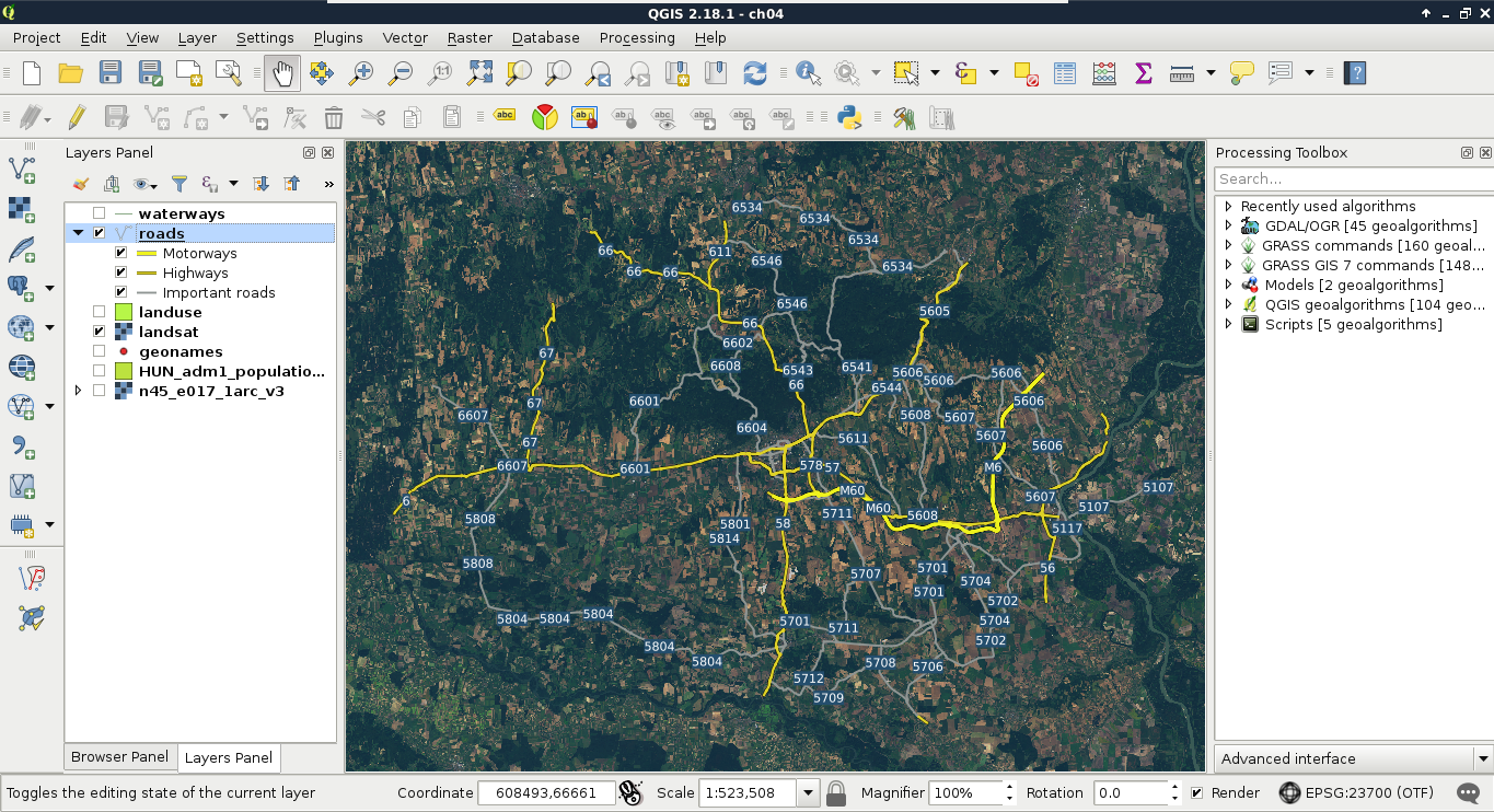
The correct way to handle these cases is merging the lines in a way there will be only one feature for every unique value from the ref column. There is a tool for exactly this--dissolve. It needs an attribute to unify features with, and strives to merge connected features with the same attributes. If there are features which cannot be merged, it creates a multipart feature with the disconnected parts. We can dissolve our road layer in the following way:
- Apply a filter on the roads layer, so the dissolve tool does not have to iterate through all of the features. A filter for our current visualization can be expressed with the query "fclass" LIKE 'motorway%' OR "fclass" LIKE 'primary%' OR "fclass" LIKE 'secondary%'.
- Select the tool QGIS geoalgorithms | Vector geometry tools | Dissolve from the Processing Toolbox.
- Specify the roads layer as Input layer, uncheck the Dissolve all box, and select the ref column as the Unique ID field. Also select a destination folder, and save the result to a Shapefile.
After running the algorithm, we get a dissolved layer, which only has one feature for every road number. As the attributes which were the same for the new features are retained, we can style our new layer like our previous one. To make things even more simple, we can apply the same styling to our new roads layer in these two easy steps:
- Right-click on the old roads layer's entry in the Layers Panel, choose Styles, and click on Copy Style.
- Right-click on the new roads layer's entry, choose Styles, and click on Paste Style:
The only thing left is adding some town labels. We will use our GeoNames layer to visualize more important settlements as follows:
- Filter the GeoNames layer to only show more popular settlements. The seats of administrative divisions can be filtered with the query "featurecode" LIKE 'PPLA%'. Note that if you created an extract in a Shapefile, the column name is truncated to featurecod.
- In the Style tab, select the No symbols option.
- In the Labels tab, choose Show labels, and select the name column for labeling.
- In the Text menu, select white for text color.
- In the Buffer menu, check Draw text buffer, specify an appropriate buffer size, and select black for its color.
Now we can also see some of the settlements labeled on our map. If some of the labels got suppressed, we can modify the weights of the GeoNames and the roads layers in Labels | Rendering | Obstacles.