
Data can come with a great many number of individual data points. Maps especially can be the playground for large datasets. While it might be tempting to visualize features of a dataset as individual elements, in explanatory data visualization especially it often makes sense to aggregate data to bring across a single point well. While Canvas allows you to show and animate many points, it is power you might want to use responsibly.
Having said that, it can often be mesmerizing to watch dynamic data unfold as well as bringing across a specific point. Combining user engagement with concise learnings is of course a great plus you should leverage if possible. Considering map data, there are a great many examples of dynamic visualizations with numerous animated elements, such as natural elements like winds or ocean currents, cultural elements like spreading ideas or inventions, as well technical elements like cars, ships, or airplanes. In this section, we will jump on the latter and visualize flight paths.
Our aim will be two-fold. Firstly, we want to build a map visualization with many animated elements – not just for the sake of showing many elements, but the detail we show should facilitate the understanding of the visual. Secondly, we want to compare the performance between SVG and Canvas. We have described it theoretically in a previous section, but let's get practical now.
Here's what we will build:
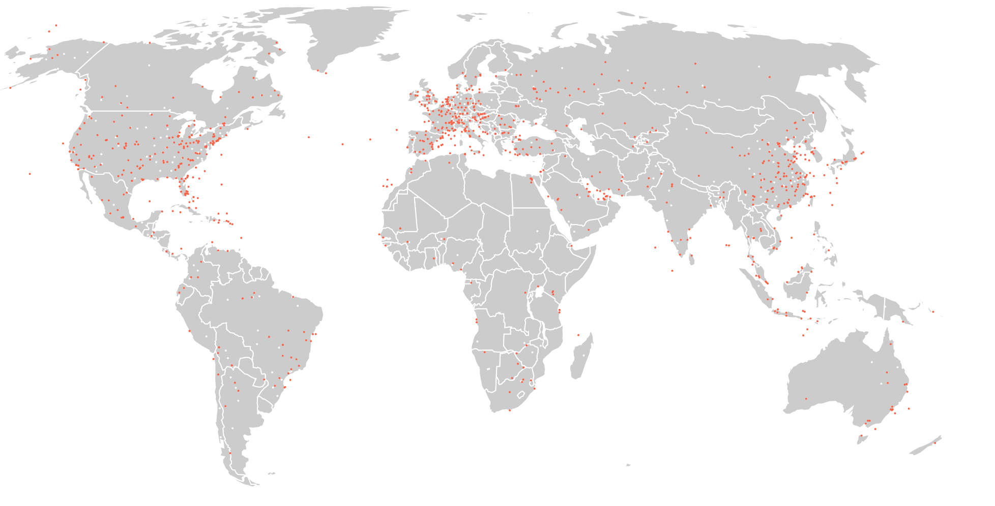
There are three main element categories we will draw: the world, airports (the white dots, consciously kept in the background as they are of only supporting importance), and the planes (the red dots). Representing real planes, our red dots are animated along their very own flight path flying from their origin to their destination. Here's an image showing the paths our planes follow:
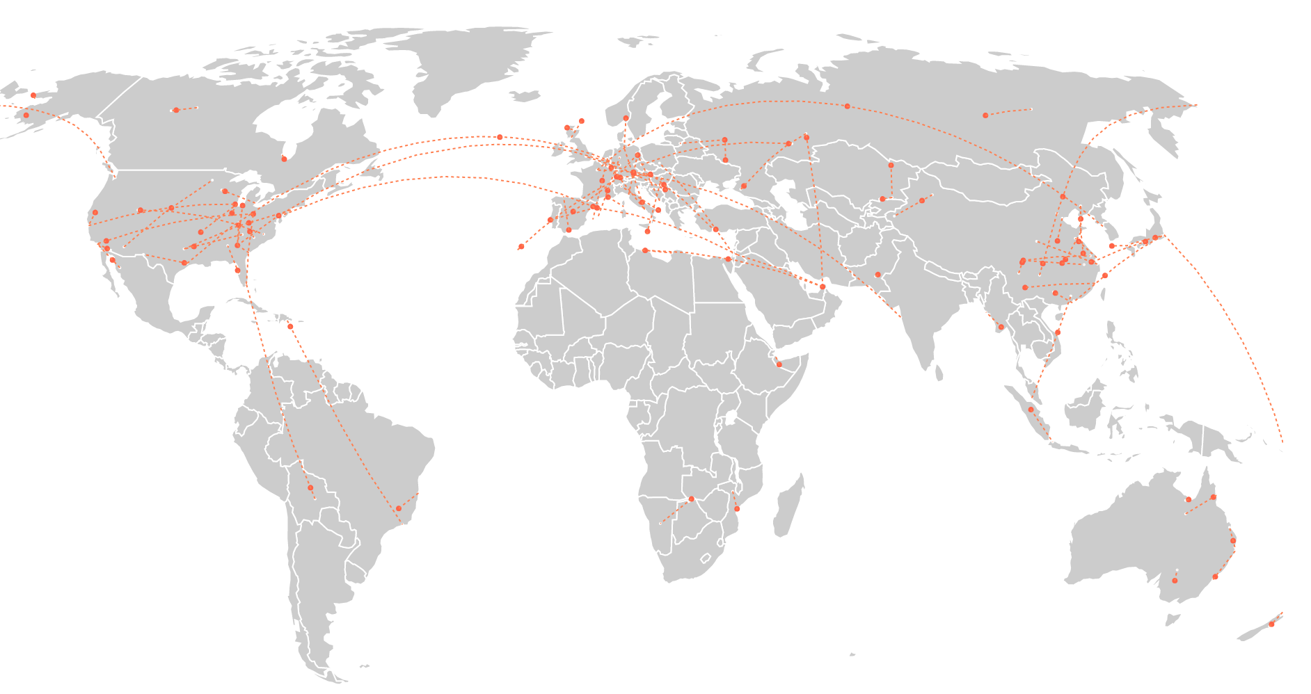
The source data for this visual includes over 65,000 worldwide routes flying to and from just over 7,000 airports. We won't be able to animate all these routes, not even with Canvas. The aim of our visualization will rather be to show as many as we can to convey an immediate visual understanding of active versus less active flight regions as well as oft-used versus lesser-used routes.
At the bottom of the visual we will show a row of buttons:

These buttons will allow the user to set the number of flights to be displayed at once. Importantly, this will not be real time or replayed time. We won't bring in any flight schedules, showing flights at the time of day/date they depart or arrive, we will show all flights at the same time! Firstly, this supports the visualization aims described previously and secondly, it will help test performance because as many elements as possible are being animated at the same time.
To test browser performance, we shall add a small information box from stats.js at the top left of our app. Once dropped into your code, this nifty info tool displays page performance measures on your page, of which we will be mainly interested in frames per second (FPS). You will see it soon in action, but this is how it looks magnified indicating 60 frames per second: