
Dot density maps are great if you want to show counts of things rather than ratios. Each thing is a dot displayed on the map. Here’s a dot density map of all farmers' markets in the US:
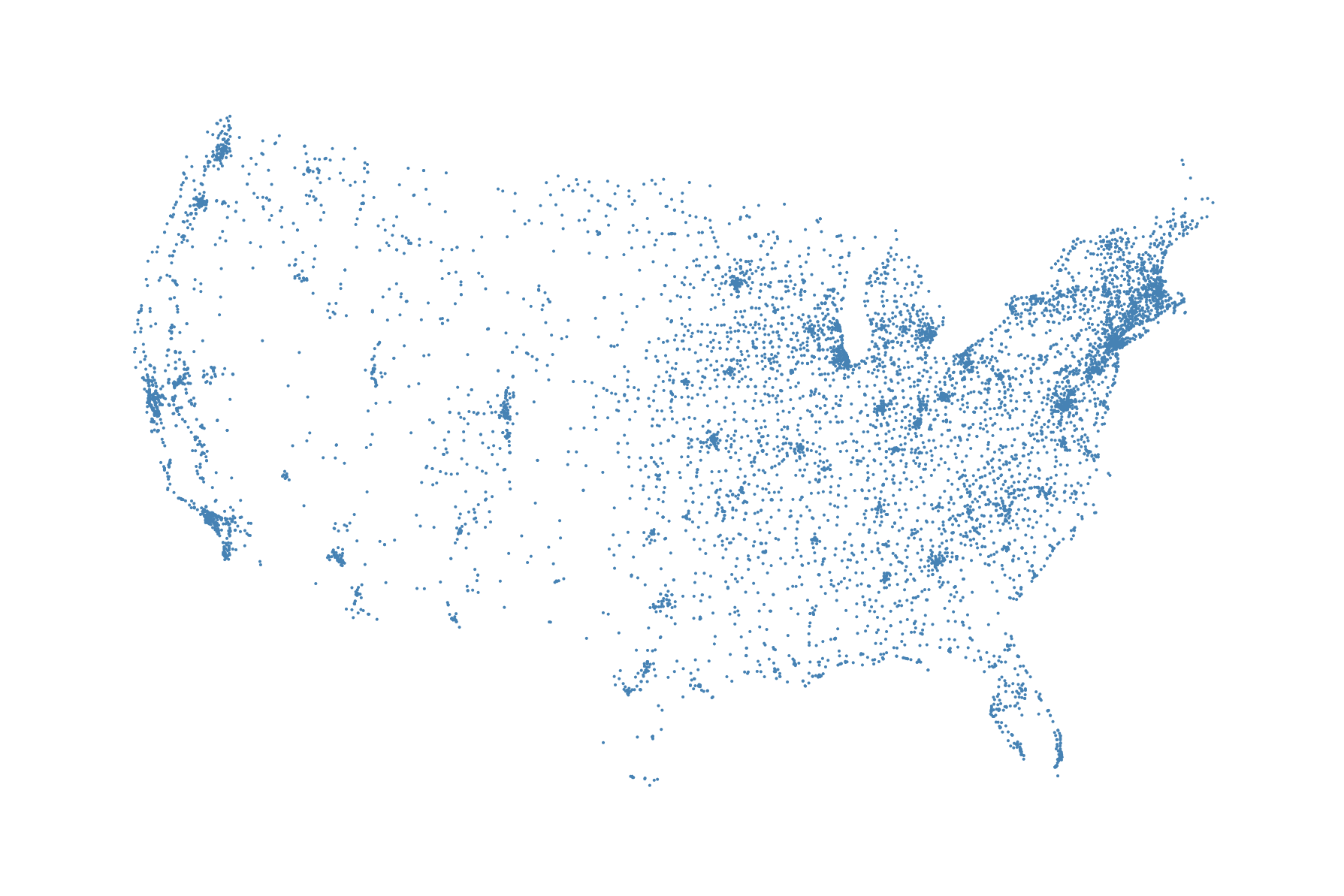
The benefit of this visualization technique is obvious: it shows all the data. You can easily see where they all are and detect clusters of farmers' markets across the country. The problem is that in fact it doesn’t show all the data. Some of the dots are overlapping in small, busy areas. A second potential problem is that many absolute measures in spatial analysis correlate highly with population distribution. So while you want to say Look where all the farmers' markets are you are actually saying Look where all the people are. This doesn't mean you shouldn't show it, but you should be aware of it. By the way, our hexbin map will have the same problem, so be aware. Another caveat of showing all the data is that it might appear confusing for users to look at that amount of data and elements. We might want to focus the eye in a more orderly way to the clusters. This is where hexbin maps come in handy.
Note that this list of map visualization techniques is not complete. There are, of course, other map visualization techniques, such as heat maps, cluster maps, graduated circle, proportional symbol, or bubble maps, and non-contiguous cartograms. A good place to see what people visualize with and on maps is https://flowingdata.com/category/visualization/mapping/.