
So far so good. But does it work? And if it works, does it work better than the SVG example? Let's recall that the SVG flight path visual gave us a whopping 60 FPS for 100 animated circles and a meager 6 FPS for some 5,000 animated circles. Let's start with 100 circles and focus on the stats.js measure in the top-left corner:
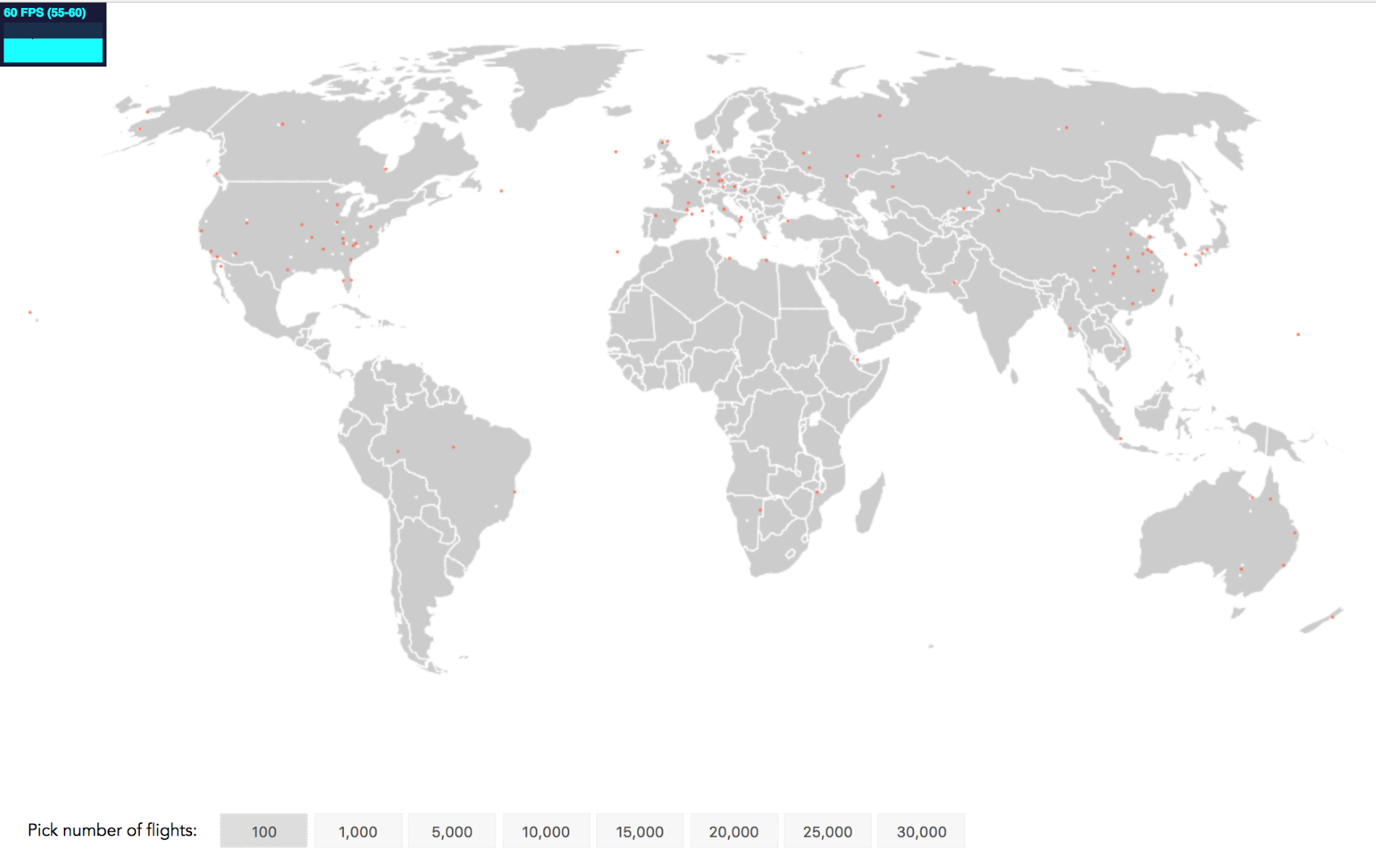
Canvas visualization of 100 flight paths at 60 FPS
View this step in the browser at: https://larsvers.github.io/learning-d3-mapping-9-2a. Code example 09_02a.html.
We expected 60 FPS. Let's go to 1,000 flights:
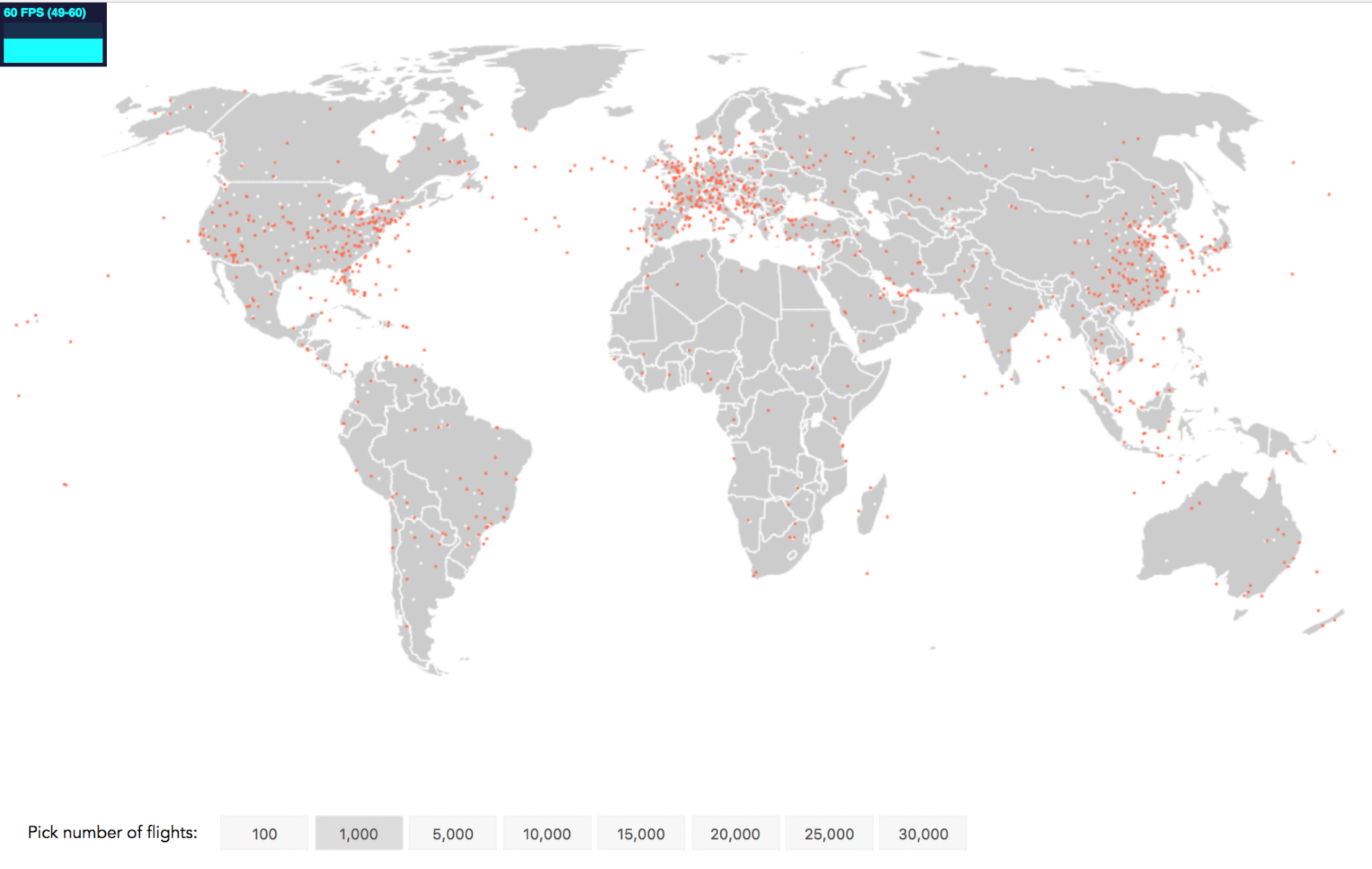
Canvas visualization of 1,000 flight paths at 60 FPS
Again, 60 FPS! 5,000 planes?
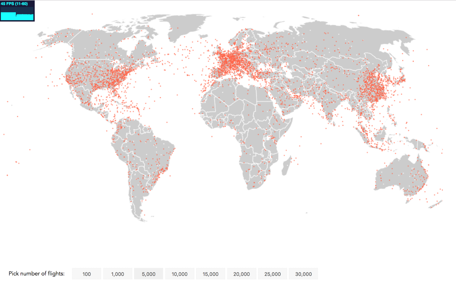
Canvas visualization of 5,000 flight paths at 45 FPS
It's going down, but still at 45 FPS keeping the animation fluid. Let's look at 10,000 flights:
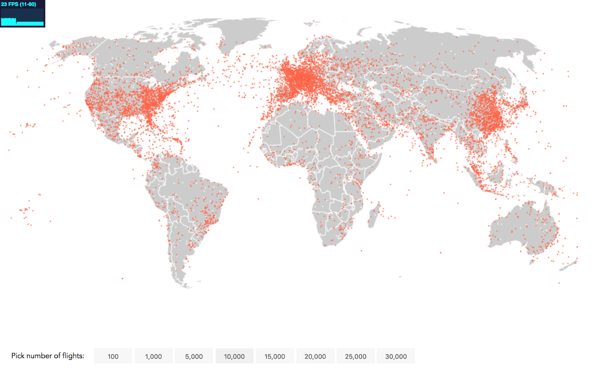
Canvas visualization of 10,000 flight paths at 23 FPS
We still see a frame rate similar to what you see when watching a movie with 23 FPS. However, let's try and squeeze out a bit more.