
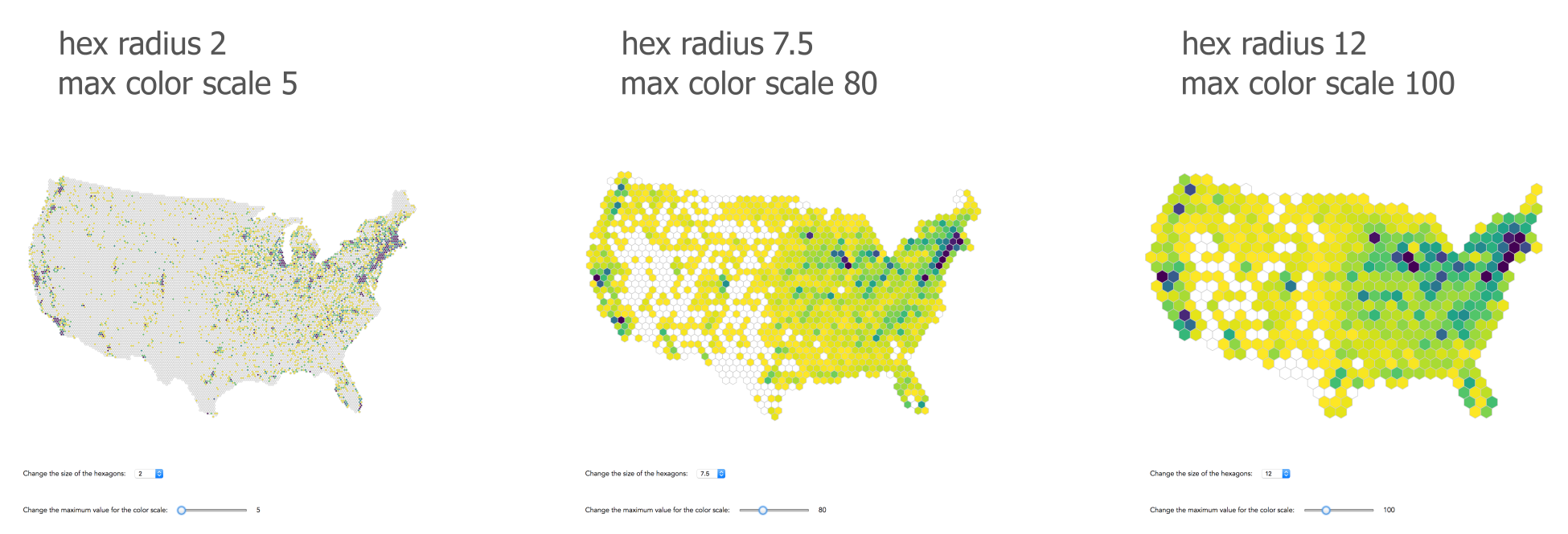
A key advantage of hexbin maps compared to dot density maps is that interaction is easier. If you have many dots on a map, you might have to keep them small (1-3 pixels) to convey a good sense of the data. Such small targets are hard to catch with the mouse. Furthermore, some dots will inevitably overlap, so you can’t get to them at all. In a hexbin map, each hexagon is reachable, if it’s not too small. I would even argue that our choice of hexagon size might be a little small with 3.5 pixels. Let’s add a drop-down control, allowing the user to change the size of area. Here are some hexagon size variants:
Two notes of caution here: when building a regularly tessellated hexbin map as we do, you might run into the border problem. Imagine a large hexagon just touching the tip of Florida. 5% of the hexagon is over land, 95% is over sea. However, the map readers can’t see the real coastal line. They assume the hexagon represents the coastal line, covering 100% land area. If that corner of Florida has a high point density, this hexagon should encode it. However, as it only covers 5% of the land, and maybe around 5% of the dot density, it appears to the reader as though the coast of Florida is void of dots.
Another problem that becomes apparent when you look at the different sized hexagons above is the so-called modifiable areal unit problem (MAUD). The summary values we encode are highly dependent on the shape and the scale of our aggregation units. This is a problem, as the results might differ when the same analysis is applied to the same data. You can see the scale effect above; changing hexagon size results in a different perception of farmers markets’ density. The shape or zone effect can be more problematic. Using a different shape at the same scale, for example, 10-mile squares instead of 10-mile hexagons can change the aggregate and hence analysis. It then becomes an analysis of different bins rather than of the underlying data. This effect is particularly problematic when representing non-arbitrary units such as counties or census tracts, which might change in shape over time but remain consistent in the readers’ minds.
You could solve the border problem by overlaying the country outline, but the key step to alleviate any of these problems is your awareness, explaining potential issues to readers.