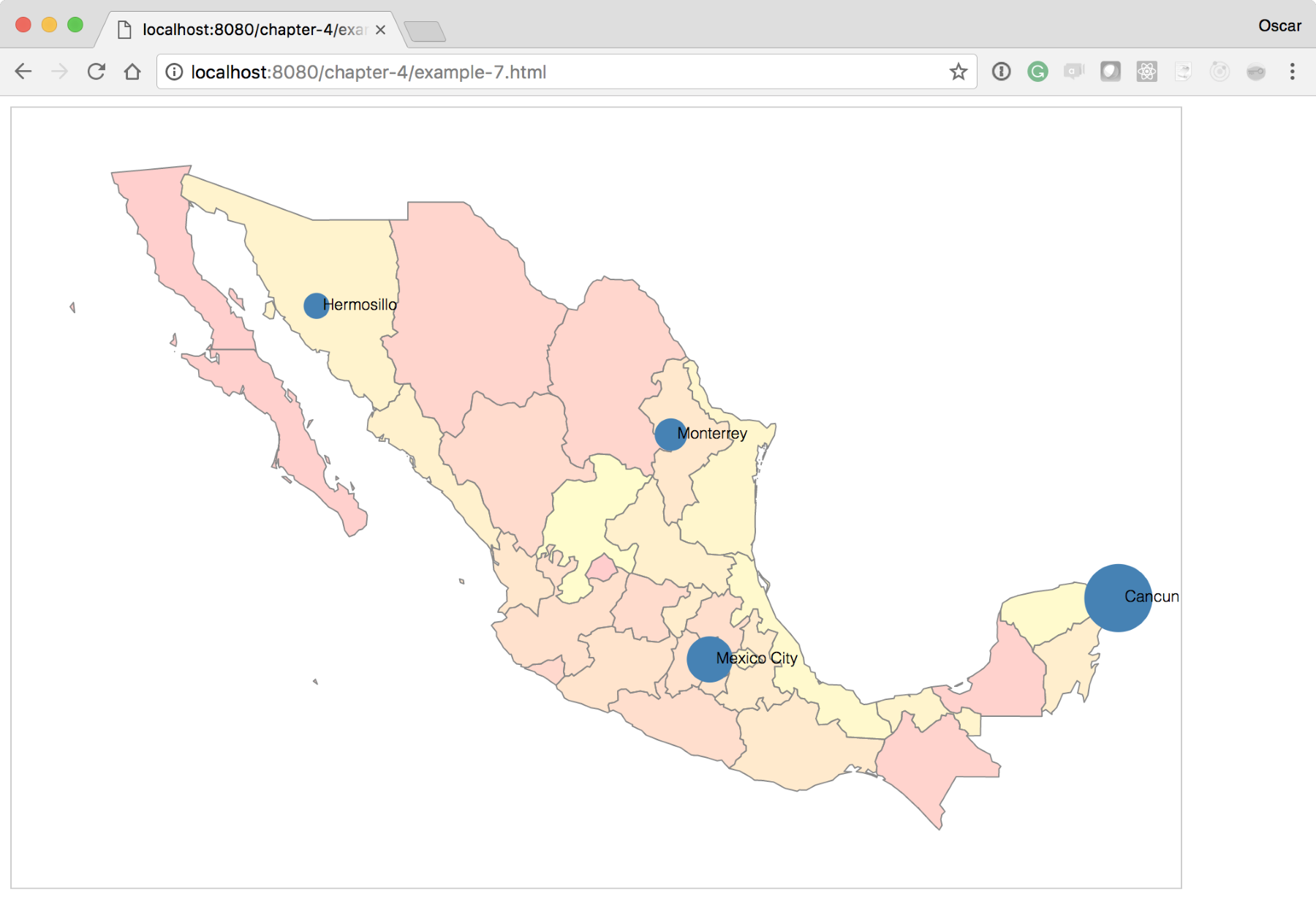
For our final experiment, we will layer visualizations on top of visualizations! Starting from where we left off at http://localhost:8080/chapter-4/example-6.html, we will add a fictitious column to the data to indicate a metric of tequila consumption (the final version can be seen at http://localhost:8080/chapter-4/example-7.html):
name,lat,lon,tequila
Cancun,21.1606,-86.8475,85,15
Mexico City,19.4333,-99.1333,51,49
Monterrey,25.6667,-100.3000,30,70
Hermosillo,29.0989,-110.9542,20,80
With just two more lines of code, we can have the city points portray meaning. In this experiment, we will scale the radius of the city circles in relation to the amount of tequila consumed:
var radius = d3.scaleLinear().domain([0,100]).range([5,30]);
Here, we will introduce a new scale that linearly distributes the input values from 1 to 100 to a radius length between 5 and 30. This means that the minimum radius of a circle will be 5 and the maximum will be 30, preventing the circles from growing too large or too small to be readable:
cityPoints.enter()
          .append('circle')
          .attr('cx', function(d) {
             return projection([d.lon, d.lat])[0];})
          .attr('cy', function(d) {
             return projection([d.lon, d.lat])[1];})
          .attr('r', 4)
          .attr('fill', 'steelblue');
Next, we will change the preceding line of code to call the radius function instead of the hardcoded value of 4. The code will now look like this:
.attr('r', function(d) {return radius(d.tequila); })
After these two small additions, your map should look like the one shown in the following screenshot: