
You have some real data about farmer's markets joined with the hexagons, but you can’t use it yet. All your data is still tucked away in the array of objects per hexagon. Let’s roll this data up.
The measure we want to visualize is the number of farmer's markets in each hexagonal area. Hence, all we need to do is to count the objects that have their datapoint value set to 1. While we’re at it, let’s also remove the layout point objects, that is, the objects with datapoint value 0; we won’t need them anymore.
We will add our task to the ready() function:
function ready(error, us) {
  // … previous steps

  var hexPointsRolledup = rollupHexPoints(hexPoints);
}
Primarily, rollupHexPoints() will roll up the number of markets per hex point. It will turn the upper hexagon data into the lower hexagon data of the following figure:
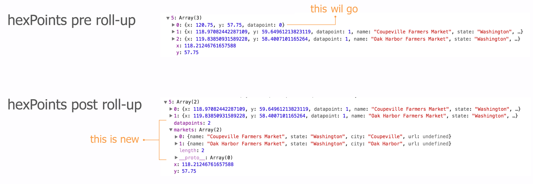
rollupHexPoints() will perform the following things in an order:
- Remove the layout grid points.
- Count the number of datapoints and add the count as a new property called datapoints.
- Collect key markets data in single array called markets for easy interaction access.
- Finally, it will produce a color scale we so dearly need for the hexagon coloring.
Here we go:
function rollupHexPoints(data) {
  var maxCount = 0;
We start by initializing a maxCount variable that will later have the maximum number of farmers' markets in a single hexagon. We’ll need this for the color scale.
Next, we’ll loop through all the layout and data points:
  data.forEach(function(el) {

    for (var i = el.length - 1; i >= 0; --i) {
      if (el[i].datapoint === 0) {
        el.splice(i, 1);
      }
    }
First, we will get rid of all the layout point objects with splice() if the datapoint property holds a 0.
Next, we will create the rolled-up data. There will be two rolled-up data elements: an integer representing the total count of farmers' markets within the hexagon and an array of market data we can use for later interaction. First, we will set up the variables:
    var count = 0,
        markets = [];

    el.forEach(function(elt) {
      count++;
      var obj = {};
      obj.name = elt.name;
      obj.state = elt.state;
      obj.city = elt.city;
      obj.url = elt.url;
      markets.push(obj);
    });

    el.datapoints = count;
    el.markets = markets;
We loop through each object within the hexagon array of objects, and once we’ve collected the data, we add it as keys to the array. This data is now on the same level as the x and y coordinates for the hex points.
Note that we could have taken a shortcut to summarize the count of markets. Our datapoints property just counts the number of elements in the array. This is exactly the same as what the in-built Array.length property does. However, this is a more conscious and descriptive way of doing it without adding much more complexity.
The last thing we do in the loop is to update maxCount if the count value of this particular hexagon is higher than the maxCount value of all previous hexagons we looped through:
    maxCount = Math.max(maxCount, count);

  }); // end of loop through hexagons

  colorScale = d3.scaleSequential(d3.interpolateViridis)
    .domain([maxCount, 1]);

  return data;

} // end of rollupHexPoints()
The last thing we do in our roll-up function is to create our colorScale. We’re using the Viridis color scale, which has great properties for visualizing count data. Note that Viridis maps low numbers to purple and high numbers to yellow. However, we want high numbers to be darker (more purple) and low numbers to be lighter (more yellow). We will achieve this by just flipping our domain mapping.
The way scales work internally is that each value we feed from our domain will be normalized to a value between 0 and 1. The first number we set in the array we pass to .domain() will be normalized to 0—that's maxCount or 169 in our case. The second number (1) will be normalized to 1. The output range will also be mapped to the range from 0 to 1, which for Viridis means 0 = purple and 1 = yellow. When we send a value to our scale, it will normalize the value and return the corresponding range value between 0 and 1. Here is what happens when we feed it the number 24:
- The scale receives 24 as an input (as in colorScale(24)).
- According to the .domain() input ([max, min] rather than [min, max]), the scale normalizes 24 to 0.84.
- Next, the scale queries the Viridis interpolator about which color corresponds to the value of 0.84 on the Viridis color scale. The interpolator comes back with the color #a2da37, which is a light green. This makes sense, as 0.84 is closer to 1, which represents yellow. Light green is obviously closer to yellow than to dark purple, which is encoded as 0 by the interpolator.
That was is it!
Nearly. The very last thing we have to do is to jump into our drawHexmap() function and change the hexagon coloring to our colorScale:
function drawHexmap(points) {
  var hexes = svg.append('g').attr('id', 'hexes')
   .selectAll('.hex').data(points)
   .enter().append('path')
     .attr('class', 'hex')
     .attr('transform', function(d) {
        return 'translate(' + d.x + ', ' + d.y +')';
     })
     .attr('d', hexbin.hexagon())
     .style('fill', function(d) {
        return d.datapoints === 0 ? 'none' : colorScale(d.datapoints);
     })
     .style('stroke', '#ccc')
     .style('stroke-width', 1);
}
If the hexagons don’t cover any markets, their data points property will be 0 and we won’t color it. Otherwise, we pick the appropriate Viridis color.
Here it is:
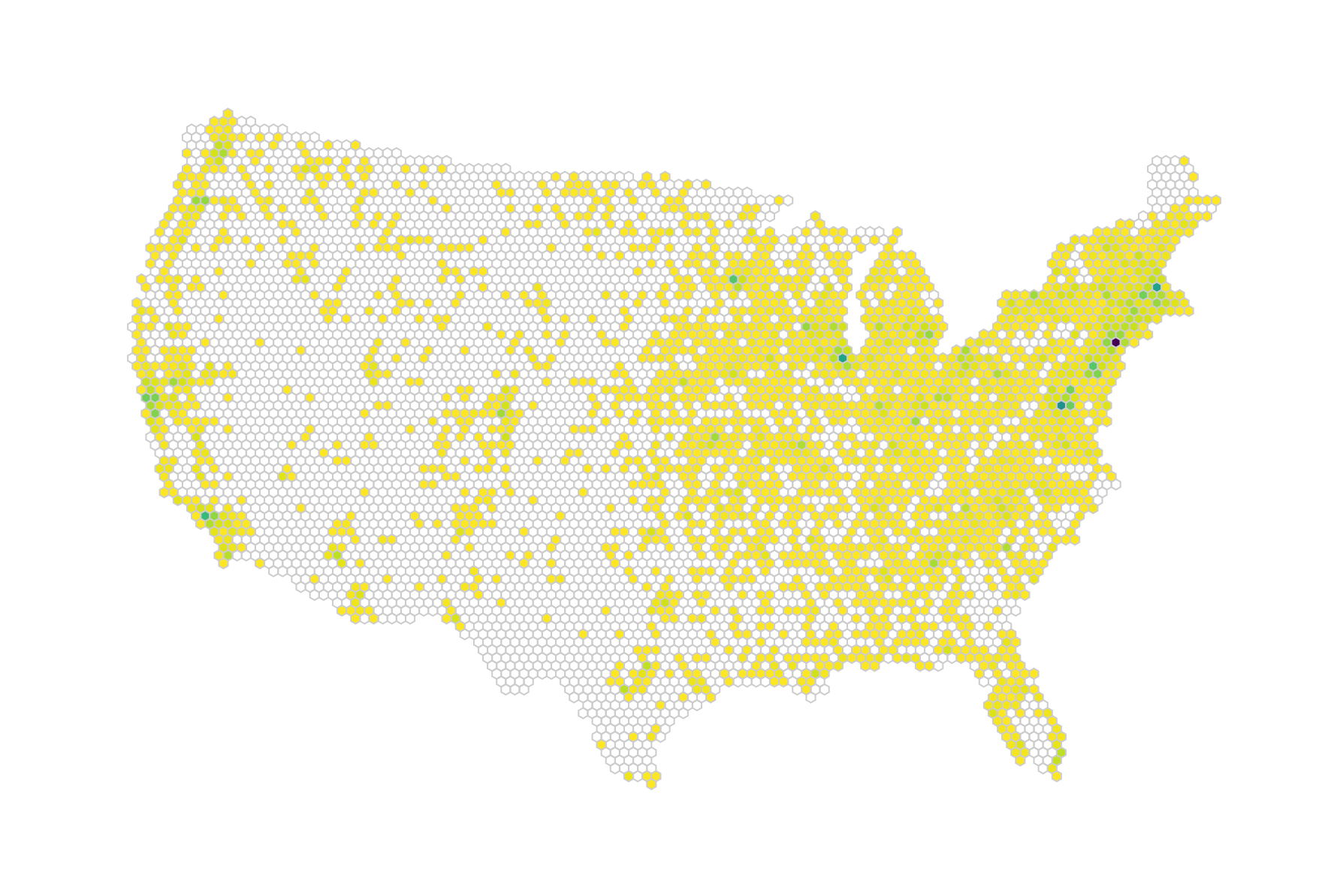
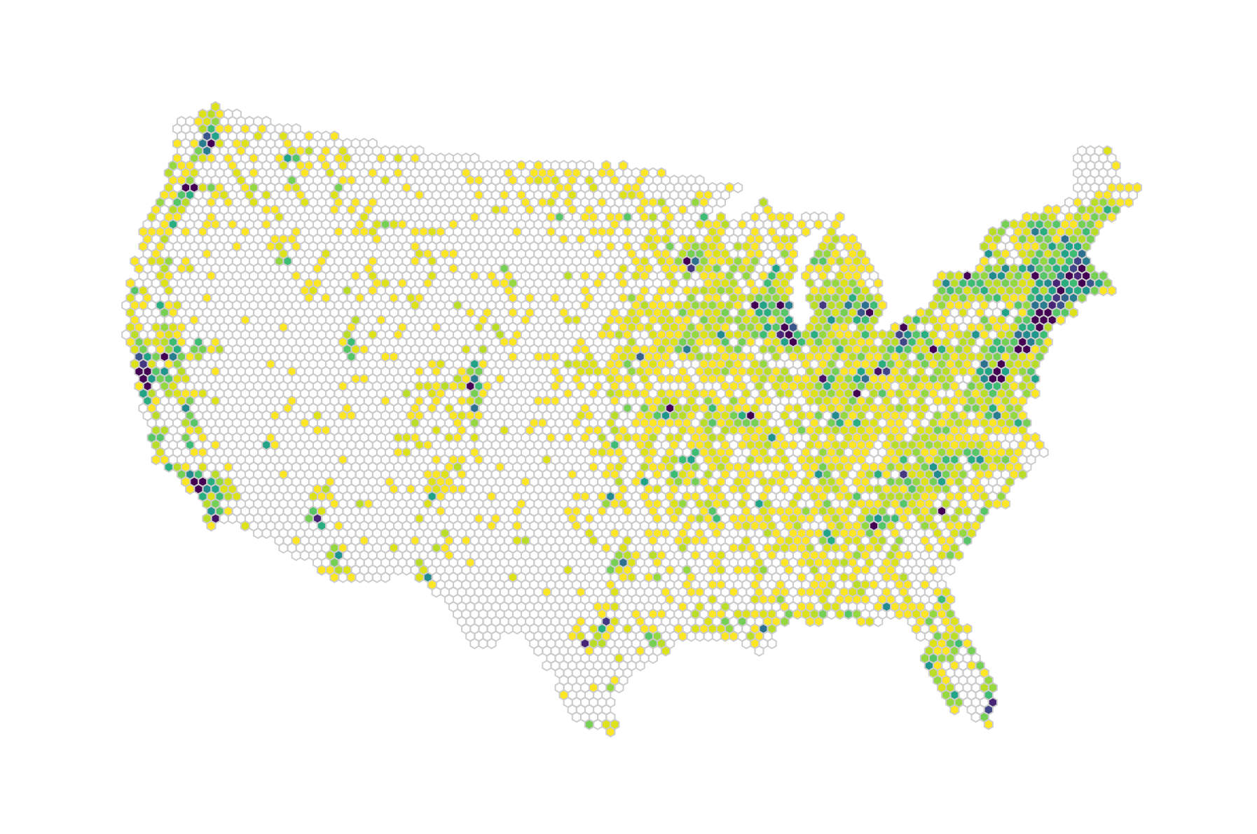
Looks pretty yellow, doesn’t it? The problem is that we have a few outliers in our data. That single dark purple dot on the East Coast is New York, which has significantly more farmers' markets than any other area (169). Washington and Boston are busy as well. However, that makes our visual less interesting. Looking at the distribution of numbers tells us that most hexagons enclose 20 or less markets:
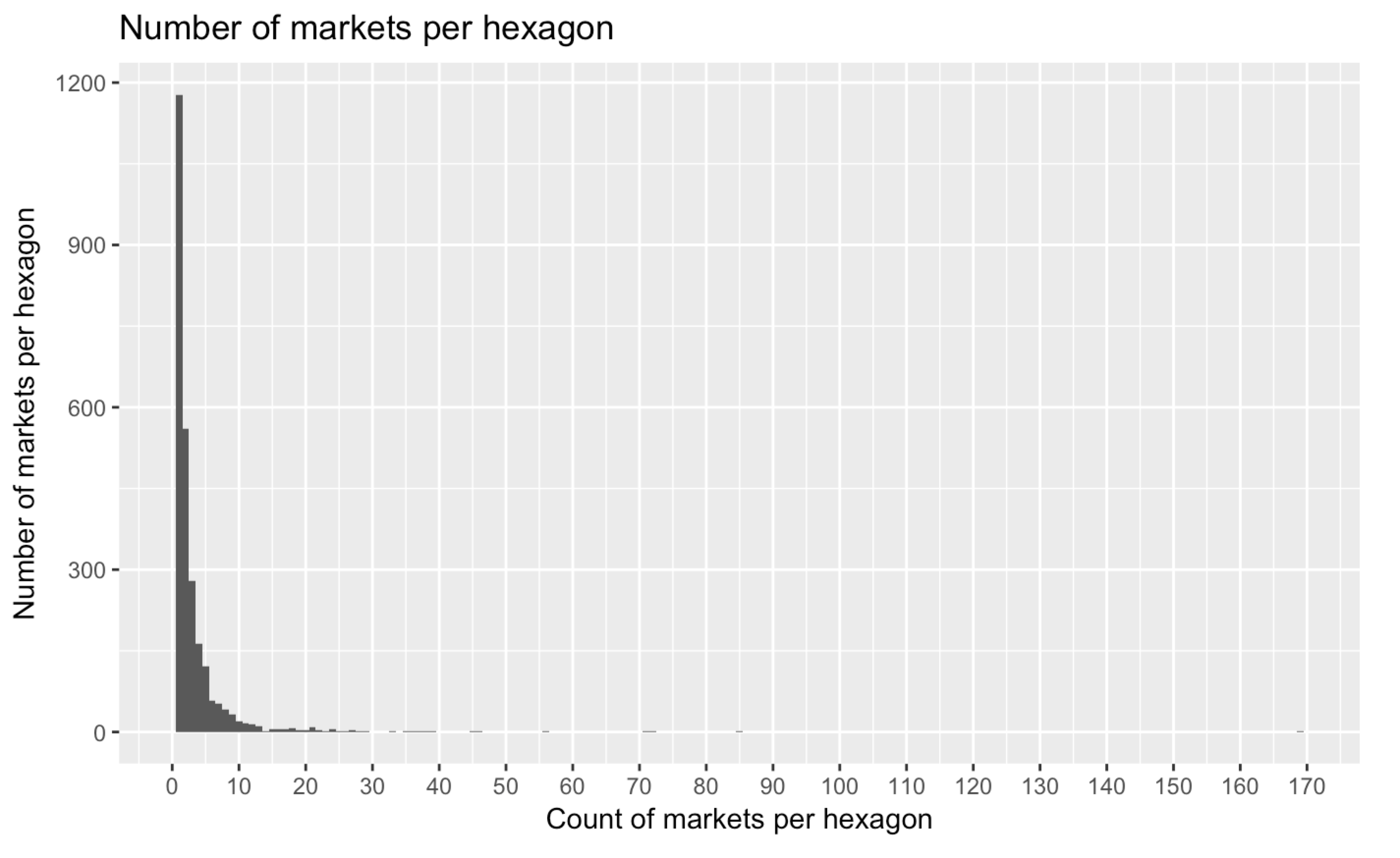
The highest number of markets per hexagon, however, is currently 169. We can do two things here. We can either choose a lower value as our maximum color scale value, say 20. That would only scale our values from 1 to 20 to the Viridis spectrum. All hexagons with higher values would receive the maximum colour (purple) by default.
A more elegant alternative is to use an exponential interpolator for the color scale. Our domain would map not linearly but exponentially to our color output, effectively reaching the end of our color spectrum (purple) with much lower values. To achieve this, we just need a new color scale with a custom interpolator. Let's take a look at the code first:
colorScale = d3.scaleSequential(function(t) {

    var tNew = Math.pow(t,10);
    return d3.interpolateViridis(tNew)

}).domain([maxCount, 1]);
What exactly are we doing here? Let's reconsider the scaling steps we went through in the preceding code:
- The scale receives a number 24 (as in colorScale(24)).
- According to the .domain() input ([max, min] rather than [min, max]), the scale normalizes 24 to 0.84. No change for points 1 and 2.
- With the old colorScale, we just waved through this linearly normalized value between 1 and 0 without us interfering. Now, we catch it as an argument to a callback. Convention lets us call this t. Now, we can use and transform this however we desire. As we saw previously, many hexagons encircle 1 to 20 markets, very few encircle more. So we want to traverse the majority of the Viridis color space in the lower range of our values so that the color scale encodes the interesting part of our data. How do we do this?
- Before we pass t to our color interpolator, we set it to the power of 10. We can use a different exponent, but 10 works fine. In general, taking the power of a number between 0 and 1 returns a smaller number. The higher the power, the smaller the output will be. Our linear t was 0.84; our exponential tNew equals 0.23.
- Finally, we pass tNew to the Viridis interpolator, which spits out the respective—much darker—color.
Let's graph this transformation to clarify:
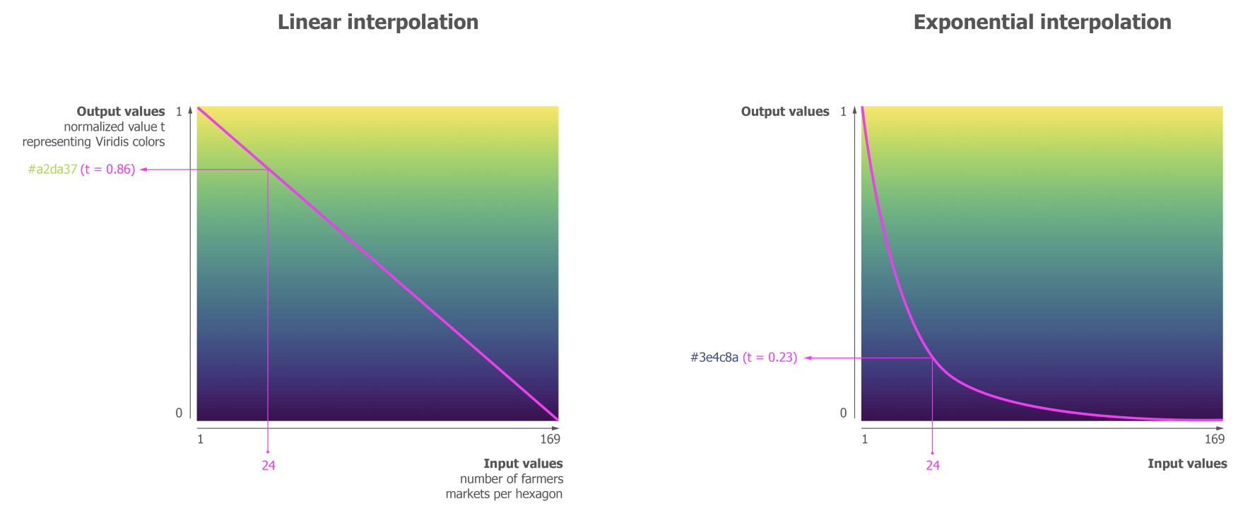
The x axis shows the input values, the y axis shows our scale-normalized value t that we send to the interpolator to retrieve a corresponding color. The left graph shows what a linear interpolation does. It linearly translates the increase of values to the decrease in t. The curve in the right graph shows us how our adjusted tNew behaves after setting t to the power of 10: we enter the lower regions of t (the more purple regions) with much smaller input values. Put differently, we traverse the color space from yellow to purple in a much smaller range of domain values. Piping our example value of 24 through a linear interpolation would return a yellowish green; piping it through our exponential interpolation already returns a purple value from the end of the color spectrum.
The main win this brings is that color differences can be seen where the data is rather than where the gap between the main data cluster and the outlier is. Here is our hexbin map with an exponential scale:
Let’s just revel in our achievement for a moment, but are we done? We’re itching to explore this map a little more. After all, people are used to playing with maps, trying to locate themselves in them or move from one area to the other with ease. That’s what we will allow for in our last step.