
So here it is – let's make some planes fly. We should start modestly and try with 100 routes:
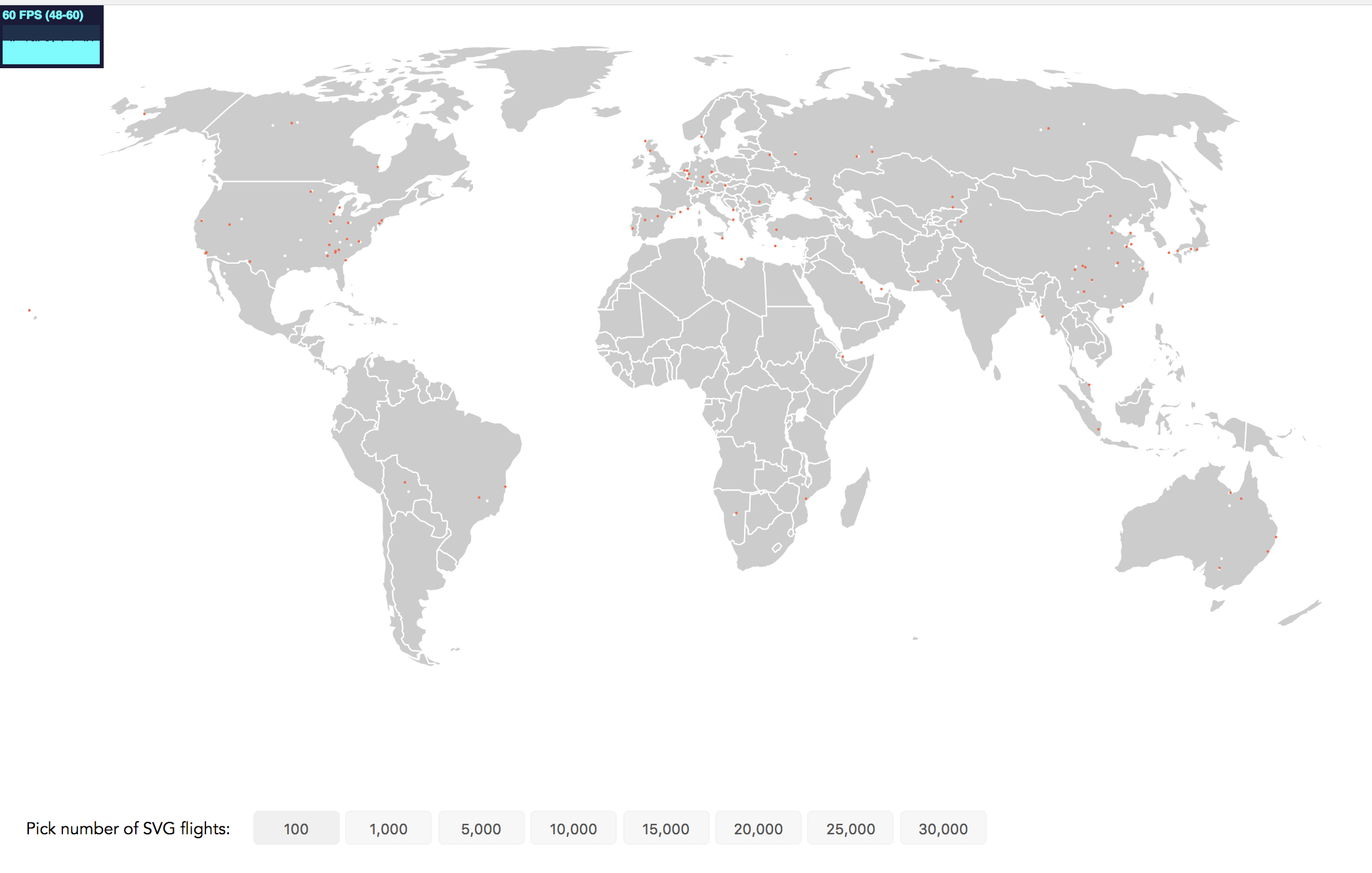
See the frame rate in the top-left corner? It's a bit small but we're still very happy with it! Displaying 60 frames per second is perfect. 1,000 flights will give us up to 40 frames per seconds. This is a drop, but the animation remains smooth. However, even at 1,000 flights we can’t really see any major clusters of flight activity. So, let’s try 5,000 flights at the same time:
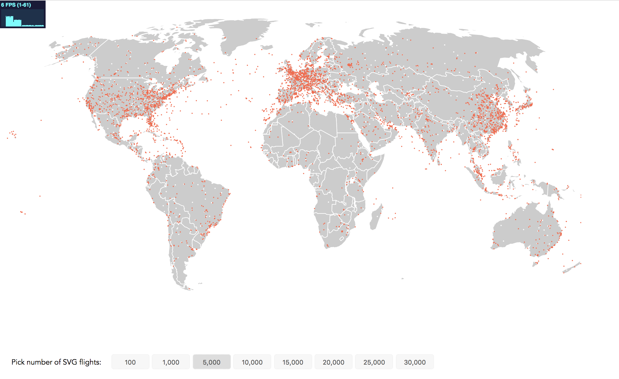
Our performance crashed to 6 FPS. While this static image brings us closer to our visualization aim of identifying regions of high flight traffic, it's no fun to view the janking animation. Canvas to the rescue.
At the conclusion of each step you will find two links in an info box close to the the relevant image. The first link brings you to a working implementation of this step that you can view in the browser. The second code example link brings you to the full code. If you're reading the print version, you can find all code examples at https://github.com/larsvers/Learning-D3.js-4-Mapping in their relevant chapter.