
Cartograms do away with the area problem, by encoding your values to area size. A cartogram of our farmers' markets mapping the ratio to color and area size would look as follows:
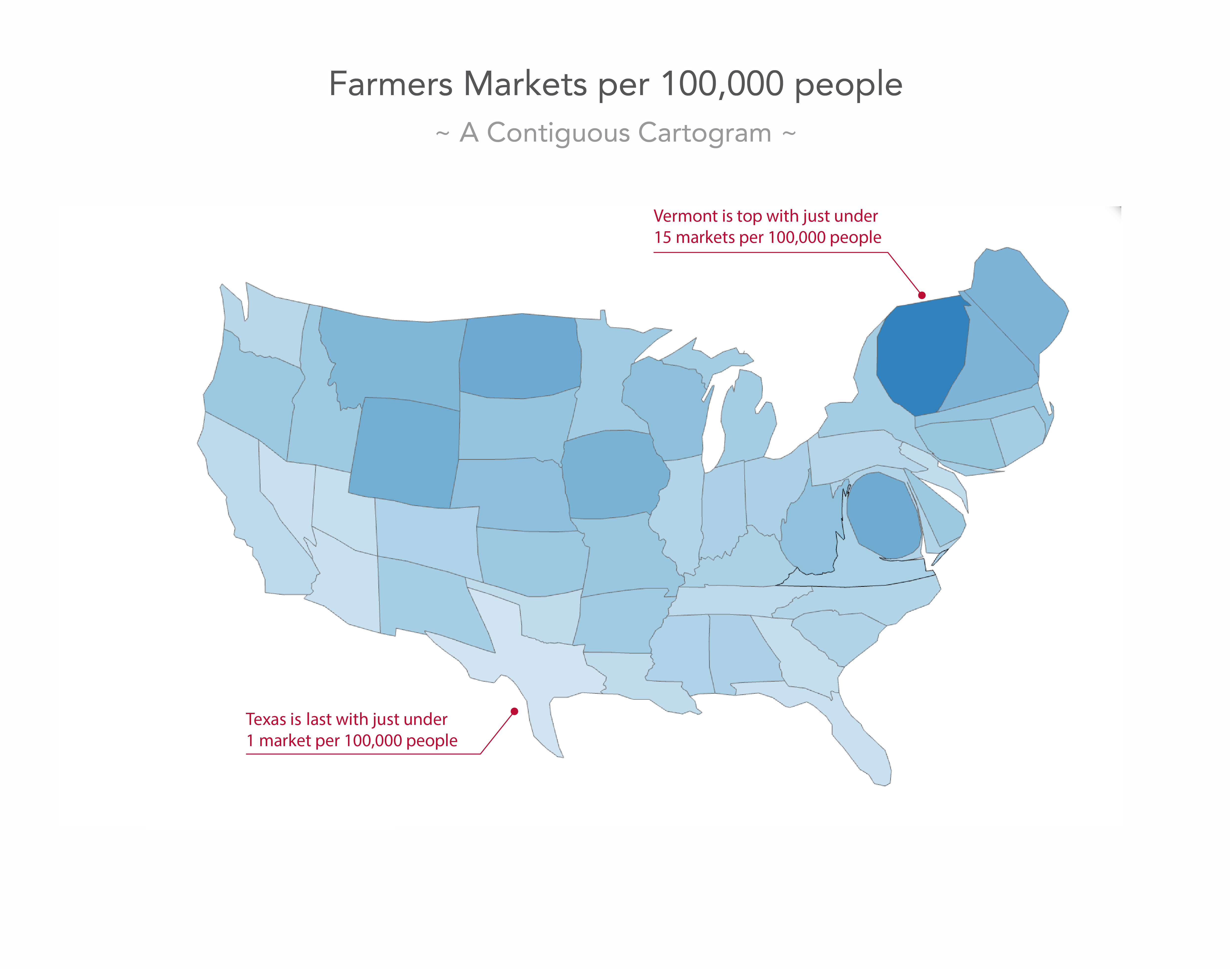
The area— and consequently the shape—of your map gets distorted in such a way that the area represents the value you want to visualize. It's great for Washington, D.C. which has been sized up significantly to be recognized as a farmers' markets heavyweight. In short, they solve the choropleth problem of attention theft, but create a new problem in that our geographical units are often hardly recognizable. Your users will be fine with this reality bend for counties, states, and countries they know well, but they will struggle to make sense of areas they don’t know the shape of. It’ll look too cryptic and reduce readability to a potential full loss of interest.