
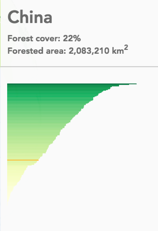
Your globe is colored by forest cover. Yellow countries have a low percentage of cover; dark green a higher one. That’s already a good clue about how much forest there is proportionally in each country. However, a user might additionally be interested in how high the forest cover is exactly, and how this compares to other countries. You have all the data in your hands, so let’s not be stingy, and add the following tooltip:
Our tooltip
The visual on the tooltip shows a sorted bar chart of all countries, forest cover percentage, and a red indicator of the hovered country’s place in the overall distribution.