
Widely known and potentially overused choropleth maps are a good choice if you need to compare standardized ratios across geographical units such as states, counties, or countries. You built a choropleth map in chapter 4, Creating a Map and in chapter 10, Adding Interactivity to Your Canvas Map comparing forest cover ratio per country
The only visual channel you can encode your measure of choice with is color. The areas of the units are already given by the size of these units. This can draw the user’s attention away from the smaller, and toward, the larger units. Looking at our forest example, larger countries such as the US, Russia, or Brazil might get more initial attention than smaller countries, such as Luxembourg, Haiti, or Belize.
To alleviate this attention problem, you should be fair to each country in the measure you visualize. The key rule is to not visualize absolute numbers, but standardized ratios related to the country. We adhered to this rule in our forest example by visualizing the percentage of forested area of the total country area. This measure has the same range for each country, independent of the country’s area (0 to 100%). It’s a standardized, and hence, fair measure. The absolute number of trees would be an unfair measure. A large country with a few trees could still have more trees than a small country full of trees, rendering our comparison problematic to pointless.
Furthermore, the geographical unit should define the measure you visualize. Tax rates, for example, are made by countries and make perfect sense to compare across countries. Forest cover is not (entirely) informed by a country’s actions and policies, and makes less sense to show in a choropleth. The countries’ actions still influence their forest cover, so I wouldn’t disregard it (the Dominican Republic, for example, has a much more conservative approach to its forests than neighboring Haiti), but this should be a conscious part of your choice of visualization technique.
As choropleths are so omnipresent, let’s take a look at another example with different data: farmers' markets in the US. They will accompany us for the rest of the chapter, so this is a good time to dive into it.
The farmers' markets data we will use is published by the USDA at https://www.ams.usda.gov/local-food-directories/farmersmarkets. After a bit of a clean up, we have a dataset of 8,475 markets on mainland US. Each market has a number of interesting variables, starting with longitude and latitude values we can use for the mapping, as well as name, state, and city they are located in. It also has 29 binary variables (as in yes/no) indicating the products that each market is selling. We will use this later to visualize subsets of markets.
Here’s a choropleth of the US states (only mainland to keep it simple). It shows the number of farmers' markets per 100,000 people. Light blue means few markets; dark blue means many markets per 100k people:
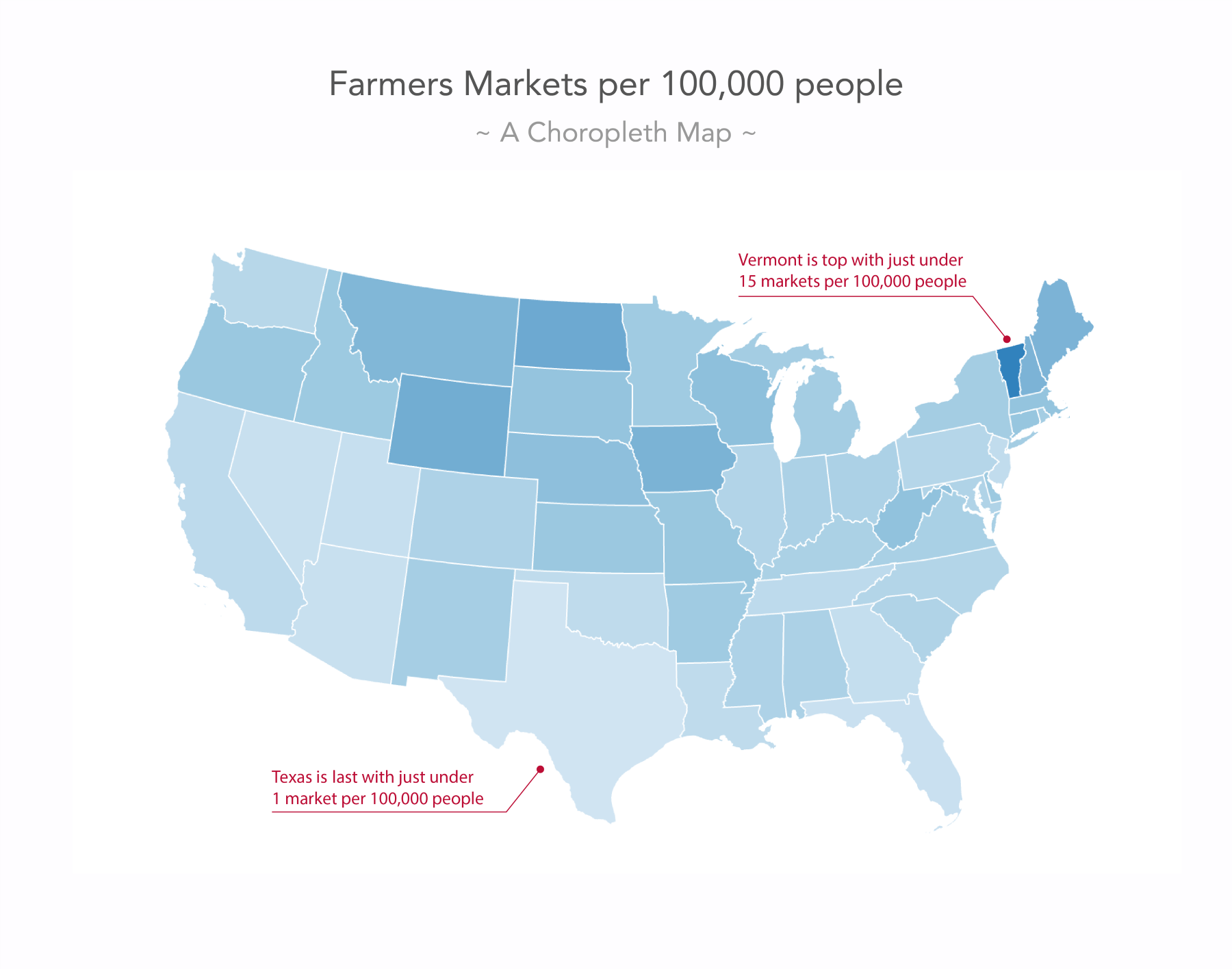
One question here has to be whether a state-wise comparison of farmers' markets makes much sense. Do the state-policies or cultures play a role in promoting or objecting to farmers' markets? Maybe. However, once we decided to go for a state-wise comparison of it, are we able to compare well? Texas with its size gets a lot of weight in the visual, suggesting southern farmers' market deprivation. We can see Vermont has the highest ratio (it helps that we’re pointing a red line at it), but what about Washington, D.C.? There are 8.5 markets per 100k people? We can’t even see it on the map.