Table of Contents for
Bootstrap 4 – Responsive Web Design
 Bootstrap 4 – Responsive Web Design
Published by
Packt Publishing, 2017
Bootstrap 4 – Responsive Web Design
Published by
Packt Publishing, 2017
- Cover
- Table of Contents
- Bootstrap 4 – Responsive Web Design
- Bootstrap 4 – Responsive Web Design
- Credits
- Preface
- What you need for this learning path
- Who this learning path is for
- Reader feedback
- Customer support
- 1. Module 1
- 1. Getting Started
- Setting up the framework
- Building our first Bootstrap example
- Optionally using the CDN setup
- Community activity
- Bootstrap and web applications
- Browser compatibility
- Summary
- 2. Creating a Solid Scaffolding
- Building our scaffolding
- Fluid container
- We need some style!
- Manipulating tables
- Like a boss!
- Final thoughts
- Summary
- 3. Yes, You Should Go Mobile First
- Bootstrap and the mobile-first design
- How to debug different viewports at the browser
- Cleaning up the mess
- Creating the landing page for different devices
- Summary
- 4. Applying the Bootstrap Style
- Summary
- 5. Making It Fancy
- Paying attention to your navigation
- Dropping it down
- Making an input grouping
- Getting ready for flexbox!
- Summary
- 6. Can You Build a Web App?
- Adding the navigation
- Do a grid again
- Playing the cards
- Implementing the main content
- Creating breadcrumbs
- Finishing with the right-hand-side content
- Summary
- 7. Of Course, You Can Build a Web App!
- Waiting for the progress bar
- Creating a settings page
- Summary
- 8. Working with JavaScript
- Awesome Bootstrap modals
- Creating our custom modal
- A tool for your tip
- Pop it all over
- Making the menu affix
- Finishing the web app
- Summary
- 9. Entering in the Advanced Mode
- The last navigation bar with flexbox
- Filling the main fluid content
- Filling the main content
- Overhead loading
- Fixing the toggle button for mobile
- Summary
- 10. Bringing Components to Life
- Fixing the mobile viewport
- Learning more advanced plugins
- Summary
- 11. Making It Your Taste
- Working with plugin customization
- The additional Bootstrap plugins
- Creating our Bootstrap plugin
- Defining the plugin methods
- Creating additional plugin methods
- Summary
- 2. Module 2
- 1. Introducing Bootstrap 4
- Summary
- 2. Using Bootstrap Build Tools
- Download the Bootstrap source files
- Setting up the blog project
- Setting up the JSON files
- Creating our first page template
- Summary
- 3. Jumping into Flexbox
- Ordering your Flexbox
- Wrapping your Flexbox
- Setting up the Bootstrap Flexbox layout grid
- Setting up a Flexbox project
- Designing a single blog post
- Summary
- 4. Working with Layouts
- Inserting rows into your layout
- Adding columns to your layout
- Choosing a column class
- Creating a simple three-column layout
- Mixing column classes for different devices
- Coding the blog home page
- Using responsive utility classes
- Summary
- 5. Working with Content
- Learning to use typography
- Customizing headings
- How to style images
- Coding tables
- Summary
- 6. Playing with Components
- Basic button examples
- Creating outlined buttons
- Checkbox and radio buttons
- Coding forms in Bootstrap 4
- Creating an inline form
- Adding validation to inputs
- Using the Jumbotron component
- Adding the Label component
- Using the Alerts component
- Using Cards for layout
- Updating the Blog index page
- How to use the Navs component
- Adding Breadcrumbs to a page
- Using the Pagination component
- How to use the List Group component
- Summary
- 7. Extending Bootstrap with JavaScript Plugins
- Coding Tooltips
- Avoiding collisions with our components
- Using Popover components
- Using the Collapse component
- Coding an Accordion with the Collapse component
- Coding a Bootstrap Carousel
- Summary
- 8. Throwing in Some Sass
- Using Sass in the blog project
- Importing partials in Sass
- Creating a collection of variables
- Customizing components
- Writing a theme
- Summary
- 9. Migrating from Version 3
- Big changes in version 4
- Updating your variables
- Additional global changes
- Other font updates
- Migrating components
- Migrating JavaScript
- Miscellaneous migration changes
- Summary
- 3. Module 3
- 1. Revving Up Bootstrap
- What Bootstrap 4 Alpha 4 has to offer
- Setting up our project
- Summary
- 2. Making a Style Statement
- Image elements
- Responsive utilities
- Helper classes
- Text alignment and transformation
- Summary
- 3. Building the Layout
- Adding Bootstrap components
- Summary
- 4. On Navigation, Footers, Alerts, and Content
- Improving navigation using Scrollspy
- Customizing scroll speed
- Icons
- Using and customizing alerts
- Creating a footer
- Creating and customizing forms
- Form validation
- Progress indicators
- Adding content using media objects
- Figures
- Quotes
- Abbreviations
- Summary
- 5. Speeding Up Development Using jQuery Plugins
- Enhanced pagination using bootpag
- Displaying images using Bootstrap Lightbox
- Improving our price list with DataTables
- Summary
- 6. Customizing Your Plugins
- Customizing plugins
- Writing a custom Bootstrap jQuery plugin
- Summary
- 7. Integrating Bootstrap with Third-Party Plugins
- Hover
- Summary
- 8. Optimizing Your Website
- Minifying CSS and JavaScript
- Introducing Grunt
- Running tasks automatically
- Stripping our website of unused CSS
- JavaScript file concatenation
- Summary
- 9. Integrating with AngularJS and React
- Introducing React
- Summary
- Bibliography
- Index
In this chapter, we are going to discover how to integrate some popular plugins and libraries into Bootstrap to enhance the user experience of MyPhoto.
We will identify new features or improvements we want to make to MyPhoto, introduce libraries to help us achieve those goals, and figure out how these can be gracefully integrated within our existing architecture.
This chapter will focus on the integration of three popular plugins and libraries, namely, Salvattore, Animate.css, and Hover. These libraries will allow us to improve the overall user experience of MyPhoto, creating a much more polished look and feel.
To summarize, this chapter will help us:
- Learn how to leverage Salvattore to add more flexibility to Bootstrap's grid system
- Learn how to leverage Animate.css to easily add CSS3 animations to a Bootstrap page
- Learn how to leverage Hover to easily add hover effects to a Bootstrap page
MyPhoto does a good job of boasting about the services on offer and the quality of those services. However, a user may want to read some feedback from the previous customers. To do this, we're going to add a testimonials component to our page as a new tab in the services component. The Testimonials tab will display some positive feedback from the users. Let's add that new tab to our list of tabs:
    <li class="nav-item">
        <a href="#services-testimonials" class="nav-link"
        data-toggle="tab">Testimonials</a>
    </li>
Next, we want to add some content. Let's use Bootstrap's grid system to display the testimonials in four neat rows of three columns. Add the following code below the services-prints markup:
    <div role="tabpanel" class="tab-pane" id="services-testimonials">


<div class="container">


<div class="row myphoto-testimonial-row">
                <div class="col-xs-3 myphoto-testimonial-column">
                    <h6>Debbie</h6>
                    <p>Great service! Would recommend to friends!</p>
                </div>


<div class="col-xs-3 myphoto-testimonial-column">
                    <h6>Joey</h6>
                    <p>5 stars! Thanks for the great photos!</p>
                </div>


<div class="col-xs-3 myphoto-testimonial-column">
                    <h6>Jack & Jill</h6>
                    <p>So happy with how the photos turned out!
                    Thanks for capturing the memories of our day!</p>
                </div>


<div class="col-xs-3 myphoto-testimonial-column">
                    <h6>Tony</h6>
                    <p>Captured our Cup final win! Great stuff!</p>
                </div>
            </div>


<div class="row myphoto-testimonial-row">


<div class="col-xs-3 myphoto-testimonial-column">
                    <h6>Anne</h6>
                    <p>Really high quality prints!</p>
                </div>


<div class="col-xs-3 myphoto-testimonial-column">
                    <h6>Mary</h6>
                    <p>Made a stressful event much easier!
                    Absolute professionals!</p>
                </div>
            </div>

<div class="row myphoto-testimonial-row">
<div class="col-xs-3 myphoto-testimonial-column">
                    <h6>Oscar</h6>
                    <p>Declared their greatness, exhibited greatness.</p>
                </div>

<div class="col-xs-3 myphoto-testimonial-column">
                    <h6>Alice</h6>
                    <p>Wonderful! Exactly as I imagined they would
                    turn out!
                    </p>
                </div>


<div class="col-xs-3 myphoto-testimonial-column">
                    <h6>Nick</h6>
                    <p>Perfectly captured the mood of our gig.
                    Top notch.</p>
                </div>
            </div>
        </div>
    </div>
We have added three rows with varying amounts of columns. Each column includes the name of a user and the associated testimonial. As we want a maximum of four columns in a row, we have given each column the
col-xs-3
class so that the column takes up three of the 12 columns in the Bootstrap grid system. We have also given each column an additional
myphoto-testimonial-column
class for specific styling, and each row a
myphoto-testimonial-row
class. Add the following rules to
myphoto.css
:
    .myphoto-testimonial-row {        margin-right : 5px;
    }
    .myphoto-testimonial-column
    {
        border: 1px solid black; background-color: #FFFFFF;
        padding: 10px;
        margin: 5px;        max-width: 23%;
    }
We have given some extra spacing to our testimonials. To make up for the extra spacing, we set a
max-width
property of
23%
as opposed to the
25%
declared by
col-xs-3
, and overrode the default
margin-right
property of the
row
class of
-15px
to
5px
. We also included a black border and solid white background. Let's check out our results:
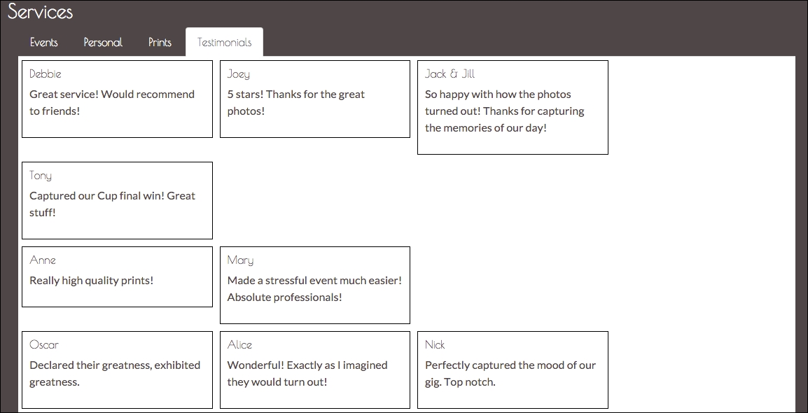
Figure 7.1: A Testimonials tab is created using Bootstrap's grid system
Okay, cool. We have our Testimonials tab and our positive testimonies from users. However, it looks kind of ugly. The contents of the columns are of varying lengths, which makes the spacing visually awkward. Take the distance between Joey's testimony on the first row and Mary's on the second. Wouldn't it be nice if we could decrease this distance? From column to column across individual rows, the spacing is uniform and looks good. Wouldn't it be nice if we could achieve this uniformity vertically, too? Unfortunately, Bootstrap's grid system is not flexible enough to make the vertical spacing uniform while allowing for varying heights of columns. However, we can achieve this with a popular library called Salvattore.
Salvattore (http://salvattore.com/) is a JavaScript library that allows for more flexible grid system definitions. For instance, with the help of Salvattore, we can define grid system rules that will allow three rows of four columns, but the position of each column is relative to the height of the corresponding column in the preceding row. Salvattore is a pure JavaScript library, meaning that it doesn't depend on any other library (such as jQuery) to work.
Let's add Salvattore to our project. Download Salvattore using Bower:
bower install salvattore
Then, make sure to include it in our markup, at the bottom of the page. Including the JavaScript file at the bottom of our page is the suggested practice by Salvattore as it needs the DOM to be loaded before it takes effect:
<footer class="footer text-center">
<p class="text-muted">
<small>© MyPhoto Inc.</small>
</p>
<p class="text-muted text-center">
<a href="#">
<small>Terms & Conditions</small>
</a>
</p>
<p class="text-muted">
<a href="#">
<small>About Us</small>
</a>
</p>
</footer>
<script src="bower_components/salvattore/dist/
salvattore.min.js"></script>
Next, we need to rewrite our testimonials grid to work with Salvattore. One big difference between how we constructed the grid initially and how we need to construct it for Salvattore, is that we won't be grouping the testimonials by row; Salvattore will do the grouping for us.
Currently, we have the following:
    <div class="row myphoto-testimonial-row">
        <div class="col-xs-3 myphoto-testimonial-column">
            <h6>Anne</h6>
            <p>Really high quality prints!</p>

        </div>
        <div class="col-xs-3 myphoto-testimonial-column">
            <h6>Mary</h6>
            <p>Made a stressful event much easier! Absolute
            professionals!</p>

        </div>
    </div>
Here, we are creating a row, and then constructing the columns within that row. That is not how Salvattore works. Let's rewrite our grid. This time, we will simply be listing the testimonials:
    <div role="tabpanel" class="tab-pane" id="services-testimonials">
        <div class="container">
            <div class="myphoto-testimonial-grid" data-columns>
                <div>
                    <h6>Debbie</h6>
                    <p>Great service! Would recommend to friends!</p>
                </div>
                <div>
                    <h6>Anne</h6>
                    <p>Really high quality prints!</p>
                </div>
                <div>
                    <h6>Oscar</h6>
                    <p>Declared their greatness, exhibited greatness.</p>
                </div>
                <div>
                    <h6>Joey</h6>
                    <p>5 stars! Thanks for the great photos!</p>
                </div>
                <div>
                    <h6>Mary</h6>
                    <p>Made a stressful event much easier! Absolute
                    professionals!</p>
                </div>
                <div>
                    <h6>Alice</h6>
                    <p>Wonderful! Exactly as I imagined they would
                    turn out!</p>
                </div>
                <div>
                    <h6>Jack & Jill</h6>
                    <p>So happy with how the photos turned out! Thanks for
                    capturing the memories of our day!</p>
                </div>
                <div>
                    <h6>Nick</h6>
                    <p>Perfectly captured the mood of our gig.
                    Top notch.</p>
                </div>
                <div>
                    <h6>Tony</h6>
                    <p>Captured our Cup final win! Great stuff!</p>
                </div>
            </div>
        </div>
    </div>
Okay, so that's quite a change. Let's talk through the important pieces. As mentioned earlier, we are now simply listing testimonials rather than grouping them by row. We no longer have our
row
wrapper elements. We have added a parent
div
wrapper around all the testimonials, with the
myphoto
-
testim
onial
-
grid
class. As we are no longer referencing Bootstrap's grid system, each column entry no longer has the
col
-
xs
-
3
class and we have also removed the
myphoto
-
testimonial
-
column
classes. The final thing we need to do with the markup is add a
data
-
columns
attribute to the parent grid element. Observe the following code snippet:
<div id="myphoto-testimonial-grid" data-columns>
The
data-columns
attribute is the hook Salvattore needs to know which elements to act upon. All we need to do now is add some CSS.
Open up
myphoto.css
and add the following:
    .myphoto-testimonials-grid[data-columns]::before {
        content: '4 .column.size-1of4';
    }
    .column {
        float: left;
    }
    .size-1of4 {
        width: 25%;
    }
So, what's happening here? First, we are using the
before
pseudo-selector to define how many columns we want and the classes we want applied. In this case, we want four columns and to apply the
column
class and the
size-1of4
class. The
column
class makes sure any column elements are rendered as close to the left of the element's container element as possible, and any elements with the
size-1of4
class are to only take up a quarter of the available space. If we planned on only having three columns, then we could define and apply a
size-1of3
class with a rule to only take up
33.333%
of the available space, and so on. Salvattore will split the testimonials into four groups, as evenly as possible, and apply the classes defined by
.
myphoto
-
testimonials
-
grid[data
-
columns]::before
to the column groups. For instance, in our example, the first group of columns has the following markup:
    <div class="myphoto-testimonial-grid" data-columns="4">
        <div class="column size-1of4">
            <h6>Debbie</h6>
            <p>Great service! Would recommend to friends!</p>
        </div>
        ...        <div>
            <h6>Mary</h6>
            <p>Made a stressful event much easier! Absolute
            professionals!</p>

        </div>
        <div>
            <h6>Tony</h6>
            <p>Captured our Cup final win! Great stuff!</p>        </div>
    </div>
    ...
Let's see how this renders:
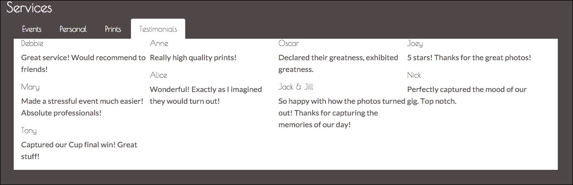
Figure 7.2: The unstyled testimonials, created using Salvattore
Great! Now all we need to do is add some styling!
The first thing that we want to do is create some space between the top and the content. As you can see, the top of the panel is very close to the list tab. We have a parent class for our grid, myphoto-testimonial-grid, that we can leverage. Add the following style rules:
    .myphoto-testimonial-grid {
        padding-top : 30px ;
    }
Take a look at the following screenshot:
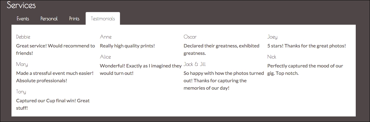
Figure 7.3: The unstyled testimonials, created using Salvattore with a top padding of 30px
Next up, we want to make the testimonials distinguishable. For this, we'll leverage the
myphoto-testimonial-column
. Remove any previous rules for this class and add the following:
    .myphoto-testimonial-column {
        padding: 10px;
        border: 1px solid #000000;
        margin: 5px;
    }
We have simply created a border around the element, added an internal spacing of
10px
between the element contents and its border, and lastly, we have created a margin of
5px
between each of the elements. Add the
myphoto-testimonial-column
class to each of our testimonial elements:
    <div class="myphoto-testimonial-grid" data-columns>
        <div class="myphoto-testimonial-column">
            <h6>Debbie</h6>
            <p>Great service! Would recommend to friends!</p>

        </div>
        <div class="myphoto-testimonial-column">
            <h6>Anne</h6>
            <p>Really high quality prints!</p>
        </div>
        <div class="myphoto-testimonial-column">
            <h6>Oscar</h6>
            <p>Declared their greatness, exhibited greatness.</p>
        </div>
        <div class="myphoto-testimonial-column">
            <h6>Joey</h6>
            <p>5 stars! Thanks for the great photos!</p>
        </div>
        <div class="myphoto-testimonial-column">
            <h6>Mary</h6>
            <p>Made a stressful event much easier! Absolute
            professionals!</p> </div>
        <div class="myphoto-testimonial-column">
            <h6>Alice</h6>
            <p>Wonderful! Exactly as I imagined they would
            turn out!</p>        </div>
        <div class="myphoto-testimonial-column">
            <h6>Jack & Jill</h6>
            <p>So happy with how the photos turned out! Thanks
            for capturing the memories of our day!</p>
        </div>
        <div class="myphoto-testimonial-column">
            <h6>Nick</h6>
            <p>Perfectly captured the mood of our gig. Top notch.</p>
        </div>
        <div class="myphoto-testimonial-column">
            <h6>Tony</h6>
            <p>Captured our Cup final win! Great stuff!</p>        </div>
    </div>
That's a little better. Now we can at least differentiate each of the testimonials from one another (see Figure 7.4). Compare this with the testimonial component we built using just Bootstrap's grid system; the visual improvements are obvious. We have a much more natural, flowing visual now, compared to the clunky, almost awkward, original visual.
Now, let's see how we can leverage Bootstrap's grid system to ease the use of Salvattore.
Take a look at the following screenshot:
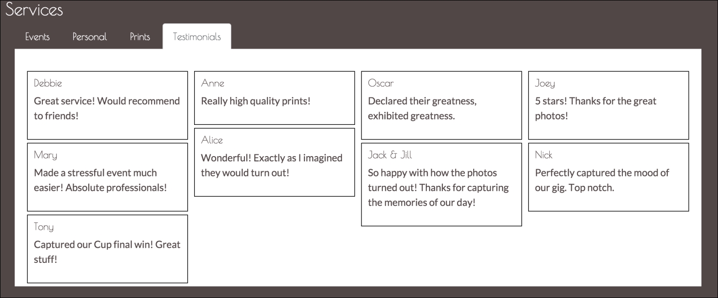
Figure 7.4: The testimonials arranged using Salvatorre and with some custom styling
In our example, we created two new classes to lay out our Salvattore grid, namely,
column
, which just applies
float: left
, and
size-1of4
, which just sets a width of
25%
on the element. Doesn't Bootstrap already provide these classes? Of course it does.
In fact, our
col-**-**
classes all have the
float: left
property, and they all manage the width of our column. Let's use these classes instead!
First, we need to figure out which
col-**-**
class we want to use. We always want four horizontal columns with a width of 25%. Bootstrap's grid system is split into 12, so we want each of our columns to take up three column spaces;
col-xs-3
fulfils those requirements. Let's rewrite the .myphoto-testimonial-grid[data-columns]:
    .myphoto-testimonial-grid[data-columns]::before {
        content: '4 .col-xs-3';
    }
We have replaced the classes to be applied to the column groups with Bootstrap's
col-xs-3
class. Let's take a look at the results (see Figure 7.5):
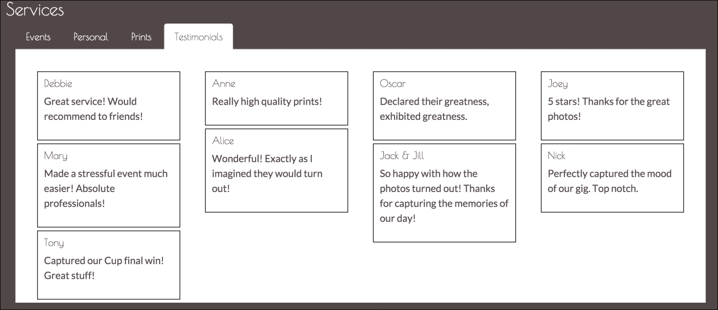
Figure 7.5: Using Bootstrap's col-**-** class to render the testimonials grid (note the additional padding)
Our
col-xs-3
class has added some extra padding that we don't really want in this scenario. Let's create a new class,
myphoto
-
testimonial
-
group
, to override the padding:
    .myphoto-testimonial-group {     padding: 0px;
    }
We also need to make sure that the following class is applied to the columns groups:
    .myphoto-testimonial-grid[data-columns]::before {
        content: '4 .col-xs-3.myphoto-testimonial-group';
    }
Take a look at the following screenshot:
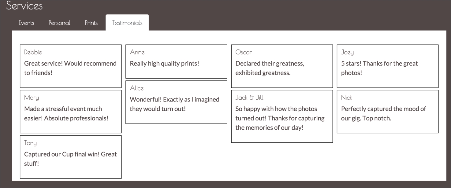
Figure 7.6: Using Bootstrap's col-**-** class together with the myphoto-testimonial-grid class to render the testimonials grid (note the reduced padding)
Note
The content property
The content property is used to add content to a given element. For example, the rule span::before {content: 'Hello World'; } will insert the text "Hello World" before the content within any span element on the page. Similarly, the rule span::before {content: 'Hello World'; } inserts the text "Hello World" after the content within any span element on the page. It is important to note that the content property can only be used in conjunction with either the after or before selector.
Great! Our Salvattore grid is now powered by Bootstrap's grid system! This is quite important, as we now know how to use the flexibility and simplicity of Salvattore's grid system without having to worry about all the nitty-gritty work Bootstrap solves with its own grid system.
Let's animate. Animate.css (https://daneden.github.io/animate.css/) is a cross-browser, pure CSS library that provides a huge number of easy-to-use classes to add animations to a page. That is, the library has zero dependencies and can be layered upon any web page.
As it's a pure CSS library, integrating Animate.css with MyPhoto is exceedingly simple. First, use Bower to download Animate.css:
bower install animate.css
Next, include the library in the head of MyPhoto, after the other CSS includes:.
    <link rel="stylesheet"
    href="bower_components/bootstrap/dist/css/bootstrap.min.css" />
    <link rel="stylesheet" href="styles/myphoto.css" />
    ...
    <link rel="stylesheet"
    href="bower_components/DataTables/media/css/dataTables.
    bootstrap.min.css" />
    <link rel="stylesheet"
    href="bower_components/animate.css/animate.min.css" />
To make sure we are set up correctly, let's add an animation to the body of our web page. To use any of the classes provided by Animate.css, we must include the animated class on the element:
<body data-spy="scroll" data-target=".navbar" class="animated">
If we take a look at
animate.min.css
, we will see that all selectors depend on the
animated
class to be defined and the
animated
class itself provides the base animation rules:
    .animated {
        -webkit-animation-duration: 1s;
        animation-duration: 1s;
        -webkit-animation-fill-mode: both;
        animation-fill-mode: both
    }
    .animated.hinge {
        -webkit-animation-duration:2s;
        animation-duration:2s
    }
To apply the animation itself is just as simple. Add the desired class to the element. To make MyPhoto fade in, we just need to apply the
fadeIn
class to the body element:
    <body data-spy="scroll" data-target=".navbar" class="animated
    fadeIn">
If you fire up the page, you should see the page slowly fade in as it renders. If you do not see this animation, make sure you have the correct path to
animate.min.css
in the head.
Now that we have Animate.css added to our project and working, let's add some emphasis to some of the core elements in our site.
MyPhoto has a special offers alert in a prominent position on the page. However, it may still not grab the attention of the user initially. We need to focus the attention of the user immediately on the alert and add some emphasis. We need to tell the user that this is something they should read.
Animate.css has a range of bounce classes which are great for grabbing the attention of a user. We have a selection of 11 bounce classes here:
bounce
,
bounceIn
,
bounceInDown
,
bounceInLeft
,
bounceInRight
,
bounceInUp
,
bounceOut
,
bounceOutDown
,
bounceOutLeft
,
bounceOutRight, and
bounceOutUp
.
We're going to go with the
bounceIn
class, which gives a throbber-like behavior. To get the
bounceIn
effect, add the
animated
and
bounceIn
classes to the special offers alert element:
<div class="alert alert-info alert-position animated bounceIn">
<a href="#" class="close" data-dismiss="alert" aria-label=
"close">×</a>
<a href="#" class="close minimize" data-minimize="alert"
aria-label="minimize">_</a>
<a href="#" class="close expand hide" data-expand="alert"
aria-label="expand">+</a>
<strong>
<i class="fa fa-exclamation"></i> Special Offer -
</strong>
<span>2 FOR 1 PRINTS TODAY ONLY WITH PROMO CODE
<span style="font-style: italic">BOOTSTRAP</span>
</span>
</div>The alert should now be animated. Animate.css also provides an infinite animation option, where the animation will be infinitely repeated. To use this option, simply add the infinite class to the element:
    <div class="alert alert-info alert-position animated bounceIn
    infinite">
Now, the
bounceIn
effect will be infinitely repeated. However, it does not look great as the element actually transitions from hidden to visible during the animation, so this transition is also looped. This is a great example of how the
infinite
class does not play well with all animations. A more infinite-friendly animation is
pulse
, which offers a similar effect. Replace the
bounceIn
class with the
pulse
class:
<div class="alert alert-info alert-position animated pulse infinite">
Great, the special offers alert now animates infinitely, with a gentle pulse to gain the attention of the user. However, if we want this applied to all alerts, then we need to apply it to all alerts individually. In this scenario, if there is a design change and, for instance, we want to change the animation, we would again have to change them all individually. Let's manage it centrally, instead, by extending the Alert jQuery plugin by adding further customizations to the
js/alert.js
file we created in Chapter 6, Customizing Your Plugins.
So, what do we want to do? On page load, we want to add
animate.css
classes to our alert elements. First, let's add our on load listener to our IIFE. Add this directly after $(document).on('click.bs.alert.data-api', '[data-expand="alert"]', Alert.prototype.expand):
    $(window).on('load', function () {
    })
Next, we need a hook for our plugin. Let's use a data-* attribute, as is the general practice with Bootstrap jQuery plugins. We will call it
data-alert-animate
. Any element to which we want these classes applied will already have the
data-alert-animate
attribute. Our plugin will loop through each of these elements, applying the relevant classes:.
    $(window).on('load', function() {
        $('[data-alert-animate]').each(function() {
        })
    })
In our markup, let's update the special offers alert element to remove the
animate.css
classes and add the
data-alert-animate
attribute:
<div class="alert alert-info alert-position" data-alert-animate>
We want to add three classes to the
data
-
alert
-
animate
elements:
animated
,
pulse
, and
infinite
. Let's update the plugin to apply these classes to each
data
-
alert
-
animate
element:
    $(window).on('load', function() {
        $('[data-alert-animate]').each(function() {
            $(this).addClass('animated pulse infinite')
        })
    })
Now, the markup will be dynamically transformed on page load, adding the
animated
,
pulse
and
infinite
classes:
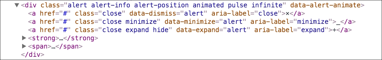
Figure 7.7: By examining the page source inside our browser, we can see the dynamically transformed markup: Our alert now has the animated , pulse , and infinite classes applied to it
Great, but it isn't exactly extensible. Our plugin does not allow for these classes to be overridden via the
data-alert-animate
attribute. Let's fix this by defining a default animation, using pulse infinite, but allowing a developer to override the animation via the
data-alert-animate
attribute. Update the on load function as follows:
    $(window).on('load', function() {
        $('[data-alert-animate]').each(function() {
            var defaultAnimations = 'animated pulse infinite'
            var $animations = $(this).attr('data-alert-animate')
            if ($animations) {
                $(this).addClass('animated ' + $animations)
            } else {
                $(this).addClass(defaultAnimations)
            }
        })
    })
Now, we are defining a
defaultAnimati
ons
variable from
animated
,
pulse
and
infinite
. We then check if the
data
-
alert
-
animate
attribute has any value; if it has, add the classes referenced plus the
animated
class. If not, simply apply the classes defined in
defaultAnimations
.
Loading MyPhoto as-is, we should still see the
animated
,
pulse, and
infinite
classes applied. However, the alert looks a little awkward, as it renders in a static state before the animation takes effect. To make the behavior of the alert more natural, let's make it invisible until
Alert.js
adds the animation classes. Add a new class,
hide-before-animated
, to
myphoto.css:
    .hide-before-animated {

        visibility: hidden;
    }
    .hide-before-animated.animated {
        visibility: visible;
    }
The hide-before-animated
class simply sets the
visibility
of the element to
hidden
, unless the
animated
class is also present on the element, in which case
visibility
is set to
visible
. As the
data-alert-animate
attribute adds the
animated
class to an element, the element will be invisible until the element is ready. Add the
hide-before-animated
class to the
class
attribute of the special offers alert element and reload the page to see the results:
    <div class="alert alert-info alert-position hide-before-
    animated" data-alert-animate>
Let's update our special offers alert element to override the
pulse
and
infinite
values with just the
bounceIn
class:
    <div class="alert alert-info alert-position" data-alert-
    animate="bounceIn">
Now, we should see just the
animated
and
bounceIn
classes applied to the element:
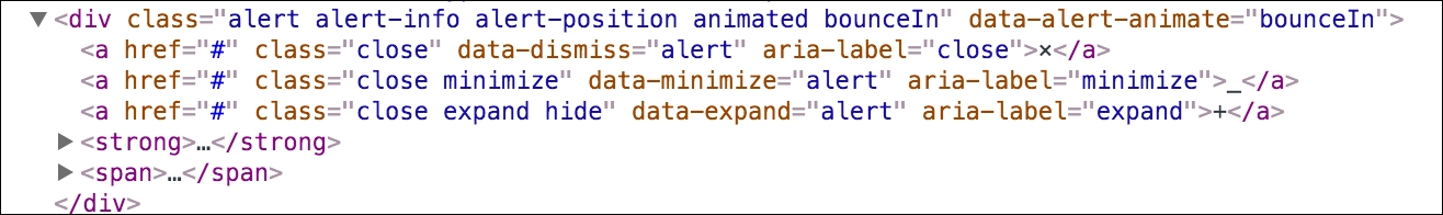
Figure 7.8: By examining the page source inside our browser, we can see how only the animated and bounceIn classes have now been applied to our alert
Perfect. Now, via a neat little
data
-attribute
, we can initiate a default animation for our alerts, and override that animation if need be.
Another nice use of these animations is to add a natural feel to the rendering of elements that may initially be hidden. Let's apply this idea to the Testimonials tab we created earlier in this chapter.
The testimonials component is a very simple grid built with Salvattore. While it is a neat grid, we want to make it a little flashier. Let's simply add an animation from Animate.css, the
fadeIn
class, so that, when the Testimonial tab is open, the grid appears to fade into view:
<div class="myphoto-testimonial-grid animated fadeIn" data-columns>
When a user clicks on the Testimonials tab, the tab panel will open and then the grid will fade into view.
We can go a bit further and actually apply an animation to the column groups, to induce optimal motion sickness. In
myphoto.css
, we already leverage the
data-columns
attribute to allow Salvattore to create the column groups for the grid and apply the appropriate style:
    .myphoto-testimonial-grid[data-columns]::before {
        content: '4 .col-xs-3.myphoto-testimonial-group';
    }
We can make the columns bounce into view by simply extending this rule to include the
animated
and
bounceIn
classes:
    .myphoto-testimonial-grid[data-columns]::before {
        content: '4 .col-xs-3.myphoto-testimonial-
        group.animated.bounceIn';
    }
Now, when the tab is opened, the whole grid fades in while the column groups also have a bounce effect. A little crass, but effective. The resulting markup for the component should look like the following:
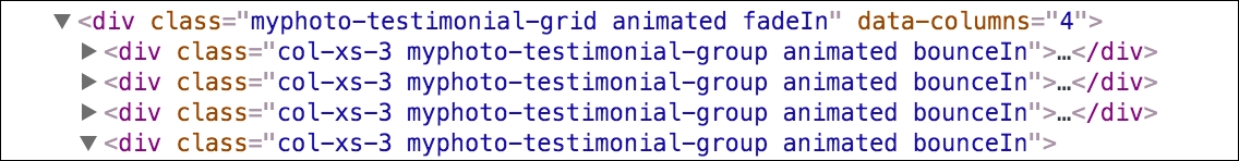
Figure 7.9: By examining the page source inside our browser, we can see that the testimonial grid now has bounce and fade effects applied to it
As far as Animate.css goes, that is all there is. A nice, simple, and elegant library for providing nice, simple, and elegant animations. For a full list of effects, take a look at the Animate demo website at https://daneden.github.io/animate.css/ .
Next, we are going to take a look at a complementary library, Hover.