Table of Contents for
Bootstrap 4 – Responsive Web Design
 Bootstrap 4 – Responsive Web Design
Published by
Packt Publishing, 2017
Bootstrap 4 – Responsive Web Design
Published by
Packt Publishing, 2017
- Cover
- Table of Contents
- Bootstrap 4 – Responsive Web Design
- Bootstrap 4 – Responsive Web Design
- Credits
- Preface
- What you need for this learning path
- Who this learning path is for
- Reader feedback
- Customer support
- 1. Module 1
- 1. Getting Started
- Setting up the framework
- Building our first Bootstrap example
- Optionally using the CDN setup
- Community activity
- Bootstrap and web applications
- Browser compatibility
- Summary
- 2. Creating a Solid Scaffolding
- Building our scaffolding
- Fluid container
- We need some style!
- Manipulating tables
- Like a boss!
- Final thoughts
- Summary
- 3. Yes, You Should Go Mobile First
- Bootstrap and the mobile-first design
- How to debug different viewports at the browser
- Cleaning up the mess
- Creating the landing page for different devices
- Summary
- 4. Applying the Bootstrap Style
- Summary
- 5. Making It Fancy
- Paying attention to your navigation
- Dropping it down
- Making an input grouping
- Getting ready for flexbox!
- Summary
- 6. Can You Build a Web App?
- Adding the navigation
- Do a grid again
- Playing the cards
- Implementing the main content
- Creating breadcrumbs
- Finishing with the right-hand-side content
- Summary
- 7. Of Course, You Can Build a Web App!
- Waiting for the progress bar
- Creating a settings page
- Summary
- 8. Working with JavaScript
- Awesome Bootstrap modals
- Creating our custom modal
- A tool for your tip
- Pop it all over
- Making the menu affix
- Finishing the web app
- Summary
- 9. Entering in the Advanced Mode
- The last navigation bar with flexbox
- Filling the main fluid content
- Filling the main content
- Overhead loading
- Fixing the toggle button for mobile
- Summary
- 10. Bringing Components to Life
- Fixing the mobile viewport
- Learning more advanced plugins
- Summary
- 11. Making It Your Taste
- Working with plugin customization
- The additional Bootstrap plugins
- Creating our Bootstrap plugin
- Defining the plugin methods
- Creating additional plugin methods
- Summary
- 2. Module 2
- 1. Introducing Bootstrap 4
- Summary
- 2. Using Bootstrap Build Tools
- Download the Bootstrap source files
- Setting up the blog project
- Setting up the JSON files
- Creating our first page template
- Summary
- 3. Jumping into Flexbox
- Ordering your Flexbox
- Wrapping your Flexbox
- Setting up the Bootstrap Flexbox layout grid
- Setting up a Flexbox project
- Designing a single blog post
- Summary
- 4. Working with Layouts
- Inserting rows into your layout
- Adding columns to your layout
- Choosing a column class
- Creating a simple three-column layout
- Mixing column classes for different devices
- Coding the blog home page
- Using responsive utility classes
- Summary
- 5. Working with Content
- Learning to use typography
- Customizing headings
- How to style images
- Coding tables
- Summary
- 6. Playing with Components
- Basic button examples
- Creating outlined buttons
- Checkbox and radio buttons
- Coding forms in Bootstrap 4
- Creating an inline form
- Adding validation to inputs
- Using the Jumbotron component
- Adding the Label component
- Using the Alerts component
- Using Cards for layout
- Updating the Blog index page
- How to use the Navs component
- Adding Breadcrumbs to a page
- Using the Pagination component
- How to use the List Group component
- Summary
- 7. Extending Bootstrap with JavaScript Plugins
- Coding Tooltips
- Avoiding collisions with our components
- Using Popover components
- Using the Collapse component
- Coding an Accordion with the Collapse component
- Coding a Bootstrap Carousel
- Summary
- 8. Throwing in Some Sass
- Using Sass in the blog project
- Importing partials in Sass
- Creating a collection of variables
- Customizing components
- Writing a theme
- Summary
- 9. Migrating from Version 3
- Big changes in version 4
- Updating your variables
- Additional global changes
- Other font updates
- Migrating components
- Migrating JavaScript
- Miscellaneous migration changes
- Summary
- 3. Module 3
- 1. Revving Up Bootstrap
- What Bootstrap 4 Alpha 4 has to offer
- Setting up our project
- Summary
- 2. Making a Style Statement
- Image elements
- Responsive utilities
- Helper classes
- Text alignment and transformation
- Summary
- 3. Building the Layout
- Adding Bootstrap components
- Summary
- 4. On Navigation, Footers, Alerts, and Content
- Improving navigation using Scrollspy
- Customizing scroll speed
- Icons
- Using and customizing alerts
- Creating a footer
- Creating and customizing forms
- Form validation
- Progress indicators
- Adding content using media objects
- Figures
- Quotes
- Abbreviations
- Summary
- 5. Speeding Up Development Using jQuery Plugins
- Enhanced pagination using bootpag
- Displaying images using Bootstrap Lightbox
- Improving our price list with DataTables
- Summary
- 6. Customizing Your Plugins
- Customizing plugins
- Writing a custom Bootstrap jQuery plugin
- Summary
- 7. Integrating Bootstrap with Third-Party Plugins
- Hover
- Summary
- 8. Optimizing Your Website
- Minifying CSS and JavaScript
- Introducing Grunt
- Running tasks automatically
- Stripping our website of unused CSS
- JavaScript file concatenation
- Summary
- 9. Integrating with AngularJS and React
- Introducing React
- Summary
- Bibliography
- Index
As you add more contents to your website or web application, you will notice that a large proportion of this content revolves around the text aligned next to an image. Indeed, text and image alignment form the basis from which most modern websites are built, and combining these two elements into a reusable component results in what are called media objects (Figure 4.20). Take a look at the following screenshot:
Figure 4.20: A media object refers to the combination of a title, text, and image element in such a way that they form a reusable entity.
Given how fundamental these media objects are to a website's content, it is of no surprise that Bootstrap 4 offers out-of-the-box support for them. Let's see how we can make use of Bootstrap's media-object to improve the appearance of our About Us section. One suggestion for improvement could be to add some profile information about one of the photographers at MyPhoto. To do so, go ahead and create a new
div
element, and assign it the
media
class. This identifies the element as a media object and gives the element a top margin of 15 px. To add a left aligned image of one of the MyPhoto photographers, create a new
div
element, set its class to
media-left
and create a nested image element to which the class
media-object
is applied. This ensures that the image is aligned to the left of our content, with appropriate padding (specifically, a
padding-right
of 10 px and a top vertical alignment). To add some biographical information about our photographer, we must use the
media-body
class. Create a second div inside the
media
element, assign it the
media-body
class, and add some text. Use a header element in conjunction with the
media-heading
class to create a title:
    <div class="media">
        <div class="media-left">
<img class="media-object" src="images/jason.jpg" alt="Jason">
    </div>
    <div class="media-body">
<h4 class="media-heading">Jason</h4>
            Some text about Jason, our photographer. Aeterno meliore has
            ut, sed ad.
            Tollit volumus mea id, sed dicunt aliquando cu. Ea reque
            dmedsimilique deseruisse duo
            Est te essent argumentum, mea et error tritani eleifend. Eum
            appellantur intellegebat at, ne graece repudiandae
            vituperatoribus duo.
    </div>
    </div>
Take a look at the following screenshot:
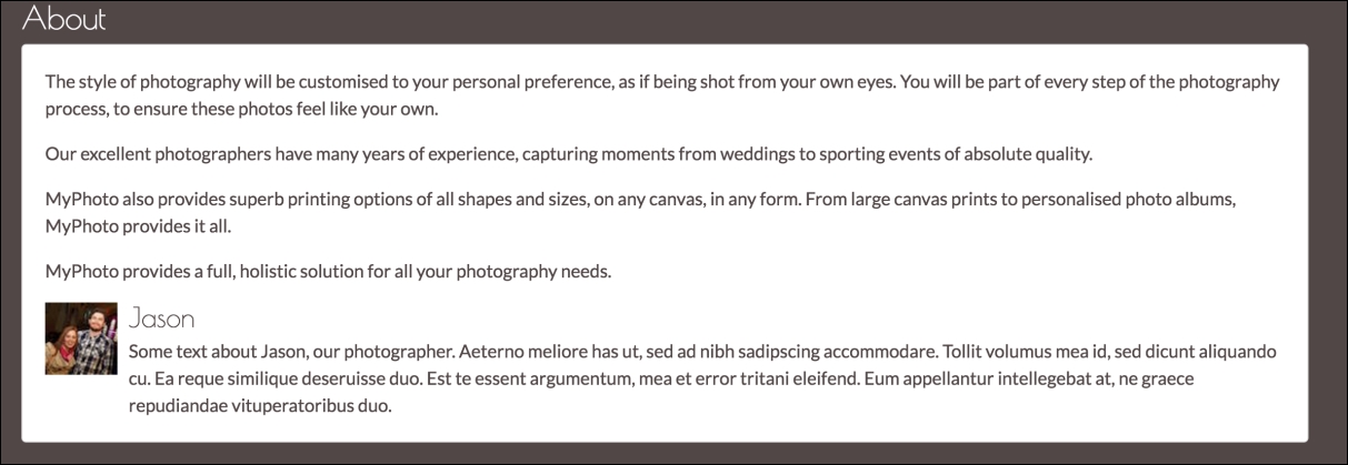
Figure 4.21: Using Bootstrap's media objects to add a photographer profile to MyPhoto's About Us section.
Instead of top aligning our media element, we could also:
- Middle align the
mediaelement usingmedia-left media-middle. - Bottom align the
mediaelement usingmedia-left media-bottom.
Of course, media elements do not need to appear on their own. Instead, they can be both nested and/or combined into lists. To nest a media element, simply place the child element inside the parent's body element (recall from our example above that body elements are denoted using the
media-heading
class).
Lists of media elements are created using the
media-list
class. Simply apply it to a list element (ul or ol tag), and use the media class in conjunction with the individual list items (li tags).