Table of Contents for
Bootstrap 4 – Responsive Web Design
 Bootstrap 4 – Responsive Web Design
Published by
Packt Publishing, 2017
Bootstrap 4 – Responsive Web Design
Published by
Packt Publishing, 2017
- Cover
- Table of Contents
- Bootstrap 4 – Responsive Web Design
- Bootstrap 4 – Responsive Web Design
- Credits
- Preface
- What you need for this learning path
- Who this learning path is for
- Reader feedback
- Customer support
- 1. Module 1
- 1. Getting Started
- Setting up the framework
- Building our first Bootstrap example
- Optionally using the CDN setup
- Community activity
- Bootstrap and web applications
- Browser compatibility
- Summary
- 2. Creating a Solid Scaffolding
- Building our scaffolding
- Fluid container
- We need some style!
- Manipulating tables
- Like a boss!
- Final thoughts
- Summary
- 3. Yes, You Should Go Mobile First
- Bootstrap and the mobile-first design
- How to debug different viewports at the browser
- Cleaning up the mess
- Creating the landing page for different devices
- Summary
- 4. Applying the Bootstrap Style
- Summary
- 5. Making It Fancy
- Paying attention to your navigation
- Dropping it down
- Making an input grouping
- Getting ready for flexbox!
- Summary
- 6. Can You Build a Web App?
- Adding the navigation
- Do a grid again
- Playing the cards
- Implementing the main content
- Creating breadcrumbs
- Finishing with the right-hand-side content
- Summary
- 7. Of Course, You Can Build a Web App!
- Waiting for the progress bar
- Creating a settings page
- Summary
- 8. Working with JavaScript
- Awesome Bootstrap modals
- Creating our custom modal
- A tool for your tip
- Pop it all over
- Making the menu affix
- Finishing the web app
- Summary
- 9. Entering in the Advanced Mode
- The last navigation bar with flexbox
- Filling the main fluid content
- Filling the main content
- Overhead loading
- Fixing the toggle button for mobile
- Summary
- 10. Bringing Components to Life
- Fixing the mobile viewport
- Learning more advanced plugins
- Summary
- 11. Making It Your Taste
- Working with plugin customization
- The additional Bootstrap plugins
- Creating our Bootstrap plugin
- Defining the plugin methods
- Creating additional plugin methods
- Summary
- 2. Module 2
- 1. Introducing Bootstrap 4
- Summary
- 2. Using Bootstrap Build Tools
- Download the Bootstrap source files
- Setting up the blog project
- Setting up the JSON files
- Creating our first page template
- Summary
- 3. Jumping into Flexbox
- Ordering your Flexbox
- Wrapping your Flexbox
- Setting up the Bootstrap Flexbox layout grid
- Setting up a Flexbox project
- Designing a single blog post
- Summary
- 4. Working with Layouts
- Inserting rows into your layout
- Adding columns to your layout
- Choosing a column class
- Creating a simple three-column layout
- Mixing column classes for different devices
- Coding the blog home page
- Using responsive utility classes
- Summary
- 5. Working with Content
- Learning to use typography
- Customizing headings
- How to style images
- Coding tables
- Summary
- 6. Playing with Components
- Basic button examples
- Creating outlined buttons
- Checkbox and radio buttons
- Coding forms in Bootstrap 4
- Creating an inline form
- Adding validation to inputs
- Using the Jumbotron component
- Adding the Label component
- Using the Alerts component
- Using Cards for layout
- Updating the Blog index page
- How to use the Navs component
- Adding Breadcrumbs to a page
- Using the Pagination component
- How to use the List Group component
- Summary
- 7. Extending Bootstrap with JavaScript Plugins
- Coding Tooltips
- Avoiding collisions with our components
- Using Popover components
- Using the Collapse component
- Coding an Accordion with the Collapse component
- Coding a Bootstrap Carousel
- Summary
- 8. Throwing in Some Sass
- Using Sass in the blog project
- Importing partials in Sass
- Creating a collection of variables
- Customizing components
- Writing a theme
- Summary
- 9. Migrating from Version 3
- Big changes in version 4
- Updating your variables
- Additional global changes
- Other font updates
- Migrating components
- Migrating JavaScript
- Miscellaneous migration changes
- Summary
- 3. Module 3
- 1. Revving Up Bootstrap
- What Bootstrap 4 Alpha 4 has to offer
- Setting up our project
- Summary
- 2. Making a Style Statement
- Image elements
- Responsive utilities
- Helper classes
- Text alignment and transformation
- Summary
- 3. Building the Layout
- Adding Bootstrap components
- Summary
- 4. On Navigation, Footers, Alerts, and Content
- Improving navigation using Scrollspy
- Customizing scroll speed
- Icons
- Using and customizing alerts
- Creating a footer
- Creating and customizing forms
- Form validation
- Progress indicators
- Adding content using media objects
- Figures
- Quotes
- Abbreviations
- Summary
- 5. Speeding Up Development Using jQuery Plugins
- Enhanced pagination using bootpag
- Displaying images using Bootstrap Lightbox
- Improving our price list with DataTables
- Summary
- 6. Customizing Your Plugins
- Customizing plugins
- Writing a custom Bootstrap jQuery plugin
- Summary
- 7. Integrating Bootstrap with Third-Party Plugins
- Hover
- Summary
- 8. Optimizing Your Website
- Minifying CSS and JavaScript
- Introducing Grunt
- Running tasks automatically
- Stripping our website of unused CSS
- JavaScript file concatenation
- Summary
- 9. Integrating with AngularJS and React
- Introducing React
- Summary
- Bibliography
- Index
One important feature missing from our Events section is the ability to include images that illustrate an event (or provide additional information). Sure, you can add images using the img tag, but that may not be very practical, as the image size will be limited by the container's dimensions.
In this section, we will demonstrate how we can overcome this limitation by allowing users to enlarge images as they click on them, without redirecting them away from our page. To this end, go ahead and embed one image with each event (see Figure 5.8). Each image should be aligned to the left of the event description, have a width of 80, and a height of 45:
    <div id="page-1">
        <h3>My Sample Event #1</h3>
        <p>
            <img src="images/event1.jpg" align="left" width="80"
            height="45"/>
            Lorem ipsum dolor sit amet, consectetur adipiscing elit.
            Curabitur leo dolor,

            fringilla vel lacus at, auctor finibus ipsum. Lorem ipsum dolor
            sit amet,

            consectetur adipiscing elit. Morbi quis arcu lorem. Vivamus
            elementum convallis

            enim sagittis tincidunt. Nunc feugiat mollis risus non dictum.
            Nam commodo nec

            sapien a vestibulum. Duis et tellus cursus, laoreet ante non,
            mollis sem.

            Nullam vulputate justo nisi, sit amet bibendum ligula varius
            id.

</p>
        <h3>My Sample Event #2</h3>
        <p>
            <img src="images/event2.jpg" align="left" width="80"
            height="45"/>
            Lorem ipsum dolor sit amet, consectetur adipiscing elit.
            Curabitur leo dolor,

            fringilla vel lacus at, auctor finibus ipsum. Lorem ipsum
            dolor sit amet,

            consectetur adipiscing elit. Morbi quis arcu lorem. Vivamus
            elementum convallis

            enim sagittis tincidunt. Nunc feugiat mollis risus non dictum.
            Nam commodo nec

            sapien a vestibulum. Duis et tellus cursus, laoreet ante non,
            mollis sem.

            Nullam vulputate justo nisi, sit amet bibendum ligula varius
            id.

        </p>

    </div>
As you save the preceding markup and refresh the page, you will notice that the images are not very nicely aligned with the text. They appear somewhat squashed. We can improve their appearance by adding some spacing between the images, the text, and the top of the container. To do this, go ahead and add a top margin of 0.5em and a right margin of 1em to each image within our services-events-content container:
    #services-events-content div img {
        margin-top: 0.5em;
        margin-right: 1em;
}Take a look at the following screenshot:
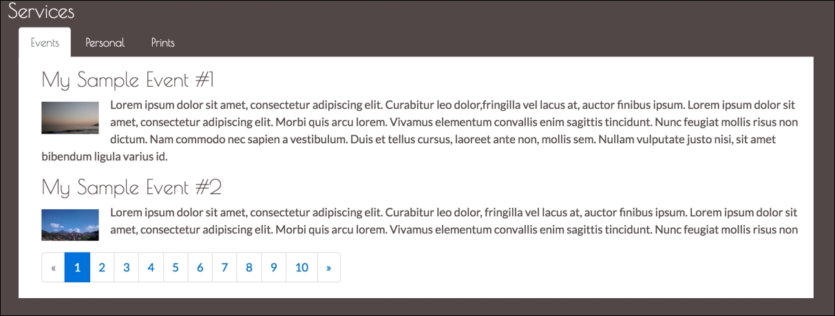
Figure 5.8: Sample images accompanying each event description. The images are left-aligned and have a dimension of 80 x 45.
One popular third-party library that allows users to enlarge the images embedded within the event description is Bootstrap Lightbox, available via GitHub at https://github.com/jbutz/bootstrap-lightbox. Unfortunately, the plugin is no longer maintained and ships with several unfixed bugs and usability issues. Upon downloading it, you will find that it does not immediately work out of the box. Luckily, DJ Interactive ( http://djinteractive.co.uk) extended the original Bootstrap Lightbox through Lightbox for Bootstrap. Also available via GitHub ( https://github.com/djinteractive/Lightbox-for-Bootstrap), the plugin is published under the Creative Commons Attribution 2.5 license. This means that the plugin is free for use under the condition that the author of the plugin is properly attributed.
Go ahead and download Lightbox for Bootstrap, and include both its JavaScript and CSS files within the
head
of our HTML document:
    <script src="bower_components/lightbox-for-bootstrap
    /js/bootstrap.lightbox.js"></script>
    <link rel="stylesheet" href="bower_components/bootstrap-lightbox
    /css/bootstrap.lightbox.css" />
Using the plugin to display our images within a lightbox fortunately requires hardly any modification to our existing markup. The only two steps to undertake are as follows:
- Place our existing
imgelement inside a container element that has athumbnailclass anddata-toggleattribute. - Apply the
thumbnailclass anddata-targetattribute to ourimgelement:<p> <span class="thumbnails" data-toggle="lightbox"> <img src="images/event1.jpg" align="left" width="80" height="45" class="thumbnail" data-target="images/event1.jpg"/> </span> Lorem ipsum dolor sit amet, consectetur adipiscing elit. Curabitur leo dolor,fringilla vel lacus at, auctor finibus ipsum. Lorem ipsum dolor sit amet, consectetur adipiscing elit. Morbi quis arcu lorem. Vivamus elementum convallis enim sagittis tincidunt. Nunc feugiat mollis risus non dictum. Nam commodo nec sapien a vestibulum. Duis et tellus cursus, laoreet ante non, mollis sem. Nullam vulputate justo nisi, sit amet bibendum ligula varius id. </p>
The
data-target
attribute tells Lightbox for Bootstrap where our larger image is located. It is important to note that the src attribute of our image element has no effect on the image that will be displayed within the lightbox; only the data-target attribute determines this. As such, we could display a thumbnail, which then actually links to a different lightbox image (although this would make little sense and be grossly misleading). Unsurprisingly, the data-toggle attribute is used to identify the element that serves as the lightbox toggle, in our case, the toggle is our 80 x 45 image. However, it is important to note that toggles do not need to be image elements. Any element can become a lightbox toggle.
Last but not least, the thumbnails class serves as selectors for the lightbox plugin. Without them, the desired functionality would not work. Take a look at the following screenshot:

Figure 5.9: An enlarged image displayed using Lightbox for Bootstrap.
To summarize, our Events section should now look as follows:
    <div class="container">
        <div class="row" style="margin: 1em;">
            <div id="services-events-content">
                <div
 id="page-1">
                    <h3>My Sample Event #1</h3>
                    <p>
                        <span class="thumbnails" data-toggle="lightbox">
                        <img src="images/event1.jpg" align="left"
                        width="80" height="45"
                        class="thumbnail" data-target="images/event1.jpg"/>
                    </span>

                    Lorem ipsum...

</p>
                    <h3>My Sample Event #2</h3>
                    <p>
                        <span class="thumbnails" data-toggle="lightbox">
                            <img src="images/event2.jpg" align="left"
                            width="80" height="45"
                            class="thumbnail"
                            data-target="images/event2.jpg"/>
                        </span>  Lorem ipsum...
                    </p>

                </div>

<div
 id="page-2">
                    <h3>My Sample Event #3</h3>
                    <p>
                        <span class="thumbnails" data-toggle="lightbox">
                        <img src="images/event3.jpg" align="left"
                        width="80" height="45"
                        class="thumbnail" data-target="images/event3.jpg"/>
                        </span>

                Lorem ipsum...

</p>

                </div>

            </div>

            <div
 id="services-events-pagination"></div>

        </div>

</div>