Table of Contents for
Bootstrap 4 – Responsive Web Design
 Bootstrap 4 – Responsive Web Design
Published by
Packt Publishing, 2017
Bootstrap 4 – Responsive Web Design
Published by
Packt Publishing, 2017
- Cover
- Table of Contents
- Bootstrap 4 – Responsive Web Design
- Bootstrap 4 – Responsive Web Design
- Credits
- Preface
- What you need for this learning path
- Who this learning path is for
- Reader feedback
- Customer support
- 1. Module 1
- 1. Getting Started
- Setting up the framework
- Building our first Bootstrap example
- Optionally using the CDN setup
- Community activity
- Bootstrap and web applications
- Browser compatibility
- Summary
- 2. Creating a Solid Scaffolding
- Building our scaffolding
- Fluid container
- We need some style!
- Manipulating tables
- Like a boss!
- Final thoughts
- Summary
- 3. Yes, You Should Go Mobile First
- Bootstrap and the mobile-first design
- How to debug different viewports at the browser
- Cleaning up the mess
- Creating the landing page for different devices
- Summary
- 4. Applying the Bootstrap Style
- Summary
- 5. Making It Fancy
- Paying attention to your navigation
- Dropping it down
- Making an input grouping
- Getting ready for flexbox!
- Summary
- 6. Can You Build a Web App?
- Adding the navigation
- Do a grid again
- Playing the cards
- Implementing the main content
- Creating breadcrumbs
- Finishing with the right-hand-side content
- Summary
- 7. Of Course, You Can Build a Web App!
- Waiting for the progress bar
- Creating a settings page
- Summary
- 8. Working with JavaScript
- Awesome Bootstrap modals
- Creating our custom modal
- A tool for your tip
- Pop it all over
- Making the menu affix
- Finishing the web app
- Summary
- 9. Entering in the Advanced Mode
- The last navigation bar with flexbox
- Filling the main fluid content
- Filling the main content
- Overhead loading
- Fixing the toggle button for mobile
- Summary
- 10. Bringing Components to Life
- Fixing the mobile viewport
- Learning more advanced plugins
- Summary
- 11. Making It Your Taste
- Working with plugin customization
- The additional Bootstrap plugins
- Creating our Bootstrap plugin
- Defining the plugin methods
- Creating additional plugin methods
- Summary
- 2. Module 2
- 1. Introducing Bootstrap 4
- Summary
- 2. Using Bootstrap Build Tools
- Download the Bootstrap source files
- Setting up the blog project
- Setting up the JSON files
- Creating our first page template
- Summary
- 3. Jumping into Flexbox
- Ordering your Flexbox
- Wrapping your Flexbox
- Setting up the Bootstrap Flexbox layout grid
- Setting up a Flexbox project
- Designing a single blog post
- Summary
- 4. Working with Layouts
- Inserting rows into your layout
- Adding columns to your layout
- Choosing a column class
- Creating a simple three-column layout
- Mixing column classes for different devices
- Coding the blog home page
- Using responsive utility classes
- Summary
- 5. Working with Content
- Learning to use typography
- Customizing headings
- How to style images
- Coding tables
- Summary
- 6. Playing with Components
- Basic button examples
- Creating outlined buttons
- Checkbox and radio buttons
- Coding forms in Bootstrap 4
- Creating an inline form
- Adding validation to inputs
- Using the Jumbotron component
- Adding the Label component
- Using the Alerts component
- Using Cards for layout
- Updating the Blog index page
- How to use the Navs component
- Adding Breadcrumbs to a page
- Using the Pagination component
- How to use the List Group component
- Summary
- 7. Extending Bootstrap with JavaScript Plugins
- Coding Tooltips
- Avoiding collisions with our components
- Using Popover components
- Using the Collapse component
- Coding an Accordion with the Collapse component
- Coding a Bootstrap Carousel
- Summary
- 8. Throwing in Some Sass
- Using Sass in the blog project
- Importing partials in Sass
- Creating a collection of variables
- Customizing components
- Writing a theme
- Summary
- 9. Migrating from Version 3
- Big changes in version 4
- Updating your variables
- Additional global changes
- Other font updates
- Migrating components
- Migrating JavaScript
- Miscellaneous migration changes
- Summary
- 3. Module 3
- 1. Revving Up Bootstrap
- What Bootstrap 4 Alpha 4 has to offer
- Setting up our project
- Summary
- 2. Making a Style Statement
- Image elements
- Responsive utilities
- Helper classes
- Text alignment and transformation
- Summary
- 3. Building the Layout
- Adding Bootstrap components
- Summary
- 4. On Navigation, Footers, Alerts, and Content
- Improving navigation using Scrollspy
- Customizing scroll speed
- Icons
- Using and customizing alerts
- Creating a footer
- Creating and customizing forms
- Form validation
- Progress indicators
- Adding content using media objects
- Figures
- Quotes
- Abbreviations
- Summary
- 5. Speeding Up Development Using jQuery Plugins
- Enhanced pagination using bootpag
- Displaying images using Bootstrap Lightbox
- Improving our price list with DataTables
- Summary
- 6. Customizing Your Plugins
- Customizing plugins
- Writing a custom Bootstrap jQuery plugin
- Summary
- 7. Integrating Bootstrap with Third-Party Plugins
- Hover
- Summary
- 8. Optimizing Your Website
- Minifying CSS and JavaScript
- Introducing Grunt
- Running tasks automatically
- Stripping our website of unused CSS
- JavaScript file concatenation
- Summary
- 9. Integrating with AngularJS and React
- Introducing React
- Summary
- Bibliography
- Index
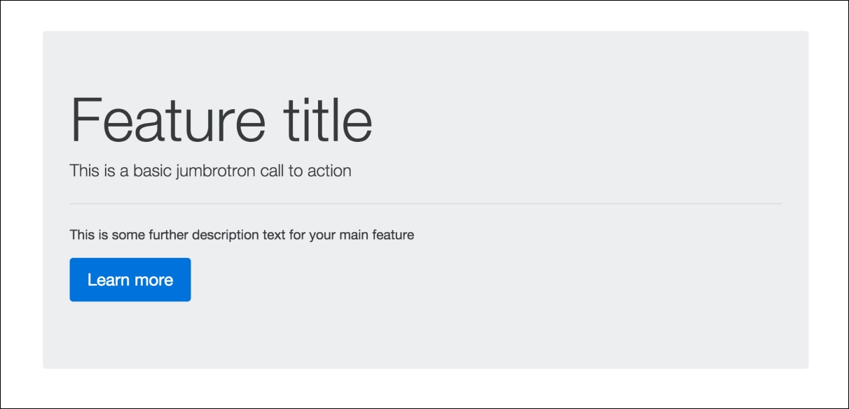
If you're new to Bootstrap, you may be asking yourself what the heck is a Jumbotron component. Jumbotron is used to feature a block of content, usually at the top of your page. This is your standard main feature block that you'll see on a number of websites. If you require something more sophisticated than a simple page title, Jumbotron is the component you'll want to use. Let's take a quick look at the code required to create this component:
<div class="jumbotron">
  <h1 class="display-3">Feature title</h1>
  <p class="lead">This is a basic jumbrotron call to action</p>
  <hr class="m-y-2">
  <p>This is some further description text for your main feature</p>
  <p class="lead">
    <a class="btn btn-primary btn-lg" href="#" role="button">Learn more</a>
  </p>
</div>
There are some new CSS classes here that we need to review, as well as some existing ones we have already learned about. Let's break down what's happening in the code:
- The Jumbotron component is based off a
<div>with a CSS class named.jumbotron. Within this<div>, you can pretty much use whatever text formatting tags you like. However, there are a few basics you should include to make it look good. - The first tag you'll see is the
<h1>with a class of.display-3on it. Since the Jumbotron is more of a "display" component, you'll want to beef up the size of your<h1>by using the optional class we learned about earlier in the book. - Next, you'll see a simple
<p>tag for the feature's tagline. On that tag, there is a class named.lead. This class increases the base font size by 25% and sets thefont-weightto300which is a lighter weight. Again, this gives the Jumbotron component more of a "feature" like look and feel. - After the tagline text, you'll see an
<hr>tag with a class of.m-y-2on it. If you remember, this is a utility spacing class. The-yin this case will add amarginabove and below the<hr>tag. - Next we have another
<p>tag with some additional descriptive text in it. - Finally, we have a
<button>wrapped in a<p>tag so that there is a conclusion to the call to action in the Jumbotron block. Note that the user of the.btn-lgclass will produce a larger-sized button.
After you've coded up your Jumbotron component, it should look like this in the browser:
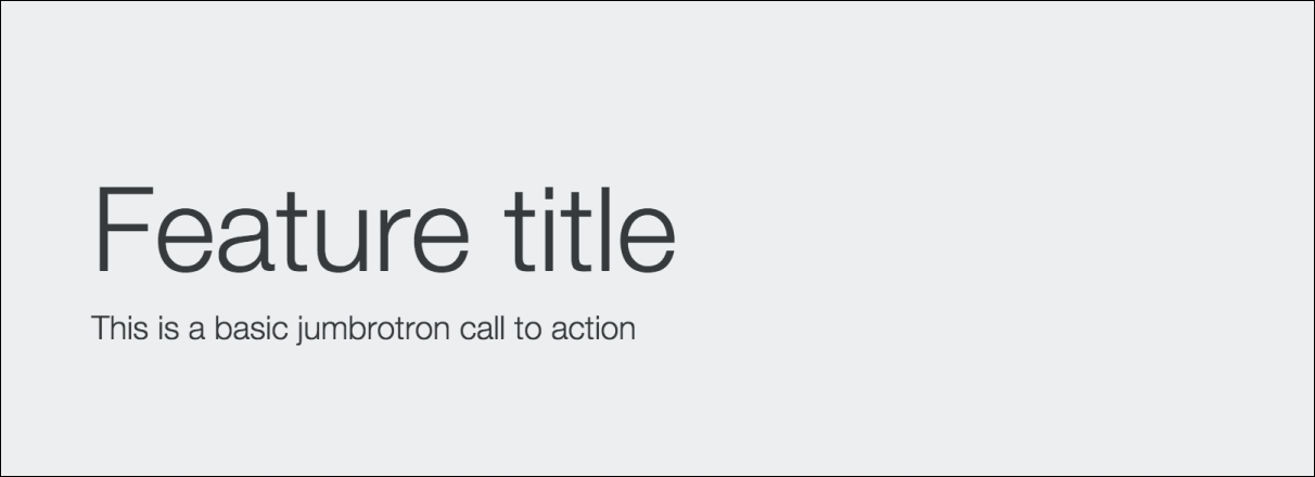
By default, the Jumbotron component will stretch to fit the width of the column it is contained within. In most cases, you'll likely want it to span the entire width of your page. However, in some cases, you might want a Jumbotron to stretch from one edge of the browser to the other without any horizontal padding on it. If this is the case, you need to add the .jumbotron-fluid class to the main <div> and make sure it is outside of a Bootstrap .container. Let's take a look at the following code to see what I mean:
<div class="jumbotron jumbotron-fluid">
  <div class="container">
    <h1 class="display-3">Feature title</h1>
      <p class="lead">This is a basic jumbrotron call to action</p>
  </div>
</div>
As you can see, the .container <div> is now inside of the Jumbotron <div>. This is how you remove the horizontal padding on the section. Once completed, it should look like this in the browser:
That concludes the use of the Jumbotron component in Bootstrap 4. Next let's move on to learning how to use the Label component.