Table of Contents for
Bootstrap 4 – Responsive Web Design
 Bootstrap 4 – Responsive Web Design
Published by
Packt Publishing, 2017
Bootstrap 4 – Responsive Web Design
Published by
Packt Publishing, 2017
- Cover
- Table of Contents
- Bootstrap 4 – Responsive Web Design
- Bootstrap 4 – Responsive Web Design
- Credits
- Preface
- What you need for this learning path
- Who this learning path is for
- Reader feedback
- Customer support
- 1. Module 1
- 1. Getting Started
- Setting up the framework
- Building our first Bootstrap example
- Optionally using the CDN setup
- Community activity
- Bootstrap and web applications
- Browser compatibility
- Summary
- 2. Creating a Solid Scaffolding
- Building our scaffolding
- Fluid container
- We need some style!
- Manipulating tables
- Like a boss!
- Final thoughts
- Summary
- 3. Yes, You Should Go Mobile First
- Bootstrap and the mobile-first design
- How to debug different viewports at the browser
- Cleaning up the mess
- Creating the landing page for different devices
- Summary
- 4. Applying the Bootstrap Style
- Summary
- 5. Making It Fancy
- Paying attention to your navigation
- Dropping it down
- Making an input grouping
- Getting ready for flexbox!
- Summary
- 6. Can You Build a Web App?
- Adding the navigation
- Do a grid again
- Playing the cards
- Implementing the main content
- Creating breadcrumbs
- Finishing with the right-hand-side content
- Summary
- 7. Of Course, You Can Build a Web App!
- Waiting for the progress bar
- Creating a settings page
- Summary
- 8. Working with JavaScript
- Awesome Bootstrap modals
- Creating our custom modal
- A tool for your tip
- Pop it all over
- Making the menu affix
- Finishing the web app
- Summary
- 9. Entering in the Advanced Mode
- The last navigation bar with flexbox
- Filling the main fluid content
- Filling the main content
- Overhead loading
- Fixing the toggle button for mobile
- Summary
- 10. Bringing Components to Life
- Fixing the mobile viewport
- Learning more advanced plugins
- Summary
- 11. Making It Your Taste
- Working with plugin customization
- The additional Bootstrap plugins
- Creating our Bootstrap plugin
- Defining the plugin methods
- Creating additional plugin methods
- Summary
- 2. Module 2
- 1. Introducing Bootstrap 4
- Summary
- 2. Using Bootstrap Build Tools
- Download the Bootstrap source files
- Setting up the blog project
- Setting up the JSON files
- Creating our first page template
- Summary
- 3. Jumping into Flexbox
- Ordering your Flexbox
- Wrapping your Flexbox
- Setting up the Bootstrap Flexbox layout grid
- Setting up a Flexbox project
- Designing a single blog post
- Summary
- 4. Working with Layouts
- Inserting rows into your layout
- Adding columns to your layout
- Choosing a column class
- Creating a simple three-column layout
- Mixing column classes for different devices
- Coding the blog home page
- Using responsive utility classes
- Summary
- 5. Working with Content
- Learning to use typography
- Customizing headings
- How to style images
- Coding tables
- Summary
- 6. Playing with Components
- Basic button examples
- Creating outlined buttons
- Checkbox and radio buttons
- Coding forms in Bootstrap 4
- Creating an inline form
- Adding validation to inputs
- Using the Jumbotron component
- Adding the Label component
- Using the Alerts component
- Using Cards for layout
- Updating the Blog index page
- How to use the Navs component
- Adding Breadcrumbs to a page
- Using the Pagination component
- How to use the List Group component
- Summary
- 7. Extending Bootstrap with JavaScript Plugins
- Coding Tooltips
- Avoiding collisions with our components
- Using Popover components
- Using the Collapse component
- Coding an Accordion with the Collapse component
- Coding a Bootstrap Carousel
- Summary
- 8. Throwing in Some Sass
- Using Sass in the blog project
- Importing partials in Sass
- Creating a collection of variables
- Customizing components
- Writing a theme
- Summary
- 9. Migrating from Version 3
- Big changes in version 4
- Updating your variables
- Additional global changes
- Other font updates
- Migrating components
- Migrating JavaScript
- Miscellaneous migration changes
- Summary
- 3. Module 3
- 1. Revving Up Bootstrap
- What Bootstrap 4 Alpha 4 has to offer
- Setting up our project
- Summary
- 2. Making a Style Statement
- Image elements
- Responsive utilities
- Helper classes
- Text alignment and transformation
- Summary
- 3. Building the Layout
- Adding Bootstrap components
- Summary
- 4. On Navigation, Footers, Alerts, and Content
- Improving navigation using Scrollspy
- Customizing scroll speed
- Icons
- Using and customizing alerts
- Creating a footer
- Creating and customizing forms
- Form validation
- Progress indicators
- Adding content using media objects
- Figures
- Quotes
- Abbreviations
- Summary
- 5. Speeding Up Development Using jQuery Plugins
- Enhanced pagination using bootpag
- Displaying images using Bootstrap Lightbox
- Improving our price list with DataTables
- Summary
- 6. Customizing Your Plugins
- Customizing plugins
- Writing a custom Bootstrap jQuery plugin
- Summary
- 7. Integrating Bootstrap with Third-Party Plugins
- Hover
- Summary
- 8. Optimizing Your Website
- Minifying CSS and JavaScript
- Introducing Grunt
- Running tasks automatically
- Stripping our website of unused CSS
- JavaScript file concatenation
- Summary
- 9. Integrating with AngularJS and React
- Introducing React
- Summary
- Bibliography
- Index
Now that we know what Bootstrap has to offer, let us set up our project:
- Create a new project directory named
MyPhoto. This will become our project root directory. - Create a blank
index.htmlfile and insert the following HTML code:<!DOCTYPE html> <html lang="en"> <head> <meta charset="utf-8"> <meta name="viewport" content="width=device-width, initial-scale=1, shrink-to-fit=no"> <meta http-equiv="x-ua-compatible" content="ie=edge"> <title>MyPhoto</title> </head> <body> <div class="alert alert-success"> Hello World! </div> </body> </html>Note the three
metatags. The first tag tells the browser that the document in question isutf-8encoded. Since Bootstrap optimizes its content for mobile devices, the subsequentmetatag is required to help with viewport scaling. The lastmetatag forces the document to be rendered using the latest document rendering mode available if viewed in Internet Explorer. - Open the
index.htmlin your browser. You should see just a blank page with the words Hello World.
Now it is time to include Bootstrap. At its core, Bootstrap is a glorified CSS style sheet. Within that style sheet, Bootstrap exposes very powerful features of CSS with an easy-to-use syntax. It being a style sheet, you include it in your project as you would with any other style sheet that you might develop yourself. That is, open the index.html and directly link it to the style sheet.
Note
Viewport scaling
The term "viewport" refers to the available display size to render the contents of a page. The viewport meta tag allows you to define this available size. Viewport scaling using meta tags was first introduced by Apple and, at the time of writing, is supported by all major browsers.
Using the width parameter, we can define the exact width of the user's viewport. For example, <meta name="viewport" content="width=320px"> will instruct the browser to set the viewport's width to 320px. The ability to control the viewport's width is useful when developing mobile-friendly websites; by default, mobile browsers will attempt to fit the entire page onto their viewports by zooming out as far as possible. This allows users to view and interact with websites that have not been designed to be viewed on mobile devices. However, as Bootstrap embraces a mobile-first design philosophy, a zoom out will, in fact, result in undesired side-effects. For example, breakpoints (which we will discuss in
Chapter 2
, Making a Style Statement) will no longer work as intended, as they now deal with the zoomed-out equivalent of the page in question. This is why explicitly setting the viewport width is so important. By writing content="width=device-width, initial-scale=1, shrink-to-fit=no", we are telling the browser the following:
- We want to set the viewport's width equal to the actual device's screen width.
- We do not want any zoom, initially.
- We do not wish to shrink the content to fit the viewport.
For now, we will use the Bootstrap builds hosted on Bootstrap's official Content Delivery Network (CDN). This is done by including the following HTML tag into the head of your HTML document (the head of your HTML document refers to the contents between the <head> opening tag and the </head> closing tag):
    <link rel="stylesheet" href="https://maxcdn.bootstrapcdn.com/
    bootstrap/4.0.0-alpha.4/css/bootstrap.min.css">
Bootstrap relies on jQuery, a JavaScript framework that provides a layer of abstraction in an effort to simplify the most common JavaScript operations (such as element selection and event handling). Therefore, before we include the Bootstrap JavaScript file, we must first include jQuery. Both inclusions should occur just before the </body> closing tag:
    <script src="https://ajax.googleapis.com/ajax/libs/jquery/2.1.4
    /jquery.min.js">
    </script>
    <script src="https://maxcdn.bootstrapcdn.com/bootstrap/4.0.0-alpha.4
    /js/bootstrap.min.js"></script>
Note that, while these scripts could, of course, be loaded at the top of the page, loading scripts at the end of the document is considered best practice to speed up page loading times and to avoid JavaScript issues preventing the page from being rendered. The reason behind this is that browsers do not download all dependencies in parallel (although a certain number of requests are made asynchronously, depending on the browser and the domain). Consequently, forcing the browser to download dependencies early on will block page rendering until these assets have been downloaded. Furthermore, ensuring that your scripts are loaded last will ensure that once you invoke Document Object Model (DOM) operations in your scripts, you can be sure that your page's elements have already been rendered. As a result, you can avoid checks that ensure the existence of given elements.
Note
What is a Content Delivery Network?
The objective behind any Content Delivery Network (CDN) is to provide users with content that is highly available. This means that a CDN aims to provide you with content, without this content ever (or rarely) becoming unavailable. To this end, the content is often hosted using a large, distributed set of servers. The BootstrapCDN basically allows you to link to the Bootstrap style sheet so that you do not have to host it yourself.
Save your changes and reload the index.html in your browser. The Hello World string should now contain a green background:
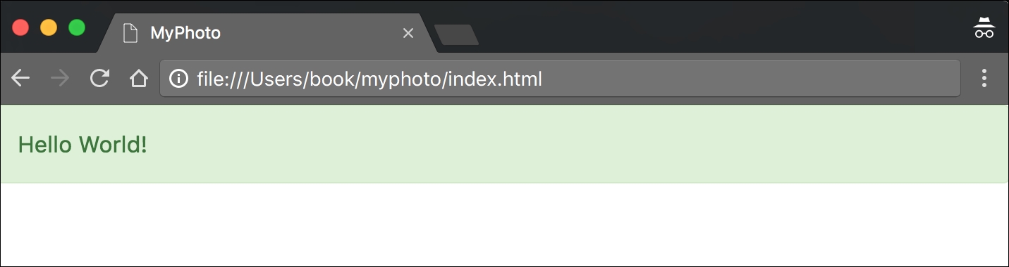
Figure 1.8: Our "Hello World" styled using Bootstrap 4
Now that the Bootstrap framework has been included in our project, open your browser's developer console (if using Chrome on Microsoft Windows, press Ctrl + Shift + I; on Mac OS X you can press cmd + alt + I). As Bootstrap requires another third-party library Tether, for displaying popovers and tooltips, the developer console will display an error (Figure 1.6). Take a look at the following screenshot:
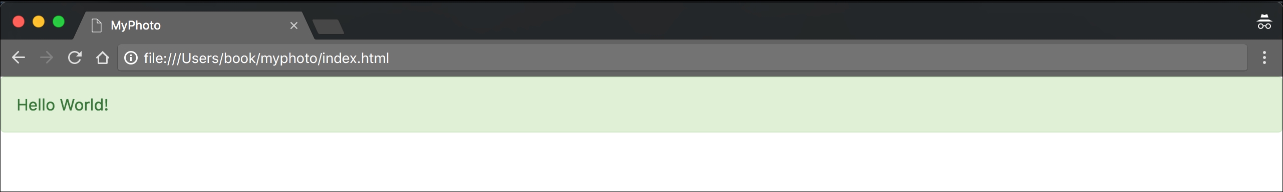
Figure 1.9: Chrome's Developer Tools can be opened by going to View, selecting Developer, and then clicking on Developer Tools. At the bottom of the page, a new view will appear. Under the Console tab, an error will indicate an unmet dependency.
Tether is available via the CloudFare CDN, and consists of both a CSS file and a JavaScript file. As before, we should include the JavaScript file at the bottom of our document while we reference Tether's style sheet from inside our document head:
    <!DOCTYPE html>
    <html lang="en">
    <head>
        <meta charset="utf-8">
        <meta name="viewport" content="width=device-width, initial-
        scale=1, shrink-to-fit=no">
        <meta http-equiv="x-ua-compatible" content="ie=edge">
        <title>MyPhoto</title>
        <link rel="stylesheet" href="https://maxcdn.bootstrapcdn.com/
        bootstrap/4.0.0-alpha.4/css/bootstrap.min.css">
        <link rel="stylesheet" href="https://cdnjs.cloudflare.com/ajax/
        libs/tether/1.3.1/css/tether.min.css">
    </head>
    <body>
        <div class="alert alert-success">
            Hello World!
        </div>
        <script src="https://ajax.googleapis.com/ajax/libs/jquery/
        2.1.4/jquery.min.js"></script>
        <script src="https://cdnjs.cloudflare.com/ajax/libs/tether/
        1.3.1/js/tether.min.js"></script>
        <script src="https://maxcdn.bootstrapcdn.com/bootstrap/4.0.0-
        alpha.4/js/bootstrap.min.js"></script>
    </body>
    </html>
While CDNs are an important resource, there are several reasons why, at times, using a third-party CDN may not be desirable:
- CDNs introduce an additional point of failure, as you now rely on third-party servers.
- The privacy and security of users may be compromised, as there is no guarantee that the CDN provider does not inject malicious code into the libraries that are being hosted. Nor can one be certain that the CDN does not attempt to track its users.
- Certain CDNs may be blocked by the Internet Service Providers of users in different geographical locations.
- Offline development will not be possible when relying on a remote CDN.
- You will not be able to optimize the files hosted by your CDN. This loss of control may affect your website's performance (although typically you are more often than not offered an optimized version of the library through the CDN).
Instead of relying on a CDN, we could manually download the jQuery, Tether, and Bootstrap project files. We could then copy these builds into our project root and link them to the distribution files. The disadvantage of this approach is the fact that maintaining a manual collection of dependencies can quickly become very cumbersome, and next to impossible as your website grows in size and complexity. As such, we will not manually download the Bootstrap build. Instead, we will let Bower do it for us. Bower is a package management system, that is, a tool that you can use to manage your website's dependencies. It automatically downloads, organizes, and (upon command) updates your website's dependencies. To install Bower, head over to http://bower.io/.
Note
How do I install Bower?
Before you can install Bower, you will need two other tools: Node.js and Git. The latter is a version control tool, in essence; it allows you to manage different versions of your software. To install Git, head over to http://git-scm.com/ and select the installer appropriate for your operating system. NodeJS is a JavaScript runtime environment needed for Bower to run. To install it, simply download the installer from the official NodeJS website: https://nodejs.org/Once you have successfully installed Git and NodeJS, you are ready to install Bower. Simply type the following command into your terminal:
npm install -g bower
This will install Bower for you, using the JavaScript package manager npm, which happens to be used by, and is installed with, NodeJS.
Once Bower has been installed, open up your terminal, navigate to the project root folder you created earlier, and fetch the bootstrap build:
bower install bootstrap#v4.0.0-alpha.4
This will create a new folder structure in our project root:
|__bower_components
  |__bootstrap
    |__Gruntfile.js
    |__LICENSE
    |__README.md
    |__bower.json
    |__dist
    |__fonts
    |__grunt
    |__js
    |__less
    |__package.js
    |__package.json
We will explain all of these various files and directories later on in this book. For now, you can safely ignore everything except for the dist directory inside bower_components/bootstrap/. Go ahead and open the dist directory. You should see three sub directories:
cssfontsjs
The name dist stands for distribution. Typically, the distribution directory contains the production-ready code that users can deploy. As its name implies, the css directory inside dist includes the ready-for-use style sheets. Likewise, the js directory contains the JavaScript files that compose Bootstrap. Lastly, the fonts directory holds the font assets that come with Bootstrap.
To reference the local Bootstrap CSS file in our index.html, modify the href attribute of the link tag that points to the bootstrap.min.css:
    <link rel="stylesheet" href="bower_components/bootstrap/dist/css
    /bootstrap.min.css">
Let's do the same for the Bootstrap JavaScript file:
<script src="bower_components/bootstrap/dist/js/bootstrap.min.js"></script>
Repeat this process for both jQuery and Tether. To install jQuery using Bower, use the following command:
bower install jquery
Just as before, a new directory will be created inside the bower_components directory:
|__bower_components
  |__jquery
    |__AUTHORS.txt
    |__LICENSE.txt
    |__bower.json
    |__dist
    |__sizzle
    |__src
Again, we are only interested in the contents of the dist directory, which, among other files, will contain the compressed jQuery build jquery.min.js.
Reference this file by modifying the src attribute of the script tag that currently points to Google's jquery.min.js by replacing the URL with the path to our local copy of jQuery:
<script src="bower_components/jquery/dist/jquery.min.js"></script>
Last but not least, repeat the steps already outlined for Tether:
bower install tether
Once the installation completes, a similar folder structure than the ones for Bootstrap and jQuery will have been created. Verify the contents of bower_components/tether/dist and replace the CDN Tether references in our document with their local equivalent.
The final index.html should now look as follows:
    <!DOCTYPE html>
    <html lang="en">
    <head>
        <meta charset="utf-8">
        <meta name="viewport" content="width=device-width, initial-scale=1,
        shrink-to-fit=no">
        <meta http-equiv="x-ua-compatible" content="ie=edge">
        <title>MyPhoto</title>
        <link rel="stylesheet" href="bower_components/bootstrap/dist/css
        /bootstrap.min.css">
        <link rel="stylesheet" href="bower_components/tether/dist/css
        /tether.min.css">
    </head>
    <body>
        <div class="alert alert-success">
            Hello World!
        </div>
        <script src="bower_components/jquery/dist/jquery.min.js"></script>
        <script src="bower_components/tether/dist/js/tether.min.js">
        </script>
        <script src="bower_components/bootstrap/dist/js/bootstrap.min.js">
        </script>
    </body>
    </html>
Refresh the index.html in your browser to make sure that everything works.
What IDE and browser should I be using when following the examples in this book?
While we recommend a JetBrains IDE or Sublime Text along with Google Chrome, you are free to use whatever tools and browser you like. Our taste in IDE and browser is subjective on this matter. However, keep in mind that Bootstrap 4 does not support Internet Explorer 8 or below. As such, if you do happen to use Internet Explorer 8, you should upgrade it to the latest version.