Table of Contents for
Bootstrap 4 – Responsive Web Design
 Bootstrap 4 – Responsive Web Design
Published by
Packt Publishing, 2017
Bootstrap 4 – Responsive Web Design
Published by
Packt Publishing, 2017
- Cover
- Table of Contents
- Bootstrap 4 – Responsive Web Design
- Bootstrap 4 – Responsive Web Design
- Credits
- Preface
- What you need for this learning path
- Who this learning path is for
- Reader feedback
- Customer support
- 1. Module 1
- 1. Getting Started
- Setting up the framework
- Building our first Bootstrap example
- Optionally using the CDN setup
- Community activity
- Bootstrap and web applications
- Browser compatibility
- Summary
- 2. Creating a Solid Scaffolding
- Building our scaffolding
- Fluid container
- We need some style!
- Manipulating tables
- Like a boss!
- Final thoughts
- Summary
- 3. Yes, You Should Go Mobile First
- Bootstrap and the mobile-first design
- How to debug different viewports at the browser
- Cleaning up the mess
- Creating the landing page for different devices
- Summary
- 4. Applying the Bootstrap Style
- Summary
- 5. Making It Fancy
- Paying attention to your navigation
- Dropping it down
- Making an input grouping
- Getting ready for flexbox!
- Summary
- 6. Can You Build a Web App?
- Adding the navigation
- Do a grid again
- Playing the cards
- Implementing the main content
- Creating breadcrumbs
- Finishing with the right-hand-side content
- Summary
- 7. Of Course, You Can Build a Web App!
- Waiting for the progress bar
- Creating a settings page
- Summary
- 8. Working with JavaScript
- Awesome Bootstrap modals
- Creating our custom modal
- A tool for your tip
- Pop it all over
- Making the menu affix
- Finishing the web app
- Summary
- 9. Entering in the Advanced Mode
- The last navigation bar with flexbox
- Filling the main fluid content
- Filling the main content
- Overhead loading
- Fixing the toggle button for mobile
- Summary
- 10. Bringing Components to Life
- Fixing the mobile viewport
- Learning more advanced plugins
- Summary
- 11. Making It Your Taste
- Working with plugin customization
- The additional Bootstrap plugins
- Creating our Bootstrap plugin
- Defining the plugin methods
- Creating additional plugin methods
- Summary
- 2. Module 2
- 1. Introducing Bootstrap 4
- Summary
- 2. Using Bootstrap Build Tools
- Download the Bootstrap source files
- Setting up the blog project
- Setting up the JSON files
- Creating our first page template
- Summary
- 3. Jumping into Flexbox
- Ordering your Flexbox
- Wrapping your Flexbox
- Setting up the Bootstrap Flexbox layout grid
- Setting up a Flexbox project
- Designing a single blog post
- Summary
- 4. Working with Layouts
- Inserting rows into your layout
- Adding columns to your layout
- Choosing a column class
- Creating a simple three-column layout
- Mixing column classes for different devices
- Coding the blog home page
- Using responsive utility classes
- Summary
- 5. Working with Content
- Learning to use typography
- Customizing headings
- How to style images
- Coding tables
- Summary
- 6. Playing with Components
- Basic button examples
- Creating outlined buttons
- Checkbox and radio buttons
- Coding forms in Bootstrap 4
- Creating an inline form
- Adding validation to inputs
- Using the Jumbotron component
- Adding the Label component
- Using the Alerts component
- Using Cards for layout
- Updating the Blog index page
- How to use the Navs component
- Adding Breadcrumbs to a page
- Using the Pagination component
- How to use the List Group component
- Summary
- 7. Extending Bootstrap with JavaScript Plugins
- Coding Tooltips
- Avoiding collisions with our components
- Using Popover components
- Using the Collapse component
- Coding an Accordion with the Collapse component
- Coding a Bootstrap Carousel
- Summary
- 8. Throwing in Some Sass
- Using Sass in the blog project
- Importing partials in Sass
- Creating a collection of variables
- Customizing components
- Writing a theme
- Summary
- 9. Migrating from Version 3
- Big changes in version 4
- Updating your variables
- Additional global changes
- Other font updates
- Migrating components
- Migrating JavaScript
- Miscellaneous migration changes
- Summary
- 3. Module 3
- 1. Revving Up Bootstrap
- What Bootstrap 4 Alpha 4 has to offer
- Setting up our project
- Summary
- 2. Making a Style Statement
- Image elements
- Responsive utilities
- Helper classes
- Text alignment and transformation
- Summary
- 3. Building the Layout
- Adding Bootstrap components
- Summary
- 4. On Navigation, Footers, Alerts, and Content
- Improving navigation using Scrollspy
- Customizing scroll speed
- Icons
- Using and customizing alerts
- Creating a footer
- Creating and customizing forms
- Form validation
- Progress indicators
- Adding content using media objects
- Figures
- Quotes
- Abbreviations
- Summary
- 5. Speeding Up Development Using jQuery Plugins
- Enhanced pagination using bootpag
- Displaying images using Bootstrap Lightbox
- Improving our price list with DataTables
- Summary
- 6. Customizing Your Plugins
- Customizing plugins
- Writing a custom Bootstrap jQuery plugin
- Summary
- 7. Integrating Bootstrap with Third-Party Plugins
- Hover
- Summary
- 8. Optimizing Your Website
- Minifying CSS and JavaScript
- Introducing Grunt
- Running tasks automatically
- Stripping our website of unused CSS
- JavaScript file concatenation
- Summary
- 9. Integrating with AngularJS and React
- Introducing React
- Summary
- Bibliography
- Index
In this section, we will learn both how to use Bootstrap's default pagination, and how to overcome its limitations quickly and with minimal effort. We will first populate the section with a set of sample events, and then group these events into pages in an effort to reduce the overall length of the section. In order to add a set of events to the Events section, replace the <p>Lorem Ipsum</p> markup in the services-events div
with the following event placeholder text:
    <h3>My Sample Event #1</h3>
    <p>
Lorem ipsum dolor sit amet, consectetur adipiscing elit.
    Curabitur leo dolor,

    fringilla vel lacus at, auctor finibus ipsum. Lorem ipsum dolor sit
    amet,

    consectetur adipiscing elit. Morbi quis arcu lorem. Vivamus elementum
    convallis

    enim sagittis tincidunt. Nunc feugiat mollis risus non dictum.
    Nam commodo nec

    sapien a vestibulum. Duis et tellus cursus, laoreet ante non,
    mollis sem.

    Nullam vulputate justo nisi, sit amet bibendum ligula varius id.
</p>
Repeat this text three times so that we now have three sample events displaying on our page under the Events tab (see Figure 5.2). Add top padding and a left-hand margin of
2rem
to the parent container to offset the events in an effort to make the section look less crowded:
    #services-events .container {
        margin-left: 2rem;
        padding-top: 1rem;
    }
Take a look at the following screenshot:
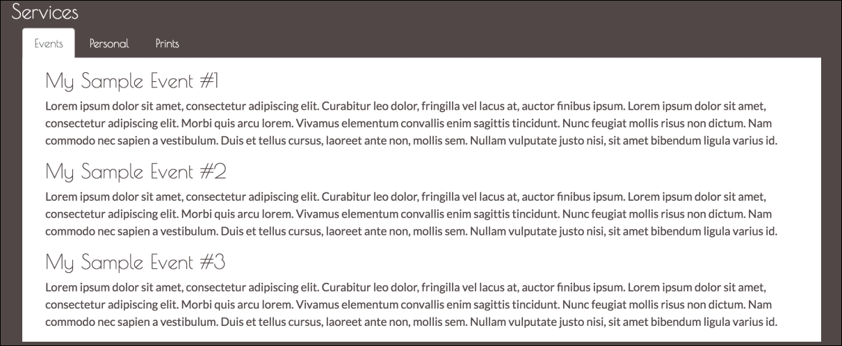
Figure 5.2: Three sample events displayed one below the other within our Events tab.
Hit save and refresh. Voila! This looks pretty good already, so why exactly would we want to display the events on separate pages? Well, as we begin adding more and more events, the events will appear below one another. As such, the Events section will grow indefinitely. Pagination is a clever way of avoiding this while allowing us to maintain the ability to list all MyPhoto events. Bootstrap offers a visually appealing pagination style (see Figure 5.3) that can be added to any section of your page by applying the
pagination
class to an unordered list element. The individual list items within this unordered list should have the page-item class applied to them. Applying this class simply sets the element's display property to inline. Applying the pagination class sets the display of the unordered list to inline-block and adjusts its margins. As such, in order to display pagination with 10 pages (for example's sake, we will carry on using 10 pages from now on), add the following markup after the
p
element of our third event (note how the active class is used on a list item to denote the currently selected page. The pagination-lg and pagination-sm classes can be used to increase or decrease the size of the pagination control):
    <ul class="pagination">

        <li class="page-item"><a class="page-link active"
        href="#">1</a></li>
        <li class="page-item"><a class="page-link" href="#">2</a></li>
        <li class="page-item"><a class="page-link" href="#">3</a></li>
        <li class="page-item"><a class="page-link" href="#">4</a></li>
        <li class="page-item"><a class="page-link" href="#">5</a></li>
        <li class="page-item"><a class="page-link" href="#">6</a></li>
        <li class="page-item"><a class="page-link" href="#">7</a></li>
        <li class="page-item"><a class="page-link" href="#">8</a></li>
        <li class="page-item"><a class="page-link" href="#">9</a></li>
        <li class="page-item"><a class="page-link" href="#">10</a></li>
    </ul>
Note
Pagination in Bootstrap 3
When it comes to pagination, the changes from Bootstrap 3 to Bootstrap 4 are not that drastic. The pagination class remains between the two versions. However, in Bootstrap 3, we did not explicitly need to specify which elements were pagination items and which elements were pagination links. As the
page-item
and
page-link
classes have only been introduced with Bootstrap 4, one could previously specify the pagination by simply creating an unordered list and applying the
pagination
class to it:
<ul class="pagination">
     <li><a class="active" href="#">1</a></li>
     <li><a href="#">2</a></li>
     <li><a href="#">3</a></li>
  </ul>
With the addition of the preceding markup, we have already reached the end of Bootstrap's default pagination capabilities. The implementation of the actual pagination is up to us. Specifically, this would involve the following:
- Grouping our events into pages.
- Detecting the currently active page.
- Toggling the visibility of the various pages depending on the page that is currently selected.
As our event grows beyond 10 pages, we would then be required to manually add both a new page and a new list item to the paginator. While implementing the logic for all this is not quite rocket science, it would be nice if we did not have to be concerned with reinventing a solution to such a well known user interface problem. Indeed, there exist plenty of third-party libraries to help us speed up the development of our events pagination.
One of the most popular libraries is
jQuery.bootpag
, a jQuery plugin that allows you to paginate your data. Unfortunately, bootpag (versions 1.0.7 and below) currently does not support Bootstrap 4 out of the box, and as such will require a little bit of tweaking. As with all libraries presented in this chapter, jQuery.bootpag is free to use, and its source code, as well as licensing information, is available on GitHub at
https://github.com/botmonster/jquery-bootpag
. Take a look at the following screenshot:
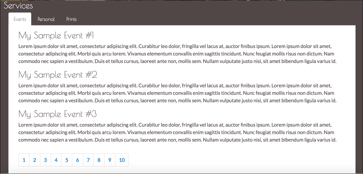
Figure 5.3: Bootstrap default pagination.
Unsurprisingly, the bootpag Bower package's name is also bootpag. Go ahead and install it:
bower install bootpag
Once installation is complete, you should see a directory named bootpag under your
bower_components
directory. Inside
bootpag/lib
, you should see the following files:
jquery.bootpag.jsjquery.bootpag.min.js
As always, we want to work with the minified version of our plugin, so go ahead and include jquery.bootpag.min.js within the
head
of our document:
    <script
    src="bower_components/bootpag/lib/jquery.bootpag.min.js"></script>
Before we can start using bootpag, we must understand that the plugin needs containers: one container in which to display the pagination control, and one container for displaying the content that is to be paginated. In other words, it requires one to divide the area of the Events section between the data that is to be displayed, and one to separate the controls with which the user navigates the data. As a user navigates the data using the pagination control, the content area will be updated with the new content, or, alternatively, the visibility of multiple containers will be toggled.
We will be using the latter approach. That is, we will first divide our events into pages, and then use an event listener on the pagination control to toggle the visibility of these various pages. To this end, we must now go ahead and modify our events in the Services section so that each of our events is contained within its own distinct page (that is, by using div).
Since our example consists of only three sample events, we will divide the events into two pages. The first page will contain My Sample Event #1 and My Sample Event #2, while the second page will contain My Sample Event #3. We will use a div element to represent an individual page. Each page's div will consist of a unique id, the word page, followed by the page number. The pagination control will be added in after our last event. To do this, add an empty
div
for holding the pagination below the last of our pages. It should also be assigned a unique id:
    <div class="row">
        <div id="page-1">
            <h3>My Sample Event #1</h3>
            <p>Lorem ipsum dolor sit amet, consectetur adipiscing elit.
            Curabitur leo dolor,
              fringilla vel lacus at, auctor finibus ipsum. Lorem ipsum
              dolor sit amet,
            consectetur adipiscing elit. Morbi quis arcu lorem. Vivamus
            elementum convallis

            enim sagittis tincidunt. Nunc feugiat mollis risus non dictum.
            Nam commodo nec

            sapien a vestibulum. Duis et tellus cursus, laoreet ante non,
            mollis sem.

            Nullam vulputate justo nisi, sit amet bibendum ligula varius
            id.

</p>
           <h3>My Sample Event #2</h3>
            <p>Lorem ipsum dolor sit amet, consectetur adipiscing elit.
            Curabitur leo dolor,
              fringilla vel lacus at, auctor finibus ipsum. Lorem ipsum
              dolor sit amet,
            consectetur adipiscing elit. Morbi quis arcu lorem. Vivamus
            elementum convallis

            enim sagittis tincidunt. Nunc feugiat mollis risus non dictum.
            Nam commodo nec

            sapien a vestibulum. Duis et tellus cursus, laoreet ante non,
            mollis sem

  Nullam vulputate justo nisi, sit amet bibendum ligula varius
            id.

            </p>

        </div>

        <div
 id="page-2">
            <h3>My Sample Event #3</h3>
            <p>Lorem ipsum dolor sit amet, consectetur adipiscing elit.
            Curabitur leo dolor,
            fringilla vel lacus at, auctor finibus ipsum. Lorem ipsum
            dolor sit amet,
            consectetur adipiscing elit. Morbi quis arcu lorem. Vivamus
            elementum convallis

          enim sagittis tincidunt. Nunc feugiat mollis risus non dictum.
            Nam commodo nec

            sapien a vestibulum. Duis et tellus cursus, laoreet ante non,
            mollis sem.

            Nullam vulputate justo nisi, sit amet bibendum ligula varius
            id.

</p>

        </div>

        <div id="services-events-pagination"></div>

</div>
Before we will be able to actually use our pagination control, we must inform bootpag of its container. We do so by calling the bootpag function on our element, passing a configuration object as a parameter that contains our desired page count (10 in our case). Insert the following code into the
head
of our HTML document:
    $('#services-events-pagination').bootpag({
        total: 10
    }).on("page", function(event, num){});
The bootpag function will render the control to the element with an id equal to services-events-pagination, but notice the
on
event listener with the page parameter. This is our event listener, which will invoke the code contained within the (currently empty) callback as the user uses the pagination control to change pages. However, before we can implement the page change logic that will toggle the visibility of our individual pages, we must first hide our pages. To this end, we must update our myphoto.css file.
Now, one obvious approach would be to add a style for each one of our individual pages, identifying them by their id. As our number of events grows, this will seriously bloat our style sheet, as you will be required to add a new CSS rule for each new page. A much neater approach would be to wrap our pages within their own container and then use CSS selectors to hide all pages (that is, div elements) within this content area. To achieve this, first wrap the pages inside a new container div and assign this container a unique id:
    <div id="services-events-content">
        <div id="page-1">
        <h3>My Sample Event #1</h3>
        <p>...</p>
        <h3>My Sample Event #2</h3>
        <p>...</p>

</div>

<div id="page-2">
        <h3>My Sample Event #3</h3>
        <p>...</p>

</div>

</div>
Then we update our style sheet so that the individual page
div
elements held within this new container are hidden by default:
    #services-events-content div
    {
        display: none;
    }
Save and hit refresh. All of our events should now be hidden.
Now all we need to do is implement the logic that makes our individual pages visible as the user navigates. To this end, we complete the currently empty callback function, so that it first hides all pages and only then displays the currently selected page. Hiding all the pages, instead of the previous page, makes our code much cleaner, as we require no logic to determine the previously selected page; instead, we just use a CSS selector to hide all
div
elements contained within our services-events-content container. The bootpag plugin informs us of the currently selected page number through the second parameter (here named num) passed to our callback function. As such, we can use this page number to construct the id of the div (page) that we wish to make visible:
    $('#services-events-pagination').bootpag({
        total: 10
    }).on("page", function(event, num){
        $('#services-events-content div').hide();
        var current_page = '#page-' + num;
        $(current_page).show();
    });
Seeing how our style sheet hides all the pages, we should include a statement that makes the first page visible as the user first visits our page. To do this, simply add $('#page-1').show(); to the head of our document, so that our code takes the following structure:
    $('#page-1').show();
    $('#services-events-pagination').bootpag({
        total: 10
    }).on("page", function(event, num){

// Pagination logic


});
Take a look at the following screenshot:
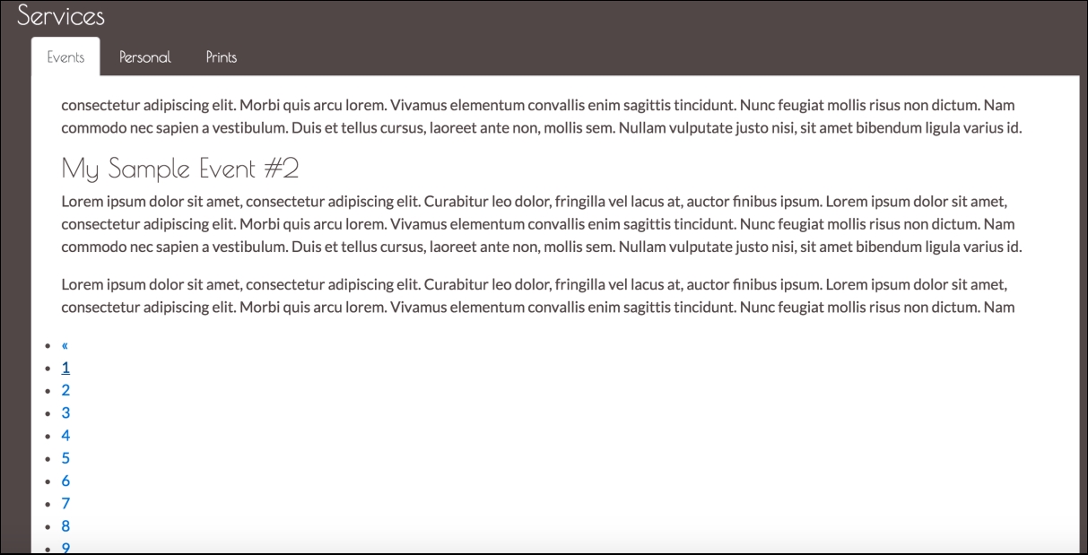
Figure 5.4: The display of the bootpag pagination controls is broken for Bootstrap 4. This is due to the changes to the pagination controls introduced by Bootstrap 4.
Hit save and refresh. While the pagination controls themselves are working, their display is broken (see Figure 5.4). This is due to the previously discussed changes to the pagination controls introduced by Bootstrap 4. Examining jquery.bootpag.js, we can see that the issue lies in constructing the pagination list items on line 130+. Observe the following code:
    return this.each(function(){
        var $bootpag, lp, me = $(this),
            p = ['<ul class="', settings.wrapClass, ' bootpag">'];

        if(settings.firstLastUse){
            p = p.concat(['<li data-lp="1" class="', settings.firstClass,
            '"><a href="', href(1), '">', settings.first, '</a></li>']);
        }
        // ...
    });
As the pagination items are being created for Bootstrap 3, the problem here lies with the fact that the code generating the items fails to apply the page-item and page-link classes. We can fix this easily enough. First, create a new folder,
js
, in our project root. Copy the jquery.bootpag.js file into this folder. Update the pagination markup generation logic so that the page-item and page-link classes are being applied to the list item and anchor elements:
    return this.each(function(){
        var $bootpag, lp, me = $(this),
        p = ['<ul class="', settings.wrapClass, ' bootpag">'];

        if(settings.firstLastUse){
            p = p.concat(['<li data-lp="1" class="page-item ',
            settings.firstClass, '"><a class="page-link" href="', href(1),
            '">',
            settings.first, '</a></li>']);
        }
        if(settings.prev){
            p = p.concat(['<li data-lp="1" class="page-item ',
            settings.prevClass, '"><a class="page-link" href="', href(1),
            '">',
            settings.prev, '</a></li>']);
            }
        for(var c = 1; c <= Math.min(settings.total, settings.maxVisible);
        c++){
            p = p.concat(['<li class="page-item" data-lp="', c, '"><a
            class="page-link" href="', href(c), '">', c, '</a></li>']);
        }
        if(settings.next){
            lp = settings.leaps && settings.total > settings.maxVisible
            ? Math.min(settings.maxVisible + 1, settings.total) : 2;
            p = p.concat(['<li data-lp="', lp, '" class="page-item ',
            settings.nextClass, '"><a class="page-link" href="', href(lp),
            '">', settings.next, '</a></li>']);
        }
        if(settings.firstLastUse){
            p = p.concat(['<li data-lp="', settings.total, '" class=
            "page-item
            last"><a class="page-link" href="', href(settings.total),'">',
            settings.last, '</a></li>']);
        }

    });
Finally, update the reference in the document head to point to our modified version of bootpag:
<script src="js/jquery.bootpag.js"></script>
Take a look at the following screenshot:
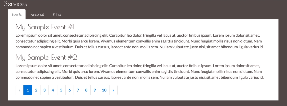
Figure 5.5: Pagination using our modified version of the bootpag plugin.
As you paginate to our second page, you will spot one issue: the last page may, at times, contain only one event (as is the case with My Sample Event #3), and the event descriptions differ in their lengths. Hence, there will be a height difference, which becomes apparent as the user switches pages. As a consequence, the pagination control
div
will move up and down (see Figure 5.6). Luckily, the fix for this is straightforward, and involves assigning our event-services-content div
a fixed height of 15em. Open the myphoto.css and add the following:
    #services-events-content {
        height: 15em;
    }
Take a look at the following screenshot:
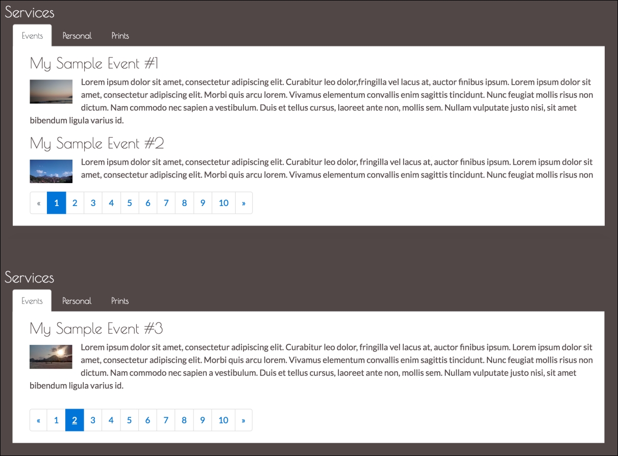
Figure 5.6: Notice the height difference between the two pages. Having a different number of events per page or listing events with differing descriptions will result in the container growing and shrinking.
Now that our events container is of a fixed height, we can be certain that the container will not shrink based on its content. As a result, the pagination control will remain fixed in its position. However, this raises one final issue, of long event descriptions. How can we deal with events that contain more text than is permissible by our events container? For example, consider the additional paragraph added to My Sample Event #2 in Figure 5.7. As you can see, the pagination control is now rendered above the event description.
Any text exceeding our container's height is simply cut:
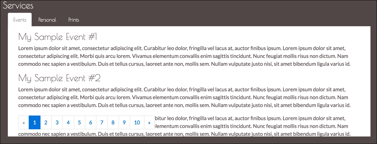
Figure 5.7: Display bug: Long event descriptions result in the pagination control being rendered above the event description. Any text exceeding our container's height is cut.
Once again, our fix is a simple one-liner, and involves setting the container's Y-axis overflow so that any content within the container is scrollable. Open myphoto.css and update the styling for our services-events-content container so that its overflow-y property is set to scroll:
    #services-events-content {
        height: 15em;
        overflow-y: scroll;
    }
Save and refresh. Voila!