Table of Contents for
Bootstrap 4 – Responsive Web Design
 Bootstrap 4 – Responsive Web Design
Published by
Packt Publishing, 2017
Bootstrap 4 – Responsive Web Design
Published by
Packt Publishing, 2017
- Cover
- Table of Contents
- Bootstrap 4 – Responsive Web Design
- Bootstrap 4 – Responsive Web Design
- Credits
- Preface
- What you need for this learning path
- Who this learning path is for
- Reader feedback
- Customer support
- 1. Module 1
- 1. Getting Started
- Setting up the framework
- Building our first Bootstrap example
- Optionally using the CDN setup
- Community activity
- Bootstrap and web applications
- Browser compatibility
- Summary
- 2. Creating a Solid Scaffolding
- Building our scaffolding
- Fluid container
- We need some style!
- Manipulating tables
- Like a boss!
- Final thoughts
- Summary
- 3. Yes, You Should Go Mobile First
- Bootstrap and the mobile-first design
- How to debug different viewports at the browser
- Cleaning up the mess
- Creating the landing page for different devices
- Summary
- 4. Applying the Bootstrap Style
- Summary
- 5. Making It Fancy
- Paying attention to your navigation
- Dropping it down
- Making an input grouping
- Getting ready for flexbox!
- Summary
- 6. Can You Build a Web App?
- Adding the navigation
- Do a grid again
- Playing the cards
- Implementing the main content
- Creating breadcrumbs
- Finishing with the right-hand-side content
- Summary
- 7. Of Course, You Can Build a Web App!
- Waiting for the progress bar
- Creating a settings page
- Summary
- 8. Working with JavaScript
- Awesome Bootstrap modals
- Creating our custom modal
- A tool for your tip
- Pop it all over
- Making the menu affix
- Finishing the web app
- Summary
- 9. Entering in the Advanced Mode
- The last navigation bar with flexbox
- Filling the main fluid content
- Filling the main content
- Overhead loading
- Fixing the toggle button for mobile
- Summary
- 10. Bringing Components to Life
- Fixing the mobile viewport
- Learning more advanced plugins
- Summary
- 11. Making It Your Taste
- Working with plugin customization
- The additional Bootstrap plugins
- Creating our Bootstrap plugin
- Defining the plugin methods
- Creating additional plugin methods
- Summary
- 2. Module 2
- 1. Introducing Bootstrap 4
- Summary
- 2. Using Bootstrap Build Tools
- Download the Bootstrap source files
- Setting up the blog project
- Setting up the JSON files
- Creating our first page template
- Summary
- 3. Jumping into Flexbox
- Ordering your Flexbox
- Wrapping your Flexbox
- Setting up the Bootstrap Flexbox layout grid
- Setting up a Flexbox project
- Designing a single blog post
- Summary
- 4. Working with Layouts
- Inserting rows into your layout
- Adding columns to your layout
- Choosing a column class
- Creating a simple three-column layout
- Mixing column classes for different devices
- Coding the blog home page
- Using responsive utility classes
- Summary
- 5. Working with Content
- Learning to use typography
- Customizing headings
- How to style images
- Coding tables
- Summary
- 6. Playing with Components
- Basic button examples
- Creating outlined buttons
- Checkbox and radio buttons
- Coding forms in Bootstrap 4
- Creating an inline form
- Adding validation to inputs
- Using the Jumbotron component
- Adding the Label component
- Using the Alerts component
- Using Cards for layout
- Updating the Blog index page
- How to use the Navs component
- Adding Breadcrumbs to a page
- Using the Pagination component
- How to use the List Group component
- Summary
- 7. Extending Bootstrap with JavaScript Plugins
- Coding Tooltips
- Avoiding collisions with our components
- Using Popover components
- Using the Collapse component
- Coding an Accordion with the Collapse component
- Coding a Bootstrap Carousel
- Summary
- 8. Throwing in Some Sass
- Using Sass in the blog project
- Importing partials in Sass
- Creating a collection of variables
- Customizing components
- Writing a theme
- Summary
- 9. Migrating from Version 3
- Big changes in version 4
- Updating your variables
- Additional global changes
- Other font updates
- Migrating components
- Migrating JavaScript
- Miscellaneous migration changes
- Summary
- 3. Module 3
- 1. Revving Up Bootstrap
- What Bootstrap 4 Alpha 4 has to offer
- Setting up our project
- Summary
- 2. Making a Style Statement
- Image elements
- Responsive utilities
- Helper classes
- Text alignment and transformation
- Summary
- 3. Building the Layout
- Adding Bootstrap components
- Summary
- 4. On Navigation, Footers, Alerts, and Content
- Improving navigation using Scrollspy
- Customizing scroll speed
- Icons
- Using and customizing alerts
- Creating a footer
- Creating and customizing forms
- Form validation
- Progress indicators
- Adding content using media objects
- Figures
- Quotes
- Abbreviations
- Summary
- 5. Speeding Up Development Using jQuery Plugins
- Enhanced pagination using bootpag
- Displaying images using Bootstrap Lightbox
- Improving our price list with DataTables
- Summary
- 6. Customizing Your Plugins
- Customizing plugins
- Writing a custom Bootstrap jQuery plugin
- Summary
- 7. Integrating Bootstrap with Third-Party Plugins
- Hover
- Summary
- 8. Optimizing Your Website
- Minifying CSS and JavaScript
- Introducing Grunt
- Running tasks automatically
- Stripping our website of unused CSS
- JavaScript file concatenation
- Summary
- 9. Integrating with AngularJS and React
- Introducing React
- Summary
- Bibliography
- Index
At this point, you can be called a Bootstrap master around the world! You nailed the framework as few people do these days—you should be proud of that!
Now, you are about to face a challenge to overpass the boundaries of learning. In this chapter, we will see how to create and customize your own Bootstrap plugin. This could be tough, but if you reached this point you can go a step further to become a true Bootstrap master.
The topics covered are as follows:
- Customizing Bootstrap components
- Customizing Bootstrap plugins
- Creating a Bootstrap plugin
When we finish this chapter, we will also reach the end of the book. I hope this last chapter will help you empower yourself with all the Bootstrap framework skills.
To follow this chapter, create a sandbox.html file and just place the default template that we are using all over the book. We will place all the code snippets of this chapter in this file.
In my years of experience of using Bootstrap, one of the major issues that I received is how can I change a Bootstrap component to appear like I need?
Most of the time, the answer is to take a look at the CSS and see how you can override the style. However, this orientation can be obscure sometimes and the developer will be unable to find a solution.
In this section, we will customize some Bootstrap components. We did some of that in previous chapters, but now we will go a step further into this subject. Let's start customizing a single button.
We must start with a button, because of two factors. First, it is a quite simple component and second we have to customize a button very often.
Let's assume we have a simple button placed in a page that already has the Bootstrap fully loaded. We will call it as the sandbox page. The HTML for it should be like this:
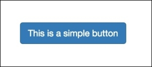
<button type="button" class="btn btn-primary" aria-pressed="false" autocomplete="off">
  This is a simple button
</button>
As we saw so many times, this button is a simple one with the .btn and .btn-default classes that will make the button blue, as shown in the next screenshot:
If you want a different color for the button, you can use one of the others contextual classes provided by Bootstrap (.btn-success, .btn-info, .btn-warning, .btn-danger, and so on) by using them together with the base class .btn class.
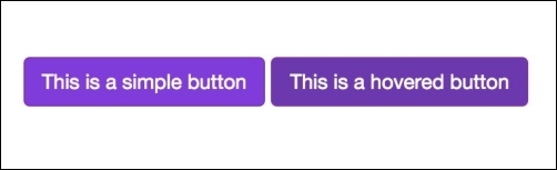
If you want to define a new color, the suggestion is to create a new class and define the necessary pseudo-class. Let's assume we want a purple button defined by a class .btn-purple. Define a CSS for it:
.btn-purple {
    color: #fff;
    background-color: #803BDB;
    border-color: #822FBA;
}
This is the base CSS. Now we must define all the pseudo-classes for the button:
.btn-purple:hover,
.btn-purple:focus,
.btn-purple:active,
.btn-purple.active {
    color: #ffffff;
    background-color: #6B39AD;
    border-color: #822FBA;
}
Now, for every interaction with the button (such as hovering over it), the button will have a background color a little darker. Not all same pseudo-classes can have the same style; you can customize it as per your choice.
The next screenshot represents our new button. What we did was replace the .btn-default for the class .btn-purple. The one on the left is .btn-purple and the one on the right is .btn-purple:hover:
Bootstrap has a nice feature for button toggle. It is native from the framework and can be used in different ways. We will take a look at the single toggle button. For that, create a normal button in the sandbox page:
<button type="button" class="btn btn-primary" autocomplete="off">
  Single toggle
</button>
To make this button turn into a single toggle, we have to add the data attribute data-toggle="button" and the attribute aria-pressed="true". This will turn the button into a toggle button. Now when you click on the button, Bootstrap will add a class .active to it, making it appear pressed. The code is as follows:
<button type="button" class="btn btn-default" data-toggle="button" aria-pressed="false" autocomplete="off">
  Single toggle
</button>
The toggle buttons can turn into buttons checkbox or buttons radio. At first, we need to remember the concept of button group. So let's create a simple .btn-group in the HTML:
<div class="btn-group">
<button class="btn btn-default">
Laika
</button>
<button class="btn btn-default">
Jonny
</button>
<button class="btn btn-default">
Doge
</button>
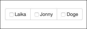
</div>The concept of using button groups is to create a div with the class .btn-group and insert a bunch of button elements inside it. However, we want a bunch of checkboxes, so let's substitute the button element for a label and input elements with type checkbox:
<div class="btn-group">
  <label class="btn btn-default">
    <input type="checkbox" autocomplete="off"> Laika
  </label>
  <label class="btn btn-default">
    <input type="checkbox" autocomplete="off"> Jonny
  </label>
  <label class="btn btn-default">
    <input type="checkbox" autocomplete="off"> Doge
  </label>
</div>
Refresh the page and you will see that the button list now has a checkbox input on each label, as shown in the following screenshot:
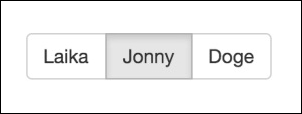
To change it to toggle and hide the checkboxes, we just need to simple add the data attribute data-toggle="buttons".
There is an option to preselect a checkbox, just need to add the .active class to the label and add the attribute checked="checked" to the input:
<div class="btn-group" data-toggle="buttons">
  <label class="btn btn-default">
    <input type="checkbox" autocomplete="off"> Laika
  </label>
  <label class="btn btn-default active">
    <input type="checkbox" autocomplete="off" checked="checked"> Jonny
  </label>
  <label class="btn btn-default">
    <input type="checkbox" autocomplete="off"> Doge
  </label>
</div>
The next image shows the final output of the checkbox with the second checkbox selected on the page reload:
The other option for the toggle button is to become a radio button. The procedure is very similar to the checkbox. We just need to change the input from type="checkbox" to type="radio":
<div class="btn-group" data-toggle="buttons">
  <label class="btn btn-default">
    <input type="radio" autocomplete="off"> Laika
  </label>
  <label class="btn btn-default active">
    <input type="radio" autocomplete="off" checked="checked"> Jonny
  </label>
  <label class="btn btn-default">
    <input type="radio" autocomplete="off"> Doge
  </label>
</div>
This will create a .btn-group formed by radio button, been just one selected at once.
Buttons can be customized using JavaScript as well. For instance, any toggle button can be toggled by calling:
$('button selector').button('toggle')This will toggle the state of the button from active to not active.
Before Version 3.3.6, it was possible to change the text of a button via JavaScript by calling the button passing a string. First, you should define a state text. For instance, let's define a button with the attribute data-statesample-text="What a sample":
<button type="button" class="btn btn-primary" autocomplete="off" data-statesample-text="What a sample">
  Single toggle
</button>
Using JavaScript, you can change the text with the value or the data text by calling:
$('button').button('statesample');Reset the text to original with the following function:
$('button').button('reset');However, this feature is deprecated after Version 3.3.6 and will be removed in Version 4 of Bootstrap.