Table of Contents for
Bootstrap 4 – Responsive Web Design
 Bootstrap 4 – Responsive Web Design
Published by
Packt Publishing, 2017
Bootstrap 4 – Responsive Web Design
Published by
Packt Publishing, 2017
- Cover
- Table of Contents
- Bootstrap 4 – Responsive Web Design
- Bootstrap 4 – Responsive Web Design
- Credits
- Preface
- What you need for this learning path
- Who this learning path is for
- Reader feedback
- Customer support
- 1. Module 1
- 1. Getting Started
- Setting up the framework
- Building our first Bootstrap example
- Optionally using the CDN setup
- Community activity
- Bootstrap and web applications
- Browser compatibility
- Summary
- 2. Creating a Solid Scaffolding
- Building our scaffolding
- Fluid container
- We need some style!
- Manipulating tables
- Like a boss!
- Final thoughts
- Summary
- 3. Yes, You Should Go Mobile First
- Bootstrap and the mobile-first design
- How to debug different viewports at the browser
- Cleaning up the mess
- Creating the landing page for different devices
- Summary
- 4. Applying the Bootstrap Style
- Summary
- 5. Making It Fancy
- Paying attention to your navigation
- Dropping it down
- Making an input grouping
- Getting ready for flexbox!
- Summary
- 6. Can You Build a Web App?
- Adding the navigation
- Do a grid again
- Playing the cards
- Implementing the main content
- Creating breadcrumbs
- Finishing with the right-hand-side content
- Summary
- 7. Of Course, You Can Build a Web App!
- Waiting for the progress bar
- Creating a settings page
- Summary
- 8. Working with JavaScript
- Awesome Bootstrap modals
- Creating our custom modal
- A tool for your tip
- Pop it all over
- Making the menu affix
- Finishing the web app
- Summary
- 9. Entering in the Advanced Mode
- The last navigation bar with flexbox
- Filling the main fluid content
- Filling the main content
- Overhead loading
- Fixing the toggle button for mobile
- Summary
- 10. Bringing Components to Life
- Fixing the mobile viewport
- Learning more advanced plugins
- Summary
- 11. Making It Your Taste
- Working with plugin customization
- The additional Bootstrap plugins
- Creating our Bootstrap plugin
- Defining the plugin methods
- Creating additional plugin methods
- Summary
- 2. Module 2
- 1. Introducing Bootstrap 4
- Summary
- 2. Using Bootstrap Build Tools
- Download the Bootstrap source files
- Setting up the blog project
- Setting up the JSON files
- Creating our first page template
- Summary
- 3. Jumping into Flexbox
- Ordering your Flexbox
- Wrapping your Flexbox
- Setting up the Bootstrap Flexbox layout grid
- Setting up a Flexbox project
- Designing a single blog post
- Summary
- 4. Working with Layouts
- Inserting rows into your layout
- Adding columns to your layout
- Choosing a column class
- Creating a simple three-column layout
- Mixing column classes for different devices
- Coding the blog home page
- Using responsive utility classes
- Summary
- 5. Working with Content
- Learning to use typography
- Customizing headings
- How to style images
- Coding tables
- Summary
- 6. Playing with Components
- Basic button examples
- Creating outlined buttons
- Checkbox and radio buttons
- Coding forms in Bootstrap 4
- Creating an inline form
- Adding validation to inputs
- Using the Jumbotron component
- Adding the Label component
- Using the Alerts component
- Using Cards for layout
- Updating the Blog index page
- How to use the Navs component
- Adding Breadcrumbs to a page
- Using the Pagination component
- How to use the List Group component
- Summary
- 7. Extending Bootstrap with JavaScript Plugins
- Coding Tooltips
- Avoiding collisions with our components
- Using Popover components
- Using the Collapse component
- Coding an Accordion with the Collapse component
- Coding a Bootstrap Carousel
- Summary
- 8. Throwing in Some Sass
- Using Sass in the blog project
- Importing partials in Sass
- Creating a collection of variables
- Customizing components
- Writing a theme
- Summary
- 9. Migrating from Version 3
- Big changes in version 4
- Updating your variables
- Additional global changes
- Other font updates
- Migrating components
- Migrating JavaScript
- Miscellaneous migration changes
- Summary
- 3. Module 3
- 1. Revving Up Bootstrap
- What Bootstrap 4 Alpha 4 has to offer
- Setting up our project
- Summary
- 2. Making a Style Statement
- Image elements
- Responsive utilities
- Helper classes
- Text alignment and transformation
- Summary
- 3. Building the Layout
- Adding Bootstrap components
- Summary
- 4. On Navigation, Footers, Alerts, and Content
- Improving navigation using Scrollspy
- Customizing scroll speed
- Icons
- Using and customizing alerts
- Creating a footer
- Creating and customizing forms
- Form validation
- Progress indicators
- Adding content using media objects
- Figures
- Quotes
- Abbreviations
- Summary
- 5. Speeding Up Development Using jQuery Plugins
- Enhanced pagination using bootpag
- Displaying images using Bootstrap Lightbox
- Improving our price list with DataTables
- Summary
- 6. Customizing Your Plugins
- Customizing plugins
- Writing a custom Bootstrap jQuery plugin
- Summary
- 7. Integrating Bootstrap with Third-Party Plugins
- Hover
- Summary
- 8. Optimizing Your Website
- Minifying CSS and JavaScript
- Introducing Grunt
- Running tasks automatically
- Stripping our website of unused CSS
- JavaScript file concatenation
- Summary
- 9. Integrating with AngularJS and React
- Introducing React
- Summary
- Bibliography
- Index
In this chapter, we will complete the elements of our web app with the use of other Bootstrap elements and components. By the end of this chapter, we will have covered the majority of elements present in Bootstrap, making you almost an expert as well as answering this question from the last chapter: can you build a web app? Of course you can!
We will cover some more complex Bootstrap components and elements. These are the key points of this chapter, and you will learn how to:
- Use Bootstrap alerts
- Customize alerts
- Progress bars
- CSS key frames
- Navigation components
- Tabs
- Labels and badges
- List groups
Even though these seem to be a lot of key points, they are easy to learn and master. So, I am sure you will be able to nail all of them.
In the last chapter, we did almost everything related to page components. Now we will create some components that interact with the user. To start this, we will introduce alerts, which are very common components of every web app.
In order to learn about alerts, we should create some of them. The pattern for creation is pretty simple; just remember to import Bootstrap JavaScript as we have been doing all throughout the book.
The main class needed to create alerts is .alert. You can just follow this class with some other, regarding the type of alert, such as .alert-success for a success message. There are other classes available as well, such as .alert-info and .alert-danger. Just replace the suffix of .alert with the one that you want to use.
It's time to create our first alert! Keeping the same code of the web app from the last chapter, right before div#main, you must have your ol.breadcrumb. Replace ol.breadcrumb with your .alert, like what is shown in this screenshot:
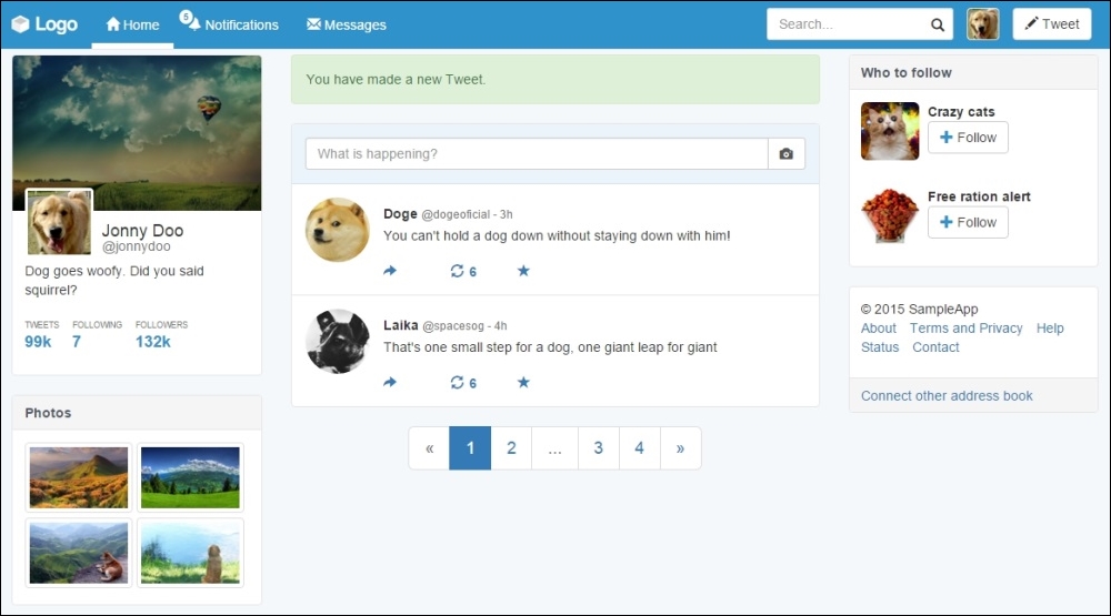
The HTML code for creating this alert is really simple:
<div class="alert alert-success" role="alert">
  You have made a new Tweet.
</div>
As mentioned before, just create an element with the .alert class in combination with the state of the alert, .alert-success in this case.
Tip
Why do we use the role attribute?
In the preceding example, we made use of the role="alert" attribute in our .alert component. The role attribute was incorporated into HTML 5, coming from the ARIA 1.0 specification. The reason for using that is to keep the semantics for different items, for example, in this case, where we used a common <div> to describe a more semantic element that is an alert.
Bootstrap is incredible! Did you realize that? We created an alert with just three lines of code!
Well, another reason to think about that is to create dismissible alerts. Just add the highlighted line to the alert component and you will get the expected result:
<div class="alert alert-success" role="alert">
<button type="button" class="close" data-dismiss="alert" aria-label="Close"><span aria-hidden="true">×</span></button>
You have made a new Tweet.
</div>This will create a close button that will dismiss the component using the data-dismiss="alert" attribute. Refresh the web page and you will see the alert like this:

Now, it's time for us to create our recipe for the alert. We have two tasks: add a title to .alert and use the links inside it.
First, create a heading element inside the alert:
<div class="alert alert-success" role="alert">
<button type="button" class="close" data-dismiss="alert" aria-label="Close"><span aria-hidden="true">×</span></button>
<h3>Tweet alert</h3>
You have made a new Tweet.
</div>Then, adjust the CSS for the heading inside the alert:
.alert h3 {
  margin: 0  0 1rem;
  font-size: 1.4em;
}
The final result of adding the title must be like what is shown in this screenshot:

For the second task, we have to add some links inside the component. Bootstrap can give us a little shortcut for this using the .alert-link class in the link. The class will give the correctly matching color for the link in response to the kind of the alert shown.
Therefore, the HTML code is simple:
<div class="alert alert-success" role="alert">
<button type="button" class="close" data-dismiss="alert" aria-label="Close"><span aria-hidden="true">×</span></button>
<h3>Tweet alert</h3>
You have made a new Tweet.
<a href="#" class="alert-link">Click here to review your tweets.</a>
</div>To finish our first alert usage, let's just add one last fancy thing in the CSS, refresh the browser after that, and check the final result, as shown in the next screenshot:
.alert {
  border-left-width: 0.5rem;
}