Table of Contents for
Bootstrap 4 – Responsive Web Design
 Bootstrap 4 – Responsive Web Design
Published by
Packt Publishing, 2017
Bootstrap 4 – Responsive Web Design
Published by
Packt Publishing, 2017
- Cover
- Table of Contents
- Bootstrap 4 – Responsive Web Design
- Bootstrap 4 – Responsive Web Design
- Credits
- Preface
- What you need for this learning path
- Who this learning path is for
- Reader feedback
- Customer support
- 1. Module 1
- 1. Getting Started
- Setting up the framework
- Building our first Bootstrap example
- Optionally using the CDN setup
- Community activity
- Bootstrap and web applications
- Browser compatibility
- Summary
- 2. Creating a Solid Scaffolding
- Building our scaffolding
- Fluid container
- We need some style!
- Manipulating tables
- Like a boss!
- Final thoughts
- Summary
- 3. Yes, You Should Go Mobile First
- Bootstrap and the mobile-first design
- How to debug different viewports at the browser
- Cleaning up the mess
- Creating the landing page for different devices
- Summary
- 4. Applying the Bootstrap Style
- Summary
- 5. Making It Fancy
- Paying attention to your navigation
- Dropping it down
- Making an input grouping
- Getting ready for flexbox!
- Summary
- 6. Can You Build a Web App?
- Adding the navigation
- Do a grid again
- Playing the cards
- Implementing the main content
- Creating breadcrumbs
- Finishing with the right-hand-side content
- Summary
- 7. Of Course, You Can Build a Web App!
- Waiting for the progress bar
- Creating a settings page
- Summary
- 8. Working with JavaScript
- Awesome Bootstrap modals
- Creating our custom modal
- A tool for your tip
- Pop it all over
- Making the menu affix
- Finishing the web app
- Summary
- 9. Entering in the Advanced Mode
- The last navigation bar with flexbox
- Filling the main fluid content
- Filling the main content
- Overhead loading
- Fixing the toggle button for mobile
- Summary
- 10. Bringing Components to Life
- Fixing the mobile viewport
- Learning more advanced plugins
- Summary
- 11. Making It Your Taste
- Working with plugin customization
- The additional Bootstrap plugins
- Creating our Bootstrap plugin
- Defining the plugin methods
- Creating additional plugin methods
- Summary
- 2. Module 2
- 1. Introducing Bootstrap 4
- Summary
- 2. Using Bootstrap Build Tools
- Download the Bootstrap source files
- Setting up the blog project
- Setting up the JSON files
- Creating our first page template
- Summary
- 3. Jumping into Flexbox
- Ordering your Flexbox
- Wrapping your Flexbox
- Setting up the Bootstrap Flexbox layout grid
- Setting up a Flexbox project
- Designing a single blog post
- Summary
- 4. Working with Layouts
- Inserting rows into your layout
- Adding columns to your layout
- Choosing a column class
- Creating a simple three-column layout
- Mixing column classes for different devices
- Coding the blog home page
- Using responsive utility classes
- Summary
- 5. Working with Content
- Learning to use typography
- Customizing headings
- How to style images
- Coding tables
- Summary
- 6. Playing with Components
- Basic button examples
- Creating outlined buttons
- Checkbox and radio buttons
- Coding forms in Bootstrap 4
- Creating an inline form
- Adding validation to inputs
- Using the Jumbotron component
- Adding the Label component
- Using the Alerts component
- Using Cards for layout
- Updating the Blog index page
- How to use the Navs component
- Adding Breadcrumbs to a page
- Using the Pagination component
- How to use the List Group component
- Summary
- 7. Extending Bootstrap with JavaScript Plugins
- Coding Tooltips
- Avoiding collisions with our components
- Using Popover components
- Using the Collapse component
- Coding an Accordion with the Collapse component
- Coding a Bootstrap Carousel
- Summary
- 8. Throwing in Some Sass
- Using Sass in the blog project
- Importing partials in Sass
- Creating a collection of variables
- Customizing components
- Writing a theme
- Summary
- 9. Migrating from Version 3
- Big changes in version 4
- Updating your variables
- Additional global changes
- Other font updates
- Migrating components
- Migrating JavaScript
- Miscellaneous migration changes
- Summary
- 3. Module 3
- 1. Revving Up Bootstrap
- What Bootstrap 4 Alpha 4 has to offer
- Setting up our project
- Summary
- 2. Making a Style Statement
- Image elements
- Responsive utilities
- Helper classes
- Text alignment and transformation
- Summary
- 3. Building the Layout
- Adding Bootstrap components
- Summary
- 4. On Navigation, Footers, Alerts, and Content
- Improving navigation using Scrollspy
- Customizing scroll speed
- Icons
- Using and customizing alerts
- Creating a footer
- Creating and customizing forms
- Form validation
- Progress indicators
- Adding content using media objects
- Figures
- Quotes
- Abbreviations
- Summary
- 5. Speeding Up Development Using jQuery Plugins
- Enhanced pagination using bootpag
- Displaying images using Bootstrap Lightbox
- Improving our price list with DataTables
- Summary
- 6. Customizing Your Plugins
- Customizing plugins
- Writing a custom Bootstrap jQuery plugin
- Summary
- 7. Integrating Bootstrap with Third-Party Plugins
- Hover
- Summary
- 8. Optimizing Your Website
- Minifying CSS and JavaScript
- Introducing Grunt
- Running tasks automatically
- Stripping our website of unused CSS
- JavaScript file concatenation
- Summary
- 9. Integrating with AngularJS and React
- Introducing React
- Summary
- Bibliography
- Index
Bootstrap also provides some utility classes, which Bootstrap refers to as helper classes. The helper classes provide some basic styles to accentuate information on a page. Their purpose is to give the user some context to the information they are receiving and to provide the developer with styling techniques, outside of the grid system.
Bootstrap defines six context types to give a visual indicator to the user of what type of information is being conveyed: muted, primary, success, info, warning, and danger, as well as providing the developer with simple classes to assign context to elements via text color, text-<context> or background color, bg-<context>.
Let's apply some context to our example. We will add two prices to each size: a regular price and a special offer price. We will apply a success context to the special offer price and a muted context to the regular price. Print sizes with prices reduced by €10 or more will be given an info context background. The code should look similar to the following code snippet:
    <div class="container">
        <h1 class="hidden-lg-down">Our Print Sizes</h1>
        <div class="row">
            <div class="col-xs-6 col-sm-3 push-sm-3">
                <img src="images/small.jpg" class="img-fluid img-circle
                hidden-md-down">
                <h5 class="hidden-lg-down">Small</h5>
                <div class="row">
                    <div class="col-sm-4 bg-info">6x5
                        <div class="row">
                            <div class="col-sm-3 text-muted">€15</div>
                            <div class="col-sm-3 text-success">€8</div>
                        </div>
                    </div>
                    <div class="col-sm-4">8x10
                        <div class="row">
                            <div class="col-sm-3 text-muted">€18</div>
                            <div class="col-sm-3 text-success">€11</div>
                        </div>
                    </div>
                    <div class="col-sm-4">11x17
                        <div class="row">
                            <div class="col-sm-3 text-muted">€25</div>
                            <div class="col-sm-3 text-success">€20</div>
                        </div>
                    </div>
                </div>
            </div>
            <div class="col-xs-6 col-sm-3 push-sm-3">
            <img src="images/medium.jpg" class="img-fluid img-rounded
            hidden-md-down">
            ...
    </div>
Take a look at the following screenshot:
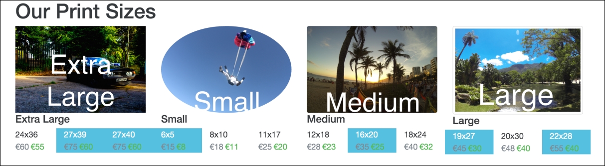
Figure 2.20: Bootstrap's context classes in action: note the changes in color for the various dimension and price blocks
As you can see, regular prices are gray, the special offer prices are green, and sizes with large discounts have a blue background.
Bootstrap also provides handy classes for centering and floating elements.
Bootstrap 3 had a center-block class, which used margins to align an element centrally and sets the display property to block. This comes in very useful outside of the grid system. This has been removed from Bootstrap 4, in favor of two other classes, d-block and m-x-auto. The d-block class is responsible for setting the element's display property to block, while the m-x-auto class sets the margin properties to auto. As you may imagine, Bootstrap 4 also comes with the d-inline and d-inline-block classes, as well as an array of m-*-* classes for various margin options. More than that, there are also various padding options, with the p-*-* convention. Let us update our example with a new heading, Special Offers, inside a div we want to take up 50% of the viewport and we'll give it a primary background using the contextual classes.
Let's see it without the use of m-x-auto first. Observe the following code:
    <div style="width:50%">
        <h1 class="bg-primary">Special Offers</h1>
    </div>
    <div class="container">
        <h1 class="hidden-lg-down">Our Print Sizes</h1>
        <div class="row">
Take a look at the following screenshot:
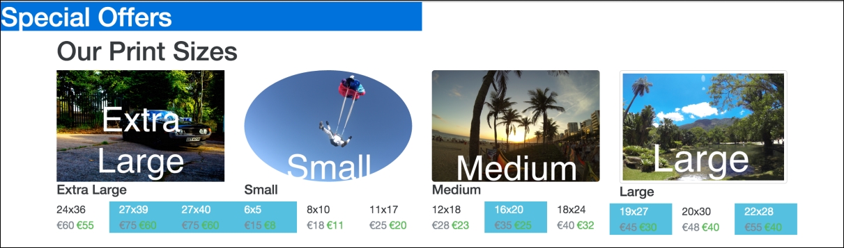
Figure 2.21: Applying Bootstrap's bg-primary class
Pretty ugly. Let's make it a little less ugly by centering the heading using center-block and text-xs-center. In Bootstrap 3, we would have used center-block, but as the element already has the display: block property, we can just use m-x-auto instead to control the margins. This can be done in the following manner:
    <div class="m-x-auto" style="width:50%">
        <h1 class="bg-primary text-xs-center">Special Offers</h1>
    </div>
For the time being, we have also used inline styles here to set the width of Special Offers to 50%. Inline styles should in general be avoided as they decrease maintainability of the code base. Ideally, we should use a class here to apply this style rule. We will address this in a later chapter. Let's check out the result in the following screenshot:
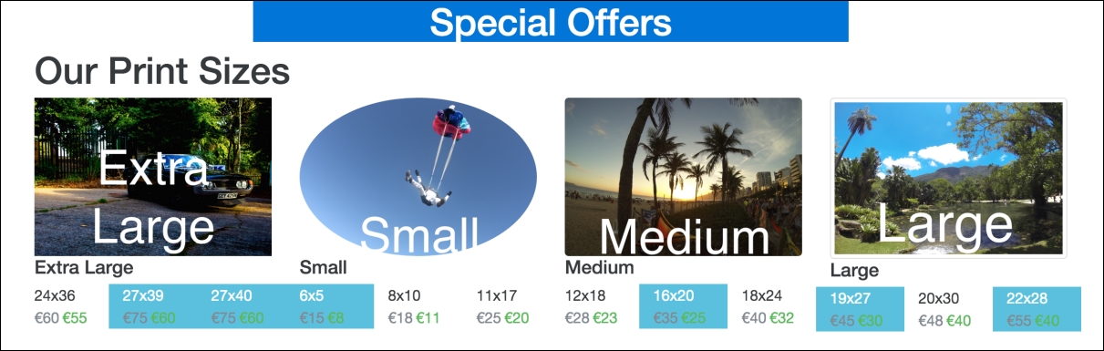
Figure 2.22: Applying Bootstrap's m-x-auto, text-xs-center and bg-primary classes
Nice, a little less ugly.
Along with this, Bootstrap gives us useful classes for floating elements left and right: pull-*-right and pull-*-left. These classes follow the same semantics as the previously discussed hidden classes and simply result in the appropriate float property being applied to the element together with an !important rule. The rules only get applied when the display is at or above the given breakpoint (the supported breakpoints are: xs, sm, md, lg, and xl).
Let's add a caveat to the page, indicating that Terms and Conditions Apply. We will use the pull-xs-right class to float it to the far right, the contextual danger class to indicate that it is worth noting to the user, and Bootstrap's label class to make the text look a little prettier. Since pull-xs-right floats elements to the right when the display is extra small or larger, the Terms and Conditions element will be floating to the right for all display sizes. Take a look at the following code:
    <div class="bg-danger pull-xs-right">
        <p class="label">Temperatures may not be accurate</p>
    </div>
Take a look at the following screenshot:
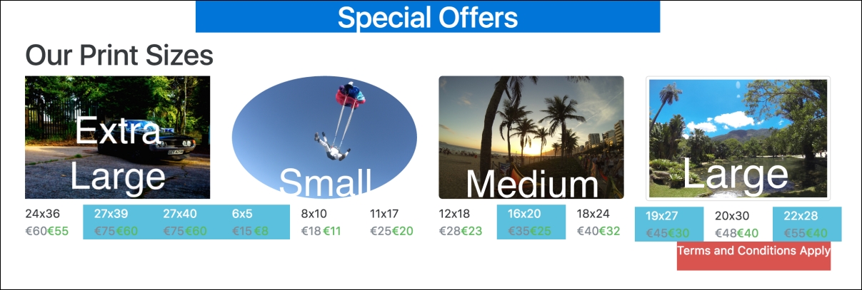
Figure 2.23: Using pull-xs-right to align an element to the right, for all display sizes
Nice and neatly docked to the right-hand side.
None of these utility classes are very complex. Nor would a developer not be able to implement the required logic themselves. However, they greatly help speed up development. The classes Bootstrap provides to toggle content visibility are a clear example of this. The invisible class simply sets the elements visbility property to hidden, with an !important rule. However, there are a few very useful display utility classes that are slightly more complex such as text-hide, sr-only, and sr-only-focusable.
The sr-only class hides an element except from screen-readers. sr-only-focusable extends this functionality to become visible when the element becomes focused, for instance in the case of keyboard access.
The text-hide class allows the developer to couple an image with a text element. The text will be read by a screen-reader, but by using text-hidden, it is not visible. Let's see this in action with the images in our example. Replace the hidden-** classes we added to our category text elements with text-hide. Have a look here:
<h5 class="text-hide">Small</h5>
Give it a try with a screen-reader to see (actually, hear!) the results.