This is the last main content component we need to go over for this chapter. Let's get right into it by reviewing the code needed to render a List Group:
<ul class="list-group">
  <li class="list-group-item">Item 1</li>
  <li class="list-group-item">Item 2</li>
  <li class="list-group-item">Item 3</li>
  <li class="list-group-item">Item 4</li>
</ul>
Like the components before it, this one is based off of an unordered list:
- The
<ul>tag needs a class of.list-groupon it to start - Each
<li>needs a class of.list-group-itemon it
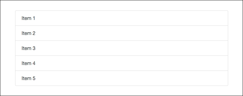
Once you're done, your List Group should look like this in the browser:

As you can see, with some minimal coding you can render a decent looking component. You may have missed it, but we actually already used this component when we were building our sidebar on the index and blog post page templates. Open up one of them in a text editor and you'll see the following code, which is a List Group:
<div class="card card-block">
  <h5 class="card-title">Recent Posts</h5>
  <div class="list-group">
    <button type="button" class="list-group-item">Cras justo odio</button>
    <button type="button" class="list-group-item">Dapibus ac facilisis in</button>
    <button type="button" class="list-group-item">Morbi leo risus</button>
    <button type="button" class="list-group-item">Porta ac consectetur ac</button>
    <button type="button" class="list-group-item">Vestibulum at eros</button>
  </div>
  <div class="m-t-1"><a href="#">View More</a></div>
</div>
That concludes the use of the List Group component. That also concludes the Content components chapter.
