Table of Contents for
Bootstrap 4 – Responsive Web Design
 Bootstrap 4 – Responsive Web Design
Published by
Packt Publishing, 2017
Bootstrap 4 – Responsive Web Design
Published by
Packt Publishing, 2017
- Cover
- Table of Contents
- Bootstrap 4 – Responsive Web Design
- Bootstrap 4 – Responsive Web Design
- Credits
- Preface
- What you need for this learning path
- Who this learning path is for
- Reader feedback
- Customer support
- 1. Module 1
- 1. Getting Started
- Setting up the framework
- Building our first Bootstrap example
- Optionally using the CDN setup
- Community activity
- Bootstrap and web applications
- Browser compatibility
- Summary
- 2. Creating a Solid Scaffolding
- Building our scaffolding
- Fluid container
- We need some style!
- Manipulating tables
- Like a boss!
- Final thoughts
- Summary
- 3. Yes, You Should Go Mobile First
- Bootstrap and the mobile-first design
- How to debug different viewports at the browser
- Cleaning up the mess
- Creating the landing page for different devices
- Summary
- 4. Applying the Bootstrap Style
- Summary
- 5. Making It Fancy
- Paying attention to your navigation
- Dropping it down
- Making an input grouping
- Getting ready for flexbox!
- Summary
- 6. Can You Build a Web App?
- Adding the navigation
- Do a grid again
- Playing the cards
- Implementing the main content
- Creating breadcrumbs
- Finishing with the right-hand-side content
- Summary
- 7. Of Course, You Can Build a Web App!
- Waiting for the progress bar
- Creating a settings page
- Summary
- 8. Working with JavaScript
- Awesome Bootstrap modals
- Creating our custom modal
- A tool for your tip
- Pop it all over
- Making the menu affix
- Finishing the web app
- Summary
- 9. Entering in the Advanced Mode
- The last navigation bar with flexbox
- Filling the main fluid content
- Filling the main content
- Overhead loading
- Fixing the toggle button for mobile
- Summary
- 10. Bringing Components to Life
- Fixing the mobile viewport
- Learning more advanced plugins
- Summary
- 11. Making It Your Taste
- Working with plugin customization
- The additional Bootstrap plugins
- Creating our Bootstrap plugin
- Defining the plugin methods
- Creating additional plugin methods
- Summary
- 2. Module 2
- 1. Introducing Bootstrap 4
- Summary
- 2. Using Bootstrap Build Tools
- Download the Bootstrap source files
- Setting up the blog project
- Setting up the JSON files
- Creating our first page template
- Summary
- 3. Jumping into Flexbox
- Ordering your Flexbox
- Wrapping your Flexbox
- Setting up the Bootstrap Flexbox layout grid
- Setting up a Flexbox project
- Designing a single blog post
- Summary
- 4. Working with Layouts
- Inserting rows into your layout
- Adding columns to your layout
- Choosing a column class
- Creating a simple three-column layout
- Mixing column classes for different devices
- Coding the blog home page
- Using responsive utility classes
- Summary
- 5. Working with Content
- Learning to use typography
- Customizing headings
- How to style images
- Coding tables
- Summary
- 6. Playing with Components
- Basic button examples
- Creating outlined buttons
- Checkbox and radio buttons
- Coding forms in Bootstrap 4
- Creating an inline form
- Adding validation to inputs
- Using the Jumbotron component
- Adding the Label component
- Using the Alerts component
- Using Cards for layout
- Updating the Blog index page
- How to use the Navs component
- Adding Breadcrumbs to a page
- Using the Pagination component
- How to use the List Group component
- Summary
- 7. Extending Bootstrap with JavaScript Plugins
- Coding Tooltips
- Avoiding collisions with our components
- Using Popover components
- Using the Collapse component
- Coding an Accordion with the Collapse component
- Coding a Bootstrap Carousel
- Summary
- 8. Throwing in Some Sass
- Using Sass in the blog project
- Importing partials in Sass
- Creating a collection of variables
- Customizing components
- Writing a theme
- Summary
- 9. Migrating from Version 3
- Big changes in version 4
- Updating your variables
- Additional global changes
- Other font updates
- Migrating components
- Migrating JavaScript
- Miscellaneous migration changes
- Summary
- 3. Module 3
- 1. Revving Up Bootstrap
- What Bootstrap 4 Alpha 4 has to offer
- Setting up our project
- Summary
- 2. Making a Style Statement
- Image elements
- Responsive utilities
- Helper classes
- Text alignment and transformation
- Summary
- 3. Building the Layout
- Adding Bootstrap components
- Summary
- 4. On Navigation, Footers, Alerts, and Content
- Improving navigation using Scrollspy
- Customizing scroll speed
- Icons
- Using and customizing alerts
- Creating a footer
- Creating and customizing forms
- Form validation
- Progress indicators
- Adding content using media objects
- Figures
- Quotes
- Abbreviations
- Summary
- 5. Speeding Up Development Using jQuery Plugins
- Enhanced pagination using bootpag
- Displaying images using Bootstrap Lightbox
- Improving our price list with DataTables
- Summary
- 6. Customizing Your Plugins
- Customizing plugins
- Writing a custom Bootstrap jQuery plugin
- Summary
- 7. Integrating Bootstrap with Third-Party Plugins
- Hover
- Summary
- 8. Optimizing Your Website
- Minifying CSS and JavaScript
- Introducing Grunt
- Running tasks automatically
- Stripping our website of unused CSS
- JavaScript file concatenation
- Summary
- 9. Integrating with AngularJS and React
- Introducing React
- Summary
- Bibliography
- Index
Popover components are similar to Tooltips but allow for more content to be included. Popovers are also revealed on a click action, not a hover action like Tooltips. Let's take a look at the basic code to render a Popover. First, let's make sure we add this Popover to our project, so open up index.ejs again and find another filler line of code to add this new component. When you do, enter the following code into the template:
<p><a id="popover-link" data-toggle="popover" data-content="This is the content of my popover which can be longer than a tooltip">This is a popover</a>. Pellentesque habitant morbi tristique senectus et netus et malesuada fames ac turpis egestas. Vestibulum tortor quam, feugiat vitae, ultricies eget, tempor sit amet, ante.</p>
As you can see, there are a few new things we need to go over here:
- First of all, you'll notice I've given the link tag this ID;
popover-link. - In this case,
data-toggleis set topopover. - The
titleattribute is required and will be the title for your Popover. - Finally, we have a new attribute named
data-content. The value for this should be the copy you want to appear on the Popover.
Like we did with Tooltips, we also need to update the JavaScript for this new component. Open up _layout.ejs again and insert the following line of code after the Tooltip JavaScript:
$("#popover-link").popover();
This code will initialize a Popover component on the element with the #popover-link ID on it. Once you've completed that, save both files and go to your browser. Find the link you created for the Popover and click it. This is what you should see in the browser:
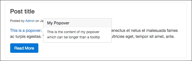
As you can see, the Popover component has more to it than the Tooltip. It includes a title and content. You should use this component if you need to give more context than can be achieved through the use of a regular Tooltip.
Again, like Tooltips, it is possible to control the position of a Popover component. This is done in the same way by using the data-placement attribute on the link tag. Here's the code for each variation:
<p><a id="popover-link" data-placement="top" data-toggle="popover"  data-content="This is the content of my popover which can be longer than a tooltip">This is a popover</a>. Pellentesque habitant morbi...</p>

<p><a id="popover-link" data-placement="bottom" data-toggle="popover"  data-content="This is the content of my popover which can be longer than a tooltip">This is a popover</a>. Pellentesque habitant morbi...</p>

<p><a id="popover-link" data-placement="right" data-toggle="popover"  data-content="This is the content of my popover which can be longer than a tooltip">This is a popover</a>. Pellentesque habitant morbi...</p>

<p><a id="popover-link" data-placement="left" data-toggle="popover"  data-content="This is the content of my popover which can be longer than a tooltip">This is a popover</a>. Pellentesque habitant morbi...</p>
Since this works in exactly the same way as for Tooltips, I won't bother breaking it down any further. Simply include the data-placement attribute and give it one of the four positioning values to control where the Popover appears when clicked.
A Popover component can also be easily added to a button. Open up the index template again and insert the following button code:
<p><button type="button" id="popover-button" class="btn btn-primary" data-toggle="popover" data-content="This is a button popover example">Popover Button</button></p>
As you can see, this markup is very similar to the Tooltip button. Let's break it down again:
- The button tag needs an ID of
popover-buttonto be added - As with the link, set the
data-toggleattribute topopover - Include a value for
titleand thedata-contentattribute
As with the previous examples, don't forget to update the JavaScript!
The last thing we need to do is update the JavaScript to initialize our new Popover button. Open up _layout.ejs and insert the following line of code after the Popover link JavaScript:
$("#popover-button").popover();
Once that is complete, save both files and open up the index page in your browser. Locate the button you inserted and click it. Your Popover should look like this:
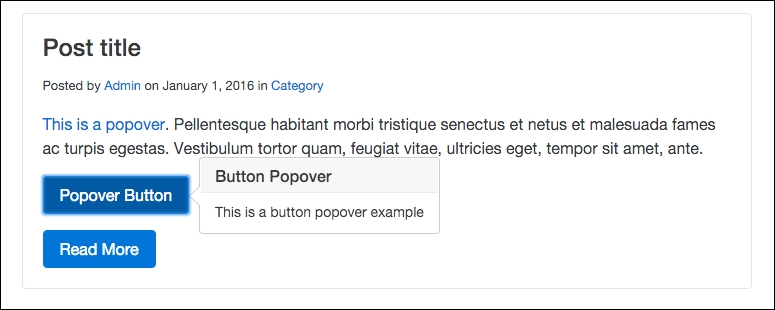
As you can see, you now have a button with a Popover component attached to it. This can be useful for calling out something important with a button, and then once it has been clicked it reveals a message to your users. I have a couple more JavaScript components I would like to review with you; the next one is the Collapse component.