Table of Contents for
Bootstrap 4 – Responsive Web Design
 Bootstrap 4 – Responsive Web Design
Published by
Packt Publishing, 2017
Bootstrap 4 – Responsive Web Design
Published by
Packt Publishing, 2017
- Cover
- Table of Contents
- Bootstrap 4 – Responsive Web Design
- Bootstrap 4 – Responsive Web Design
- Credits
- Preface
- What you need for this learning path
- Who this learning path is for
- Reader feedback
- Customer support
- 1. Module 1
- 1. Getting Started
- Setting up the framework
- Building our first Bootstrap example
- Optionally using the CDN setup
- Community activity
- Bootstrap and web applications
- Browser compatibility
- Summary
- 2. Creating a Solid Scaffolding
- Building our scaffolding
- Fluid container
- We need some style!
- Manipulating tables
- Like a boss!
- Final thoughts
- Summary
- 3. Yes, You Should Go Mobile First
- Bootstrap and the mobile-first design
- How to debug different viewports at the browser
- Cleaning up the mess
- Creating the landing page for different devices
- Summary
- 4. Applying the Bootstrap Style
- Summary
- 5. Making It Fancy
- Paying attention to your navigation
- Dropping it down
- Making an input grouping
- Getting ready for flexbox!
- Summary
- 6. Can You Build a Web App?
- Adding the navigation
- Do a grid again
- Playing the cards
- Implementing the main content
- Creating breadcrumbs
- Finishing with the right-hand-side content
- Summary
- 7. Of Course, You Can Build a Web App!
- Waiting for the progress bar
- Creating a settings page
- Summary
- 8. Working with JavaScript
- Awesome Bootstrap modals
- Creating our custom modal
- A tool for your tip
- Pop it all over
- Making the menu affix
- Finishing the web app
- Summary
- 9. Entering in the Advanced Mode
- The last navigation bar with flexbox
- Filling the main fluid content
- Filling the main content
- Overhead loading
- Fixing the toggle button for mobile
- Summary
- 10. Bringing Components to Life
- Fixing the mobile viewport
- Learning more advanced plugins
- Summary
- 11. Making It Your Taste
- Working with plugin customization
- The additional Bootstrap plugins
- Creating our Bootstrap plugin
- Defining the plugin methods
- Creating additional plugin methods
- Summary
- 2. Module 2
- 1. Introducing Bootstrap 4
- Summary
- 2. Using Bootstrap Build Tools
- Download the Bootstrap source files
- Setting up the blog project
- Setting up the JSON files
- Creating our first page template
- Summary
- 3. Jumping into Flexbox
- Ordering your Flexbox
- Wrapping your Flexbox
- Setting up the Bootstrap Flexbox layout grid
- Setting up a Flexbox project
- Designing a single blog post
- Summary
- 4. Working with Layouts
- Inserting rows into your layout
- Adding columns to your layout
- Choosing a column class
- Creating a simple three-column layout
- Mixing column classes for different devices
- Coding the blog home page
- Using responsive utility classes
- Summary
- 5. Working with Content
- Learning to use typography
- Customizing headings
- How to style images
- Coding tables
- Summary
- 6. Playing with Components
- Basic button examples
- Creating outlined buttons
- Checkbox and radio buttons
- Coding forms in Bootstrap 4
- Creating an inline form
- Adding validation to inputs
- Using the Jumbotron component
- Adding the Label component
- Using the Alerts component
- Using Cards for layout
- Updating the Blog index page
- How to use the Navs component
- Adding Breadcrumbs to a page
- Using the Pagination component
- How to use the List Group component
- Summary
- 7. Extending Bootstrap with JavaScript Plugins
- Coding Tooltips
- Avoiding collisions with our components
- Using Popover components
- Using the Collapse component
- Coding an Accordion with the Collapse component
- Coding a Bootstrap Carousel
- Summary
- 8. Throwing in Some Sass
- Using Sass in the blog project
- Importing partials in Sass
- Creating a collection of variables
- Customizing components
- Writing a theme
- Summary
- 9. Migrating from Version 3
- Big changes in version 4
- Updating your variables
- Additional global changes
- Other font updates
- Migrating components
- Migrating JavaScript
- Miscellaneous migration changes
- Summary
- 3. Module 3
- 1. Revving Up Bootstrap
- What Bootstrap 4 Alpha 4 has to offer
- Setting up our project
- Summary
- 2. Making a Style Statement
- Image elements
- Responsive utilities
- Helper classes
- Text alignment and transformation
- Summary
- 3. Building the Layout
- Adding Bootstrap components
- Summary
- 4. On Navigation, Footers, Alerts, and Content
- Improving navigation using Scrollspy
- Customizing scroll speed
- Icons
- Using and customizing alerts
- Creating a footer
- Creating and customizing forms
- Form validation
- Progress indicators
- Adding content using media objects
- Figures
- Quotes
- Abbreviations
- Summary
- 5. Speeding Up Development Using jQuery Plugins
- Enhanced pagination using bootpag
- Displaying images using Bootstrap Lightbox
- Improving our price list with DataTables
- Summary
- 6. Customizing Your Plugins
- Customizing plugins
- Writing a custom Bootstrap jQuery plugin
- Summary
- 7. Integrating Bootstrap with Third-Party Plugins
- Hover
- Summary
- 8. Optimizing Your Website
- Minifying CSS and JavaScript
- Introducing Grunt
- Running tasks automatically
- Stripping our website of unused CSS
- JavaScript file concatenation
- Summary
- 9. Integrating with AngularJS and React
- Introducing React
- Summary
- Bibliography
- Index
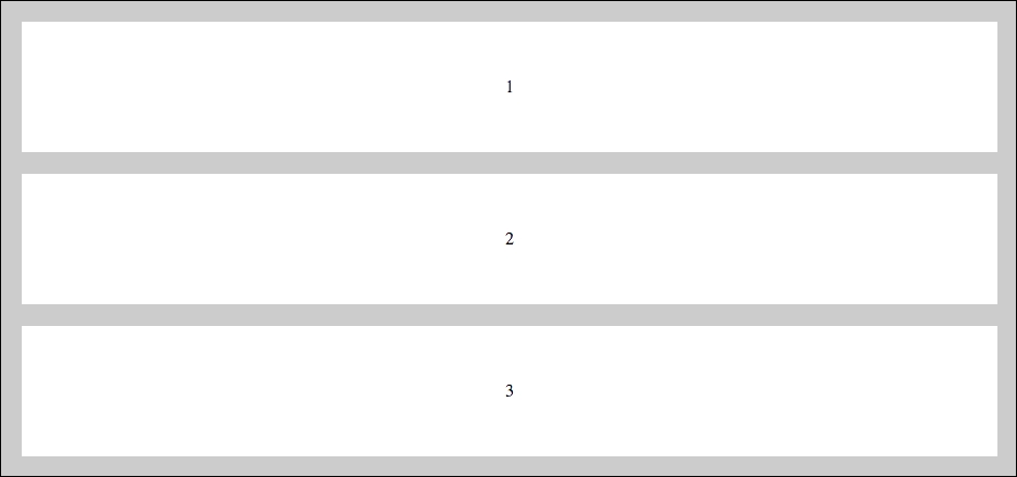
Flexbox is a really powerful module as it comes with several properties that you can customize. Let's quickly go over some more basics before we fully take the plunge and use Flexbox in Bootstrap. Let's start by talking about the order of child boxes. By default, they will appear in the order that you insert them in the HTML file. Consider the following code:
<div class="parent">
   <div class="child">
   1
   </div>
   <div class="child">
   2
   </div>
   <div class="child">
   3
   </div>
</div>
A proper CSS will produce a layout that looks like this:

Here's the CSS to produce this layout if you are following along at home:
.parent {
  display: flex;
  background: #ccc;
  padding: 10px;
  font-family: helvetica;
}

.child {
  padding: 10px;
  margin: 10px;
  background: #fff;
  flex-grow: 1;
  text-align:center;
  height: 100px;
  line-height: 100px;
}
Now using an order property we can reorder the children using some CSS. Let's put the third box at the beginning. If you are reordering some blocks, you need to define the position for each one; you can't simply enter the value for a single block. Add the following CSS to your style sheet:
.child:nth-of-type(1) {
  order: 2;
}
.child:nth-of-type(2) {
  order: 3;
}
.child:nth-of-type(3) {
  order: 1;
}
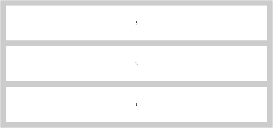
I'm using the nth-of-type pseudo selector to target each of the three boxes. I've then used the order property to set the third box to the first position. I've also adjusted the other two boxes to move them over one space. Save the file and your boxes should now look like this:

As you can see, the third box has moved to the first position. It's as easy as that to rearrange blocks on boxes on a page. I think you'll likely see how this could be useful for coding up a web application dashboard.
Another important Flexbox feature is the ability to stretch the width of the child boxes to fit the full-width of the containing parent. If you look at the preceding CSS you'll notice a flex-grow property on the .child class. The property is set to 1 which means that the child boxes will stretch to equally fill their parent. You could also do something where one box is set to a different value, using the nth-of-type selector, and then it would be wider than the others. Here's the code to create equal-width columns as that is what you'll likely do in most cases:
.child {
   flex-grow: 1;
}
By default in Flexbox, the child boxes will be in a row going left to right. If you like, you can change the direction using the flex-direction property. Let's try out a few different directions. First let's review our base HTML code again:
<div class="parent">
   <div class="child">
     1
   </div>
   <div class="child">
     2
   </div>
   <div class="child">
     3
   </div>
</div>
Here's the base CSS we wrote a little earlier. However, this time we'll add the flex-direction property (with a value of row-reverse)to the .parent class. This will reverse the order of the boxes:
.parent {
  display: flex;
  flex-direction: row-reverse;
  background: #ccc;
  padding: 10px;
}

.child {
  padding: 10px;
  margin: 10px;
  background: #fff;
  flex-grow: 1;
  text-align:center;
  height: 100px;
  line-height: 100px;
}
If you save the file and view it in a browser it should now look like this:

What if we wanted to order the boxes vertically so they were stacked on top of each other in descending order? We can do that by changing the flex-direction property to column:
.parent {
   ...
   flex-direction: column;
}
That configuration will produce a grid that looks like this:
Finally there is one more direction we can try. Let's do the same vertically stacked grid but this time we'll reverse it. We do that by switching the flex-direction property to column-reverse:
.parent {
   ...
   flex-direction: column-reverse;
}
That will produce a grid that looks like this: