Table of Contents for
Bootstrap 4 – Responsive Web Design
 Bootstrap 4 – Responsive Web Design
Published by
Packt Publishing, 2017
Bootstrap 4 – Responsive Web Design
Published by
Packt Publishing, 2017
- Cover
- Table of Contents
- Bootstrap 4 – Responsive Web Design
- Bootstrap 4 – Responsive Web Design
- Credits
- Preface
- What you need for this learning path
- Who this learning path is for
- Reader feedback
- Customer support
- 1. Module 1
- 1. Getting Started
- Setting up the framework
- Building our first Bootstrap example
- Optionally using the CDN setup
- Community activity
- Bootstrap and web applications
- Browser compatibility
- Summary
- 2. Creating a Solid Scaffolding
- Building our scaffolding
- Fluid container
- We need some style!
- Manipulating tables
- Like a boss!
- Final thoughts
- Summary
- 3. Yes, You Should Go Mobile First
- Bootstrap and the mobile-first design
- How to debug different viewports at the browser
- Cleaning up the mess
- Creating the landing page for different devices
- Summary
- 4. Applying the Bootstrap Style
- Summary
- 5. Making It Fancy
- Paying attention to your navigation
- Dropping it down
- Making an input grouping
- Getting ready for flexbox!
- Summary
- 6. Can You Build a Web App?
- Adding the navigation
- Do a grid again
- Playing the cards
- Implementing the main content
- Creating breadcrumbs
- Finishing with the right-hand-side content
- Summary
- 7. Of Course, You Can Build a Web App!
- Waiting for the progress bar
- Creating a settings page
- Summary
- 8. Working with JavaScript
- Awesome Bootstrap modals
- Creating our custom modal
- A tool for your tip
- Pop it all over
- Making the menu affix
- Finishing the web app
- Summary
- 9. Entering in the Advanced Mode
- The last navigation bar with flexbox
- Filling the main fluid content
- Filling the main content
- Overhead loading
- Fixing the toggle button for mobile
- Summary
- 10. Bringing Components to Life
- Fixing the mobile viewport
- Learning more advanced plugins
- Summary
- 11. Making It Your Taste
- Working with plugin customization
- The additional Bootstrap plugins
- Creating our Bootstrap plugin
- Defining the plugin methods
- Creating additional plugin methods
- Summary
- 2. Module 2
- 1. Introducing Bootstrap 4
- Summary
- 2. Using Bootstrap Build Tools
- Download the Bootstrap source files
- Setting up the blog project
- Setting up the JSON files
- Creating our first page template
- Summary
- 3. Jumping into Flexbox
- Ordering your Flexbox
- Wrapping your Flexbox
- Setting up the Bootstrap Flexbox layout grid
- Setting up a Flexbox project
- Designing a single blog post
- Summary
- 4. Working with Layouts
- Inserting rows into your layout
- Adding columns to your layout
- Choosing a column class
- Creating a simple three-column layout
- Mixing column classes for different devices
- Coding the blog home page
- Using responsive utility classes
- Summary
- 5. Working with Content
- Learning to use typography
- Customizing headings
- How to style images
- Coding tables
- Summary
- 6. Playing with Components
- Basic button examples
- Creating outlined buttons
- Checkbox and radio buttons
- Coding forms in Bootstrap 4
- Creating an inline form
- Adding validation to inputs
- Using the Jumbotron component
- Adding the Label component
- Using the Alerts component
- Using Cards for layout
- Updating the Blog index page
- How to use the Navs component
- Adding Breadcrumbs to a page
- Using the Pagination component
- How to use the List Group component
- Summary
- 7. Extending Bootstrap with JavaScript Plugins
- Coding Tooltips
- Avoiding collisions with our components
- Using Popover components
- Using the Collapse component
- Coding an Accordion with the Collapse component
- Coding a Bootstrap Carousel
- Summary
- 8. Throwing in Some Sass
- Using Sass in the blog project
- Importing partials in Sass
- Creating a collection of variables
- Customizing components
- Writing a theme
- Summary
- 9. Migrating from Version 3
- Big changes in version 4
- Updating your variables
- Additional global changes
- Other font updates
- Migrating components
- Migrating JavaScript
- Miscellaneous migration changes
- Summary
- 3. Module 3
- 1. Revving Up Bootstrap
- What Bootstrap 4 Alpha 4 has to offer
- Setting up our project
- Summary
- 2. Making a Style Statement
- Image elements
- Responsive utilities
- Helper classes
- Text alignment and transformation
- Summary
- 3. Building the Layout
- Adding Bootstrap components
- Summary
- 4. On Navigation, Footers, Alerts, and Content
- Improving navigation using Scrollspy
- Customizing scroll speed
- Icons
- Using and customizing alerts
- Creating a footer
- Creating and customizing forms
- Form validation
- Progress indicators
- Adding content using media objects
- Figures
- Quotes
- Abbreviations
- Summary
- 5. Speeding Up Development Using jQuery Plugins
- Enhanced pagination using bootpag
- Displaying images using Bootstrap Lightbox
- Improving our price list with DataTables
- Summary
- 6. Customizing Your Plugins
- Customizing plugins
- Writing a custom Bootstrap jQuery plugin
- Summary
- 7. Integrating Bootstrap with Third-Party Plugins
- Hover
- Summary
- 8. Optimizing Your Website
- Minifying CSS and JavaScript
- Introducing Grunt
- Running tasks automatically
- Stripping our website of unused CSS
- JavaScript file concatenation
- Summary
- 9. Integrating with AngularJS and React
- Introducing React
- Summary
- Bibliography
- Index
Progress bars are very useful in web applications in cases where, for example, you need to wait for an action to be sent to the server while maintaining a feedback for the user that something is being done in the background.
For instance, we can create a progress bar to present the user that a new tweet is being posted. Likewise, other scenarios can suit well for a progress bar, for example, when you are uploading a file on the server or when the web client is loading some information.
To exemplify this, we will create another alert that will contain a progress bar inside for a new tweet post feedback, subliminally saying "Hey, wait until I finish my task!"
We replace the .alert code that we just created with the new one presented here:
<div class="alert alert-info" role="alert"> <button type="button" class="close" data-dismiss="alert" aria-label="Close"><span aria-hidden="true">×</span></button> <h3>Posting new Tweet</h3> </div>
This will produce a blue alert using the colors from .alert-info. In the new element, create the following code for the progress bar:
<div class="alert alert-info" role="alert"> <button type="button" class="close" data-dismiss="alert" aria-label="Close"><span aria-hidden="true">×</span></button> <h3>Posting new Tweet</h3> <div class="progress"> <div class="progress-bar progress-bar-info" role="progressbar" aria-valuenow="25" aria-valuemin="0" aria-valuemax="100" style="width: 25%"> </div> </div> </div>
The result of the progress bar in shown in the next screenshot. Let's understand each part of the new component:
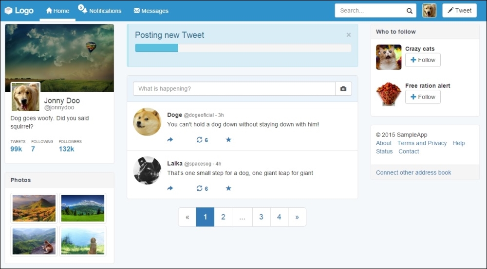
We created a div.progress inside our alert component, which is the gray rectangle to be filled during the progress. Inside it, we have another tag, div.progress-bar, to create the inside filler that contains the .progress-bar-info class to make the bar blue, following the .info contextual color.
The progress bar also has some aria-* attributes and its size is set by the width: 25% style. To change its size, just change the width style.
Just like alerts, progress bars have the same contextual colors of Bootstrap. Just use the .progress-bar-* prefix while using the suffix of one of the contextual colors. It is also possible to apply stripe marks to the progress bar with the .progress-bar-striped class:
<div class="alert alert-info" role="alert">
<button type="button" class="close" data-dismiss="alert" aria-label="Close"><span aria-hidden="true">×</span></button>
<h3>Posting new Tweet</h3>
<div class="progress">
<div class="progress-bar progress-bar-info progress-bar-striped active" role="progressbar" aria-valuenow="25" aria-valuemin="0" aria-valuemax="100" style="width: 25%">
</div>
</div>
</div>Finally, you can also animate the strip using the .active class in conjunction with the .progress-bar-striped class. Check out the next screenshot to see the result of addition of the classes:

Now we have a good opportunity to use the CSS @keyframes animations.
If you check out the CSS code when you add the .progress-bar-striped and .active classes, Bootstrap will load the following animation:
.progress-bar.active {
    animation: progress-bar-stripes 2s linear infinite;
}
This animation applies to the CSS selector, the @keyframe defined at progress-bar-stripes:
@keyframes progress-bar-stripes {
  from {
    background-position: 40px 0;
  }
  to {
    background-position: 0 0;
  }
}
This means that the striped background will move from a position of 40 pixels to 0, repeating it every 2 seconds.
Well, nice to meet you progress-bar-stripes, but I can do another animation! Create the following @keyframe:
@keyframes w70 {
  from { width: 0%; }
  to { width: 70%; }
}
The goal of this key frame is to change the width of our progress bar from 0% to 70% of the maximum when the page loads. Now apply the new animation to .progress-bar.active:
.progress-bar.active {
  animation: w70 1s ease forwards,
             progress-bar-stripes 2s linear infinite;
}
So, our animation will last 1 second and execute just once, since we defined it to be just forwards. Note that we must override the animations, so after the new animation, which is w70, add the current animation, which is progress-bar-stripes. Refresh the page and see this fancy effect.