Table of Contents for
Bootstrap 4 – Responsive Web Design
 Bootstrap 4 – Responsive Web Design
Published by
Packt Publishing, 2017
Bootstrap 4 – Responsive Web Design
Published by
Packt Publishing, 2017
- Cover
- Table of Contents
- Bootstrap 4 – Responsive Web Design
- Bootstrap 4 – Responsive Web Design
- Credits
- Preface
- What you need for this learning path
- Who this learning path is for
- Reader feedback
- Customer support
- 1. Module 1
- 1. Getting Started
- Setting up the framework
- Building our first Bootstrap example
- Optionally using the CDN setup
- Community activity
- Bootstrap and web applications
- Browser compatibility
- Summary
- 2. Creating a Solid Scaffolding
- Building our scaffolding
- Fluid container
- We need some style!
- Manipulating tables
- Like a boss!
- Final thoughts
- Summary
- 3. Yes, You Should Go Mobile First
- Bootstrap and the mobile-first design
- How to debug different viewports at the browser
- Cleaning up the mess
- Creating the landing page for different devices
- Summary
- 4. Applying the Bootstrap Style
- Summary
- 5. Making It Fancy
- Paying attention to your navigation
- Dropping it down
- Making an input grouping
- Getting ready for flexbox!
- Summary
- 6. Can You Build a Web App?
- Adding the navigation
- Do a grid again
- Playing the cards
- Implementing the main content
- Creating breadcrumbs
- Finishing with the right-hand-side content
- Summary
- 7. Of Course, You Can Build a Web App!
- Waiting for the progress bar
- Creating a settings page
- Summary
- 8. Working with JavaScript
- Awesome Bootstrap modals
- Creating our custom modal
- A tool for your tip
- Pop it all over
- Making the menu affix
- Finishing the web app
- Summary
- 9. Entering in the Advanced Mode
- The last navigation bar with flexbox
- Filling the main fluid content
- Filling the main content
- Overhead loading
- Fixing the toggle button for mobile
- Summary
- 10. Bringing Components to Life
- Fixing the mobile viewport
- Learning more advanced plugins
- Summary
- 11. Making It Your Taste
- Working with plugin customization
- The additional Bootstrap plugins
- Creating our Bootstrap plugin
- Defining the plugin methods
- Creating additional plugin methods
- Summary
- 2. Module 2
- 1. Introducing Bootstrap 4
- Summary
- 2. Using Bootstrap Build Tools
- Download the Bootstrap source files
- Setting up the blog project
- Setting up the JSON files
- Creating our first page template
- Summary
- 3. Jumping into Flexbox
- Ordering your Flexbox
- Wrapping your Flexbox
- Setting up the Bootstrap Flexbox layout grid
- Setting up a Flexbox project
- Designing a single blog post
- Summary
- 4. Working with Layouts
- Inserting rows into your layout
- Adding columns to your layout
- Choosing a column class
- Creating a simple three-column layout
- Mixing column classes for different devices
- Coding the blog home page
- Using responsive utility classes
- Summary
- 5. Working with Content
- Learning to use typography
- Customizing headings
- How to style images
- Coding tables
- Summary
- 6. Playing with Components
- Basic button examples
- Creating outlined buttons
- Checkbox and radio buttons
- Coding forms in Bootstrap 4
- Creating an inline form
- Adding validation to inputs
- Using the Jumbotron component
- Adding the Label component
- Using the Alerts component
- Using Cards for layout
- Updating the Blog index page
- How to use the Navs component
- Adding Breadcrumbs to a page
- Using the Pagination component
- How to use the List Group component
- Summary
- 7. Extending Bootstrap with JavaScript Plugins
- Coding Tooltips
- Avoiding collisions with our components
- Using Popover components
- Using the Collapse component
- Coding an Accordion with the Collapse component
- Coding a Bootstrap Carousel
- Summary
- 8. Throwing in Some Sass
- Using Sass in the blog project
- Importing partials in Sass
- Creating a collection of variables
- Customizing components
- Writing a theme
- Summary
- 9. Migrating from Version 3
- Big changes in version 4
- Updating your variables
- Additional global changes
- Other font updates
- Migrating components
- Migrating JavaScript
- Miscellaneous migration changes
- Summary
- 3. Module 3
- 1. Revving Up Bootstrap
- What Bootstrap 4 Alpha 4 has to offer
- Setting up our project
- Summary
- 2. Making a Style Statement
- Image elements
- Responsive utilities
- Helper classes
- Text alignment and transformation
- Summary
- 3. Building the Layout
- Adding Bootstrap components
- Summary
- 4. On Navigation, Footers, Alerts, and Content
- Improving navigation using Scrollspy
- Customizing scroll speed
- Icons
- Using and customizing alerts
- Creating a footer
- Creating and customizing forms
- Form validation
- Progress indicators
- Adding content using media objects
- Figures
- Quotes
- Abbreviations
- Summary
- 5. Speeding Up Development Using jQuery Plugins
- Enhanced pagination using bootpag
- Displaying images using Bootstrap Lightbox
- Improving our price list with DataTables
- Summary
- 6. Customizing Your Plugins
- Customizing plugins
- Writing a custom Bootstrap jQuery plugin
- Summary
- 7. Integrating Bootstrap with Third-Party Plugins
- Hover
- Summary
- 8. Optimizing Your Website
- Minifying CSS and JavaScript
- Introducing Grunt
- Running tasks automatically
- Stripping our website of unused CSS
- JavaScript file concatenation
- Summary
- 9. Integrating with AngularJS and React
- Introducing React
- Summary
- Bibliography
- Index
In this chapter, we're going to dive deeper into Bootstrap components by learning how to extend the framework using JavaScript plugins. You may remember that back in the first chapter we included bootstrap.min.js in our template. This file contains a number of JavaScript components that come with Bootstrap. In this chapter, we'll go over how to use some of these components, including: Modals, Tooltips, Popovers, Collapse, and Carousel. Let's get right to it by learning how to create a Modal in Bootstrap 4.
Modals go by a number of different names; you may also know them as dialogs, popups, overlays, or alerts. In the case of Bootstrap, this component is referred to as a Modal and that is how I'll be referring to it throughout the book. A Modal is made up of two required pieces of code. The first is a button, and here's the basic code required to render it:
<button type="button" class="btn btn-primary" data-toggle="modal" data-target="#firstModal">
  Open Modal
</button>
As you can see, this is a basic Button component with a few attributes added to it:
- The first is the
data-toggledata attribute, which needs to be set tomodal. This tells the browser that this<button>is attached to a Modal component. - The second is the
data-targetattribute, which should be an ID. It doesn't really matter what you name this, I've called it#firstModal. It's important to note this ID name as it will be tied in later. Also make sure that the ID name is unique.
Once you've coded this up, it should look like a regular button in the browser:

The second part of the Modal component is the dialog. This is the part that will pop up in the browser once you click the button. Let's take a look at some basic code for creating the dialog:
<div class="modal fade" id="firstModal" tabindex="-1" role="dialog" aria-hidden="true">
<div class="modal-dialog" role="document">
<div class="modal-content">
<div class="modal-header">
<button type="button" class="close" data-dismiss="modal" aria-label="Close">
<span aria-hidden="true">×</span>
</button>
<h4 class="modal-title">Dialog Title</h4>
</div>
<div class="modal-body">
Some copy for your modal.
</div>
<div class="modal-footer">
<button type="button" class="btn btn-secondary" data-dismiss="modal">Close</button>
<button type="button" class="btn btn-primary">Save</button>
</div>
</div>
</div>
</div>
This is a bigger piece of code and there are a few things going on here that I need to explain to you:
- The entire dialog is wrapped in a
<div>with a required class of.modal. There's also an optional.fadeclass there, which will fade the dialog in. Note the ID on this<div>because it's important. The ID value needs to match thedata-targetattribute you set on the button. This is how we tell the browser to link that button with this dialog. Finally, there are a couple of other attributes that are required by Bootstrap includingtabindex,role, andaria-hidden. Make sure you include those with their corresponding values. - Inside the first
<div>we have a second one with a class of.modal-dialogon it; make sure you include that. - Next, the interior of the Modal is split into three parts: header, body, and footer.
- Inside our
.modal-dialog, add another<div>with a class of.modal-headeron it. Within this section you'll notice another button. This button is the Close or X icon for the Modal; although not required, it's a good idea to include this. - After the button you need to include a header tag, in this case a
<h4>, with a CSS class of.modal-titleon it. Here you should enter the title for your Modal. - The next section is another
<div>for our body and it has a class of.modal-bodyon it. Within this section you should enter the body copy for your Modal. - Finally, we have the footer section, which is another
<div>with a class of.modal-footeron it. Inside this section you'll find two buttons that you need to include. The first is the white button labeled Close which when clicked will close the Modal. Note that the<button>tag has a data attribute calleddata-dismisson it and its value ismodal. This will close the Modal. The second button is a primary button that would be used as a Save button if you were hooking in the actual functionality.
After coding all that up, go to the browser and click on your button. You should then see a Modal that looks like this:
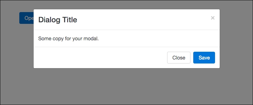
As you can see, our Modal has popped up over the button. You can read the Modal title and body and see the footer buttons as well as the Close or X button in the top-right corner. You may have noticed that you didn't actually have to write any JavaScript to make this Modal work. That is the power of the Bootstrap framework; all of the JavaScript is already written for you and you can simply call the Modal functionality by using the HTML data attributes, which makes things much easier. That concludes the lesson on Modals; next let's move on to learning how to use Tooltips.