Table of Contents for
Bootstrap 4 – Responsive Web Design
 Bootstrap 4 – Responsive Web Design
Published by
Packt Publishing, 2017
Bootstrap 4 – Responsive Web Design
Published by
Packt Publishing, 2017
- Cover
- Table of Contents
- Bootstrap 4 – Responsive Web Design
- Bootstrap 4 – Responsive Web Design
- Credits
- Preface
- What you need for this learning path
- Who this learning path is for
- Reader feedback
- Customer support
- 1. Module 1
- 1. Getting Started
- Setting up the framework
- Building our first Bootstrap example
- Optionally using the CDN setup
- Community activity
- Bootstrap and web applications
- Browser compatibility
- Summary
- 2. Creating a Solid Scaffolding
- Building our scaffolding
- Fluid container
- We need some style!
- Manipulating tables
- Like a boss!
- Final thoughts
- Summary
- 3. Yes, You Should Go Mobile First
- Bootstrap and the mobile-first design
- How to debug different viewports at the browser
- Cleaning up the mess
- Creating the landing page for different devices
- Summary
- 4. Applying the Bootstrap Style
- Summary
- 5. Making It Fancy
- Paying attention to your navigation
- Dropping it down
- Making an input grouping
- Getting ready for flexbox!
- Summary
- 6. Can You Build a Web App?
- Adding the navigation
- Do a grid again
- Playing the cards
- Implementing the main content
- Creating breadcrumbs
- Finishing with the right-hand-side content
- Summary
- 7. Of Course, You Can Build a Web App!
- Waiting for the progress bar
- Creating a settings page
- Summary
- 8. Working with JavaScript
- Awesome Bootstrap modals
- Creating our custom modal
- A tool for your tip
- Pop it all over
- Making the menu affix
- Finishing the web app
- Summary
- 9. Entering in the Advanced Mode
- The last navigation bar with flexbox
- Filling the main fluid content
- Filling the main content
- Overhead loading
- Fixing the toggle button for mobile
- Summary
- 10. Bringing Components to Life
- Fixing the mobile viewport
- Learning more advanced plugins
- Summary
- 11. Making It Your Taste
- Working with plugin customization
- The additional Bootstrap plugins
- Creating our Bootstrap plugin
- Defining the plugin methods
- Creating additional plugin methods
- Summary
- 2. Module 2
- 1. Introducing Bootstrap 4
- Summary
- 2. Using Bootstrap Build Tools
- Download the Bootstrap source files
- Setting up the blog project
- Setting up the JSON files
- Creating our first page template
- Summary
- 3. Jumping into Flexbox
- Ordering your Flexbox
- Wrapping your Flexbox
- Setting up the Bootstrap Flexbox layout grid
- Setting up a Flexbox project
- Designing a single blog post
- Summary
- 4. Working with Layouts
- Inserting rows into your layout
- Adding columns to your layout
- Choosing a column class
- Creating a simple three-column layout
- Mixing column classes for different devices
- Coding the blog home page
- Using responsive utility classes
- Summary
- 5. Working with Content
- Learning to use typography
- Customizing headings
- How to style images
- Coding tables
- Summary
- 6. Playing with Components
- Basic button examples
- Creating outlined buttons
- Checkbox and radio buttons
- Coding forms in Bootstrap 4
- Creating an inline form
- Adding validation to inputs
- Using the Jumbotron component
- Adding the Label component
- Using the Alerts component
- Using Cards for layout
- Updating the Blog index page
- How to use the Navs component
- Adding Breadcrumbs to a page
- Using the Pagination component
- How to use the List Group component
- Summary
- 7. Extending Bootstrap with JavaScript Plugins
- Coding Tooltips
- Avoiding collisions with our components
- Using Popover components
- Using the Collapse component
- Coding an Accordion with the Collapse component
- Coding a Bootstrap Carousel
- Summary
- 8. Throwing in Some Sass
- Using Sass in the blog project
- Importing partials in Sass
- Creating a collection of variables
- Customizing components
- Writing a theme
- Summary
- 9. Migrating from Version 3
- Big changes in version 4
- Updating your variables
- Additional global changes
- Other font updates
- Migrating components
- Migrating JavaScript
- Miscellaneous migration changes
- Summary
- 3. Module 3
- 1. Revving Up Bootstrap
- What Bootstrap 4 Alpha 4 has to offer
- Setting up our project
- Summary
- 2. Making a Style Statement
- Image elements
- Responsive utilities
- Helper classes
- Text alignment and transformation
- Summary
- 3. Building the Layout
- Adding Bootstrap components
- Summary
- 4. On Navigation, Footers, Alerts, and Content
- Improving navigation using Scrollspy
- Customizing scroll speed
- Icons
- Using and customizing alerts
- Creating a footer
- Creating and customizing forms
- Form validation
- Progress indicators
- Adding content using media objects
- Figures
- Quotes
- Abbreviations
- Summary
- 5. Speeding Up Development Using jQuery Plugins
- Enhanced pagination using bootpag
- Displaying images using Bootstrap Lightbox
- Improving our price list with DataTables
- Summary
- 6. Customizing Your Plugins
- Customizing plugins
- Writing a custom Bootstrap jQuery plugin
- Summary
- 7. Integrating Bootstrap with Third-Party Plugins
- Hover
- Summary
- 8. Optimizing Your Website
- Minifying CSS and JavaScript
- Introducing Grunt
- Running tasks automatically
- Stripping our website of unused CSS
- JavaScript file concatenation
- Summary
- 9. Integrating with AngularJS and React
- Introducing React
- Summary
- Bibliography
- Index
After the navigation bar, we must fill the main content using a fluid layout. For that, we create a .container-fluid, just as we did in the <nav>. Inside the container, we create a single .row and two columns with spacing three and nine, respectively:
<div class="container-fluid">
  <div class="row">
    <div id="side-menu" class="col-md-3 hidden-xs">
    </div>

    <div id="main" class="col-md-9">
    </div>
  </div>
</div>
It is a common grid, containing one row. In the row, the first column, #side-menu, is shown from small viewports up to larger ones, while the #main column fills 9 out of 12 grids for medium resolutions.
However, we must not forget that #side-menu is actually an affix component. So, let's add the data properties to make it stitch to the top of the page, as we did in the web application example when you were learning this plugin:
<div class="container-fluid">
  <div class="row">
    <div id="side-menu" class="col-md-3 hidden-xs" data-spy="affix" data-offset-top="0">
    </div>

    <div id="main" class="col-sm-offset-3 col-md-9">
    </div>
  </div>
</div>
Note that because of the addition of the affix, we must set an offset in the #main div with the .col-sm-offset-3 class.
Let's fill #side-menu with content. At first, we have to create the profile block, which contains the user data. Place the following HTML inside the referred element:
<div id="side-menu" class="col-md-3 hidden-xs" data-spy="affix" data-offset-top="0">
  <div class="profile-block">
    <img src="imgs/jon.png" class="img-circle">
    <h4 class="profile-title">Jonny Doo <small>@jonnydoo</small></h4>
  </div>
</div>
Check out the page in the browser, and you will see that it is not displaying nicely. For the CSS, we must follow this style:
#side-menu {
  background-color: #1b1e24;
  padding-top: 7.2rem;
  height: 100%;
  position: fixed;
}

#side-menu .profile-block > * {
  display: inline-block;
}

#side-menu .profile-block img {
  width: 70px;
}

#side-menu .profile-title {
  color: #FFF;
  margin-left: 1rem;
  font-size: 1.5em;
  vertical-align: middle;
}

#side-menu .profile-title small {
  display: block;
}
With that, the #side-menu should fill the entire left height, but if you resize the browser to a smaller resolution, you will see that #nav-header does not resize together with the main content. This is a small challenge. Do you know why it is happening?
That was a little prank! Did I get you? In #side-menu, we applied only the class for medium viewports, that is, the .col-md-3 class. What we should have done was apply the class for small devices as well to make it responsive to small viewports and resize like all the other elements, which needs the .col-sm-* class. In this case, just change the class of #side-menu and in the #main element as well:
<div class="container-fluid">
<div class="row">
<div id="side-menu" class="col-sm-3 hidden-xs" data-spy="affix" data-offset-top="0">
</div>
<div id="main" class="col-sm-offset-3 col-sm-9">
</div>
</div>
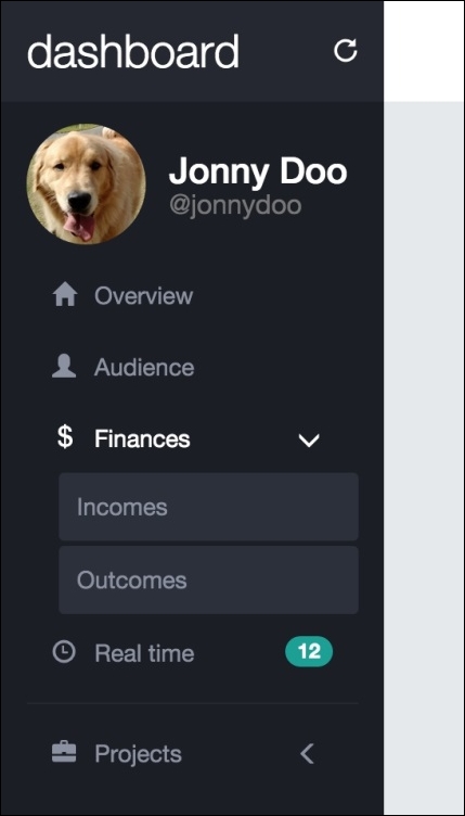
</div>Here is a screenshot that shows the result of the side menu for the moment:
A web application is never a web application if it does not have a menu. After the profile info in #side-menu, we will add a stacked menu.
Hearing the word "stacked" for a menu, what you remember? Of course, the .nav-stacked menu from Bootstrap! Let's create a .nav-stacked component in this menu. Therefore, after #profile-block, append the following HTML:
<ul class="nav nav-pills nav-stacked">
  <li>
    <a href="#" class="transition">
      <span class="glyphicon glyphicon-home" aria-hidden="true"></span>
      Overview
    </a>
  </li>
  <li>
    <a href="#" class="transition">
      <span class="glyphicon glyphicon-user" aria-hidden="true"></span>
      Audience
    </a>
  </li>
  <li>
    <a href="#" class="transition">
      <span class="glyphicon glyphicon-usd" aria-hidden="true"></span>
      Finances
      <span class="glyphicon glyphicon-menu-left pull-right transition" aria-hidden="true"></span>
    </a>
  </li>
  <li>
    <a href="#" class="transition">
      <span class="glyphicon glyphicon-time" aria-hidden="true"></span>
      Real time
      <span class="badge pull-right">12</span>
    </a>
  </li>
  <li class="nav-divider"></li>
  <li>
    <a href="#" class="transition">
      <span class="glyphicon glyphicon-briefcase" aria-hidden="true"></span>
      Projects
      <span class="glyphicon glyphicon-menu-left pull-right transition" aria-hidden="true"></span>
    </a>
  </li>
</ul>
No secrets here! Just create a simple stacked list using the .nav, .nav-pills, and .nav-stacked classes. Bootstrap will do the magic for you. You will learn a little trick now—the collapse Bootstrap plugin.
Collapse is another plugin from Bootstrap that toggles the visualization behavior of an element. It will show or collapse an item regarding the trigger of an action.
To add the collapse event to an element, you should add a data attribute called data-toggle="collapse". If the element is a link <a>, point the anchor to the identifier of the element, like this: href="#my-collapsed-element". If it is a <button>, add the data attribute pointing the identifier, like this for instance: data-target="#my-collapsed-element". The difference between using href for a link and data-target for a button is because of the semantics of the element. Naturally, every link is expected to have a reference in the href, although we do not have this requirement in buttons. So, Bootstrap binds the element through a data-target data attribute.
We will create a sublist in our menu using the collapse plugin for the Finances and Projects entries. After the link of each one of these items, create a secondary list, as is pointed in the following highlighted HTML. Also, since we are using <a> tags, we add to the href the identifier of the element that will be collapsed and the data-toggle corresponding to collapse:
<ul class="nav nav-pills nav-stacked">
  <li>
    <a href="#" class="transition">
      <span class="glyphicon glyphicon-home" aria-hidden="true"></span>
      Overview
    </a>
  </li>
  <li>
    <a href="#" class="transition">
      <span class="glyphicon glyphicon-user" aria-hidden="true"></span>
      Audience
    </a>
  </li>
  <li>
    <a href="#finances-opts" class="transition" role="button" data-toggle="collapse" aria-expanded="false" aria-controls="finances-opts">
      <span class="glyphicon glyphicon-usd" aria-hidden="true"></span>
      Finances
      <span class="glyphicon glyphicon-menu-left pull-right transition" aria-hidden="true"></span>
    </a>
    <ul class="collapse list-unstyled" id="finances-opts">
      <li>
        <a href="#" class="transition">
          Incomes
        </a>
      </li>
      <li>
        <a href="#" class="transition">
          Outcomes
        </a>
      </li>
    </ul>
  </li>
  <li>
    <a href="#" class="transition">
      <span class="glyphicon glyphicon-time" aria-hidden="true"></span>
      Real time
      <span class="badge pull-right">12</span>
    </a>
  </li>
  <li class="nav-divider"></li>
  <li>
    <a href="#projects-opts" class="transition" role="button" data-toggle="collapse" aria-expanded="false" aria-controls="projects-opts">
      <span class="glyphicon glyphicon-briefcase" aria-hidden="true"></span>
      Projects
      <span class="glyphicon glyphicon-menu-left pull-right transition" aria-hidden="true"></span>
    </a>
    <ul class="collapse list-unstyled" id="projects-opts">
      <li>
        <a href="#" class="transition">
          Free ration nation
        </a>
      </li>
      <li>
        <a href="#" class="transition">
          Cats going crazy
        </a>
      </li>
    </ul>
  </li>
</ul>
To make it clear, take as an example the first collapsed menu from Finances. Below the Finances link, we created the list to be collapsed, identified by #finances-opt. We also added the .collapse class, which is a Bootstrap class used to collapse elements.
Going back to the Finances link, add to the href the ID of the collapsed list, #finances-opt. Also, we added the data-toggle="collapse" required to Bootstrap Collapse work. Finally, we added the aria attributes, aria-controls and aria-controls, for semantic notation.
Refresh the browser and you will see how Bootstrap does almost the entire job for us. In the CSS, we need to add some simple styles for color and spacing:
#side-menu ul.nav {
  margin-top: 1rem;
}

#side-menu ul.nav a {
  color: #8b91a0;
}

#side-menu ul.nav a:hover,
#side-menu ul.nav a:focus {
  color: #FFF;
  background-color: inherit;
}

#side-menu ul.nav a .glyphicon {
  margin-right: 0.7rem;
}

#side-menu ul.nav a .glyphicon.pull-right {
  margin-top: 0.2rem;
}

#side-menu ul.nav a .badge {
  background-color: #1ca095;
}

#side-menu ul.nav .nav-divider {
  background-color: #252830;
}

#side-menu ul.nav ul {
  margin-left: 10%;
}

#side-menu ul.nav ul a {
  display: block;
  background-color: #2b303b;
  padding: 1rem;
  margin-bottom: 0.3rem;
  border-radius: 0.25em;
}

#side-menu ul.nav ul a:hover {
  text-decoration: none;
  background-color: #434857;
}
Go to the browser and refresh it to see the result. It should look like what is shown in this screenshot:
Let's add a cherry to this pie while learning other CSS properties. What do you think if we could rotate the arrow of the items that have collapsed menus by 90 degrees anticlockwise to create an opening effect? It would be awesome—even more if we did that with only CSS.
Add the next CSS rule for the effect using the transform property:
#side-menu ul.nav a:focus .glyphicon.pull-right {
  -moz-transform: rotate(-90deg);
  -webkit-transform: rotate(-90deg);
  -o-transform: rotate(-90deg);
  -ms-transform: rotate(-90deg);
  transform: rotate(-90deg);
}
This transform property will do exactly what we want; when the link is in focus (which means it is clicked on), the icon from the arrow will rotate 90 degrees anticlockwise, because of the minus signal.
To be more pro, let's use a supernew property called will-change. Add the style to the following selector:
#side-menu ul.nav a .glyphicon.pull-right {
  margin-top: 0.2rem;
  will-change: transform;
}
Tip
The will-change property
The will-change property optimizes animations by letting the browser know which elements will change and need careful treatment. Currently, this property is not supported by all browsers, but soon it will be. Check out its availability at http://caniuse.com/#feat=will-change.
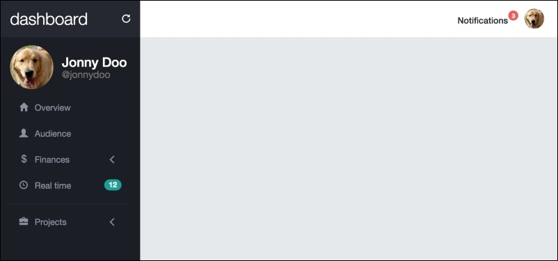
Click to open a submenu and see the opening menu animation with the arrow rotation. The next screenshot presents an open menu: