Table of Contents for
Bootstrap 4 – Responsive Web Design
 Bootstrap 4 – Responsive Web Design
Published by
Packt Publishing, 2017
Bootstrap 4 – Responsive Web Design
Published by
Packt Publishing, 2017
- Cover
- Table of Contents
- Bootstrap 4 – Responsive Web Design
- Bootstrap 4 – Responsive Web Design
- Credits
- Preface
- What you need for this learning path
- Who this learning path is for
- Reader feedback
- Customer support
- 1. Module 1
- 1. Getting Started
- Setting up the framework
- Building our first Bootstrap example
- Optionally using the CDN setup
- Community activity
- Bootstrap and web applications
- Browser compatibility
- Summary
- 2. Creating a Solid Scaffolding
- Building our scaffolding
- Fluid container
- We need some style!
- Manipulating tables
- Like a boss!
- Final thoughts
- Summary
- 3. Yes, You Should Go Mobile First
- Bootstrap and the mobile-first design
- How to debug different viewports at the browser
- Cleaning up the mess
- Creating the landing page for different devices
- Summary
- 4. Applying the Bootstrap Style
- Summary
- 5. Making It Fancy
- Paying attention to your navigation
- Dropping it down
- Making an input grouping
- Getting ready for flexbox!
- Summary
- 6. Can You Build a Web App?
- Adding the navigation
- Do a grid again
- Playing the cards
- Implementing the main content
- Creating breadcrumbs
- Finishing with the right-hand-side content
- Summary
- 7. Of Course, You Can Build a Web App!
- Waiting for the progress bar
- Creating a settings page
- Summary
- 8. Working with JavaScript
- Awesome Bootstrap modals
- Creating our custom modal
- A tool for your tip
- Pop it all over
- Making the menu affix
- Finishing the web app
- Summary
- 9. Entering in the Advanced Mode
- The last navigation bar with flexbox
- Filling the main fluid content
- Filling the main content
- Overhead loading
- Fixing the toggle button for mobile
- Summary
- 10. Bringing Components to Life
- Fixing the mobile viewport
- Learning more advanced plugins
- Summary
- 11. Making It Your Taste
- Working with plugin customization
- The additional Bootstrap plugins
- Creating our Bootstrap plugin
- Defining the plugin methods
- Creating additional plugin methods
- Summary
- 2. Module 2
- 1. Introducing Bootstrap 4
- Summary
- 2. Using Bootstrap Build Tools
- Download the Bootstrap source files
- Setting up the blog project
- Setting up the JSON files
- Creating our first page template
- Summary
- 3. Jumping into Flexbox
- Ordering your Flexbox
- Wrapping your Flexbox
- Setting up the Bootstrap Flexbox layout grid
- Setting up a Flexbox project
- Designing a single blog post
- Summary
- 4. Working with Layouts
- Inserting rows into your layout
- Adding columns to your layout
- Choosing a column class
- Creating a simple three-column layout
- Mixing column classes for different devices
- Coding the blog home page
- Using responsive utility classes
- Summary
- 5. Working with Content
- Learning to use typography
- Customizing headings
- How to style images
- Coding tables
- Summary
- 6. Playing with Components
- Basic button examples
- Creating outlined buttons
- Checkbox and radio buttons
- Coding forms in Bootstrap 4
- Creating an inline form
- Adding validation to inputs
- Using the Jumbotron component
- Adding the Label component
- Using the Alerts component
- Using Cards for layout
- Updating the Blog index page
- How to use the Navs component
- Adding Breadcrumbs to a page
- Using the Pagination component
- How to use the List Group component
- Summary
- 7. Extending Bootstrap with JavaScript Plugins
- Coding Tooltips
- Avoiding collisions with our components
- Using Popover components
- Using the Collapse component
- Coding an Accordion with the Collapse component
- Coding a Bootstrap Carousel
- Summary
- 8. Throwing in Some Sass
- Using Sass in the blog project
- Importing partials in Sass
- Creating a collection of variables
- Customizing components
- Writing a theme
- Summary
- 9. Migrating from Version 3
- Big changes in version 4
- Updating your variables
- Additional global changes
- Other font updates
- Migrating components
- Migrating JavaScript
- Miscellaneous migration changes
- Summary
- 3. Module 3
- 1. Revving Up Bootstrap
- What Bootstrap 4 Alpha 4 has to offer
- Setting up our project
- Summary
- 2. Making a Style Statement
- Image elements
- Responsive utilities
- Helper classes
- Text alignment and transformation
- Summary
- 3. Building the Layout
- Adding Bootstrap components
- Summary
- 4. On Navigation, Footers, Alerts, and Content
- Improving navigation using Scrollspy
- Customizing scroll speed
- Icons
- Using and customizing alerts
- Creating a footer
- Creating and customizing forms
- Form validation
- Progress indicators
- Adding content using media objects
- Figures
- Quotes
- Abbreviations
- Summary
- 5. Speeding Up Development Using jQuery Plugins
- Enhanced pagination using bootpag
- Displaying images using Bootstrap Lightbox
- Improving our price list with DataTables
- Summary
- 6. Customizing Your Plugins
- Customizing plugins
- Writing a custom Bootstrap jQuery plugin
- Summary
- 7. Integrating Bootstrap with Third-Party Plugins
- Hover
- Summary
- 8. Optimizing Your Website
- Minifying CSS and JavaScript
- Introducing Grunt
- Running tasks automatically
- Stripping our website of unused CSS
- JavaScript file concatenation
- Summary
- 9. Integrating with AngularJS and React
- Introducing React
- Summary
- Bibliography
- Index
The last chapter was tough! Although the dashboard is not ready yet, following our layout, we must create three more cards in the main, while fixing issues regarding visualization for multiple viewports. After that, we will move on to creating more components for our dashboard. Let's proceed towards this new challenge!
In this chapter, we will cover the following topics:
- A custom checkbox
- External plugin integration
- Advanced Bootstrap media queries
- The viewport's advanced adjustments
- The Bootstrap Carousel plugin
- The Bootstrap Scrollspy plugin
Taking a look at our layout, we must create three more cards. The first of them is the hardest one, so let's face it!
The following .card is composed of an area chart with two series and some iOS-styled checkboxes. This screenshot reminds us of what the card must look like:
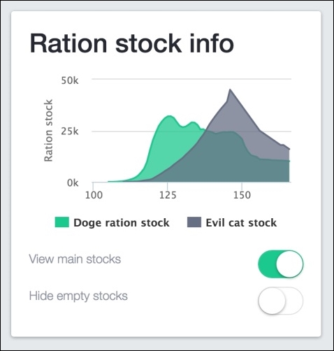
For the chart area, we will again use the highcharts library, while for the checkbox, we will use a plugin called switchery (https://github.com/abpetkov/switchery). After we've considered the documentation, let's create the following HTML:
<div class="card" id="ration-stock">
  <div class="card-block">
    <h2>Ration stock info</h2>
    <div class="stacked-area"></div>
    <div class="switch">
      View main stocks
      <input type="checkbox" class="swithcery" checked />
      <div class="clearfix"></div>
    </div>
    <div class="switch">
      Hide empty stocks
      <input type="checkbox" class="swithcery" />
      <div class="clearfix"></div>
    </div>
  </div>
</div>
Breaking the code down, to create the chart, we just have to set the div.stacked-area element. For the checkbox, we must create an input with type="checkbox" and the .switchery class to identify it.
Load the CSS of switchery in <head>, after the Bootstrap CSS:
<link rel="stylesheet" href="css/switchery.min.css">
Also, in the HTML, import the switchery library in the bottom part that contains the JavaScript loads:
<script src="js/switchery.min.js"></script>
We do not need much CSS here, since most of it will be created by JavaScript. So, just add the following rules to specify the height of the chart and the font style for the checkbox text:
#ration-stock .stacked-area {
  height: 200px;
}

#ration-stock .switch {
  font-weight: 300;
  color: #8b91a0;
  padding: 0.5rem 0;
}

#ration-stock .switchery {
  float: right;
}
The JavaScript contains the core portion of this card. First, let's initialize the switchery plugin. In main.js, inside the .ready function, add these lines:
var elems, switcheryOpts;

elems = Array.prototype.slice.call(document.querySelectorAll('.switchery'));

switcheryOpts = {
    color: '#1bc98e'
};

elems.forEach(function(el) {
    var switchery = new Switchery(el, switcheryOpts);
});
In elems, we store the elements that contain the .switchery class. This plugin does not use jQuery, so we must create a query using native JavaScript. The query needed to select the elements follows the one provided in the documentation, and I recommend that you check it out for further information, since this is not the main focus of the book.
The query is performed by document.querySelectorAll('.switchery'). Array is a global JavaScript object used to create high-level list objects present in most recent browsers.
The slice function chops the array using a shallow copy into another array. In summary, we are getting an array of elements with the .switchery class.
Next, we set the options for the plugin, in this case just the background color, using the color property in the switcheryOpts variable. Finally, we start each Switchery object inside the forEach loop.
Refresh the web page and the new card should appear as what is shown in the following screenshot:
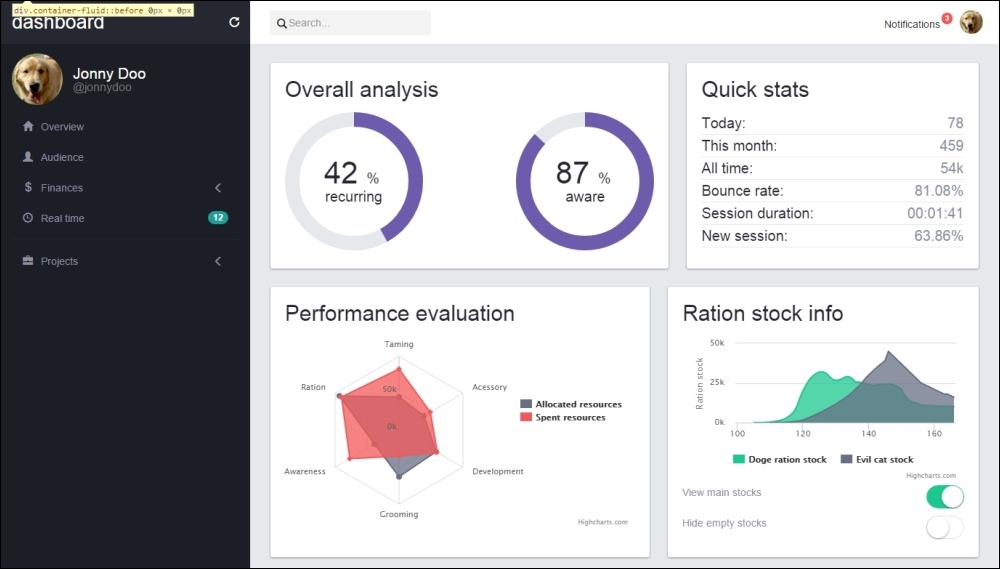
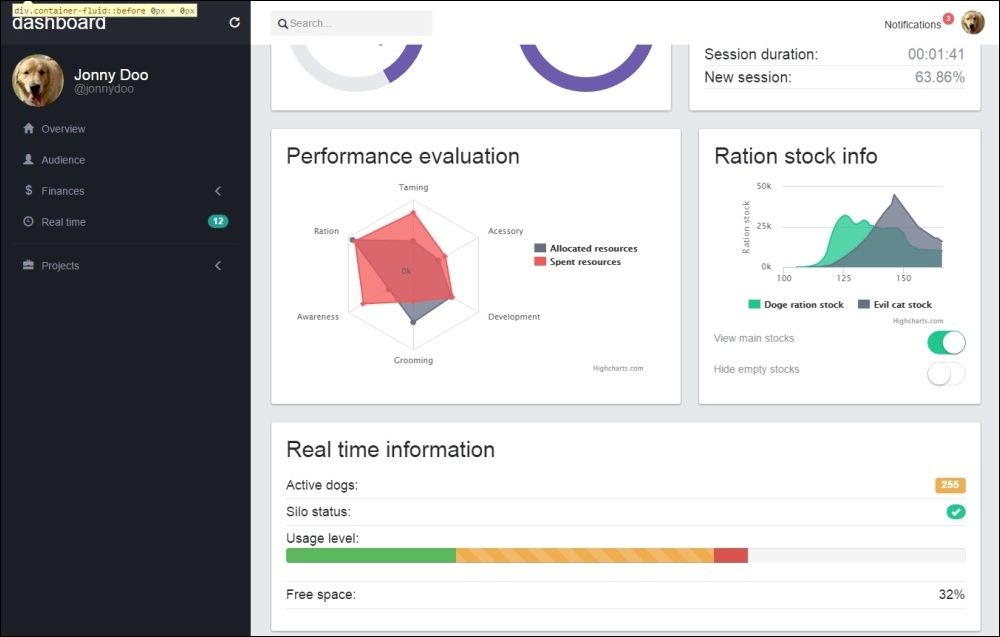
To create the next card, we will use the Bootstrap progress bar component, labels, and badges. This card represents some kind of real-time information, and we will create it using the progress bar and make it animated through JavaScript.
First, let's create this new card identified by #real-time in the HTML. Place the code after the last card, #ration-stock:
<div class="card" id="real-time">
  <div class="card-block">
  <h2>Real time information</h2>
  </div>
</div>
After <h2>, we must create a list containing each item of the information. A label, a badge, a progress bar, and a piece of sample text compose the list. Create it like the highlighted HTML code shown here:
<div class="card" id="real-time">
  <div class="card-block">
  <h2>Real time information</h2>
    <ul class="list-unstyled">
      <li>
        Active dogs:
        <span class="label label-warning pull-right">255</span>
      </li>
      <li>
        Silo status:
        <span class="badge ok pull-right">
          <span class="glyphicon glyphicon-ok" aria-hidden="true"></span>
        </span>
      </li>
      <li>
        Usage level:
        <div class="progress">
          <div class="progress-bar progress-bar-success" role="progressbar" aria-valuenow="25" aria-valuemin="0" aria-valuemax="100" style="width: 25%">
            <span class="sr-only">25%</span>
          </div>
          <div class="progress-bar progress-bar-warning progress-bar-striped active" role="progressbar" aria-valuenow="38" aria-valuemin="0" aria-valuemax="100" style="width: 38%">
            <span class="sr-only">38% alocated</span>
          </div>
          <div class="progress-bar progress-bar-danger" role="progressbar" aria-valuenow="5" aria-valuemin="0" aria-valuemax="100" style="width: 5%">
            <span class="sr-only">5% reserved</span>
          </div>
        </div>
      </li>
      <li>
        Free space:
        <span id="free-space" class="pull-right">
          32%
        </span>
      </li>
    </ul>
  </div>
</div>
Because we are mostly using only Bootstrap elements and components, we do not need too much CSS but just the following:
#real-time li {
  font-size: 1.8rem;
  font-weight: 300;
  border-bottom: 0.1rem solid #e5e9ec;
  padding: 0.5rem 0;
}

#real-time .badge.ok {
  background-color: #1bc98e;
}

#real-time .badge span,
#real-time .label {
  color: #FFF;
}

#real-time .badge,
#real-time .label {
  margin-top: 0.25rem;
}
This CSS will change the font size of the text in the card and the borders from one to another item in the list. Also, for the badge and the labels, we've customized the colors and margins.
Refresh the page and it should look like this:
The new card looks nice! Now let's create some CSS to animate it. Let's change the free space percentage periodically. To do this, create the following JavaScript function:
changeMultiplier = 0.2;
window.setInterval(function() {
  var freeSpacePercentage;

  freeSpacePercentage = $('#free-space').text();
  freeSpacePercentage = parseFloat(freeSpacePercentage);

  delta = changeMultiplier * (Math.random() < 0.5 ? -1.0 : 1.0);

  freeSpacePercentage = freeSpacePercentage + freeSpacePercentage * delta;
  freeSpacePercentage = parseInt(freeSpacePercentage);

  $('#free-space').text(freeSpacePercentage + '%');
}, 2000);
With this JavaScript code, we are executing a function every 2 seconds. We did this because of the usage of the setInterval function, and we call it every 2,000 ms (or 2 seconds).
What is done first is just a parse of the text inside the #free-space percentage element. Then we create a delta that could be 20 percent positive or negative, randomly generated by using the changeMultiplier parameter.
Finally, we multiply the delta by the current value and update the value in the element. To update the value in the element, we use the .text() function from jQuery. This function sets the content for the element to the specified text passed as a parameter; in this case, it's the percentage change in freeSpacePercentage that we randomly generated.
Refresh the page and see the number update every 2 seconds.
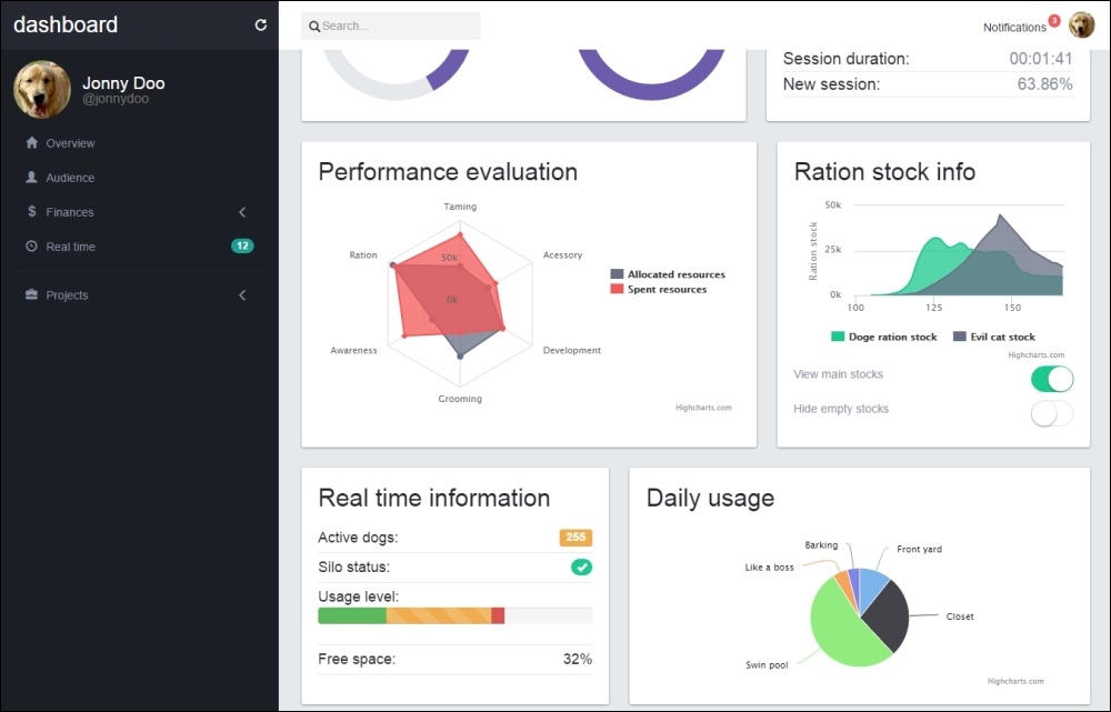
The last card in the main content is another plot, this time a pie chart. Just like the last charts, let's again use the Highcharts library. Remember that we must first create a simple HTML card, placed after the last #real-time card:
<div class="card" id="daily-usage">
  <div class="card-block">
    <h2>Daily usage</h2>
    <div class="area-chart"></div>
  </div>
</div>
In the CSS, just set the height of the plot:
#daily-usage .area-chart {
  height: 200px;
}
To complete it—the most important part for this card—create the function calls in the JavaScript:
$('#daily-usage .area-chart').highcharts({
    title: {
        text: '',
    },
    tooltip: {
        pointFormat: '{series.name}: <b>{point.percentage:.1f}%</b>'
    },
    plotOptions: {
        pie: {
            dataLabels: {
                enabled: true,
                style: {
                    fontWeight: '300'
                }
            }
        }
    },
    series: [{
        type: 'pie',
        name: 'Time share',
        data: [
            ['Front yard', 10.38],
            ['Closet', 26.33],
            ['Swim pool', 51.03],
            ['Like a boss', 4.77],
            ['Barking', 3.93]
        ]
    }]
});
As you can see in the preceding code, we set the graph to be of the pie type and create the share for each segment in the data array.
The following screenshot shows how the last card must be displayed on the web browser:
And we are done! The main page of the dashboard is complete. Now let's proceed to the next pages in this component.