Table of Contents for
Bootstrap 4 – Responsive Web Design
 Bootstrap 4 – Responsive Web Design
Published by
Packt Publishing, 2017
Bootstrap 4 – Responsive Web Design
Published by
Packt Publishing, 2017
- Cover
- Table of Contents
- Bootstrap 4 – Responsive Web Design
- Bootstrap 4 – Responsive Web Design
- Credits
- Preface
- What you need for this learning path
- Who this learning path is for
- Reader feedback
- Customer support
- 1. Module 1
- 1. Getting Started
- Setting up the framework
- Building our first Bootstrap example
- Optionally using the CDN setup
- Community activity
- Bootstrap and web applications
- Browser compatibility
- Summary
- 2. Creating a Solid Scaffolding
- Building our scaffolding
- Fluid container
- We need some style!
- Manipulating tables
- Like a boss!
- Final thoughts
- Summary
- 3. Yes, You Should Go Mobile First
- Bootstrap and the mobile-first design
- How to debug different viewports at the browser
- Cleaning up the mess
- Creating the landing page for different devices
- Summary
- 4. Applying the Bootstrap Style
- Summary
- 5. Making It Fancy
- Paying attention to your navigation
- Dropping it down
- Making an input grouping
- Getting ready for flexbox!
- Summary
- 6. Can You Build a Web App?
- Adding the navigation
- Do a grid again
- Playing the cards
- Implementing the main content
- Creating breadcrumbs
- Finishing with the right-hand-side content
- Summary
- 7. Of Course, You Can Build a Web App!
- Waiting for the progress bar
- Creating a settings page
- Summary
- 8. Working with JavaScript
- Awesome Bootstrap modals
- Creating our custom modal
- A tool for your tip
- Pop it all over
- Making the menu affix
- Finishing the web app
- Summary
- 9. Entering in the Advanced Mode
- The last navigation bar with flexbox
- Filling the main fluid content
- Filling the main content
- Overhead loading
- Fixing the toggle button for mobile
- Summary
- 10. Bringing Components to Life
- Fixing the mobile viewport
- Learning more advanced plugins
- Summary
- 11. Making It Your Taste
- Working with plugin customization
- The additional Bootstrap plugins
- Creating our Bootstrap plugin
- Defining the plugin methods
- Creating additional plugin methods
- Summary
- 2. Module 2
- 1. Introducing Bootstrap 4
- Summary
- 2. Using Bootstrap Build Tools
- Download the Bootstrap source files
- Setting up the blog project
- Setting up the JSON files
- Creating our first page template
- Summary
- 3. Jumping into Flexbox
- Ordering your Flexbox
- Wrapping your Flexbox
- Setting up the Bootstrap Flexbox layout grid
- Setting up a Flexbox project
- Designing a single blog post
- Summary
- 4. Working with Layouts
- Inserting rows into your layout
- Adding columns to your layout
- Choosing a column class
- Creating a simple three-column layout
- Mixing column classes for different devices
- Coding the blog home page
- Using responsive utility classes
- Summary
- 5. Working with Content
- Learning to use typography
- Customizing headings
- How to style images
- Coding tables
- Summary
- 6. Playing with Components
- Basic button examples
- Creating outlined buttons
- Checkbox and radio buttons
- Coding forms in Bootstrap 4
- Creating an inline form
- Adding validation to inputs
- Using the Jumbotron component
- Adding the Label component
- Using the Alerts component
- Using Cards for layout
- Updating the Blog index page
- How to use the Navs component
- Adding Breadcrumbs to a page
- Using the Pagination component
- How to use the List Group component
- Summary
- 7. Extending Bootstrap with JavaScript Plugins
- Coding Tooltips
- Avoiding collisions with our components
- Using Popover components
- Using the Collapse component
- Coding an Accordion with the Collapse component
- Coding a Bootstrap Carousel
- Summary
- 8. Throwing in Some Sass
- Using Sass in the blog project
- Importing partials in Sass
- Creating a collection of variables
- Customizing components
- Writing a theme
- Summary
- 9. Migrating from Version 3
- Big changes in version 4
- Updating your variables
- Additional global changes
- Other font updates
- Migrating components
- Migrating JavaScript
- Miscellaneous migration changes
- Summary
- 3. Module 3
- 1. Revving Up Bootstrap
- What Bootstrap 4 Alpha 4 has to offer
- Setting up our project
- Summary
- 2. Making a Style Statement
- Image elements
- Responsive utilities
- Helper classes
- Text alignment and transformation
- Summary
- 3. Building the Layout
- Adding Bootstrap components
- Summary
- 4. On Navigation, Footers, Alerts, and Content
- Improving navigation using Scrollspy
- Customizing scroll speed
- Icons
- Using and customizing alerts
- Creating a footer
- Creating and customizing forms
- Form validation
- Progress indicators
- Adding content using media objects
- Figures
- Quotes
- Abbreviations
- Summary
- 5. Speeding Up Development Using jQuery Plugins
- Enhanced pagination using bootpag
- Displaying images using Bootstrap Lightbox
- Improving our price list with DataTables
- Summary
- 6. Customizing Your Plugins
- Customizing plugins
- Writing a custom Bootstrap jQuery plugin
- Summary
- 7. Integrating Bootstrap with Third-Party Plugins
- Hover
- Summary
- 8. Optimizing Your Website
- Minifying CSS and JavaScript
- Introducing Grunt
- Running tasks automatically
- Stripping our website of unused CSS
- JavaScript file concatenation
- Summary
- 9. Integrating with AngularJS and React
- Introducing React
- Summary
- Bibliography
- Index
Let's first start by customizing a single component; later on I'll talk about creating a theme where you customize all the components in Bootstrap. To get started, we'll build on the button component we started to work on earlier. In this next step we are going to expand on the CSS we have added to fully customize the component. What you want to do is overwrite all the CSS classes and properties that you want to change. In some cases, this might only be a few things but in other scenarios you may want to change quite a bit.
To start, open up _buttons.scss located in /css/components in our project directory. The first thing we need to customize is the base .btn CSS class. Once we have applied some changes there, we'll add more CSS to control the look and feel of the different button variations. Insert the following CSS at the top of the file for the base button class:
.btn {
  background-color: $grey;
  border-color: $grey;

  @include border-radius(20px);
}
To keep things simple, I'm only going to overwrite a few properties. You're totally free to get more creative and change additional properties to make your buttons look different from the Bootstrap default link. Let's break down what I've done:
- First I've set the
background-colorandborder-colorto use the$greyfrom our color palette. This is a good time to point out that if you want to do a full theme you need to overwrite all the Bootstrap default colors on all components to match your color palette. - Next I've inserted the
border-radiusmixin and given it a value of20px. This will make the buttons really rounded. I'm going for this look so you can clearly see that the button has been customized.
Once you have saved these changes, go to the terminal and run the harp compile command from the root of the project directory. Then fire up the server and open the home page of the project that has a bunch of buttons on it. Your buttons should now look like this:
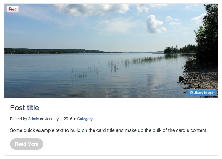
Now that might not look too useful, but it's important that we customize the base .btn class first; now we'll continue building the component out by applying our color palette to all of the different button variations.
In this next section, we will extend the button component further by applying our color palette to all the different Bootstrap button variations. Before we get to all the different button types, let's start by customizing the .btn-primary variation. Enter the following code in the _buttons.scss file after the base .btn styles:
.btn-primary {
   background-color: $purple;
   border-color: $purple;
}

.btn-primary:hover,
.btn-primary:active {
   background-color: $purple2;
   border-color: $purple2;
}
There are a few different things going on so let's review them all:
- There are two sections of CSS for each button variation. The first is the static state of the button. The second is the hover and active states of the button.
- For the static state we use the
.btn-primaryclass and insert thebackground-colorandborder-colorproperties. I want to make my primary button purple so I've inserted the$purpleSass variable to overwrite the Bootstrap default color. - For the other states, we have
.btn-primary:hoverand.btn-primary:active. In this case, I'm using the second purple color variable which is$purple2. On the hover or active button there will be a slightly darker shade of purple.
Save the file, run a harp compile in the terminal, and then open up the home page in your browser. If everything was coded correctly, your buttons should now look like this:
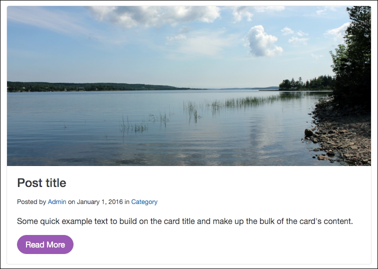
As you can see, the primary button is now purple! It's as simple as that; you can start to apply a custom look and feel to the button component. Let's build out the rest of the button color variations by entering the following code into the _buttons.scss file:
.btn-secondary {
   background-color: $off-white;
   border-color: $off-white;
}

.btn-secondary:hover,
.btn-secondary:active {
   background-color: $grey;
   border-color: $grey;
}

.btn-success {
   background-color: $green;
   border-color: $green;
}

.btn-success:hover,
.btn-success:active {
   background-color: $green2;
   border-color: $green2;
}

.btn-info {
   background-color: $blue;
   border-color: $blue;
}

.btn-info:hover,
.btn-info:active {
   background-color: $blue2;
   border-color: $blue2;
}

.btn-warning {
   background-color: $yellow;
   border-color: $yellow;
}

.btn-warning:hover,
.btn-warning:active {
   background-color: $yellow2;
   border-color: $yellow2;
}

.btn-danger {
   background-color: $red;
   border-color: $red;
}

.btn-danger:hover,
.btn-danger:active {
   background-color: $red2;
   border-color: $red2;
}
That's a bunch of code but it should be fairly easy to understand. I've simply followed the same steps I completed for the primary button for every other button variation. Along the way, I've replaced the default Bootstrap color values with our custom color palette. Once you're done, all of your buttons should now look like this:

We've now successfully customized the entire button component. As I mentioned earlier, there may be additional things you might want to do to the buttons. However, at the very least, we've done enough to show how you can make the component your own. The next step in this process is to go through every Bootstrap component one by one and apply the same customization process. We call this writing your own Bootstrap theme.