Table of Contents for
Bootstrap 4 – Responsive Web Design
 Bootstrap 4 – Responsive Web Design
Published by
Packt Publishing, 2017
Bootstrap 4 – Responsive Web Design
Published by
Packt Publishing, 2017
- Cover
- Table of Contents
- Bootstrap 4 – Responsive Web Design
- Bootstrap 4 – Responsive Web Design
- Credits
- Preface
- What you need for this learning path
- Who this learning path is for
- Reader feedback
- Customer support
- 1. Module 1
- 1. Getting Started
- Setting up the framework
- Building our first Bootstrap example
- Optionally using the CDN setup
- Community activity
- Bootstrap and web applications
- Browser compatibility
- Summary
- 2. Creating a Solid Scaffolding
- Building our scaffolding
- Fluid container
- We need some style!
- Manipulating tables
- Like a boss!
- Final thoughts
- Summary
- 3. Yes, You Should Go Mobile First
- Bootstrap and the mobile-first design
- How to debug different viewports at the browser
- Cleaning up the mess
- Creating the landing page for different devices
- Summary
- 4. Applying the Bootstrap Style
- Summary
- 5. Making It Fancy
- Paying attention to your navigation
- Dropping it down
- Making an input grouping
- Getting ready for flexbox!
- Summary
- 6. Can You Build a Web App?
- Adding the navigation
- Do a grid again
- Playing the cards
- Implementing the main content
- Creating breadcrumbs
- Finishing with the right-hand-side content
- Summary
- 7. Of Course, You Can Build a Web App!
- Waiting for the progress bar
- Creating a settings page
- Summary
- 8. Working with JavaScript
- Awesome Bootstrap modals
- Creating our custom modal
- A tool for your tip
- Pop it all over
- Making the menu affix
- Finishing the web app
- Summary
- 9. Entering in the Advanced Mode
- The last navigation bar with flexbox
- Filling the main fluid content
- Filling the main content
- Overhead loading
- Fixing the toggle button for mobile
- Summary
- 10. Bringing Components to Life
- Fixing the mobile viewport
- Learning more advanced plugins
- Summary
- 11. Making It Your Taste
- Working with plugin customization
- The additional Bootstrap plugins
- Creating our Bootstrap plugin
- Defining the plugin methods
- Creating additional plugin methods
- Summary
- 2. Module 2
- 1. Introducing Bootstrap 4
- Summary
- 2. Using Bootstrap Build Tools
- Download the Bootstrap source files
- Setting up the blog project
- Setting up the JSON files
- Creating our first page template
- Summary
- 3. Jumping into Flexbox
- Ordering your Flexbox
- Wrapping your Flexbox
- Setting up the Bootstrap Flexbox layout grid
- Setting up a Flexbox project
- Designing a single blog post
- Summary
- 4. Working with Layouts
- Inserting rows into your layout
- Adding columns to your layout
- Choosing a column class
- Creating a simple three-column layout
- Mixing column classes for different devices
- Coding the blog home page
- Using responsive utility classes
- Summary
- 5. Working with Content
- Learning to use typography
- Customizing headings
- How to style images
- Coding tables
- Summary
- 6. Playing with Components
- Basic button examples
- Creating outlined buttons
- Checkbox and radio buttons
- Coding forms in Bootstrap 4
- Creating an inline form
- Adding validation to inputs
- Using the Jumbotron component
- Adding the Label component
- Using the Alerts component
- Using Cards for layout
- Updating the Blog index page
- How to use the Navs component
- Adding Breadcrumbs to a page
- Using the Pagination component
- How to use the List Group component
- Summary
- 7. Extending Bootstrap with JavaScript Plugins
- Coding Tooltips
- Avoiding collisions with our components
- Using Popover components
- Using the Collapse component
- Coding an Accordion with the Collapse component
- Coding a Bootstrap Carousel
- Summary
- 8. Throwing in Some Sass
- Using Sass in the blog project
- Importing partials in Sass
- Creating a collection of variables
- Customizing components
- Writing a theme
- Summary
- 9. Migrating from Version 3
- Big changes in version 4
- Updating your variables
- Additional global changes
- Other font updates
- Migrating components
- Migrating JavaScript
- Miscellaneous migration changes
- Summary
- 3. Module 3
- 1. Revving Up Bootstrap
- What Bootstrap 4 Alpha 4 has to offer
- Setting up our project
- Summary
- 2. Making a Style Statement
- Image elements
- Responsive utilities
- Helper classes
- Text alignment and transformation
- Summary
- 3. Building the Layout
- Adding Bootstrap components
- Summary
- 4. On Navigation, Footers, Alerts, and Content
- Improving navigation using Scrollspy
- Customizing scroll speed
- Icons
- Using and customizing alerts
- Creating a footer
- Creating and customizing forms
- Form validation
- Progress indicators
- Adding content using media objects
- Figures
- Quotes
- Abbreviations
- Summary
- 5. Speeding Up Development Using jQuery Plugins
- Enhanced pagination using bootpag
- Displaying images using Bootstrap Lightbox
- Improving our price list with DataTables
- Summary
- 6. Customizing Your Plugins
- Customizing plugins
- Writing a custom Bootstrap jQuery plugin
- Summary
- 7. Integrating Bootstrap with Third-Party Plugins
- Hover
- Summary
- 8. Optimizing Your Website
- Minifying CSS and JavaScript
- Introducing Grunt
- Running tasks automatically
- Stripping our website of unused CSS
- JavaScript file concatenation
- Summary
- 9. Integrating with AngularJS and React
- Introducing React
- Summary
- Bibliography
- Index
To finish the content of the first step of our dashboard, we will move on to the main content, referred to by the column identified by #main. In this section, we will create a set of cards almost similar to the cards made in the web application demo, along with the use of some external plugins for chart generation.
However, before everything else, we need to create some common CSS in our main content. Add the following style to the base.css file:
#main {
  padding-top: 7.2rem;
  display: -webkit-flex;
  display: flex;
  align-items: stretch;
  flex-flow: row wrap;
}

.card {
  position: relative;
  border-radius: 0.25em;
  box-shadow: 0 1px 4px 0 rgba(0, 0, 0, 0.37);
  background-color: #FFF;
  margin: 1.25rem;
  flex-grow: 5;
}

.card * {
  color: #252830;
}

.card-block {
  padding: 2rem;
}

.card-block h2 {
  margin: 0;
  margin-bottom: 1.5rem;
  color: #252830;
}
As I said, we will play with cards inside this element, so let's create the classes that relate to it almost similarly to what we did in the cards for the web application example. In this case, even though you are using Bootstrap 4, you must add to those classes to correctly style the cards component.
Our first card will be placed inside the #main element. So, create the following HTML. The first card will be an
Overall analysis card:
<div id="main" class="col-sm-offset-3 col-sm-9">
  <div class="card" id="pie-charts">
    <div class="card-block">
      <h2>Overall analysis</h2>

    </div>
  </div>
</div>The first plugin that we will use is called Easy Pie Chart (https://rendro.github.io/easy-pie-chart/). This plugin generates only rounded pie charts. It is a lightweight, single-purpose plugin.
In order to use this plugin, you can get it through bower, through npm, or by simply downloading the ZIP file from the repository. In any case, what you will need to do at the end is load the plugin in the HTML file.
We will use the jQuery version of the plugin, so we place the JavaScript file in our js folder and load the plugin at the end of our file:
<script src="js/jquery-1.11.3.js"></script>
<script src="js/bootstrap.js"></script>
<script src="js/jquery.easypiechart.min.js"></script>
<script src="js/main.js"></script>
Inside our #pie-charts card that we just created, let's add some HTML that is needed for the corresponding plugin:
<div class="card" id="pie-charts">
  <div class="card-block">
    <h2>Overall analysis</h2>
    <div class="round-chart" data-percent="42">
      <span>
        42
        <small>
          % <br>
          recurring
        </small>
      </span>
    </div>
    <div class="round-chart" data-percent="87">
      <span>
        87
        <small>
          % <br>
          aware
        </small>
      </span>
    </div>
  </div>
</div>
To make the Easy Pie Chart plugin work, you must apply it to an element, and you can pass arguments by data attributes. For example, in this case, we have data-percent, which will say the fill of the chart.
Go to your JavaScript file (the main.js file), and inside the ready function (just as we did in Chapter 8, Working with JavaScript, Creating our custom modal), add the following code to initialize the plugin:
$(document).ready(function() {
    $('.round-chart').easyPieChart({
        'scaleColor': false,
        'lineWidth': 20,
        'lineCap': 'butt',
        'barColor': '#6d5cae',
        'trackColor': '#e5e9ec',
        'size': 190
    });
});
What we are telling here is the style of the chart. But we need more style! We append the following CSS to our base.css:
.round-chart {
  display: inline-block;
  position: relative;
}

.round-chart + .round-chart {
  float: right;
}

.round-chart span {
  font-size: 3em;
  font-weight: 100;
  line-height: 1.7rem;
  width: 12rem;
  height: 4.4rem;
  text-align: center;
  position: absolute;
  margin: auto;
  top: 0;
  bottom: 0;
  left: 0;
  right: 0;
}

.round-chart span > small {
  font-size: 2rem;
  font-weight: 400;
}
What we are doing here, besides changing some spacing, is the centralization of the percentage text that we have added. Refresh the page and you should see something like this:
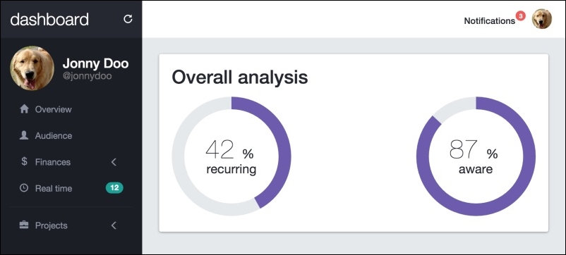
As you can see, the card has filled the entire line. This is because of the flexbox layout that we are using in the #main element. Check out the CSS that we used for this element:
#main {
  padding-top: 7.2rem;
  display: -webkit-flex;
  display: flex;
  align-items: stretch;
  flex-flow: row wrap;
}
With the flex display, if we use align-items: stretch, the layout will stretch to fill the content in the cross axis.
The flex-flow style is a shorthand for flex-direction and flex-wrap. By using this property, we can apply both options to specify the direction of the items, in this case as a row, and set the row to wrap to the next lines.
Also, for each card, we have created the flex-grow: 5 property, which says to the element that it can assume five different sizes inside the #main container.
The next card contains statistical information and we will create it just by using Bootstrap components. So, after the #pie-charts card, create another one in HTML:
<div class="card" id="quick-info">
  <div class="card-block">
    <h2>Quick stats</h2>
    <div class="quick-stats">
      <strong>Today:</strong>
      <span>78</span>
    </div>
    <div class="quick-stats">
      <strong>This month:</strong>
      <span>459</span>
    </div>
    <div class="quick-stats">
      <strong>All time:</strong>
      <span>54k</span>
    </div>
    <div class="quick-stats">
      <strong>Bounce rate:</strong>
      <span>81.08%</span>
    </div>
    <div class="quick-stats">
      <strong>Session duration:</strong>
      <span>00:01:41</span>
    </div>
    <div class="quick-stats">
      <strong>New session:</strong>
      <span>63.86%</span>
    </div>
  </div>
</div>
The #quick-info card contains only the common elements that will be displayed, each one in a line inside .card. Add the next CSS style to correctly display this card:
#quick-info .card-block {
  display: flex;
  flex-direction: column;
}

#quick-info .quick-stats {
  font-size: 2rem;
  line-height: 3rem;
  border-bottom: 0.1rem solid #e5e9ec;
}

#quick-info .quick-stats strong {
  font-weight: 300;
}

#quick-info .quick-stats span {
  font-weight: 300;
  float: right;
  color: #8b91a0;
}
In the web browser, you should see the following result:
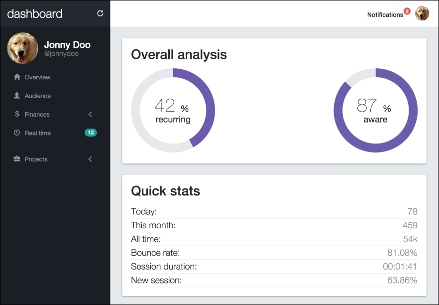
But wait! If you look at the initial layout, you will realize that those two cards should be displayed side by side! What happened here?
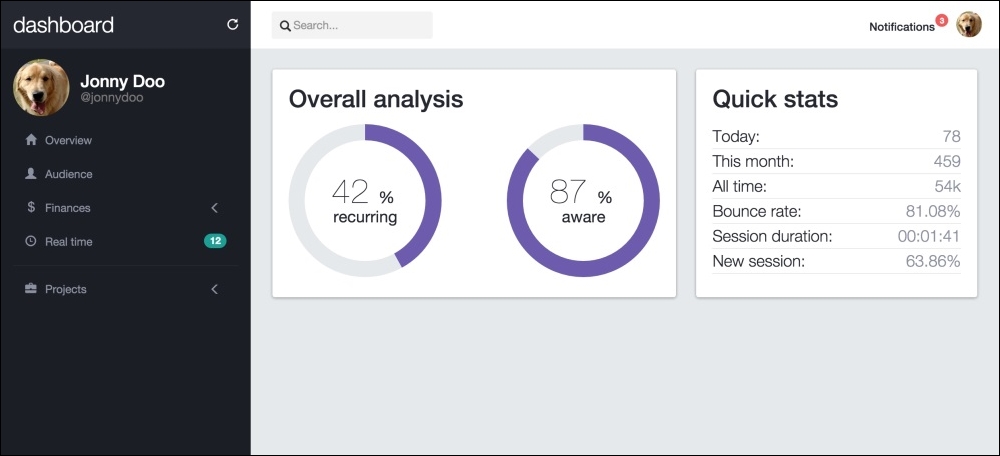
This is another advantage of using the flexbox! With a flex display, each item inside the container will adapt for the display. The previous screenshot was taken from a medium viewport. If you take it from a large-resolution screen, you will see how the elements appear side by side, like this:
The next chart is called a spider chart. The Highcharts plugin (http://www.highcharts.com/) is one of the most definitive plugins used to create charts. It provides a wide variety of charts divided over different modules, so you can load only the plugins that you will use.
Just like Easy Pie Chart, you can get Highcharts from different sources. After getting it, let's load the first Highcharts module that we need. Load them along with the other JavaScript files (the plugin is loaded using CDN in this case):
<script src="https://code.highcharts.com/highcharts.js"></script>
<script src="https://code.highcharts.com/highcharts-more.js"></script>
Create another .card in the HTML after #quick-info, this new one being identified by #performance-eval:
<div class="card" id="performance-eval">
  <div class="card-block">
    <h2>Performance evaluation</h2>
    <div class="spider-chart"></div>
  </div>
</div>
Highcharts does not require too much HTML, but you need to customize it all over JavaScript. To initialize and customize the plugin, add the following code inside the ready function of the JavaScript:
$('#performance-eval .spider-chart').highcharts({

    chart: {
        polar: true,
        type: 'area'
    },

    title: {
        text: ''
    },

    xAxis: {
        categories: ['Taming', 'Acessory', 'Development', 'Grooming', 'Awareness', 'Ration'],
        tickmarkPlacement: 'on',
        lineWidth: 0
    },

    yAxis: {
        gridLineInterpolation: 'polygon',
        lineWidth: 0,
        min: 0
    },

    tooltip: {
        shared: true,
        pointFormat: '<span style="color:{series.color}">{series.name}: <b>${point.y:,.0f}</b><br/>'
    },

    legend: {
        align: 'right',
        verticalAlign: 'top',
        y: 70,
        layout: 'vertical'
    },

    series: [{
        name: 'Allocated resources',
        data: [45000, 39000, 58000, 63000, 38000, 93000],
        pointPlacement: 'on',
        color: '#676F84'
    },
    {
        name: 'Spent resources',
        data: [83000, 49000, 60000, 35000, 77000, 90000],
        pointPlacement: 'on',
        color: '#f35958'
    }]

});
In this JavaScript code, we called the highcharts function for the selector chart #performance-eval .spider-chart. All the properties are fully described in the official documentation. Just note that we instructed the chart that we want a polar chart with the polar: true key inside the chart key option.
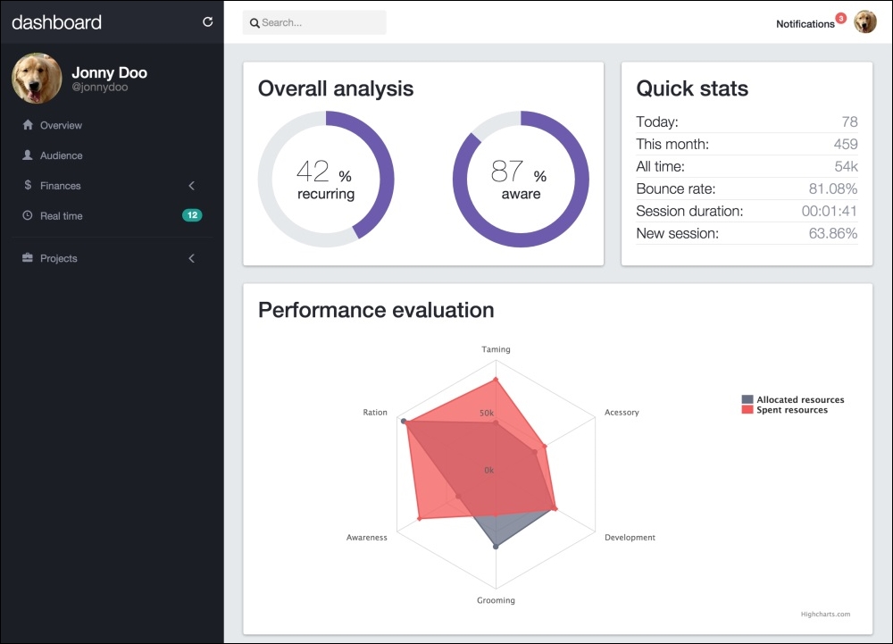
The dashboard application must look and feel like this: