Table of Contents for
Bootstrap 4 – Responsive Web Design
 Bootstrap 4 – Responsive Web Design
Published by
Packt Publishing, 2017
Bootstrap 4 – Responsive Web Design
Published by
Packt Publishing, 2017
- Cover
- Table of Contents
- Bootstrap 4 – Responsive Web Design
- Bootstrap 4 – Responsive Web Design
- Credits
- Preface
- What you need for this learning path
- Who this learning path is for
- Reader feedback
- Customer support
- 1. Module 1
- 1. Getting Started
- Setting up the framework
- Building our first Bootstrap example
- Optionally using the CDN setup
- Community activity
- Bootstrap and web applications
- Browser compatibility
- Summary
- 2. Creating a Solid Scaffolding
- Building our scaffolding
- Fluid container
- We need some style!
- Manipulating tables
- Like a boss!
- Final thoughts
- Summary
- 3. Yes, You Should Go Mobile First
- Bootstrap and the mobile-first design
- How to debug different viewports at the browser
- Cleaning up the mess
- Creating the landing page for different devices
- Summary
- 4. Applying the Bootstrap Style
- Summary
- 5. Making It Fancy
- Paying attention to your navigation
- Dropping it down
- Making an input grouping
- Getting ready for flexbox!
- Summary
- 6. Can You Build a Web App?
- Adding the navigation
- Do a grid again
- Playing the cards
- Implementing the main content
- Creating breadcrumbs
- Finishing with the right-hand-side content
- Summary
- 7. Of Course, You Can Build a Web App!
- Waiting for the progress bar
- Creating a settings page
- Summary
- 8. Working with JavaScript
- Awesome Bootstrap modals
- Creating our custom modal
- A tool for your tip
- Pop it all over
- Making the menu affix
- Finishing the web app
- Summary
- 9. Entering in the Advanced Mode
- The last navigation bar with flexbox
- Filling the main fluid content
- Filling the main content
- Overhead loading
- Fixing the toggle button for mobile
- Summary
- 10. Bringing Components to Life
- Fixing the mobile viewport
- Learning more advanced plugins
- Summary
- 11. Making It Your Taste
- Working with plugin customization
- The additional Bootstrap plugins
- Creating our Bootstrap plugin
- Defining the plugin methods
- Creating additional plugin methods
- Summary
- 2. Module 2
- 1. Introducing Bootstrap 4
- Summary
- 2. Using Bootstrap Build Tools
- Download the Bootstrap source files
- Setting up the blog project
- Setting up the JSON files
- Creating our first page template
- Summary
- 3. Jumping into Flexbox
- Ordering your Flexbox
- Wrapping your Flexbox
- Setting up the Bootstrap Flexbox layout grid
- Setting up a Flexbox project
- Designing a single blog post
- Summary
- 4. Working with Layouts
- Inserting rows into your layout
- Adding columns to your layout
- Choosing a column class
- Creating a simple three-column layout
- Mixing column classes for different devices
- Coding the blog home page
- Using responsive utility classes
- Summary
- 5. Working with Content
- Learning to use typography
- Customizing headings
- How to style images
- Coding tables
- Summary
- 6. Playing with Components
- Basic button examples
- Creating outlined buttons
- Checkbox and radio buttons
- Coding forms in Bootstrap 4
- Creating an inline form
- Adding validation to inputs
- Using the Jumbotron component
- Adding the Label component
- Using the Alerts component
- Using Cards for layout
- Updating the Blog index page
- How to use the Navs component
- Adding Breadcrumbs to a page
- Using the Pagination component
- How to use the List Group component
- Summary
- 7. Extending Bootstrap with JavaScript Plugins
- Coding Tooltips
- Avoiding collisions with our components
- Using Popover components
- Using the Collapse component
- Coding an Accordion with the Collapse component
- Coding a Bootstrap Carousel
- Summary
- 8. Throwing in Some Sass
- Using Sass in the blog project
- Importing partials in Sass
- Creating a collection of variables
- Customizing components
- Writing a theme
- Summary
- 9. Migrating from Version 3
- Big changes in version 4
- Updating your variables
- Additional global changes
- Other font updates
- Migrating components
- Migrating JavaScript
- Miscellaneous migration changes
- Summary
- 3. Module 3
- 1. Revving Up Bootstrap
- What Bootstrap 4 Alpha 4 has to offer
- Setting up our project
- Summary
- 2. Making a Style Statement
- Image elements
- Responsive utilities
- Helper classes
- Text alignment and transformation
- Summary
- 3. Building the Layout
- Adding Bootstrap components
- Summary
- 4. On Navigation, Footers, Alerts, and Content
- Improving navigation using Scrollspy
- Customizing scroll speed
- Icons
- Using and customizing alerts
- Creating a footer
- Creating and customizing forms
- Form validation
- Progress indicators
- Adding content using media objects
- Figures
- Quotes
- Abbreviations
- Summary
- 5. Speeding Up Development Using jQuery Plugins
- Enhanced pagination using bootpag
- Displaying images using Bootstrap Lightbox
- Improving our price list with DataTables
- Summary
- 6. Customizing Your Plugins
- Customizing plugins
- Writing a custom Bootstrap jQuery plugin
- Summary
- 7. Integrating Bootstrap with Third-Party Plugins
- Hover
- Summary
- 8. Optimizing Your Website
- Minifying CSS and JavaScript
- Introducing Grunt
- Running tasks automatically
- Stripping our website of unused CSS
- JavaScript file concatenation
- Summary
- 9. Integrating with AngularJS and React
- Introducing React
- Summary
- Bibliography
- Index
Now that we know how to use icons, let's turn to a different topic, namely, alert boxes. Alert boxes are typically used to highlight an important event, or to emphasize an important message. As such, the purpose behind alerts is to provide a content area that immediately stands out, and therefore cannot be easily overseen by the user. For example, imagine that MyPhoto only supports browsers above certain versions. In such a case, a user who visits the site with an unsupported browser version should be notified that their browser is not supported. After all, the website may not function or display correctly when viewed with unsupported software. Bootstrap provides us with the
alert
class, which makes it very easy for us to implement this hypothetical scenario (the JavaScript for browser detection will be presented in Chapter 5, Speeding Up Development Using jQuery Plugins).
Bootstrap's alert comes with four contexts: Success, Warning, Info, and Danger. Each context class styles the element to which it is applied differently, depending on the intended message. See Figure 4.7, which lists the four default alert styles that come with Bootstrap:
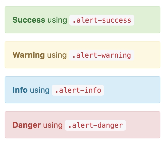
Figure 4.7: Bootstrap's four contextual alert classes: .alert-success, .alert-warning, .alert-info, and .alert-danger.
Let's go ahead and apply one of these styles to our new unsupported browser alert box. Go ahead and create a new
div
and set its class attribute to
alert
alert
-
danger
:
    <div class="alert alert-danger">
        <strong>Unsupported browser</strong> Internet Explorer 8 and
        lower are not supported by this website.
    </div>
Now insert this alert div inside our Welcome section, below the jumbotron:
    <div class="container-fluid myphoto-section bg-myphoto-welcome"
    id="welcome">
        <div class="container">
            <div class="jumbotron">
                <h1>Welcome to MyPhoto</h1>
                <p>Photographs you can cherish!</p>


</div>


<div class="alert alert-danger">
                <strong class="alert-heading">Unsupported browser</strong>
                 Internet Explorer 8 and lower are not supported by this
                 website.

</div>
        </div>
    </div>
Save and refresh. Voila! We have just created our very first Bootstrap alert (see Figure 4.8). Take a look at the following screenshot:
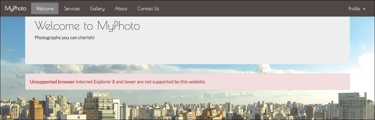
Figure 4.8: Our first dangerous alert dialog.
But something isn't quite right. What if the user knows that their browser is outdated, but still wishes to continue viewing the contents of our Welcome section without the invasive alert? Could we provide a way for the user to acknowledge the message and then allow them to continue browsing without its invasive presence? The answer is yes. Bootstrap provides us with a very easy way to make alerts dismissible using the
data
-
dismiss
attribute:
<div class="alert alert-danger alert-dismissible">
<a href="#" class="close" data-dismiss="alert" aria-label="close">
×</a>
<strong>Unsupported browser</strong> Internet Explorer 8
and lower are not supported by this website.
</div>
This will add an X to the right side of our alert dialog. Adding the alert-dismissible class will align the X and have it inherit its color. Click this X, and see the alert disappear.
This is great. Users can now dismiss our alert. However, what happens when the user jumps straight into a different section of MyPhoto? Currently, the alert is placed inside our Welcome section. As such, users viewing other sections of our website will not necessarily be able to see the alert dialog. The solution is to adjust the position of our alert dialog so that it appears stuck to our page, regardless of the section that the user is currently in. How do we do this? First, we will need to take the alert outside of our Welcome section, and move it just below our navbar. This will make the alert hidden behind our fixed navbar. To make the alert visible below our navbar, we can simply offset the position of the alert from the top of the page using the CSS
margin
-
top
property. To then make the alert sticky, that is, fixed below the navbar regardless of which section the user is currently in, we use the CSS
position
property and set it to fixed. Lastly, we can adjust the left offset and width of our alert so that it is nicely indented from the left hand side of our page, and stretches horizontally across the page (note that, for the sake of keeping the sample code short and concise, we are applying inline styles to achieve this. However, as we will discover in Chapter 8, Optimizing Your Website we should normally avoid using inline styles whenever we can). Observe the following code:
<nav class="navbar navbar-myphoto navbar-fixed-top" role="navigation">
<!-- Navbar markup -->
</nav>
<div class="alert alert-danger alert-dismissible" style="position:
fixed; margin-top: 4em; width: 90%;margin-left: 4em;">
<a href="#" class="close" data-dismiss="alert" aria-label="close">
×</a>
<strong class="alert-heading">Unsupported browser</strong>
Internet Explorer 8 and lower are not supported by this website.
</div>
Take a look at the following screenshot:
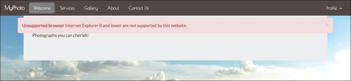
Figure 4.9: Our sticky alert dialog now stretches across the entire page and remains visible across the sections.
Great! Try scrolling down the page and observe how our alert remains fixed below the navbar. Let's add an icon:
    <div class="alert alert-danger alert-dismissible" style="position:
    fixed; margin-top: 4em; width: 90%;margin-left: 4em;">
        <a href="#" class="close" data-dismiss="alert" aria-label="close">&
        times;</a>


<strong class="alert-heading"><i class="fa fa-exclamation"></i>


Unsupported browser</strong>Internet Explorer 8 and lower are not
        supported by this website.
    </div>
Our alert is already looking pretty decent. It is positioned nicely below our navbar, is dismissible, and sports a nice little icon. But it somehow doesn't look very dangerous, does it? How about we customize its colors a bit? For example, we could darken the background color slightly, and lighten the foreground color. But how would we go about doing this without modifying the Bootstrap source? Easy! Just apply the desired CSS properties using either an inline style, or, even better, apply it globally throughout our style sheet. Go ahead and open
styles/myphoto.css
. Insert the following CSS snippet, save, and then refresh the MyPhoto page:
    .alert-danger

{
        background-color: #a94342;


color: white;
    }
The snippet that you just added to your myphoto.css file should be pretty self-explanatory: It applies a white foreground and a dark red background (Figure 4.10) to any element that has the class
alert-danger
. Consequently, this foreground and background color will apply to any alert dialog that uses the
alert-danger
context class. Congratulations! You just learned how to customize your first Bootstrap component!
Let's finish by tidying any inline styles that we created (we will talk more about inline styles in Chapter 8, Optimizing Your Website; for now just accept that you should avoid using inline styles whenever possible). Create a custom class,
alert-myphoto
, extract the inline styles into it, and add a
z-index
rule to ensure that our warning will appear above all other elements on the page:
    .alert-myphoto
    {
        background-color: #a94342;
        color: white;
        position: fixed;
        margin-top: 4em;
        width: 90%;
        margin-left: 4em;
        z-index: 3000;
    }
Take a look at the following screenshot:
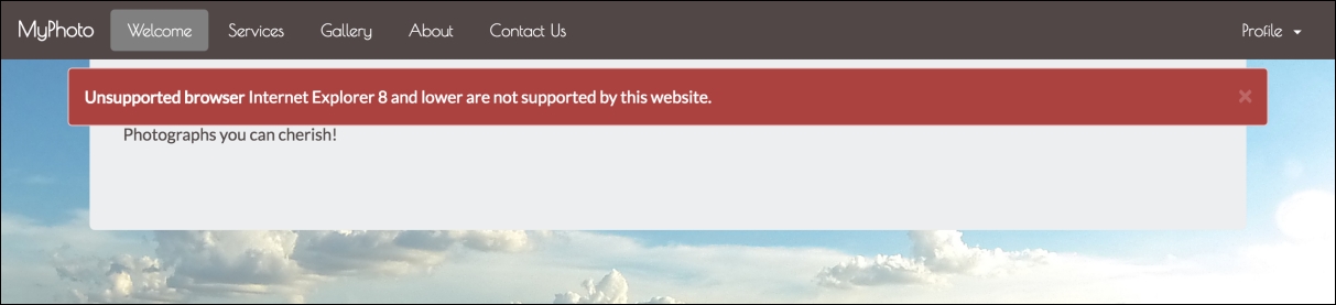
Figure 4.10: Our alert now with a white foreground and a darker background.
Note
Under the hood
Bootstrap defines the background color for the individual context classes using the $state-<context>-bg
variable, where context refers to one of the four Bootstrap contexts: Success, Danger, Info, or Warning. As such, you can globally override the default background color for a given alert by changing the value of
$state-<context>-bg
to your desired background color. For example, to make the background of the danger alert blue, you could write the following:
$state-danger-bg: blue
However, this is generally not recommended as it will change the background color for all danger alerts across your entire website.
Note that, when adding links to alerts, that you should apply the
alert-link
class to the link element. This will style the element to match the alert's context.