Table of Contents for
Bootstrap 4 – Responsive Web Design
 Bootstrap 4 – Responsive Web Design
Published by
Packt Publishing, 2017
Bootstrap 4 – Responsive Web Design
Published by
Packt Publishing, 2017
- Cover
- Table of Contents
- Bootstrap 4 – Responsive Web Design
- Bootstrap 4 – Responsive Web Design
- Credits
- Preface
- What you need for this learning path
- Who this learning path is for
- Reader feedback
- Customer support
- 1. Module 1
- 1. Getting Started
- Setting up the framework
- Building our first Bootstrap example
- Optionally using the CDN setup
- Community activity
- Bootstrap and web applications
- Browser compatibility
- Summary
- 2. Creating a Solid Scaffolding
- Building our scaffolding
- Fluid container
- We need some style!
- Manipulating tables
- Like a boss!
- Final thoughts
- Summary
- 3. Yes, You Should Go Mobile First
- Bootstrap and the mobile-first design
- How to debug different viewports at the browser
- Cleaning up the mess
- Creating the landing page for different devices
- Summary
- 4. Applying the Bootstrap Style
- Summary
- 5. Making It Fancy
- Paying attention to your navigation
- Dropping it down
- Making an input grouping
- Getting ready for flexbox!
- Summary
- 6. Can You Build a Web App?
- Adding the navigation
- Do a grid again
- Playing the cards
- Implementing the main content
- Creating breadcrumbs
- Finishing with the right-hand-side content
- Summary
- 7. Of Course, You Can Build a Web App!
- Waiting for the progress bar
- Creating a settings page
- Summary
- 8. Working with JavaScript
- Awesome Bootstrap modals
- Creating our custom modal
- A tool for your tip
- Pop it all over
- Making the menu affix
- Finishing the web app
- Summary
- 9. Entering in the Advanced Mode
- The last navigation bar with flexbox
- Filling the main fluid content
- Filling the main content
- Overhead loading
- Fixing the toggle button for mobile
- Summary
- 10. Bringing Components to Life
- Fixing the mobile viewport
- Learning more advanced plugins
- Summary
- 11. Making It Your Taste
- Working with plugin customization
- The additional Bootstrap plugins
- Creating our Bootstrap plugin
- Defining the plugin methods
- Creating additional plugin methods
- Summary
- 2. Module 2
- 1. Introducing Bootstrap 4
- Summary
- 2. Using Bootstrap Build Tools
- Download the Bootstrap source files
- Setting up the blog project
- Setting up the JSON files
- Creating our first page template
- Summary
- 3. Jumping into Flexbox
- Ordering your Flexbox
- Wrapping your Flexbox
- Setting up the Bootstrap Flexbox layout grid
- Setting up a Flexbox project
- Designing a single blog post
- Summary
- 4. Working with Layouts
- Inserting rows into your layout
- Adding columns to your layout
- Choosing a column class
- Creating a simple three-column layout
- Mixing column classes for different devices
- Coding the blog home page
- Using responsive utility classes
- Summary
- 5. Working with Content
- Learning to use typography
- Customizing headings
- How to style images
- Coding tables
- Summary
- 6. Playing with Components
- Basic button examples
- Creating outlined buttons
- Checkbox and radio buttons
- Coding forms in Bootstrap 4
- Creating an inline form
- Adding validation to inputs
- Using the Jumbotron component
- Adding the Label component
- Using the Alerts component
- Using Cards for layout
- Updating the Blog index page
- How to use the Navs component
- Adding Breadcrumbs to a page
- Using the Pagination component
- How to use the List Group component
- Summary
- 7. Extending Bootstrap with JavaScript Plugins
- Coding Tooltips
- Avoiding collisions with our components
- Using Popover components
- Using the Collapse component
- Coding an Accordion with the Collapse component
- Coding a Bootstrap Carousel
- Summary
- 8. Throwing in Some Sass
- Using Sass in the blog project
- Importing partials in Sass
- Creating a collection of variables
- Customizing components
- Writing a theme
- Summary
- 9. Migrating from Version 3
- Big changes in version 4
- Updating your variables
- Additional global changes
- Other font updates
- Migrating components
- Migrating JavaScript
- Miscellaneous migration changes
- Summary
- 3. Module 3
- 1. Revving Up Bootstrap
- What Bootstrap 4 Alpha 4 has to offer
- Setting up our project
- Summary
- 2. Making a Style Statement
- Image elements
- Responsive utilities
- Helper classes
- Text alignment and transformation
- Summary
- 3. Building the Layout
- Adding Bootstrap components
- Summary
- 4. On Navigation, Footers, Alerts, and Content
- Improving navigation using Scrollspy
- Customizing scroll speed
- Icons
- Using and customizing alerts
- Creating a footer
- Creating and customizing forms
- Form validation
- Progress indicators
- Adding content using media objects
- Figures
- Quotes
- Abbreviations
- Summary
- 5. Speeding Up Development Using jQuery Plugins
- Enhanced pagination using bootpag
- Displaying images using Bootstrap Lightbox
- Improving our price list with DataTables
- Summary
- 6. Customizing Your Plugins
- Customizing plugins
- Writing a custom Bootstrap jQuery plugin
- Summary
- 7. Integrating Bootstrap with Third-Party Plugins
- Hover
- Summary
- 8. Optimizing Your Website
- Minifying CSS and JavaScript
- Introducing Grunt
- Running tasks automatically
- Stripping our website of unused CSS
- JavaScript file concatenation
- Summary
- 9. Integrating with AngularJS and React
- Introducing React
- Summary
- Bibliography
- Index
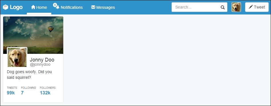
Moving on with our web app example, it is time to create a settings page for the application. We have already created a link for this in the navigation bar, inside the button group. Do you remember?
So, in the same folder as that of the web app HTML file, create another one named settings.html and update the link at the navigation bar:
<div id="nav-options" class="btn-group pull-right hidden-xs">
  <button type="button" class="btn btn-default dropdown-toggle thumbnail" data-toggle="dropdown" aria-haspopup="true" aria-expanded="false">
    <img src="imgs/jon.png">
  </button>
  <ul class="dropdown-menu">
    <li><a href="#">Profile</a></li>
    <li><a href="settings.html">Setting</a></li>
    <li role="separator" class="divider"></li>
    <li><a href="#">Logout</a></li>
  </ul>
</div>
In this page, we use the same template that we used in the web application, copying the navigation bar, the grid layout, and the left-hand side #profile column. So, the settings page will look like this:
Now we will add some content to this page. Our main goal here is to use some other navigation Bootstrap components that will be handy for us.
The first navigation menu that we will use here is Pills, using the vertical stack option. Pills are a Bootstrap component used to create menus that can be horizontal or vertical. Many web apps use them for side menus, just as we will soon do.
The basic usage for navigation components is the use of the .nav class followed by another one regarding the navigation option. In our case, we will use the .nav-pills class to create the desired effect in conjunction with the .nav-stacked class to vertically stack the pills. Create a .card element just after #profile and add the code related to the pills navigation:
<div id="profile-settings" class="card">
  <ul class="nav nav-pills nav-stacked">
    <li role="presentation" class="active">
      <a href="#">
        Account
        <span class="glyphicon glyphicon-chevron-right pull-right" aria-hidden="true"></span>
      </a>
    </li>
    <li role="presentation">
      <a href="#">
        Security
        <span class="glyphicon glyphicon-chevron-right pull-right" aria-hidden="true"></span>
      </a>
    </li>
    <li role="presentation">
      <a href="#">
        Notifications
        <span class="glyphicon glyphicon-chevron-right pull-right" aria-hidden="true"></span>
      </a>
    </li>
    <li role="presentation">
      <a href="#">
        Design
        <span class="glyphicon glyphicon-chevron-right pull-right" aria-hidden="true"></span>
      </a>
    </li>
  </ul>
</div>
In the CSS file, also add the following rule:
.row .card + .card {
  margin-top: 2rem;
}
With this, every .card element followed by another .card element will automatically create a margin, because of the use of the + selector. Open the settings page, and you will see the result like what is shown in the following screenshot:
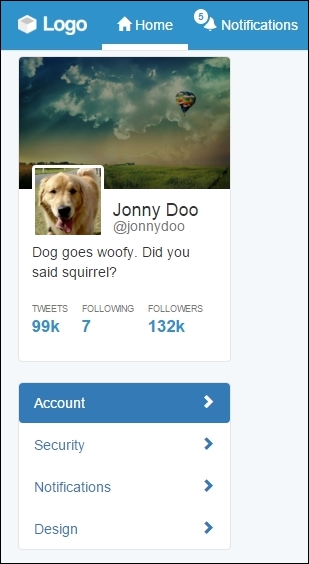
Basically, we created a list with the mentioned classes: .nav, .nav-pills, and .nav-stacked. The list is composed of four items, containing a link and a left arrow icon. To place the arrows at the right-hand side, we again used the .pull-right helper together with the .glyphicon-chevron-right icon. In the first item, we added the .active class, which turned this item blue and changed the colors of both the text and the icon.
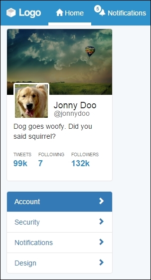
This is almost awesome! It just needs some adjustments in the CSS to look perfect. Let's use some :nth-child selectors to style some elements based on their position, such as the first item in the menu (:first-child) and the last item (:last-child). Add the following CSS:
#profile-settings .nav-stacked li {
  border-bottom: 1px solid #e5e5e5;
  margin: 0;
}

#profile-settings .nav-stacked a {
  border-radius: 0;
}

#profile-settings .nav-stacked li:first-child a {
  border-radius: 0.4rem 0.4rem 0 0;
}


#profile-settings .nav-stacked li:last-child {
  border-bottom: 0;
}


#profile-settings .nav-stacked li:last-child a {
  border-radius: 0 0 0.4rem 0.4rem;
}
We just removed unwanted margins and the border radius, while adding a border bottom to all elements in the list, except the last one. This is because of the #profile-settings .nav-stacked li:last-child selector, where we a specific rule only for the last item element.
We also changed border-radius for the first element and the last element to create a rounded border in the pill list. The .nav-pill menu will appear like what is shown in the next screenshot:
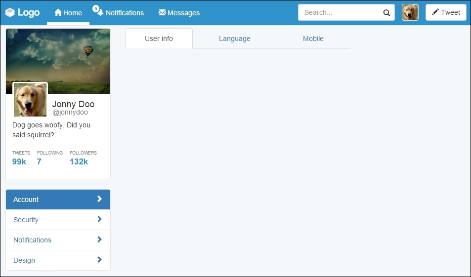
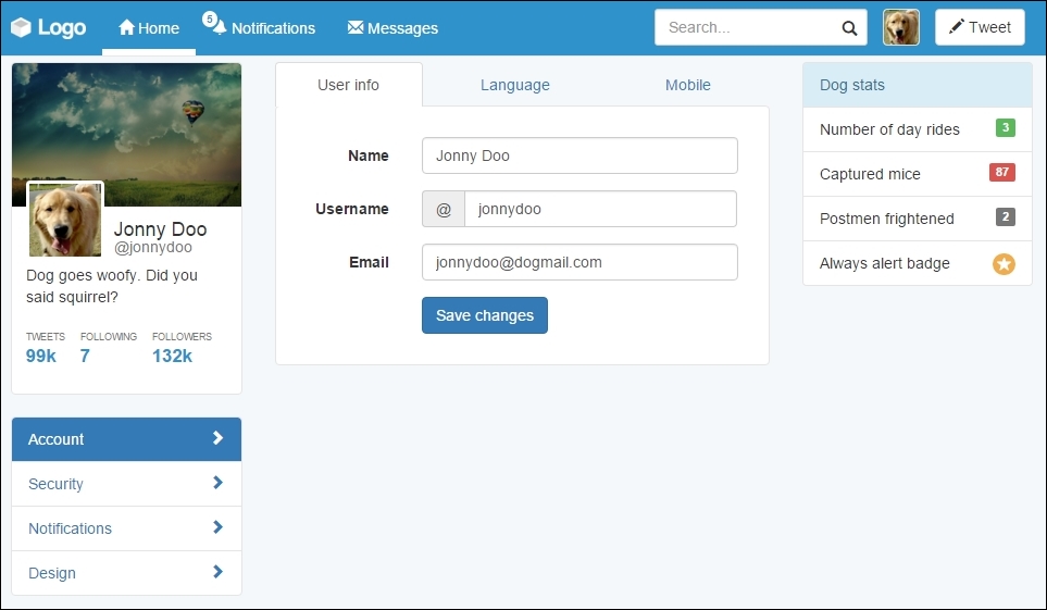
In the #main column, we must create a tab option with the settings content. Bootstrap also offers a tabs component with the navigation components. First, we will work with the markup and CSS style and use it with JavaScript.
Therefore, inside the #main tag, place the following markup, corresponding to the Bootstrap tabs:
<ul id="account-tabs" class="nav nav-tabs nav-justified">
  <li role="presentation" class="active">
    <a href="#account-user">User info</a>
  </li>
  <li role="presentation">
    <a href="#account-language">Language</a>
  </li>
  <li role="presentation">
    <a href="#account-mobile">Mobile</a>
  </li>
</ul>
Just like the Pills, to use tabs, create a list with the .nav and .nav-tabs classes. We used the .nav-justified class as well to make the tabs equally distributed over the component.
Moreover, we populated the list with some items. Each link of the item contains an identifier, which will be used to link each tab to the corresponding content. Keep that information at the moment.
Let's add some CSS rules to keep the same border colors that we are using:
#account-tabs > li {
  border-bottom: 0.1rem solid #e5e5e5;
}

#account-tabs a {
  border-bottom: 0;
}

#account-tabs li.active {
  border-bottom: 0;
}
Refresh the web page and you should see it like this:
To add the tab content, we use the named tab panes. Each tab must be placed in an element with the .tab-pane class and have the corresponding identifier in the tab component. After the tab list, add the HTML code for the tab panes:
 <ul id="account-tabs" class="nav nav-tabs nav-justified">
  <li role="presentation" class="active">
    <a href="#account-user">User info</a>
  </li>
  <li role="presentation">
    <a href="#account-language">Language</a>
  </li>
  <li role="presentation">
    <a href="#account-mobile">Mobile</a>
  </li>
</ul>

<div class="tab-content">
  <div role="tabpanel" class="tab-pane active" id="account-user">
    User info tab pane
  </div>
  <div role="tabpanel" class="tab-pane" id="account-language">
    Language tab pane
  </div>
  <div role="tabpanel" class="tab-pane" id="account-mobile">
    Mobile tab pane
  </div>
</div>
Refresh the web page and you will see only the content of #account-user appearing, although clicking on other tabs will not cause any switch between them. This is because we have not initialized the component through JavaScript yet.
We can initialize the tabs with simple JavaScript code, like what is presented next. However, we will do that in a smarter way using data markup:
$('#account-tabs a').click(function (e) {
  e.preventDefault()
  $(this).tab('show')
})
For data markup, we must add the data-toggle="tab" attribute on the link elements, inside the list. Change the list markup for the following:
<ul id="account-tabs" class="nav nav-tabs nav-justified">
  <li role="presentation" class="active">
    <a href="#account-user" data-toggle="tab">User info</a>
  </li>
  <li role="presentation">
    <a href="#account-language" data-toggle="tab">Language</a>
  </li>
  <li role="presentation">
    <a href="#account-mobile" data-toggle="tab">Mobile</a>
  </li>
</ul>Refresh the web browser and switch between the tabs. It works like a charm! To make it even fancier, add the .fade class to each .tab-pane to create a fade effect when changing tabs.
Inside the .tab-pane identified by #account-user, let's add some content. Since it is a configuration menu, we will create a form to set the user settings. Again, we will work with some forms in Bootstrap. Do you remember how to use them?
In the form, we will have three inputs (name, username, and e-mail) followed by a button to save the changes. We will use the .form-horizontal class to make each form input next its label and stacked by each other. So, place the following code inside the #account-user element:
<div id="account-user" role="tabpanel" class="tab-pane active" >
  <form class="form-horizontal">
    <div class="form-group">
      <label class="col-sm-3 control-label">Name</label>
      <div class="col-sm-9">
        <input type="text" class="form-control" value="Jonny Doo">
      </div>
    </div>
    <div class="form-group">
      <label class="col-sm-3 control-label">Username</label>
      <div class="col-sm-9">
        <div class="input-group">
          <div class="input-group-addon">@</div>
          <input type="text" class="form-control" value="jonnydoo">
        </div>
      </div>
    </div>
    <div class="form-group">
      <label class="col-sm-3 control-label">Email</label>
      <div class="col-sm-9">
        <input type="email" class="form-control" value="jonnydoo@dogmail.com">
      </div>
    </div>
    <div class="form-group">
      <div class="col-sm-offset-3 col-sm-9">
        <button type="submit" class="btn btn-primary">
          Save changes
        </button>
      </div>
    </div>
  </form>
</div>
Break through the code, we set the labels to fill a quarter of the form row, while the input fills the rest. We again used the input groups to add the @ sign before the username field.
Each label has the .col-sm-3 class and the input the .col-sm-9 class. As we said, the forms respect the grid system layout, so we can apply the same classes here. We also added the .col-sm-offset-3 class to the submit button for a correct offset.
Right now, the page should look like the following screenshot. Isn't it looking nicer?
CSS turn! We must make it look prettier, so let's play with some paddings. However, before anything, add the class to .card to the .tab-content. Next, let's fix the borders and margins in .tab-content by adding some padding and some negative margin, as follows:
#main .tab-content {
  padding: 2em;
  margin-top: -0.1rem;
}
Then, remove the border from the tab list and change the z-index of the tabs:
#account-tabs > li {
  border-bottom: 0;
}

#account-tabs {
  position: relative;
  z-index: 99;
}
Finally, remove the margin from the save changes button using another nth recipe, as follows:
#main .form-horizontal .form-group:last-child {
  margin-bottom: 0;
}
Nice! Refresh the web app and see the result, like this:
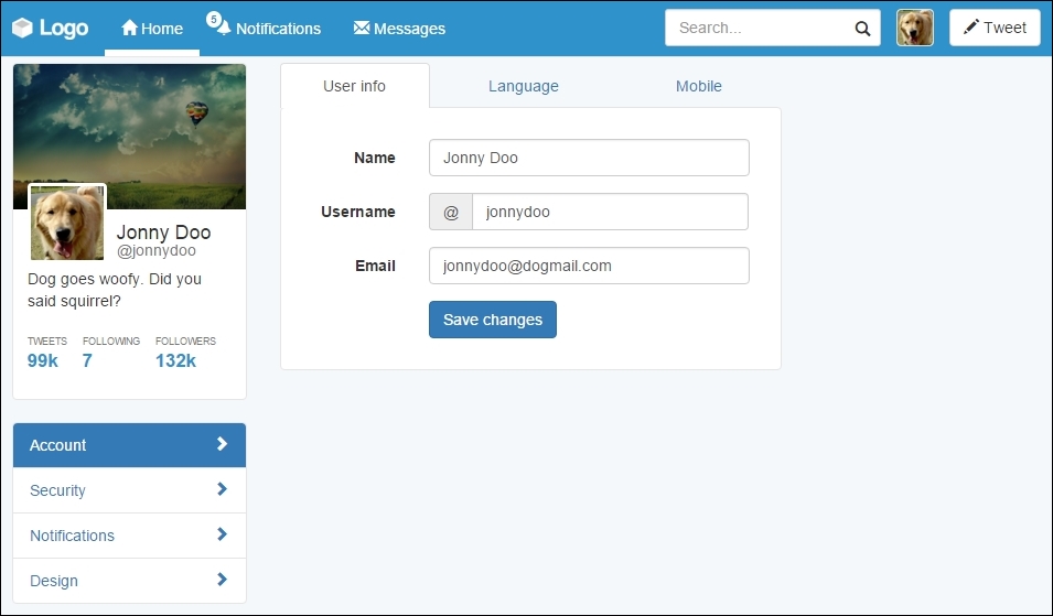
With these changes, we have made the form from .tab-content look like a card. We also added some margins and padding to correct the designs. Lastly, with the margin top and z-index, we make the selected tab blend correctly with the content.
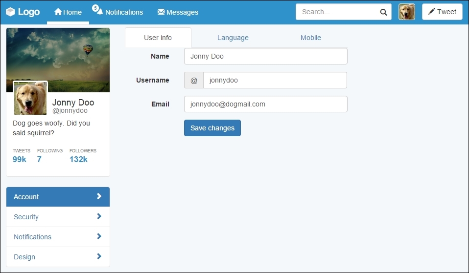
To finalize the settings page, we must fill the right column of the web app. To do this, we will create a menu that presents some general statistics about the user.
In order to do that, we will use the Bootstrap List group component. List group is powerful in Bootstrap as it can seem similar to Bootstrap Cards, but it has more specific options for menu list generation, such as headers, disabled items, and much more.
So let's start doing this! Create the HTML markup at the #right-content element:
<div id="right-content" class="col-md-3 hidden-sm hidden-xs">
  <ul class="list-group">
    <li class="list-group-item list-group-item-info">
      Dog stats
    </li>
    <li class="list-group-item">
      Number of day rides
    </li>
    <li class="list-group-item">
      Captured mice
    </li>
    <li class="list-group-item">
      Postmen frightened
    </li>
    <li class="list-group-item">
      Always alert badge
    </li>
  </ul>
</div>
It is a simple list and we just added the .list-group class to the list, while adding the .list-group-item class for each item in the list. For the first item, we used the .list-group-item-info contextual color class to make it blue, according to the Bootstrap contextual colors.
Before we continue, we have to change the colors of the borders from list group to respect the same border color that we have been using:
.list-group-item {
  border-color: #e5e5e5;
}
The result that you should see right know is like the one presented in the next screenshot. List groups is a very handy component that we can use to achieve almost the same effect that we got using Pills, but here we are using fewer CSS rules.

Labels and badges are Bootstrap components that can easily highlight some text or information. They can be used in any place, as we did in the navigation bar, on the notification item.
Just like most of Bootstrap's components, labels follow the contextual colors of Bootstrap, while badges do not have this option. To consolidate their utilization, let's add some of them to the right menu, regarding the statistics, because after all we want to know our stats!
It will be pretty easy since we have worked with this before. For the three first items, we will use labels, and for the last one, we will use a badge with an icon. Just add the highlighted code to the current .list-group:
<div id="right-content" class="col-md-3 hidden-sm hidden-xs">
  <ul class="list-group">
    <li class="list-group-item list-group-item-info">
      Dog stats
    </li>
    <li class="list-group-item">
      Number of day rides
      <span class="label label-success">3</span>
    </li>
    <li class="list-group-item">
      Captured mice
      <span class="label label-danger">87</span>
    </li>
    <li class="list-group-item">
      Postmen frightened
      <span class="label label-default">2</span>
    </li>
    <li class="list-group-item">
      Always alert badge
      <span class="badge glyphicon glyphicon-star" aria-hidden="true">
      </span>
    </li>
  </ul>
</div>
We must pay attention to some points here. The first is that we used the .label class together with the contextual color class, like this: .label-*. Here, * is the name of the contextual class.
The second thing is that if you refresh your web page right now, you will see that Bootstrap does have a CSS for aligning all badges on the right, but it does not apply the same rule for labels. So, add the next CSS:
#right-content .list-group .label {
  float: right;
}
The third point is that we used badges and icons in the same span. This is possible, and then we just need to adjust the CSS render:
#right-content .list-group .label {
  padding: 0.3rem 0.6rem;
}

#right-content .list-group .badge.glyphicon-star {
  background-color: #f0ad4e;
  padding: 0.4rem;
  padding-left: 0.5rem;
}
By adding these rules, we adjusted the padding for the labels, adjusted the padding for the badge, and correctly set the yellow background for the star badge. See the result in the browser; it must look like this:
Cool! We've done another page for our web app. The stats menu looks cute. We will not cover the other page settings menus in this book, since they follow almost the same structure that we showed in this example. Try doing that as homework.