Table of Contents for
Bootstrap 4 – Responsive Web Design
 Bootstrap 4 – Responsive Web Design
Published by
Packt Publishing, 2017
Bootstrap 4 – Responsive Web Design
Published by
Packt Publishing, 2017
- Cover
- Table of Contents
- Bootstrap 4 – Responsive Web Design
- Bootstrap 4 – Responsive Web Design
- Credits
- Preface
- What you need for this learning path
- Who this learning path is for
- Reader feedback
- Customer support
- 1. Module 1
- 1. Getting Started
- Setting up the framework
- Building our first Bootstrap example
- Optionally using the CDN setup
- Community activity
- Bootstrap and web applications
- Browser compatibility
- Summary
- 2. Creating a Solid Scaffolding
- Building our scaffolding
- Fluid container
- We need some style!
- Manipulating tables
- Like a boss!
- Final thoughts
- Summary
- 3. Yes, You Should Go Mobile First
- Bootstrap and the mobile-first design
- How to debug different viewports at the browser
- Cleaning up the mess
- Creating the landing page for different devices
- Summary
- 4. Applying the Bootstrap Style
- Summary
- 5. Making It Fancy
- Paying attention to your navigation
- Dropping it down
- Making an input grouping
- Getting ready for flexbox!
- Summary
- 6. Can You Build a Web App?
- Adding the navigation
- Do a grid again
- Playing the cards
- Implementing the main content
- Creating breadcrumbs
- Finishing with the right-hand-side content
- Summary
- 7. Of Course, You Can Build a Web App!
- Waiting for the progress bar
- Creating a settings page
- Summary
- 8. Working with JavaScript
- Awesome Bootstrap modals
- Creating our custom modal
- A tool for your tip
- Pop it all over
- Making the menu affix
- Finishing the web app
- Summary
- 9. Entering in the Advanced Mode
- The last navigation bar with flexbox
- Filling the main fluid content
- Filling the main content
- Overhead loading
- Fixing the toggle button for mobile
- Summary
- 10. Bringing Components to Life
- Fixing the mobile viewport
- Learning more advanced plugins
- Summary
- 11. Making It Your Taste
- Working with plugin customization
- The additional Bootstrap plugins
- Creating our Bootstrap plugin
- Defining the plugin methods
- Creating additional plugin methods
- Summary
- 2. Module 2
- 1. Introducing Bootstrap 4
- Summary
- 2. Using Bootstrap Build Tools
- Download the Bootstrap source files
- Setting up the blog project
- Setting up the JSON files
- Creating our first page template
- Summary
- 3. Jumping into Flexbox
- Ordering your Flexbox
- Wrapping your Flexbox
- Setting up the Bootstrap Flexbox layout grid
- Setting up a Flexbox project
- Designing a single blog post
- Summary
- 4. Working with Layouts
- Inserting rows into your layout
- Adding columns to your layout
- Choosing a column class
- Creating a simple three-column layout
- Mixing column classes for different devices
- Coding the blog home page
- Using responsive utility classes
- Summary
- 5. Working with Content
- Learning to use typography
- Customizing headings
- How to style images
- Coding tables
- Summary
- 6. Playing with Components
- Basic button examples
- Creating outlined buttons
- Checkbox and radio buttons
- Coding forms in Bootstrap 4
- Creating an inline form
- Adding validation to inputs
- Using the Jumbotron component
- Adding the Label component
- Using the Alerts component
- Using Cards for layout
- Updating the Blog index page
- How to use the Navs component
- Adding Breadcrumbs to a page
- Using the Pagination component
- How to use the List Group component
- Summary
- 7. Extending Bootstrap with JavaScript Plugins
- Coding Tooltips
- Avoiding collisions with our components
- Using Popover components
- Using the Collapse component
- Coding an Accordion with the Collapse component
- Coding a Bootstrap Carousel
- Summary
- 8. Throwing in Some Sass
- Using Sass in the blog project
- Importing partials in Sass
- Creating a collection of variables
- Customizing components
- Writing a theme
- Summary
- 9. Migrating from Version 3
- Big changes in version 4
- Updating your variables
- Additional global changes
- Other font updates
- Migrating components
- Migrating JavaScript
- Miscellaneous migration changes
- Summary
- 3. Module 3
- 1. Revving Up Bootstrap
- What Bootstrap 4 Alpha 4 has to offer
- Setting up our project
- Summary
- 2. Making a Style Statement
- Image elements
- Responsive utilities
- Helper classes
- Text alignment and transformation
- Summary
- 3. Building the Layout
- Adding Bootstrap components
- Summary
- 4. On Navigation, Footers, Alerts, and Content
- Improving navigation using Scrollspy
- Customizing scroll speed
- Icons
- Using and customizing alerts
- Creating a footer
- Creating and customizing forms
- Form validation
- Progress indicators
- Adding content using media objects
- Figures
- Quotes
- Abbreviations
- Summary
- 5. Speeding Up Development Using jQuery Plugins
- Enhanced pagination using bootpag
- Displaying images using Bootstrap Lightbox
- Improving our price list with DataTables
- Summary
- 6. Customizing Your Plugins
- Customizing plugins
- Writing a custom Bootstrap jQuery plugin
- Summary
- 7. Integrating Bootstrap with Third-Party Plugins
- Hover
- Summary
- 8. Optimizing Your Website
- Minifying CSS and JavaScript
- Introducing Grunt
- Running tasks automatically
- Stripping our website of unused CSS
- JavaScript file concatenation
- Summary
- 9. Integrating with AngularJS and React
- Introducing React
- Summary
- Bibliography
- Index
The previous chapter showed us how to style the content for MyPhoto and how to improve a website's overall appearance by using and customizing different Bootstrap components. We learned how to use Bootstrap's navbar, how to use icons, and how to customize a website's scrolling behavior using the Scrollspy plugin. In this chapter, we will emphasize the power of third-party plugins, introducing you to some essential third-party (and hence non-Bootstrap) plugins that will help speed up the development of the most common and mundane features. Building on the features implemented throughout the previous chapters, we will first teach you how to quickly and efficiently implement client-side browser detection using the jQuery browser plugin (jquery.browser). We will then improve the display of our tabular Events section by using pagination, first covering Bootstrap's pagination, and then showing you how to rapidly improve the default pagination feature using bootpag, Bootstrap's pagination plugin. Further improvements to our Events section will be made by adding images using Bootstrap Lightbox. Finally, staying within our tabular data display, we will improve the display of MyPhoto's price list using jQuery DataTables.
To summarize, this chapter will cover the following:
- Browser detection using the jQuery browser plugin
- Improved pagination using bootpag
- Using Bootstrap Lightbox to display images
- Enhancing the display of tabular data using DataTables
Recall the hypothetical example from Chapter 4,
On Navigation, Footers, Alerts, and Content, where MyPhoto only supports browsers above certain versions. To this end, we added a Bootstrap alert to our page, which notified visitors that their browser is not supported. Up until now, however, we had no way to actually identify which browser or browser version a MyPhoto visitor was using. Lacking any logic to hide and display the alert, the alert was visible regardless of whether or not the user's browser was actually supported by our website. Now the time has come for us to implement this missing logic.
Web browsers identify themselves by specifying their name and version information using a special field called User-Agent, which is part of the HTTP Request Header (see Figure 5.1). JavaScript allows users to access this field using the window.navigator property. This property contains the exact same string that is present in the User-Agent field of the HTTP Request Header. Therefore, to determine whether our visitor's browser is indeed supported, all that one needs to do is match the supported browser against the string presented by window.navigator. However, as can be seen from Figure 5.1, these strings are typically quite long and complex. As a result, matching different browsers can be tedious and prone to programming errors. Therefore, it is much better to use external resources that do this matching for us, and have been well tested, well documented, and are kept up to date. The popular, open source jQuery browser plugin (https://github.com/gabceb/jquery-browser-plugin) is one such resource that we can use. Let's go ahead and do just that! As usual, go ahead and fire up your console and install the plugin using Bower:
bower install jquery.browser
Once the installation is complete, you should see a new directory under
bower_components:
bower_components/jquery.browser
Inside the
dist
folder, you should see two files, namely, jquery.browser.js and jquery.browser.min.js.
Take a look at the following screenshot:
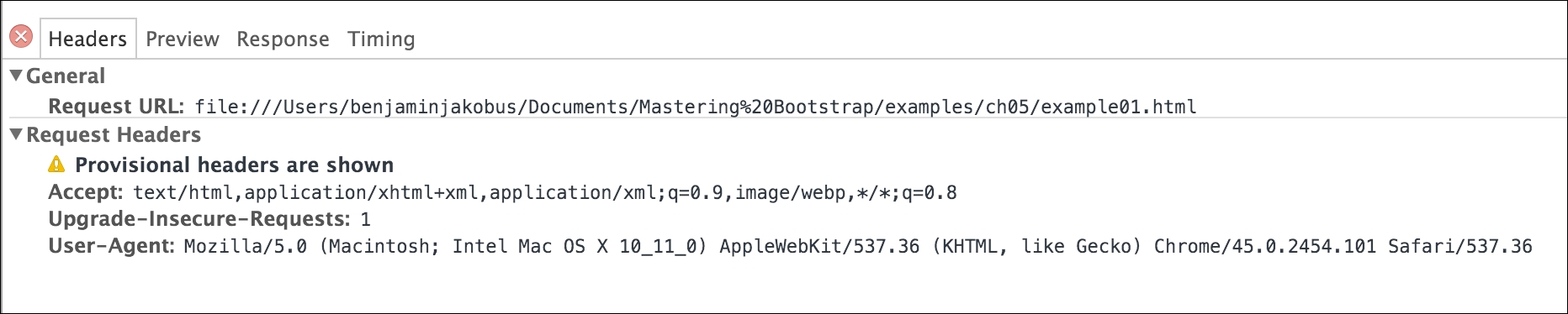
Figure 5.1: An example of a User-Agent string transmitted as part of the HTTP header when making a request.
If you can see the aforementioned files, then this means that jquery.browser has been successfully installed. Now, before we start using jquery.browser, we first need to work some more on our alert. The first thing that we will need to do is find a way of uniquely identifying it. Let's use the HTML
id
attribute for this purpose. Add the id attribute to our alert: id="unsupported-browser-alert".
Next, we should tidy up our markup. Go ahead and open css/myphoto.css and move the inline styles for our alert into our style sheet.
This won't affect browser detection, but will simply allow us to keep our markup nice and tidy. Observe the following code:
    #unsupported-browser-alert {
        position: fixed;
        margin-top: 4em;
        width: 90%;
        margin-left: 4em;
    }
Note
Generally, it is not a good idea to couple CSS rules with an id, as this is bad for reusability. But hold tight; we will talk more about this in Chapter 6, Customizing Your Plugins.
Since we only want the alert to display under certain conditions (namely, if the user is using a specific version of Internet Explorer), we should hide the alert div
by default. Go ahead and add the following CSS to our alert styles:
display: none;
Save and refresh. The alert at the top of the page should now no longer be visible. Furthermore, our outermost alert div
should now only contain id and class attributes:
<div class="alert alert-danger" id="unsupported-browser-alert">
<a href="#" class="close" data-dismiss="alert" aria-label="close"
>×</a>
<strong class="alert-heading"><i class="fa fa-exclamation"></i>
Unsupported browser</strong> Internet Explorer 8 and lower are
not supported by this website.
</div>
Now it is finally time to start using our freshly installed jQuery plugin. Open the MyPhoto index.html file and include the minified jquery.browser JavaScript file within the head of the document:
    <script
    src="bower_components/jquery.browser/dist/jquery.browser.min.js">
    </script>
    Great. The head of our index.html should now look as follows:
    <head>
        <meta charset="UTF-8">
        <title>ch05</title>
        <link rel="stylesheet" href="bower_components/bootstrap/dist/css
        /bootstrap.min.css" />
        <link rel="stylesheet" href="styles/myphoto.css" />
        <link rel="stylesheet" href="bower_components/components-
        font-awesome/css/font-awesome.min.css" />
        <script src="bower_components/jquery/dist/jquery.min.js"></script>
        <script src="bower_components/bootstrap/dist/js/bootstrap.min.js">
        </script>
        <script src=
        "bower_components/jquery.browser/dist/jquery.browser.min.js">
        </script>
        <script type="text/javascript">
            $( document ).ready(function() {
                $("nav ul li a").on('click', function(evt) {
                    evt.preventDefault();
                    var offset = $(this.hash).offset();
                    if (offset) {
                        $('body').animate({
                            scrollTop: offset.top
                        });
                    }
                });
            });
        </script>
    </head>
We are now ready to use jquery.browser to detect which browser the visitor is using. To this end, and as noted in the jquery.browser documentation, the following variables are are available:
$.browser.msie: This is true if the website visitor is using Microsoft Internet Explorer.$.browser.webkit: This is true if the website visitor is using either Chrome, Safari, or Opera.$.browser.version: This shows the browser version (not type!) that the website visitor is using.
To add the logic that makes the alert visible, let us start with a general condition of whether or not the user is using Internet Explorer. We will move to a more specific condition later (whether the user is using a specific version of Internet Explorer). In other words, let us begin by making the browser alert visible only if the visitor's browser is identifying itself as Internet Explorer. The code for this is fairly straightforward. We simply check the $.browser.msie variable. If this variable evaluates to true, then we use jQuery to make our alert visible:
    if ($.browser.msie) {
        $('#unsupported-browser-alert').show();
    }
Now let us make our browser test more specific. We now want to test whether the visitor is using both Internet Explorer and whether the version of Internet Explorer (let's say version 8 and below) is unsupported by MyPhoto. To do so, we simply perform a second check using the $.browser.version variable. If the conditional evaluates to true, then the
show()
function is executed. The show() function modifies the display rule of an element to make it visible:
    if ($.browser.msie && $.browser.version <= 8) {
        $('#unsupported-browser-alert').show();
    }
Go ahead and insert this snippet into the
head
of our HTML document:
    <script type="text/javascript">
        $( document ).ready(function() {
            $("nav ul li a").on('click', function(evt) {
                evt.preventDefault();
                var offset = $(this.hash).offset();
                if (offset) {
                    $('body').animate({
                        scrollTop: offset.top
                    });

                }

            });
            if ($.browser.msie && $.browser.version <= 7) {
                $('#unsupported-browser-alert').show();
            }

        });

    </script>
Note
Conditional comments with Internet Explorer
If you wished to target Internet Explorer only for specific portions of your markup, then you can use Microsoft's conditional comments with Internet Explorer. Other browsers that are not Internet Explorer will simply ignore these proprietary comments:
<!--[if IE 8]-->
         <insert IE specific markup here>
     [endif]-->