Table of Contents for
Bootstrap 4 – Responsive Web Design
 Bootstrap 4 – Responsive Web Design
Published by
Packt Publishing, 2017
Bootstrap 4 – Responsive Web Design
Published by
Packt Publishing, 2017
- Cover
- Table of Contents
- Bootstrap 4 – Responsive Web Design
- Bootstrap 4 – Responsive Web Design
- Credits
- Preface
- What you need for this learning path
- Who this learning path is for
- Reader feedback
- Customer support
- 1. Module 1
- 1. Getting Started
- Setting up the framework
- Building our first Bootstrap example
- Optionally using the CDN setup
- Community activity
- Bootstrap and web applications
- Browser compatibility
- Summary
- 2. Creating a Solid Scaffolding
- Building our scaffolding
- Fluid container
- We need some style!
- Manipulating tables
- Like a boss!
- Final thoughts
- Summary
- 3. Yes, You Should Go Mobile First
- Bootstrap and the mobile-first design
- How to debug different viewports at the browser
- Cleaning up the mess
- Creating the landing page for different devices
- Summary
- 4. Applying the Bootstrap Style
- Summary
- 5. Making It Fancy
- Paying attention to your navigation
- Dropping it down
- Making an input grouping
- Getting ready for flexbox!
- Summary
- 6. Can You Build a Web App?
- Adding the navigation
- Do a grid again
- Playing the cards
- Implementing the main content
- Creating breadcrumbs
- Finishing with the right-hand-side content
- Summary
- 7. Of Course, You Can Build a Web App!
- Waiting for the progress bar
- Creating a settings page
- Summary
- 8. Working with JavaScript
- Awesome Bootstrap modals
- Creating our custom modal
- A tool for your tip
- Pop it all over
- Making the menu affix
- Finishing the web app
- Summary
- 9. Entering in the Advanced Mode
- The last navigation bar with flexbox
- Filling the main fluid content
- Filling the main content
- Overhead loading
- Fixing the toggle button for mobile
- Summary
- 10. Bringing Components to Life
- Fixing the mobile viewport
- Learning more advanced plugins
- Summary
- 11. Making It Your Taste
- Working with plugin customization
- The additional Bootstrap plugins
- Creating our Bootstrap plugin
- Defining the plugin methods
- Creating additional plugin methods
- Summary
- 2. Module 2
- 1. Introducing Bootstrap 4
- Summary
- 2. Using Bootstrap Build Tools
- Download the Bootstrap source files
- Setting up the blog project
- Setting up the JSON files
- Creating our first page template
- Summary
- 3. Jumping into Flexbox
- Ordering your Flexbox
- Wrapping your Flexbox
- Setting up the Bootstrap Flexbox layout grid
- Setting up a Flexbox project
- Designing a single blog post
- Summary
- 4. Working with Layouts
- Inserting rows into your layout
- Adding columns to your layout
- Choosing a column class
- Creating a simple three-column layout
- Mixing column classes for different devices
- Coding the blog home page
- Using responsive utility classes
- Summary
- 5. Working with Content
- Learning to use typography
- Customizing headings
- How to style images
- Coding tables
- Summary
- 6. Playing with Components
- Basic button examples
- Creating outlined buttons
- Checkbox and radio buttons
- Coding forms in Bootstrap 4
- Creating an inline form
- Adding validation to inputs
- Using the Jumbotron component
- Adding the Label component
- Using the Alerts component
- Using Cards for layout
- Updating the Blog index page
- How to use the Navs component
- Adding Breadcrumbs to a page
- Using the Pagination component
- How to use the List Group component
- Summary
- 7. Extending Bootstrap with JavaScript Plugins
- Coding Tooltips
- Avoiding collisions with our components
- Using Popover components
- Using the Collapse component
- Coding an Accordion with the Collapse component
- Coding a Bootstrap Carousel
- Summary
- 8. Throwing in Some Sass
- Using Sass in the blog project
- Importing partials in Sass
- Creating a collection of variables
- Customizing components
- Writing a theme
- Summary
- 9. Migrating from Version 3
- Big changes in version 4
- Updating your variables
- Additional global changes
- Other font updates
- Migrating components
- Migrating JavaScript
- Miscellaneous migration changes
- Summary
- 3. Module 3
- 1. Revving Up Bootstrap
- What Bootstrap 4 Alpha 4 has to offer
- Setting up our project
- Summary
- 2. Making a Style Statement
- Image elements
- Responsive utilities
- Helper classes
- Text alignment and transformation
- Summary
- 3. Building the Layout
- Adding Bootstrap components
- Summary
- 4. On Navigation, Footers, Alerts, and Content
- Improving navigation using Scrollspy
- Customizing scroll speed
- Icons
- Using and customizing alerts
- Creating a footer
- Creating and customizing forms
- Form validation
- Progress indicators
- Adding content using media objects
- Figures
- Quotes
- Abbreviations
- Summary
- 5. Speeding Up Development Using jQuery Plugins
- Enhanced pagination using bootpag
- Displaying images using Bootstrap Lightbox
- Improving our price list with DataTables
- Summary
- 6. Customizing Your Plugins
- Customizing plugins
- Writing a custom Bootstrap jQuery plugin
- Summary
- 7. Integrating Bootstrap with Third-Party Plugins
- Hover
- Summary
- 8. Optimizing Your Website
- Minifying CSS and JavaScript
- Introducing Grunt
- Running tasks automatically
- Stripping our website of unused CSS
- JavaScript file concatenation
- Summary
- 9. Integrating with AngularJS and React
- Introducing React
- Summary
- Bibliography
- Index
Bootstrap allows you to do a few useful things with images through the use of CSS classes. These things include: making images responsive, converting images to shapes, and aligning images. In the next section, I'll show you how to apply all these techniques to your images.
Bootstrap 4 comes with a new responsive image class that is super-handy when developing websites or web-based applications. When applying the class img-fluid to an <img> tag, it will automatically set the max-width of the image to 100% and the height to auto. The result will be an image that scales with the size of the device viewport. Here's what the code looks like:
<img src="myimage.jpg" class="fluid-image" alt="Responsive Image">
It's as easy as adding that class to the image to trigger the responsive controls. A word of advice: I would recommend making your images a little bit bigger than the maximum size you think you will need. That way, the image will look good on all screen sizes.
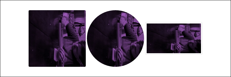
Bootstrap allows you to apply three different shape styles to images:
img-roundedwill add round corners to your imageimg-circlewill crop your image into a circleimg-thumbnailwill add round corners and a border to make the image look like a thumbnail
As with the responsive images, all you need to do is add a single CSS class to the <img> tag to apply these styles. The reason you would want to use these classes is to avoid having to actually create these variations in an app such as Photoshop. It's much easier to apply this simple image formatting using code. Here's the code for each variation:
<img src="myimage.jpg" class="img-rounded" alt="Image Rounded">

<img src="myimage.jpg" class="img-circle" alt="Image Circle">

<img src="myimage.jpg" class="img-thumbnail" alt="Image Thumbnail">
Once you've coded that up, it should look like this in the browser:
The final Bootstrap classes you can apply to images are the alignment classes. They will allow you to align your image to the left, right, or center of your layout. Like the previous examples, you only need to add a single CSS class to the <img> tag to apply the alignment you want. With left and right alignment, you can also provide a column size within the class name. The best policy would be to use the same size as the column the image is contained within. Therefore, if your image is displayed in a column with a class of col-xs-4, then use the -xs unit in the alignment class name. Here's what the left and right alignment code looks like using the extra small size:
<img src="myimage.jpg" class="pull-xs-left" alt="Left Aligned Image">

<img src="myimage.jpg" class="pull-xs-right" alt="Right Aligned Image">

The final image alignment class you can use is to center the image in the layout. The class name for this is a little bit different, as you can see here:
<img src="myimage.jpg" class="center-block" alt="Center Aligned Image">

That concludes the section on image classes that you can use in your Bootstrap layouts. Next we will look at writing and rendering tables using Bootstrap 4.