Table of Contents for
Bootstrap 4 – Responsive Web Design
 Bootstrap 4 – Responsive Web Design
Published by
Packt Publishing, 2017
Bootstrap 4 – Responsive Web Design
Published by
Packt Publishing, 2017
- Cover
- Table of Contents
- Bootstrap 4 – Responsive Web Design
- Bootstrap 4 – Responsive Web Design
- Credits
- Preface
- What you need for this learning path
- Who this learning path is for
- Reader feedback
- Customer support
- 1. Module 1
- 1. Getting Started
- Setting up the framework
- Building our first Bootstrap example
- Optionally using the CDN setup
- Community activity
- Bootstrap and web applications
- Browser compatibility
- Summary
- 2. Creating a Solid Scaffolding
- Building our scaffolding
- Fluid container
- We need some style!
- Manipulating tables
- Like a boss!
- Final thoughts
- Summary
- 3. Yes, You Should Go Mobile First
- Bootstrap and the mobile-first design
- How to debug different viewports at the browser
- Cleaning up the mess
- Creating the landing page for different devices
- Summary
- 4. Applying the Bootstrap Style
- Summary
- 5. Making It Fancy
- Paying attention to your navigation
- Dropping it down
- Making an input grouping
- Getting ready for flexbox!
- Summary
- 6. Can You Build a Web App?
- Adding the navigation
- Do a grid again
- Playing the cards
- Implementing the main content
- Creating breadcrumbs
- Finishing with the right-hand-side content
- Summary
- 7. Of Course, You Can Build a Web App!
- Waiting for the progress bar
- Creating a settings page
- Summary
- 8. Working with JavaScript
- Awesome Bootstrap modals
- Creating our custom modal
- A tool for your tip
- Pop it all over
- Making the menu affix
- Finishing the web app
- Summary
- 9. Entering in the Advanced Mode
- The last navigation bar with flexbox
- Filling the main fluid content
- Filling the main content
- Overhead loading
- Fixing the toggle button for mobile
- Summary
- 10. Bringing Components to Life
- Fixing the mobile viewport
- Learning more advanced plugins
- Summary
- 11. Making It Your Taste
- Working with plugin customization
- The additional Bootstrap plugins
- Creating our Bootstrap plugin
- Defining the plugin methods
- Creating additional plugin methods
- Summary
- 2. Module 2
- 1. Introducing Bootstrap 4
- Summary
- 2. Using Bootstrap Build Tools
- Download the Bootstrap source files
- Setting up the blog project
- Setting up the JSON files
- Creating our first page template
- Summary
- 3. Jumping into Flexbox
- Ordering your Flexbox
- Wrapping your Flexbox
- Setting up the Bootstrap Flexbox layout grid
- Setting up a Flexbox project
- Designing a single blog post
- Summary
- 4. Working with Layouts
- Inserting rows into your layout
- Adding columns to your layout
- Choosing a column class
- Creating a simple three-column layout
- Mixing column classes for different devices
- Coding the blog home page
- Using responsive utility classes
- Summary
- 5. Working with Content
- Learning to use typography
- Customizing headings
- How to style images
- Coding tables
- Summary
- 6. Playing with Components
- Basic button examples
- Creating outlined buttons
- Checkbox and radio buttons
- Coding forms in Bootstrap 4
- Creating an inline form
- Adding validation to inputs
- Using the Jumbotron component
- Adding the Label component
- Using the Alerts component
- Using Cards for layout
- Updating the Blog index page
- How to use the Navs component
- Adding Breadcrumbs to a page
- Using the Pagination component
- How to use the List Group component
- Summary
- 7. Extending Bootstrap with JavaScript Plugins
- Coding Tooltips
- Avoiding collisions with our components
- Using Popover components
- Using the Collapse component
- Coding an Accordion with the Collapse component
- Coding a Bootstrap Carousel
- Summary
- 8. Throwing in Some Sass
- Using Sass in the blog project
- Importing partials in Sass
- Creating a collection of variables
- Customizing components
- Writing a theme
- Summary
- 9. Migrating from Version 3
- Big changes in version 4
- Updating your variables
- Additional global changes
- Other font updates
- Migrating components
- Migrating JavaScript
- Miscellaneous migration changes
- Summary
- 3. Module 3
- 1. Revving Up Bootstrap
- What Bootstrap 4 Alpha 4 has to offer
- Setting up our project
- Summary
- 2. Making a Style Statement
- Image elements
- Responsive utilities
- Helper classes
- Text alignment and transformation
- Summary
- 3. Building the Layout
- Adding Bootstrap components
- Summary
- 4. On Navigation, Footers, Alerts, and Content
- Improving navigation using Scrollspy
- Customizing scroll speed
- Icons
- Using and customizing alerts
- Creating a footer
- Creating and customizing forms
- Form validation
- Progress indicators
- Adding content using media objects
- Figures
- Quotes
- Abbreviations
- Summary
- 5. Speeding Up Development Using jQuery Plugins
- Enhanced pagination using bootpag
- Displaying images using Bootstrap Lightbox
- Improving our price list with DataTables
- Summary
- 6. Customizing Your Plugins
- Customizing plugins
- Writing a custom Bootstrap jQuery plugin
- Summary
- 7. Integrating Bootstrap with Third-Party Plugins
- Hover
- Summary
- 8. Optimizing Your Website
- Minifying CSS and JavaScript
- Introducing Grunt
- Running tasks automatically
- Stripping our website of unused CSS
- JavaScript file concatenation
- Summary
- 9. Integrating with AngularJS and React
- Introducing React
- Summary
- Bibliography
- Index
Now that we have created the main page of the dashboard example and nailed almost every element, plugin, and component in Bootstrap, let's use some other advanced JavaScript plugins to complete our journey.
For this part, let's create another file named audience.html in the same folder of dashboard.html. In this file, copy the exact same code of dashboard.html, except the HTML inside the div#main element, because that is where we will make some new changes.
Bootstrap provides us with a nice plugin to slideshow components through cycling elements, although it's pretty verbose and a little complicated to understand at first sight.
First of all, we need to create an element inside our div#main:
<div id="main" class="col-sm-offset-3 col-sm-9">
  <div id="carousel-notification" class="carousel" data-ride="carousel">
      …
  </div>
</div>
We must identify this element for the Bootstrap Carousel plugin, so we have called it #carousel-notification at our outmost div of the plugin.
Bootstrap will start a carousel via the data attributes for elements marked with data-ride="carousel", just like our element. In addition, this element must have the .carousel class for the CSS style.
We must create the elements inside the slides for the carousel, so we use the following markup to create the notification slides:
<div id="main" class="col-sm-offset-3 col-sm-9">
<div id="carousel-notification" class="carousel" data-ride="carousel">
<div class="carousel-inner" role="listbox">
<div class="item active">
<img src="imgs/doge.jpg" width="512">
<div class="carousel-caption">
<p>What are you doing? So scare. It's alright now.</p>
</div>
</div>
<div class="item">
<img src="imgs/cat.jpg" width="512">
<div class="carousel-caption">
<p>I will never forgive you...</p>
</div>
</div>
<div class="item">
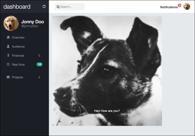
<img src="imgs/laika.jpg" width="512">
<div class="carousel-caption">
<p>Hey! How are you?</p>
</div>
</div>
</div>
</div>
</div>Note that we have created three items. Each item has been created inside the .carousel-inner element. Inside this element, the items have been created with the .item class.
Inside each .item, there is an image followed by another element with the .carousel-caption class, which contains text to be displayed as captions for each slide. Note that the first slide also contains the .active class, which must necessarily be added to one (and only one) of the slides.
At this point, refresh Bootstrap carousel your browser and you should see the page like what is shown in this screenshot:
If you wait 5 seconds, you will see the image and caption change. You can set this interval value by the
data-interval data attribute or through JavaScript, as an initializer parameter, as shown in this example:
$('.carousel').carousel({
  interval: 1000 // value in milliseconds
})
Also observe that there is no animation between the changes of the slides. To add it, put the .slide class into the .carousel element and you will see a left slide of the images.
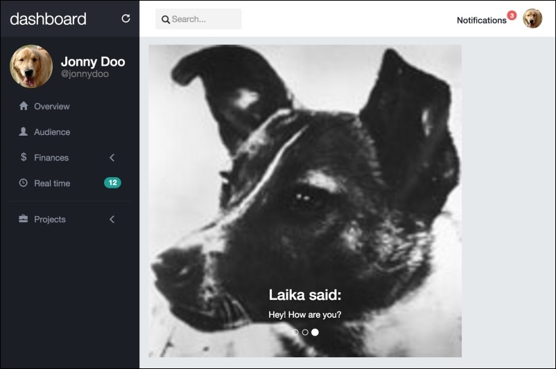
For each item in the carousel, we just created a simple <p> element inside it. However, you can add other elements, as in the following example, where we are adding a heading 3:
<div class="item">
  <img src="imgs/laika.jpg" width="512">
  <div class="carousel-caption">
    <h3>Laika said:</h3>
    <p>Hey! How are you?</p>
  </div>
</div>The Bootstrap carousel also offers the ability to create bullet slide indicators. To do this, add the following code after the .carousel-inner element:
<div id="carousel-notification" class="carousel slide" data-ride="carousel">
  <div class="carousel-inner" role="listbox">
    …
  </div>

  <!-- Indicators -->
  <ol class="carousel-indicators">
    <li data-target="#carousel-notification" data-slide-to="0" class="active"></li>
    <li data-target="#carousel-notification" data-slide-to="1"></li>
    <li data-target="#carousel-notification" data-slide-to="2"></li>
  </ol>
</div>
We just created an ordered list, <ol>. On each item, we have to say which is the carousel element identifier through data-target (in this case, it is #carousel-notification) and which slide each bullet will correspond to through data-slide-to. To do this, we just create the number of list items from the same size of the image items and enumerate them.
Refresh the browser, and now you should see the carousel with the bullets and all the modifications (the slide transition, the heading on the image item, and the bullet identifier), like this:
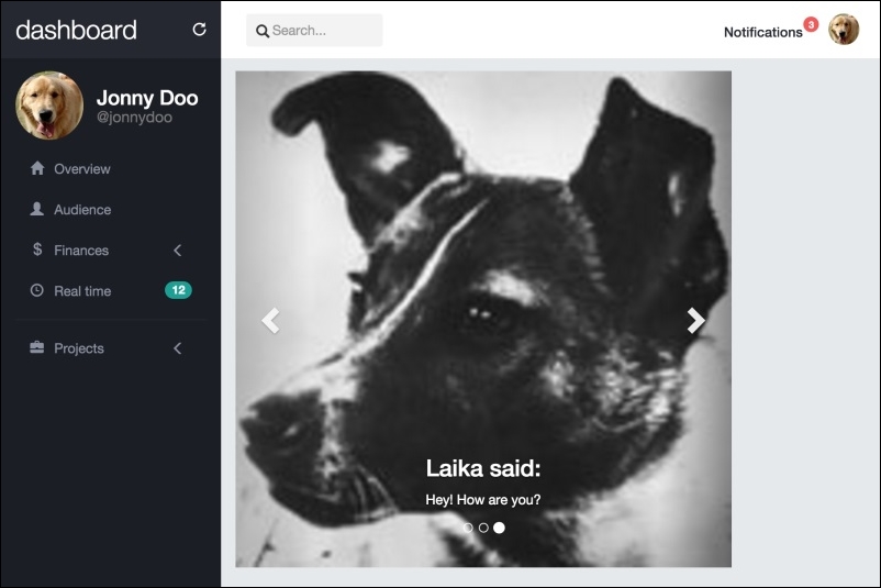
Another cool option in the Bootstrap carousel is creating side navigation controls to change slides from left to right.
We add the markup for this after the indicator's one, as shown in the following HTML code:
<div id="carousel-notification" class="carousel slide" data-ride="carousel">
  <div class="carousel-inner" role="listbox">
    …
  </div>

  <!-- Indicators -->
  <ol class="carousel-indicators">
  </ol>

  <!-- Controls -->
  <a class="left carousel-control" href="#carousel-notification" role="button" data-slide="prev">
    <span class="glyphicon glyphicon-chevron-left" aria-hidden="true"></span>
    <span class="sr-only">Previous</span>
  </a>
  <a class="right carousel-control" href="#carousel-notification" role="button" data-slide="next">
    <span class="glyphicon glyphicon-chevron-right" aria-hidden="true"></span>
    <span class="sr-only">Next</span>
  </a>
</div>
As you can see, we created two carousel controls, one to the right and one to the left. Each of them must be inside an <a> tag identified by the .carousel-control class and the class for the action, which is .right or .left.
The href of the element represents the identifier of the carousel, just as data-target in the bullet indicators. The data-slide indicates the action that should be performed by the control, which can be next to move to the next slide or prev to move to the previous slide.
The next screenshot presents the final expected result of the carousel:
Just like every Bootstrap plugin, the carousel offers a set of parameters and methods that can be used. Check out the official documentation for detailed info (http://getbootstrap.com/javascript/#carousel-options).
There are some options that we should be talking about, such as wrap, which defines whether the carousel should be cyclic or not. By default, this option has the value true.
You can also call via JavaScript to the carousel go to a certain slide or just force a slide switch. To go to a certain slide, use this function:
$('.carousel').carousel(2); // which 2 is the slide enumerated as 2 in the data-slide-toTo call the carousel to switch slides, use the same function but pass the prev or next string as the argument:
$('.carousel').carousel('next') // or 'prev'Just like other Bootstrap plugins, the carousel is great for creating slide images on your page. There are a plenty of customizations available to fit the required styles. Always check out the documentation for further information.
You will now learn another Bootstrap plugin—Bootstrap Scrollspy. Scrollspy is a plugin used to automatically update any kind of Bootstrap navigation based on the scroll position. Many sites use it, including the Bootstrap documentation, in the side navigation. There, when you scroll the page, the active elements in the navigation bar change.
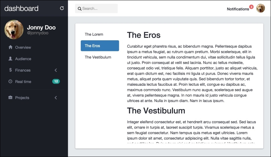
To exemplify the utilization of the plugin, let's create a .card on our audience.html page:
<div class="card">
  <div class="card-block">

  </div>
</div>
Inside .card-block, we will create two columns, the left one for the spy navigation and one to the right for the content itself. Remember to always place your .col-*-* inside a .row element:
<div class="card">
  <div class="card-block">
    <div class="row">
      <div class="col-sm-3" id="content-spy"></div>
      <div id="content" class="col-sm-9"></div>
    </div>
  </div>
</div>
We are identifying the navigation column as #content-spy and the content column as just #content.
First, let's create the left navigation using the .nav-pills.nav-stacked Bootstrap component. Do you remember it? Let's refresh your memory by using it again, as follows:
<div class="card">
  <div class="card-block">
    <div class="row">
      <div class="col-sm-3" id="content-spy">
        <ul class="nav nav-pills nav-stacked">
          <li role="presentation" class="active">
            <a href="#lorem">The Lorem</a>
          </li>
          <li role="presentation">
            <a href="#eros">The Eros</a>
          </li>
          <li role="presentation">
            <a href="#vestibulum">The Vestibulum</a>
          </li>
        </ul>
      </div>
      <div id="content" class="col-sm-9"></div>
    </div>
  </div>
</div>
All we need to do is create a <ul> with the .nav, .nav-pills, and .nav-stacked classes. Then we create three item lists, each one with a link inside, referencing an ID in the HTML (#lorem, #eros, and #vestibulum). We will use these IDs later to refer to the Scrollspy.
Now create the content. It must be in the #content three <div>, each one with the ID corresponding to the references in the href of the link in the item list, as shown in this code:
<div class="card">
  <div class="card-block">
    <div class="row">
      <div class="col-sm-3" id="content-spy">
        <ul class="nav nav-pills nav-stacked">
          <li role="presentation" class="active">
            <a href="#lorem">The Lorem</a>
          </li>
          <li role="presentation">
            <a href="#eros">The Eros</a>
          </li>
          <li role="presentation">
            <a href="#vestibulum">The Vestibulum</a>
          </li>
        </ul>
      </div>
      <div id="content" class="col-sm-9">
        <div id="lorem">
          <h2>The Lorem</h2>
          <p>
            Lorem ipsum dolor sit amet… <!-- Rest of the text -->
          </p>
        </div>
        <div id="eros">
          <h2>The Eros</h2>
          <p>
            Curabitur eget pharetra risus… <!-- Rest of the text -->
          </p>
        </div>
        <div id="vestibulum">
          <h2>The Vestibulum</h2>
          <p>
            Integer eleifend consectetur… <!-- Rest of the text -->
            <img src="imgs/jon.png" class="img-responsive">
          </p>
        </div>
      </div>
    </div>
  </div>
</div>
Note the identifiers on each <div> corresponding to the href in the link of the item list. This is used to correlate the scroll with the active item in the nav element.
To activate the plugin, we have two options. Activate it by data attributes or by JavaScript. If you choose JavaScript, place the call function in main.js:
$('#content').scrollspy({
  target: '#content-spy'
})
Refresh the page and see it working. If you want to use data attributes, place a data-spy and a data-target in the #content element:
<div class="card">
  <div class="card-block">
    <div class="row">
      <div class="col-sm-3" id="content-spy">
        <ul class="nav nav-pills nav-stacked">
          <li role="presentation" class="active">
          <a href="#lorem">The Lorem</a>
          </li>
          <li role="presentation">
            <a href="#eros">The Eros</a>
          </li>
          <li role="presentation">
            <a href="#vestibulum">The Vestibulum</a>
          </li>
        </ul>
      </div>
      <div id="content" class="col-sm-9" data-spy="scroll" data-target="#content-spy">
        <div id="lorem">
          <h2>The Lorem</h2>
          <p>
            Lorem ipsum dolor sit amet… <!-- Rest of the text -->
          </p>
        </div>
        <div id="eros">
          <h2>The Eros</h2>
          <p>
            Curabitur eget pharetra risus… <!-- Rest of the text -->
          </p>
        </div>
        <div id="vestibulum">
          <h2>The Vestibulum</h2>
          <p>
            Integer eleifend consectetur… <!-- Rest of the text -->
            <img src="imgs/jon.png" class="img-responsive">
          </p>
        </div>
      </div>
    </div>
  </div>
</div>
The data-spy must have the scroll value in order to identify that the spy must be active for the scrolling action. The data-target works just like the parameter target passed in the activation by JavaScript. It should represent the element that will spy on the element, #content-spy in this case.
To make a final effect for the scrolling, create the following CSS to limit the height and adjust the scroll of the content:
#content {
  height: 30em;
  overflow: auto;
}
Refresh your web browser and the card should appear like what is shown in the next screenshot. Note that here we have scrolled the content to the second item.
Great! Now you have learned another Bootstrap plugin! The Scrollspy plugin is very useful, especially on pages with extensive content, subdivided into sections. Make great use of it.