Table of Contents for
Bootstrap 4 – Responsive Web Design
 Bootstrap 4 – Responsive Web Design
Published by
Packt Publishing, 2017
Bootstrap 4 – Responsive Web Design
Published by
Packt Publishing, 2017
- Cover
- Table of Contents
- Bootstrap 4 – Responsive Web Design
- Bootstrap 4 – Responsive Web Design
- Credits
- Preface
- What you need for this learning path
- Who this learning path is for
- Reader feedback
- Customer support
- 1. Module 1
- 1. Getting Started
- Setting up the framework
- Building our first Bootstrap example
- Optionally using the CDN setup
- Community activity
- Bootstrap and web applications
- Browser compatibility
- Summary
- 2. Creating a Solid Scaffolding
- Building our scaffolding
- Fluid container
- We need some style!
- Manipulating tables
- Like a boss!
- Final thoughts
- Summary
- 3. Yes, You Should Go Mobile First
- Bootstrap and the mobile-first design
- How to debug different viewports at the browser
- Cleaning up the mess
- Creating the landing page for different devices
- Summary
- 4. Applying the Bootstrap Style
- Summary
- 5. Making It Fancy
- Paying attention to your navigation
- Dropping it down
- Making an input grouping
- Getting ready for flexbox!
- Summary
- 6. Can You Build a Web App?
- Adding the navigation
- Do a grid again
- Playing the cards
- Implementing the main content
- Creating breadcrumbs
- Finishing with the right-hand-side content
- Summary
- 7. Of Course, You Can Build a Web App!
- Waiting for the progress bar
- Creating a settings page
- Summary
- 8. Working with JavaScript
- Awesome Bootstrap modals
- Creating our custom modal
- A tool for your tip
- Pop it all over
- Making the menu affix
- Finishing the web app
- Summary
- 9. Entering in the Advanced Mode
- The last navigation bar with flexbox
- Filling the main fluid content
- Filling the main content
- Overhead loading
- Fixing the toggle button for mobile
- Summary
- 10. Bringing Components to Life
- Fixing the mobile viewport
- Learning more advanced plugins
- Summary
- 11. Making It Your Taste
- Working with plugin customization
- The additional Bootstrap plugins
- Creating our Bootstrap plugin
- Defining the plugin methods
- Creating additional plugin methods
- Summary
- 2. Module 2
- 1. Introducing Bootstrap 4
- Summary
- 2. Using Bootstrap Build Tools
- Download the Bootstrap source files
- Setting up the blog project
- Setting up the JSON files
- Creating our first page template
- Summary
- 3. Jumping into Flexbox
- Ordering your Flexbox
- Wrapping your Flexbox
- Setting up the Bootstrap Flexbox layout grid
- Setting up a Flexbox project
- Designing a single blog post
- Summary
- 4. Working with Layouts
- Inserting rows into your layout
- Adding columns to your layout
- Choosing a column class
- Creating a simple three-column layout
- Mixing column classes for different devices
- Coding the blog home page
- Using responsive utility classes
- Summary
- 5. Working with Content
- Learning to use typography
- Customizing headings
- How to style images
- Coding tables
- Summary
- 6. Playing with Components
- Basic button examples
- Creating outlined buttons
- Checkbox and radio buttons
- Coding forms in Bootstrap 4
- Creating an inline form
- Adding validation to inputs
- Using the Jumbotron component
- Adding the Label component
- Using the Alerts component
- Using Cards for layout
- Updating the Blog index page
- How to use the Navs component
- Adding Breadcrumbs to a page
- Using the Pagination component
- How to use the List Group component
- Summary
- 7. Extending Bootstrap with JavaScript Plugins
- Coding Tooltips
- Avoiding collisions with our components
- Using Popover components
- Using the Collapse component
- Coding an Accordion with the Collapse component
- Coding a Bootstrap Carousel
- Summary
- 8. Throwing in Some Sass
- Using Sass in the blog project
- Importing partials in Sass
- Creating a collection of variables
- Customizing components
- Writing a theme
- Summary
- 9. Migrating from Version 3
- Big changes in version 4
- Updating your variables
- Additional global changes
- Other font updates
- Migrating components
- Migrating JavaScript
- Miscellaneous migration changes
- Summary
- 3. Module 3
- 1. Revving Up Bootstrap
- What Bootstrap 4 Alpha 4 has to offer
- Setting up our project
- Summary
- 2. Making a Style Statement
- Image elements
- Responsive utilities
- Helper classes
- Text alignment and transformation
- Summary
- 3. Building the Layout
- Adding Bootstrap components
- Summary
- 4. On Navigation, Footers, Alerts, and Content
- Improving navigation using Scrollspy
- Customizing scroll speed
- Icons
- Using and customizing alerts
- Creating a footer
- Creating and customizing forms
- Form validation
- Progress indicators
- Adding content using media objects
- Figures
- Quotes
- Abbreviations
- Summary
- 5. Speeding Up Development Using jQuery Plugins
- Enhanced pagination using bootpag
- Displaying images using Bootstrap Lightbox
- Improving our price list with DataTables
- Summary
- 6. Customizing Your Plugins
- Customizing plugins
- Writing a custom Bootstrap jQuery plugin
- Summary
- 7. Integrating Bootstrap with Third-Party Plugins
- Hover
- Summary
- 8. Optimizing Your Website
- Minifying CSS and JavaScript
- Introducing Grunt
- Running tasks automatically
- Stripping our website of unused CSS
- JavaScript file concatenation
- Summary
- 9. Integrating with AngularJS and React
- Introducing React
- Summary
- Bibliography
- Index
You may be bored of doing navigation bars; however, because of the acquired experience, we will do this one very quickly, taking advantage of the code written in previous examples.
Create a <nav> element, and inside it, create a .container-fluid and a .row:
<nav class="navbar navbar-fixed-top">
  <div class="container-fluid">
    <div class="row">
    </div>
  </div>
</nav>
This .row element will have two columns, just as we mentioned that will be done for the main container. On the first one, let's create the dashboard title and a refresh button, as follows:
<nav class="navbar navbar-fixed-top">
  <div class="container-fluid">
    <div class="row">
      <div class="col-sm-3 top-left-menu">
        <div class="navbar-header">
          <a class="navbar-brand" href="webapp.html">
            <h1>dashboard</h1>
          </a>

        </div>
        <a href="#" data-toggle="tooltip" data-placement="bottom" data-delay="500" title="Refresh data" class="header-refresh pull-right">
          <span class="glyphicon glyphicon-repeat" aria-hidden="true"></span>
        </a>
      </div>
    </div>
  </div>
</nav>
Note that for the refresh button, we have used .glyphicon and added a tooltip. Do not forget to activate the tooltip in the main.js file that you have loaded:
$(document).ready(function() {
    $('[data-toggle="tooltip"]').tooltip();
});
In the tooltip, we added a delay to it show up with the data-delay="500" attribute. We mentioned this as an option for tooltip, but haven't made use of it so far. This will just delay the appearance of the tooltip for 500 milliseconds, while hovering the refresh link.
Inside .nav-header, add .navbar-toggle, which will be displayed for small screens and collapse the menu:
<nav class="navbar navbar-fixed-top">
  <div class="container-fluid">
    <div class="row">
      <div class="col-sm-3 top-left-menu">
        <div class="navbar-header">
          <a class="navbar-brand" href="webapp.html">
            <h1>dashboard</h1>
          </a>
          <button type="button" class="navbar-toggle collapsed" data-toggle="collapse" data-target="#nav-menu" aria-expanded="false">
            <span class="sr-only">Toggle navigation</span>
            <span class="icon-bar"></span>
            <span class="icon-bar"></span>
            <span class="icon-bar"></span>
          </button>
        </div>
        <a href="#" data-toggle="tooltip" data-placement="bottom" data-delay="500" title="Refresh data" class="header-refresh pull-right">
          <span class="glyphicon glyphicon-repeat" aria-hidden="true"></span>
        </a>
      </div>
    </div>
  </div>
</nav>
So far, we have no secrets. We have just replicated components that we used before. Following our pipeline, we should create some CSS rules to style our page, although first let's create some common CSS style. At the beginning of base.css, which is loaded in our HTML, we add the style:
.transition,
.transition:hover,
.transition:focus {

  -webkit-transition: all 150ms ease-in-out;
  -moz-transition: all 150ms ease-in-out;
  -ms-transition: all 150ms ease-in-out;
  -o-transition: all 150ms ease-in-out;
  transition: all 150ms ease-in-out;
}

html, body {
  position: relative;
  height: 100%;
  background-color: #e5e9ec;
}
First, we created a common .transition class to be used in multiples cases (we will use it in the chapter). Transitions were introduced in CSS3 and they allow us to create transition effects. In this case, it's an effect of ease-in-out for any element that has this class.
Also, for html and body, we changed the background and set the position and height to fill the entire screen.
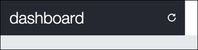
Next, we must add the CSS for the navigation header:
nav.navbar-fixed-top {
  background-color: #FFF;
  border: none;
}

nav .top-left-menu {
  background-color: #252830;
  display: -webkit-flex;
  display: flex;
  align-items: center;
}

.navbar-brand {
  height: auto;
}

.navbar-brand h1 {
  margin: 0;
  font-size: 1.5em;
  font-weight: 300;
  color: #FFF;
}

nav .header-refresh {
  margin-left: auto;
  color: #FFF;
}
Here, we changed the color of the elements. But the most important thing here is the usage of the flexbox rules (do you remember flexbox, which we discussed in Chapter 5, Making It Fancy, in the Understanding flexbox section?). Remember that Bootstrap 4 will support flex display, so it is nice to keep using it, since it should be the standard in the near future for every browser.
The result of this part must look like what is shown in the following screenshot:
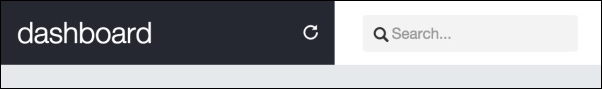
Following our design, we have to create a search form. So, just after the closure of .top-left-menu, add the form code, such as the portion in bold:
<nav class="navbar navbar-fixed-top">
  <div class="container-fluid">
    <div class="row">
      <div class="col-sm-3 top-left-menu">
        ...
      </div>

      <form id="search" role="search" class="hidden-xs col-sm-3">
        <div class="input-group">
          <span class="glyphicon glyphicon-search" aria-hidden="true"></span>
          <input type="text" class="form-control transition" placeholder="Search...">
        </div>
      </form>

    </div>
  </div>
</nav>
As usual, it's CSS time:
nav form#search {
  padding: 0.9em;
}

nav form#search .input-group {
  display: -webkit-flex;
  display: flex;
  align-items: center;
}

nav form#search .input-group .form-control {
  border-radius: 0.25em;
  border: none;
  width: 70%;
  padding-left: 1.9em;
  background-color: #F3F3F3;
  box-shadow: none;
}

nav form#search .input-group .form-control:focus {
  width: 100%;
  box-shadow: none;
}

nav form#search .glyphicon-search {
  z-index: 99;
  left: 1.7em;
}
In this CSS, we have again used the display: flex property. In addition to this, we created a pseudo-class rule for .form-control. The :focus, which is activated whenever the input has focus, in other words, is receiving some text. This :focus rule will change the width of the input when you focus the input, which happens when you click on it.
Refresh the web page and click on the input on the search form. Note that we applied the .transition class in this element, so when we focus it, the change of width is smoothed in a transition. The result should look like this:
To finish the navigation bar, we have to create the right-hand-side content of the navigation bar, which we call #nav-menu. This menu will hold the notification list, placed as a button dropdown.
After <form>, place the presented HTML:
<div id="nav-menu" class="collapse navbar-collapse pull-right">
  <ul class="nav navbar-nav">
  </ul>
</div>
Inside this <ul> tag, we will place the notifications. Right now, we just have this option, but with this list, we can add multiple items in the navigation bar. So, add the following code for the item:
<div id="nav-menu" class="collapse navbar-collapse pull-right">
  <ul class="nav navbar-nav">
    <li>
      <div id="btn-notifications" class="btn-group">
        <span class="badge">3</span>
        <button type="button" class="btn btn-link dropdown-toggle" data-toggle="dropdown" aria-haspopup="true" aria-expanded="false">
          Notifications
        </button>
      </div>
    </li>
  </ul>
</div>
Explaining this item, we can say that it is a button for the notification. There is a wrapper element named #btn-notifications. Inside it is a .badge to verbalize the number of new notifications, and a button.btn that must seem like a link, so we applied the .btn-link class to it. The button also contains the tags needed for a Bootstrap drop-down button, such as the .dropdown-toggle class and the data-toggle="dropdown" data property.
Therefore, every
button.dropdown-toggle button needs a ul.dropdown-menu. Just after <button>, create the list:
<div id="nav-menu" class="collapse navbar-collapse pull-right">
  <ul class="nav navbar-nav">
    <li>
      <div id="btn-notifications" class="btn-group">
        <span class="badge">3</span>
        <button type="button" class="btn btn-link dropdown-toggle" data-toggle="dropdown" aria-haspopup="true" aria-expanded="false">
          Notifications
        </button>
        <ul id="notification-list" class="dropdown-menu pull-right">
          <li>
            <a href="#">
              <span class="badge"></span>
              <img src="imgs/laika.jpg" class="img-circle">
              <div class="notification-message">
                <strong>Laika</strong>
                <p>Hey! How are you?</p>
                <em class="since">2h ago</em>
              </div>
            </a>
          </li>
          <li>
            <a href="#">
              <span class="badge"></span>
              <img src="imgs/cat.jpg" class="img-circle">
              <div class="notification-message">
                <strong>Devil cat</strong>
                <p>I will never forgive you...</p>
                <em class="since">6h ago</em>
              </div>
            </a>
          </li>
          <li>
            <a href="#">
              <span class="badge"></span>
              <img src="imgs/doge.jpg" class="img-circle">
              <div class="notification-message">
                <strong>Doge</strong>
                <p>What are you doing? So scare. It's alright now.</p>
                <em class="since">yesterday</em>
              </div>
            </a>
          </li>
        </ul>
      </div>
    </li>
  </ul>
</div>
The new list element is pointed out in bold. Even though the content seems long, it is just a repetition of three items with different contents inside our notification list.
Refresh the page, open the dropdown, and you will feel an uncontrollable desire to add some CSS and stop the dropdown from being ugly anymore:
/*nav menu*/
nav #nav-menu {
  padding: 0.4em;
  padding-right: 1em;
}

/*nav menu and notifications*/
#nav-menu #btn-notifications > .badge {
  color: #FFF;
  background-color: #f35958;
  font-size: 0.7em;
  padding: 0.3rem 0.55rem 0.3rem 0.5rem;
  position: absolute;
  right: -0.4rem;
  top: 1rem;
  z-index: 99;
}

#btn-notifications .btn-link {
  padding-top: 1.5rem;
  color: #252830;
  font-weight: 500;
}

#btn-notifications .btn-link:hover {
  text-decoration: none;
}
Great! This will make the button and notification badge appear more beautiful. Then it's time for #notification-list:
#notification-list {
max-height: 20em;
overflow: auto;
}
#notification-list a {
display: -webkit-flex;
display: flex;
opacity: 0.7;
margin: 1.5rem;
border-radius: 0.5rem;
padding: 0.5rem 1.3rem;
background-color: #EFEFEF;
position: relative;
}
#notification-list a:hover {
color: #262626;
text-decoration: none;
opacity: 1;
}
#notification-list img {
display: inline-block;
height: 35px;
width: 35px;
margin-right: 1em;
margin-top: 1em;
}
#notification-list .notification-message {
display: inline-block;
white-space: normal;
min-width: 25rem;
}
#notification-list .badge:empty {
display: inline-block;
position: absolute;
right: 0.5rem;
top: 0.5rem;
background-color: #f35958;
height: 1.4rem;
}
#notification-list em.since {
font-size: 0.7em;
color: #646C82;
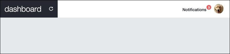
}For the notification, we did just some common rules, such as spacing, color, and so on. The only different thing is, again, the use of flexbox to align the content. See this screenshot for the final result of the navigation bar:

In the navigation bar, the last present component is a picture that, when you click on it, opens a user menu, just like what we did in the example of the web application. With no further delay, place the next HTML just after the <ul> of #nav-menu:
<div id="nav-menu" class="collapse navbar-collapse pull-right">
  <ul class="nav navbar-nav">
    …
  </ul>

  <div id="nav-profile" class="btn-group pull-right">
    <button type="button" class="btn btn-link dropdown-toggle thumbnail" data-toggle="dropdown" aria-haspopup="true" aria-expanded="false">
      <img src="imgs/jon.png" class="img-circle">
    </button>
    <ul class="dropdown-menu">
      <li><a href="#">Profile</a></li>
      <li><a href="settings.html">Setting</a></li>
      <li role="separator" class="divider"></li>
      <li><a href="#">Logout</a></li>
    </ul>
  </div>
</div>
So, it is another button dropdown. The CSS for this HTML is as follows:
#nav-profile {
  margin: 0.5em;
  margin-left: 1em;
}

#nav-profile button.thumbnail {
  margin: 0;
  padding: 0;
  border: 0;
}

#nav-profile img {
  max-height: 2.3em;
}
We are done! Refresh the web browser and see the result, which should be like what is shown in this screenshot: