Table of Contents for
Bootstrap 4 – Responsive Web Design
 Bootstrap 4 – Responsive Web Design
Published by
Packt Publishing, 2017
Bootstrap 4 – Responsive Web Design
Published by
Packt Publishing, 2017
- Cover
- Table of Contents
- Bootstrap 4 – Responsive Web Design
- Bootstrap 4 – Responsive Web Design
- Credits
- Preface
- What you need for this learning path
- Who this learning path is for
- Reader feedback
- Customer support
- 1. Module 1
- 1. Getting Started
- Setting up the framework
- Building our first Bootstrap example
- Optionally using the CDN setup
- Community activity
- Bootstrap and web applications
- Browser compatibility
- Summary
- 2. Creating a Solid Scaffolding
- Building our scaffolding
- Fluid container
- We need some style!
- Manipulating tables
- Like a boss!
- Final thoughts
- Summary
- 3. Yes, You Should Go Mobile First
- Bootstrap and the mobile-first design
- How to debug different viewports at the browser
- Cleaning up the mess
- Creating the landing page for different devices
- Summary
- 4. Applying the Bootstrap Style
- Summary
- 5. Making It Fancy
- Paying attention to your navigation
- Dropping it down
- Making an input grouping
- Getting ready for flexbox!
- Summary
- 6. Can You Build a Web App?
- Adding the navigation
- Do a grid again
- Playing the cards
- Implementing the main content
- Creating breadcrumbs
- Finishing with the right-hand-side content
- Summary
- 7. Of Course, You Can Build a Web App!
- Waiting for the progress bar
- Creating a settings page
- Summary
- 8. Working with JavaScript
- Awesome Bootstrap modals
- Creating our custom modal
- A tool for your tip
- Pop it all over
- Making the menu affix
- Finishing the web app
- Summary
- 9. Entering in the Advanced Mode
- The last navigation bar with flexbox
- Filling the main fluid content
- Filling the main content
- Overhead loading
- Fixing the toggle button for mobile
- Summary
- 10. Bringing Components to Life
- Fixing the mobile viewport
- Learning more advanced plugins
- Summary
- 11. Making It Your Taste
- Working with plugin customization
- The additional Bootstrap plugins
- Creating our Bootstrap plugin
- Defining the plugin methods
- Creating additional plugin methods
- Summary
- 2. Module 2
- 1. Introducing Bootstrap 4
- Summary
- 2. Using Bootstrap Build Tools
- Download the Bootstrap source files
- Setting up the blog project
- Setting up the JSON files
- Creating our first page template
- Summary
- 3. Jumping into Flexbox
- Ordering your Flexbox
- Wrapping your Flexbox
- Setting up the Bootstrap Flexbox layout grid
- Setting up a Flexbox project
- Designing a single blog post
- Summary
- 4. Working with Layouts
- Inserting rows into your layout
- Adding columns to your layout
- Choosing a column class
- Creating a simple three-column layout
- Mixing column classes for different devices
- Coding the blog home page
- Using responsive utility classes
- Summary
- 5. Working with Content
- Learning to use typography
- Customizing headings
- How to style images
- Coding tables
- Summary
- 6. Playing with Components
- Basic button examples
- Creating outlined buttons
- Checkbox and radio buttons
- Coding forms in Bootstrap 4
- Creating an inline form
- Adding validation to inputs
- Using the Jumbotron component
- Adding the Label component
- Using the Alerts component
- Using Cards for layout
- Updating the Blog index page
- How to use the Navs component
- Adding Breadcrumbs to a page
- Using the Pagination component
- How to use the List Group component
- Summary
- 7. Extending Bootstrap with JavaScript Plugins
- Coding Tooltips
- Avoiding collisions with our components
- Using Popover components
- Using the Collapse component
- Coding an Accordion with the Collapse component
- Coding a Bootstrap Carousel
- Summary
- 8. Throwing in Some Sass
- Using Sass in the blog project
- Importing partials in Sass
- Creating a collection of variables
- Customizing components
- Writing a theme
- Summary
- 9. Migrating from Version 3
- Big changes in version 4
- Updating your variables
- Additional global changes
- Other font updates
- Migrating components
- Migrating JavaScript
- Miscellaneous migration changes
- Summary
- 3. Module 3
- 1. Revving Up Bootstrap
- What Bootstrap 4 Alpha 4 has to offer
- Setting up our project
- Summary
- 2. Making a Style Statement
- Image elements
- Responsive utilities
- Helper classes
- Text alignment and transformation
- Summary
- 3. Building the Layout
- Adding Bootstrap components
- Summary
- 4. On Navigation, Footers, Alerts, and Content
- Improving navigation using Scrollspy
- Customizing scroll speed
- Icons
- Using and customizing alerts
- Creating a footer
- Creating and customizing forms
- Form validation
- Progress indicators
- Adding content using media objects
- Figures
- Quotes
- Abbreviations
- Summary
- 5. Speeding Up Development Using jQuery Plugins
- Enhanced pagination using bootpag
- Displaying images using Bootstrap Lightbox
- Improving our price list with DataTables
- Summary
- 6. Customizing Your Plugins
- Customizing plugins
- Writing a custom Bootstrap jQuery plugin
- Summary
- 7. Integrating Bootstrap with Third-Party Plugins
- Hover
- Summary
- 8. Optimizing Your Website
- Minifying CSS and JavaScript
- Introducing Grunt
- Running tasks automatically
- Stripping our website of unused CSS
- JavaScript file concatenation
- Summary
- 9. Integrating with AngularJS and React
- Introducing React
- Summary
- Bibliography
- Index
Tables in Bootstrap 4 are largely unchanged from the previous version of the framework. However, there are a few new things, like inverse color table options and responsive tables. Let's start with the basics and we will build in the new features as we go.
The basic table structure in Bootstrap takes advantage of almost all the available HTML table tags. The header is wrapped in <thead> and the body <tbody> tags. This will allow additional styling as we get into the inverse table layout. For now, let's see how we put together a basic table in Bootstrap:
<table class="table">
<thead>
  <tr>
    <th>first name</th>
    <th>last name</th>
    <th>twitter</th>
  </tr>
</thead>
<tbody>
  <tr>
    <td>john</td>
    <td>smtih</td>
    <td>@jsmtih</td>
  </tr>
  <tr>
    <td>steve</td>
    <td>stevens</td>
    <td>@stevens</td>
  </tr>
  <tr>
    <td>mike</td>
    <td>michaels</td>
    <td>@mandm</td>
  </tr>
</tbody>
</table>
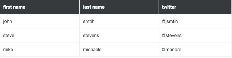
As you can see, the syntax is fairly straightforward. The only class being applied is the root table class on the <table> tag. This needs to be applied to any table variation you are using in Bootstrap. This will produce a table that looks like the following in the browser:
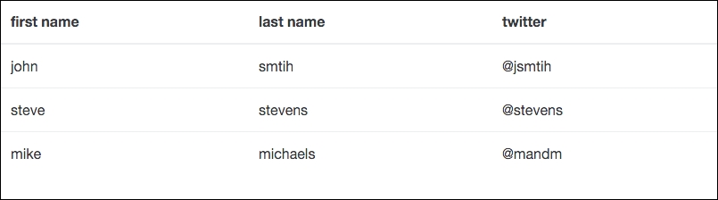
As you can see, the syntax is fairly straightforward. The only class being applied is the root table class on the <table> tag. This needs to be applied to any table variation you are using in Bootstrap.
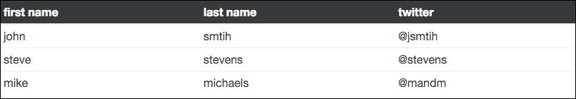
Let me quickly show you one of the new table classes in Bootstrap 4. If we add the class table-inverse to the <table> tag, the table colors will flip to be a dark background with light text. Here's the code you need to change:
<table class="table table-inverse">
  ...
</table>
This slight variation in code will produce a table that looks like this:
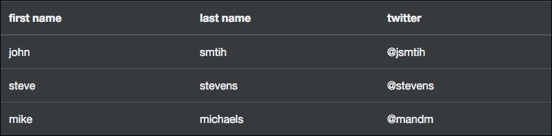
That's a pretty handy trick to know if you need to get a quick variation of the basic table styles going.
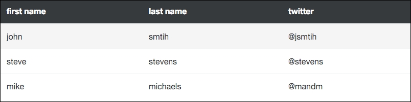
Perhaps you don't want to inverse the entire table? If that is the case, you can use the thead-inverse class on the <thead> tag to only inverse that row:
<table class="table">
<thead class="thead-inverse">
  ...
</thead>
  ...
</table>
If this variation is applied, then your table will look like this:
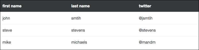
If you're looking for a more subtle design for your project, this approach may be more appealing to you.
Although not new to Bootstrap 4, the table-striped class is one that I use all the time. Applying this class to the <table> tag will add zebra striping to your table, starting with the first row in the body and applying a light grey background color on all the odd numbered rows:
<table class="table table-striped">
Using this class will produce a table that looks like this:
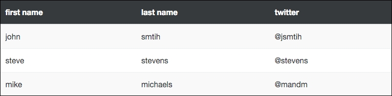
Now our table is starting to come together. With a few classes, we can get an attractive-looking layout. Let's see what else we can do with tables.
Another style that is regularly used is to add borders to your table. This can be done in the same way as stripes. Just change or add another class to the <table> tab called table-bordered. For this example, I'll remove the stripes and add the borders:
<table class="table table-bordered">
Now that we've added the borders and taken away the stripes, our table should look like this:
<table class="table table-bordered table-striped">
It's important to know that you can combine the table classes and use more than one. What if you wanted a table with stripes and borders? You can do that easily, by including both of the corresponding classes.
It's possible and easy to add a hover state to each of your table rows. To do so, you just need to add the table-hover class to the <table> tag. When used, if you hover over a row in the table, its background color will change to indicate a state change:
<table class="table table-hover">
Here I've removed the other table classes to show you the basic hover table option. When viewed in the browser, the table should look like the following when a row is hovered over with the mouse:
In some cases you may require a table with smaller text and compressed height. This can be done by adding the table-sm class to the <table> tag. This will make the look of the table more compact when viewing it:
<table class="table table-sm">
If you choose to use this class, your table should look like this:
Creating smaller tables
That concludes the core table variations that you can apply through a simple CSS class. Before we move on, there are a couple more important points on tables that we should go over.
In some cases, you may want to color the background of a table row in a different color. This can easily be achieved through the use of some included contextual classes. There are five different color variations you can choose from:
table-activeis the hover color, light grey by defaulttable-successis green for a positive actiontable-infois blue for an informational highlighttable-warningis yellow to call out something that needs attentiontable-dangeris red for a negative or error action
The preceding classes can be applied to either a <tr> or <td> tag. If I apply all of these color variations to a single table, they look like this:
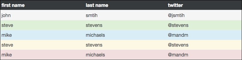
As you can see, these classes can be useful for validation or just highlighting a particular row that needs to stand out more.
Adding responsiveness to tables has never been very easy to do with CSS. Thankfully, Bootstrap 4 comes with some support built right in that you can easily take advantage of. To make a table responsive, you simply need to wrap a <div> around your <table> that has a class of table-responsive on it:
<div class="table-responsive">
  <table class="table">
    ...
  </table>
</div>
If you view the table on a viewport that is smaller than 768px, then the table cells will scroll horizontally, so they can all be viewed. If the viewport is larger, you will see no difference in the table compared to a regular one.