Table of Contents for
Bootstrap 4 – Responsive Web Design
 Bootstrap 4 – Responsive Web Design
Published by
Packt Publishing, 2017
Bootstrap 4 – Responsive Web Design
Published by
Packt Publishing, 2017
- Cover
- Table of Contents
- Bootstrap 4 – Responsive Web Design
- Bootstrap 4 – Responsive Web Design
- Credits
- Preface
- What you need for this learning path
- Who this learning path is for
- Reader feedback
- Customer support
- 1. Module 1
- 1. Getting Started
- Setting up the framework
- Building our first Bootstrap example
- Optionally using the CDN setup
- Community activity
- Bootstrap and web applications
- Browser compatibility
- Summary
- 2. Creating a Solid Scaffolding
- Building our scaffolding
- Fluid container
- We need some style!
- Manipulating tables
- Like a boss!
- Final thoughts
- Summary
- 3. Yes, You Should Go Mobile First
- Bootstrap and the mobile-first design
- How to debug different viewports at the browser
- Cleaning up the mess
- Creating the landing page for different devices
- Summary
- 4. Applying the Bootstrap Style
- Summary
- 5. Making It Fancy
- Paying attention to your navigation
- Dropping it down
- Making an input grouping
- Getting ready for flexbox!
- Summary
- 6. Can You Build a Web App?
- Adding the navigation
- Do a grid again
- Playing the cards
- Implementing the main content
- Creating breadcrumbs
- Finishing with the right-hand-side content
- Summary
- 7. Of Course, You Can Build a Web App!
- Waiting for the progress bar
- Creating a settings page
- Summary
- 8. Working with JavaScript
- Awesome Bootstrap modals
- Creating our custom modal
- A tool for your tip
- Pop it all over
- Making the menu affix
- Finishing the web app
- Summary
- 9. Entering in the Advanced Mode
- The last navigation bar with flexbox
- Filling the main fluid content
- Filling the main content
- Overhead loading
- Fixing the toggle button for mobile
- Summary
- 10. Bringing Components to Life
- Fixing the mobile viewport
- Learning more advanced plugins
- Summary
- 11. Making It Your Taste
- Working with plugin customization
- The additional Bootstrap plugins
- Creating our Bootstrap plugin
- Defining the plugin methods
- Creating additional plugin methods
- Summary
- 2. Module 2
- 1. Introducing Bootstrap 4
- Summary
- 2. Using Bootstrap Build Tools
- Download the Bootstrap source files
- Setting up the blog project
- Setting up the JSON files
- Creating our first page template
- Summary
- 3. Jumping into Flexbox
- Ordering your Flexbox
- Wrapping your Flexbox
- Setting up the Bootstrap Flexbox layout grid
- Setting up a Flexbox project
- Designing a single blog post
- Summary
- 4. Working with Layouts
- Inserting rows into your layout
- Adding columns to your layout
- Choosing a column class
- Creating a simple three-column layout
- Mixing column classes for different devices
- Coding the blog home page
- Using responsive utility classes
- Summary
- 5. Working with Content
- Learning to use typography
- Customizing headings
- How to style images
- Coding tables
- Summary
- 6. Playing with Components
- Basic button examples
- Creating outlined buttons
- Checkbox and radio buttons
- Coding forms in Bootstrap 4
- Creating an inline form
- Adding validation to inputs
- Using the Jumbotron component
- Adding the Label component
- Using the Alerts component
- Using Cards for layout
- Updating the Blog index page
- How to use the Navs component
- Adding Breadcrumbs to a page
- Using the Pagination component
- How to use the List Group component
- Summary
- 7. Extending Bootstrap with JavaScript Plugins
- Coding Tooltips
- Avoiding collisions with our components
- Using Popover components
- Using the Collapse component
- Coding an Accordion with the Collapse component
- Coding a Bootstrap Carousel
- Summary
- 8. Throwing in Some Sass
- Using Sass in the blog project
- Importing partials in Sass
- Creating a collection of variables
- Customizing components
- Writing a theme
- Summary
- 9. Migrating from Version 3
- Big changes in version 4
- Updating your variables
- Additional global changes
- Other font updates
- Migrating components
- Migrating JavaScript
- Miscellaneous migration changes
- Summary
- 3. Module 3
- 1. Revving Up Bootstrap
- What Bootstrap 4 Alpha 4 has to offer
- Setting up our project
- Summary
- 2. Making a Style Statement
- Image elements
- Responsive utilities
- Helper classes
- Text alignment and transformation
- Summary
- 3. Building the Layout
- Adding Bootstrap components
- Summary
- 4. On Navigation, Footers, Alerts, and Content
- Improving navigation using Scrollspy
- Customizing scroll speed
- Icons
- Using and customizing alerts
- Creating a footer
- Creating and customizing forms
- Form validation
- Progress indicators
- Adding content using media objects
- Figures
- Quotes
- Abbreviations
- Summary
- 5. Speeding Up Development Using jQuery Plugins
- Enhanced pagination using bootpag
- Displaying images using Bootstrap Lightbox
- Improving our price list with DataTables
- Summary
- 6. Customizing Your Plugins
- Customizing plugins
- Writing a custom Bootstrap jQuery plugin
- Summary
- 7. Integrating Bootstrap with Third-Party Plugins
- Hover
- Summary
- 8. Optimizing Your Website
- Minifying CSS and JavaScript
- Introducing Grunt
- Running tasks automatically
- Stripping our website of unused CSS
- JavaScript file concatenation
- Summary
- 9. Integrating with AngularJS and React
- Introducing React
- Summary
- Bibliography
- Index
It is finally time to take our last step through the landing page example. After learning all the basics of Bootstrap, passing from side to side of the grid system, mobile-first development, and using Bootstrap HTML elements, the landing page example has come to an end. Now it is time to go a little deeper and acquire more knowledge of this beautiful framework—Bootstrap.
In this chapter, we will focus on adding components all over the landing page. We will also touch upon the flexbox option, present in version 4. After all has been said, our landing page will be ready for the production stage. Get ready for the key points that we will cover in this chapter:
- Glyphicon icons
- Navigation bars
- The Drop-down component
- Input grouping
- Flexbox Bootstrap usage
Bootstrap is such a nice thing! It provides for us more than 250 icons ready for use and fully resizable. The icons were created from the Glyphicon Halflings set (http://glyphicons.com/). They are fully rendered as fonts, so you can customize both size and color for each one of them. To make use of that, let's see the features section on the landing page. As you can see, we let this section be a little simpler. By adding some fonts, we will get a nicer result:
<section id="features">
  <div class="container">

    <!-- row 5 -->
    <div class="row">
      <div class="col-sm-12">
        <h3 class="text-center">Features</h3>
        <p class="text-center">Features headline message</p>
      </div>
    </div>

    <!-- row 6 -->
    <div class="row">
      <div class="col-sm-2 col-md-4">
        <div class="feature">
          <span class="glyphicon glyphicon-screenshot" aria-hidden="true"></span>
          <span class="feature-tag">Product focus</span>
        </div>
      </div>
      <div class="col-sm-2 col-md-4">
        <div class="feature">
          <span class="glyphicon glyphicon-education" aria-hidden="true"></span>
          <span class="feature-tag">Teaching as a passion</span>
        </div>
      </div>
      <div class="col-sm-2 col-md-4">
        <div class="feature">
          <span class="glyphicon glyphicon-send" aria-hidden="true"></span>
          <span class="feature-tag">Spreading knowledge</span>
        </div>
      </div>
      <div class="col-sm-2 col-md-4">
        <div class="feature">
          <span class="glyphicon glyphicon-hourglass" aria-hidden="true"></span>
          <span class="feature-tag">Save your day time</span>
        </div>
      </div>
      <div class="col-sm-2 col-md-4">
        <div class="feature">
          <span class="glyphicon glyphicon-sunglasses" aria-hidden="true"></span>
          <span class="feature-tag">Make it fancy</span>
        </div>
      </div>
      <div class="col-sm-2 col-md-4">
        <div class="feature">
          <span class="glyphicon glyphicon-heart" aria-hidden="true"></span>
          <span class="feature-tag">Made with love</span>
        </div>
      </div>
      </div>
    </div>
  </div>
</section>
So, from the beginning, here is the code of the modified features section. The bold text corresponds to the icon additions. It is pretty simple to add an icon. Just check out the options at http://getbootstrap.com/components/#glyphicons, copy the class code, and use it in an element. Note that you must add both classes, .glyphicon and .glyphicon-*.
Tip
The aria-hidden property
You may have noticed that there is a property called aria-hidden="true" present in all the icons. The reason for this is that the fonts are represented as Unicode characters, meaning they may represent words. Therefore, to prevent that accessibility, screen readers start reading those characters such as they are words, the aria-hidden attribute prevents that.
Even more, we made some changes to the CSS file, adding more rules for the current working section. Add the following style to the base.css file, located in the css folder:
section#features .feature {
  padding-top: 2rem;
  padding-bottom: 4rem;
  text-align: center;
}

section#features .glyphicon {
  font-size: 2rem;
}

section#features .glyphicon-heart {
  color: #E04C4C;
}

section#features .feature-tag {
  max-width: 10.7em;
  display: inline-block;
  text-align: left;
  margin-left: 1.5em;
  font-size: 1.7rem;
}
With this, we want to show some nice options that you can use with icons. The first one is that you can change the size of the icon by changing its font size. In our case, we set it to font-size: 2rem. The second one is that icons provide the option to change their color by just adding the CSS color rule. We applied it to the heart icon, because the heart must be red—color: #E04C4C.
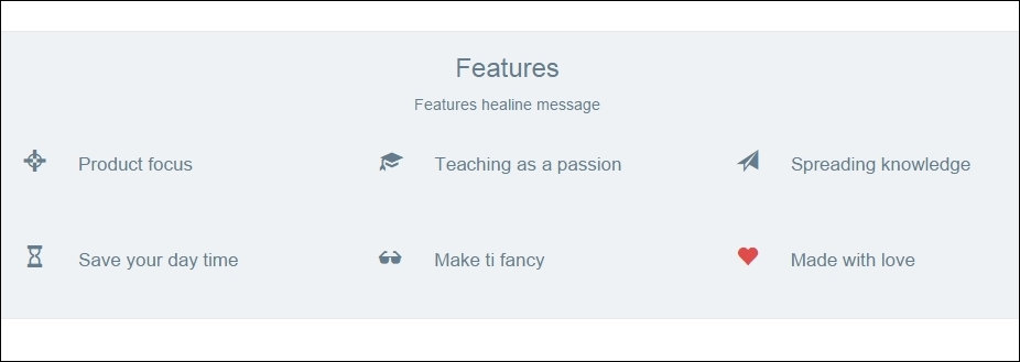
The preceding screenshot shows the final result of the Features section. As you can see, it is pretty simple to use icons in Bootstrap. Also, the possibilities that the framework offers are very suitable for daily adjustments, such changing icons' colors and sizes.
Tip
Using other icons sets
There are plenty of other icon sets out there that can be used just like glyphicons for Bootstrap. Among all of them, it is worth mentioning Font Awesome (https://fortawesome.github.io/Font-Awesome/). It stands out from others, since it was the first icon set to use font encoding, together with a wide variety of icons.