Table of Contents for
Bootstrap 4 – Responsive Web Design
 Bootstrap 4 – Responsive Web Design
Published by
Packt Publishing, 2017
Bootstrap 4 – Responsive Web Design
Published by
Packt Publishing, 2017
- Cover
- Table of Contents
- Bootstrap 4 – Responsive Web Design
- Bootstrap 4 – Responsive Web Design
- Credits
- Preface
- What you need for this learning path
- Who this learning path is for
- Reader feedback
- Customer support
- 1. Module 1
- 1. Getting Started
- Setting up the framework
- Building our first Bootstrap example
- Optionally using the CDN setup
- Community activity
- Bootstrap and web applications
- Browser compatibility
- Summary
- 2. Creating a Solid Scaffolding
- Building our scaffolding
- Fluid container
- We need some style!
- Manipulating tables
- Like a boss!
- Final thoughts
- Summary
- 3. Yes, You Should Go Mobile First
- Bootstrap and the mobile-first design
- How to debug different viewports at the browser
- Cleaning up the mess
- Creating the landing page for different devices
- Summary
- 4. Applying the Bootstrap Style
- Summary
- 5. Making It Fancy
- Paying attention to your navigation
- Dropping it down
- Making an input grouping
- Getting ready for flexbox!
- Summary
- 6. Can You Build a Web App?
- Adding the navigation
- Do a grid again
- Playing the cards
- Implementing the main content
- Creating breadcrumbs
- Finishing with the right-hand-side content
- Summary
- 7. Of Course, You Can Build a Web App!
- Waiting for the progress bar
- Creating a settings page
- Summary
- 8. Working with JavaScript
- Awesome Bootstrap modals
- Creating our custom modal
- A tool for your tip
- Pop it all over
- Making the menu affix
- Finishing the web app
- Summary
- 9. Entering in the Advanced Mode
- The last navigation bar with flexbox
- Filling the main fluid content
- Filling the main content
- Overhead loading
- Fixing the toggle button for mobile
- Summary
- 10. Bringing Components to Life
- Fixing the mobile viewport
- Learning more advanced plugins
- Summary
- 11. Making It Your Taste
- Working with plugin customization
- The additional Bootstrap plugins
- Creating our Bootstrap plugin
- Defining the plugin methods
- Creating additional plugin methods
- Summary
- 2. Module 2
- 1. Introducing Bootstrap 4
- Summary
- 2. Using Bootstrap Build Tools
- Download the Bootstrap source files
- Setting up the blog project
- Setting up the JSON files
- Creating our first page template
- Summary
- 3. Jumping into Flexbox
- Ordering your Flexbox
- Wrapping your Flexbox
- Setting up the Bootstrap Flexbox layout grid
- Setting up a Flexbox project
- Designing a single blog post
- Summary
- 4. Working with Layouts
- Inserting rows into your layout
- Adding columns to your layout
- Choosing a column class
- Creating a simple three-column layout
- Mixing column classes for different devices
- Coding the blog home page
- Using responsive utility classes
- Summary
- 5. Working with Content
- Learning to use typography
- Customizing headings
- How to style images
- Coding tables
- Summary
- 6. Playing with Components
- Basic button examples
- Creating outlined buttons
- Checkbox and radio buttons
- Coding forms in Bootstrap 4
- Creating an inline form
- Adding validation to inputs
- Using the Jumbotron component
- Adding the Label component
- Using the Alerts component
- Using Cards for layout
- Updating the Blog index page
- How to use the Navs component
- Adding Breadcrumbs to a page
- Using the Pagination component
- How to use the List Group component
- Summary
- 7. Extending Bootstrap with JavaScript Plugins
- Coding Tooltips
- Avoiding collisions with our components
- Using Popover components
- Using the Collapse component
- Coding an Accordion with the Collapse component
- Coding a Bootstrap Carousel
- Summary
- 8. Throwing in Some Sass
- Using Sass in the blog project
- Importing partials in Sass
- Creating a collection of variables
- Customizing components
- Writing a theme
- Summary
- 9. Migrating from Version 3
- Big changes in version 4
- Updating your variables
- Additional global changes
- Other font updates
- Migrating components
- Migrating JavaScript
- Miscellaneous migration changes
- Summary
- 3. Module 3
- 1. Revving Up Bootstrap
- What Bootstrap 4 Alpha 4 has to offer
- Setting up our project
- Summary
- 2. Making a Style Statement
- Image elements
- Responsive utilities
- Helper classes
- Text alignment and transformation
- Summary
- 3. Building the Layout
- Adding Bootstrap components
- Summary
- 4. On Navigation, Footers, Alerts, and Content
- Improving navigation using Scrollspy
- Customizing scroll speed
- Icons
- Using and customizing alerts
- Creating a footer
- Creating and customizing forms
- Form validation
- Progress indicators
- Adding content using media objects
- Figures
- Quotes
- Abbreviations
- Summary
- 5. Speeding Up Development Using jQuery Plugins
- Enhanced pagination using bootpag
- Displaying images using Bootstrap Lightbox
- Improving our price list with DataTables
- Summary
- 6. Customizing Your Plugins
- Customizing plugins
- Writing a custom Bootstrap jQuery plugin
- Summary
- 7. Integrating Bootstrap with Third-Party Plugins
- Hover
- Summary
- 8. Optimizing Your Website
- Minifying CSS and JavaScript
- Introducing Grunt
- Running tasks automatically
- Stripping our website of unused CSS
- JavaScript file concatenation
- Summary
- 9. Integrating with AngularJS and React
- Introducing React
- Summary
- Bibliography
- Index
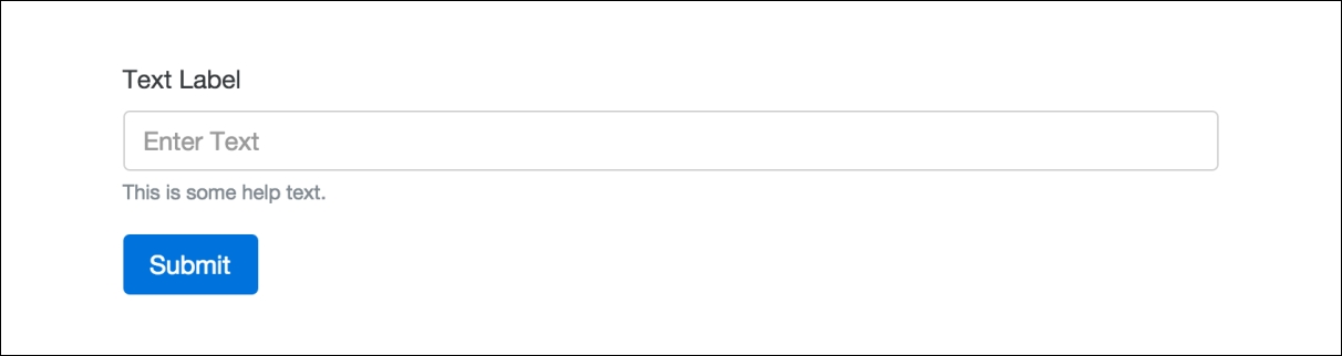
If you are familiar with Bootstrap 3, then you'll notice the CSS form classes are pretty much the same in version 4. The biggest change I see in forms for the new version is that each form group uses a <fieldset> tag instead of <div>. If you are new to Bootstrap forms, a basic form group is made up of a label and an input. It can also include help text, but that is optional. Let's jump right in by creating a generic form that uses a number of core components.
At the very least, a form needs to be made up of one input and one button. Let's start with the basics and create a form following those requirements. Here's the code to get you started:
<form>
  <fieldset class="form-group">
    <label>Text Label</label>
    <input type="text" class="form-control" placeholder="Enter Text">
    <small class="text-muted">This is some help text.</small>
  </fieldset>
  <button type="submit" class="btn btn-primary">Submit</button>
 </form>
Let me explain what is happening here in the code:
- Every form needs to start with a
<form>tag. However, no special classes are required on this tag. - I've inserted a
<fieldset>tag with a class of.form-groupon it for our single input. This<fieldset>pattern will be repeated in the future when you add additional inputs. - Within the
<fieldset>, we have a<label>. Again, no special CSS classes need to be added to the<label>. - After the label, you need to insert the form
<input>tag. In this case, I'm using a text input. On this HTML tag, you need to add a class of.form-control. All input tags in Bootstrap will require this class. The placeholder text is optional but nice to add for usability. - In the last line of the
<fieldset>, I've included a<small>tag with a class of.text-muted, which will render the text small and light grey. This is the pattern you should use if you want to include some help text with your form input. - Close the
<fieldset>tag and then you need to add a<button>tag for the formsubmitbutton. - Close the
<form>and you are done.
After you've finished reviewing the code, fire up your web browser, and your form should look like this:
You've successfully coded your first Bootstrap 4 form. Let's continue and I'll explain how to implement other common form components using the latest version of Bootstrap.
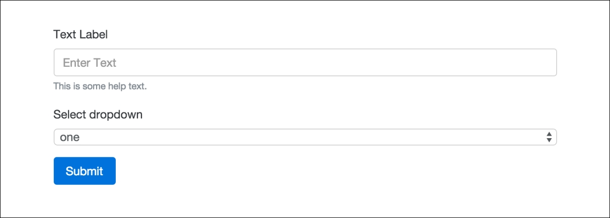
Let's build on our form code by adding a select drop-down menu. Insert the following code after our text input:
<fieldset class="form-group">
  <label>Select dropdown</label>
  <select class="form-control">
    <option>one</option>
    <option>two</option>
    <option>three</option>
    <option>four</option>
    <option>five</option>
  </select>
</fieldset>
Let's break down the parts of the code you need to be aware of:
- Note that the entire
<select>is wrapped in a<fieldset>with a class of.form-group. This pattern should repeat for each type of form input you add. - On the
<select>tag, there is a class of.form-controlthat needs to be added. - Aside from that, you should code the
<select>as you normally would, following the best HTML syntax practices.
Once you're done, if you view the form in the browser, it should now look like this:
That completes the setup for <select> dropdowns. Next let's check out the <textarea> tag.
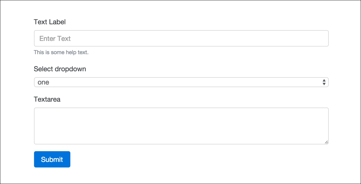
Moving along to the next input type, let's insert a <textarea> tag into our form. After the <select> menu, add the following code:
<fieldset class="form-group">
  <label>Textarea</label>
  <textarea class="form-control" rows="3"></textarea>
</fieldset>
Using this input is fairly simple. Like our other examples, you need to use a <fieldset> tag with a CSS class of .form-group to wrap the entire thing. On the actual <textarea> tag, you need to add the .form-control class. That's it; once you're done, your form should now look like this:
Now that the <textarea> is complete, let's move on to the file input form field.
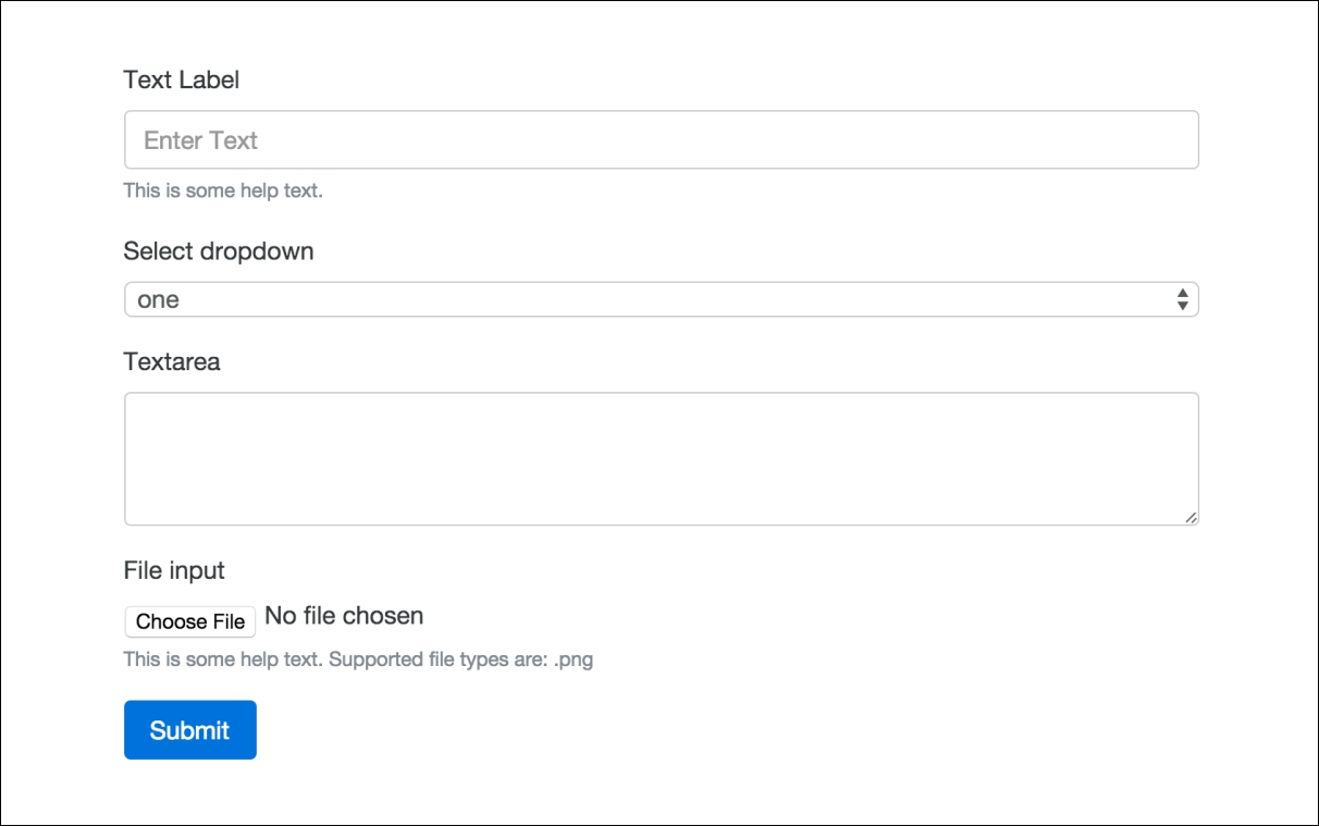
Historically, the file input form field has been a tricky one to style with CSS. I'm happy to say that in Bootstrap 4 they've created a new approach that's the best I've seen to date. Let's start by inserting the following code after the <textarea> in our form:
<fieldset class="form-group">
  <label>File input</label>
  <input type="file" class="form-control-file">
  <small class="text-muted">This is some help text. Supported file types are: .png</small>
</fieldset>
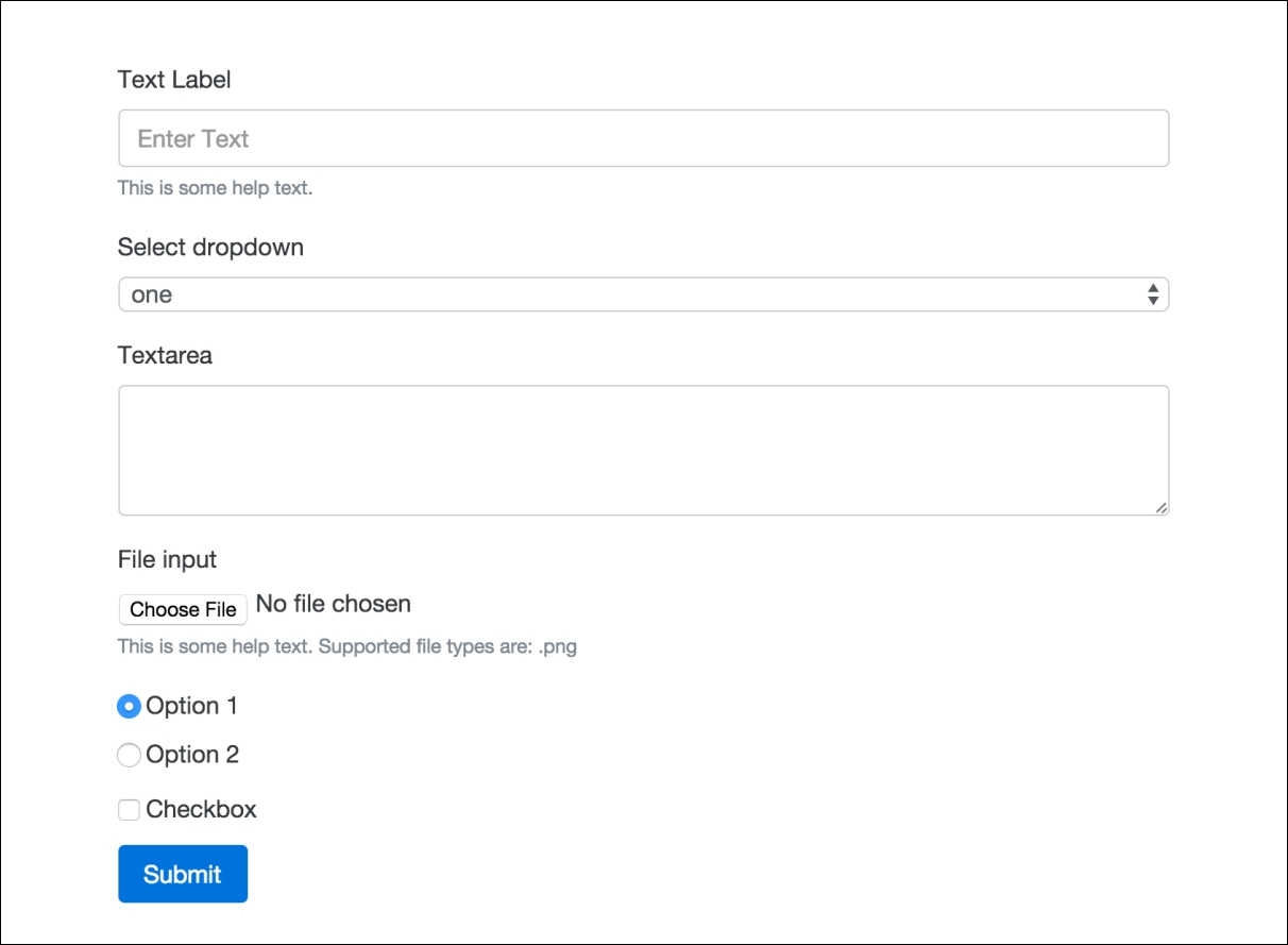
Again, this form field is constructed in the same manner as the previous ones. However, there is one small change you need to be aware of with the File input field. On the <input> tag, you need to change the CSS class to .form-control-file. There are some specific styles being applied to clean up the look and feel of this form field. Once you're done, your form should look like this:
That completes the File input field which leaves us with two more basic form field inputs to go over. They are radio buttons and checkboxes. Let's learn how to add them next.
These fields are pretty similar so I'm going to group them together in their own section. The code for these two fields differs a little bit from the other inputs, as I'll outline now. First, let's insert the following code after the File input field in our form:
<div class="radio">
  <label>
    <input type="radio" name="optionsRadios" id="optionsRadios1" value="option1" checked>
    Option 1
  </label>
</div>
<div class="radio">
  <label>
    <input type="radio" name="optionsRadios" id="optionsRadios2" value="option2">
       Option 2
  </label>
</div>

<div class="checkbox">
  <label>
    <input type="checkbox"> Checkbox
  </label>
</div>
Let's start by going over the radio button code first, then we'll move on to the checkbox:
- The fields don't use the
<fieldset>tag as the wrapper. In this case, you should use a<div>and give it a class of either.radioor.checkbox, depending on what type you want to use. - For these fields, the
<label>tag will also wrap around the<input>tag so that everything is displayed in a horizontal line. We don't want the text label to drop down below the radio button or checkbox. - You don't need a special class on the
<input>for either of these fields.
As you can see, the code for these fields is a bit different from what we've learned about the other form inputs. Not to worry, as they are pretty easy to use and there aren't a bunch of CSS classes you have to memorize. One of the nicest changes with forms in Bootstrap 4 is that they require less HTML markup, so are easier to write. Finally, if you view our form in the browser, it should look like this:
That completes the explanation of all the core form fields that you need to know how to use in Bootstrap 4. Before we move on to some more advanced form fields and variations, why don't we add a form to our blog project?
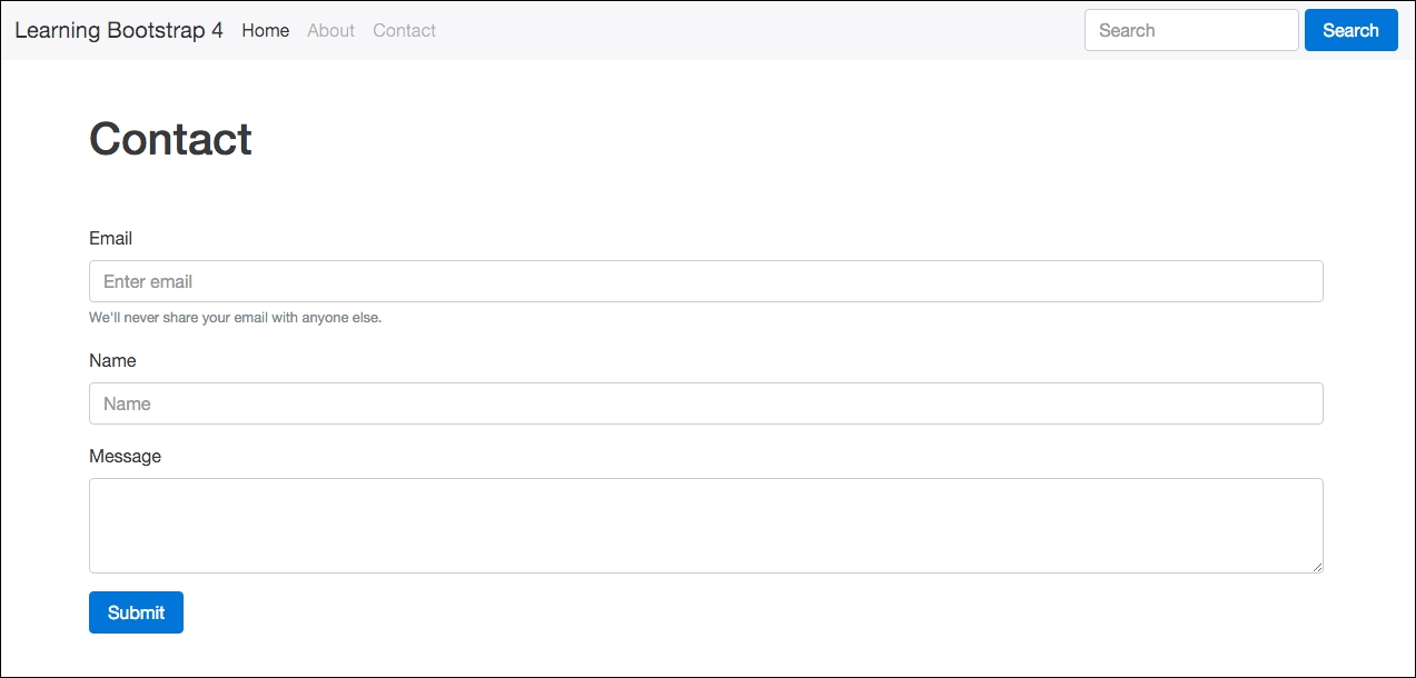
I know, I know. I said we would wait till the end of the chapter to build components into the blog project. However, I'm thinking you might like a break from learning and actually add some of what you've learned to your project. Let's go ahead and do just that by filling in a form on the Contact page.
Let's start by opening up our project directory and finding the file named contact.ejs. Open up that file in your text editor and we are going to add some new form code and remove some filler code. To start, find the body section of the page that is wrapped in the following column <div>:
<div class="col-md-12">
Within that <div> is currently some filler text. Remove that text and replace it with the following form code:
<form>
  <fieldset class="form-group">
    <label>Email</label>
    <input type="email" class="form-control" placeholder="Enter email">
    <small class="text-muted">We'll never share your email with anyone else.</small>
  </fieldset>
  <fieldset class="form-group">
    <label>Name</label>
    <input type="text" class="form-control" placeholder="Name">
  </fieldset>
  <fieldset class="form-group">
    <label>Message</label>
    <textarea class="form-control" rows="3"></textarea>
  </fieldset>
  <button type="submit" class="btn btn-primary">Submit</button>
</form>
I've coded up a basic contact form that you'll commonly see on a blog. It has e-mail, name, and message fields along with a submit button. Save your file and then preview your project in a browser. The Contact page should now look like this:
That concludes the updates to the Contact page for now. Later on in the book, we'll add some additional components to this page. Let's jump back into learning about forms in Bootstrap 4 by reviewing some additional form controls.