Table of Contents for
Bootstrap 4 – Responsive Web Design
 Bootstrap 4 – Responsive Web Design
Published by
Packt Publishing, 2017
Bootstrap 4 – Responsive Web Design
Published by
Packt Publishing, 2017
- Cover
- Table of Contents
- Bootstrap 4 – Responsive Web Design
- Bootstrap 4 – Responsive Web Design
- Credits
- Preface
- What you need for this learning path
- Who this learning path is for
- Reader feedback
- Customer support
- 1. Module 1
- 1. Getting Started
- Setting up the framework
- Building our first Bootstrap example
- Optionally using the CDN setup
- Community activity
- Bootstrap and web applications
- Browser compatibility
- Summary
- 2. Creating a Solid Scaffolding
- Building our scaffolding
- Fluid container
- We need some style!
- Manipulating tables
- Like a boss!
- Final thoughts
- Summary
- 3. Yes, You Should Go Mobile First
- Bootstrap and the mobile-first design
- How to debug different viewports at the browser
- Cleaning up the mess
- Creating the landing page for different devices
- Summary
- 4. Applying the Bootstrap Style
- Summary
- 5. Making It Fancy
- Paying attention to your navigation
- Dropping it down
- Making an input grouping
- Getting ready for flexbox!
- Summary
- 6. Can You Build a Web App?
- Adding the navigation
- Do a grid again
- Playing the cards
- Implementing the main content
- Creating breadcrumbs
- Finishing with the right-hand-side content
- Summary
- 7. Of Course, You Can Build a Web App!
- Waiting for the progress bar
- Creating a settings page
- Summary
- 8. Working with JavaScript
- Awesome Bootstrap modals
- Creating our custom modal
- A tool for your tip
- Pop it all over
- Making the menu affix
- Finishing the web app
- Summary
- 9. Entering in the Advanced Mode
- The last navigation bar with flexbox
- Filling the main fluid content
- Filling the main content
- Overhead loading
- Fixing the toggle button for mobile
- Summary
- 10. Bringing Components to Life
- Fixing the mobile viewport
- Learning more advanced plugins
- Summary
- 11. Making It Your Taste
- Working with plugin customization
- The additional Bootstrap plugins
- Creating our Bootstrap plugin
- Defining the plugin methods
- Creating additional plugin methods
- Summary
- 2. Module 2
- 1. Introducing Bootstrap 4
- Summary
- 2. Using Bootstrap Build Tools
- Download the Bootstrap source files
- Setting up the blog project
- Setting up the JSON files
- Creating our first page template
- Summary
- 3. Jumping into Flexbox
- Ordering your Flexbox
- Wrapping your Flexbox
- Setting up the Bootstrap Flexbox layout grid
- Setting up a Flexbox project
- Designing a single blog post
- Summary
- 4. Working with Layouts
- Inserting rows into your layout
- Adding columns to your layout
- Choosing a column class
- Creating a simple three-column layout
- Mixing column classes for different devices
- Coding the blog home page
- Using responsive utility classes
- Summary
- 5. Working with Content
- Learning to use typography
- Customizing headings
- How to style images
- Coding tables
- Summary
- 6. Playing with Components
- Basic button examples
- Creating outlined buttons
- Checkbox and radio buttons
- Coding forms in Bootstrap 4
- Creating an inline form
- Adding validation to inputs
- Using the Jumbotron component
- Adding the Label component
- Using the Alerts component
- Using Cards for layout
- Updating the Blog index page
- How to use the Navs component
- Adding Breadcrumbs to a page
- Using the Pagination component
- How to use the List Group component
- Summary
- 7. Extending Bootstrap with JavaScript Plugins
- Coding Tooltips
- Avoiding collisions with our components
- Using Popover components
- Using the Collapse component
- Coding an Accordion with the Collapse component
- Coding a Bootstrap Carousel
- Summary
- 8. Throwing in Some Sass
- Using Sass in the blog project
- Importing partials in Sass
- Creating a collection of variables
- Customizing components
- Writing a theme
- Summary
- 9. Migrating from Version 3
- Big changes in version 4
- Updating your variables
- Additional global changes
- Other font updates
- Migrating components
- Migrating JavaScript
- Miscellaneous migration changes
- Summary
- 3. Module 3
- 1. Revving Up Bootstrap
- What Bootstrap 4 Alpha 4 has to offer
- Setting up our project
- Summary
- 2. Making a Style Statement
- Image elements
- Responsive utilities
- Helper classes
- Text alignment and transformation
- Summary
- 3. Building the Layout
- Adding Bootstrap components
- Summary
- 4. On Navigation, Footers, Alerts, and Content
- Improving navigation using Scrollspy
- Customizing scroll speed
- Icons
- Using and customizing alerts
- Creating a footer
- Creating and customizing forms
- Form validation
- Progress indicators
- Adding content using media objects
- Figures
- Quotes
- Abbreviations
- Summary
- 5. Speeding Up Development Using jQuery Plugins
- Enhanced pagination using bootpag
- Displaying images using Bootstrap Lightbox
- Improving our price list with DataTables
- Summary
- 6. Customizing Your Plugins
- Customizing plugins
- Writing a custom Bootstrap jQuery plugin
- Summary
- 7. Integrating Bootstrap with Third-Party Plugins
- Hover
- Summary
- 8. Optimizing Your Website
- Minifying CSS and JavaScript
- Introducing Grunt
- Running tasks automatically
- Stripping our website of unused CSS
- JavaScript file concatenation
- Summary
- 9. Integrating with AngularJS and React
- Introducing React
- Summary
- Bibliography
- Index
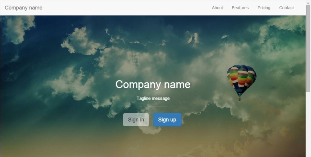
Bootstrap offers a very nice navigation bar to be placed at the top of website, or even in places where you want that behavior. Let's change our header section to make it our navigation bar. It will stick to the top of the web page, working as a navigation menu.
First of all, let's use a <nav> element and add to it the .navbar and .navbar-default classes, which are required for the component, and the .navbar-fixed-top class to fix the element at the top. Replace the <header> HTML section with the following code:
<nav class="navbar navbar-default navbar-fixed-top">
  <div class="navbar-header">
    <a class="navbar-brand" href="landing_page.html">Company name</a>
  </div>
  <div class="navbar-right">
      <ul class="nav navbar-nav">
        <li><a href="#about">About</a></li>
        <li><a href="#features">Features</a></li>
        <li><a href="#pricing">Pricing</a></li>
        <li><a href="contact.html">Contact</a></li>
      </ul>
  </div>
</nav>
As was mentioned, the .navbar and .navbar-default classes are required for the navigation component. For the Company name link, we added a class, .navbar-brand, which has the purpose of branding the heading with an appropriate font size and padding.
Then, we created a <div> tag using the .navbar-right class to provide a set padding CSS rules and place the list to the right to appear the same way as was before. For the CSS, just add the following rule to create a padding to the <body> of your page:
body {
  padding-top: 3.6em;
}

#nav-menu {
  margin-right: 1rem;
}
The result of the navigation bar should be like what is presented in the following screenshot:
Try to resize the web page and you will see that for small viewports, the horizontal list placed in the navigation will stack vertically, as illustrated in the next screenshot. Fortunately, Bootstrap has the option to collapse the lists at the navigation bar. The procedure for doing this is pretty simple and we will do it now.
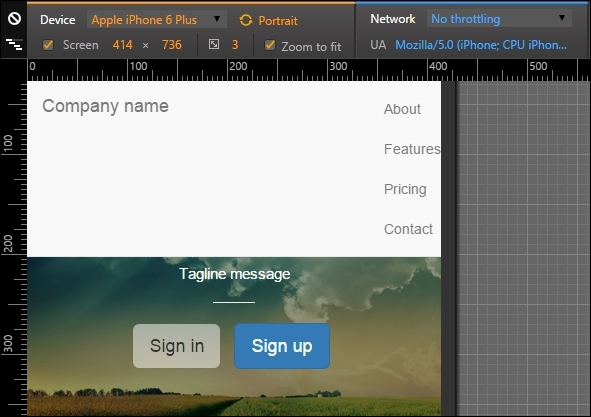
So, let's make the .nav-header collapses and create a toggle button to show or hide the list menu. Change the HTML to this:
<nav class="navbar navbar-default navbar-fixed-top">
<div class="navbar-header">
<a class="navbar-brand" href="landing_page.html">Company name</a>
<button type="button" class="navbar-toggle collapsed" data-toggle="collapse" data-target="#nav-menu" aria-expanded="false">
<span class="sr-only">Toggle navigation</span>
<span class="icon-bar"></span>
<span class="icon-bar"></span>
<span class="icon-bar"></span>
</button>
</div>
<div id="nav-menu" class="collapse navbar-collapse navbar-right">
<ul class="nav navbar-nav">
<li><a href="#about">About</a></li>
<li><a href="#features">Features</a></li>
<li><a href="#pricing">Pricing</a></li>
<li><a href="contact.html">Contact</a></li>
</ul>
</div>
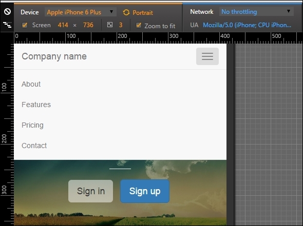
</nav>The new code is in bold. First, we added a <button> element to create our sandwich button (the one with three dashes). On data-target, we must add the element that is the collapse target, #nav-menu in our case.
Then, we must say which is the element to be collapsed in the small viewport, so for .navbar-right, we added the .collapse.navbar-collapse classes. The navigation bar should then appear like the one shown in the following screenshot. Hooray! Bootstrap has saved the day again!
For this example, we fixed the navigation bar to the top of our web page, although we can use different attachments. For instance, we can attach the navigation bar to the bottom using the .navbar-fixed-bottom class.
The bar can also be static. For that, use the .navbar-static-* class, where the asterisk can mean top or bottom. If you are using the static navigation bars, you must place a container (static or fluid) right in the next level of the component:
<nav class="navbar navbar-default navbar-static-top">
  <div class="container">
    …
  </div>
</nav>You can also change the color of the navigation bar. Bootstrap version 3 offers an inverted set of colors. To do so, add the .navbar-inverse class to the <nav> element, as follows:
<nav class="navbar navbar-inverse">
  …
</nav>
In version 4, they added other color options. So if the background of your navigation bar has a dark color, add the .navbar-dark class to make the text and other elements white. If the background has a light color, use the .navbar-light class to get the opposite result.
For the background color, you can pass a class called .bg-*, where the asterisk means a set of colors from Bootstrap. These are default, primary, info, success, warning, or danger:
<nav class="navbar navbar-dark bg-danger">
  …
</nav>