Table of Contents for
Bootstrap 4 – Responsive Web Design
 Bootstrap 4 – Responsive Web Design
Published by
Packt Publishing, 2017
Bootstrap 4 – Responsive Web Design
Published by
Packt Publishing, 2017
- Cover
- Table of Contents
- Bootstrap 4 – Responsive Web Design
- Bootstrap 4 – Responsive Web Design
- Credits
- Preface
- What you need for this learning path
- Who this learning path is for
- Reader feedback
- Customer support
- 1. Module 1
- 1. Getting Started
- Setting up the framework
- Building our first Bootstrap example
- Optionally using the CDN setup
- Community activity
- Bootstrap and web applications
- Browser compatibility
- Summary
- 2. Creating a Solid Scaffolding
- Building our scaffolding
- Fluid container
- We need some style!
- Manipulating tables
- Like a boss!
- Final thoughts
- Summary
- 3. Yes, You Should Go Mobile First
- Bootstrap and the mobile-first design
- How to debug different viewports at the browser
- Cleaning up the mess
- Creating the landing page for different devices
- Summary
- 4. Applying the Bootstrap Style
- Summary
- 5. Making It Fancy
- Paying attention to your navigation
- Dropping it down
- Making an input grouping
- Getting ready for flexbox!
- Summary
- 6. Can You Build a Web App?
- Adding the navigation
- Do a grid again
- Playing the cards
- Implementing the main content
- Creating breadcrumbs
- Finishing with the right-hand-side content
- Summary
- 7. Of Course, You Can Build a Web App!
- Waiting for the progress bar
- Creating a settings page
- Summary
- 8. Working with JavaScript
- Awesome Bootstrap modals
- Creating our custom modal
- A tool for your tip
- Pop it all over
- Making the menu affix
- Finishing the web app
- Summary
- 9. Entering in the Advanced Mode
- The last navigation bar with flexbox
- Filling the main fluid content
- Filling the main content
- Overhead loading
- Fixing the toggle button for mobile
- Summary
- 10. Bringing Components to Life
- Fixing the mobile viewport
- Learning more advanced plugins
- Summary
- 11. Making It Your Taste
- Working with plugin customization
- The additional Bootstrap plugins
- Creating our Bootstrap plugin
- Defining the plugin methods
- Creating additional plugin methods
- Summary
- 2. Module 2
- 1. Introducing Bootstrap 4
- Summary
- 2. Using Bootstrap Build Tools
- Download the Bootstrap source files
- Setting up the blog project
- Setting up the JSON files
- Creating our first page template
- Summary
- 3. Jumping into Flexbox
- Ordering your Flexbox
- Wrapping your Flexbox
- Setting up the Bootstrap Flexbox layout grid
- Setting up a Flexbox project
- Designing a single blog post
- Summary
- 4. Working with Layouts
- Inserting rows into your layout
- Adding columns to your layout
- Choosing a column class
- Creating a simple three-column layout
- Mixing column classes for different devices
- Coding the blog home page
- Using responsive utility classes
- Summary
- 5. Working with Content
- Learning to use typography
- Customizing headings
- How to style images
- Coding tables
- Summary
- 6. Playing with Components
- Basic button examples
- Creating outlined buttons
- Checkbox and radio buttons
- Coding forms in Bootstrap 4
- Creating an inline form
- Adding validation to inputs
- Using the Jumbotron component
- Adding the Label component
- Using the Alerts component
- Using Cards for layout
- Updating the Blog index page
- How to use the Navs component
- Adding Breadcrumbs to a page
- Using the Pagination component
- How to use the List Group component
- Summary
- 7. Extending Bootstrap with JavaScript Plugins
- Coding Tooltips
- Avoiding collisions with our components
- Using Popover components
- Using the Collapse component
- Coding an Accordion with the Collapse component
- Coding a Bootstrap Carousel
- Summary
- 8. Throwing in Some Sass
- Using Sass in the blog project
- Importing partials in Sass
- Creating a collection of variables
- Customizing components
- Writing a theme
- Summary
- 9. Migrating from Version 3
- Big changes in version 4
- Updating your variables
- Additional global changes
- Other font updates
- Migrating components
- Migrating JavaScript
- Miscellaneous migration changes
- Summary
- 3. Module 3
- 1. Revving Up Bootstrap
- What Bootstrap 4 Alpha 4 has to offer
- Setting up our project
- Summary
- 2. Making a Style Statement
- Image elements
- Responsive utilities
- Helper classes
- Text alignment and transformation
- Summary
- 3. Building the Layout
- Adding Bootstrap components
- Summary
- 4. On Navigation, Footers, Alerts, and Content
- Improving navigation using Scrollspy
- Customizing scroll speed
- Icons
- Using and customizing alerts
- Creating a footer
- Creating and customizing forms
- Form validation
- Progress indicators
- Adding content using media objects
- Figures
- Quotes
- Abbreviations
- Summary
- 5. Speeding Up Development Using jQuery Plugins
- Enhanced pagination using bootpag
- Displaying images using Bootstrap Lightbox
- Improving our price list with DataTables
- Summary
- 6. Customizing Your Plugins
- Customizing plugins
- Writing a custom Bootstrap jQuery plugin
- Summary
- 7. Integrating Bootstrap with Third-Party Plugins
- Hover
- Summary
- 8. Optimizing Your Website
- Minifying CSS and JavaScript
- Introducing Grunt
- Running tasks automatically
- Stripping our website of unused CSS
- JavaScript file concatenation
- Summary
- 9. Integrating with AngularJS and React
- Introducing React
- Summary
- Bibliography
- Index
By default all of your child boxes will try to fit onto one line. If you have a layout with several boxes, this may not be the look you want. If this is the case, you can use the flex-wrap property to wrap the child boxes as needed. Let's add more boxes to our original code with the following HTML:
<div class="parent">
   <div class="child">
   1
   </div>
   <div class="child">
   2
   </div>
   <div class="child">
   3
   </div>
   <div class="child">
   4
   </div>
   <div class="child">
   5
   </div>
   <div class="child">
   6
   </div>
   <div class="child">
   7
   </div>
   <div class="child">
   8
   </div>
   <div class="child">
   9
   </div>
</div>
We now have nine boxes in our parent container. That should give us enough to work with to create a nice wrapping effect. Before we see what this looks like, we need to add some more CSS. Add the following properties to your CSS file:
.parent {
   ...
   flex-wrap: wrap;
}

.child {
   ...
   min-width: 100px;
}
I've added two new properties to achieve the layout we want. Let me break-down what is happening:
- I've added the
flex-wrapproperty to the.parentclass and set the value towrap. This will wrap the boxes when it's appropriate. - On the
.childclass I added amin-widthof100px. I've done this so we can have some control on when the child boxes will break. If we don't add this, the width of the columns may get too thin.
Once you've added those properties to the existing code, save the file and test it. Your layout should now look something like this:
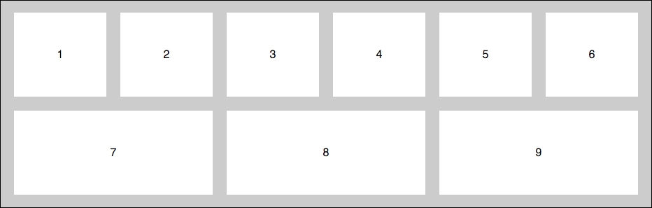
As you can see, we now have a two-row layout with six boxes on top and three below. Remember we added the flex-grow property previously, so the second row is stretching or growing to fit. If you want your boxes to always be equal you should use an even number, in this case 12. You could also remove the flex-grow property; then all the boxes would be the same width but they would not fill the layout the same way.
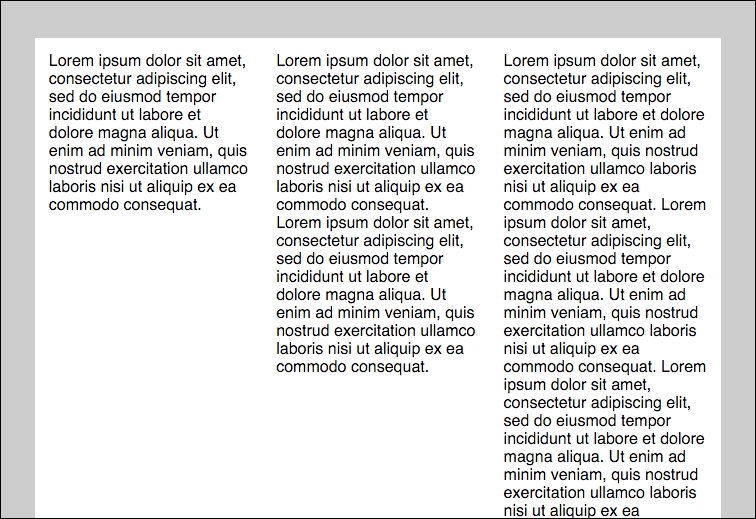
One of the best features of Flexbox is the ability to easily create equal height columns. In a regular horizontal layout, if your content is not the exact same length, each column will be a different height. This can be problematic for a web application layout because you usually want your boxes to be more uniform. Let's check out some regular layout code and what it looks like in the browser:
<div class="parent">
   <div class="child">
   Lorem ipsum dolor sit amet, consectetur adipiscing elit, sed do eiusmod tempor incididunt ut labore et dolore magna aliqua. Ut enim ad minim veniam, quis nostrud exercitation ullamco laboris nisi ut aliquip ex ea commodo consequat.
   </div>
   <div class="child">
   Lorem ipsum dolor sit amet, consectetur adipiscing elit, sed do eiusmod tempor incididunt ut labore et dolore magna aliqua. Ut enim ad minim veniam, quis nostrud exercitation ullamco laboris nisi ut aliquip ex ea commodo consequat. Lorem ipsum dolor sit amet, consectetur adipiscing elit, sed do eiusmod tempor incididunt ut labore et dolore magna aliqua. Ut enim ad minim veniam, quis nostrud exercitation ullamco laboris nisi ut aliquip ex ea commodo consequat.
   </div>
   <div class="child">
   Lorem ipsum dolor sit amet, consectetur adipiscing elit, sed do eiusmod tempor incididunt ut labore et dolore magna aliqua. Ut enim ad minim veniam, quis nostrud exercitation ullamco laboris nisi ut aliquip ex ea commodo consequat. Lorem ipsum dolor sit amet, consectetur adipiscing elit, sed do eiusmod tempor incididunt ut labore et dolore magna aliqua. Ut enim ad minim veniam, quis nostrud exercitation ullamco laboris nisi ut aliquip ex ea commodo consequat. Lorem ipsum dolor sit amet, consectetur adipiscing elit, sed do eiusmod tempor incididunt ut labore et dolore magna aliqua. Ut enim ad minim veniam, quis nostrud exercitation ullamco laboris nisi ut aliquip ex ea commodo consequat. Lorem ipsum dolor sit amet, consectetur adipiscing elit, sed do eiusmod tempor incididunt ut labore et dolore magna aliqua. Ut enim ad minim veniam, quis nostrud exercitation ullamco laboris nisi ut aliquip ex ea commodo consequat. Lorem ipsum dolor sit amet, consectetur adipiscing elit, sed do eiusmod tempor incididunt ut labore et dolore magna aliqua. Ut enim ad minim veniam, quis nostrud exercitation ullamco laboris nisi ut aliquip ex ea commodo consequat.
   </div>
</div>
I've created three columns with different amounts of text in each of them. Let's add some basic styling to these columns:
.parent {
  width: 100%;
  background: #ccc;
  font-family: helvetica;
  padding: 5%;
  float: left;
}

.child {
  padding: 2%;
  background: white;
  width: 25%;
  display: inline-block;
  float: left;
}
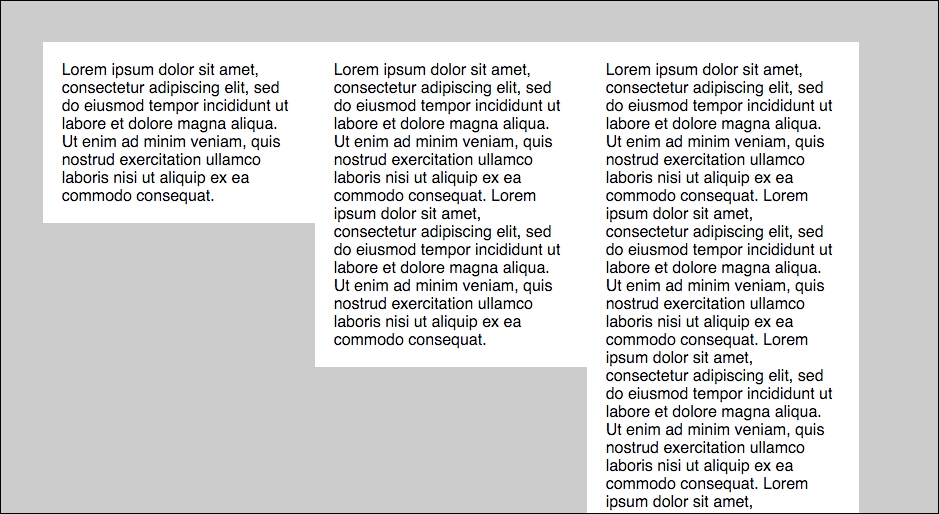
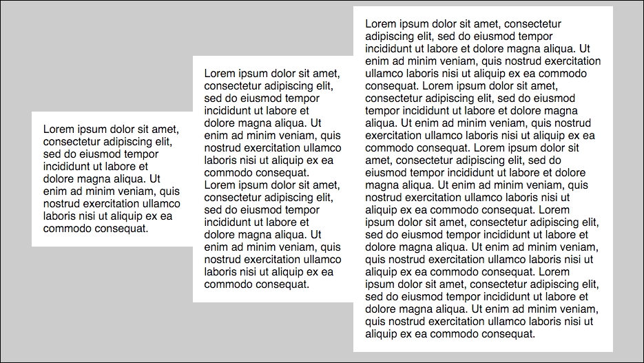
I've created a similar look and feel for this regular layout like our Flexbox. Let's see what this looks like if we view it in a browser:

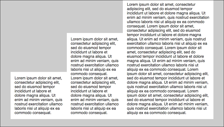
That doesn't look very good does it? What would be better is if the two smaller columns stretched vertically to match the height of the longest column. The good news is this is really easy to do with Flexbox. Leave the HTML as it is but let's go and change our CSS to use a Flexbox approach:
.parent {
  display: flex;
  background: #ccc;
  font-family: helvetica;
  padding: 5%;
}

.child {
  padding: 2%;
  background: white;
  flex-grow: 1;
  min-width: 200px;
}
The preceding code is actually very similar to one of the first examples. Therefore, an equal height column comes standard right out of the Flexbox. I have added a min-width of 200px to each column so that the text is readable. With the preceding CSS our layout will now look like this:
Perfect! Now the white background of each column has extended vertically to match the height of the tallest child. This looks much better and will allow for nicer horizontal alignment if you add additional rows of content. What's happening here is that the align-items property is defaulting to the stretch value. This value is what stretches the height of the columns to fit. There are some additional alignment values you can also try out. To continue, let's try out the flex-start value. Add the following CSS to the .parent class:
.parent {
   ...
   align-items: flex-start;
}
This configuration will actually undo the equal height columns and appear like a regular grid. Here's the image to refresh your memory:
A more useful value is the flex-end option, which will align the boxes to the bottom of the browser window. Change your CSS to:
.parent {
   ...
   align-items: flex-end;
}
This setup will produce a grid that looks like this:
If you'd like to center your columns vertically in the layout, you can do that with the center value:
.parent {
   ...
   align-items: center;
}
If you go for this setup, your grid will look like this:
This is a just a taste of the properties you can use to customize the Flexbox grid. As I mentioned previously, I just wanted to give you a quick introduction to using Flexbox and some of the terminology that is needed. Let's take what we've learned and build on that by building a Flexbox grid in Bootstrap.