Table of Contents for
Bootstrap 4 – Responsive Web Design
 Bootstrap 4 – Responsive Web Design
Published by
Packt Publishing, 2017
Bootstrap 4 – Responsive Web Design
Published by
Packt Publishing, 2017
- Cover
- Table of Contents
- Bootstrap 4 – Responsive Web Design
- Bootstrap 4 – Responsive Web Design
- Credits
- Preface
- What you need for this learning path
- Who this learning path is for
- Reader feedback
- Customer support
- 1. Module 1
- 1. Getting Started
- Setting up the framework
- Building our first Bootstrap example
- Optionally using the CDN setup
- Community activity
- Bootstrap and web applications
- Browser compatibility
- Summary
- 2. Creating a Solid Scaffolding
- Building our scaffolding
- Fluid container
- We need some style!
- Manipulating tables
- Like a boss!
- Final thoughts
- Summary
- 3. Yes, You Should Go Mobile First
- Bootstrap and the mobile-first design
- How to debug different viewports at the browser
- Cleaning up the mess
- Creating the landing page for different devices
- Summary
- 4. Applying the Bootstrap Style
- Summary
- 5. Making It Fancy
- Paying attention to your navigation
- Dropping it down
- Making an input grouping
- Getting ready for flexbox!
- Summary
- 6. Can You Build a Web App?
- Adding the navigation
- Do a grid again
- Playing the cards
- Implementing the main content
- Creating breadcrumbs
- Finishing with the right-hand-side content
- Summary
- 7. Of Course, You Can Build a Web App!
- Waiting for the progress bar
- Creating a settings page
- Summary
- 8. Working with JavaScript
- Awesome Bootstrap modals
- Creating our custom modal
- A tool for your tip
- Pop it all over
- Making the menu affix
- Finishing the web app
- Summary
- 9. Entering in the Advanced Mode
- The last navigation bar with flexbox
- Filling the main fluid content
- Filling the main content
- Overhead loading
- Fixing the toggle button for mobile
- Summary
- 10. Bringing Components to Life
- Fixing the mobile viewport
- Learning more advanced plugins
- Summary
- 11. Making It Your Taste
- Working with plugin customization
- The additional Bootstrap plugins
- Creating our Bootstrap plugin
- Defining the plugin methods
- Creating additional plugin methods
- Summary
- 2. Module 2
- 1. Introducing Bootstrap 4
- Summary
- 2. Using Bootstrap Build Tools
- Download the Bootstrap source files
- Setting up the blog project
- Setting up the JSON files
- Creating our first page template
- Summary
- 3. Jumping into Flexbox
- Ordering your Flexbox
- Wrapping your Flexbox
- Setting up the Bootstrap Flexbox layout grid
- Setting up a Flexbox project
- Designing a single blog post
- Summary
- 4. Working with Layouts
- Inserting rows into your layout
- Adding columns to your layout
- Choosing a column class
- Creating a simple three-column layout
- Mixing column classes for different devices
- Coding the blog home page
- Using responsive utility classes
- Summary
- 5. Working with Content
- Learning to use typography
- Customizing headings
- How to style images
- Coding tables
- Summary
- 6. Playing with Components
- Basic button examples
- Creating outlined buttons
- Checkbox and radio buttons
- Coding forms in Bootstrap 4
- Creating an inline form
- Adding validation to inputs
- Using the Jumbotron component
- Adding the Label component
- Using the Alerts component
- Using Cards for layout
- Updating the Blog index page
- How to use the Navs component
- Adding Breadcrumbs to a page
- Using the Pagination component
- How to use the List Group component
- Summary
- 7. Extending Bootstrap with JavaScript Plugins
- Coding Tooltips
- Avoiding collisions with our components
- Using Popover components
- Using the Collapse component
- Coding an Accordion with the Collapse component
- Coding a Bootstrap Carousel
- Summary
- 8. Throwing in Some Sass
- Using Sass in the blog project
- Importing partials in Sass
- Creating a collection of variables
- Customizing components
- Writing a theme
- Summary
- 9. Migrating from Version 3
- Big changes in version 4
- Updating your variables
- Additional global changes
- Other font updates
- Migrating components
- Migrating JavaScript
- Miscellaneous migration changes
- Summary
- 3. Module 3
- 1. Revving Up Bootstrap
- What Bootstrap 4 Alpha 4 has to offer
- Setting up our project
- Summary
- 2. Making a Style Statement
- Image elements
- Responsive utilities
- Helper classes
- Text alignment and transformation
- Summary
- 3. Building the Layout
- Adding Bootstrap components
- Summary
- 4. On Navigation, Footers, Alerts, and Content
- Improving navigation using Scrollspy
- Customizing scroll speed
- Icons
- Using and customizing alerts
- Creating a footer
- Creating and customizing forms
- Form validation
- Progress indicators
- Adding content using media objects
- Figures
- Quotes
- Abbreviations
- Summary
- 5. Speeding Up Development Using jQuery Plugins
- Enhanced pagination using bootpag
- Displaying images using Bootstrap Lightbox
- Improving our price list with DataTables
- Summary
- 6. Customizing Your Plugins
- Customizing plugins
- Writing a custom Bootstrap jQuery plugin
- Summary
- 7. Integrating Bootstrap with Third-Party Plugins
- Hover
- Summary
- 8. Optimizing Your Website
- Minifying CSS and JavaScript
- Introducing Grunt
- Running tasks automatically
- Stripping our website of unused CSS
- JavaScript file concatenation
- Summary
- 9. Integrating with AngularJS and React
- Introducing React
- Summary
- Bibliography
- Index
Responsive utility classes will allow you to selectively hide <div>s or components based on the screen resolution size. This is great for creating a mobile-first web application, because in many cases you'll want to hide some components that don't work well on a phone or tablet. Mobile application design generally means a simpler, more minimal experience some using responsive utility classes will allow you to achieve this. Open up index.ejs in a text editor and go down to the sidebar <div>, then add the .hidden-md-down class to your code:
<div class="col-md-4 hidden-md-down">
Adding this class will hide the <div> from the browser when your screen resolution is smaller than 720 pixels. Make sure your column class, in this case -md, matches the hidden class. Now, if you shrink your web browser down again, you'll notice that the sidebar <div> will disappear.
There are a number of responsive utility classes you can use in your projects. There is a -down version for each of the column class names. You can also use a -up version if you wish to hide something when viewing at a larger resolution. Some examples of that class are .hidden-lg-up or .hidden-xl-up. To learn more about responsive utility classes, check out the page in the Bootstrap docs at
http://v4-alpha.getbootstrap.com/layout/responsive-utilities/
.
That completes the layout of the grid for our blog home page. Before we move onto learning about content classes in Bootstrap 4, let's set up the layout grid for the other pages we'll be building for the blog.
Before we create new templates for our contact and single blog post pages, we need to update some of the Harp project files. Let's update those files, then we'll move onto the page templates.
Remember a couple chapters back we learned how to code the _data.json file and we created a variable for the page title of each of our templates? We need to update this file for our two new pages by providing the pageTitle variable value for each of them. Open up _data.json in a text editor; you can find the file in the root of your blog project directory. Once you have the file open, insert the following code. The entire file should read as follows:
{
   "index": {
      "pageTitle": "Home"
   },
   "contact": {
      "pageTitle": "Contact"
   },
   "blog-post": {
      "pageTitle": "Blog Post"
   }
}
Originally, we only included the index file. I've added two more entries, one for the contact page and one for the blog-post page. I've entered a value for each page's pageTitle variable. It's as simple as that. Save the JSON file and then you can close it.
Now that _data.json has been updated, we need to create the actual page template EJS files like we did with index. In your text editor, create two new files and save them as contact.ejs and blog-post.ejs. For now, just leave them blank and we'll start to fill them in the next steps. The templates are now set up and ready to be coded. For now, both of our new pages will use the same _layout.ejs file as the index file, so there is no need to create any more layouts. Let's start by coding the contact page template.
Open up the contact.ejs file you just created in your text editor. Let's start the template by setting up our page title. Enter the following code into the file:
<div class="container">
  <!-- page title //-->
  <div class="row m-t-3">
    <div class="col-lg-12">
      <h1>Contact</h1>
    </div>
  </div>
</div>
Let's breakdown what's happening here in the code:
- I've opened up the file with a
<div>with a.containerclass on it. - Next I added
.row <div>and I've added the samem-t-3spacing classes so it matches the blog home page. - I've added a column
<div>with a class of.col-md-12. Since this is our page title, we want it to stretch to the width of our layout. - Finally, I've added an
<h1>tag with our contact page title.
Next let's insert our grid layout for the body of the contact page. Following the page title code, insert the following grid code:
<!-- page body //-->
  <div class="row m-t-3">
    <div class="col-md-12">
      <p>Pellentesque habitant morbi tristique senectus et netus et malesuada fames ac turpis egestas. Vestibulum tortor quam, feugiat vitae, ultricies eget, tempor sit amet, ante. Donec eu libero sit amet quam egestas semper. Aenean ultricies mi vitae est. Mauris placerat eleifend leo. Quisque sit amet est et sapien ullamcorper pharetra. Vestibulum erat wisi, condimentum sed, commodo vitae, ornare sit amet, wisi. Aenean fermentum, elit eget tincidunt condimentum, eros ipsum rutrum orci, sagittis tempus lacus enim ac dui. Donec non enim in turpis pulvinar facilisis. Ut felis. Praesent dapibus, neque id cursus faucibus, tortor neque egestas augue, eu vulputate magna eros eu erat. Aliquam erat volutpat. Nam dui mi, tincidunt quis, accumsan porttitor, facilisis luctus, metus</p>
    </div>
  </div>
Let's review the code for the page body:
- I've opened up another row
<div>for the page body. It also has the samem-t-3spacing class on it for consistent vertical spacing. - I've used the
col-md-12column class again because the contact page layout will fill the whole width of our container. - I've added some filler text for now so that we can verify that the page is laid out properly.
Before we finish, let's add one more row for our mailing list section. I'd like this to be available on every page of our blog. The grid code for this section will be identical to the markup we did for the page body. Here's what it looks like, for reference:
<!-- mailing list //-->
<div class="row m-t-3">
  <div class="col-md-12">
   <p>Pellentesque habitant morbi tristique senectus et netus et malesuada fames ac turpis egestas. Vestibulum tortor quam, feugiat vitae, ultricies eget, tempor sit amet, ante. Donec eu libero sit amet quam egestas semper. Aenean ultricies mi vitae est. Mauris placerat eleifend leo. Quisque sit amet est et sapien ullamcorper pharetra. Vestibulum erat wisi, condimentum sed, commodo vitae, ornare sit amet, wisi. Aenean fermentum, elit eget tincidunt condimentum, eros ipsum rutrum orci, sagittis tempus lacus enim ac dui. Donec non enim in turpis pulvinar facilisis. Ut felis. Praesent dapibus, neque id cursus faucibus, tortor neque egestas augue, eu vulputate magna eros eu erat. Aliquam erat volutpat. Nam dui mi, tincidunt quis, accumsan porttitor, facilisis luctus, metus</p>
  </div>
</div>
Since this code is identical to the page body, I won't bother breaking it down again. Our layout for the contact page is now complete. Make sure you save the file and let's test it before we move onto the blog post page.
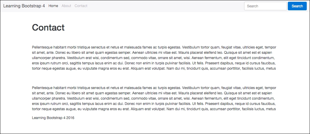
Open your Terminal back up and navigate to the root directory of the blog project. Once there, run the harp compile command and then the Harp server command to launch the local web server. Open your web browser and enter the following URL to preview your page: http://localhost:9000/contact.html.
Your contact page should load up and you should see a page title and two rows of filler text. Here's what it should look like:
Our contact page grid is now complete. Before we move onto creating the blog post template, let's take a look at all the code for the contact template:
<div class="container">
  <!-- page title //-->
  <div class="row m-t-3">
    <div class="col-md-12">
      <h1>Contact</h1>
    </div>
  </div>
  <!-- page body //-->
  <div class="row m-t-3">
    <div class="col-md-12">
      <p>Pellentesque habitant morbi tristique senectus et netus et malesuada fames ac turpis egestas. Vestibulum tortor quam, feugiat vitae, ultricies eget, tempor sit amet, ante. Donec eu libero sit amet quam egestas semper. Aenean ultricies mi vitae est. Mauris placerat eleifend leo. Quisque sit amet est et sapien ullamcorper pharetra. Vestibulum erat wisi, condimentum sed, commodo vitae, ornare sit amet, wisi. Aenean fermentum, elit eget tincidunt condimentum, eros ipsum rutrum orci, sagittis tempus lacus enim ac dui. Donec non enim in turpis pulvinar facilisis. Ut felis. Praesent dapibus, neque id cursus faucibus, tortor neque egestas augue, eu vulputate magna eros eu erat. Aliquam erat volutpat. Nam dui mi, tincidunt quis, accumsan porttitor, facilisis luctus, metus</p>
    </div>
  </div>
  <!-- mailing list //-->
  <div class="row m-t-3">
    <div class="col-md-12">
      <p>Pellentesque habitant morbi tristique senectus et netus et malesuada fames ac turpis egestas. Vestibulum tortor quam, feugiat vitae, ultricies eget, tempor sit amet, ante. Donec eu libero sit amet quam egestas semper. Aenean ultricies mi vitae est. Mauris placerat eleifend leo. Quisque sit amet est et sapien ullamcorper pharetra. Vestibulum erat wisi, condimentum sed, commodo vitae, ornare sit amet, wisi. Aenean fermentum, elit eget tincidunt condimentum, eros ipsum rutrum orci, sagittis tempus lacus enim ac dui. Donec non enim in turpis pulvinar facilisis. Ut felis. Praesent dapibus, neque id cursus faucibus, tortor neque egestas augue, eu vulputate magna eros eu erat. Aliquam erat volutpat. Nam dui mi, tincidunt quis, accumsan porttitor, facilisis luctus, metus</p>
    </div>
  </div>
</div>
Head back to your text editor and open the file blog-post.ejs that you previously created. Like our contact page template, let's start by first setting up the page title section of code. Enter the following code into the blog post template file:
<div class="container">
  <!-- page title //-->
  <div class="row m-t-2 m-b-2">
    <div class="col-lg-12">
      <h1>Post Title</h1>
    </div>
  </div>
</div>
As you can see, this code is almost identical to the contact page. There are two small differences that I will point out for you:
- I've changed up the spacing classes on the row
<div>. In a future chapter, we are going to add some different components around the page title, so I've altered the vertical spacing to allow for them. I'm using the same margin top spacer but I've only set it to a value of 2. I've added a second margin bottom spacer with a value of 2 with the.m-b-2class. Switching the-tto a-bwill apply a bottom margin instead a of top margin. - I've changed the page title to
Post Titlein the<h1>tag.
The body of our blog post will have some different elements compared to the blog home template. After the page title, I'm going to insert a feature section that will be used for an image or carousel in a future chapter. For now, let's just lay in the grid column and some filler text for testing purposes. Enter the following code after the page title section:
<!-- feature //-->
<div class="row">
  <div class="col-md-12">
    <p>Pellentesque habitant morbi tristique senectus et netus et malesuada fames ac turpis egestas. Vestibulum tortor quam, feugiat vitae, ultricies eget, tempor sit amet, ante. Donec eu libero sit amet quam egestas semper. Aenean ultricies mi vitae est. Mauris placerat eleifend leo. Quisque sit amet est et sapien ullamcorper pharetra. Vestibulum erat wisi, condimentum sed, commodo vitae, ornare sit amet, wisi. Aenean fermentum, elit eget tincidunt condimentum, eros ipsum rutrum orci, sagittis tempus lacus enim ac dui. Donec non enim in turpis pulvinar facilisis. Ut felis. Praesent dapibus, neque id cursus faucibus, tortor neque egestas augue, eu vulputate magna eros eu erat. Aliquam erat volutpat. Nam dui mi, tincidunt quis, accumsan porttitor, facilisis luctus, metus</p>
  </div>
</div>
This is a very simple section. Notice the row <div> doesn't have a spacer class on it, since we added the bottom margin to the page title section. I've inserted a full-width col-md-12 column class so the feature can stretch to the width of the layout.
Now that we've added the blog post feature section, let's add the actual body part of the template. This section will use the same layout as our blog home page. It will be a two-column layout, the first being 2/3 wide, and the sidebar being 1/3 of the layout. Insert the following code after the feature section:
<!-- page body //-->
<div class="row m-t-2">
  <div class="col-md-8">
     <p>Pellentesque habitant morbi tristique senectus et netus et malesuada fames ac turpis egestas. Vestibulum tortor quam, feugiat vitae, ultricies eget, tempor sit amet, ante. Donec eu libero sit amet quam egestas semper. Aenean ultricies mi vitae est. Mauris placerat eleifend leo. Quisque sit amet est et sapien ullamcorper pharetra. Vestibulum erat wisi, condimentum sed, commodo vitae, ornare sit amet, wisi. Aenean fermentum, elit eget tincidunt condimentum, eros ipsum rutrum orci, sagittis tempus lacus enim ac dui. Donec non enim in turpis pulvinar facilisis. Ut felis. Praesent dapibus, neque id cursus faucibus, tortor neque egestas augue, eu vulputate magna eros eu erat. Aliquam erat volutpat. Nam dui mi, tincidunt quis, accumsan porttitor, facilisis luctus, metus</p>
   </div>
   <!-- sidebar //-->
   <div class="col-md-4 hidden-md-down">
    <p>sidebar</p>
    <p>Pellentesque habitant morbi tristique senectus et netus et malesuada fames ac turpis egestas. Vestibulum tortor quam, feugiat vitae, ultricies eget, tempor sit amet, ante. Donec eu libero sit amet quam egestas semper. Aenean ultricies mi vitae est. Mauris placerat eleifend leo. Quisque sit amet est et sapien ullamcorper pharetra. Vestibulum erat wisi, condimentum sed, commodo vitae, ornare sit amet, wisi. Aenean fermentum, elit eget tincidunt condimentum, eros ipsum rutrum orci, sagittis tempus lacus enim ac dui. Donec non enim in turpis pulvinar facilisis. Ut felis. Praesent dapibus, neque id cursus faucibus, tortor neque egestas augue, eu vulputate magna eros eu erat. Aliquam erat volutpat. Nam dui mi, tincidunt quis, accumsan porttitor, facilisis luctus, metus</p>
  </div>
</div>
Let's break down what's happening here in the code:
- The row
<div>has am-t-2spacer class added on to provide some vertical spacing - I'm using the same
col-md-8andcol-md-4column classes to set up the layout - I've also used the
hidden-md-4class on the sidebar<div>so that this section will not be visible on smaller resolution devices - Finally, I added some temporary filler text for testing purposes
As I mentioned earlier, I would like the mailing list section to appear on all pages of the blog. Since this is the case, it would make more sense to make this chunk of code a partial that can be included in each template. It saves us having to reinsert this snippet in every one of our page templates.
From your text editor, create a new file called _mailing-list.ejs and save it to the partial directory in the root of your blog project. Once the file is saved, insert the following code into it:
<div class="row m-t-3">
  <div class="col-md-12">
    <p>Pellentesque habitant morbi tristique senectus et netus et malesuada fames ac turpis egestas. Vestibulum tortor quam, feugiat vitae, ultricies eget, tempor sit amet, ante. Donec eu libero sit amet quam egestas semper. Aenean ultricies mi vitae est. Mauris placerat eleifend leo. Quisque sit amet est et sapien ullamcorper pharetra. Vestibulum erat wisi, condimentum sed, commodo vitae, ornare sit amet, wisi. Aenean fermentum, elit eget tincidunt condimentum, eros ipsum rutrum orci, sagittis tempus lacus enim ac dui. Donec non enim in turpis pulvinar facilisis. Ut felis. Praesent dapibus, neque id cursus faucibus, tortor neque egestas augue, eu vulputate magna eros eu erat. Aliquam erat volutpat. Nam dui mi, tincidunt quis, accumsan porttitor, facilisis luctus, metus</p>
  </div>
</div>
Now go back to the blog post template file and insert the following line of code where the mailing list section should appear:
<%- partial("partial/_mailing-list") %>
Remember to do the same thing for the index and contact template. Delete the hardcoded mailing list and replace it with the preceding partial line.
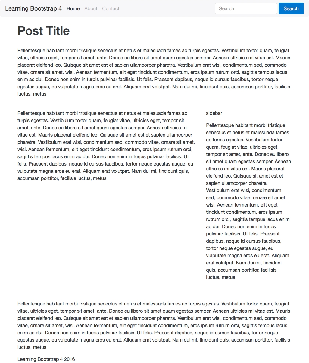
That concludes the setup of the blog post template. Let's test it out before we move onto the next chapter, to make sure the new mailing list partial is working properly. Return to the Terminal and compile your project from the root directory. Run the Harp server command, then visit the following URL: http://localhost:9000/blog-post.html.
If all went as planned, your blog post page should look like this:
Make sure you don't forget to test the index and contact page templates in your browser to make sure the mailing list partial is working properly. That concludes the design layout for the blog post template. All of our templates are now ready to go, but before we move onto the next chapter on content components, let's review what we've learned.