Table of Contents for
Bootstrap 4 – Responsive Web Design
 Bootstrap 4 – Responsive Web Design
Published by
Packt Publishing, 2017
Bootstrap 4 – Responsive Web Design
Published by
Packt Publishing, 2017
- Cover
- Table of Contents
- Bootstrap 4 – Responsive Web Design
- Bootstrap 4 – Responsive Web Design
- Credits
- Preface
- What you need for this learning path
- Who this learning path is for
- Reader feedback
- Customer support
- 1. Module 1
- 1. Getting Started
- Setting up the framework
- Building our first Bootstrap example
- Optionally using the CDN setup
- Community activity
- Bootstrap and web applications
- Browser compatibility
- Summary
- 2. Creating a Solid Scaffolding
- Building our scaffolding
- Fluid container
- We need some style!
- Manipulating tables
- Like a boss!
- Final thoughts
- Summary
- 3. Yes, You Should Go Mobile First
- Bootstrap and the mobile-first design
- How to debug different viewports at the browser
- Cleaning up the mess
- Creating the landing page for different devices
- Summary
- 4. Applying the Bootstrap Style
- Summary
- 5. Making It Fancy
- Paying attention to your navigation
- Dropping it down
- Making an input grouping
- Getting ready for flexbox!
- Summary
- 6. Can You Build a Web App?
- Adding the navigation
- Do a grid again
- Playing the cards
- Implementing the main content
- Creating breadcrumbs
- Finishing with the right-hand-side content
- Summary
- 7. Of Course, You Can Build a Web App!
- Waiting for the progress bar
- Creating a settings page
- Summary
- 8. Working with JavaScript
- Awesome Bootstrap modals
- Creating our custom modal
- A tool for your tip
- Pop it all over
- Making the menu affix
- Finishing the web app
- Summary
- 9. Entering in the Advanced Mode
- The last navigation bar with flexbox
- Filling the main fluid content
- Filling the main content
- Overhead loading
- Fixing the toggle button for mobile
- Summary
- 10. Bringing Components to Life
- Fixing the mobile viewport
- Learning more advanced plugins
- Summary
- 11. Making It Your Taste
- Working with plugin customization
- The additional Bootstrap plugins
- Creating our Bootstrap plugin
- Defining the plugin methods
- Creating additional plugin methods
- Summary
- 2. Module 2
- 1. Introducing Bootstrap 4
- Summary
- 2. Using Bootstrap Build Tools
- Download the Bootstrap source files
- Setting up the blog project
- Setting up the JSON files
- Creating our first page template
- Summary
- 3. Jumping into Flexbox
- Ordering your Flexbox
- Wrapping your Flexbox
- Setting up the Bootstrap Flexbox layout grid
- Setting up a Flexbox project
- Designing a single blog post
- Summary
- 4. Working with Layouts
- Inserting rows into your layout
- Adding columns to your layout
- Choosing a column class
- Creating a simple three-column layout
- Mixing column classes for different devices
- Coding the blog home page
- Using responsive utility classes
- Summary
- 5. Working with Content
- Learning to use typography
- Customizing headings
- How to style images
- Coding tables
- Summary
- 6. Playing with Components
- Basic button examples
- Creating outlined buttons
- Checkbox and radio buttons
- Coding forms in Bootstrap 4
- Creating an inline form
- Adding validation to inputs
- Using the Jumbotron component
- Adding the Label component
- Using the Alerts component
- Using Cards for layout
- Updating the Blog index page
- How to use the Navs component
- Adding Breadcrumbs to a page
- Using the Pagination component
- How to use the List Group component
- Summary
- 7. Extending Bootstrap with JavaScript Plugins
- Coding Tooltips
- Avoiding collisions with our components
- Using Popover components
- Using the Collapse component
- Coding an Accordion with the Collapse component
- Coding a Bootstrap Carousel
- Summary
- 8. Throwing in Some Sass
- Using Sass in the blog project
- Importing partials in Sass
- Creating a collection of variables
- Customizing components
- Writing a theme
- Summary
- 9. Migrating from Version 3
- Big changes in version 4
- Updating your variables
- Additional global changes
- Other font updates
- Migrating components
- Migrating JavaScript
- Miscellaneous migration changes
- Summary
- 3. Module 3
- 1. Revving Up Bootstrap
- What Bootstrap 4 Alpha 4 has to offer
- Setting up our project
- Summary
- 2. Making a Style Statement
- Image elements
- Responsive utilities
- Helper classes
- Text alignment and transformation
- Summary
- 3. Building the Layout
- Adding Bootstrap components
- Summary
- 4. On Navigation, Footers, Alerts, and Content
- Improving navigation using Scrollspy
- Customizing scroll speed
- Icons
- Using and customizing alerts
- Creating a footer
- Creating and customizing forms
- Form validation
- Progress indicators
- Adding content using media objects
- Figures
- Quotes
- Abbreviations
- Summary
- 5. Speeding Up Development Using jQuery Plugins
- Enhanced pagination using bootpag
- Displaying images using Bootstrap Lightbox
- Improving our price list with DataTables
- Summary
- 6. Customizing Your Plugins
- Customizing plugins
- Writing a custom Bootstrap jQuery plugin
- Summary
- 7. Integrating Bootstrap with Third-Party Plugins
- Hover
- Summary
- 8. Optimizing Your Website
- Minifying CSS and JavaScript
- Introducing Grunt
- Running tasks automatically
- Stripping our website of unused CSS
- JavaScript file concatenation
- Summary
- 9. Integrating with AngularJS and React
- Introducing React
- Summary
- Bibliography
- Index
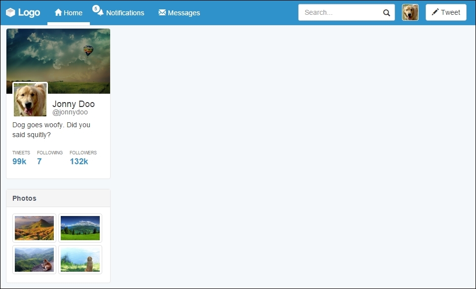
Moving on, in our web application, we will create a new component containing the about information, named Card. We will take a break from page development to discuss this section in depth.
Cards are flexible container extensions that include internal options, such as header, footer, and other display options. In Bootstrap 4, there is a component called Card, but since we are supporting versions 3 and 4 in this book, we will teach both ways.
As was mentioned before, Bootstrap 4 provides Cards components. To make use of them, create a div.card element and start adding elements such as .card-block and .card-img-top:
<div class="card">
  <img class="card-img-top img-responsive" src="imgs/landscape.jpg">
  <div class="card-block">
    <h4 class="card-title">Name</h4>
    <p class="card-text">About text</p>
    <a href="#" class="btn btn-primary">Can add buttons</a>
  </div>
</div>
For the preceding code, the output will look like what is shown in the following screenshot. As we can see, the Card component is pretty simple and straightforward. The component offers some other options as well, but we will talk about that when needed.
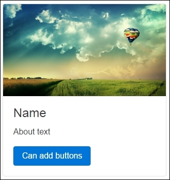
Like the famous quote, if you have lemons, make lemonade, in Bootstrap version 3, we do not have the Card component. However, we have the tools needed to make our own Card component for sure! So let's have some lemonade!
We will use the same classes and structures of Bootstrap 4, playing with only the CSS. Therefore, if you are using version 3, you will see the page render like this for the use of the same HTML from version 4:
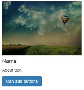
To squeeze the first lemon, let's create the CSS for the .card class:
.card {
  position: relative;
  border: 0.1rem solid #e5e5e5;
  border-radius: 0.4rem;
  background-color: #FFF;
}
Following this, just add two CSS rules for img.card-img-top and .card-block, as shown here:
.card-img-top {
  border-radius: 0.4rem 0.4rem 0 0;
}

.card-block {
  padding: 1.25rem;
}
Done! We have our own card component ready for Bootstrap 3. The next screenshot presents the final result. Of course, there are some differences of typography and button color, but these are the differences because of the version; the component is perfectly done.
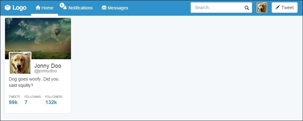
Getting back to the web application, let's add the Card components inside div#profile, at the main container. The HTML code for this section will be as follows:
<div id="profile-resume" class="card">
  <img class="card-img-top img-responsive" src="imgs/landscape.jpg">
  <div class="card-block">
    <img src="imgs/jon.png" class="card-img">
    <h4 class="card-title">Jonny Doo <small>@jonnydoo</small></h4>
    <p class="card-text">Dog goes woofy. Did you said squitly?</p>
    <ul class="list-inline list-unstyled">
      <li id="card-tweets">
        <a href="#">
          <span class="profile-stats">Tweets</span>
          <span class="profile-value">99k</span>
        </a>
      </li>
      <li class="card-following">
        <a href="#">
          <span class="profile-stats">Following</span>
          <span class="profile-value">7</span>
        </a>
      </li>
      <li class="card-followers">
        <a href="#">
          <span class="profile-stats">Followers</span>
          <span class="profile-value">132k</span>
        </a>
      </li>
    </ul>
  </div>
</div>
Breaking down the code, we added some components to .card-block. First of all is the .card-img element, which will represent the profile photography. Following this, we changed .card-title by adding a <small> tag inside <h4>. The last change is the addition of the <ul> list, representing some stats for the profile.
There is no secret in this HTML piece; we just added some elements in a straightforward way. Now it's time for the CSS rules. First, change the position and size of the img.card-img element:
.card-block img.card-img {
  top: 50%;
  margin-top: -36px;
  width: 72px;
  border: 3px solid #FFF;
  border-radius: 0.4rem;
  float: left;
  position: relative;
  z-index: 99;
}
Since it is in the right place, let's correctly align .card-title and add some padding to .card-text:
.card-block .card-title {
  float: left;
  margin: 0;
  margin-left: 0.5em;
}

.card-block .card-title small {
  display: block;
}

.card-block .card-text {
  clear: both;
  padding-top: 0.25em;
  margin-bottom: 1.5em;
}
Tip
Can you change the card block to use flexbox?
Another challenge appears here. Since you have already learned about the usage of flexbox, try to replace the floats in the previous code with some flexbox CSS rules. Just keep in mind that it is recommended for Bootstrap 4 and works only on new browsers.
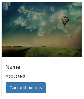
It is almost looking like the Twitter card on the left; we just need to change the list style inside the profile card. Add this CSS:
.card-block ul a:hover {
  text-decoration: none;
}

.card-block ul .profile-stats {
  color: #777;
  display: block;
  text-transform: uppercase;
  font-size: 0.63em;
}

.card-block ul .profile-value {
  font-size: 1.2em;
  font-weight: bold;
  color: #2F92CA;
}
Well done! It looks prettier than the Twitter component. In the following screenshot, we present the expected result:
After the #profile-resume card, we will create another one named #profile-photo, which will contain photos of the user. Use the same cards methodology to place this new one after #profile-resume with the following HTML code:
<div id="profile-photo" class="card">
  <div class="card-header">Photos</div>
  <div class="card-block">
    <ul class="list-inline list-unstyled">
      <li>
        <a href="#" class="thumbnail"><img class="img-responsive" src="imgs/landscape-02.jpg"></a>
      </li>
      <li>
        <a href="#" class="thumbnail"><img class="img-responsive" src="imgs/landscape-03.jpg"></a>
      </li>
      <li>
        <a href="#" class="thumbnail"><img class="img-responsive" src="imgs/landscape-04.jpg"></a>
      </li>
      <li>
        <a href="#" class="thumbnail"><img class="img-responsive" src="imgs/landscape-05.jpg"></a>
      </li>
    </ul>
  </div>
</div>
In this card we will create a new card element, .card-header. In Bootstrap 4, you can use the regarding class, but in version 3, you will need this CSS rule:
.card .card-header {
  border-radius: 0.4rem 0.4rem 0 0;
  padding: .75rem 1.25rem;
  background-color: #f5f5f5;
  border-bottom: 0.1em solid #e5e5e5;
  color: #4e5665;
  font-weight: bold;
}
Moving on, the rest of CSS for this card is simple. Just change the image's width and adjust some margins and paddings:
#profile-photo {
  margin-top: 2rem;
}

#profile-photo ul {
  margin: 0;
}

#profile-photo li {
  width: 48%;
  padding: 0;
}
Also note that we are using the .thumbnail class in the <a> tag that wraps the images. This class is useful for nicely styled thumbnail images. It can also be used to wrap text along with an image.
The photo card should look like what is shown in the following screenshot. Again, we will use some more cards in this web application, although we'll talk about that later, when needed.