Table of Contents for
Bootstrap 4 – Responsive Web Design
 Bootstrap 4 – Responsive Web Design
Published by
Packt Publishing, 2017
Bootstrap 4 – Responsive Web Design
Published by
Packt Publishing, 2017
- Cover
- Table of Contents
- Bootstrap 4 – Responsive Web Design
- Bootstrap 4 – Responsive Web Design
- Credits
- Preface
- What you need for this learning path
- Who this learning path is for
- Reader feedback
- Customer support
- 1. Module 1
- 1. Getting Started
- Setting up the framework
- Building our first Bootstrap example
- Optionally using the CDN setup
- Community activity
- Bootstrap and web applications
- Browser compatibility
- Summary
- 2. Creating a Solid Scaffolding
- Building our scaffolding
- Fluid container
- We need some style!
- Manipulating tables
- Like a boss!
- Final thoughts
- Summary
- 3. Yes, You Should Go Mobile First
- Bootstrap and the mobile-first design
- How to debug different viewports at the browser
- Cleaning up the mess
- Creating the landing page for different devices
- Summary
- 4. Applying the Bootstrap Style
- Summary
- 5. Making It Fancy
- Paying attention to your navigation
- Dropping it down
- Making an input grouping
- Getting ready for flexbox!
- Summary
- 6. Can You Build a Web App?
- Adding the navigation
- Do a grid again
- Playing the cards
- Implementing the main content
- Creating breadcrumbs
- Finishing with the right-hand-side content
- Summary
- 7. Of Course, You Can Build a Web App!
- Waiting for the progress bar
- Creating a settings page
- Summary
- 8. Working with JavaScript
- Awesome Bootstrap modals
- Creating our custom modal
- A tool for your tip
- Pop it all over
- Making the menu affix
- Finishing the web app
- Summary
- 9. Entering in the Advanced Mode
- The last navigation bar with flexbox
- Filling the main fluid content
- Filling the main content
- Overhead loading
- Fixing the toggle button for mobile
- Summary
- 10. Bringing Components to Life
- Fixing the mobile viewport
- Learning more advanced plugins
- Summary
- 11. Making It Your Taste
- Working with plugin customization
- The additional Bootstrap plugins
- Creating our Bootstrap plugin
- Defining the plugin methods
- Creating additional plugin methods
- Summary
- 2. Module 2
- 1. Introducing Bootstrap 4
- Summary
- 2. Using Bootstrap Build Tools
- Download the Bootstrap source files
- Setting up the blog project
- Setting up the JSON files
- Creating our first page template
- Summary
- 3. Jumping into Flexbox
- Ordering your Flexbox
- Wrapping your Flexbox
- Setting up the Bootstrap Flexbox layout grid
- Setting up a Flexbox project
- Designing a single blog post
- Summary
- 4. Working with Layouts
- Inserting rows into your layout
- Adding columns to your layout
- Choosing a column class
- Creating a simple three-column layout
- Mixing column classes for different devices
- Coding the blog home page
- Using responsive utility classes
- Summary
- 5. Working with Content
- Learning to use typography
- Customizing headings
- How to style images
- Coding tables
- Summary
- 6. Playing with Components
- Basic button examples
- Creating outlined buttons
- Checkbox and radio buttons
- Coding forms in Bootstrap 4
- Creating an inline form
- Adding validation to inputs
- Using the Jumbotron component
- Adding the Label component
- Using the Alerts component
- Using Cards for layout
- Updating the Blog index page
- How to use the Navs component
- Adding Breadcrumbs to a page
- Using the Pagination component
- How to use the List Group component
- Summary
- 7. Extending Bootstrap with JavaScript Plugins
- Coding Tooltips
- Avoiding collisions with our components
- Using Popover components
- Using the Collapse component
- Coding an Accordion with the Collapse component
- Coding a Bootstrap Carousel
- Summary
- 8. Throwing in Some Sass
- Using Sass in the blog project
- Importing partials in Sass
- Creating a collection of variables
- Customizing components
- Writing a theme
- Summary
- 9. Migrating from Version 3
- Big changes in version 4
- Updating your variables
- Additional global changes
- Other font updates
- Migrating components
- Migrating JavaScript
- Miscellaneous migration changes
- Summary
- 3. Module 3
- 1. Revving Up Bootstrap
- What Bootstrap 4 Alpha 4 has to offer
- Setting up our project
- Summary
- 2. Making a Style Statement
- Image elements
- Responsive utilities
- Helper classes
- Text alignment and transformation
- Summary
- 3. Building the Layout
- Adding Bootstrap components
- Summary
- 4. On Navigation, Footers, Alerts, and Content
- Improving navigation using Scrollspy
- Customizing scroll speed
- Icons
- Using and customizing alerts
- Creating a footer
- Creating and customizing forms
- Form validation
- Progress indicators
- Adding content using media objects
- Figures
- Quotes
- Abbreviations
- Summary
- 5. Speeding Up Development Using jQuery Plugins
- Enhanced pagination using bootpag
- Displaying images using Bootstrap Lightbox
- Improving our price list with DataTables
- Summary
- 6. Customizing Your Plugins
- Customizing plugins
- Writing a custom Bootstrap jQuery plugin
- Summary
- 7. Integrating Bootstrap with Third-Party Plugins
- Hover
- Summary
- 8. Optimizing Your Website
- Minifying CSS and JavaScript
- Introducing Grunt
- Running tasks automatically
- Stripping our website of unused CSS
- JavaScript file concatenation
- Summary
- 9. Integrating with AngularJS and React
- Introducing React
- Summary
- Bibliography
- Index
The Navs component in Bootstrap can be displayed in a couple of different ways. The default view for the component is just a simple unstyled list of links. This list can also be transformed into tabs or pills for ways of organizing your content and navigation. Let's start by learning how to create a default Nav component:
<ul class="nav">
  <li class="nav-item">
    <a class="nav-link" href="#">Link 1</a>
  </li>
  <li class="nav-item">
    <a class="nav-link" href="#">Link 2</a>
  </li>
  <li class="nav-item">
    <a class="nav-link" href="#">Link 3</a>
  </li>
</ul>
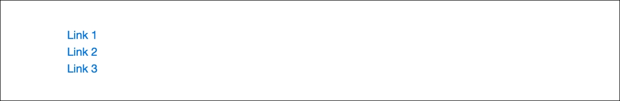
The most basic version of the Nav component is built using the preceding code:
- The component is based on an unordered list with a class of
.nav - Each
<li>tag in the list requires a class of.nav-item - Nested inside the
<li>tag must be an<a>tag with a class of.nav-link
Once you've completed adding that code it should look like this in the browser:
As I mentioned, this is just a basic unstyled list of links. One easy change you can make is to display the list of links inline horizontally. To achieve this, you just need to add a class named .nav-inline to the <ul> tag, like this:
<ul class="nav nav-inline">
This will display all the links in a horizontal line. Why don't we move on to something a little more exciting, such as converting this list into tabs.
Converting the basic list to tabs is easy to do by adding a couple of things to our code. Take a look at this sample:
<ul class="nav nav-tabs">
  <li class="nav-item">
    <a class="nav-link active" href="#">Link 1</a>
  </li>
  <li class="nav-item">
    <a class="nav-link" href="#">Link 2</a>
  </li>
  <li class="nav-item">
    <a class="nav-link" href="#">Link 3</a>
  </li>
</ul>
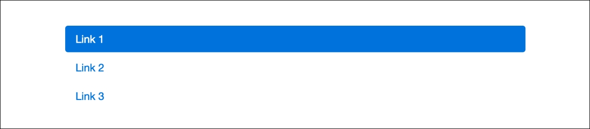
I've made two changes to the code, let's review them now:
- On the
<ul>tag, I removed the.nav-inlineclass and added.nav-tabs. This will render the list as tabs. - I then added a class of
.activeto the first link so that it is the selected tab when the page loads.
After you've coded that up, it should look like this in the browser:

Just like that you can render the list as a set of tabs. The next variations you'll want to try are pills.
Changing the style of the Nav component to Pills is actually really easy. Take a look at the following sample code:
<ul class="nav nav-pills">
  <li class="nav-item">
    <a class="nav-link active" href="#">Link 1</a>
  </li>
  <li class="nav-item">
    <a class="nav-link" href="#">Link 2</a>
  </li>
  <li class="nav-item">
    <a class="nav-link" href="#">Link 3</a>
  </li>
</ul>
Let's breakdown what is new here. I've only made one change to the code. I've removed the .nav-tabs class from the <ul> tag and replaced it with a .nav-pills class. This is the only change you need to make.
Save your file with the changes and it should look like this in the browser:

The preceding example is the default display for Nav pills. There is another variation you can try though, which are stacked pills. This pattern is commonly used in sidebar navigations. To create this version, update the following line of code:
<ul class="nav nav-pills nav-stacked">
Here I've simply added a class of .nav-stacked to the <ul> tag to stack the pills. Here's how it will look in the browser:
That concludes the Nav component in Bootstrap 4. As you learned, it's pretty easy to create a few different styles of navigation with a simple list of unordered links. In the next section, we'll review the more complicated navigation component, which is the Navbar.
The Navbar component is a staple of Bootstrap that gets used all the time. In the past, this component has required a decent amount of markup to get it working. I'm glad to report that in Bootstrap 4 they have simplified this component and made it easier to use. Let's start by going over a basic example of the Navbar:
<nav class="navbar navbar-light bg-faded">
  <a class="navbar-brand" href="#">Navbar</a>
  <ul class="nav navbar-nav">
    <li class="nav-item active">
      <a class="nav-link" href="#">Home</a>
    </li>
    <li class="nav-item">
      <a class="nav-link" href="#">Page 1</a>
    </li>
    <li class="nav-item">
      <a class="nav-link" href="#">Page 2</a>
    </li>
    <li class="nav-item">
      <a class="nav-link" href="#">Page 3</a>
    </li>
  </ul>
</nav>
You may notice some similarities here with the Nav component. The Navbar uses some of the same code, but you can extend it further and combine additional components into it. Let's start by breaking down this basic example:
- A Navbar component can be used outside or inside of a
<div>with a.containerclass on it. If you want the Navbar to be flush with the edges of the browser, you should not include it inside a.container <div>. However, if you do want the default padding and margins applied, put it inside the<div>. For this example, I'm going to build it outside of a container. - The Navbar component starts with an HTML5
<nav>tag that has the following CSS classes added to it. .navbaris the default class that always needs to appear on the component..navbar-lightis the color of component you want to use. There are some other variations you can pick from..bg-fadedis a utility class that you can use to make the background lighter. This is an optional class.- The first element inside of a Navbar is the Brand. The Brand should be the title for your project. To render the element, create an
<a>tag and give it a class of.navbar-brand. The anchor text for this link should be the name of your project or website. Keep in mind, using the Brand is optional. - The core part of the Navbar is the list of navigation links. This is created with an unordered list, similar to the Nav component. In this case, your
<ul>tag should have classes of.navand.navbar-navincluded. - The nested
<li>and<a>tags should use the same.nav-itemand.nav-linkclasses from the Nav component.
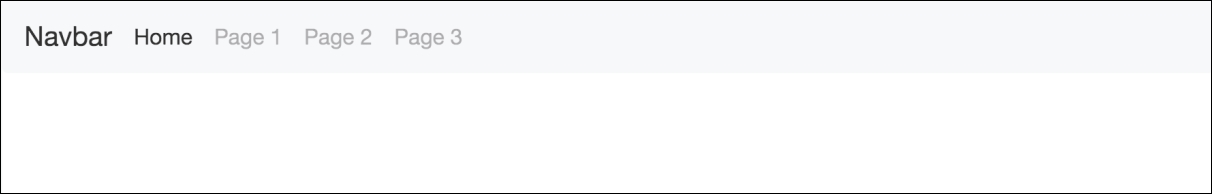
This will create a basic Navbar component for you. This is how it should look in the browser:
Now that you've learned how to build a basic Navbar, let's learn how to extend the component further.
In Bootstrap 3, you could invert the color scheme of the Navbar. However, in Bootstrap 4 you have multiple options for coloring the Navbar component. All that is needed to edit is some of the classes on the <nav> tag that wrap the component. Let's take a look at the code for some of the different color options:
<nav class="navbar navbar-inverse">
  ...
</nav>
<nav class="navbar navbar-primary">
  ...
</nav>
<nav class="navbar navbar-success">
  ...
</nav>
<nav class="navbar navbar-warning">
  ...
</nav>
<nav class="navbar navbar-info">
  ...
</nav>
<nav class="navbar navbar-danger">
  ...
</nav>
As you can see, we're reusing the keywords for color variations that we've used in other components. Let's break down each variation of the Navbar component:
.navbar-inversewill color the component black and grey.navbar-primarywill color the component blue.navbar-successwill color the component green.navbar-warningwill color the component yellow.navbar-infowill color the component light blue.navbar-dangerwill color the component red
Once you're done coding that up, the navbars should look like this in the browser:
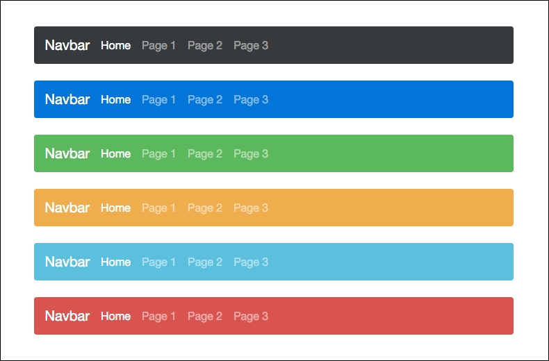
As you can see, we now have the Navbar in a whole range of colors you can choose from. Let's learn what else we can add to this component.
Being that Bootstrap is a mobile-first framework, it would only make sense that you need the ability to make the Navbar component responsive. Let's check out the basic code for this:
<nav class="navbar navbar-light bg-faded">
   <button class="navbar-toggler hidden-sm-up" type="button" data-toggle="collapse" data-target="#responsive-nav">
    ☰
  </button>
  <div class="collapse navbar-toggleable-xs" id="responsive-nav">
     <a class="navbar-brand" href="#">Navbar</a>
     <ul class="nav navbar-nav">
       <li class="nav-item active">
         <a class="nav-link" href="#">Home</a>
       </li>
       <li class="nav-item">
         <a class="nav-link" href="#">Page 1</a>
       </li>
       <li class="nav-item">
         <a class="nav-link" href="#">Page 2</a>
       </li>
       <li class="nav-item">
         <a class="nav-link" href="#">Page 3</a>
       </li>
     </ul>
   </div>
</nav>
There's a few different things in the code here that you need to be aware of:
- After the opening
<nav>class, you need to insert a<button>with the CSS classes.navbar-toggleand.hidden-sm-up. The first class says this button will toggle the navigation. The second class says only show the responsive navigation for sizes above small. You also need to include the data attributedata-toggle="collapse"to all the Nav to collapse. Finally, you need to add a data-target, which will point to the area you want to be collapsible. I've given that an ID of#responsive-nav. - Next, head down to your list of links and wrap a
<div>around them. This section needs CSS classes named.collapseand.navbar-toggleable-xs. You also need to give it an ID ofresponsive-navto tie it to the button from the previous step.
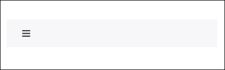
That's it; once you code this up shrink your browser window to a small size and your bar should switch to look like this. Oh, and don't forget that the code ☰ in the button will render a hamburger menu icon in the responsive Navbar:
That concludes the Navbar component in Bootstrap 4. I know this has been a long chapter, but we only have a few more components to go over.