Table of Contents for
Bootstrap 4 – Responsive Web Design
 Bootstrap 4 – Responsive Web Design
Published by
Packt Publishing, 2017
Bootstrap 4 – Responsive Web Design
Published by
Packt Publishing, 2017
- Cover
- Table of Contents
- Bootstrap 4 – Responsive Web Design
- Bootstrap 4 – Responsive Web Design
- Credits
- Preface
- What you need for this learning path
- Who this learning path is for
- Reader feedback
- Customer support
- 1. Module 1
- 1. Getting Started
- Setting up the framework
- Building our first Bootstrap example
- Optionally using the CDN setup
- Community activity
- Bootstrap and web applications
- Browser compatibility
- Summary
- 2. Creating a Solid Scaffolding
- Building our scaffolding
- Fluid container
- We need some style!
- Manipulating tables
- Like a boss!
- Final thoughts
- Summary
- 3. Yes, You Should Go Mobile First
- Bootstrap and the mobile-first design
- How to debug different viewports at the browser
- Cleaning up the mess
- Creating the landing page for different devices
- Summary
- 4. Applying the Bootstrap Style
- Summary
- 5. Making It Fancy
- Paying attention to your navigation
- Dropping it down
- Making an input grouping
- Getting ready for flexbox!
- Summary
- 6. Can You Build a Web App?
- Adding the navigation
- Do a grid again
- Playing the cards
- Implementing the main content
- Creating breadcrumbs
- Finishing with the right-hand-side content
- Summary
- 7. Of Course, You Can Build a Web App!
- Waiting for the progress bar
- Creating a settings page
- Summary
- 8. Working with JavaScript
- Awesome Bootstrap modals
- Creating our custom modal
- A tool for your tip
- Pop it all over
- Making the menu affix
- Finishing the web app
- Summary
- 9. Entering in the Advanced Mode
- The last navigation bar with flexbox
- Filling the main fluid content
- Filling the main content
- Overhead loading
- Fixing the toggle button for mobile
- Summary
- 10. Bringing Components to Life
- Fixing the mobile viewport
- Learning more advanced plugins
- Summary
- 11. Making It Your Taste
- Working with plugin customization
- The additional Bootstrap plugins
- Creating our Bootstrap plugin
- Defining the plugin methods
- Creating additional plugin methods
- Summary
- 2. Module 2
- 1. Introducing Bootstrap 4
- Summary
- 2. Using Bootstrap Build Tools
- Download the Bootstrap source files
- Setting up the blog project
- Setting up the JSON files
- Creating our first page template
- Summary
- 3. Jumping into Flexbox
- Ordering your Flexbox
- Wrapping your Flexbox
- Setting up the Bootstrap Flexbox layout grid
- Setting up a Flexbox project
- Designing a single blog post
- Summary
- 4. Working with Layouts
- Inserting rows into your layout
- Adding columns to your layout
- Choosing a column class
- Creating a simple three-column layout
- Mixing column classes for different devices
- Coding the blog home page
- Using responsive utility classes
- Summary
- 5. Working with Content
- Learning to use typography
- Customizing headings
- How to style images
- Coding tables
- Summary
- 6. Playing with Components
- Basic button examples
- Creating outlined buttons
- Checkbox and radio buttons
- Coding forms in Bootstrap 4
- Creating an inline form
- Adding validation to inputs
- Using the Jumbotron component
- Adding the Label component
- Using the Alerts component
- Using Cards for layout
- Updating the Blog index page
- How to use the Navs component
- Adding Breadcrumbs to a page
- Using the Pagination component
- How to use the List Group component
- Summary
- 7. Extending Bootstrap with JavaScript Plugins
- Coding Tooltips
- Avoiding collisions with our components
- Using Popover components
- Using the Collapse component
- Coding an Accordion with the Collapse component
- Coding a Bootstrap Carousel
- Summary
- 8. Throwing in Some Sass
- Using Sass in the blog project
- Importing partials in Sass
- Creating a collection of variables
- Customizing components
- Writing a theme
- Summary
- 9. Migrating from Version 3
- Big changes in version 4
- Updating your variables
- Additional global changes
- Other font updates
- Migrating components
- Migrating JavaScript
- Miscellaneous migration changes
- Summary
- 3. Module 3
- 1. Revving Up Bootstrap
- What Bootstrap 4 Alpha 4 has to offer
- Setting up our project
- Summary
- 2. Making a Style Statement
- Image elements
- Responsive utilities
- Helper classes
- Text alignment and transformation
- Summary
- 3. Building the Layout
- Adding Bootstrap components
- Summary
- 4. On Navigation, Footers, Alerts, and Content
- Improving navigation using Scrollspy
- Customizing scroll speed
- Icons
- Using and customizing alerts
- Creating a footer
- Creating and customizing forms
- Form validation
- Progress indicators
- Adding content using media objects
- Figures
- Quotes
- Abbreviations
- Summary
- 5. Speeding Up Development Using jQuery Plugins
- Enhanced pagination using bootpag
- Displaying images using Bootstrap Lightbox
- Improving our price list with DataTables
- Summary
- 6. Customizing Your Plugins
- Customizing plugins
- Writing a custom Bootstrap jQuery plugin
- Summary
- 7. Integrating Bootstrap with Third-Party Plugins
- Hover
- Summary
- 8. Optimizing Your Website
- Minifying CSS and JavaScript
- Introducing Grunt
- Running tasks automatically
- Stripping our website of unused CSS
- JavaScript file concatenation
- Summary
- 9. Integrating with AngularJS and React
- Introducing React
- Summary
- Bibliography
- Index
It's time to learn how to use modals! Modals are really present nowadays in web development and Bootstrap plugins, for that is really complete and easy to use. To use it, let's go back to our main web application page, the one containing the feeds.
First, we add the .hide helper class to the div.alert that we created at the #main column. We will play with alerts later. Now, go to the #tweet button on the navigation bar. We want to open a modal for tweets when clicking on this button. So, add the markup to the element:
<!-- modal launch button -->
<button id="tweet" class="btn btn-default pull-right visible-xs-block" data-toggle="modal" data-target="#tweet-modal">
  <span class="glyphicon glyphicon-pencil" aria-hidden="true"></span>
  Tweet
</button>
What we did is the call to open a modal, recognized by the #tweet-modal ID and the data-toggle="modal" data attribute. We could also have done that via JavaScript with this code:
$('#tweet-modal').modal();Create the modal by adding the next HTML code. We have created all the modals at the end of our HTML code, outside of all Bootstrap elements and right before the loading of the JavaScript libraries:
<div class="modal fade" id="tweet-modal" tabindex="-1" role="dialog">
<div class="modal-dialog" role="document">
<div class="modal-content">
<div class="modal-header">
<button type="button" class="close" data-dismiss="modal" aria-label="Close">
<span aria-hidden="true">×</span>
</button>
<h4 class="modal-title">Modal title</h4>
</div>
<div class="modal-body">
Modal content
</div>
<div class="modal-footer">
<button type="button" class="btn btn-default" data-dismiss="modal">
Close
</button>
<button type="button" class="btn btn-primary">
Save changes
</button>
</div>
</div>
</div>
</div>Reload the web application, click on the Tweet button and see the magic happen! This code is a little more complex, so let's explain each part separately. The following screenshot shows what the first draft of our modal looks like. Now let's understand what we did.
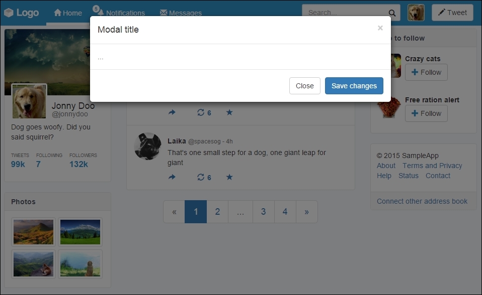
The first tag used to initiate a modal is a <div> with the .modal class. Note that we also added the .fade class to create the effect of fade in and fade out when the modal appears and disappears.
Inside the .modal element, we created two more nested tags. The first one is .modal-dialog, which will wrap all of the modal dialog. Inside it, we created .modal-content, which will hold the content of the modal itself.
Next, inside .modal-content we have the .modal-header element. In the modal header, we can add some title information about the modal. In our example, we have also added a close button that hides the modal using a data-dismiss="modal" data attribute.
The modal body is where you should place the main content of the modal. A cool feature inside the modal is the ability to use scaffolding.
To use the grid system inside the modal body, you do not need to create a container. Just create a .row inside .modal-body and start adding columns, as shown in the following example in bold:
<div class="modal fade" id="tweet-modal" tabindex="-1" role="dialog">
<div class="modal-dialog" role="document">
<div class="modal-content">
<div class="modal-header">
<button type="button" class="close" data-dismiss="modal" aria-label="Close">
<span aria-hidden="true">×</span>
</button>
<h4 class="modal-title">Modal title</h4>
</div>
<div class="modal-body">
<div class="row">
<div class="col-sm-2">Use</div>
<div class="col-sm-4">the</div>
<div class="col-sm-6">grid system</div>
</div>
</div>
<div class="modal-footer">
<button type="button" class="btn btn-default" data-dismiss="modal">
Close
</button>
<button type="button" class="btn btn-primary">
Save changes
</button>
</div>
</div>
</div>
</div>